
.NET MAUI Succinctly®

CHAPTER 7
Resources and Data Binding
XAML is a very powerful declarative language, and it shows all of its power in two particular scenarios: working with resources and working with data binding. If you have previous experience with platforms like Xamarin.Forms, WPF, and Universal Windows Platform, you will be familiar with the concepts described in this chapter. If this is your first time, you will immediately appreciate how XAML simplifies difficult things in both scenarios.
Working with resources
In XAML-based platforms, including .NET MAUI, resources are reusable pieces of information that you can apply to visual elements in the user interface. Typical XAML resources are styles, control templates, object references, and data templates. .NET MAUI supports styles and data templates, so these will be discussed in this chapter.
Declaring resources
Every Page object and every layout expose a property called Resources, a collection of XAML resources that you can populate with one or more objects of type ResourceDictionary. A ResourceDictionary is a container of XAML resources, such as styles, data templates, and object references. For example, you can add a ResourceDictionary to a page as follows:
<ContentPage.Resources>
<ResourceDictionary>
<!-- Add resources here -->
</ResourceDictionary>
</ContentPage.Resources>
Resources have scope. This implies that resources you add to the page level are available to the whole page, whereas resources you add to the layout level are only available to the current layout, like in the following snippet:
<StackLayout.Resources>
<ResourceDictionary>
<!-- Resources are available only to this layout, not outside -->
</ResourceDictionary>
</StackLayout.Resources>
Sometimes you might want to make resources available to the entire application. In this case, you can take advantage of the App.xaml file. The default code for this file is shown in Code Listing 15.
Code Listing 15
<?xml version = "1.0" encoding = "UTF-8" ?> <Application xmlns="http://schemas.microsoft.com/dotnet/2021/maui" xmlns:x="http://schemas.microsoft.com/winfx/2009/xaml" xmlns:local="clr-namespace:Resources" x:Class="Resources.App"> <Application.Resources> <ResourceDictionary> <ResourceDictionary.MergedDictionaries> <ResourceDictionary Source="Resources/Styles/Colors.xaml" /> <ResourceDictionary Source="Resources/Styles/Styles.xaml" /> </ResourceDictionary.MergedDictionaries> </ResourceDictionary> </Application.Resources> </Application> |
As you can see, the autogenerated code of this file already contains an Application.Resources node with a nested ResourceDictionary. Resources you put inside this resource dictionary will be visible to any page, layout, and view in the application.
In addition, ResourceDictionary containers can be stored inside separate XAML files for easier reuse. When you want to link separate resource dictionaries, you add a collection called MergedDictionaries as you can see in the preceding code. Such a collection is populated with as many ResourceDictionary objects as separate XAML files you link, and the file name is specified by assigning the Source property.
When you create a new .NET MAUI project, Visual Studio generates two reusable resource dictionaries called Colors.xaml and Styles.xaml, both located inside the Resources\Styles subfolder. These files are very long, and they contain objects that you do not know yet, so their content will not be shown here. You can open them with Visual Studio and focus on the fact that the root node is a ResourceDictionary object. In the next section you will start learning about supported resources, and the content of the Colors.xaml and Style.xaml files will become clear.
Now that you have knowledge of where resources are declared and their scope, it is time to see how resources work, starting with styles. Other resources, such as data templates, will be discussed later in this chapter.
Introducing styles
When designing your user interface, you might have multiple views of the same type, and for each of them, you might need to assign the same properties with the same values. For example, you might have two buttons with the same width and height, or two or more labels with the same width, height, and font settings.
In such situations, instead of assigning the same properties many times, you can take advantage of styles. A style allows you to assign a set of properties to views of the same type. Styles must be defined inside a ResourceDictionary and must specify the type they are intended for and an identifier. The following code demonstrates how to define a style for Label views:
<ResourceDictionary>
<Style x:Key="labelStyle" TargetType="Label">
<Setter Property="TextColor" Value="Green" />
<Setter Property="FontSize" Value="Large" />
</Style>
</ResourceDictionary>
You assign an identifier with the x:Key expression, and the target type with TargetType, passing the type name for the target view. Property values are assigned with Setter elements whose Property represents the target property name and whose Value represents the property value. You then assign the style to Label views as follows:
<Label Text="Enter some text:" Style="{StaticResource labelStyle}"/>
A style is applied by assigning the Style property on a view with an expression that encloses the StaticResource markup extension and the style identifier within curly braces. You can then assign the Style property on each view of that type instead of manually assigning the same properties every time.
With styles, XAML supports both StaticResource and DynamicResource markup extensions. In the first case, if a style changes, the target view will not be updated with the refreshed style. In the second case, the view will be updated, reflecting changes in the style.
Style inheritance
Styles support inheritance; therefore, you can create a style that derives from another style. For example, you can define a style that targets the abstract View type as follows:
<Style x:Key="viewStyle" TargetType="View">
<Setter Property="HorizontalOptions" Value="Center" />
<Setter Property="VerticalOptions" Value="Center" />
</Style>
This style can be applied to any view, regardless of the concrete type. Then you can create a more specialized style using the BasedOn property as follows:
<Style x:Key="labelStyle" TargetType="Label"
BasedOn="{StaticResource viewStyle}">
<Setter Property="TextColor" Value="Green" />
</Style>
The second style targets Label views, but also inherits property settings from the parent style. Put succinctly, the labelStyle will assign the HorizontalOptions, VerticalOptions, and TextColor properties on the targeted Label views.
Implicit styling
A view’s Style property allows you to assign a style defined inside resources. This allows you to selectively assign the style only to certain views of a given type. However, if you want the same style to be applied to all the views of the same type in the user interface, assigning the Style property to each view manually might be tedious.
In this case, you can take advantage of implicit styling. This feature allows you to automatically assign a style to all the views of the type specified with the TargetType property without the need to set the Style property. To accomplish this, you simply avoid assigning an identifier with x:Key, like in the following example:
<Style TargetType="Label">
<Setter Property="HorizontalOptions" Value="Center" />
<Setter Property="VerticalOptions" Value="Center" />
<Setter Property="TextColor" Value="Green" />
</Style>
Styles with no identifier will automatically be applied to all the Label views in the user interface (according to the scope of the containing resource dictionary), and you will not need to assign the Style property on the Label definitions.
Working with data binding
Data binding is a built-in mechanism that allows visual elements to communicate with data so that the user interface is automatically updated when data changes and vice versa. Data binding is available in all the most important development platforms, and .NET MAUI is no exception.
In fact, its data binding engine relies on the power of XAML, and the way it works is similar in all the XAML-based platforms. If you have previous experience with Xamarin.Forms, you’ll notice no difference. .NET MAUI supports binding an object to visual elements, a collection to visual elements, and visual elements to other visual elements. This chapter describes the first two scenarios.
Because data binding is a very complex topic, the best way to start is with an example. Suppose you want to bind an instance of the following Person class to the user interface so that a communication flow is established between the object and views:
public class Person
{
public string FullName { get; set; }
public DateTime DateOfBirth { get; set; }
public string Address { get; set; }
}
In the user interface, you will want to allow the user to enter their full name, date of birth, and address via an Entry, a DatePicker, and another Entry. In XAML, this can be accomplished with the code shown in Code Listing 16.
Code Listing 16
<?xml version="1.0" encoding="utf-8" ?> <ContentPage xmlns="http://schemas.microsoft.com/dotnet/2021/maui" xmlns:x="http://schemas.microsoft.com/winfx/2009/xaml" x:Class="DataBinding.SingleObjectPage" Title="SingleObjectPage"> <VerticalStackLayout Padding="20"> <Label Text="Name:" /> <Entry Text="{Binding FullName}"/> <Label Text="Date of birth:"/> <DatePicker Date="{Binding DateOfBirth, Mode=TwoWay}"/> <Label Text="Address:"/> <Entry Text="{Binding Address}"/> </VerticalStackLayout> </ContentPage> |
As you can see, the Text property for Entry views and the Date property of the DatePicker have a markup expression as their value. Such an expression is made up of the Binding literal followed by the property you want to bind from the data object. The expanded form of this syntax could be {Binding Path=PropertyName}, but Path can be omitted.
Data binding can be of five types:
· TwoWay: Views can read and write data.
· OneWay: Views can only read data.
· OneWayToSource: Views can only write data.
· OneTime: Views can read data only once.
· Default: MAUI resolves the appropriate mode automatically based on the view (see the explanation that follows).
TwoWay and OneWay are the most-used modes, and in most cases, you do not need to specify the mode explicitly because MAUI automatically resolves the appropriate mode based on the view. For example, binding in the Entry control is TwoWay because this kind of view can be used to read and write data, whereas binding in the Label control is OneWay because this view can only read data.
However, with the DatePicker, you need to explicitly set the binding mode, so you use the following syntax:
<DatePicker Date="{Binding DateOfBirth, Mode=TwoWay}"/>
View properties that are bound to an object’s properties are known as bindable properties (or dependency properties if you come from the WPF or UWP worlds).
Tip: Bindable properties are very powerful but a bit more complex in architecture. In this chapter, you will learn how to use them, but for further details about their implementation and how you can use them in your custom objects, you can refer to the official documentation.
Bindable properties will automatically update the value of the bound object’s property and will automatically refresh their value in the user interface if the object is updated. However, this automatic refresh is possible only if the data-bound object implements the INotifyPropertyChanged interface, which allows an object to send change notifications.
Consequently, you must extend the Person class definition, as shown in Code Listing 17.
Code Listing 17
using System; using System.ComponentModel; using System.Runtime.CompilerServices;
namespace App1 { public class Person : INotifyPropertyChanged { private string fullName; public string FullName { get { return fullName; } set { fullName = value; OnPropertyChanged(); } }
private DateTime dateOfBirth;
public DateTime DateOfBirth { get { return dateOfBirth; } set { dateOfBirth = value; OnPropertyChanged(); } } private string address; public string Address { get { return address; } set { address = value; OnPropertyChanged(); } }
public event PropertyChangedEventHandler PropertyChanged;
private void OnPropertyChanged([CallerMemberName] string propertyName = null) { PropertyChanged?.Invoke(this, new PropertyChangedEventArgs(propertyName)); } } } |
By implementing INotifyPropertyChanged, property setters can raise a change notification via the PropertyChanged event. Bound views will be notified of any changes and will refresh their contents.
Tip: With the CallerMemberName attribute, the compiler automatically resolves the name of the caller member. This avoids the need to pass the property name in each setter and helps keep code much cleaner.
The next step is binding an instance of the Person class to the user interface. This can be accomplished with the following lines of code, normally placed inside the page’s constructor or in its OnAppearing event handler:
Person person = new Person();
this.BindingContext = person;
Pages and layouts expose the BindingContext property (exactly like Xamarin.Forms), of type object, which represents the data source for the page or layout and is the same as DataContext in WPF or UWP.
Child views that are data-bound to an object’s properties will search for an instance of the object in the BindingContext property value and bind to properties from this instance. In this case, the Entry and the DatePicker will search for an object instance inside BindingContext and they will bind to properties from that instance.
Remember that XAML is case-sensitive, so binding to FullName is different from binding to Fullname. The runtime will throw an exception if you try to bind to a property that does not exist or has a different name.
If you now try to run the application, not only will data binding work, but the user interface will also be automatically updated if the data source changes. You may think of binding views to a single object instance, like in the previous example, as binding to a row in a database table.
IntelliSense support for data binding and resources
IntelliSense provides full support for binding expressions with markup extensions. For instance, suppose you have a Person class you want to use as the binding context for your UI and it is declared as a local resource.
IntelliSense will help you create the binding expression by showing the list of available resources. With a binding context declared in the resources, IntelliSense can help with creating binding expressions by showing a list of properties exposed by the bound object.
Figure 50 shows an example where you can also see the Text property of a Label being bound to the property FullName, which is defined in the Person class.
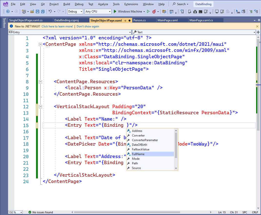
Figure 50: IntelliSense support for data-binding expressions
This is a big productivity feature that simplifies the way you create binding expressions.
Bindable spans
.NET MAUI offers the so-called bindable spans. The Span class inherits from BindableObject, which means that all its properties support data binding. The following snippet provides an example:
<Label
HorizontalOptions="Center"
VerticalOptions="Center">
<Label.FormattedText>
<FormattedString>
<FormattedString.Spans>
<Span FontSize="{Binding TitleSize}"
ForegroundColor="{Binding TitleColor}"
Text="{Binding Title}" />
<Span FontSize="{Binding SubTitleSize}"
ForegroundColor="{Binding SubTitleColor}"
Text="{Binding SubTitle}" />
<Span FontSize="{Binding AuthorSize}"
ForegroundColor="{Binding AuthorColor}"
Text="{Binding AuthorName}" />
</FormattedString.Spans>
</FormattedString>
</Label.FormattedText>
</Label>
With bindable spans, you can create formatted strings dynamically based on the data exposed by your view models.
Working with collections
Though working with a single object instance is a common scenario, another very common situation is working with collections that you display as lists in the user interface. .NET MAUI supports data binding over collections via the ObservableCollection<T> object. This collection works exactly like List<T>, but it also raises a change notification when items are added to or removed from the collection.
Tip: To be precise, data binding in .NET MAUI works with every collection that implements the IEnumerable<T> interface. Using ObservableCollection<T> is generally preferred because of built-in change notification mechanisms, but other collections can be data-bound as well.
Collections are very useful when you want to represent rows in a database table. For example, suppose you have the following collection of Person objects:
Person person1 = new Person { FullName = "Alessandro" };
Person person2 = new Person { FullName = "James" };
Person person3 = new Person { FullName = "Graham" };
var people = new ObservableCollection<Person>() { person1, person2,
person3 };
this.BindingContext = people;
The code assigns the collection to the BindingContext property of the root container, but at this point, you need a visual element that is capable of displaying the content of this collection. .NET MAUI offers two main views: the ListView and the CollectionView. In particular, the ListView is described here with the same level of detail because you might need to migrate existing code from Xamarin.Forms to MAUI.
Note: If you have developed apps with Xamarin.Forms, you will notice how the ListView still relies on cell objects in .NET MAUI. The best approach would be to use the CollectionView whenever possible, but having the ListView as an option will certainly simplify the migration of your Xamarin.Forms projects to .NET MAUI.
The ListView can receive the data source from either the BindingContext of its container or by assigning its ItemsSource property, and any object that implements the IEnumerable interface can be used with the ListView. You will typically assign ItemsSource directly if the data source for the ListView is not the same data source as for the other views in the page.
The problem to solve with the ListView is that it does not know how to present objects in a list. For example, think of a People collection that contains instances of the Person class, defined in Code Listing 18.
Code Listing 18
public class PeopleModel { public ObservableCollection<Person> People { get; set; } public Person SelectedPerson { get; set; } public PeopleModel() { this.People = new ObservableCollection<Person>(); Person person1 = new Person { FullName = "Alessandro", DateOfBirth = new DateTime(1977, 05, 10) }; Person person2 = new Person { FullName = "James", DateOfBirth = new DateTime(1980, 02, 03) }; Person person3 = new Person { FullName = "Graham", DateOfBirth = new DateTime(1982, 04, 06) }; People.Add(person1); People.Add(person2); People.Add(person3); } } |
Each instance exposes the FullName, DateOfBirth, and Address properties, but the ListView does not know how to present these properties, so it is your job to explain to it how. This is accomplished with the data templates. A data template is a static set of views that are bound to properties in the object. It instructs the ListView on how to present items. Data templates in the ListView rely on the concept of cells.
Cells can display information in a specific way, as summarized in Table 7.
Table 7: Cells in .NET MAUI
Cell Type | Description |
|---|---|
TextCell | Displays two labels: one with a description and one with a data-bound text value. |
EntryCell | Displays a label with a description and an Entry with a data-bound text value; also allows a placeholder to be displayed. |
ImageCell | Displays a label with a description and an Image control with a data-bound image. |
SwitchCell | Displays a label with a description and a Switch control bound to a bool value. |
ViewCell | Allows for creating custom data templates. |
Tip: Labels within cells are also bindable properties.
For example, if you only had to display and edit the FullName property, you could write the following data template:
<Grid>
<ListView x:Name="PeopleList" ItemsSource="{Binding}">
<ListView.ItemTemplate>
<DataTemplate>
<EntryCell Label="Full name:" Text="{Binding FullName}"/>
</DataTemplate>
</ListView.ItemTemplate>
</ListView>
</Grid>
Tip: The DataTemplate definition is always defined inside the ListView.ItemTemplate element.
Generally, if the data source is assigned to the BindingContext property, the ItemsSource must be set with the {Binding} value, which means your data source is the same as that of your parent.
With this code, the ListView will display all the items in the bound collection, showing two cells for each item. However, each Person also exposes a property of type DateTime, and no cell is suitable for that. In such situations, you can create a custom cell using the ViewCell, as shown in Code Listing 19.
Code Listing 19
<?xml version="1.0" encoding="utf-8" ?> <ContentPage xmlns="http://schemas.microsoft.com/dotnet/2021/maui" xmlns:x="http://schemas.microsoft.com/winfx/2009/xaml" xmlns:local="clr-namespace:App1" Title="Main page" Padding="20" x:Class="App1.MainPage">
<ListView x:Name="PeopleList" ItemsSource="{Binding}" HasUnevenRows="True"> <ListView.ItemTemplate> <DataTemplate> <ViewCell> <ViewCell.View> <StackLayout Margin="10"> <Label Text="Full name:"/> <Entry Text="{Binding FullName}"/> <Label Text="Date of birth:"/> <DatePicker Date="{Binding DateOfBirth, Mode=TwoWay}"/> <Label Text="Address:"/> <Entry Text="{Binding Address}"/> </StackLayout> </ViewCell.View> </ViewCell> </DataTemplate> </ListView.ItemTemplate> </ListView> </StackLayout> </ContentPage> |
As you can see, the ViewCell allows you to create custom and complex data templates, contained in the ViewCell.View property, so that you can display whatever kind of information you need. Notice the HasUnevenRows property; if true, this dynamically resizes a cell’s height based on its content.
Tip: The ListView is a very powerful and versatile view and there is much more to it, such as interactivity, grouping and sorting, and customizations. I strongly recommend that you read the official documentation, which also includes some tips to improve performance.
Figure 51 shows the result for the code provided in this section. Notice that the ListView includes built-in scrolling capability and should never be enclosed within a ScrollView.
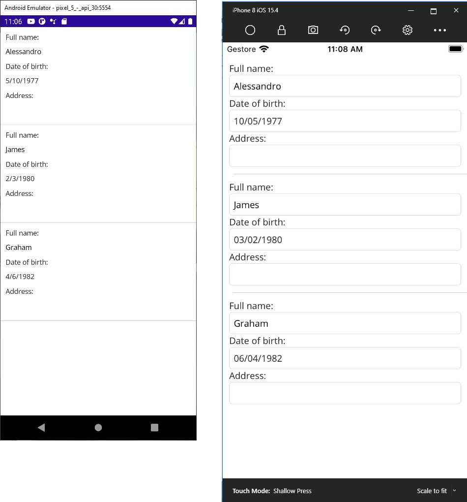
Figure 51: A data-bound ListView
A data template can be placed inside the page or app resources so that it becomes reusable. Then you assign the ItemTemplate property in the ListView definition with the StaticResource expression, as shown in Code Listing 20.
Code Listing 20
<?xml version="1.0" encoding="utf-8" ?> <ContentPage xmlns="http://schemas.microsoft.com/dotnet/2021/maui" xmlns:x="http://schemas.microsoft.com/winfx/2009/xaml" xmlns:local="clr-namespace:App1" Title="Main page" x:Class="App1.MainPage">
<ContentPage.Resources> <ResourceDictionary> <DataTemplate x:Key="MyTemplate"> <ViewCell> <ViewCell.View> <StackLayout Margin="10" Orientation="Vertical" Padding="10"> <Label Text="Full name:"/> <Entry Text="{Binding FullName}"/> <Label Text="Date of birth:"/> <DatePicker Date="{Binding DateOfBirth, Mode=TwoWay}"/> <Label Text="Address:"/> <Entry Text="{Binding Address}"/> </StackLayout> </ViewCell.View> </ViewCell> </DataTemplate> </ResourceDictionary> </ContentPage.Resources>
<ListView x:Name="PeopleList" VerticalOptions="Fill" HasUnevenRows="True" ItemTemplate="{StaticResource MyTemplate}"/> </ContentPage> |
You can also disable item selection with the SelectionMode = "None" property assignment. This can be useful when displaying read-only data.
Showing and selecting values with the Picker view
It is common to provide the user an option to select an item from a list of values, which can be accomplished with the Picker view. You can easily bind a List<T> or ObservableCollection<T> to its ItemsSource property and retrieve the selected item via its SelectedItem property. For example, suppose you have the following Fruit class:
public class Fruit
{
public string Name { get; set; }
public string Color { get; set; }
}
In the user interface, suppose you want to ask the user to select a fruit from a list with the XAML shown in Code Listing 21.
Code Listing 21
<?xml version="1.0" encoding="utf-8" ?> <ContentPage xmlns="http://schemas.microsoft.com/dotnet/2021/maui" xmlns:x="http://schemas.microsoft.com/winfx/2009/xaml" x:Class="DataBinding.PickerPage" Title="PickerPage"> <VerticalStackLayout> <Label Text="Select your favorite fruit:"/> <Picker x:Name="FruitPicker" ItemDisplayBinding="{Binding Name}"
SelectedIndexChanged="FruitPicker_SelectedIndexChanged"/> </VerticalStackLayout> </ContentPage> |
As you can see, the Picker exposes the SelectedIndexChanged event, which is raised when the user selects an item. With the ItemDisplayBinding, you specify which property it needs to display from the bound object—in this case, the fruit name.
The ItemsSource property can, instead, be assigned either in XAML or in the code-behind. In this case, a collection can be assigned in C#, as demonstrated in Code Listing 22.
Code Listing 22
public partial class MainPage : ContentPage { public MainPage() { InitializeComponent();
var apple = new Fruit { Name = "Apple", Color = "Green" }; var strawberry = new Fruit { Name = "Strawberry", Color = "Red" }; var orange = new Fruit { Name = "Orange", Color = "Orange" };
var fruitList = new ObservableCollection<Fruit>() { apple, strawberry, orange }; this.FruitPicker.ItemsSource = fruitList; }
private async void FruitPicker_SelectedIndexChanged(object sender, EventArgs e) { var currentFruit = this.FruitPicker.SelectedItem as Fruit; if (currentFruit != null) await DisplayAlert("Selection", $"You selected {currentFruit.Name}", "OK"); } } |
Like the same-named property in the ListView, ItemsSource is of type object and can bind to any object that implements the IEnumerable interface. Notice how you can retrieve the selected item by handling the SelectedIndexChanged event and casting the Picker.SelectedItem property to the type you expect. In such situations, it is convenient to use the as operator, which returns null if the conversion fails, instead of an exception.
Figure 52 shows how the user can select an item from the Picker. An iOS version of the Picker is not shown because there is a known issue at the time of this writing with Visual Studio 2022.
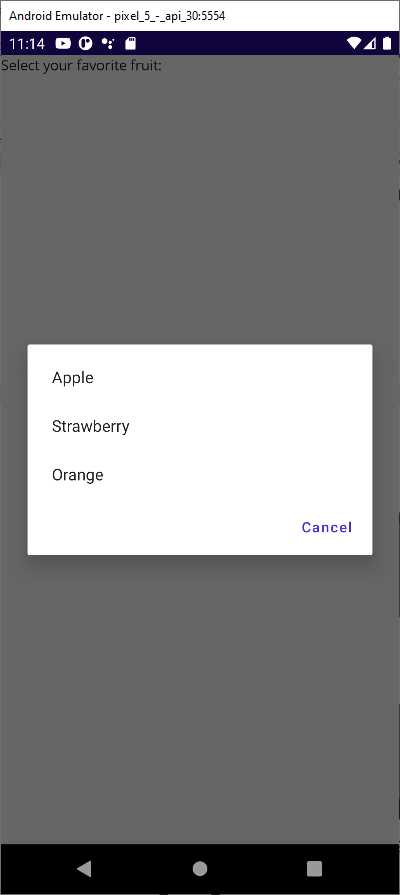
Figure 52: Selecting items with a Picker
Binding images
Displaying images in data-binding scenarios is very common, and .NET MAUI makes it easy to do. You simply need to bind the Image.Source property to an object of type ImageSource, or to a URL that can be represented by both a string and a Uri.
For example, suppose you have a class with a property that stores the URL of an image as follows:
public class Picture
{
public Uri PictureUrl { get; set; }
}
When you have an instance of this class, you can assign the PictureUrl property:
var picture1 = new Picture();
picture1.PictureUrl = new Uri("http://mystorage.com/myimage.jpg");
Supposing you have an Image view in your XAML code and a BindingContext assigned with an instance of the class, data binding would work as follows:
<Image Source="{Binding PictureUrl}"/>
XAML has a type converter for the Image.Source property, so it automatically resolves strings and Uri instances into the appropriate type.
Introducing value converters
The previous sentence mentioned a type converter that resolves specific types into the appropriate type for the Image.Source property. Such converters are available for many other views and types.
For example, if you bind an integer value to the Text property of an Entry view, such an integer is converted into a string by a XAML type converter. However, there are situations in which you might want to bind objects that XAML type converters cannot automatically convert into the type a view expects.
For example, you might want to bind a Color value to a Label’s Text property, which is not possible out of the box. In these cases, you can create value converters. A value converter is a class that implements the IValueConverter interface and exposes the Convert and ConvertBack methods. Convert translates the original type into a type that the view can receive, while ConvertBack does the opposite.
Code Listing 23 shows an example of a value converter that converts a string containing HTML markup into an object that can be bound to the WebView control. ConvertBack is not implemented because this value converter is supposed to be used in a read-only scenario, so a round-trip conversion is not required.
Code Listing 23
using System.Globalization; namespace App1 { public class HtmlConverter : IValueConverter { public object Convert(object value, Type targetType, object parameter, CultureInfo culture) { try { var source = new HtmlWebViewSource(); string originalValue = (string)value; source.Html = originalValue; return source; } catch (Exception) { return value; } } public object ConvertBack(object value, Type targetType, object parameter, CultureInfo culture) { throw new NotImplementedException(); } } } |
Both methods always receive the data to convert as object instances, and then you need to cast the object into a specialized type for manipulation. In this case, Convert creates an HtmlWebViewSource object, converts the received object into a string, and populates the Html property with the string that contains the HTML markup. The value converter must then be declared in the resources of the XAML file where you wish to use it (or in App.xaml).
Code Listing 24 provides an example that also shows how to use the value converter.
<?xml version="1.0" encoding="utf-8" ?> <ContentPage xmlns=" http://schemas.microsoft.com/dotnet/2021/maui" xmlns:x="http://schemas.microsoft.com/winfx/2009/xaml" xmlns:local="clr-namespace:App1" Title="Main page" x:Class="App1.MainPage">
<ContentPage.Resources> <local:HtmlConverter x:Key="HtmlConverter"/> </ContentPage.Resources>
<!-- Assumes you have a data-bound .NET object that exposes a property called HtmlContent --> <WebView Source="{Binding HtmlContent, Converter={StaticResource HtmlConverter}}"/> </ContentPage> |
You declare the converter as you would any other resource. Then your binding will also contain the Converter expression, which points to the value converter with the typical syntax you used with other resources.
Displaying lists with the CollectionView
Like Xamarin.Forms, .NET MAUI provides another view that allows you to display lists of data: the CollectionView. Its biggest benefits are a simpler API surface and no need for view cells, as you will see shortly. Whenever possible, use the CollectionView instead of the ListView.
Continuing the example shown previously, Code Listing 25 shows how you could bind a collection of Person objects to a CollectionView.
Code Listing 25
<CollectionView x:Name="PeopleList" ItemsSource="{Binding People}" SelectionMode="Single" SelectionChanged="PeopleList_SelectionChanged" VerticalScrollBarVisibility="Never" HorizontalScrollBarVisibility="Never"> <CollectionView.ItemTemplate> <DataTemplate> <StackLayout Margin="10"> <Label Text="Full name:"/> <Entry Text="{Binding FullName}"/> <Label Text="Date of birth:"/> <DatePicker Date="{Binding DateOfBirth, Mode=TwoWay}"/> <Label Text="Address:"/> <Entry Text="{Binding Address}"/> </StackLayout> </DataTemplate> </CollectionView.ItemTemplate> </CollectionView> |
You can control the visibility of the scroll bars directly, without custom renderers, by using the VerticalScrollBarVisibility and HorizontalScrollBarVisibility properties. The SelectionMode property allows for improved item selection with values like None, Single, and Multiple. The SelectionChanged event is fired when an item is selected.
Code Listing 26 shows how to work on the item selection, depending on the value of SelectionMode.
Code Listing 26
private void PeopleList_SelectionChanged(object sender, SelectionChangedEventArgs e) { // In case of single selection var selectedPerson = this.PeopleList.SelectedItem as Person; // In case of multiselection var singlePerson = e.CurrentSelection.FirstOrDefault() as Person; var selectedObjects = e.CurrentSelection.Cast<Person>(); foreach (var person in selectedObjects) { // Handle your object properties here... } } |
Figure 53 shows the result of the preceding code listings.

Figure 53: Displaying lists with the CollectionView
The CollectionView also makes it very simple to customize its layout. By default, the orientation is vertical, but you can use the LinearItemsLayout property to change the orientation to Horizontal, as follows:
<CollectionView.ItemsLayout>
<LinearItemsLayout Orientation="Horizontal"/>
</CollectionView.ItemsLayout>
The CollectionView also supports a grid view layout, which can be accomplished with the GridItemsLayout property, as follows:
<CollectionView.ItemsLayout>
<GridItemsLayout Orientation="Horizontal" Span="3"/>
</CollectionView.ItemsLayout>
The Span property indicates how many items are visible per line of the grid view. The CollectionView also has another amazing property called EmptyView, which you use to display a specific view in case the bound collection is empty (null or zero elements). For example, the following code demonstrates how to show a red label if the bound collection has no data:
<CollectionView.EmptyView>
<Label Text="No data is available" TextColor="Red" FontSize="Large"/>
</CollectionView.EmptyView>
There is no similar option in the ListView, and it’s your responsibility to implement and manage the empty data scenario. You can also display complex views with empty data by using the EmptyViewTemplate property instead, which works as shown in the following example:
<CollectionView.EmptyViewTemplate>
<DataTemplate>
<StackLayout Orientation="Vertical" Spacing="20">
<Image Source="EmptyList.png" Aspect="Fill"/>
<Label Text="No data is available" TextColor="Red"/>
</StackLayout>
</DataTemplate>
</CollectionView.EmptyViewTemplate>
In this code snippet, an image and a text message are displayed vertically. Figure 54 shows an example of an empty view.
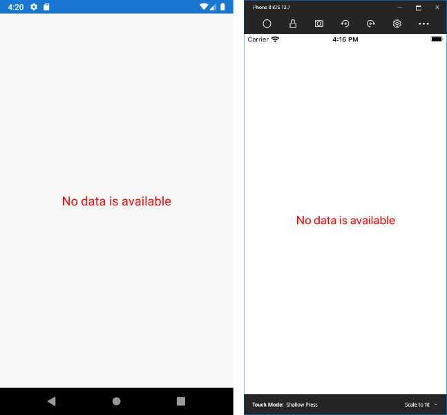
Figure 54: Default empty view
The CollectionView has no built-in support for the pull-to-refresh gesture; however, a view called RefreshView allows you to implement this common functionality. This view requires a bit of knowledge of the Model-View-ViewModel pattern, which is discussed later in this chapter.
Scrolling lists with the CarouselView
The CarouselView is a control that allows for scrolling lists. Typically, a CarouselView is used to scroll lists horizontally, but it also supports vertical orientation. When you declare a CarouselView, you will still define a DataTemplate like you would for the CollectionView, and you can also define the EmptyView and EmptyViewTemplate properties.
Code Listing 27 shows an example based on a collection of Person objects, just like the CollectionView example.
Code Listing 27
<?xml version="1.0" encoding="utf-8" ?> <ContentPage xmlns="http://schemas.microsoft.com/dotnet/2021/maui" xmlns:x="http://schemas.microsoft.com/winfx/2009/xaml" x:Class="DataBinding.CarouselViewPage" Padding="0,20,0,0" Title="CarouselViewPage"> <VerticalStackLayout> <CarouselView x:Name="PeopleList" ItemsSource="{Binding People}" CurrentItemChanged="PeopleList_CurrentItemChanged" PositionChanged="PeopleList_PositionChanged" CurrentItem="{Binding SelectedPerson}"> <CarouselView.ItemsLayout> <LinearItemsLayout Orientation="Horizontal" SnapPointsAlignment="Center" SnapPointsType="Mandatory"/> </CarouselView.ItemsLayout> <CarouselView.ItemTemplate> <DataTemplate> <StackLayout Margin="10"> <Label Text="Full name:"/> <Entry Text="{Binding FullName}"/> <Label Text="Date of birth:"/> <DatePicker Date="{Binding DateOfBirth, Mode=TwoWay}"/> <Label Text="Address:"/> <Entry Text="{Binding Address}"/> </StackLayout> </DataTemplate> </CarouselView.ItemTemplate> </CarouselView> </VerticalStackLayout> </ContentPage> |
The PositionChanged event is fired when the control is scrolled. The PositionChangedEventArgs object provides the CurrentPosition and PreviousPosition properties, both of type int.
The CurrentItemChanged event is fired when the user taps on a displayed item. The CurrentItemChangedEventArgs object provides the CurrentItem and PreviousItem properties, both of type object. Notice how the CurrentItem property is data-bound to an individual instance of the Person class; this simplifies the way you get the instance of the currently selected object in the CarouselView.
In the layout definition, the SnapPointsAlignment property specifies how snap points are aligned with items, whereas the SnapPointsType property specifies the behavior of snap points when scrolling. Figure 55 shows an example of the CarouselView in action, with items scrolling horizontally.
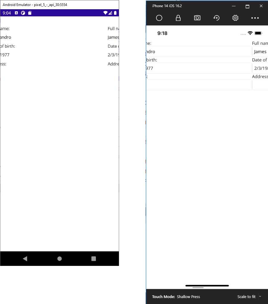
Figure 55: Scrolling lists with the CarouselView
Introducing the IndicatorView
The IndicatorView is a control that displays indicators representing the number of items and current position in a CarouselView. The latter has an IndicatorView property, which you assign with the name of the related IndicatorView, usually declared below the CarouselView.
Continuing the example of the previous section, you would extend the XAML as follows:
<VerticalStackLayout>
<CarouselView IndicatorView="PersonIndicatorView">
...
</CarouselView>
<IndicatorView x:Name="PersonIndicatorView"
IndicatorColor="LightGray"
SelectedIndicatorColor="DarkGray"
HorizontalOptions="Center" />
</VerticalStackLayout>
You will need to wrap both views into a layout to have them close to each other in the user interface. The IndicatorColor and SelectedIndicatorColor properties represent the color of the indicator in its normal and selected states.
You can also use the IndicatorsShape property and set it with Square (default) or Circle to define the appearance of the indicators. The IndicatorSize property allows you to customize the indicator size, but you can also provide a completely custom appearance using the IndicatorTemplate property, in which you can supply views to provide your own representation inside a DataTemplate.
Figure 56 shows an example of how the IndicatorView looks at the bottom of the image.
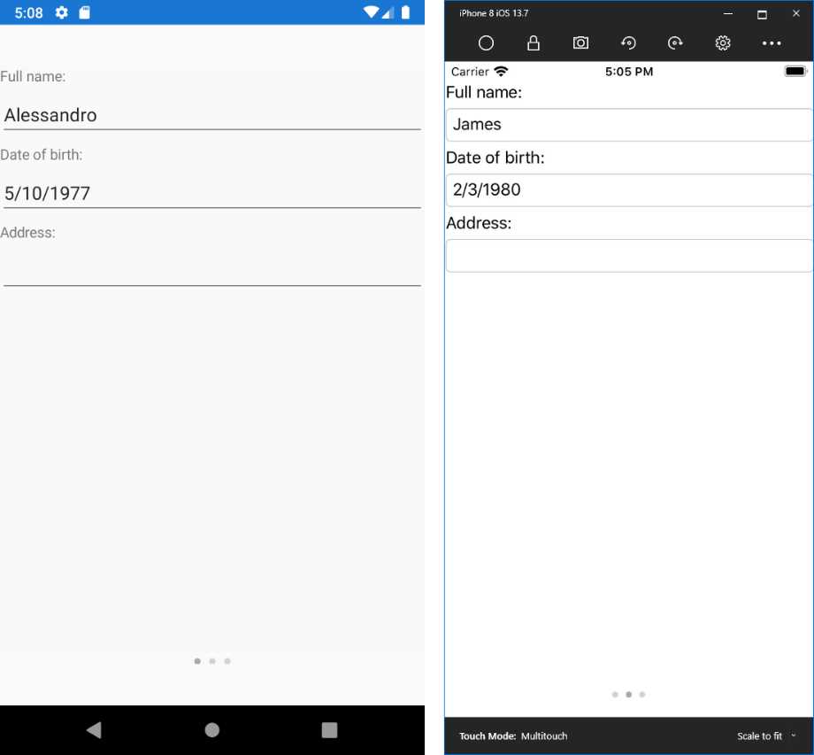
Figure 56: Assigning an IndicatorView to a CarouselView
Introducing Model-View-ViewModel
Model-View-ViewModel (MVVM) is an architectural pattern used in XAML-based platforms that allows for clean separation between the data (model), the logic (view model), and the user interface (view). With MVVM, pages only contain code related to the user interface, they strongly rely on data binding, and most of the work is done in the view model.
MVVM can be quite complex if you have never seen it before, so I will try to simplify the explanations as much as possible. The fundamental concepts that power MVVM are covered in the Commanding page of the official documentation.
Let’s start with a simple example and a fresh .NET MAUI solution. Imagine you want to work with a list of Person objects. This is your model, and you can reuse the Person class from before. Add a new folder called Model to your project and add a new Person.cs class file to this folder, pasting the code of the Person class. Next, add a new folder called ViewModel to the project and add a new class file called PersonViewModel.cs.
Before writing the code for it, let’s summarize some important considerations:
· The view model contains the business logic, acts like a bridge between the model and the view, and exposes properties to which the view can bind.
· Among such properties, one will certainly be a collection of Person objects.
· In the view model, you can load data, filter data, execute save operations, and query data.
Loading, filtering, saving, and querying data are examples of actions a view model can execute against data. In a classic development approach, you would handle Clicked events on Button views and write the code that executes an action.
However, in MVVM, views should only contain code related to the user interface, not code that executes actions against data. In MVVM, view models expose the so-called commands. A command is a property of type ICommand that can be data-bound to views such as Button, SearchBar, CollectionView, ListView, and TapGestureRecognizer objects. In the UI, you bind a view to a command in the view model. In this way, the action is executed in the view model instead of in the view’s code behind.
Code Listing 28 shows the PersonViewModel class definition.
using ModelViewViewModel.Model; using System.Collections.ObjectModel; using System.ComponentModel; using System.Runtime.CompilerServices; using System.Windows.Input; namespace ModelViewViewModel.ViewModel { public class PersonViewModel : INotifyPropertyChanged { public ObservableCollection<Person> People { get; set; } private Person _selectedPerson; public Person SelectedPerson { get { return _selectedPerson; } set { _selectedPerson = value; OnPropertyChanged(); } } public ICommand AddPersonCommand { get; set; } public ICommand DeletePersonCommand { get; set; } public event PropertyChangedEventHandler PropertyChanged; private void OnPropertyChanged([CallerMemberName] string propertyName = null) { PropertyChanged?.Invoke(this, new PropertyChangedEventArgs(propertyName)); } private void LoadSampleData() { People = new ObservableCollection<Person>(); // sample data Person person1 = new Person { FullName = "Alessandro", Address = "Italy", DateOfBirth = new DateTime(1977, 5, 10) }; Person person2 = new Person { FullName = "Robert", Address = "United States", DateOfBirth = new DateTime(1960, 2, 1) }; Person person3 = new Person { FullName = "Niklas", Address = "Germany", DateOfBirth = new DateTime(1980, 4, 2) }; People.Add(person1); People.Add(person2); People.Add(person3); } public PersonViewModel() { LoadSampleData(); AddPersonCommand = new Command(() => People.Add(new Person())); DeletePersonCommand = new Command<Person>((person) => People.Remove(person)); } } } |
The People and SelectedPerson properties expose a collection of Person objects and a single Person, respectively, and the latter will be bound to the SelectedItem property of a CollectionListView, as you will see shortly.
Notice how properties of type ICommand are assigned with instances of the Command class, to which you can pass an Action delegate via a lambda expression that executes the desired operation. The Command provides an out-of-the-box implementation of the ICommand interface, and its constructor can also receive a parameter, in which case you must use its generic overload (see the DeletePerson assignment).
In that case, the Command works with objects of type Person and the action is executed against the received object. Commands and other properties are data-bound to views in the user interface.
Note: Here you saw the most basic use of commands. However, commands also expose a CanExecute Boolean method that determines whether an action can be executed. Additionally, you can create custom commands that implement ICommand and must explicitly implement the Execute and CanExecute methods, where Execute is invoked to run an action. For further details, refer to the official documentation.
Now it is time to write the XAML code for the user interface. Code Listing 29 shows how to use the new CollectionView for this and how to bind two Button views to commands.
<?xml version="1.0" encoding="utf-8" ?> <ContentPage xmlns="http://schemas.microsoft.com/dotnet/2021/maui" xmlns:x="http://schemas.microsoft.com/winfx/2009/xaml" x:Class="ModelViewViewModel.MainPage"> <VerticalStackLayout> <CollectionView x:Name="PeopleList" ItemsSource="{Binding People}" SelectionMode="Single" SelectedItem="{Binding SelectedPerson}" VerticalScrollBarVisibility="Never" HorizontalScrollBarVisibility="Never"> <CollectionView.ItemTemplate> <DataTemplate> <VerticalStackLayout Margin="10"> <Label Text="Full name:"/> <Entry Text="{Binding FullName}"/> <Label Text="Date of birth:"/> <DatePicker Date="{Binding DateOfBirth, Mode=TwoWay}"/> <Label Text="Address:"/> <Entry Text="{Binding Address}"/> </VerticalStackLayout> </DataTemplate> </CollectionView.ItemTemplate> </CollectionView> <HorizontalStackLayout> <Button Text="Add" Command="{Binding AddPersonCommand}"/> <Button Text="Delete" Command="{Binding DeletePersonCommand}" CommandParameter= "{Binding Source={x:Reference PeopleList}, Path=SelectedItem}"/> <Button Text="Detail" Command="{Binding ViewPersonDetail}"/> </HorizontalStackLayout> </VerticalStackLayout> </ContentPage> |
Notice how:
· The CollectionView.ItemsSource property is bound to the People collection in the view model.
· The CollectionView.SelectedItem property is bound to the SelectedPerson property in the view model.
· The first Button is bound to the AddPerson command in the view model.
· The second Button is bound to the DeletePerson command, and it passes the selected Person object in the CollectionView with a special binding expression:
o Source represents the data source, in this case the CollectionView, referred to with x:Reference.
o Path points to the property in the source that exposes the object you want to pass to the command as a parameter (simply referred to as a command parameter).
The final step is to create an instance of the view model and assign it to the BindingContext of the page, which you can do in the page code-behind, as demonstrated in Code Listing 30.
Code Listing 30
using MvvmSample.ViewModel; using Xamarin.Forms;
namespace MvvmSample { public partial class MainPage : ContentPage { // Not using a field here because properties // are optimized for data binding. private PersonViewModel ViewModel { get; set; }
public MainPage() { InitializeComponent();
this.ViewModel = new PersonViewModel(); this.BindingContext = this.ViewModel; } } } |
If you now run the application, you will see the list of Person objects, and you will be able to use the two buttons. The real benefit is that all the logic is in the view model. With this approach, if you change the logic in the properties or in the commands, you will not need to change the page code.
In Figure 57, you can see a new Person object added via command binding.
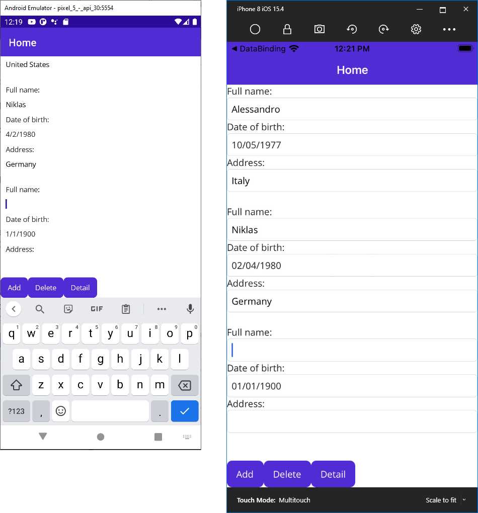
Figure 57: Showing a list of people and adding a new person with MVVM
MVVM is very powerful, but real-world implementations can be very complex. For example, if you want to navigate to another page and you have commands, the view model should contain code related to the user interface (launching a page) that does not adhere to the principles of MVVM.
Obviously, there are solutions to this problem that require further knowledge of the pattern, so I recommend you check out books and articles on the internet for further study. There’s no need to reinvent the wheel; many robust and popular MVVM libraries already exist, and you might want to choose one from among the following:
· Prism
All these alternatives are powerful enough to save you a lot of time.
Implementing pull-to-refresh: the RefreshView
The CollectionView provides many benefits due to a simplified API surface, but it lacks built-in support for the pull-to-refresh gesture. Fortunately, .NET MAUI provides the RefreshView, a container that allows for implementing the pull-to-refresh gesture where it isn’t already available. This view is discussed here because, as you will see shortly, it requires knowledge of how commands work.
Tip: The RefreshView can be used with any views that implement scrolling, not just the CollectionView. For instance, a ScrollView with child elements can implement pull-to-refresh if put inside a RefreshView.
Let’s start by adding the RefreshView in the XAML. Continuing the current code example, you will wrap the CollectionView inside a RefreshView as follows:
<VerticalStackLayout>
<RefreshView RefreshColor="Teal"
IsRefreshing="{Binding IsRefreshing}"
Command="{Binding RefreshCommand}">
<CollectionView x:Name="PeopleList" … >
…
</CollectionView>
</RefreshView>
</VerticalStackLayout>
The RefreshView exposes a helpful property called RefreshColor, which allows you to change the color of the spinner that is displayed while the pull-to-refresh is active. The IsRefreshing property is bound to a bool property in the view model, which enables or disables the pull-to-refresh spinner when true or false, respectively.
The Command property is bound to a command object that performs the actual refresh operation. The IsRefreshing and RefreshCommand properties will be defined in the view model as follows:
private bool _isRefreshing;
public bool IsRefreshing
{
get
{
return _isRefreshing;
}
set
{
_isRefreshing = value;
OnPropertyChanged();
}
}
public ICommand RefreshCommand { get; set; }
In the constructor of the view model, you can then assign the RefreshCommand with the action that will be performed to refresh the data, so add the following code:
RefreshCommand =
new Command(async () =>
{
IsRefreshing = true;
LoadSampleData();
// Simulates a longer operation
await Task.Delay(2000);
IsRefreshing = false;
}
);
The action does simple work: it assigns IsRefreshing with true in order to activate the pull-to-refresh user interface, it reloads the sample data, and then it assigns IsRefreshing with false when finished to disable the pull-to-refresh user interface.
Now you can run the sample, pull and release the list of data, and see how the gesture is implemented. Figure 58 shows an example.
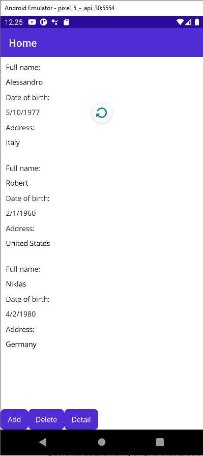
Figure 58: Pull-to-refresh with the RefreshView
Obviously, in real-world scenarios, your data will take a couple of seconds to reload, so you will not need to use the Task.Delay method to simulate a long-running operation.
Chapter summary
XAML plays a fundamental role in .NET MAUI, allowing for defining reusable resources and for data-binding scenarios. Resources are reusable styles, data templates, and references to objects you declare in XAML. Notably, styles allow you to set the same properties to all views of the same type, and they can extend other styles with inheritance. XAML also includes a powerful data-binding engine that allows you to quickly bind objects to visual elements in a two-way communication flow.
In this chapter, you have seen how to bind a single object to individual visual elements and collections of objects to ListView and CollectionView. You have seen how to define data templates so that the ListView and the CollectionView can have knowledge of how items must be presented, and you have learned about value converters, special objects that help you when you want to bind objects of a type that is different from the type a view supports.
In the second part of the chapter, you have been introduced to the Model-View-ViewModel pattern, focusing on separating the logic from the UI and understanding new objects and concepts such as commands. Finally, you have seen how to quickly implement pull-to-refresh with the new RefreshView.
In the next chapter, you will walk through two exciting new features: brushes and shapes.
- An ever-growing .NET MAUI control suite with rich feature sets.
- DataGrid, Charts, ListView, Scheduler, and more.
- Active community and dedicated support.
- Phone, tablet, and desktop support.