
.NET MAUI Succinctly®

CHAPTER 8
Brushes and Shapes
If you have ever worked with professional designers on real-world mobile apps, you know how frustrating it is to say, “We can’t do this,” when they ask for shapes and gradient colors in the app design. There are options, like third-party libraries, but this creates a dependency, which is not always allowed by companies. Luckily, .NET MAUI offers brushes and shapes, providing a great solution to this kind of problem.
Understanding brushes
Brushes are types that expand the way you can add colors and gradients to your visual elements. Consider the following line, which declares a Button with a background color:
<Button Text="Tap here" BackgroundColor="LightBlue"/>
The BackgroundColor is of type Color and allows for assigning an individual color. You could also assign a property called Background, of type Brush. This is an abstract type definition for specialized types like SolidColorBrush, LinearGradientBrush, and RadialGradientBrush. Let’s discuss these in more detail.
Solid colors with SolidColorBrush
As the name implies, SolidColorBrush assigns a solid color to a property of type Brush. This can be done inline, like in the previous button declaration, which takes advantage of type converters. The value can be one of the literals displayed by IntelliSense or even a color in hexadecimal format (such as #FFFFFF).
SolidColorBrush can be assigned with two different syntaxes. The first one is an inline assignment, as follows:
<Frame CornerRadius="5" Background="Green"
Margin="20" WidthRequest="150"
HeightRequest="150">
</Frame>
The second syntax is the property syntax, with an extended form that will be very useful with gradients:
<Frame CornerRadius="5"
Margin="20" WidthRequest="150"
HeightRequest="150">
<Frame.Background>
<SolidColorBrush Color="Green"/>
</Frame.Background>
</Frame>
Tip: In practice, using a solid color with a property of type Color or with a property of type Brush makes no difference. However, you might want to use properties of type Brush if you plan to replace a solid color brush value with a linear or radial gradient at runtime, since both of these derive from Brush, like SolidColorBrush.
Linear gradients with LinearGradientBrush
You can create linear gradients with the LinearGradientBrush object. Gradients can be horizontal, vertical, and diagonal. Linear gradients have two-dimensional coordinates, represented by the StartPoint and EndPoint properties on an axis where a value of 0,0 is the top-left corner of the view and 1,1 is the bottom-right corner of the view. The default value for StartPoint is 0,0 while the default value for EndPoint is 1,1.
The following example draws a horizontal linear gradient as the background for a Grid view:
<Grid>
<Grid.Background>
<!-- StartPoint defaults to (0,0) -->
<LinearGradientBrush EndPoint="1,0">
<GradientStop Color="Blue"
Offset="0.1" />
<GradientStop Color="Violet"
Offset="1.0" />
</LinearGradientBrush>
</Grid.Background>
</Grid>
Each GradientStop represents a color and its position in the gradient via the Offset property. Figure 59 shows what the gradient looks like.
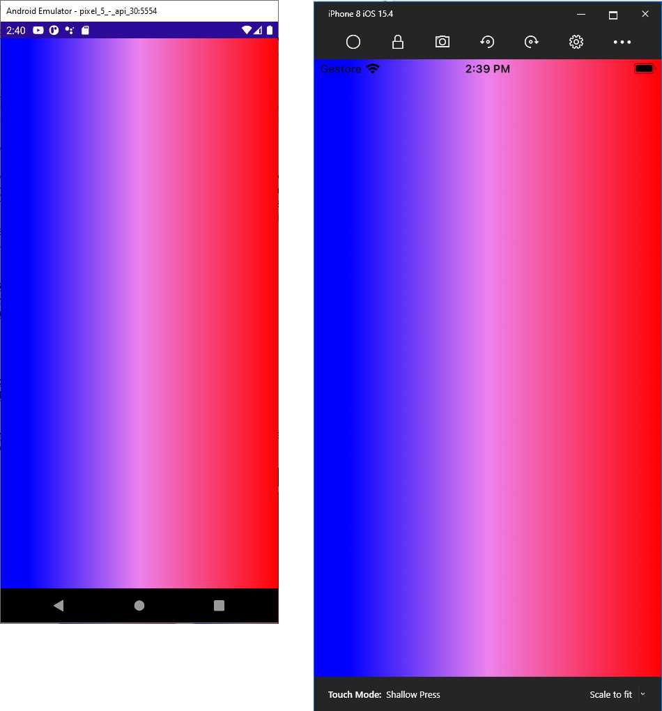
Figure 59: A horizontal linear gradient
You can change the orientation of the gradient to vertical by replacing the value of the EndPoint property as follows:
<LinearGradientBrush EndPoint="0,1">
A diagonal gradient can be created by simply removing StartPoint and EndPoint and using their default values of 0,0 and 1,1, respectively. You can also add more than two colors. The following code demonstrates this:
<LinearGradientBrush EndPoint="1,0">
<GradientStop Color="Blue"
Offset="0.1" />
<GradientStop Color="Violet"
Offset="0.5" />
<GradientStop Color="Red"
Offset="1.0" />
</LinearGradientBrush>
Notice how the Offset property is used to determine the position of the colors; in this case, Violet is placed in the middle of the gradient in a scale between 0.1 and 1.
Circular gradients with RadialGradientBrush
You can create circular gradients using the RadialGradientBrush object. This object exposes the Radius property, of type double, which represents the radius of the circle for the gradient, and whose default value is 0.5. It also exposes the Center property, of type Point, which represents the center of the circle in the gradient and whose default value is 0.5,0.5.
In its simplest form, a RadialGradientBrush can be declared as follows:
<Grid Margin="10">
<Grid.Background>
<!-- Radius defaults to (0.5,0.5) -->
<RadialGradientBrush>
<GradientStop Color="Blue"
Offset="0.1" />
<GradientStop Color="Violet"
Offset="1.0" />
</RadialGradientBrush>
</Grid.Background>
</Grid>
The resulting gradient looks like Figure 60.
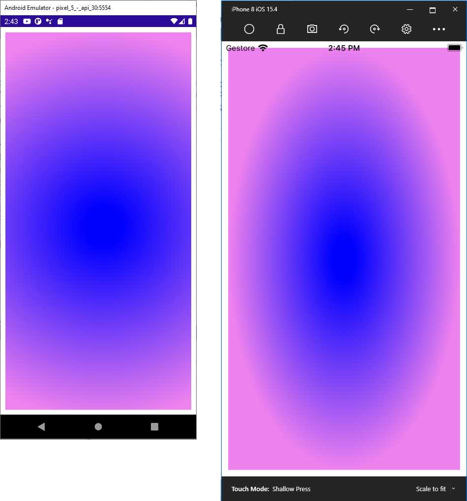
Figure 60: Drawing a circular gradient
You can move the center of the gradient with the Center property. The following value moves the center of the gradient to the top-left corner of the view:
<RadialGradientBrush Center="0.0,0.0">
The following assignment moves the center of the gradient to the bottom-right corner of the view:
<RadialGradientBrush Center="1.0,1.0">
In real-world development, you will probably use linear gradients more often, but radial gradients are certainly a very nice addition to the new drawing possibilities.
Drawing shapes
Shapes are views that derive from the Shape class, and .NET MAUI offers the following, each with a self-explanatory name: Ellipse, Rectangle, RoundRectangle, Line, and Polygon. In addition, a shape called Polyline allows for drawing custom polygons, and another shape called Path allows for drawing completely custom shapes.
All these shapes share some properties, and the most important are described in Table 8.
Table 8: Shape properties
Property | Type | Description |
|---|---|---|
Aspect | Stretch | Defines how the shape fills its allocated space. Supported values are None, Fill, Uniform, and UniformToFill. |
Fill | Brush | The brush used to fill the shape’s interior. |
Stroke | Brush | The brush used for the shape’s outline. |
StrokeThickness | double | The width of the shape’s outline (default is 0). |
StrokeDashArray | DoubleCollection | A collection of values that indicate the pattern of dashes and gaps used to outline a shape. |
StrokeDashOffset | double | The distance between dashes. |
Note: The examples provided shortly draw shapes’ outlines for a better understanding, but this is totally optional.
Once you learn the properties listed in Table 8, you will see how shapes are very easy to handle.
Drawing ellipses and circles
The first shape we’ll discuss is the Ellipse, which you use to draw ellipses and circles. The following code provides an example where the ellipse is filled with violet and the outline is green, with a thickness of 3:
<Ellipse Fill="Violet" Stroke="Green" StrokeThickness="3"
WidthRequest="250" HeightRequest="100" HorizontalOptions="Center"
Margin="0,50,0,0"/>
The resulting shape is the one at the top in Figure 61.
Drawing rectangles
The second shape we’ll discuss is the Rectangle. While keeping an eye on Table 8 for the properties used to draw dashes on the outline, review the following example that shows how you can use brushes to fill a shape:
<Rectangle Stroke="Green" StrokeThickness="4" StrokeDashArray="1,1"
StrokeDashOffset="6" WidthRequest="250" HeightRequest="100"
Margin="0,50,0,0" HorizontalOptions="Center">
<Rectangle.Fill>
<LinearGradientBrush>
<GradientStop Color="LightBlue" Offset="0"/>
<GradientStop Color="Blue" Offset="0.5"/>
<GradientStop Color="Violet" Offset="1"/>
</LinearGradientBrush>
</Rectangle.Fill>
</Rectangle>
The resulting shape is the middle one in Figure 61. .NET MAUI also offers the RoundRectangle shape, which draws a rectangle with rounded corners by assigning its CornerRadius property.
Drawing lines
The next shape we’ll discuss is the Line. Let’s start with some code:
<Line X1="0" Y1="30" X2="250" Y2="20" StrokeLineCap="Round" Stroke="Violet"
StrokeThickness="12" Margin="0,50,0,0" HorizontalOptions="Center"/>
X1 and X2 represent the starting and ending points of the line on the x-axis. Y1 and Y2 represent the lowest and the highest points on the y-axis, respectively. The StrokeLineCap property, of type PenCap, describes a shape at the end of a line, and can be assigned with Flat (default), Square, or Round. Flat basically draws no shape, Square draws a rectangle with the same height and thickness of the line, and Round draws a semicircle with the diameter equal to the line’s thickness.
Drawing polygons
Polygons are complex shapes, and MAUI provides the Polygon class to draw these. The following example draws a triangle filled with violet and outlined with green dashes:
<Polygon Points="50,20 80,60 20,60" Fill="Violet" Stroke="Green"
StrokeThickness="4" StrokeDashArray="1,1" StrokeDashOffset="6"
HorizontalOptions="Center"/>
The resulting shape is the bottom one in Figure 61.
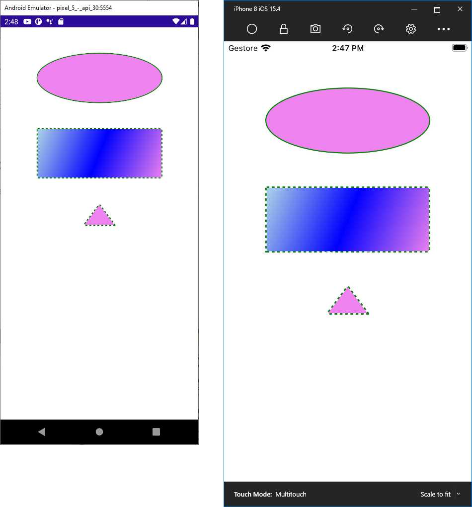
Figure 61: Drawing basic shapes
The key property in the Polygon shape is Points, which is a collection of Point objects, each representing the coordinates of a specific delimiter in the polygon. Because there’s basically no limit to the collection of points, you can create very complex polygons.
Drawing complex shapes with the Polyline
The Polyline is a particular shape that allows for drawing a series of straight lines connected to one another, but the last line does not connect with the first point of the shape. Consider the following example:
<Polyline Margin="0,50,0,0" HorizontalOptions="Center"
Points="0 48, 0 144, 96 150, 100 0, 192 0, 192 96, 50 96, 48 192, 150 200
144 48" Stroke="DarkGreen" StrokeThickness="3"/>
Like the Polygon, the Polyline exposes a property called Points, which is a collection of Point objects, each representing the coordinates of a point. The resulting shape is shown in Figure 62.
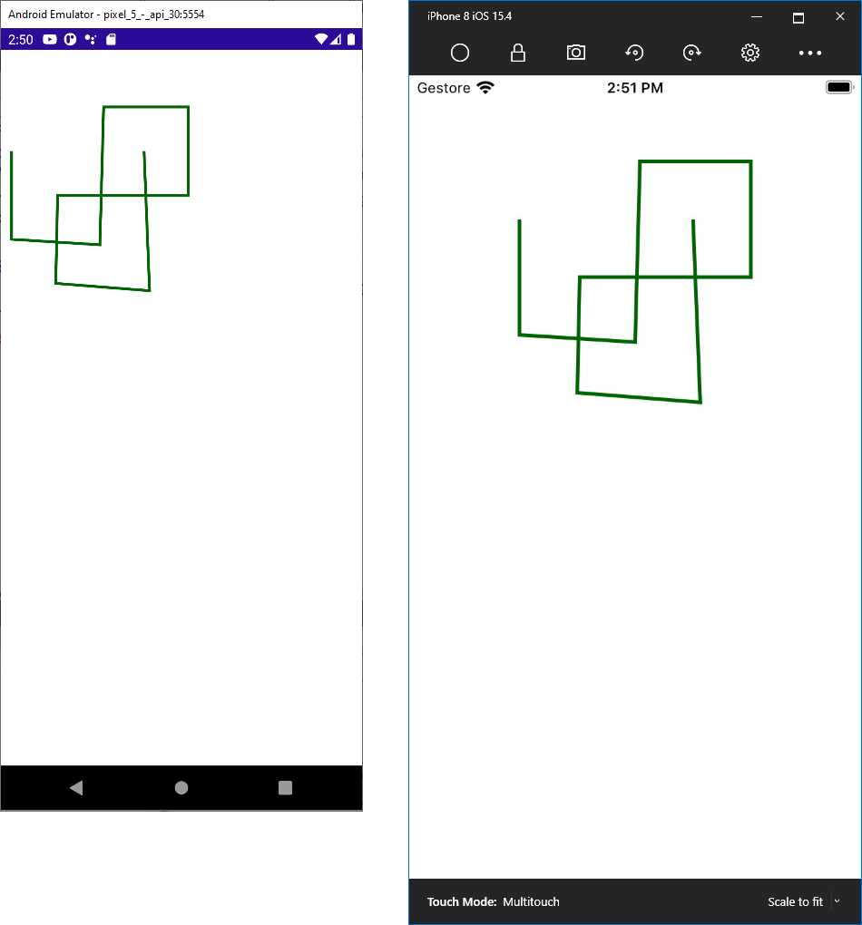
Figure 62: Drawing complex shapes
Note: Polyline exposes a property called FillRule, which determines how pieces of the shape should be filled based on the intersection of points. This is not a quick and easy topic, and it involves some math. For this reason, this property is not discussed in this ebook, but you can have a look at the documentation for further details.
Tips about geometries and paths
The new drawing possibilities are not limited to the basic shapes described in the previous sections. .NET MAUI also offers powerful 2D drawings with geometries, and it also provides the Path class that allows drawing curves and complex shapes using geometries. Both are very complex topics that cannot fit inside a book of the Succinctly series. For this reason, I recommend having a look at the official Geometries and Path documentation pages.
Chapter summary
This chapter introduced brushes and shapes. With brushes, you can assign solid colors (SolidColorBrush), linear gradients (LinearGradientBrush), and circular gradients (RadialGradientBrush) to properties of type Brush, like views’ Background property. You can then draw shapes with the Ellipse, Rectangle, Line, Polygon, and Polyline objects, to which you can assign a brush to the Fill property as the shape color and the Stroke property as the outline color.
So far, you have seen what .NET MAUI has to offer cross-platform, but there is more power that allows you to use platform-specific APIs. This is the topic of the next chapter.
- An ever-growing .NET MAUI control suite with rich feature sets.
- DataGrid, Charts, ListView, Scheduler, and more.
- Active community and dedicated support.
- Phone, tablet, and desktop support.