
.NET MAUI Community Toolkit Succinctly®

CHAPTER 2
Working with Views
The .NET MAUI Community Toolkit includes several views that are commonly used in cross-platform projects but are not available in the MAUI code base, filling the gap with native development. The views also include a new layout, which extends the possibilities of arranging the user interface. This chapter describes layouts and views offered by the library, using the official sample project as the starting point but with many considerations about practical use.
Arranging visual elements with the UniformItemsLayout
The UniformItemsLayout is a new layout in the MAUI Community Toolkit that allows creating simplified grids with columns and rows of the same size. The usage, demonstrated in the Pages\Layouts\UniformItemsLayoutPage.xaml file, is extremely simple. The default usage is the following.
<mct:UniformItemsLayout x:Name="UniformItemsLayout_Default">
<Button BackgroundColor="Red" />
<Button BackgroundColor="Green" />
<Button BackgroundColor="Blue" />
<Button BackgroundColor="Yellow" />
</mct:UniformItemsLayout>
Notice that, unlike the regular Grid, it is not possible to specify the RowDefinitions and ColumnDefinitions collections because the UniformItemsLayout automatically arranges its content wrapping and aligning as necessary. You can limit the number of rows and columns by assigning the MaxRows and MaxColumns properties of type int like the following declaration.
<mct:UniformItemsLayout x:Name="UniformItemsLayout_MaxRows2MaxColumns2"
MaxColumns="2" MaxRows="2"/>
Other common properties of the UniformItemsLayout are Padding and Margin, both of type Thickness. As you would expect, Padding represents the space between the content of the layout and the layout borders; Margin represents the space between the layout and its parent. Figure 5 shows how the UniformItemsLayout appears with different assignments of the MaxColumns, MaxRows, Margin, and Padding properties.

Figure 5: The UniformItemsLayout in Action
It’s not uncommon to work with grid layouts with rows and columns of the same size, so the UniformItemsLayout can save you a lot of time by avoiding the declaration of rows and columns and shortening your code at the same time.
New views
New design standards have debuted in recent years, and consequently new views have entered common mobile app designs. The .NET MAUI Community Toolkit bridges the gap between the MAUI code base and such new designs, introducing views that are now commonly used in mobile apps that will help you be more productive by avoiding time spent creating custom views.
Displaying profile pictures with the AvatarView
An avatar displays the profile picture of a person or contact and, when the image is not available, the avatar usually displays the initials of the person’s name. There are many programs that use avatars to identify people or contacts. Microsoft Outlook is an example. The .NET MAUI Community Toolkit makes it easy to use avatars in your apps by offering the AvatarView control.
The sample solution provides 11 different examples located in the Pages\Views\AvatarView subfolder, but for a first understanding of how it works, look at Figure 6. It shows how you can use the AvatarView to display images and text with different shapes and customizations. The code file is Pages\Views\AvatarViewBindablePropertiesPage.xaml.
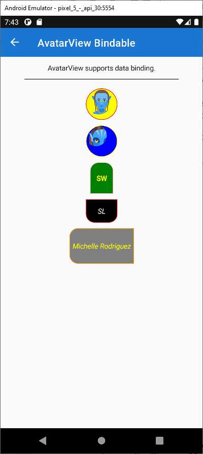
Figure 6: The AvatarView in Action
In its simplest form, an AvatarView is declared as follows.
<mct:AvatarView ImageSource="imagefile.png" Text="FL" />
In the previous line, Text represents the user initials and FL stands for FirstName LastName. Obviously, in a real application these will be replaced with relevant text. The ImageSource property is assigned with the image you want to display. When the ImageSource is not assigned, the value of the Text property is displayed.
Tip: The image can also be remote and represented via a Uri or in the local and embedded resources.
Table 1 describes the most relevant properties that you will use when working with the AvatarView.
Table 1: AvatarView Properties
Property | Type | Description |
|---|---|---|
BackgroundColor | Color | The background color of the control. If unset, the background will be the default color (White). |
BorderColor | Color | The border color of the control. If unset, the border will be the default color (Black). |
BorderWidth | double | The rendered width of the control border. The default is 1.0. |
CornerRadius | CornerRadius | The shape of the control. It can be set to a single double uniform corner radius value, or a CornerRadius structure defined by four double values (top left, top right, bottom left, and bottom right). The default is 24 for each corner. |
ImageSource | ImageSource | The image of the control. If unset, the control will render the Text property. |
Padding | Thickness | The distance between the control’s border and the Text or ImageSource. The default is 1. |
Text | string | The text for the control, typically the user initials. If unset, the default is ‘?’. |
TextColor | Color | The text color of the control. |
Once you have knowledge of the properties listed in Table 1, understanding how all the examples work will be very easy. They are bindable properties, so they support data binding. For the sake of consistency, a couple more relevant examples are described here. If you look at Figure 7, you can see another sample page that shows how to customize the shape of an AvatarView.
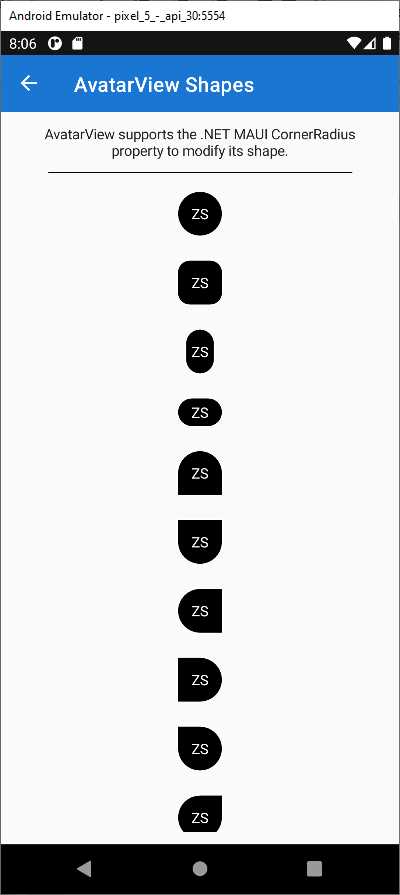
Figure 7: Custom AvatarView Shapes
Customizing the shape is possible by assigning the CornerRadius property with specific values for each corner. For example, considering Figure 7, the following assignment produces the sixth shape from the top.
<mct:AvatarView CornerRadius="0, 0, 24, 24" Text="ZS" />
Tip: In the sample project, the CornerRadius is assigned inside Style objects. Here the property is assigned to the AvatarView directly for clarity.
The following sample code, which is not in the sample solution, generates an AvatarView with a yellow background, orange border, dark green text color, some text, and a local image, with a reduced CornerRadius to make it appear closer to a square.
<mct:AvatarView BackgroundColor="Yellow" BorderColor="Orange"
BorderWidth="2" Text="AD"
CornerRadius="12" TextColor="DarkGreen"
ImageSource="an_image.png">
In general, you can control the size of an AvatarView via the WidthRequest and HeightRequest properties in combination with the CornerRadius property. Also, AvatarView supports gesture recognizers so that you can add user interaction. The following snippet demonstrates how to add a TapGestureRecognizer for click support (or tap support on mobile) to an AvatarView.
<mct:AvatarView.GestureRecognizers>
<TapGestureRecognizer Tapped="TapGestureRecognizer_Tapped" />
</mct:AvatarView.GestureRecognizers>
Then you will need to handle the Tapped event in C#. All the other gesture recognizers offered by .NET MAUI can be used. Now that you have knowledge of the way AvatarView works and its properties, it will be easier for you to navigate the long list of sample pages about this view.
Displaying certified profile pictures with GravatarImageSource
Gravatar is an online service for providing globally unique avatars and is widely used to create certified profile pictures. Gravatar is maintained by Automattic, the company that owns WordPress. By creating a profile picture on Gravatar, you can be sure that your identity is safe. The profile picture is strictly related to your email address, and this is an important point to highlight because you will see shortly in the code how it works. The .NET MAUI Community Toolkit allows for displaying certified profile pictures from Gravatar via the GravatarImageSource class, which is demonstrated in the Pages\ImageSources\GravatarImageSourcePage.xaml file of the sample project. This object retrieves an image from Gravatar and returns an ImageSource object that can be assigned to an Image or to all the other views that expose a property of type ImageSource, such as the native Button and the ImageButton, and even the AvatarView discussed in the previous section. A good idea is first having a look at the sample page in action on the device, as shown in Figure 8.
Figure 8: Displaying Profile Pictures from Gravatar
Note: The picture of a real person is used here because the code repository is public and globally available, and it has been intentionally provided by the authors of the .NET MAUI Community Toolkit sample code.
As you can see, an email address is specified, and it is how the GravatarImageSource can download the profile picture from Gravatar. In the example, you see the same picture several times because it is assigned to different views as specified in the page. You also see a default picture assigned to the Button, which you can use in different situations, such as download errors. If you now look at the XAML code of the page, you will see that the first image is displayed via the following markup.
<Image HeightRequest="128" WidthRequest="128">
<Image.Source>
<mct:GravatarImageSource
CacheValidity="{Binding CacheValidityTimespan}"
CachingEnabled="{Binding EnableCache}"
Email="{Binding Email}"
Image="{Binding DefaultGravatarSelected}"
SemanticProperties.Description="GravatarImageSource for an Image control, binding all properties." />
</Image.Source>
</Image>
As you can see, the GravatarImageSource object is populating the Source property, of type ImageSource, of the Image view and the source for the picture is specified via the Email property. In the sample project, the email is exposed by the Email property of the GravatarImageViewModel class and it is of type string. You can also specify a size for the picture with the Size property of type int whose value can be between 0 and 100. You can also cache the image via the CachingEnabled property to optimize performance. Both the Size and EnableCache binding properties are exposed by the viewmodel. It is also possible to provide a default picture in case the GravatarImageSource is not able to retrieve the proper one. This is possible by assigning the image source with an object of type DefaultImage, which is also what you see rendered inside the Button. The DefaultImage object is an enumeration defined as follows.
public enum DefaultImage
{
MysteryPerson = 0,
FileNotFound,
Identicon,
MonsterId,
Wavatar,
Retro,
Robohash,
Blank,
}
In the GravatarImageSourceViewModel class, the DefaultGravatarSelected property returns the default image, and it is initialized with the MysteryPerson value. However, the user interface of the sample app allows you to select a different one via the following Picker.
<Picker
AutomationProperties.LabeledBy="{x:Reference LabelDefaultImage}"
ItemsSource="{Binding DefaultGravatarItems}"
SelectedItem="{Binding DefaultGravatarSelected}"
SemanticProperties.Hint="A default image is displayed if there is no image associated with the requested email hash." />
The Picker.ItemsSource property is assigned with the following collection of default images.
public IReadOnlyList<DefaultImage> DefaultGravatarItems { get; } = new[]
{
DefaultImage.MysteryPerson,
DefaultImage.FileNotFound,
DefaultImage.Identicon,
DefaultImage.MonsterId,
DefaultImage.Retro,
DefaultImage.Robohash,
DefaultImage.Wavatar,
DefaultImage.Blank
};
Clearly this implementation is for demonstration purposes. In your real-world projects, you will normally use one default image. With the GravatarImageSource, you can quickly display a certified picture for a person, and if it’s not available, you can warn your users using a default image.
Freehand line drawing with the DrawingView
A very useful view introduced by the .NET MAUI Community Toolkit is the DrawingView, which provides a surface for drawing lines with the mouse or with touch interaction. There are plenty of scenarios where this view can be useful: certainly, imaging applications that allow for drawing, but also applications where you want to allow users to enter their signature without a mouse, and many others. In the sample solution, usage of the DrawingView is demonstrated in the Pages\Views\DrawingViewPage.xaml file. Figure 9 shows an example based on text and random lines.
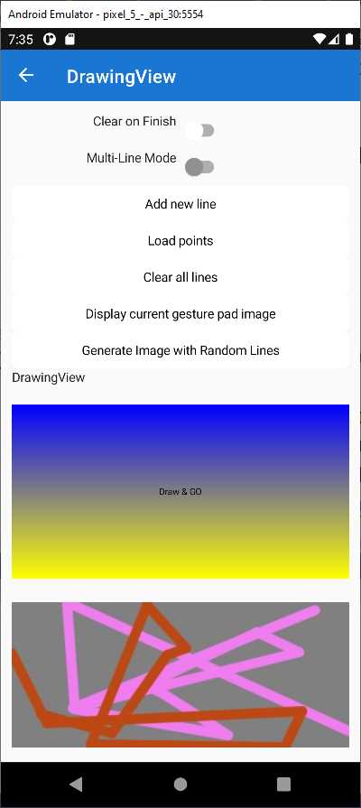
Figure 9: Drawing Lines with the DrawingView
In the sample page, there are two drawing surfaces. In the first surface, the app is rendering text. This text is actually drawn with lines, whereas the second surface shows randomly generated lines. In the sample page, the DrawingView is declared as follows.
<mct:DrawingView x:Name="DrawingViewControl" Margin="0,0,0,10"
Grid.Row="8" Grid.Column="0" Grid.ColumnSpan="2"
LineColor="Green" LineWidth="5"
Lines="{Binding Lines, Mode=TwoWay}"
DrawingLineCompleted="OnDrawingLineCompleted"
DrawingLineCompletedCommand="{Binding DrawingLineCompletedCommand}"
ShouldClearOnFinish="{Binding Source={x:Reference ClearOnFinish},
Path=IsToggled}"
IsMultiLineModeEnabled="{Binding Source={x:Reference MultiLineMode},
Path=IsToggled}">
Some of the properties are data-bound to values from the backing viewmodel, so I’ve summarized their type and description in Table 2.
Table 2: DrawingView Properties
Property | Type | Description |
|---|---|---|
Lines | ObservableCollection | The collection of drawn lines. |
IsMultiLineModeEnabled | bool | When true, multiple lines can be drawn on the DrawingView when the tap/click is released between drawing lines. If assigned, the DrawingLineCompletedCommand will be invoked after each line that is drawn. |
ShouldClearOnFinish | bool | Clear the canvas after releasing the tap/click and a line is drawn. |
DrawingLineCompleted | ICommand | Command that is invoked whenever the drawing of a line on the DrawingView has completed. With MultiLineMode enabled, this command is fired multiple times. |
DrawingLineCompleted | EventHandler<DrawingLine | An event fired when drawing a line is completed. |
LineColor | Color | The color of an individual line. |
LineWidth | float | The width of an individual line. |
Every line is represented by an object of type DrawingLine. If the IsMultiLineModeEnabled property is false, the Lines property contains only one DrawingLine, otherwise multiple objects. There are a few examples in the project about generating lines. One is represented by the GenerateLines method that generates random lines as follows.
IEnumerable<DrawingLine> GenerateLines(int count)
{
var width = GetSide(GestureImage.Width);
var height = GetSide(GestureImage.Height);
for (var i = 0; i < count; i++)
{
yield return new DrawingLine
{
Points = new(DrawingViewViewModel.
GeneratePoints(10, width, height))
LineColor = Color.FromRgb(Random.Shared.Next(255),
Random.Shared.Next(255), Random.Shared.Next(255)),
LineWidth = 10,
ShouldSmoothPathWhenDrawn = false,
Granularity = 5
};
}
}
This method generates a random number of lines that are then rendered on the DrawingView surface. The relevant part of this code is the DrawingLine object generation, which highlights the following properties:
· Points: a collection of PointF objects. The PointF class is defined in the Microsoft.Maui.Graphics namespace and represents x-, y-, and z-coordinates.
· LineColor: an object of type Color representing the color of the line.
· LineWidth: an object of type float representing the line width.
· ShouldSmoothPathWhenDrawn: when true, enables anti-aliasing when drawing the line.
· Granularity: an object of type int representing the granularity of the line. The higher the value, the smoother the line, the slower the rendering. The minimum value is 5.
When new lines are generated programmatically, like in the following code, they must be manually added to the Lines collection as follows (and as demonstrated in the sample project).
DrawingViewControl.Lines.Add(line);
When the user draws lines with touch interaction or with the mouse, a collection of DrawingLine objects is generated behind the scenes and added to the Lines property of the DrawingView for rendering. The power of the DrawingView is not limited to render lines generated by the user interaction or programmatically. The following sections describe additional useful features.
Retrieving the drawing as an image
The DrawingView control displays lines drawn by the user or added in code, but in a lot of situations you will want to create an image from the canvas so that it can be assigned to Image views or saved to disk. This is demonstrated in the following event handler of the sample page.
async void GetCurrentDrawingViewImageClicked(object sender, EventArgs e)
{
var stream = await DrawingViewControl.
GetImageStream(GestureImage.Width, GestureImage.Height);
GestureImage.Source = ImageSource.FromStream(() => stream);
}
The GetImageStream method returns a binary stream of type Stream that represents the image whose width and height are the same as the target Image view. The stream must be converted to an ImageSource before it can be assigned to the Source property of an Image and this is accomplished with the ImageSource.FromStream method. Once the image has been assigned, you can work with it as you would any other Image view. This includes saving the image to disk for later reuse.
Tip: There are different options to save an image to disk. I personally like the simple way described in this forum reply on Microsoft Learn.
Additional drawing possibilities
You are not limited to drawing lines on the surface of the DrawingView control. This exposes the DrawAction object, which represents an Action<ICanvas, RectF>. The ICanvas object is the actual drawing surface of the DrawingView. Look at the following code in the constructor of the DrawingViewPage.
DrawingViewControl.DrawAction = (canvas, rect) =>
{
canvas.DrawString("Draw & GO", 0, 0, (int)DrawingViewControl.Width,
(int)DrawingViewControl.Height, HorizontalAlignment.Center,
VerticalAlignment.Center);
};
Objects of type ICanvas expose several methods for adding different types of drawings. In the previous code, the DrawString method draws the specified string as lines on the drawing surface with specified dimensions. Table 3 summarizes the other methods you can use to draw on the DrawingView.
Table 3: ICanvas Methods
Method | Description |
DrawLine | Draw a line given its X1, Y1, X2, and Y2 coordinates. |
DrawEllipse | Draw an ellipse given its X1, Y1, X2, and Y2 coordinates. |
DrawRectangle | Draw a rectangle given its X1, Y1, X2, and Y2 coordinates. |
DrawRoundedRectangle | Draw a rectangle with rounded corners given its X1, Y1, X2, and Y2 coordinates. |
DrawArc | Draw an arc given its X, Y, width, height, startAngle, endAngle, clockwise, and closed parameters. |
DrawImage | Draw an object of type IImage given its X, Y, width, and height parameters. |
DrawString | Draw a string as lines given its X, Y, width, and height parameters, plus optional font type and colors. |
DrawText | Draw a string with attributes (italic, bold, underline). This requires the Microsoft.Maui.Graphics.Text.Markdig NuGet package, which also allows drawing text from Markdown content. |
As usual, IntelliSense will help you add the appropriate arguments to these methods. For further information, you can read the ICanvas documentation.
Displaying popups
The .NET MAUI Community Toolkit exposes the Popup view, which allows rendering native popups on each supported platform. Popups can also be customized in several ways. The sample project provides many examples under the Pages\Views\Popup folder.
Note: The sample project provides many examples on popups, but most of them are built by adding property assignments or views to the popup content. For this reason, I will start discussing popups from the simplest popup possible and then explain only the most relevant features.
The best way to start is with the simplest popup and then walk through customization possibilities. The Simple Popup example looks like Figure 10.

Figure 10: Displaying a Simple Popup
The content of a popup is generally a layout so that you can create a complex visual hierarchy, with a title, text, and other views. The Popup class is the starting point for creating and displaying popups. It exposes several public members that allow you to control and customize popups very easily, and these are summarized in Table 4.
Table 4: Most Relevant Popup Members
Member | Type | Description |
|---|---|---|
Content | Property of type View. | The visual hierarchy that represents the popup user interface. |
Color | Property of type Color. | The background color of a popup. |
HorizontalOptions | Property of type LayoutAlignment. | Determine the horizontal alignment for the popup (None, Start, Center, or End). |
VerticalOptions | Property of type LayoutAlignment. | Determine the vertical alignment for the popup (None, Start, Center, End). |
Size | Property of type Size. | The popup size expressed in width and height. |
CanBeDismissedByTappingOutsideOfPopup | Property of type bool. | Determine if the popup can be dismissed by tapping outside of it. |
Close | Method | Close the popup in C# code. |
Closed | Event | Fired when the popup is closed. |
Opened | Event | Fired when the popup is opened. |
In the sample solution, there is a class called PopupSizeConstants that defines named size constants assigned to the Popup.Size property in the various examples (see Code Listing 1).
Code Listing 1
namespace CommunityToolkit.Maui.Sample.Models; public class PopupSizeConstants { public PopupSizeConstants(IDeviceDisplay deviceDisplay) { Tiny = new(100, 100); Small = new(300, 300); Medium = new(0.7 * (deviceDisplay.MainDisplayInfo.Width / deviceDisplay.MainDisplayInfo.Density), 0.6 * (deviceDisplay.MainDisplayInfo.Height / deviceDisplay.MainDisplayInfo.Density)); Large = new(0.9 * (deviceDisplay.MainDisplayInfo.Width / deviceDisplay.MainDisplayInfo.Density), 0.8 * (deviceDisplay.MainDisplayInfo.Height / deviceDisplay.MainDisplayInfo.Density)); } // examples for fixed sizes. public Size Tiny { get; } public Size Small { get; } public Size Medium { get; } public Size Large { get; } } |
A popup is declared inside an individual XAML file and is exposed via the Popup class. Code Listing 2 shows the full code for the simplest popup.
Code Listing 2
<?xml version="1.0" encoding="utf-8" ?> <mct:Popup x:Class="CommunityToolkit.Maui.Sample.SimplePopup" xmlns="http://schemas.microsoft.com/dotnet/2021/maui" xmlns:x="http://schemas.microsoft.com/winfx/2009/xaml" xmlns:mct="http://schemas.microsoft.com/dotnet/2022/maui/toolkit"> <VerticalStackLayout Style="{StaticResource PopupLayout}"> <VerticalStackLayout.Resources> <ResourceDictionary> <Style x:Key="Title" TargetType="Label"> <Setter Property="FontSize" Value="26" /> <Setter Property="FontAttributes" Value="Bold" /> <Setter Property="TextColor" Value="#000" /> <Setter Property="VerticalTextAlignment" Value="Center" /> <Setter Property="HorizontalTextAlignment" Value="Center" /> </Style> <Style x:Key="Divider" TargetType="BoxView"> <Setter Property="HeightRequest" Value="1" /> <Setter Property="Margin" Value="50, 25" /> <Setter Property="Color" Value="#c3c3c3" /> </Style> <Style x:Key="Content" TargetType="Label"> <Setter Property="HorizontalTextAlignment" Value="Start" /> <Setter Property="VerticalTextAlignment" Value="Center" /> </Style> <Style x:Key="PopupLayout" TargetType="StackLayout"> <Setter Property="Padding" Value="{OnPlatform Android=20, UWP=20, iOS=5, MacCatalyst=5}" /> </Style> </ResourceDictionary> </VerticalStackLayout.Resources> <Label Style="{StaticResource Title}" Text="Simple Popup" /> <BoxView Style="{StaticResource Divider}" /> <Label Style="{StaticResource Content}" Text="This is a platform specific popup with a .NET MAUI View being rendered. The behaviors of the popup will confirm to 100% this platform look and feel, but still allows you to use your .NET MAUI controls." /> </VerticalStackLayout> </mct:Popup> |
The VerticalStackLayout represents the content of the popup, which means you can show whatever you need. The styles defined in the layout resources are applied to the child views and the result you get is shown in Figure 10. In order to display popups, you need to invoke a new extension method called ShowPopupAsync, which extends the Navigation class and takes the popup instance as an argument. The usage of this method is demonstrated in the MultiplePopupPage.xaml.cs file and works like this:
async void HandleSimplePopupButtonClicked(object sender, EventArgs e)
{
var simplePopup = new SimplePopup(popupSizeConstants);
await this.ShowPopupAsync(simplePopup);
}
The SimplePopup object is a reference that points to the popup defined in Code Listing 2.
Tip: All the other examples work similarly: a popup visual hierarchy is defined in XAML, an instance of the popup is declared in C#, and ShowPopupAsync is invoked.
Optionally, ShowPopupAsync can return a result in the form of an object if the popup is enabled to do so. By default, popups can be dismissed by tapping outside of them (a behavior known as light dismiss), but sometimes you want to avoid this to make sure users tap on a button and perform a mandatory action. In this case, you can set the CanBeDismissedByTappingOutsideOfPopup property in the XAML code as follows.
CanBeDismissedByTappingOutsideOfPopup="False"
You can implement actions inside popups. This can be quickly accomplished by adding Button views to the content of the popup. Two examples, called Button Popup and Multiple Button Popup respectively, demonstrate this. The following XAML from the second example (MultipleButtonPopup.xaml file) shows how to implement multiple buttons.
<HorizontalStackLayout Style="{StaticResource ButtonGroup}">
<Button
Clicked="Cancel_Clicked"
Style="{StaticResource CancelButton}"
Text="Cancel" />
<Button Clicked="Okay_Clicked" Text="OKAY" />
</HorizontalStackLayout>
You can simply handle the Clicked event or bind buttons to commands to execute actions. Figure 11 shows how the popup with buttons from the sample project appears.

Figure 11: Implementing Actions Inside Popups
Tip: Table 4 listed the Opened and Closed events. They can be subscribed like any other regular event in C# and handled consequently. The OpenedEventSimplePopup.xaml page provides an example.
Data binding and change notifications
The properties listed in Table 4 support data binding, so you can assign popup properties via viewmodels that are also populated at runtime. As a consequence, these properties also implement change notification. For example, if you reassign the Size property of the popup, this will be resized accordingly. The ToggleSizePopup.xaml.cs file demonstrates this. Finally, you can anchor a popup to another view by simply assigning the Popup.View property with the instance of the target view.
Chapter summary
Native popups can be displayed very quickly and without the need to build custom views. In addition, customization options are very easy to implement, since most of the customizations are applied via property assignments or by adding views to the popup content. This is all possible because of the Popup class exposed by the .NET MAUI Community Toolkit, which covers a very common requirement in most applications and is not part of the base MAUI codebase.
- An ever-growing .NET MAUI control suite with rich feature sets.
- DataGrid, Charts, ListView, Scheduler, and more.
- Active community and dedicated support.
- Phone, tablet, and desktop support.