
.NET MAUI Community Toolkit Succinctly®

CHAPTER 4
Saving Time with Reusable Converters
In .NET MAUI and, more generally, in platforms based on XAML, data binding happens between a source property and a target property. If both are of the same type, data binding is quick. If properties are of different types—for example, when you need to bind an Image.Source property to an image that is represented by a Base64 string—data binding requires an appropriate value converter that converts the Base64 string into an ImageSource type. This is accomplished via value converters, which are objects that implement the IValueConverter interface. As with the other chapters, the assumption here is that you already know how value converters work. If not, I recommend you read the official documentation before continuing. The .NET MAUI Community Toolkit provides a collection of reusable value converters that are extremely common in a lot of applications so that you do not need to reinvent the wheel every time, getting rid of many source code files. This chapter describes the available value converters in the library, and it will walk through the examples available with the official sample project. All the converters are located under the Pages\Converters folder of the CommunityToolkit.Maui.Sample project.
Note: To be consistent with the other ebooks in the Succinctly series, it is not possible to show and discuss the class definition of each converter. For this reason, you will learn how to use each converter and which parameters it needs without going into the details of the architecture. Also, converter classes are very easy to understand, so you can always look at their definition by analyzing the .shared.cs files located under the Converters folder of the CommunityToolkit.Maui project. In addition, note that the ItemTappedEventArgsConverter and SelectedItemEventArgsConverter will be discussed in Chapter 5 because they work in combination with the EventToCommandBehavior class, which is discussed with behaviors.
Converting from Boolean to object
Sometimes you might need to convert objects from type bool to a different type. An example is a user choice made through views like the Switch or the CheckBox, whose true or false value will change the value or status of a completely different view or class instance. For such situations, the .NET MAUI Community Toolkit exposes the BoolToObjectConverter class, which is demonstrated in the Pages\Converters\BoolToObjectConverter.xaml file of the sample project. For a better understanding, consider Figure 15, where you can see that the color of an ellipse changes via data binding depending on the true or false value set via the checkbox (the two buttons change the color by assigning properties directly, instead of using data binding).

Figure 15: Binding and Converting a Value of Type bool to Color
Tip: If you do not see the checkbox, in the source code assign the Color property of the CheckBox view with an explicit color, such as Blue.
In this example, the Ellipse color is a bound value coming from the CheckBox view and is converted into a Color. However, conversion is possible to any other type for maximum flexibility. Let’s see how this works in code. The Ellipse that displays the color is declared as follows.
<Ellipse x:Name="Ellipse"
Grid.Row="1"
Grid.ColumnSpan="3"
Margin="10"
HorizontalOptions="Center"
HeightRequest="100"
WidthRequest="100"
Fill="{Binding Source={x:Reference CheckBox},
Path=IsChecked, Mode=TwoWay,
Converter={StaticResource BoolToColorBrushConverter}}"/>
Notice how the Fill property is bound to the IsChecked property of the CheckBox and how the BoolToObject converter is referenced via a static resource called BoolToColorBrushConverter. The converter declaration in the page resources looks like the following.
<mct:BoolToObjectConverter x:Key="BoolToColorBrushConverter"
TrueObject="{StaticResource TrueColorBrush}"
FalseObject="{StaticResource FalseColorBrush}"/>
The FalseObject and TrueObject properties specify which values must be returned when the source property is false or true, respectively. Both properties are of type object, so you can return anything that derives from object itself (which means any .NET type).
Converting from byte arrays to images
In the real world, images are often stored inside databases or retrieved via API calls. The way they are stored in a data source is typically a Base64 string or a byte array if the image is retrieved by a Stream object. The Image view in .NET MAUI cannot display a byte array as an image directly, so a converter is required. This is something developers do in almost every project. The .NET MAUI Community Toolkit simplifies your code base by offering the ByteArrayToImageSourceConverter, which is demonstrated in Pages\Converters\ByteArrayToImageSourceConverterPage.xaml. In this page, you can see that the converter is declared in the simplest way possible.
<pages:BasePage.Resources>
<ResourceDictionary>
<mct:ByteArrayToImageSourceConverter
x:Key="ByteArrayToImageSourceConverter"/>
</ResourceDictionary>
</pages:BasePage.Resources>
It can be used when binding a property of type ImageSource, such as the Source property of the Image view or of the AvatarView. The current example is based on the Image as follows.
<Image HorizontalOptions="Center"
HeightRequest="75"
Source="{Binding DotNetBotImageByteArray, Mode=OneWay,
Converter={StaticResource ByteArrayToImageSourceConverter}}"/>
The purpose of the sample code is to display an image downloaded from the internet as a byte array, which is converted into an ImageSource object.
In the sample project, the ByteArrayToImageSourceConverterViewModel class (which is the data source of the page) exposes a property called DotNetBotImageByteArray of type byte?[]. This property will contain the downloaded image, which is retrieved from the GitHub page of .NET MAUI. The viewmodel contains all the code that downloads the image and assigns it to the property, but the relevant part is the following snippet from the DownloadDotNetBotImage method (see line 53 of the ByteArrayToImageSourceConverterViewModel.cs file).
DotNetBotImageByteArray =
await client.GetByteArrayAsync("https://user-images.githubusercontent.com/13558917/137551073-ac8958bf-83e3-4ae3-8623-4db6dce49d02.png",
cancellationTokenSource.Token).ConfigureAwait(false);
The DotNetBotImageByteArray property is therefore assigned with a byte array. At the XAML level, when the assignment happens, the data-binding engine will invoke the converter that will return an ImageSource object, which is accepted by the Source property of the Image. If you run the app, you will see how the image will appear after the few seconds required to download it from GitHub, as shown in Figure 16.
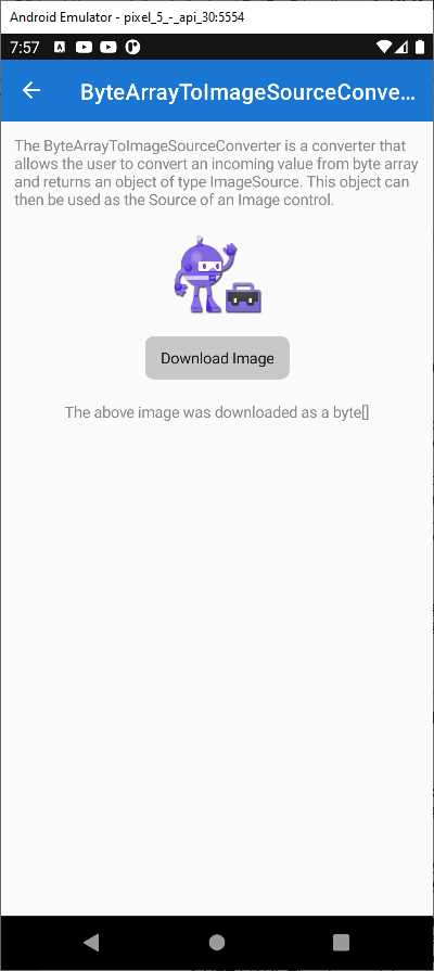
Figure 16: Converting a Byte Array into an Image
Converting dates to Coordinated Universal Time
When you have to work with different markets in different time zones, you likely need to represent dates in a way that is the same across countries. This is accomplished by converting dates to Coordinated Universal Time (UTC). In C# and .NET, this can be done using the DateTimeOffset structure. However, most of the views that allow working with dates (such as the DatePicker) natively support objects of type DateTime. For this reason, the .NET MAUI Community Toolkit provides the DateTimeOffsetConverter, which makes it easy to bind an object of type DateTimeOffset by converting an object of type DateTime into its DateTimeOffset counterpart (and vice versa). If you look into the XAML of the Pages\Converters\DateTimeOffsetConverterPage.xaml file, you will see that the converter is declared as follows.
<ResourceDictionary>
<mct:DateTimeOffsetConverter x:Key="DateTimeOffsetConverter" />
</ResourceDictionary>
The usage is then very simple because you can bind a property of type DateTimeOffset passing the converter, as demonstrated in the following declaration of the DatePicker view.
<DatePicker Date="{Binding TheDate,
Converter={StaticResource DateTimeOffsetConverter}}"
Margin="16" HorizontalOptions="Center" />
The TheDate property is declared in the DateTimeOffsetConverterViewModel class, whose simple definition is the following.
public partial class DateTimeOffsetConverterViewModel : BaseViewModel
{
[ObservableProperty]
DateTimeOffset theDate = DateTimeOffset.Now;
}
Tip: The ObservableProperty attribute is implemented in a library called .NET Community Toolkit, which includes objects that simplify model-view-viewmodel development. This library is also referenced by the sample project. The ObservableProperty attribute basically supplies change notification features to a plain CLR property in a very simple and clean way.
If you run the sample project, you will see the converter in action in the appropriate page, shown in Figure 17.
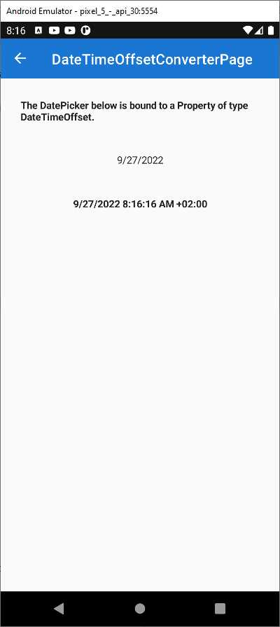
Figure 17: Converting a Date to UTC
This converter is very useful because it simplifies the way you address date problems with different time zones.
Converting decimal numbers to integers
In the case that you need to convert decimal numbers of type double into integers of type int, you can leverage the DoubleToIntConverter class without implementing conversion logic on your own. This is demonstrated in the Pages\Converters\DoubleToIntConverterPage.xaml file. For an understanding of the result, look at Figure 18, where you can see an input decimal number converted (and rounded when appropriate) into an integer.
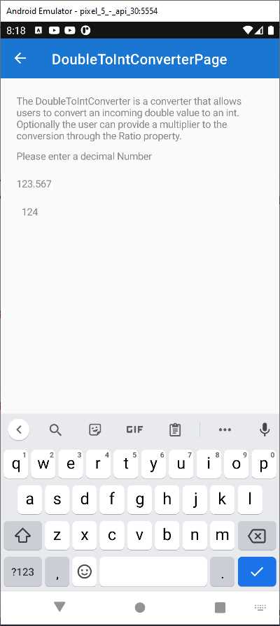
Figure 18: Converting Decimal Numbers into Integers
The declaration of the converter in XAML is simple, as usual.
<ResourceDictionary>
<mct:DoubleToIntConverter x:Key="DoubleToIntConverter" />
</ResourceDictionary>
The relevant part of the code is in the declaration of the Label, which is bound to a property called Input, of type double, and shows the result of the conversion to int:
<Label Padding="7,0,0,0"
Text="{Binding Path=Input,
Converter={StaticResource DoubleToIntConverter},
ConverterParameter=1}"
TextColor="{StaticResource NormalLabelTextColor}" />
Notice how a ConverterParameter is passed to the converter. This value is the ratio for the conversion, which represents the division of the multiplier by the denominator and equals 1 by default. This division is used to determine how many decimal numbers the input double should be rounded by. This can be better understood by looking at the ConvertFrom method of the converter.
public override int ConvertFrom(double value, object? parameter = null,
CultureInfo? culture = null) =>
(int)Math.Round(value * GetParameter(parameter));
The parameter argument matches the ConverterParameter passed in XAML. The GetParameter method returns the supplied ratio, if available and if a valid number; otherwise, it returns the value of a property called Ratio, declared in the converter and assigned with 1.
double GetParameter(object? parameter) => parameter switch
{
null => Ratio,
double d => d,
int i => i,
string s => double.TryParse(s, out var result) ? result :
throw new ArgumentException(
"Cannot parse number from the string.",
nameof(parameter)),
_ => throw new ArgumentException(
"Parameter must be a valid number.")
};
This ratio is then multiplied by the input double number. This allows you to control how the conversion is done.
Converting enumerations into Boolean values
If you need to convert values from an enum into a bool, you can leverage the EnumToBoolConverter class. This converter is demonstrated in the Pages\Converters\EnumToBoolConverterPage.xaml file. It allows you to specify which values from the enumeration must be treated as true, and then you can use the resulting bool as you like. The sample page lets you select an operating system to see if some text is visible for it, and it looks like Figure 19.

Figure 19: Converting Enumeration Values into Boolean Values
In the example, the Picker that you use to select a platform is bound to a collection of MyDevicePlatform enumerations, defined as follows.
public enum MyDevicePlatform
{
Android,
iOS,
MacCatalyst,
Tizen,
WinUI,
}
Label views that display the text depending on the selected platform are defined as follows.
<!-- Converter with TRUE list -->
<Label IsVisible="{Binding SelectedPlatform,
Converter={StaticResource MobileConverter}}"
Text="This text is visible when the Picker value is Android or iOS."/>
<Label IsVisible="{Binding SelectedPlatform,
Converter={StaticResource DesktopConverter}}"
Text="This text is visible when the Picker value is MacCatalyst or WinUI."/>
<!-- Converter, that uses parameter -->
<Label IsVisible="{Binding SelectedPlatform,
Converter={StaticResource PlatformConverter},
ConverterParameter={x:Static vm:MyDevicePlatform.Tizen}}"
Text="This text is visible when the Picker value is Platform is Tizen."/>
The IsVisible property of each Label is bound to an instance of the EnumToBoolConverter, as you can see in the page resources represented in Code Listing 3.
Code Listing 3
<pages:BasePage.Resources> <ResourceDictionary> <!-- Converter with TRUE list --> <mct:EnumToBoolConverter x:Key="MobileConverter"> <mct:EnumToBoolConverter.TrueValues> <vm:MyDevicePlatform>Android</vm:MyDevicePlatform> <vm:MyDevicePlatform>iOS</vm:MyDevicePlatform> </mct:EnumToBoolConverter.TrueValues> </mct:EnumToBoolConverter> <mct:EnumToBoolConverter x:Key="DesktopConverter"> <mct:EnumToBoolConverter.TrueValues> <vm:MyDevicePlatform>MacCatalyst</vm:MyDevicePlatform> <vm:MyDevicePlatform>WinUI</vm:MyDevicePlatform> </mct:EnumToBoolConverter.TrueValues> </mct:EnumToBoolConverter> <!-- Converter that uses parameter --> <mct:EnumToBoolConverter x:Key="PlatformConverter" /> </ResourceDictionary> </pages:BasePage.Resources> |
The MobileConverter and DesktopConverter definitions contain a list of values from the MyDevicePlatform enumeration that must be treated as true. The PlatformConverter definition does not contain any true values because one is provided as a converter parameter in the last Label (refer to the code shown previously).
With all this code, when the user selects a platform from the Picker, each Label becomes visible if the specified converter returns true for the selected value in the enumeration. And this is how the EnumToBoolConverter works: it returns true for the specified values inside an enumeration.
Converting enumerations into integer values
There is another, similar class called EnumToIntConverter that allows converting values inside an enumeration into their primitive, underlying value. This is demonstrated in the Pages\Converters\EnumToIntConverterPage.xaml file. The sample page allows you to select a state for a hypothetical issue on GitHub, and it looks like Figure 20.

Figure 20: Converting Enumerations into Integers
The Picker is bound to a collection called AllStates, of type IReadOnlyList<string>. This collection is populated with the string representation of the values of an enumeration called IssueState, defined as follows.
public enum IssueState
{
None = 0,
New = 1,
Open = 2,
Waiting = 3,
Developing = 4,
WantFix = 5,
Rejected = 6,
Resolved = 7
}
Tip: The AllStates collection receives the string representation of the enumeration values via the Enum.GetNames method. This is visible in the EnumToIntConverterViewModel.cs file.
The viewmodel also defines a property called SelectedState of type IssueState, used to bind the current state to the user interface. A converter instance is declared in the page as follows.
<ResourceDictionary>
<mct:EnumToIntConverter x:Key="EnumToIntConverter" />
</ResourceDictionary>
About data binding, the following Label displays the underlying integer value from the enumeration by invoking the EnumToIntConverter.
<Label Text="{Binding Path=SelectedState,
Converter={StaticResource EnumToIntConverter}}"
TextColor="{StaticResource NormalLabelTextColor}" />
Converting enumeration values into their underlying integers is another very common scenario, so this converter will be very helpful in many situations.
Displaying images from resources
As you might know, it is possible to store images locally in the app resources. To accomplish this, you add the desired image files to the shared project and then, for each image, in the Properties tool window, you set the Build Action property as EmbeddedResource and the Copy To Ouput Directory property as Do not copy. Retrieving and displaying an image from the app resources is very easy to do. If you had an Image view called Image1, you would write the following line of code.
Image1.Source = ImageSource.FromResource(imageId,
Application.Current.GetType().GetTypeInfo().Assembly);
The imageId object is the image identifier and has the following form: AssemblyName.Folder.FileName. If you had an image called myimage.jpg inside a folder called Resources in a project whose resulting assembly name is MyProject, the image ID would be MyProject.Resources.myimage.jpg.
Tip: The image ID is case-sensitive so it must exactly match the casing of the assembly name, folder name, and image file name.
This approach works if you can directly access your views in C# code, but it does not work if you have Image views that are data-bound to properties in a viewmodel, because data binding lives in XAML. For this reason, you need a converter, and the .NET MAUI Community Toolkit offers one ready to use, called ImageResourceConverter. What it does is basically implement code similar to the line you saw previously, but building the image ID is still your responsibility. In the sample project, it is demonstrated in the Pages\Converters\ImageResourceConverterPage.xaml file and, if you run the example in the app, you will see the result of the conversion as shown in Figure 21.

Figure 21: Displaying Images from App Resources
The sample project uses two local images under the Resources\Embedded subfolder, both called mct.png. These images simply represent the Xamarin and .NET MAUI logos. Code Listing 4 shows the code for the viewmodel, located at ViewModels\Converters\ImageResourceConverterViewModel.cs, where there is code that builds the image ID the proper way and the properties that expose the image to the UI.
Code Listing 4
public class ImageResourceConverterViewModel : BaseViewModel { public string XamarinImageResource { get; } = BuildImageResource("MCT.png"); public string MauiImageResource { get; } = BuildImageResource("MCT.png"); static string BuildImageResource(in string resourceName) => $"{System.Reflection.Assembly.GetExecutingAssembly(). GetName().Name}.Resources.Embedded.{resourceName}"; } |
As you can see, the BuildImageResource method retrieves the assembly name, then it concatenates the subfolder name and finally the image name. The resulting image ID is returned by the XamarinImageResource and MauiImageResource properties of type string. In the sample page, a reference to the ImageResourceConverter class is added as follows.
<ResourceDictionary>
<mct:ImageResourceConverter x:Key="ImageResourceConverter"/>
</ResourceDictionary>
The Image views are bound to the properties of the viewmodel and invoke the ImageResourceConverter as follows.
<Image Grid.Row="1" Grid.Column="0"
Source="{Binding XamarinImageResource,
Converter={StaticResource ImageResourceConverter}}"
WidthRequest="150" HeightRequest="150" HorizontalOptions="End"/>
<Image Grid.Row="1" Grid.Column="2"
Source="{Binding MauiImageResource,
Converter={StaticResource ImageResourceConverter}}"
WidthRequest="150" HeightRequest="150" HorizontalOptions="End"/>
In this way, you can quickly display an image from the app resources, taking advantage of the data-binding automation without the need to write C# code that handles the views’ properties manually.
Converting an index into an array item
Sometimes, you might need to bind an item inside an array to the user interface, but you only have the index of the item itself. Simplifying this process is possible with the IndexToArrayItemConverter class, which is demonstrated in the Pages\Converters\IndexToArrayItemConverter.xaml page. The way it works is quite simple. If you look at the sample code, you will see the following array definition along with the declaration of the converter.
<ContentPage.Resources>
<mct:IndexToArrayItemConverter x:Key="IndexToArrayItemConverter" />
<x:Array x:Key="StringArray" Type="{x:Type x:String}">
<x:String>Value0</x:String>
<x:String>Value1</x:String>
<x:String>Value2</x:String>
<x:String>Value3</x:String>
<x:String>Value4</x:String>
<x:String>Value5</x:String>
<x:String>Value6</x:String>
<x:String>Value7</x:String>
</x:Array>
</ContentPage.Resources>
The declared array contains a series of string values, and the converter is declared the usual way. The sample app displays the list of the array items inside a CollectionView, and then via a Stepper, it allows selecting an index of the array. The appearance of the current index will change. Figure 22 shows the result of this example.

Figure 22: Converting an Array Index to an Object Item
The code for the Stepper is the following.
<Stepper x:Name="Stepper" Minimum="0" Maximum="7"
Value="{Binding SelectedIndex}" Increment="1" Grid.Column="0"
Grid.Row="2"/>
The Stepper is bound to the SelectedIndex property of the viewmodel, which represents the index of the selected item from the array. When the value of the Stepper changes and the SelectedIndex property is updated accordingly, the following CollectionView changes the selected item to reflect the value in the Stepper, as demonstrated in its definition.
<CollectionView SelectionMode="Single"
SelectedItem="{Binding SelectedIndex,
Converter={StaticResource IndexToArrayItemConverter},
ConverterParameter={StaticResource StringArray}}"
ItemsSource="{StaticResource StringArray}"
Grid.Row="4" Grid.ColumnSpan="2">
<CollectionView.ItemTemplate>
<DataTemplate>
<ContentView>
<Label Padding="5" Text="{Binding}"/>
</ContentView>
</DataTemplate>
</CollectionView.ItemTemplate>
</CollectionView>
Tip: The color for the selected item in the CollectionView is the default one. This is why there is no code to handle the selection color.
The data source for the CollectionView is the array of strings defined previously, and the item selection is handled by binding the SelectedItem property, of type object, to the SelectedIndex property of the viewmodel. However, the latter is of type int, so the IndexToArrayItemConverter class converts the input integer to an object. Notice how you also need to supply the input array via the ConverterParameter property of the binding. The conversion is performed inside the ConvertFrom method of the IndexToArrayItemConverter class and looks like this:
public override object? ConvertFrom(int value, Array parameter,
CultureInfo? culture = null)
{
ArgumentNullException.ThrowIfNull(parameter);
if (value < 0 || value >= parameter.Length)
{
throw new ArgumentOutOfRangeException(nameof(value),
"Index was out of range.");
}
return parameter.GetValue(value);
}
Basically, the GetValue method from the Array class returns an object that can be bound to the caller view.
Converting from integer to Boolean
If you need to bind integer values to false and true Boolean values, the .NET MAUI Community Toolkit provides an easy solution: the IntToBoolConverter class, demonstrated in the Pages\Converters\IntToBoolConverter.xaml page. If the integer is 0, the converter returns false. Any other integer values will be converted to true. Declaring the converter is simple, as usual.
<ResourceDictionary>
<mct:IntToBoolConverter x:Key="IntToBoolConverter" />
</ResourceDictionary>
The sample code that demonstrates the conversion is the following, where Number is an integer property defined in the backing viewmodel and just stores the input value.
<Entry
x:Name="ExampleText"
Placeholder="0 for false other for true"
Text="{Binding Number}"
TextColor="{StaticResource NormalLabelTextColor}" />
<Label
Padding="7,0,0,0"
Text="{Binding Path=Number,
Converter={StaticResource IntToBoolConverter}}"
TextColor="{StaticResource NormalLabelTextColor}" />
The converter implementation is very easy, since it just returns the result of the != operator compared to 0, but it is still very useful and of quick reuse.
Inverting Boolean bindings
When you data bind properties of type bool, the binding happens when the source property is true. However, there are situations where you need to make the binding happen when the source property is false, such as displaying an error state view when the result of an API call is not successful. To accomplish this, the .NET MAUI Community Toolkit provides the InvertedBoolConverter class, demonstrated in the Pages\Converters\InvertedBoolConverter.xaml file. The converter is declared as follows.
<ResourceDictionary>
<mct:InvertedBoolConverter x:Key="InvertedBoolConverter" />
</ResourceDictionary>
In the sample code, the second Switch is assigned with the opposite state of the first Switch view, as follows.
<Switch IsToggled="{Binding IsToggled, Mode=OneWay,
Converter={StaticResource InvertedBoolConverter}}" IsEnabled="false"/>
The data binding is not direct between views. It happens via the IsToggled property, of type bool, defined in the backing viewmodel. The result of the code in the sample app is shown in Figure 23.
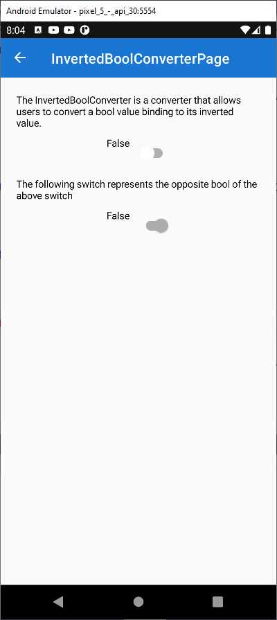
Figure 23: Inverting the Binding of a bool Value
Tip: In my real-world experience, I have implemented and used a similar converter to control the visibility of views based on the status of the data context.
Converting objects into Boolean values and comparing for equality
The .NET MAUI Community Toolkit exposes the IsEqualConverter class, which allows developers to convert any value binding to a bool, depending on whether or not it is equal to a specific value. The initial binding contains the object that will be compared, and the ConverterParameter contains the object to compare it to. In the sample project, this is demonstrated in Pages\Converters\IsEqualConverterPage.xaml. More specifically, it demonstrates how to return true or false if the input value equals the string MAUI, which is the value specified in the ConverterParameter. Figure 24 shows what the example looks like.

Figure 24: Converting Equality Comparisons to bool
You can type a string in the Entry and the app will check whether it equals the MAUI string declared in the page resources. If it does, a green confirmation message will appear. The last Label from the top shows how the converter is actually used.
<Label FontSize="Large" HorizontalOptions="FillAndExpand"
Text="Yes, it does!" TextColor="Green">
<Label.Triggers>
<DataTrigger TargetType="Label"
Binding="{Binding InputValue, Converter={StaticResource
IsEqualConverter},
ConverterParameter={StaticResource MAUI}}"
Value="False">
<Setter Property="Text" Value="No, it doesn't" />
<Setter Property="TextColor" Value="Red" />
</DataTrigger>
</Label.Triggers>
</Label>
The IsEqualConverter class checks if an object, the user input in this case, equals the value specified in the ConverterParameter and returns true or false, depending on the result of the comparison. Notice how, in this particular case, the converter is invoked in the Label’s data triggers, which means that it is invoked only when the bound value changes. As an opposite tool, the IsNotEqualConverter works exactly like IsEqualConverter, except that it returns true if two objects are not equal and false if they are equal.
Comparing objects that implement IComparable
The Community Toolkit provides another converter called CompareConverter, which allows for comparing two objects that implement the IComparable interface given a condition. Depending on the result of the comparison (true or false), you can decide if the converter should return true, false, or a specific object. This is demonstrated in the Pages\Converters\CompareConverterPage.xaml file. Before you run the example, in case you are running the Android emulator, a good idea is adding the following colors to the Slider.
ThumbColor="Black"
MinimumTrackColor="Black"
MaximumTrackColor="Black"
This will make the Slider more visible, otherwise its default color would be too light on screen. The following example shows how to compare the value of the Slider to a double of 0.5 declared in the page resources as ComparingValue, and the condition is GreaterOrEqual.
<Label
Text="{Binding SliderValue, Mode=OneWay,
Converter={mct:CompareConverter ComparingValue={StaticResource
ComparingValue}, ComparisonOperator=GreaterOrEqual}}" />
When the value of the Slider is greater than or equal to 0.5, the CompareConverter returns true, otherwise false, and the Boolean result is displayed as the text of the Label. Figure 25 shows an example.

Figure 25: Comparisons by IComparable
The condition for the comparison can be one of the self-explanatory values from the OperatorType enumeration, also defined in the Community Toolkit (see the CompareConverter.shared.cs file).
[Flags]
public enum OperatorType
{
NotEqual = 0,
Smaller = 1 << 0,
SmallerOrEqual = 1 << 1,
Equal = 1 << 2,
Greater = 1 << 3,
GreaterOrEqual = 1 << 4,
}
In the previous example, the converter returns a Boolean value. However, if you look at the following sample code in the same page, you can see how an object can be returned instead.
<Label Text="The background of this label will be green if the value of the
slider is greater than or equal to 50%, and red otherwise."
BackgroundColor="{Binding SliderValue, Mode=OneWay,
Converter={mct:CompareConverter ComparingValue={StaticResource
ComparingValue}, ComparisonOperator=GreaterOrEqual,
TrueObject=LightGreen, FalseObject=PaleVioletRed}}"
TextColor="Black" Padding="4, 0"/>
In this example, if the comparison is successful, the object assigned to the TrueObject property of the converter is returned, otherwise the object assigned to the FalseObject property is returned. Both objects are of type Color and affect the background of the Label. This is certainly a very useful converter, but it requires that both parts of the comparison implement the IComparable interface. In all the other cases, you can use the IsEqualConverter described at the beginning of this section.
Checking for string values
The .NET MAUI Community Toolkit provides two converters that detect whether a string is not null and return a bool value if this is the case: IsStringNotNullOrEmptyConverter returns false if a string is null or if it is of type string.Empty, and IsStringNotNullOrWhiteSpaceConverter returns false if a string is null or if it contains white spaces. They both return true if a string is null. In the sample project, they are demonstrated in the Pages\Converters\IsStringNotNullOrEmptyConverterPage.xaml and Pages\Converters\IsStringNotNullOrWhiteSpaceConverterPage.xaml files respectively. Both sample pages provide an Entry where you can enter a string. When the string is null or empty for the first converter, or null or white spaces for the second one, a bound Label displays False. When you enter some valid text, the Label displays True. Figure 26 shows how this appears.
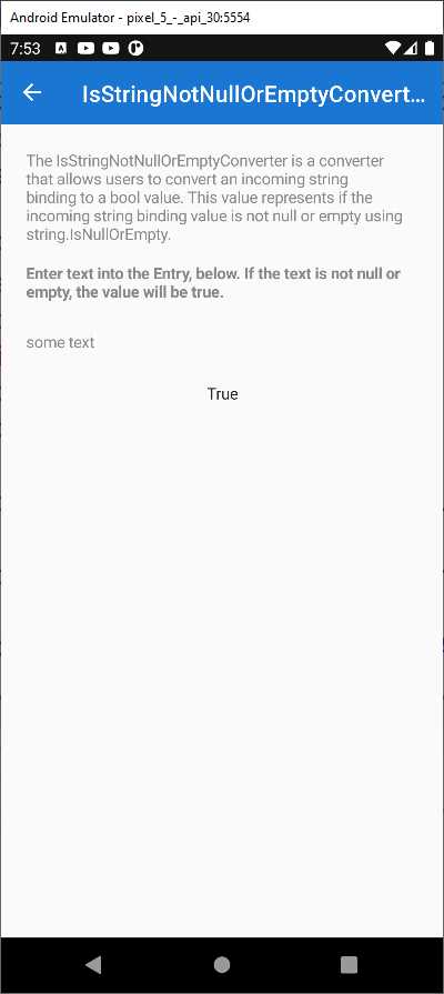
Figure 26: Checking for Null Values
The declaration of the converters is very simple, as usual.
<ResourceDictionary>
<mct:IsStringNotNullOrEmptyConverter
x:Key="IsStringNotNullOrEmptyConverter" />
</ResourceDictionary>
…
<ResourceDictionary>
<mct:IsStringNotNullOrWhiteSpaceConverter
x:Key="IsStringNotNullOrWhiteSpaceConverter" />
</ResourceDictionary>
The Label that displays the result is bound to the Entry as follows.
<Entry VerticalOptions="CenterAndExpand"
HorizontalOptions="Fill" Text="{Binding Path=LabelText,
Mode=OneWayToSource}"
TextColor="{StaticResource NormalLabelTextColor}" />
<Label VerticalOptions="CenterAndExpand" HorizontalOptions="CenterAndExpand"
Text="{Binding Path=LabelText, Mode=OneWay,
Converter={StaticResource IsStringNotNullOrEmptyConverter}}" />
Only the referenced converter changes between the two examples, otherwise the binding expression is exactly the same.
Checking for valid strings
The .NET MAUI Community Toolkit also provides two complementary converters: IsStringNullOrEmptyConverter and IsStringNullOrWhiteSpaceConverter. They return true when a string is null or empty for the first converter, and when a string is null or contains white spaces for the second converter. You use them like the converters described previously, but with the opposite bool result.
Checking data collections for null values
If your app displays data collections with a CollectionView control, you know that you can quickly implement empty states or error states via the EmptyView and EmptyViewTemplate properties, which allow for displaying a different view if the bound collection is null or empty. This is possible because the CollectionView checks the bound collection automatically. However, if your app has been around for years, it is very likely using ListView controls to display data collections, and implementing empty and error states is your own responsibility. In order to make this simple, the .NET MAUI Community Toolkit exposes the IsListNotNullOrEmptyConverter and IsListNullOrEmptyConverter classes, which respectively return true if a collection is not null or if it is null. They are demonstrated in the IsListNotNullOrEmptyConverterPage.xaml and IsListNullOrEmptyConverterPage.xaml files, both located under Page\Converters. Both sample pages work similarly, so I’m taking into consideration IsListNullOrEmptyConverterPage.xaml. If you run the sample app and open this sample page, you will see a list of items and a Label that displays False because the list is not empty. If you click the Clear List button, the data-bound collection will be cleared, and the Label will display True. Figure 27 demonstrates this.
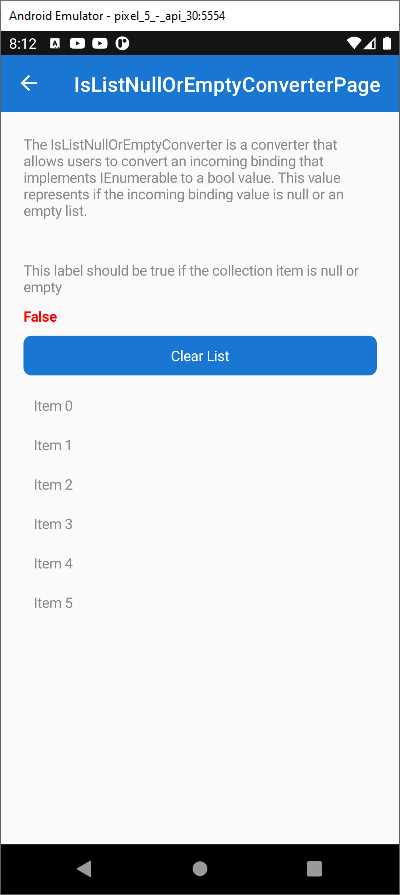
Figure 27: Checking Lists for Values
The bound data collection is called StringItemSource and is exposed from the IsListNullOrEmptyConverterViewModel class. The Text property of the Label that displays the status is assigned with the data collection, passing the converter in the binding expression. So, to retrieve the status of the data (empty or available), we do this:
<Label
Text="{Binding StringItemSource,
Converter={StaticResource IsListNullOrEmptyConverter}}"
FontAttributes="Bold" TextColor="Red" />
With these simple converters, you can quickly implement empty states and error states against any item controls, without the need to implement custom logic.
Converting a list of strings into one string
If you need to bind and convert an IEnumerable<string> object (and obviously derived collections such as ObservableCollection<string>) into one string, you can leverage the ListToStringConverter class, which is demonstrated in the Pages\Converters\ListToStringConverterPage.xaml file. The viewmodel defines the following collection of string objects.
public IReadOnlyList<string> ItemSource { get; } = new[]
{
"This",
"Is",
"The",
"ListToStringConverter"
};
The converter is declared as follows.
<ResourceDictionary>
<mct:ListToStringConverter x:Key="ListToStringConverter"
Separator=", " />
</ResourceDictionary>
Notice how you can specify a separator for each string. The sample code converts this collection into one string with the following XAML.
<Label Text="{Binding ItemSource,
Converter={StaticResource ListToStringConverter}}"
TextColor="{StaticResource NormalLabelTextColor}"/>
The resulting string will be the following.
This, Is, The, ListToStringConverter
Converting one string into a list
The MAUI Community Toolkit also provides an opposite converter, called StringToListConverter, which quickly creates a List<string> from words in a string, given a separator. This is demonstrated in the StringToListConverterPage.xaml file with the following relevant code.
<Entry
FontSize="Medium"
Placeholder="Enter some text separated by ',' or '.' or ';'"
Text="{Binding LabelText, Mode=OneWayToSource}" />
<CollectionView
ItemsSource="{Binding LabelText, Mode=OneWay,
Converter={StaticResource StringToListConverter}}">
<CollectionView.ItemTemplate>
<DataTemplate x:DataType="x:String">
<Label FontSize="Medium" Text="{Binding .}"
TextColor="{StaticResource NormalLabelTextColor}" />
</DataTemplate>
</CollectionView.ItemTemplate>
</CollectionView>
If you added the following string in the Entry:
This;is;a;string
The converter would return a new List<string> with four strings: This, is, a, and string.
Changing string casing
Changing the casing of an incoming string in a data binding is extremely common. For this reason, the .NET MAUI Community Toolkit provides the TextCaseConverter, which is demonstrated in the Pages\Converters\TextCaseConverterPage.xaml file. The converter is declared as follows.
<ResourceDictionary>
<mct:TextCaseConverter x:Key="TextCaseConverter" Type="Upper" />
</ResourceDictionary>
The Type property allows you to specify the target casing. Possible options are Upper, Lower, FirstUpperRestLower, and None. In the XAML file, a Label displays the result of the conversion of some input text provided via the Entry view.
<Entry
x:Name="ExampleText"
Placeholder="Enter text here"
Text="{Binding Input}"
TextColor="{StaticResource NormalLabelTextColor}" />
<Label
Padding="7,0,0,0"
BindingContext="{x:Reference Name=ExampleText}"
Text="{Binding Path=Text, Converter={StaticResource TextCaseConverter}}"
TextColor="{StaticResource NormalLabelTextColor}" />
If you run the sample code, you will see the string converted to uppercase.
Tip: Keep in mind that the FirstUpperRestLower option capitalizes only the first character of the string. If you want to capitalize the first letter of each word in a string, you need to implement your own converter that returns the result of the invocation to the System.Globalization.CultureInfo.CurrentCulture.TextInfo.ToTitleCase method.
Using multiple converters together
The .NET MAUI Community Toolkit provides an easy way to use multiple converters at the same time, which might be very useful if you consider the number of converters in the Toolkit, in the Xamarin.Forms code base, and possibly in your code base. To accomplish this, you can use the MultiConverter class, which is demonstrated in the Pages\Converters\MultiConverter.xaml page. For a better understanding of how it works and how powerful it is, let’s consider the code of the sample page. The purpose of the sample page is to convert an input string to uppercase and, by default, check whether it is different from the MAUI string. This is possible by combining the TextCaseConverter class with the IsNotEqualConverter class, both of which you saw previously. The MultiConverter class can contain multiple converters, as follows.
<mct:MultiConverter x:Key="MyMultiConverter">
<mct:TextCaseConverter />
<mct:IsNotEqualConverter />
</mct:MultiConverter>
Basically, you just need to declare the converter and assign a key as the identifier, and then you nest all the converters you want to be used simultaneously. However, this is not enough because converters might need parameters. These are supplied in the form of an Array of MultiConverterParameter objects, as follows.
<x:Array
x:Key="MultiParams"
Type="{x:Type mct:MultiConverterParameter}">
<mct:MultiConverterParameter
ConverterType="{x:Type mct:TextCaseConverter}"
Value="{x:Static mct:TextCaseType.Upper}" />
<mct:MultiConverterParameter
ConverterType="{x:Type mct:IsNotEqualConverter}"
Value="MAUI" />
</x:Array>
For each MultiConverterParameter, you need to assign the ConverterType property with the converter you want to use via the x:Type reference and the value. This must be of the type that is accepted by the converter as a parameter, otherwise an exception will be thrown. The last step is assigning the MultiConverter to the binding and this is done exactly as you would an individual converter. In the sample code, this can be seen in the last Label definition.
<Label Text="{Binding EnteredName, Converter={StaticResource
MyMultiConverter}, ConverterParameter={StaticResource MultiParams},
Mode=OneWay}" HorizontalOptions="CenterAndExpand"/>
As you can see, you pass the identifier of the MultiConverter to the Converter property of the binding and the identifier of the array of parameters to the ConverterParameter property of the binding. Running the sample app will demonstrate how it works in practice, but the biggest benefit to remember is that you can use multiple converters simultaneously, including converters defined outside of the .NET MAUI Community Toolkit.
Converting multiple Boolean values into one
The .NET MAUI Community Toolkit provides the VariableMultiValueConverter class, which allows for converting multiple bool values into one based on the specified conditions. This converter is demonstrated in the Pages\Converters\VariableMultiValueConverterPage.xaml file. For a better understanding, consider Figure 28, which shows the converter in action.

Figure 28: Converting Multiple Booleans into One
If you play with the various checkboxes, you will see the colored boxes change their color from red to green when the corresponding checkboxes are flagged and vice versa, depending on which conditions have been met. Conditions can be better understood with some code. First, you declare as many VariableMultiValueConverter instances for as many conditions you need, in this case three.
<pages:BasePage.Resources>
<mct:VariableMultiValueConverter x:Key="AllTrueConverter"
ConditionType="All" />
<mct:VariableMultiValueConverter x:Key="AnyTrueConverter"
ConditionType="Any" />
<mct:VariableMultiValueConverter x:Key="GreaterThanConverter"
ConditionType="GreaterThan"
Count="2" />
</pages:BasePage.Resources>
The ConditionType is an object of type MultiBindingCondition, an enumeration that exposes the following options: None, All, Any, Exact, GreaterThan, and LessThan. You will also need to supply a value for the Count property when you use the Exact, GreaterThan, and LessThan options. Each of the declared converters must be assigned to the DataTrigger of the view they are applied to, more specifically to the MultiBinding collection. The following code demonstrates this for the first BoxView, and the same thing is replicated on the other BoxView objects but changes the converter to which they refer.
<BoxView BackgroundColor="Red" HeightRequest="40" WidthRequest="40"
Grid.Row="3">
<BoxView.Triggers>
<DataTrigger TargetType="BoxView" Value="true">
<DataTrigger.Binding>
<MultiBinding
Converter="{StaticResource AllTrueConverter}">
<Binding Path="IsAllGroupSwitch1On" />
<Binding Path="IsAllGroupSwitch2On" />
</MultiBinding>
</DataTrigger.Binding>
<Setter Property="BackgroundColor" Value="Green" />
</DataTrigger>
</BoxView.Triggers>
</BoxView>
With this approach, multiple bool values can talk to each other, and their combination can be converted into a single bool.
Converting strings to mathematical expressions
The .NET MAUI Community Toolkit introduces the MathExpressionConverter class for simplifying the generation of mathematical expressions from user input. For a better understanding of it, consider Figure 29, where a Stepper allows for selecting a value and two mathematical operations are calculated and displayed below it, a division by 2 and a multiplication by 5.

Figure 29: Converting the User Input to Mathematical Expressions
The first expression, the division, is displayed via the following Label.
<Label HorizontalOptions="Center">
<Label.FormattedText>
<FormattedString>
<Span Text="Divided by 2 equals:"/>
<Span Text="{Binding SliderValue,
Converter={StaticResource MathExpressionConverter},
ConverterParameter='x/2'}"/>
</FormattedString>
</Label.FormattedText>
</Label>
The SliderValue-bound object is a property of type double defined in the viewmodel, and it stores the value selected in the Stepper. The division expression is calculated by invoking the MathExpressionConverter object, specifying the operation type through the ConverterParameter binding property. In this case, the parameter represents a division by 2 and x is the dividend. Similarly, the result of the multiplication is displayed via the following Label.
<Label HorizontalOptions="Center" >
<Label.FormattedText>
<FormattedString>
<Span Text="Multiplied by 5 equals:"/>
<Span Text="{Binding SliderValue,
Converter={StaticResource MathExpressionConverter},
ConverterParameter='x*5'}"/>
</FormattedString>
</Label.FormattedText>
</Label>
In this case, x represents the first operand. Behind the scenes, the converter creates an instance of the MathExpression class, which is new in the .NET MAUI Community Toolkit, passing the first value of the expression (SliderValue in the previous examples) and the value of the ConverterParameter. You can see this in the ConvertFrom method definition, located inside the MathExpressionConverter.shared.cs file.
public override double ConvertFrom(double value, string parameter,
CultureInfo? culture = null)
{
ArgumentNullException.ThrowIfNull(parameter);
var mathExpression = new MathExpression(parameter, new[] { value });
return mathExpression.Calculate();
}
Notice that the sample application is passing only one value along with the converter parameter, but as you can see from the code, it is possible to pass an array of double or an IEnumerable<double>. The Calculate method then returns the result of the mathematical expression.
Tip: The list of supported operations and expressions is visible inside the constructor of the MathExpression class, located in the MathExpression.Shared.cs file. You can right-click MathExpression in the ConvertFrom method and then select Go To Definition, so you can quickly go to the class’s constructor mentioned before.
Calculating complex expressions
When you need to generate complex expressions, you can use the MultiMathExpressionConverter class, which is declared the usual way, as follows.
<ResourceDictionary>
<mct:MultiMathExpressionConverter x:Key="MultiMathExpressionConverter"/>
</ResourceDictionary>
The sample code for this converter is available in the Pages\Converters\MultiMathExpressionConverterPage.xaml file. If you look at Figure 30, you can see how multiple values are entered as strings and how the result of the operation is displayed in one Label.

Figure 30: Converting the User Input to Complex Expressions
The code that displays the result is the following.
<Label Grid.Column="6"
Grid.Row="1"
VerticalTextAlignment="Center"
VerticalOptions="Center">
<Label.Text>
<MultiBinding Converter="{StaticResource MultiMathExpressionConverter}"
ConverterParameter="x0 + x1 + x2">
<Binding Path="X0" Mode="OneWay"/>
<Binding Path="X1" Mode="OneWay"/>
<Binding Path="X2" Mode="OneWay"/>
</MultiBinding>
</Label.Text>
</Label>
The MultiBinding expression attaches multiple bindings to one target. In this case, the three Binding expressions point to the values that represent the operands of the addition. The ConverterParameter of the MultiMathExpressionConverter, invoked in the MultiBinding expression, passes the values to the constructor of the MathExpression class, which has been discussed previously. Inside the ConverterParameter, values are referenced via the x literal plus the index (with zero base) of each Binding in the MultiBinding expression. So, x0 refers to the Binding Path="X0" expression (index zero), x1 refers to the Binding Path="X1" expression (index 1), and x2 refers to the Binding Path="X2" expression (index 2). Obviously, you are not limited to one operator. In fact, the power of the MultiMathExpressionConverter is that you can have different operators in one expression (for example, you might have both the addition and multiplication operators).
Converting colors
The .NET MAUI Community Toolkit exposes 21 classes for converting Color instances into different types. Table 5 summarizes these converters.
Note: In Table 5, you will find several acronyms related to colors. If you are not familiar with these, it is good to know that the K in CMYK stands for key, but it represents black. On the other hand, the A in RGBA and CMYKA stands for alpha and it represents alpha-blending, a value used to calculate the amount of transparency in a color.
Table 5: Color Converters
Color converter | Description |
|---|---|
ColorToRgbStringConverter | Returns a string that contains the RGB (red, green, blue) values of the specified color separated by commas. |
ColorToRgbaStringConverter | Returns a string that contains the RGBA (red, green, blue, alpha) values of the specified color separated by a comma. |
ColorToHexRgbStringConverter | Returns a string that contains the hexadecimal representation of the specified color generated from its RGB values. |
ColorToHexRgbaStringConverter | Returns a string that contains the hexadecimal representation of the specified color generated from its RGBA values. |
ColorToCmykStringConverter | Returns a string that contains the CMYK (cyan, magenta, yellow, key) values of the specified color separated by commas. |
ColorToCmykaStringConverter | Returns a string that contains the CMYKA (cyan, magenta, yellow, key, alpha) values of the specified color separated by commas. |
ColorToHslStringConverter | Returns a string that contains the HSL (hue, saturation, luminosity) values of the specified color separated by commas. |
ColorToHslaStringConverter | Returns a string that contains the HSLA (hue, saturation, luminosity, alpha) values of the specified color separated by commas. |
ColorToPercentBlackKeyConverter | Returns a string that contains the percentage of black key from the specified color. |
ColorToByteAlphaConverter | Returns the byte representation of the specified color’s alpha-blending. |
ColorToByteRedConverter | Returns the byte representation of the specified color’s red component. |
ColorToByteGreenConverter | Returns the byte representation of the specified color’s green component. |
ColorToByteBlueConverter | Returns the byte representation of the specified color’s blue component. |
ColorToPercentCyanConverter | Returns a float that represents the percentage of cyan in the specified color. |
ColorToPercentMagentaConverter | Returns a float that represents the percentage of magenta in the specified color. |
ColorToPercentYellowConverter | Returns a float that represents the percentage of yellow in the specified color. |
ColorToDegreeHueConverter | Returns a float representing the degree of hue in the specified color. |
ColorToBlackOrWhiteConverter | Returns the closest monochrome color (Color.Black or Color.White) for the specified color. If the supplied color is dark, the converter returns Black. If it is light, it returns White. |
ColorToColorForTextConverter | Returns Color.Black or Color.White if the supplied color is determined to be dark for the human eye or light. |
ColorToGrayScaleColorConverter | Converts the supplied color into grayscale and returns a new Color. |
ColorToInverseColorConverter | Returns the inverse of the supplied color. |
Figure 31 shows the sample page in action, where you can see the results of most converters.

Figure 31: Demonstration of Color Converters
Because of the large number of converters, and because the way you use such converters is always the same except for the return type and data, only two examples will be discussed here. You can refer to the official sample code and documentation for more information. In real-world development, it is common to retrieve the RGB and hexadecimal representations of a color. This is accomplished with the following converters.
<mct:ColorToRgbStringConverter x:Key="ColorToRgbStringConverter" />
…
<mct:ColorToHexRgbStringConverter x:Key="ColorToHexRgbStringConverter" />
In the sample page (Pages\Converters\ColorConverters.xaml), the two converters are used as follows.
<Label TextColor="{StaticResource NormalLabelTextColor}"
Text="{Binding Source={x:Reference BoxView}, Path=BackgroundColor,
Converter={StaticResource ColorToRgbStringConverter},
StringFormat='The RGB value of selected color is: {0}'}"/>
<Label TextColor="{StaticResource NormalLabelTextColor}"
Text="{Binding Source={x:Reference BoxView}, Path=BackgroundColor,
Converter={StaticResource ColorToHexRgbStringConverter},
StringFormat='The HEX value of selected color is: {0}'}"/>
The input color, defined by the NormaLabelTextColor resource, is a dark gray represented by the #888888 code. As you can see in Figure 31, the ColorToRgbStringConverter returns the following string.
RGB(224,255,255)
The ColorToHexRgbStringConverter returns the following string.
#E0FFFF
Behind the scenes, converters are defined in three different files of the .NET MAUI Community Toolkit solution: ColorToStringConverter.shared.cs, which contains converters that return string values; ColorToColor.shared.cs, which contains converters that return objects of type Color; and ColorToComponent.shared.cs, which contains converters that return objects of type byte and float. For each of the converters listed in Table 5, you will find a ConvertFrom method, which invokes other methods that perform the required conversion. These methods are defined in the ColorConversionExtensions class, which is analyzed in Chapter 6 Enhancing Object Power with Extensions, because they can also be used outside of value converters.
Chapter summary
Data binding is one of the most powerful features in development platforms based on XAML, and in many situations you will need to bind views that support specific data types to objects of different types—this is where value converters come in. The .NET MAUI Community Toolkit provides a lot of commonly used converters so that you do not need to reinvent the wheel every time, simplifying your code base. Value converters deal with data, and so do the validation behaviors described in the next chapters.
- An ever-growing .NET MAUI control suite with rich feature sets.
- DataGrid, Charts, ListView, Scheduler, and more.
- Active community and dedicated support.
- Phone, tablet, and desktop support.