
.NET MAUI Community Toolkit Succinctly®

CHAPTER 3
Improved Notifications with Alerts
The .NET MAUI Community Toolkit offers great shortcuts to quickly display toast notifications and snackbars. From a layout perspective, they are similar because they are both represented by a box with some information inside that typically auto dismisses after a certain amount of time. However, toast notifications are normally used to display system messages. Snackbars, instead, typically show a message related to the latest operation done in the app and they should contain a single-line message and no icon. This chapter describes both notification types, using the official sample project as the base. All the objects described in this chapter belong to the CommunityToolkit.Maui.Alerts namespace.
Displaying toast notifications
A toast notification is represented by the Toast class. It exposes a static method called Make, which returns an instance of the Toast class and displays the notification via the Show method. The sample project first demonstrates how to create a default notification as follows.
var toast = Toast.Make("This is a default Toast.");
await toast.Show();
In this case, you simply pass the text of the notification as an argument of the Make method. Then, the sample code provides an example of a custom notification as follows.
var toast = Toast.Make("This is a big Toast.", ToastDuration.Long, 30d);
await toast.Show();
The Make method takes a value of the ToastDuration enumeration as its second argument, between Short and Long. Short sets 2 seconds as the notification duration, whereas Long sets 3.5 seconds. The third argument of the Make method is a double, indicated by the d suffix, which represents the font size for the notification text. Figure 12 shows what the long toast notification looks like.
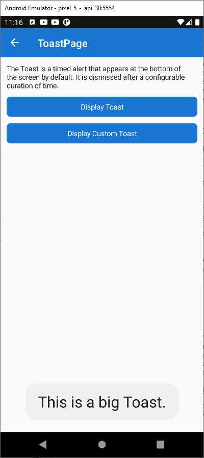
Figure 12: Displaying a Toast Notification
As you can see, the toast notification does not allow performing an additional action. That is a feature that belongs to the snackbar.
Displaying snackbars
Snackbars typically notify the user of an application event, and they also allow for user interaction. In the sample project, you can look at the Pages\Alerts\SnackbarPage.xaml file and its code-behind. There are two ways of displaying snackbars:
· Invoking a default snackbar via the DisplaySnackBar extension method that is added by the Toolkit to any object that implements the IView interface, such as pages.
· Getting an instance of the Snackbar class via its static Make method, customizing the notification appearance, and then invoking the Show instance method.
To display a default snackbar, you can use code like the following.
await this.DisplaySnackbar("This is a Snackbar.\nIt will disappear in 3 seconds.\nOr click OK to dismiss immediately.");
The this qualifier is referring to a page object in this case. You basically pass the text of the notification to the DisplaySnackbar method, and the notification will disappear after 3 seconds. Notice how you can use multiple lines by adding the \n escape sequence. Figure 13 shows how the default snackbar appears.
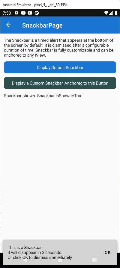
Figure 13: Displaying a Default Snackbar
You can further customize snackbars by adding a user action and by changing the appearance of the notification box. This can be accomplished by first creating an instance of the SnackbarOptions class. The sample project does this via the following code.
var options = new SnackbarOptions
{
BackgroundColor = Colors.Red,
TextColor = Colors.Green,
ActionButtonTextColor = Colors.Yellow,
CornerRadius = new CornerRadius(10),
Font = Font.SystemFontOfSize(14),
};
In summary, you can change the background and text colors in the snackbar, and you can also assign a different color to the text in the action button. Just so you know, another property called ActionButtonFont is available that allows for setting a different font to the action button, but it is not used in the example. Then, you can customize the corner radius of the snackbar via an object of type CornerRadius, which can take one double as a parameter to set a uniform radius for all the corners, or four double values to specify a different radius for each corner. Finally, you can assign a global font for the notification content. The next step is getting an instance of the Snackbar class. The sample project provides the following code.
customSnackbar = Snackbar.Make(
"This is a customized Snackbar",
async () =>
{
await DisplayCustomSnackbarButton.BackgroundColorTo(colors[Random.Shared.Next(colors.Count)], length: 500);
DisplayCustomSnackbarButton.Text = displayCustomSnackbarText;
},
"Change Button Color",
TimeSpan.FromSeconds(30),
options,
DisplayCustomSnackbarButton);
Note: customSnackbar is a variable of type ISnackbar and is declared at the beginning of the code file.
The Make method takes some arguments, though actually only the first one, representing the notification content that maps to the Text property, is mandatory. All the other arguments are optional. After the notification text, you specify the target action for the snackbar button. In this particular example, the action (of type Action) changes the background color of a button in the page. The third argument is a string that you can supply to customize the action button text and that maps to the ActionButtonText property; the default value is Ok. The fourth argument is the notification duration that maps to the Duration property and is an object of type TimeSpan. In this case, the TimeSpan.FromSeconds(30) invocation makes the snackbar visible for 30 seconds. The fifth argument is the instance of the SnackbarOptions class created previously. The sixth and last argument allows you to anchor the snackbar to the specified view and maps to the Anchor property, of type IView of the Snackbar class instance. Figure 14 shows how the current snackbar looks.

Figure 14: Displaying a Customized Snackbar
Snackbars are a very popular and convenient way to discretely notify the user of an application event, especially in mobile apps, so it is an extremely useful addition to the MAUI Community Toolkit.
Chapter summary
In-app notifications are important ways to inform the user about system and application events while maintaining the user experience. With the .NET MAUI Community Toolkit, you can leverage the most common and popular notification objects: toast notifications and snackbars. Toast notifications are represented by the Toast class and notify the user about an event, with no user interaction and limited customization options. Snackbars are represented by the Snackbar class and allow for notifying the user about an application event, providing user interaction opportunities, and giving developers more customization options. Alerts fit into the larger area of view enhancements, which also includes an extended collection of data converters, described in the next chapter.
- An ever-growing .NET MAUI control suite with rich feature sets.
- DataGrid, Charts, ListView, Scheduler, and more.
- Active community and dedicated support.
- Phone, tablet, and desktop support.