
.NET MAUI Community Toolkit Succinctly®

CHAPTER 5
Data Validation with Reusable Behaviors
In .NET MAUI (and, more generally, in XAML-based platforms) behaviors let you add functionality to user interface views without having to subclass them. The actual functionality is implemented in a behavior class, but it is simply attached to a control in XAML for easy usage. As you can imagine, this chapter assumes you already have knowledge of behaviors. If you are new to this feature, I strongly recommend you first get started with the official documentation. Here you will find guidance on the behaviors that are most relevant for data validation in the .NET MAUI Community Toolkit. Keep the official sample project open in Visual Studio, as this will serve as the reference for the discussion.
 Note: Among others, the .NET MAUI Community Toolkit also provides behaviors to animate visual elements. These are not covered in this chapter, whose goal is explaining how to perform data validation in an efficient way.
Common properties of behaviors
All the behaviors related to data validation exposed by the .NET MAUI Community Toolkit derive from the CommunityToolkit.Maui.Behaviors.ValidationBehavior class. This base class provides a number of properties that all derived behaviors expose. Table 6 summarizes the most relevant and used properties.
Table 6: Behaviors’ Common Properties
Property | Description |
|---|---|
IsValid | Returns true when the bound data is considered valid. |
IsNotValid | Returns true when the bound data is considered invalid. |
IsValidStyle | An object of type Style that is applied to the visual element when the bound data is considered valid. |
InvalidStyle | An object of type Style that is applied to the visual element when the bound data is considered invalid. |
Value | The data to be validated. |
IsRunning | Returns true when the validation process is running. |
Flags | Of type ValidationFlags, an enumeration that specifies how to handle validation. Supported values are None, ValidateOnAttaching, ValidateOnFocusing, ValidateOnValueChanging, and ForceMakeValidWhenFocused. |
Most of these properties will be recalled very often in the next sections, so it’s important for you to know what they are about.
Validating an email address
Validating an email address that the user enters via an Entry view is a very common task and the .NET MAUI Community Toolkit makes it simpler by exposing the EmailValidationBehavior class. In the sample project, this is demonstrated in the Behaviors\EmailValidationBehaviorPage.xaml file. For a better understanding, consider Figure 32, where an invalid email address has been entered.
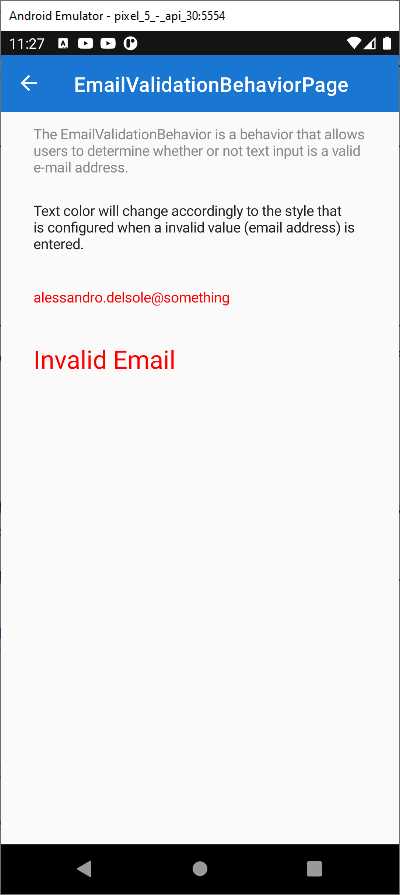
Figure 32: Email Address Validation
The provided string has been recognized as invalid by the EmailValidationBehavior object, which automatically performs formal validation. This behavior exposes two properties, IsValid and IsNotValid, that return true if the email address is valid or invalid, respectively. Based on these property values, you can style other UI elements. For example, with an invalid email address, the label you see in Figure 32 is set as visible and the color for the invalid text is red. When the behavior recognizes the supplied email address as valid, the views’ styles return to their original state. Code Listing 5 shows how this is implemented.
Code Listing 5
<?xml version="1.0" encoding="UTF-8"?> <pages:BasePage xmlns="http://schemas.microsoft.com/dotnet/2021/maui" xmlns:x="http://schemas.microsoft.com/winfx/2009/xaml" xmlns:mct="http://schemas.microsoft.com/dotnet/2022/maui/ toolkit" xmlns:pages="clr-namespace:CommunityToolkit.Maui. Sample.Pages" x:Class="CommunityToolkit.Maui.Sample.Pages.Behaviors. EmailValidationBehaviorPage" xmlns:vm="clr-namespace:CommunityToolkit.Maui.Sample. ViewModels.Behaviors" x:TypeArguments="vm:EmailValidationBehaviorViewModel" x:DataType="vm:EmailValidationBehaviorViewModel"> <pages:BasePage.Resources> <Style x:Key="InvalidEntryStyle" TargetType="Entry"> <Setter Property="TextColor" Value="Red" /> </Style> <Style x:Key="ValidEntryStyle" TargetType="Entry"> <Setter Property="TextColor" Value="Green"/> </Style> </pages:BasePage.Resources> <VerticalStackLayout Padding="{StaticResource ContentPadding}" Spacing="24" VerticalOptions="StartAndExpand"> <Label Text="The EmailValidationBehavior is a behavior that allows users to determine whether or not text input is a valid e-mail address. " TextColor="{StaticResource NormalLabelTextColor}" /> <Label Text="Text color will change accordingly to the style that is configured when a invalid value (email address) is entered." /> <Entry Placeholder="Email" HorizontalOptions="FillAndExpand" VerticalOptions="Center"> <Entry.Behaviors> <mct:EmailValidationBehavior x:Name="EmailValidator" Flags="ValidateOnValueChanged" DecorationFlags="Trim" ValidStyle="{StaticResource ValidEntryStyle}" InvalidStyle="{StaticResource InvalidEntryStyle}"/> </Entry.Behaviors> </Entry> <Label Text="Invalid Email" VerticalTextAlignment="Start" HorizontalTextAlignment="Start" HorizontalOptions="Start" VerticalOptions="Start" TextColor="Red" FontSize="25" IsVisible="{Binding IsNotValid, Source={x:Reference EmailValidator}}"/> </VerticalStackLayout> </pages:BasePage> |
Notice how the InvalidStyle property of the behavior is assigned with a style that is applied to the Entry only when the email address is recognized as invalid. The DecorationFlags property allows for managing white spaces in the string. Other supported values, all self-explanatory except for Trim, are None, NormalizeWhiteSpace, NullToEmpty, Trim, TrimEnd, and TrimStart. Finally, notice how the Label becomes visible only when the IsNotValid property of the behavior becomes true. This is a common approach to displaying an error message close to the input box.
Validating characters in a string
The .NET MAUI Community Toolkit makes it easy to validate characters in a string. This is possible via the CharactersValidationBehavior class that you can attach to Entry or Editor views. In the sample project, it is demonstrated in the Pages\Behaviors\CharactersValidationBehavior.xaml file and its code-behind. At the time of this writing, there is a bug in the source code for this example that must be fixed manually. First, at the page definition level, you need to add a page identifier as follows.
x:Name="CharValidationPage"
Obviously, the identifier is up to you, but you will then need to use it consistently across edits. The next fix is changing the source reference in the Picker declaration, as follows.
<Picker Grid.Column="1" Title="CharacterType"
ItemsSource="{Binding CharacterTypes,
Source={x:Reference CharValidationPage}, Mode=OneTime}"
SelectedIndex="1"/>
Now that the Picker is pointing to the correct source, it is possible to do the following validations. The CharactersValidationBehavior requires you to specify values for the following properties:
· CharacterType: This is of type CharacterType and establishes the validation criterion. It is an enumeration, so multiple values can be combined together. More details are coming shortly.
· MaximumCharacterCount: The maximum allowed length for the input string.
· MinimumCharacterCount: The minimum number of characters for the input string.
Now consider Figure 33. Notice that the sample code offers two examples and the second one is based on visual states, but I will use the first one.
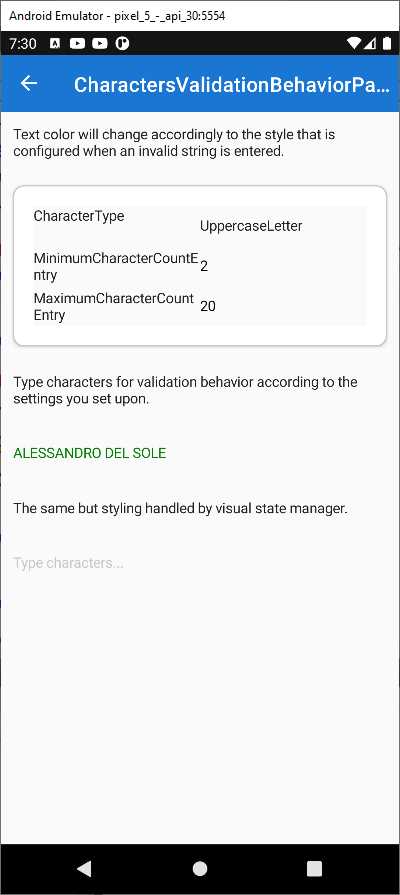
Figure 33: Validating Characters in a String
In the example, the UppercaseLetter criterion requires the input string to be all uppercase, otherwise it will be considered invalid. In addition, minimum and maximum lengths are also specified. Because the string in the figure is all uppercase and within the length limits, it is considered valid, and it is displayed in green. The XAML code for this example looks like the following.
<Entry Placeholder="Type characters...">
<Entry.Behaviors>
<mct:CharactersValidationBehavior CharacterType="{Binding SelectedItem,
Source={x:Reference CharacterTypePicker}}"
InvalidStyle="{StaticResource InvalidEntryStyle}"
ValidStyle="{StaticResource ValidEntryStyle}"
MaximumCharacterCount="{Binding Text,
Source={x:Reference MaximumCharacterCountEntry}}"
MinimumCharacterCount="{Binding Text,
Source={x:Reference MinimumCharacterCountEntry}}"/>
</Entry.Behaviors>
</Entry>
MinimumCharacterCount and MaximumCharacterCount are data-bound to the Text property of other entries in the user interface. CharacterType is data-bound to the SelectedItem property of a Picker view, whose ItemsSource is assigned in the code-behind with the following code.
public IReadOnlyList<CharacterType> CharacterTypes { get; } =
Enum.GetValues(typeof(CharacterType)).Cast<CharacterType>().ToList();
The values of the CharacterType enumeration are self-explanatory. Just to give you some examples, if you select Alphanumeric, the input string is considered valid if it contains both letters and numbers; if you select Digit, the input string is considered valid if it only contains numbers. The way the Entry displays the input string (in the example, green when valid and red when invalid) is determined by the ValidStyle and InvalidStyle properties, respectively, bound to the following styles.
<pages:BasePage.Resources>
<Style x:Key="InvalidEntryStyle"
TargetType="Entry">
<Setter Property="TextColor" Value="IndianRed"/>
</Style>
<Style x:Key="ValidEntryStyle"
TargetType="Entry">
<Setter Property="TextColor" Value="Green"/>
</Style>
</pages:BasePage.Resources>
In summary, the CharactersValidationBehavior is very useful to validate characters in a string or a string as a whole, but it is not the only behavior available for string validation. In the next section, you will learn about the MaxLengthReachedBehavior.
Detecting when the maximum length of a string is reached
The CharactersValidationBehavior provides several criteria for character validation, but sometimes you only need to set up the maximum length for a string and make sure the user does not enter a longer one. For this simpler scenario, you can use the MaxLengthReachedBehavior class. In the sample project, this is demonstrated in the Pages\Behaviors\MaxLengthReachedBehaviorPage.xaml file. The XAML code for the example is the following.
<Entry Placeholder="Start typing until MaxLength is reached..."
MaxLength="{Binding Path=Text, Source={x:Reference MaxLengthSetting}}"
Margin="{StaticResource ContentPadding}">
<Entry.Behaviors>
<mct:MaxLengthReachedBehavior MaxLengthReached=
"MaxLengthReachedBehavior_MaxLengthReached"
ShouldDismissKeyboardAutomatically="{Binding Path=IsToggled,
Source={x:Reference AutoDismissKeyboardSetting}}" />
</Entry.Behaviors>
</Entry>
In the example, when the maximum length has been reached, the focus is moved to another Entry. All the relevant properties are data-bound to other visual elements, but the following is what you need to know:
· The MaxLength property must be set on the Entry that needs validation with the maximum number of allowed characters.
· The ShouldDismissKeyboardAutomatically property of the behavior, of type bool, allows you to decide whether the keyboard input should be ignored once the maximum length has been reached.
· The MaxLengthReached event of the behavior is raised when the maximum length has been reached. With the related event handler, you can decide what action to take when this happens. In the sample project, the code moves the focus to the next entry.
You can quickly try yourself using the sample code. This behavior is very useful when the validation requirement is only checking for the maximum number of characters in a string.
Validating numbers
The .NET MAUI Community Toolkit offers the NumericValidationBehavior class, which makes it possible to validate a number against its length and decimal places. In the sample project, it is demonstrated in the Pages\Behaviors\NumericValidationBehaviorPage.xaml file. Consider Figure 34, where a number is highlighted in red and considered invalid.

Figure 34: Validating Numbers
The following XAML puts the number validation in place.
<Entry Placeholder="Number">
<Entry.Behaviors>
<mct:NumericValidationBehavior
InvalidStyle="{StaticResource InvalidEntryStyle}"
MinimumValue="1.0"
MaximumValue="100.0"
MaximumDecimalPlaces="2"/>
</Entry.Behaviors>
</Entry>
The MinimumValue and MaximumValue properties allow you to set the boundaries of the number. Outside these boundaries, the number is considered invalid. The MaximumDecimalPlaces property allows you to specify how many decimal numbers can be accepted after the separator.
Validating Uniform Resource Identifiers (URIs)
Uniform resource identifiers (also referred to as URIs) are typically used to represent web addresses. A URI is made of the protocol (e.g., https://) and the address (e.g., www.microsoft.com). Validating URIs is another extremely common requirement in many apps, and the .NET MAUI Community Toolkit makes this easy via the UriValidationBehavior class. All you have to pass to the behavior is the type of URI, which can be Absolute, Relative, or RelativeOrAbsolute (which are the ways the System.Uri class represents URIs). In the sample project, this is demonstrated in the Pages\Behaviors\UriValidationBehaviorPage.xaml file. The following is the XAML sample code.
<Entry Placeholder="UriKind: Absolute">
<Entry.Behaviors>
<mct:UriValidationBehavior UriKind="Absolute"
Flags="ValidateOnValueChanged"
ValidStyle="{StaticResource ValidEntryStyle}"
InvalidStyle="{StaticResource InvalidEntryStyle}"/>
</Entry.Behaviors>
</Entry>
<Entry Placeholder="UriKind: Relative">
<Entry.Behaviors>
<mct:UriValidationBehavior UriKind="Relative"
Flags="ValidateOnValueChanged"
ValidStyle="{StaticResource ValidEntryStyle}"
InvalidStyle="{StaticResource InvalidEntryStyle}"/>
</Entry.Behaviors>
</Entry>
<Entry Placeholder="UriKind: RelativeOrAbsolute">
<Entry.Behaviors>
<mct:UriValidationBehavior UriKind="RelativeOrAbsolute"
Flags="ValidateOnValueChanged"
ValidStyle="{StaticResource ValidEntryStyle}"
InvalidStyle="{StaticResource InvalidEntryStyle}"/>
</Entry.Behaviors>
</Entry>
As for the other behaviors, you can specify a style for the invalid state via the InvalidStyle property, and one for the valid state via the ValidStyle property. If you run the sample project and check this behavior, you will see how an invalid URI will be highlighted in red.
Validating strings for equality
Sometimes you might need to validate a string and consider it valid only if it equals another string. This is the case when the user specifies a new password and then needs to confirm the password inside another input box, so the validation passes only if the second string matches the first one. For this particular scenario, you can use the RequiredStringValidationBehavior class, demonstrated in the Pages\Behaviors\RequiredStringValidationBehavior.xaml file. The following XAML code demonstrates how easy it is to use.
<Entry Placeholder="Confirm Password">
<Entry.Behaviors>
<mct:RequiredStringValidationBehavior
InvalidStyle="{StaticResource InvalidEntryStyle}"
Flags="ValidateOnValueChanged"
ValidStyle="{StaticResource ValidEntryStyle}"
RequiredString="123" />
</Entry.Behaviors>
</Entry>
Tip: If you want to use this behavior for password validation, it is good practice to assign the IsPassword property of the Entry with true.
You simply need to assign the RequiredString property with the string you want to match and set the InvalidStyle with the style you want to use for invalid strings. If you run the code, you will see the text highlighted in red if it does not match the text in the first Entry and in green if it does.
Hints about multiple validation behaviors
It is possible to combine multiple validation behaviors and have them attached to the same view by using the MultiValidationBehavior class. The following XAML code demonstrates how to implement more complex password validation.
<Entry IsPassword="True" Placeholder="Password">
<Entry.Behaviors>
<mct:MultiValidationBehavior
InvalidStyle="{StaticResource InvalidEntryStyle}" >
<mct:CharactersValidationBehavior x:Name="digit" CharacterType="Digit" MinimumCharacterCount="1" mct:MultiValidationBehavior.Error="1 number" RegexPattern="" />
<mct:CharactersValidationBehavior x:Name="upper" CharacterType="UppercaseLetter" MinimumCharacterCount="1" mct:MultiValidationBehavior.Error="1 upper case" RegexPattern="" />
<mct:CharactersValidationBehavior x:Name="symbol" CharacterType="NonAlphanumericSymbol" MinimumCharacterCount="1" mct:MultiValidationBehavior.Error="1 symbol" RegexPattern="" />
<mct:CharactersValidationBehavior x:Name="any" CharacterType="Any" MinimumCharacterCount="8" mct:MultiValidationBehavior.Error="8 characters" RegexPattern="" />
</mct:MultiValidationBehavior>
</Entry.Behaviors>
</Entry>
Note: The original XAML sample code displays validation messages in French, so here you see the English counterparts.
The Pages\Behaviors\MultiValidationBehaviorPage.xaml file includes several code snippets that target different validation behaviors concurrently.
Handling focus changes
It is not uncommon to perform actions when a view’s focus changes. For example, suppose you have a form with multiple input boxes and you want to automatically move the focus to the next Entry once the user stops typing. Because the Entry and Editor expose a Completed event that is raised when the user stops typing and presses Enter, you can attach the SetFocusOnEntryCompletedBehavior, which is capable of intercepting such an event, and automatically set the focus on the specified Entry. In the sample project, this is demonstrated in the Pages\Behaviors\SetFocusOnEntryCompleteBehaviorPage.xaml file. The following code snippet demonstrates how to move to the next Entry when the user finishes typing in the first one.
<Entry
x:Name="Entry1"
mct:SetFocusOnEntryCompletedBehavior.NextElement="{x:Reference Entry2}"
Placeholder="Entry 1 (Tap `Next` or `Enter` or `Return` when finished)"
ReturnType="Next" />
It is very simple to use: you just need to assign the NextElement property of the behavior using the x:Reference syntax, passing the name of the Entry that will receive the focus. Another interesting behavior is called UserStoppedTypingBehavior, which is demonstrated in the Behaviors\UserStoppedTypingBehaviorPage.xaml file of the sample project. This behavior is useful to assume that the user stopped typing inside an input box, without handling events or implementing custom logic. Different from other examples, this behavior in the sample project works with a SearchBar and its XAML code is as follows.
<SearchBar Placeholder="Start searching..."
Margin="{StaticResource ContentPadding}">
<SearchBar.Behaviors>
<mct:UserStoppedTypingBehavior Command="{Binding SearchCommand}"
StoppedTypingTimeThreshold="{Binding Path=Text,
Source={x:Reference TimeThresholdSetting}}"
MinimumLengthThreshold="{Binding Path=Text,
Source={x:Reference MinimumLengthThresholdSetting}}"
ShouldDismissKeyboardAutomatically="{Binding Path=IsToggled,
Source={x:Reference AutoDismissKeyboardSetting}}" />
</SearchBar.Behaviors>
</SearchBar>
StoppedTypingTimeThreshold represents how many milliseconds must pass before the behavior decides that the user has really stopped typing, combined with a minimum number of characters the user must type (MinimumLengthThreshold). When the combination of these properties is a true condition, the Command property invokes the data-bound command to perform an action automatically. If you run the sample project, the bound command displays the text you typed in the search bar after you stop typing and after the specified number of milliseconds.
Mapping events to commands
With programming patterns like model-view-viewmodel (MVVM), views do not handle events for the user interaction directly (e.g., button clicks). Rather, they are data-bound to objects of type Command, defined inside a backing viewmodel. However, there are views that do not expose properties of type Command that can be bound to a viewmodel, so you need an alternative to map the view’s event to a command defined inside a viewmodel. This is accomplished via the EventToCommandBehavior, demonstrated in the Pages\Behaviors\EventToCommandBehaviorPage.xaml file of the sample project. Code Listing 6 shows the full XAML code for the page.
Code Listing 6
<?xml version="1.0" encoding="utf-8" ?> <pages:BasePage xmlns="http://schemas.microsoft.com/dotnet/2021/maui" xmlns:x="http://schemas.microsoft.com/winfx/2009/xaml" xmlns:pages="clr-namespace:CommunityToolkit.Maui.Sample.Pages" xmlns:mct="http://schemas.microsoft.com/dotnet/2022/maui/toolkit" xmlns:vm="clr-namespace:CommunityToolkit.Maui.Sample.ViewModels.Behaviors" x:Class="CommunityToolkit.Maui.Sample.Pages.Behaviors.EventToCommandBehaviorPage" x:TypeArguments="vm:EventToCommandBehaviorViewModel" x:DataType="vm:EventToCommandBehaviorViewModel"> <VerticalStackLayout Spacing="20"> <Label Text="The EventToCommandBehavior is a behavior that allows the user to invoke an ICommand through an event. It is designed to associate Commands to events exposed by controls that were not designed to support Commands. It allows you to map any arbitrary event on a control to a Command." TextColor="{StaticResource NormalLabelTextColor}" /> <Label Text="This sample demonstrates how to use EventToCommandBehavior. Here we observe Clicked event of the button and trigger IncrementCommand from ViewModel." /> <Label Text="{Binding ClickCount, StringFormat='{0} clicks'}" /> <Button Text="Click Me" TextColor="White" BackgroundColor="{StaticResource NormalButtonBackgroundColor}"> <Button.Behaviors> <mct:EventToCommandBehavior EventName="Clicked" Command="{Binding IncrementCommand}" /> </Button.Behaviors> </Button> </VerticalStackLayout> </pages:BasePage> |
The backing viewmodel exposes a command called IncrementCommand, whose purpose is incrementing a counter. The key point of the code is in the Button. If you look at Code Listing 6, in the Behaviors collection, you can see how the EventToCommandBehavior class is used to map the Clicked event of the button, via the EventName property, to a command in the viewmodel. This means when the Clicked event of the button is fired, the behavior redirects the action to the bound command instead of an event handler. You might argue that the Button already has a Command property and that using the behavior is not necessary, which is certainly true, but obviously this has been used to provide the simplest effective example possible. In real-world scenarios, it is very common to use this behavior with other views where there is no built-in support for commands. For instance, in a ListView you could use the behavior as follows.
<ListView>
<ListView.Behaviors>
<mct:EventToCommandBehavior
EventName="SelectionChanged"
Command="{Binding SelectionChangedCommand}" />
</ListView.Behaviors>
</ListView>
This would allow you to avoid handling an event in a view’s code-behind to manage data or logic that is in the viewmodel. At the same time, this approach would make it possible to handle the action in the viewmodel, which is where the logic is, favoring layer separation and without violating the principles of the MVVM pattern.
Retrieving event arguments
If you used regular event handlers to intercept user actions instead of using the EventToCommandBehavior class, you could also get the event arguments, typically a specialized instance of the EventArgs class, that contain information on the current object. For example, when the user taps an item in the list, the ItemTapped event is raised and information on the tapped item is contained in the ItemTappedEventArgs object; when the user selects an item in the list, the ItemSelected event is raised and information on the selected item is contained in the ItemSelectedEventArgs object. The .NET MAUI Community Toolkit provides two converters that work in combination with the EventToCommandBehavior class and that allow for retrieving the appropriate event arguments. They are demonstrated in the Pages\Converters\ItemTappedEventArgsPage.xaml and Pages\Converters\ItemSelectedEventArgsPage.xaml files, respectively, and they work very similarly. Both assign their result to the EventArgsConverter property of the EventToCommandBehavior instance, and they work as follows.
<ListView.Behaviors>
<mct:EventToCommandBehavior EventName="ItemTapped"
Command="{Binding ItemTappedCommand}"
EventArgsConverter="{StaticResource
ItemTappedEventArgsConverter}" />
</ListView.Behaviors>
…
<ListView.Behaviors>
<mct:EventToCommandBehavior EventName="ItemSelected"
Command="{Binding ItemSelectedCommand}"
EventArgsConverter="{StaticResource
ItemSelectedEventArgsConverter}" />
</ListView.Behaviors>
When you make this assignment, the EventToCommandBehavior instance checks if the EventArgsConverter property contains an object. If it does, the assigned converter is called and the retrieved data can be accessed. An example is in the code-behind file of both sample pages, and the following code shows how this happens for the ItemTappedEventArgsConverter inside the ItemTappedEventArgsViewModel class.
public ICommand ItemTappedCommand { get; } =
CommandFactory.Create<Person>(person =>
Application.Current.MainPage.DisplayAlert(
"Item Tapped: ", person?.Name, "Cancel"));
The ItemTappedCommand can access the bound instance of the Person class because the behavior has retrieved the appropriate ItemTappedEventArgs instance. That way, the ItemSelectedEventArgsConverter is also the same, and only the returned object is different.
Setting the tint color of an image
The MAUI Community Toolkit introduces a behavior called IconTintColorBehavior, which allows for changing the tint color of an image.
Note: At the time this ebook was written, this behavior does not work on Windows.
Images should represent monochrome icons like those you would use on the navigation bar of your app, for example. In the sample code, you will be able to see that the behavior is applied to both Image and ImageButton views, with red and green colors. Figure 35 shows the result.

Figure 35: Setting the Tint Color of an Image
The following is an excerpt that applies the Green color.
<Image Grid.Row="4" Source="shield.png">
<Image.Behaviors>
<mct:IconTintColorBehavior TintColor="Green" />
</Image.Behaviors>
</Image>
…
<ImageButton Grid.Row="4" Grid.Column="1" Source="shield.png">
<ImageButton.Behaviors>
<mct:IconTintColorBehavior TintColor="Green" />
</ImageButton.Behaviors>
</ImageButton>
This behavior is very useful when you have icons representing states that change during the application lifecycle.
Easily defining input masks
Sometimes you might need to force the user to input only values matching a specific pattern. The MAUI Community Toolkit simplifies this via the MaskedBehavior. If you look at Figure 36, you can see how the user input always matches the pattern described in the various labels.

Figure 36: Forcing User Input to Match Patterns
You can try this yourself by running the sample application and seeing how, as you type, your input is formatted based on the pattern specified in each instance of the MaskedBehavior. The way you use it is very simple. For example, consider the code for the time pattern shown in Figure 36.
<Entry Keyboard="Numeric" Placeholder="hh:mm">
<Entry.Behaviors>
<mct:MaskedBehavior Mask="XX:XX" />
</Entry.Behaviors>
</Entry>
You assign an instance of the MaskedBehavior object to a view derived from InputView, such as the Entry. Then you assign the Mask property with the pattern you want the user input to match. You can define more complex patterns for things like credit card numbers with the following code.
<Entry Keyboard="Numeric">
<Entry.Behaviors>
<mct:MaskedBehavior Mask="XXXX XXXX XXXX XXXX" />
</Entry.Behaviors>
</Entry>
By default, the MaskedBehavior recognizes the X letter as the masked character. If you want to use a different one, you can specify the UnmaskedCharacter property as follows.
<Entry Keyboard="Numeric">
<Entry.Behaviors>
<mct:MaskedBehavior Mask="AA-AA-AA" UnmaskedCharacter="A" />
</Entry.Behaviors>
</Entry>
This behavior is extremely useful and certainly time-saving in all those scenarios where the user input should have a fixed format and a specific number of characters.
Chapter summary
Data validation is required in any kind of application, and mobile apps are no exception. The .NET MAUI Community Toolkit exposes several reusable behaviors that make it quick and easy to validate strings without the need to implement custom logic. In fact, you can quickly validate email addresses, URIs, characters in a string, numbers, and string equality, and you can even perform multiple validations concurrently. Data is often related to an important programming pattern such as MVVM, and the objects discussed in this chapter extend the development possibilities when using MVVM.
- An ever-growing .NET MAUI control suite with rich feature sets.
- DataGrid, Charts, ListView, Scheduler, and more.
- Active community and dedicated support.
- Phone, tablet, and desktop support.