
Delphi Succinctly®

CHAPTER 6
Making Real-World Applications
We have seen the fundamental IDE tools, built the “Hello World” application, and explored the basics of Object Pascal language and its syntax.
Now the time has come to delve into the intriguing aspects of building a real-world application. We’ll explore the main steps of creating a fully-functional, WordPad-like application with almost no code!
You can try to build the demo project using this chapter as a step-by-step tutorial, or you can download the full sample from GitHub.
Introducing the VCL
The Visual Component Library (VCL) is part of the product since its first version and has been designed mainly to wrap the Windows native APIs into a hierarchy of reusable and extensible classes, components and visual controls.
Applications that are built using VCL target the Windows platform only. If you want to go cross-platform, you must use the FireMonkey library (FMX), and the next chapter is dedicated to that. Fortunately, the most frequently used VCL components have already been made cross-platform, so they are available for both VCL and FMX.
The “V” of VCL acronym stands for “visual,” not only as a reference to visual controls, but also to Delphi’s “visual way” of building user interfaces and adding business logic.
Setting Up the Project
Since we want to build a VCL Forms Application, select [File|New|VCL Forms Application] from the main menu to create a new project and click [File|Save all] to save all the files generated by Delphi.
I usually tend to create a separate folder for my project. For this sample, you may create a folder named “DelphiPad.” Then save the Main Form as “Main.pas,” replacing the default meaningless proposed name (usually “Unit1.pas” or similar) and save the main project file with the name “DelphiPad.dproj,” putting them inside the previously created folder.
You can access the project files from the Project Manager window and open them with a double-click, but if you navigate to the project directory using Windows Explorer you will see that Delphi has stored several files in it.
Here is a summary of each file type and a brief description of its aim.
Table 10: Delphi Project File Types
Name | Name / Extension | Description |
Delphi Project File | .dpr, .dpk | This file contains the main source code for a program or a library (.dpr) or a package (.dpk) and it usually is the entry point of your application |
Delphi Project File (extended) | .dproj | This file type has been introduced to store all the project metadata that cannot fit inside the “.dpr” file. If you want to open a project, you can select either a “.dproj” or a “.dpr” file. If “.dproj” file is missing, e.g. when you open a quite old project, Delphi creates it automatically. |
Delphi Form File | .dfm | This file contains the definition of a single Delphi Form or Data Module (which is a sort of non-visual container). Here is where Delphi stores the property values of forms and components. Data are usually stored using a human-readable text format, but you can switch to a more compact binary format. Delphi reads this file when you load the form inside the IDE at design time, and embeds it as a resource into the executable so it can load it and restore the form at runtime. |
Pascal Code File | .pas | This plain text file contains Object Pascal source code and can optionally link a “.dfm” file if it contains the code-behind for a Form. As we have seen in the Object Pascal chapter, this file simply contains a Unit. |
Resource File | .res | This kind of binary file contains resources like bitmaps, icons, strings, and cursors. It is a widely-adopted standard format created by a specific compiler, and it is directly embedded into executable files at build time. Delphi creates one to store Version Information about your project (title, company name, version and build number, etc.), but you can include additional resource files. |
Temporary and Cache Files | .local | These files are used by Delphi to store fast access information during the development process. If you use a Version Control System (and I hope you are really using one!) add these files to the “ignore list” and delete them (when Delphi is not running) before distributing your source code solution to others. |
Statistic file | .stat | This file contains statistical information about your project, like how many seconds you spent writing code, compiling, and debugging. |
Note: Remember that you can always see the main files that make up your project inside the Project Manager window.
The first thing you might want to do is assign a main title to your project. Select [Project|Options] (or press Ctrl+Shift+F11) to bring up the Project Options dialog.
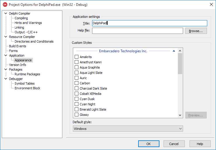
Figure 22: Project Options Dialog
You can use the navigation tree on the left to choose a page from the dialog and change the settings of your project. Select [Application|Appearance] page to affect the visual appearance of your application. For example, I have typed “DelphiPad” in the Title box, so that title will be displayed on the Windows task bar, task list, and everywhere there is an evidence of your running application.
Tip: Delphi has full support for themes. From the “Appearance” page you can choose one or more themes to embed in your project. One of them can be selected as default at startup, but you can switch to another loaded theme in code or load it from an external file.
But where does that Title information go once submitted? Try to peek the Project File (.dpr) source code selecting [Project|View Source] from the main menu. You should see a piece of come similar to this:
Code Listing 49: VCL Application Main Program
program DelphiPad; uses Vcl.Forms, Main in 'Main.pas' {Form2}; {$R *.res} begin Application.Initialize; Application.MainFormOnTaskbar := True; Application.Title := 'DelphiPad'; Application.CreateForm(TForm2, Form2); Application.Run; end. |
See that Application.Title assignment? Delphi automatically inserts it once you have typed the title and confirmed the Project Options dialog.
There are many circumstances where Delphi modifies the code in response to an action performed inside the IDE. To change the application title again, you can either edit the string directly in the Project source file or use the Project Options dialog.
Tip: I suggest you to stick as often as possible to the tools in the IDE where available, because directly editing the code by hand is much more prone to errors, even when you have become an expert.
Customize the Main Form
The Main Form has a central role for our application, and that goes for most of the projects created with Delphi. Let’s see what options are available to customize it.
Double-click the “Main.pas” file from the Project Manager to open the Main Form if not visible. If Code Editor is displayed, press F12 (or select [View|Toggle Form/Unit]) to switch to the Form Designer window. You should already be familiar with it.

Figure 23: Empty Main Form
First, change the name of the form to make it more meaningful by going to the Object Inspector and setting the Name property to “MainForm.”
Note: If you switch to the Code Editor, you will notice that Delphi has renamed the form class name for you changing it to TMainForm. It is another situation where Delphi keeps the code in sync with your changes inside the IDE.
Then we change the caption replacing the default text (“Form1” or something similar) with the name of our application. Click on the form empty area, move to the Object Inspector panel, click Caption, and insert your title.
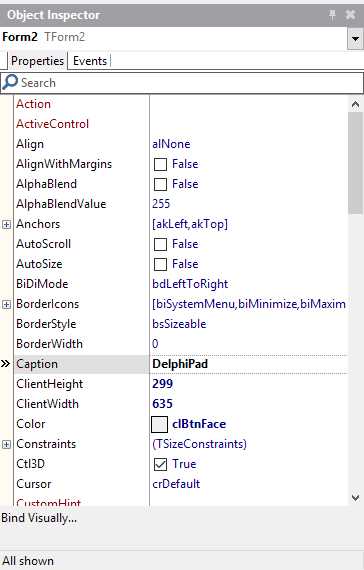
Figure 24: Form Properties
You can change many interesting properties on every form of your project, including the Main Form. Here is a list of the most frequently used ones.
Table 11: Form Properties
Name | Description |
BorderStyle | Changes the appearance and the behavior of the border. You can make the form fully resizable by selecting the bsSizeable value (default) or restricting it with bsDialog; use bsToolWindow and bsSizeToolWin to achieve the same effects but make the title bar smaller, like a tool window. |
KeyPreview | When enabled (set to true), key pressing events are raised before on the Form and later on the focused control. |
Position | Sets the default position when the Form is displayed on screen. You can keep the default position dynamically assigned by Windows or center your Form on the screen. |
ScreenSnap | When set to true, Form snaps to screen borders when you drag near them; you can adjust the effect using the SnapBuffer property. |
Windows State | Sets the windows state that affects the size of the form on the screen; e.g. set it as wsMaximized to maximize the window at startup. |
There are many other properties available. They are actually shared by many visual controls since they are introduced in a common ancestor class, TControl. Table 12 lists a few of them.
Table 12: Control Properties
Name | Description |
Align | Setting this property, you can dock any control to the upper, lower, left and right border of its parent; the control retains its position while the parent is resized. |
AlignWithMargins | Affects how the Align property works, applying a margin between the target control and the adjacent ones. |
Anchors | Lets you put a virtual “pin” to the left, top, bottom, or upper side of the control so it follows the parent equivalent border when the latter is resized. |
Constraints | Defines the minimum and maximum values for control size (width and height). |
Cursor | Allows you to specify which cursor must be displayed when the mouse points to the control. |
Height / Width | Sets the size of the control. |
Hint | You can specify a hint string that will be displayed in a tooltip if you keep the mouse over the control client area. |
Left / Top | Sets the position of the control. |
Margins | Defines the spacing between the border and the outer controls when using alignment and the AlignWithMargins property is enabled. |
Padding | Defines the spacing between the border and the contained controls when these uses alignment. |
ParentColor | Dictates the control to use the same background control of its parent. |
ParentFont | Dictates the control to use the same font of the parent control. |
We are now ready to build the user interface of our custom Wordpad-like application.
To complete our demo we need:
- A main menu.
- A toolbar.
- A rich text editing area.
Creating a Main Menu
To add a main menu to the form, select the TMainMenu component from the “Standard” page of the Tool Palette and place it on the form.
Note: Even if the main menu has a visual representation, TMainMenu is not a control but a simple component that stores the menu configuration.
To define the contents of the main menu, double-click the TMainMenu component instance to recall the Menu Designer editor.
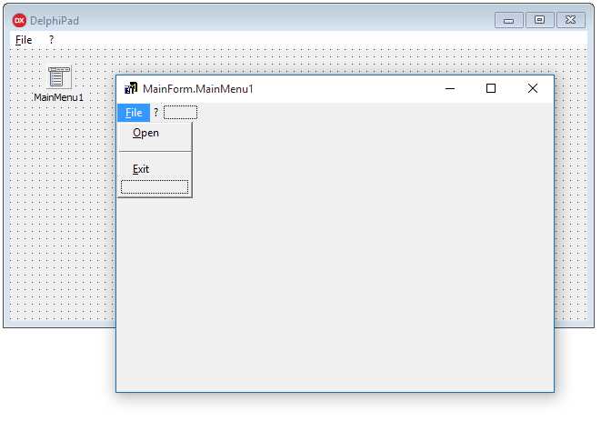
Figure 25: Menu Designer
Note: Many components support “Component Editors,” which are special wizards that can be launched by double-clicking components and controls once they are added to the form. They are useful to speed up the setting of more property values at a time, automatically generate child components or perform high-level customizations using a more suitable and intuitive interface.
Click the blank item from the Menu Designer and enter a caption using the Object Inspector, you can then add further items above or below it. If you right-click any menu item, a popup menu will appear to load or save predefined menu as a template or transform any item into a submenu.
If you want to create a menu separator, create a menu item and insert “-” in the Caption property.
Tip: By the way, don’t confuse TMainMenu with TPopupMenu component: both of them use Menu Designer to define menu items, but while TMainMenu creates a menu in the upper side of the form, TPopupMenu can be “attached” to some visual controls and components to appear when the user right-clicks on the target.
You can always launch the by program pressing Shift+Ctrl+F9, or selecting [Run|Run Without Debugging] to see if the main menu actually works as expected.
Adding a Main Toolbar
Many applications offer a toolbar that gives a fast way to execute the most frequently used commands.
You can do the same in Delphi: just select the TToolBar control from the Win32 page of the Tool Palette and add it to your form. Notice that the control is aligned to the top by default, it’s empty and ready to be configured.
Right-click the toolbar to show the popup menu. Select New Button and New Separator to quickly add command buttons and group separators. Add a couple of items just to test it: we’ll add more buttons later with further configurations.
Set the AutoSize property to true to adjust the toolbar to the same height of its buttons and enable the ShowCaptions property to make button captions visible.
Defining Commands
Support for Actions is one of the Delphi features I like the most, and you will learn why in a minute.
Visual applications usually make “commands” available to the end user (i.e. open a file, make the selected text bold, etc.). Many developers often put the command logic directly inside the event handlers that respond to user actions on visual controls.
This kind of approach leads to code duplication or, in the best case, increases the complexity when you consider the need to execute the same command by clicking on both a menu item and a toolbar button. Things can get even worse if you must enable (or disable) these command controls when some commands should not be available to the user.
This is where Delphi “actions” come to the rescue.
Drag the TActionList component from the Standard page of the Tool Palette and drop it into your form. This component acts as a central point where you can define all the commands that are available to the user when the window is displayed and in focus.
Double-click the component to bring up the Action List Editor.
Note: The Action List component editor is actually a standard Collection Editor. It looks similar and works the same way for every component that has a property that inherits from the TCollection type.
Click the New Action button (or press the Insert button) to add a new action to the Actions (VCL) list box. Each action is an instance of TAction type and represents a single executable command.
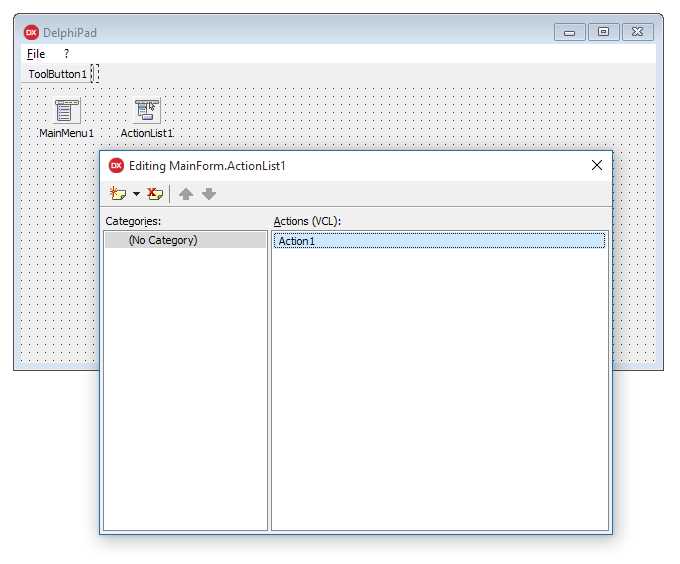
Figure 26: Action List Editor
Here are some TAction properties that are worth mentioning:
Table 13: Action Main Properties
Property Name | Description |
Caption | This property contains the display text for any control that is bound to the action and is able to execute it (like menu items, standard buttons, and toolbar buttons). |
Category | This property allows you to categorize the actions, dividing them into groups based on their context. For example, you can assign a “File” category to commands like “Open File” and “Close File.” The category name can be entered manually, or picked up from a list of categories already assigned to other actions. |
Checked | This property holds the “checked state” for an action. You can change the value either at design time or at runtime. When the action is linked to a checkbox or a menu item, the state is displayed by the control and it will reflect any change. If AutoCheck property is enabled, the action automatically toggles the Checked property when it is executed. |
Enabled | This property allows the developer to enable or disable the action. When the action is disabled, the user cannot execute it. Every control bound to this action will appear disabled too. |
Hint | This property sets the text of the tooltip that will be displayed when the user points and holds the mouse on a linked control. |
ImageIndex | This property contains the index of an image that will be displayed on linked controls, such as buttons and toolbars. The index refers to the offset of an image stored inside the TImageList component. |
ShortCut | This property assigns a keyboard shortcut to the action. The user can execute the action through the selected key combination if the action has not been disabled. |
For example, suppose we want to add an action to let the user exit our application, either by clicking the [File|Exit] main menu item or the “Exit” button on the toolbar. How could we accomplish this task?
First, add a new action to the list and set the following values for its properties:
Property Name | Value |
Caption | Exit |
Category | File |
Hint | Exits the application |
Name | FileExitAction |
ShortCut | Ctrl+Alt+X |
Switch to the Event tab in the Object Inspector and double-click the OnExecute event to create a new handler method. The method will contain the following code, which acts a response when the user executes the action.
Code Listing 50: Exit Action Execute Code
procedure TMainForm.FileExitActionExecute(Sender: TObject); begin // Closes the main form and ends the application. Self.Close; end; |
The event handler is a method of TMainForm and is attached as a reference to the OnExecute event of FileExitAction.
Note: VCL Forms Applications normally terminate when Main Form is closed. You should always resort to this practice, avoiding any other brutal or exceptional way to close your application.
How can we link our FileExitAction to the visual controls that must execute it when clicked?
Open the Menu Designer on the TMainMenu component, select the [File|Exit] menu item and set the Action property by selecting FileExitAction from the dropdown list displayed in the Object Inspector. The job is done!
Repeat this procedure for the main toolbar. Add a new tool button to the TToolBar control using its pop-up menu and change the Action property like you just did for the main menu item.
You will notice that either the menu item or the tool button mirrors the Caption specified in the FileExitAction component. If you change your mind and decide to set a different caption, the controls will reflect the change. That is the hidden power of actions!
Using Images
A toolbar is not a real toolbar without any icons, and menu items deserve some nice graphics too.
You can add images using the TImageList component from the Win32 page of the Tool Palette.
TImageList is a component that holds a set of images with a predefined size expressed through the Height and Width properties. The default size is 16x16 pixels, but you can increase it to 24x24, 32x32, 48x48, or any size value you want.
Double-click the component to recall the ImageList Editor. This dialog lets you choose images from your file system and assign them to actions, menus, toolbars, buttons, and other visual controls.

Figure 27: Image List Editor
The editor usually recognizes the background color on loaded images and considers it as a transparent color.
If you want to display the icons, you should link the Images property of TActionList, TToolBar and TMainMenu to the TImageList component using the Object Inspector as usual.
Each image is assigned to an index. Set the ImageIndex property of TMenuItem components, TToolButton controls, and TAction instances to the index of the image you want to assign to each element.
Adding a Rich Text Editor
The Visual Component Library provides a rich text editor out of the box called the TRichEdit control.
You can find it inside the Win32 Tool Palette page. Drag it to your form and drop the control somewhere in the empty area.
Using the Object Inspector, set the Align property to alClient and the control will expand itself, filling up all the available space in the client area. When the form is resized, each control will retain its position and adapt to the new size according to the value specified in the Align property.
The TRichEdit control offers an editable area similar to the one you can find in Wordpad. You can input a line of text, change the size of the font, format words and paragraphs as bold, italic and underline, create bulleted lists, and so on.
At this point, do we really have to encode any single command we want to support on our Wordpad application? Thanks to Standard Actions, you don’t have to!
Using Standard Actions
Standard Actions are TAction descendants that implement ready-to-use commands that are widely used in many business applications.
Go back to the TActionList components and call the ActionList Editor with a double-click.
Notice that New Action button has a dropdown menu that lets you choose from New Action (the command we have already used) and New Standard Action.
Selecting New Standard Action, Delphi will display a dialog to select one or more built-in actions you can add to your project.

Figure 28: Standard Action Classes
Use Ctrl+Click to select more actions from the available action class list and press OK to add them to the ActionList component. Now they will become part of your project and assignable to menu items and tool buttons.
Tip: If you link an ImageList to an ActionList, when you add Standard Actions default icons are automatically inserted to the ImageList. You can always replace the new icons with images of your choice.
Standard actions come with a set of default values assigned to their properties, and they have more properties and events than default actions to customize their behavior and meet your specific business needs.
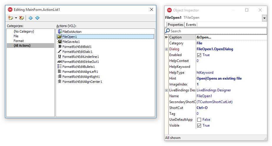
Figure 29: Standard Action Properties
Here is a screenshot of the finished application running.

Figure 30: DelphiPad Sample Running
Summary
In this chapter we have just begun to explore the real potential that Delphi and the VCL can provide to develop rapidly a complete and fully functional application in just a few minutes.
We have created only a main form to keep the demo as simple as possible, but you can add any number of forms you want and create Data Modules (non-visible forms) to host your components. Examples include data-access components, ActionLists, ImageLists, and any other component, and sharing them with all the modules and forms that make up your application.
You can also add Frames from the New Items window to insert reusable pieces of user interface dragging them from the Tool Palette to the Form Designer when you need them.
Remember that Forms, Data Modules, and Frames are based on an Object Pascal class type, so you can add your own fields, properties, and methods to them as you would with other classes. Delphi even allows you to create new descendants from them visually.
Read the official Delphi documentation to expand your knowledge about all the smart tools you can use to build VCL Forms Applications.
- 1800+ high-performance UI components.
- Includes popular controls such as Grid, Chart, Scheduler, and more.
- 24x5 unlimited support by developers.