
CSS3 Succinctly®

CHAPTER 4
New Pseudo Selectors
In the previous chapter, we covered the new main selectors added to CSS3. Now, we go further by exploring the new pseudo selectors that have been added.
Pseudo selectors are different than the regular selectors because they can't be used on their own. Instead, they need to be combined with other selectors, such as those in the previous two chapters, in order to do their job. At least, that’s how they’re described in the mainstream.
The truth of the matter is that many of the pseudo selectors can now indeed be used without any suffixing rule (as you'll see in a moment), but you do still get the best from them when combining them with a regular selector.
Some of the selectors you'll see in this chapter are actually not new in CSS3 and have been around quite some time. In previous versions, however, they either were not well known, or because of the IE6/IE7/IE8 compatibility generation problems, they were actively avoided and not used much.
To kick things off, we'll deal with the oldest ones first.
:focus
As the name suggests, focus is used when an input element has focus within a document. This is usually used in forms to highlight the active field.
Let's create a mock-up form using the following HTML markup:
<form action="#" method="post"> <label for="txtUserName">User Name</label><br /> <input type="text" id="txtUserName" name="txtUserName" /><br /><br /> <label for="txtEmail">Email</label><br /> <input type="text" id="txtEmail" name="txtEmail" /><br /><br /> <input type="submit" value="Submit" /> </form> |
Code Listing 39: Mock HTML form markup
This will give us a very generic looking HTML form.

- Generic form produced by Code Listing 39
Let’s add the following simple rule to our style sheet:
:focus { background-color: beige; color: green; } |
Code Listing 40: Simple Focus CSS rule
If we re-render our browser, and click into one of the form fields so that it gets the focus, we should see that it changes to reflect the selected state.

- Our simple form with the focus rule applied
You might notice in the example that I've used focus on its own without extending anything. In CSS3, many of the pseudo selectors can now be used in this manner; it simply means apply it to anything that understands the selector.
For our example, any element that can receive focus from the user will change its color as specified when focus is given to it.
A slight diversion into visited status
I just want to briefly break off and show another pseudo selector that's been around since V2 of the CSS spec. It can be used alone in the same way as focus, but can also be used maliciously to find out a person's browsing history.
If you place some external anchor tags in your document as follows:
<ul> <li><a href="http://www.google.co.uk/">Google</a></li> <li><a href="http://www.yahoo.co.uk/">Yahoo</a></li> <li><a href="http://msn.com">MSN</a></li> </ul> |
Code Listing 41a: External URLs
Then apply the following style rules:
:link { color: green; } :visited { color: red; } |
Code Listing 41b: Styles for the external URLs in 41a
When you render your document, you’ll see the following.

- Links rendered by Code Listing 41
You might see that some or even all of the links have a red color. In my case, only the Google link does, and this is because the Google main UK site is in my browser history, whereas the other two are not.
If you look at the CSS, you'll see that the styling is provided by the visited pseudo selector, giving you, the user of the page, instant visual confirmation that you recently visited that page.
While this might seem fairly innocuous on the surface, if you dig down under the hood and look at some of the new JavaScript API's that have been added in newer specifications, you'll find that there's an API call that goes by the name of getComputedStyle. Using this call, it's possible to get the actual computed style that's visible on the element in the browser, or at least it was.
In today's modern browsers, this hole is largely patched, and attempting to use this call to get the color of the link will in fact just return whatever the base color is. In our case, all we get back (even for the Google link) is the green color.
I have, however, heard rumors that it's possible to use JQuery and MooTools to retrieve the correct value and make a distinction.
This is just a small example of the fact that anything can be used to breach a user’s privacy or security, even something as common as CSS. Always make sure that your rules are specific if possible. Just because you can use them globally without a rule to extend, doesn't mean you should. If you tie them to given rule sets, it means that your style rules can't be abused by people hacking around with the browser tools.
:disabled and :enabled
Among the many new attributes that can be applied to elements in the HTML 5 spec is the disabled attribute.
You use it like any other attribute by simply adding “disabled” to an element in your markup.
Let’s reuse the form mock-up we created in Code Listing 39, but change it so that it looks as follows:
<form action="#" method="post"> <label for="txtUserName">User Name</label><br /> <input type="text" id="txtUserName" name="txtUserName" disabled /><br /><br /> <label for="txtEmail">Email</label><br /> <input type="text" id="txtEmail" name="txtEmail" /><br /><br /> <input type="submit" value="Submit" /> </form> |
Code Listing 42: Mock HTML form markup with disabled elements
When you render it, you should see that the first input element can't be used now.

- Simple form with a disabled input
Let’s add the following rule to our style sheet:
input:disabled { background-color: red; border: 2px solid blue; } |
Code Listing 43: CSS rule to style disabled elements
You'll see a drastic change when you re-render the form.

- Simple form with disabled pseudo class in Code Listing 43 applied
If you remove the disabled attribute from the element, the input will revert back to its original state.
This rule is typically used to show read-only fields in a record editor, or to show fields that are not applicable to the current form. For example, you might mark up a form so that address fields are shown only when a tick box to send mail to that address is ticked.
If you use the Bootstrap UI framework, you might have seen that some elements when used in a form have a small, red stop circle displayed over them when you hover over them with a mouse pointer. This is performed in the same way, using the disabled rule to change the style of the mouse pointer.
The enabled pseudo selector is the logical opposite of disabled, and applies the given style to an element that is NOT disabled, as the following example shows:
input:enabled { background-color: yellow; border: 2px solid green; } |
Code Listing 44: CSS rule to style enabled elements

- Browser form showing enabled CSS rules applied
An element is classed as enabled when there is no reason to disable it, or specifically, when it does not have a disabled attribute applied.
Note that an element is also classed as disabled if the element’s Boolean disabled property is set to true on its document object using JavaScript. In this case, as with other selectors, the application of the disabled and enabled selectors are explicitly applied based on the element’s state, meaning you don't have to keep making sure the correct elements have the correct classes applied.
:valid and :invalid
Another of the great features added to HTML 5 is browser-side validation. With browser-side validation, you can make the browser verify the inputs to a form before the form is submitted.
Like the disabled selector, the pseudo selectors here apply to elements only when we use the extra attributes and markup provided in the specification.
Using our form again, let's make another change so that you have the following HTML code:
<form action="#" method="post"> <label for="txtUserName">User Name</label><br /> <input type="text" id="txtUserName" name="txtUserName" required /><br /><br /> <label for="txtEmail">Email</label><br /> <input type="email" id="txtEmail" name="txtEmail" /><br /><br /> <input type="submit" value="Submit" /> </form> |
Code Listing 45: Mock HTML form markup with validatable elements
The changes might not be obvious at first, but if you look at the user name box, you'll see that it now has a required attribute.
The email input, however, no longer has a type of text; it now has a type of email.
If we render this, and then click Submit without entering any values, we'll see something similar to the following:

- Our basic form showing the required attribute in action
If we add something in the name box, and put something in the email box, but deliberately format the email incorrectly, we'll also get validation on the format of the email.

- Our basic form showing the email validation in action
There's more to the validation classes that I'll be showing here, but for now, add the following rules to your style sheet:
input:valid { background-color: green; } input:invalid { background-color: red; } |
Code Listing 46: CSS3 Validation rules
If you then render the page, you should get the following:

- Simple form with validation styles from Code Listing 46 applied
The user name is immediately red because it's required, so until it's filled in, it's classed as invalid.
The email is valid, as we've only told it that it must have its input validated as an email address. We haven’t said that it's required as input, so having a blank email is valid. However, if you start typing in it, it will change to red and won't change back to green until the input is either correctly formed, or removed entirely.
Using valid and invalid is a great way of giving feedback to the user, but seeing them immediately as soon as the form is displayed is generally not considered good practice.
For this reason, you would usually NOT apply them directly to input elements as I have (in fact, you can see I've just used a very broad selector because the button is green too). Usually, you'll attach them to a class/id name, then check and apply them using JavaScript when the form is submitted.
As this book is about CSS, I'm not going to go into detail about that here. If you want to venture further down the rabbit hole of HTML 5 validation, there's a post on my blog that will get you started.
:in-range and :out-of-range
Following on with the validation pseudo selectors, we have in-range and out-of-range. These are both used in a similar way to valid and invalid in the previous section, but they handle a different scenario.
Validation of text types and contents are not the only validation to be added to the new specifications; the HTML 5 spec also brings with it number types and minimum/maximum ranges.
Create another dummy form, but this time, rather than a user name and email input box, let’s define a number range.
<form action="#" method="post"> <label for="nmbUserAge">User Age</label><br /> <input type="number" id="nmbUserAge" name="nmbUserAge" min="16" maximum="100" /><br /><br /> <input type="submit" value="Submit" /> </form> |
Code Listing 47a: Mock HTML form with a number input
Let’s apply the following styles to our form:
input[type=number]:in-range { background-color: yellow; } input[type=number]:out-of-range { background-color: salmon; } |
Code Listing 47b: Styles for our number range form in Listing 47a
When we render the form, we'll initially see it show using the out-of-range color, due to the fact that it has no value in it.
If we then start entering values, we should see the color change depending on what value we enter, in range or out.

- The number range form just after loading

- The number range form with an invalid value

- The number range form with a valid value
:empty
The empty pseudo selector might at first seem like it's used when an element value is empty, but it's not; it’s used when the inner contents of an HTML element is empty. Consider the following HTML:
<div class="mydiv"></div> |
Code Listing 48a: An empty div element
The div in Code Listing 48a is empty—it's devoid of any contents whatsoever between the opening and closing tags that surround it.
If we were now to apply a rule such as the following:
.mydiv:empty { /* rules go here */ } |
Code Listing 48b: CSS rule for empty pseudo selector
Any style rules defined in the CSS would be applied to it. However, as there are actually no contents, then applying rules that make color changes is pretty much redundant, unless the parent element already has a rule that shows itself with a fixed size and border.
The empty pseudo element comes in handy when you want to remove empty elements from display. For example, let's imagine you had a message count on the end of a tab in your user interface. If that count was 0 or had no value, then you wouldn't want an empty, red circle showing.
In this case, you'd style your red badge in a separate rule, and then you'd style your empty rule something like the following:
.mydiv:empty { display: none; } |
Code Listing 48c: CSS rule to make an empty element vanish from display
By defining the empty selector using no display, all you need to do to make the count disappear from the display is to make sure there's nothing at all between the opening and closing tags.
You might notice that I'm wording things as “nothing at all,” and that's deliberate. When we say that the empty selector matches an empty tag, we mean 100 percent empty. A space might look empty to us, but to the CSS selector engine, it's classed as content, as is splitting an empty tag over two lines.
This can get quite frustrating when you’re trying to track down why an element you’re sure should vanish from display, does indeed not vanish from the display. I know firsthand how much hair-pulling this causes.
If there is anything—anything at all—in between and opening and closing tag, then the empty selector will NOT match. It works best with spans and divs that form small containers whose contents are built and removed using JavaScript.
Because of the way this selector works visually, I'm not going to provide a screen shot. If you construct a simple div tag and apply the rule in Code Listing 48c to it, then manually add or remove contents using your editor, you'll soon see how it works.
:checked
The checked pseudo selector is used when dealing with checkbox and radio elements.
The premise is simple: if the element is checked or selected, then this pseudo rule will be applied; otherwise, it won't.
Let’s alter our form, this time to show a couple of checkboxes and radio buttons, as shown in Code Listing 49:
<form action="#" method="post"> <label>Check box 1<input type="checkbox" /></label><br /> <label>Check box 2<input type="checkbox" /></label><br /> <label>Check box 3<input type="checkbox" /></label><br /> <label>Check box 4<input type="checkbox" /></label><br /> <label>Radio Button 1<input type="radio" name="radios" /></label><br /> <label>Radio Button 2<input type="radio" name="radios" /></label><br /> <label>Radio Button 3<input type="radio" name="radios" /></label><br /> <label>Radio Button 4<input type="radio" name="radios" /></label><br /> </form> |
Code Listing 49: Simple form of check boxes and radio buttons
Rendering this should give us a fairly straightforward bunch of controls.

- Form showing simple checkbox and radio controls
Since checkboxes and radio buttons don't change color, we'll use a slightly different tactic for this demonstration, and change the size of the controls. Add the following rules to your style sheet:
input[type="checkbox"], input[type="radio"] { width: 20px; height: 20px; } input[type="checkbox"]:checked, input[type="radio"]:checked { width: 25px; height: 25px; } |
Code Listing 50: CSS Styles do demonstrate using the checked pseudo selector
If you render the form now, and check and uncheck some of the controls, you should see a small size variation on the items that are checked.

- Our check boxes and radio buttons changing size
You might be wondering why you might want to use this pseudo selector if it's difficult to change the properties such as color on a checkbox.
It's not until you start to think about combining it with adjacency selectors that it starts to make sense as to how you might want to use this. Create a line in your form in Code Listing 49 that looks like the following:
<input type="checkbox" /><span class="checkboxlabel">This is my check box</span> |
Code Listing 51a: Line to add to previous form
Then, add the following CSS rule:
input[type="checkbox"]:checked + span.checkboxlabel { color: red; } |
Code Listing 51b: Rule to style the line in Code Listing 51a
You should find that when you render the document, checking or unchecking the checkbox will make no changes to the checkbox itself, but it will change the text color of the span following it.
It does this because we've told the CSS engine that for any input element that has a type attribute equal to checkbox, look at the adjacent element and check to see if it's a span, and has a class of checkboxlabel. If it does, then change the color of that span element to red.

- Check box using adjacent selectors to style the label following it
Using checked selectors like this is the method used by UI toolkits such as Foundation and Bootstrap to produce toggle buttons and custom radio and check groups made from lists of icons.
If you're looking to create custom check boxes, then you simply need to combine this pattern with pseudo elements such as before and after to add/remove content dynamically in your markup.
:before and :after
Before CSS3 came along, if you wanted to add or remove elements and content dynamically, you had to resort to JavaScript, or make the changes server side and redraw the document fragment using something like an Ajax call.
Note: Ajax is not something we'll be covering in this book, as it's deeply tied in with JavaScript and is a quite complex subject. In general, however, an Ajax call is the process of asking JavaScript to make a partial request to the web server in order to get only a small bit of content. It's typically used as a means to get small chunks of data and insert them into a webpage as needed, rather than downloading the entire page in one request.
With the before and after pseudo selectors, we can add and remove content in our HTML elements without ever touching a single line of code, and have it all driven using pure CSS rules.
Starting with a simple example, let’s imagine we have the following line in our HTML markup:
<span class="bracketedLabel">This is a bracketed Label</span> |
Code Listing 52a: Simple span to demonstrate before and after selectors
There's nothing at all special about this label; if we render it, we just get a simple output.

- Output from Code Listing 52a
As the name suggests, we'd like any label with this class to have square brackets surrounding it, but we don't want to go and find all occurrences to add them manually.
So, we can add the following CSS rules:
.bracketedLabel { color: green; } .bracketedLabel:before { content: '['; color: red; } .bracketedLabel:after { content: ']'; color: red; } |
Code Listing 52b: CSS rules required to make our label a bracketed one
Then, when we refresh the browser output, we get the following:

- Our bracketed label now has brackets
Before you all start rushing to get the before and after selectors to add and remove HTML tags in your document, I have to tell you that unfortunately, you can't.
While the before and after pseudo selectors are powerful, you’re limited to plain text only. If you try to put HTML tags in the rules, then those tags will simply be rendered as is, complete with the tag itself as a text string.
There are a number of reasons for this. Imagine you had an element, that via an CSS rule added an element, which also added an element; if you weren't careful, you could very easily end up in an infinite loop and everything would halt.
CSS rules are also designed to be parsed in one run, so any element that inserted elements that require styling would mean having to stop, go back and reprocess the rules already seen, then come back and continue.
You can, however, still perform some very interesting tricks with them.
One of the better uses is the creation of customized check boxes using nothing more than CSS3 properties and selectors. To illustrate this, create a simple form with two checkboxes in it.
<form action="#" method="post"> <input id="chkCheckboxOne" type="checkbox"> <label class="checkbox" for="chkCheckboxOne"> Checkbox 1 </label><br /> <input id="chkCheckboxTwo" type="checkbox"> <label class="checkbox" for="chkCheckboxTwo"> Checkbox 2 </label> </form> |
Code Listing 53: check boxes and radios ready for customization
Like our previous checkbox example, rendering this will just give us our plain form style:
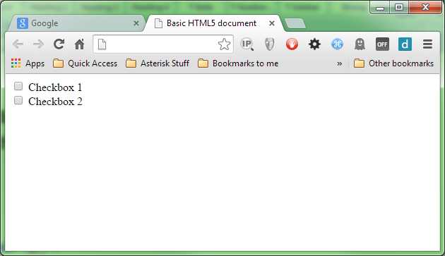
- Just another simple form
Let’s add the first of our rules, and give the checkboxes some default styling.
.checkbox { display: inline-block; cursor: pointer; font-size: 20px; font-family: sans-serif; }
input[type=checkbox] { display:none; } |
Code Listing 54a: Default styles for our checkboxes and radio buttons
If you render the page at this point, you might be surprised to see that we've hidden the actual controls, and just styled our label text. We've done this because we don't want to see the original controls, and since we can't really customize them with colors and such anyway, we just want them to disappear so we can draw our own new ones.

- Our checkboxes are still there, just invisible
The next rule we add is the before part of the style sheet, but notice we’re targeting the label and not the actual checkbox element, as it's really the label that's the driver for all of this.
.checkbox:before { content: ""; display: inline-block; width: 18px; height: 18px; vertical-align: middle; background-color: green; color: #f3f3f3; text-align: center; box-shadow: inset 0px 2px 3px 0px rgba(0, 0, 0, .3), 0px 1px 0px 0px rgba(255, 255, 255, .8); border-radius: 3px; } |
Code Listing 54b: The before part of the rules, which draws the unchecked version of the control
Rendering this, we can see that we now have something that looks a little more like checkboxes now.
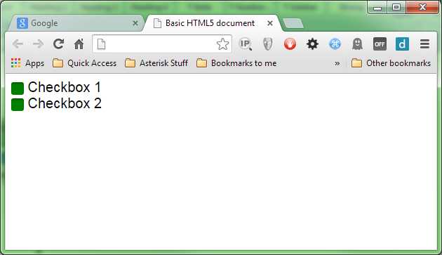
- We have green check boxes
We’re still not quite finished; we need to add one more rule, which will ensure that we get a good-looking check symbol that appears when the control is in a checked or selected state.
input[type=checkbox]:checked + .checkbox:before { content: "\2713"; text-shadow: 1px 1px 1px rgba(0, 0, 0, .2); font-size: 15px; } |
Code Listing 54c: The final rule required to finish off our custom checkboxes
When we render that, we should find we can toggle the check boxes exactly like we used to with the default ones.

- The finished custom checkboxes
This technique can be used in many places; Bootstrap, for example, uses it to position icons in input fields in the Bootstrap UI framework.
- Twitter Bootstrap uses the same method for validation icons
Before and after are probably two of the most flexible pseudo selectors available, and the development community still hasn't discovered all the ways they can be used.
First-X, Last-X, and nth-X
I've chosen to represent this last group as one collection as they are all related. The first, last and nth pseudo selectors are used for selecting the first, last and user-defined count of elements in a list of elements.
There are two distinct groups in this batch; we'll look at the general selectors (that is, the ones that will select anything), then the type specific selectors. These two groups are listed in the CSS3 spec as:
first-child, last-child, nth-child()
and
first-of-type, last-of-type, nth-of-type()
For the first set of examples, we'll use the following HTML markup to illustrate how the selectors work, and what they can do.
<ul> <li>List Item One</li> <li>List Item Two</li> <li>List Item Three</li> <li>List Item Four</li> <li>List Item Five</li> <li>List Item Six</li> <li>List Item Seven</li> <li>List Item Eight</li> <li>List Item Nine</li> <li>List Item Ten</li> </ul> |
Code Listing 55: Unordered list markup for first, last and nth selectors
As we've done with everything else thus far, here's the before rendering of our markup in the browser:

- Un-styled list from Code Listing 55
Like many of the selectors available, their names describe without any doubt what they do. Let’s apply the following rules to the HTML in Code Listing 55.
ul > li:first-child { color: red; } ul > li:last-child { color: green; } |
Code Listing 56: CSS rules to demo 'first-child' and 'last-child' pseudo selectors
As you might predict, the first and last items in our unordered list change color as anticipated.

- Our list style using 'first-child' and 'last-child'
The first-child and last-child selectors are about as simple as we get; nth-child(), however, requires a little more explanation.
You may notice that unlike the others, nth-child has a set of parentheses following it. This is because unlike the other selectors, nth-child accepts a parameter to control it.
This parameter takes the form of an algebraic equation that describes what to select and how.
Note: For many folks, doing algebra at school is a distant memory. For those who do remember it, they'd probably much rather they didn't. However, even though you might have wondered then when it might ever come in handy, remembering how it works will really help you with algebraic expressions in CSS3. If you are struggling to remember any of it, then now might be a good time to have a quick refresher.
Don't be frightened; an algebraic equation is something that describes how a number calculation should work, but not necessarily what the actual answer should be.
Many folks will have come across something at some stage in their lives that looks like this: 1n+5x=6y
To those who remember, this is called algebra, and is a quite specialist branch of mathematics that many folks study for years on end. Solving these strange equations is somewhat of a hobby for many theoretical mathematicians, and some even devote years of their lives to simply theorizing about these things.
For those who are still scratching their heads, that little bit of algebra means the following:
The equation 1 multiplied by the value of n when added to 5 multiplied by the value of x will be always equal to 6 multiplied by the value of y, where n, x, and y are theoretical instances that hold no current value.
Don't worry, you don't need to know algebra in that kind of depth to understand how an nth-child works, but you do need to know how algebra works.
When you have a discrete value followed by a theoretical instance, that theoretical instance is usually multiplied in some manner by the operator. Operators can also apply additions and subtractions, or just be specified on their own to give a static value.
For example:
1 means just that: 1, an offset of 1, a count of 1, one page, one thing… it really doesn't matter, because it's theoretical.
1n, on the other hand, means 1 amount of n, or 1 multiplication of n; again, n can represent anything because it's all theoretical.
1n+1 means 1 amount of n with an additional 1 added to it.
Perhaps an easier way to understand how these equations work, is to imagine using them to perform multiplication tables. Remember, for example, the 3 multiplication table:
3 x 0 = 0
3 x 1 = 3
3 x 2 = 6
3 x 3 = 9
3 x 4 = 12
And so on…
Now, imagine that the n in our 3n is the multiplicand in the second column (the value 0 to 4); you then start to see how n references any value in the range.
If you then treat the result as a static number, you end up with the following static sequence.
0, 3, 6, 9, 12
Let that sink in for a moment.
Now think back to the list of HTML elements in Code Listing 55. There are 10 list item children in that list, and if we forget about the numbers 0 and 12 in our static list, we have 3, 6 and 9, which could all be offsets to select (0 and 12 are not valid items, as they don't exist).
Well, that’s exactly what nth-child() does. It uses the algebraic equation passed to it to determine exactly which elements in a list it needs to select.
Let’s apply the following CSS rule to our list from Code Listing 55:
ul > li:nth-child(3n) { color: red; } |
Code Listing 57a: nth-child CSS rule to select every third element
What will happen is that every third element in the list will be affected by the rule.

- Our nth-child(3n) rule in action
If we start adding a + offset to that, we dictate where the multiplication starts:
ul > li:nth-child(3n+1) { color: red; } |
Code Listing 57b: nth-child CSS rule to select every third element starting at element 1
This will produce the following:

- nth-child(3n+1) starting at 1 and selecting every third element
Which, as you can see, starts with element index number 1, then applies the multiplication of 3 each time, to select every third item.
You can use just an n on its own too, which, when used with a positive offset, allows you to select ranges. For example:
ul > li:nth-child(n+7) { color: red; } |
Code Listing 57c: nth-child CSS rule to select everything from 7 onwards
Will start at offset 7 and simply select everything left from that point on.

- nth child selecting elements from 7 onwards
You can also go backwards by simply prefixing the n with a minus symbol.
ul > li:nth-child(-n+7) { color: red; } |
Code Listing 57d: nth-child CSS rule to select everything from 7 backwards

- nth child selecting from 7 backwards
If you’re just trying to select a single numbered element in a list, you can do the following:
ul > li:nth-child(5) { color: red; } |
Code Listing 57e: nth-child CSS rule to select just index number 5
Just specifying the number index directly will select only that numbered element.

- nth-child selecting just the fifth element in the list
I could easily fill up the rest of this book with different combinations of nth-child equations, but I think we've got enough for now.
I can take a guess at the question that most of you are asking yourselves at this point.
"How might I use this to select and stripe all the rows in a table or grid? Can you maybe tell me what the equation for that is?"
The good news here is that the W3C standards committee realized that this was likely to be one of the most common uses of the nth-child pseudo selector, so they added a couple of shortcuts: even to select every even numbered element, and odd to select every odd numbered element.
If you add the following rule:
ul > li:nth-child(odd) { color: red; } |
Code Listing 57f: nth-child CSS rule to select every odd numbered element
You should see that every odd list item in the markup gets selected.

- nth-child selecting every odd element
I think by this point you'll likely want to give your brain a rest, so we'll leave the algebra behind for now.
Take note though, that there is still a massive amount we've not covered. For example, you can chain nth-child selectors (just as you can with many others), leading to some crazy selector rules that look like this:
nth-child(3n+1):nth-child(even)
This will select every third element, starting at index 1, but only those that have an even number for the index. For 11 elements, this would select only elements with an index of 4 and 10 (all the others are odd numbers).
You can easily select ranges, then split those ranges up. You can combine those range selections with first-child and last-child too, allowing you only to select the start and end of a range. It's a subject in itself that perhaps warrants an entire book, and to date there have been some very clever uses of the nth-child pseudo selector; for us though, it's time to move on.
The second group of pseudo selectors that fall under the first, last and nth element selections are the of-type selectors.
The first-of-type, last-of-type, and nth-of-type selectors all work exactly the same way as the general selectors described previously in this chapter, but they target a specific element type.
Let's take our unordered list from Code Listing 55, and change it a bit to turn it into a definition list.
<dl> <dt>HTML 5</dt> <dd>HTML 5 is the markup language used to create documents that are published on the internet</dd> <dt>CSS3</dt> <dd>CSS3 is the markup language used to add style and colors to documents created using HTML 5</dd> <dt>HTTP (Hyper Text Transfer protocol)</dt> <dd>HTTP is the mechanism by which HTML 5 documents and their associated resources are transported on the internet</dd> <dt>WWW (World Wide Web)</dt> <dd>The World Wide Web is the collective name for the many hundreds of thousands of HTML 5 documents published via the internet</dd> <dt>The Internet</dt> <dd>The internet is a massive global computer network, which amongst other things holds the World Wide Web</dd> </dl> |
Code Listing 58: Definition list markup for first, last and nth selectors
A definition list is slightly different to the other types of lists. Rather than just list item elements, there are in fact two different types of child elements present within it: dt elements or “Definition Titles,” and dd elements, or “Definition, definitions.”
If we render Code Listing 58, we can see the default styling for both of these:

- Definition list with default styling
If we try to apply one of our previous rules to this list (modified slightly to account for the different tag types), for example, the CSS rule to select every third child (Code Listing 57a), we'll see that it doesn't quite do what we might expect it to do.
dl > :nth-child(3n) { color: red; } |
Code Listing 59a: Modified nth-child rule for our definition list
It tries to select every third child element, and even though we can target things specifically by name, we may have to deal with wildly varying list contents.

- nth-child gets our selection wrong.
However, if we use nth-of-type():
dt:nth-of-type(2n) { color: red; } |
Code Listing 59b: 'nth-of-type' CSS rule to be used instead of 'nth-child'
We quickly see that it effects only the elements we ask it to.

- nth-of-type gets our selection right
The nth-of-type (and for that matter first-of-type and last-of-type) only considers targeted elements as specified to be candidates for selection.
In a previous example we saw some markup that might be used for a news page; if you were to use nth-of-type on that, you'd get the flexibility of selecting things as you would with nth-child, but you would be able to tell the CSS selector engine to ONLY apply that to paragraph elements found in the article.
You could, for example, easily style all the even numbered paragraphs a different color to the odd numbered ones, no matter how many paragraph elements were in each section or how many other elements such as headers might be present.
There are still more pseudo selectors to be covered, and still more that can be done by chaining them all together; however, the potential is far beyond anything we have space here to describe.
Remember too, that generic rules always come before specific rules.
If you define:
p:nth-child(odd) { color: blue; } p { color: green; } |
Code Listing 60: Specific CSS rule first
You'll find that all your paragraph elements will be green. This is because the later rule targets more that the former rule, so any changes that the former rule applies will be over-written by the latter one.
Reversing the order of the two rules will fix this, so the generic one changes everything green first, then the specific one targets odd-numbered elements and changes them from green to blue.
Note: At the time of writing, and with the version of Chrome (and other browsers) being used, the previous description held true in that all <p> elements would indeed have turned green. However, two months later, an update has been made to the specifications, which now means that the nth-child rule has specifity precedence over the standard element selector in the example. This means that the previous example now produces exactly the same result, no matter which order they are in. This does not mean that you should suddenly ignore rule order; there are still plenty of places where this is obeyed. In this, case however, it's a perfect example of the fact that many of these features are still in a state of flux, so as always, choose wisely when deciding which features to use and why.
If you have any problems with styles not being applied when and where you expect them to, the first thing to always check is the order of specificity.
Summary
In this chapter we've taken quite a whirlwind (and brain-exercising) tour of the new pseudo selectors available in CSS3. You should by now have a very good idea of how to target and select the elements you need to select, and the methods by which you can do so.
We've learned a huge amount in this chapter, and learned a few clever tricks along the way. Now that the hard stuff is behind us, it’s time to sit back and enjoy the easy life.
Starting in the next chapter, we'll be taking a look at what most of you have been waiting for: the eye candy. We'll start by looking at everyone's favorites: rounded corners, drop shadows, and gradient fills.
- 1800+ high-performance UI components.
- Includes popular controls such as Grid, Chart, Scheduler, and more.
- 24x5 unlimited support by developers.