
CSS3 Succinctly®

CHAPTER 8
Generated Content and Calculations
You've already seen some of what generated content can do in the form of the :before and :after pseudo selectors; the generated content module, however, can do a bit more than that with just a few simple CSS rules.
You can, for instance, read the value of an attribute from a parent element and then use that in a rule further down the chain.
You can also initialize and use counters, allowing you to use auto-generated sequential numbers for everything from list numbering to element indexing.
Finally, with the calculation module you can actually have your CSS rules perform basic math and workout exact screen sizes, border widths, and all sorts of other useful measurements—all without ever thinking about JavaScript.
Counters
Counters are controlled by normal CSS rules, and while they are very simplistic in nature, they have quite a few uses.
A counter is initialized using the counter-reset CSS rule, and it's incremented using the counter-increment rule.
You get the value of the counter by using the counter() function.
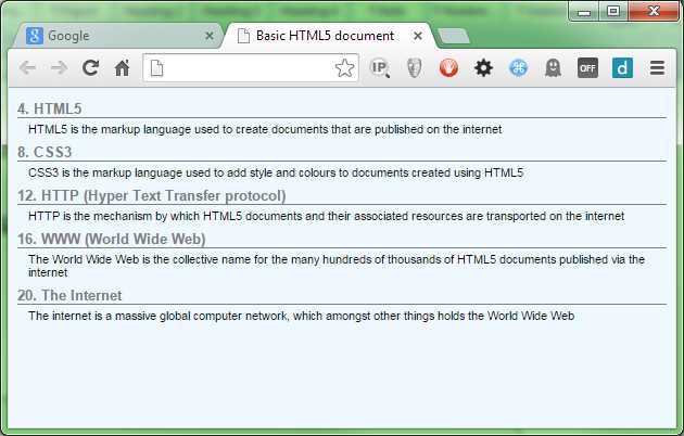
Let’s imagine you have the following HTML markup (if you've read the rest of the book so far, you'll recognize this from Code Listing 58).
<dl> <dt>HTML 5</dt> <dd>HTML 5 is the markup language used to create documents that are published on the internet</dd> <dt>CSS3</dt> <dd>CSS3 is the markup language used to add style and colors to documents created using HTML 5</dd> <dt>HTTP (Hyper Text Transfer protocol)</dt> <dd>HTTP is the mechanism by which HTML 5 documents and their associated resources are transported on the internet</dd> <dt>WWW (World Wide Web)</dt> <dd>The World Wide Web is the collective name for the many hundreds of thousands of HTML 5 documents published via the internet</dd> <dt>The Internet</dt> <dd>The internet is a massive global computer network, which amongst other things holds the World Wide Web</dd> </dl> |
Code Listing 69a: Definition list markup for counters demonstration
If we render it, we'll get the following.

- Our definition list ready to be styled.
First let’s add a bit of default styling, just to neaten things up a little.
Add the following rules to your style sheet.
body { background-color: aliceblue; font-family: sans-serif; font-size: 12px; } dt { font-weight: bold; font-size: 1.1em; border-bottom: 1px solid grey; margin-bottom: 4px; margin-top: 8px; color: grey; } dd { font-size: 0.9em; margin-top: 2px; margin-bottom: 2px; margin-left: 10px; } |
Code Listing 69b: Default style rules for our generated content
Nothing specifically new here, we’re setting a default font style, size and background color for the page, then we’re setting up some default styles for our definition list items.
The output should look like this:

- Definition list with default styling
What would be nice, however, would be if we could have each of our definition titles numbered.
Now we could go through each one and prefix the appropriate number on it, but that would be tedious and error-prone, and what if those definitions are published from a database that has no numbers ahead of time?
We could also change our dl elements to ol elements, then change all our inner list items to li elements, but then we'd have to start playing with an nth-child setup to highlight each alternate row as a header. We'd also have the problem of removing the numbers from the definition texts, leaving just the titles with numbers.
Both methods would work, but not without significant development and management work. CSS counters can solve this problem in a couple of small additions to the styles we've already developed.
First, let's reset our counter to 0 every time we encounter a dl element. Append this to your existing style sheet:
dl { counter-reset: dtcount 0 } |
Code Listing 69c: Resetting our counter
Then we need to increment the counter and add it before the contents of our dt element:
dt:before { content: counter(dtcount)". "; counter-increment: dtcount; } |
Code Listing 69d: Incrementing and adding our counter
If you now refresh your browser, you should see that each of our dt elements now has a number next to it.

- Our definition list with numbers next to the titles
The numbers will increase for however many dt /dd pairs there are in the list, and will number correctly. You don't have to use the content:before pseudo selector, either; anywhere you can use an integer value, you can use the counter() function to get the value of your counter. This means you can use it to vary colors, adjust font sizes, increase spacing, and all manner of other things.
What about decrementing a counter? Well, you can do that too, but not quite how you might imagine it.
To decrement a counter, you still use the counter-increment rule, but you use a negative offset.
Counter increment rules can take two parameters: the first is the name of the counter to change, and the second is by how much.
Change the code in Code Listing 69d so that it now reads:
dt:before { content: counter(dtcount)". "; counter-increment: dtcount 4; } |
Code Listing 69e: Code from 69d with an offset added
If you render that now, you'll see that your definition lists are now incremented by four each time.
- Our counter now increments by 4
Likewise, if you change that 4 to a negative number, then you'll see the numbers next to the dt elements run backwards.
I'm sure you can think of many more things you can do with these—I'll leave that as an exercise for experimentation.
Calculating Values
One of the biggest problems in CSS over the years has been calculating element sizes accurately. It's mostly because of the lack of ability to do simple tasks like this that there are so many JavaScript UI frameworks and tools such as Sass and Less.
In CSS3, the standards committee has introduced the calc() function, and as its name implies, this ultra-useful little gem can calculate values for you.
Most of what it can do is really just basic math—it's what you can combine it with that makes it so special.
You can combine values in the calc function with percentage-based values: em's, px's, pt's, and any other type of value or measurement that CSS understands, and this opens up some amazing possibilities.
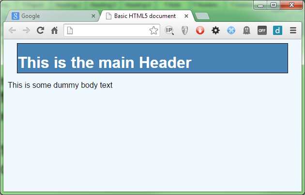
Consider the following HTML markup:
<div class="header"> <h1>This is the main Header</h1> </div> <p>This is some dummy body text</p> |
Code Listing 70a: HTML markup to demonstrate the calc function
It's not uncommon to see this type of pattern in most HTML documents, and generally you would mark up the header class so that the header has a fixed size that covers the intended document minimum width using a percentage value, maybe 75 percent.
body { background-color: aliceblue; font-family: sans-serif; } .header { width: 75%; height: 60px; background-color: steelblue; border: 1px solid black; color: white; } |
Code Listing 70b: Basic body and header rules
The basic rules in Code Listing 70b will give you the following:

- Basic rules applied to our header
Because we've used a percentage value for the width of the header element, it will always be set at 75 percent. That works fine, but what if we want to center the header? That’s not difficult, either. Add the following two lines to the .header rule in the basic styles:
margin-left: auto; margin-right: auto; |
Code Listing 70c: Additional rules to center our header
As expected, this centers our header.

- Our header is now centered
Unfortunately, we now have quite a bit of dead space at each side of the header, and because this is a percentage-based measurement, when this gets resized to the size of a wide screen monitor, the gaps will look huge, not to mention how cramped they might look on a mobile device.
You may decide to compensate by changing the percentage value. So you change it to 95 percent, 100 percent, or 98 percent. You might spend quite a few hours adjusting it and then testing it in all sorts of different screen sizes and on different devices, but no matter how hard you try, you just can't get it to look absolutely uniform on every possible device.
If only you had a way of saying, “I want my header to always be 100 percent in width, but to always have exactly 20 pixels worth of space on the left and the right, no matter how small or large my display is.”
This is exactly where the calc function comes into play.
If you want exactly 20 pixels at either side, then the total of that would be 40 pixels. If you then centered a 100 percent-width object and subtracted 40 pixels, that would give you exactly what you need.
Change the width rule in .header so that it reads as follows:
width: calc(100% - 40px); |
Code Listing 70d: Width rule now using calc to work out its width
When you render it, you should see the following:
- Our header with 20px on either side
Now, it renders with 20px either side, and it doesn't matter what the width is because the CSS engine will always know what 100 percent of the target width is, and so can do the math for us automatically.
Like counter(), you can use calc() anywhere you can use a straight forward number. A word of warning, though: not all the browsers implement it in all of the properties. From an implementation point of view, all the current browsers support it, but not all of them support it for things like color values or rotations.
The best place to check is Can I Use, which will list the current compatibility charts for all the new features as they are standardized. One useful trick to know is that you can often type something like “caniuse calc()” or “caniuse web fonts” into a Google search and get an instant link to the compatibility chart for the feature you'd like to learn more about.
Element Attributes
To round this chapter off, I'm going to introduce the ability to get at an element’s attribute in order to use it within the rules you’re using.
If you recall, earlier in the book I mentioned something called data attributes; one of the great things about data attributes is the ability to embed custom attribute data in an HTML 5 element and still have it validate.
The following HTML shows how this might be used:
<div class="header"> <h1 data-headersuffix=" (Hello)">This is the main Header</h1> </div> <p>This is some dummy body text</p> |
Code Listing 71a: HTML markup to demonstrate parent attributes
If you render this, you'll get exactly the same output as seen in Figure 97 (assuming you still have the same style rules present). If you don't have the same styles present or have started a new file, then you'll just get a plain black text on a white background.
The point here is that these extra data attributes will have no meaning on anything in the HTML or the CSS, and will be silently ignored.
This really comes in handy—especially for a lot of the JavaScript libraries available—because it means that an HTML developer can add custom attributes to a page, which the JavaScript code then later processes in some way. The Bootstrap UI framework makes extensive use of this facility so that the HTML developer creating pages never needs to know any JavaScript. He or she just has to describe what the intention is, and the Bootstrap library takes care of the rest.
Make sure your style file is the same as Code Listing 70b, and that you’re using the HTML code in Code Listing 71a. Render the HTML in your browser and make sure your output looks like Figure 95.
Now add the following extension rule to the style sheet (you should see the header text change to blue):
.header h1:after { content: " (Hiya)"; } |
Code Listing 71b: Extended header rule that puts “(Hiya)” after the header text
Render this and make sure that the header text now has “(Hiya)” appended to it. If it does, now change the rule so that it looks for the data attribute named headersuffix and uses the parameter from that as the source of its data.
.header h1 { color: attr(data-headersuffix); } |
Code Listing 71c: Extended header rule that uses the data attribute to set the text
The result should be that the header text is now extended using the contents of the custom data attribute present on the h1 element that the selector targets.

- Our header with the text from the data attribute
There is, unfortunately, some bad news. If you read the spec closely, you'll see that the ability to read parent attributes and place them into generated content fields was actually defined in CSS2.1, and the ability to use the attr() function to set properties, such as color, size, etc., was defined in CSS3. As a result, all major browsers can use attr() to set content in a :before or :after pseudo selector, but none of them as of yet have implemented them in a general property setting scenario.
This is not to say they won't; as many of you might know, the most popular features on the W3C standards track are the ones that developers request, and attr() is not getting much attention at the moment. There will come a day when this is finalized and the browser producers feel it's getting enough attention to actually finish implementing it. For now, it's only useable for content generation, despite what the documentation says.
It is useful for one scenario, however (and one I've previously used it for), and that's to append greetings onto headers and welcome banners that are localized for a given locale. Because the value is taken from an attribute, changing that attribute is very easy to do in JavaScript, as there are native calls to access data attributes.
Another place it becomes useful is in printing. If you have a style sheet that's used only when a page is printed, you can use this to grab the contents of an href from an anchor element, then print it out after the anchor tag. Doing this means that pages with links printed to a PDF or onto paper are still visible, while the ones on screen remain clickable.
Summary
In this chapter we've learned how to generate arbitrary content using nothing more than CSS rules, a task that previously required a large amount of JavaScript to get right. We've learned a bit more about how data attributes work and how we might use them to hold custom content.
In the next chapter we'll do a roundup of some of the things we didn't have space to cover, and a few of the smaller, new rules.
- 1800+ high-performance UI components.
- Includes popular controls such as Grid, Chart, Scheduler, and more.
- 24x5 unlimited support by developers.