
CSS3 Succinctly®

CHAPTER 5
Eye Candy
One thing that CSS3 has in abundance are ways to make things look pretty.
For developers (especially those who spend most of their time working server side), they might be wondering what all the fuss is about; we’re hired to produce software, and that's exactly what we're doing.
Unfortunately, on the client side and in the browser, things don't quite work that way. Those of our colleagues that don't understand what we do or how we do it love to see things that are flashy, colorful, and sparkly.
When they can see this type of progress, they gauge that visual feedback as proof that there is work being done on the application.
Chief among the things that the non-IT crowd likes to see are the staple eye candy diet of drop shadows and rounded corners.
I'm sure if you've done any serious CSS or design work in the past, you'll be more than familiar with the difficulty of having to use Photoshop to create partially-transparent PNG graphic files, which you then had to line up around the edge of a carefully placed div element.
If you were off by even so much as a pixel, you'd often have to do it all again from scratch, measuring things one pixel at a time and restricting page layouts to fixed sizes so things didn't break afterwards.
If you’re new to this game, then find any veteran of the web development industry and I'm sure that they'll have more than a few horror stories to tell you.
CSS3 solves all of this by adding the ability to define rules that state how rounded a corner should be now, and by allowing you to describe how a drop shadow should look. The CSS3 engine will then apply those instructions automatically to your HTML markup based on the selector rules you provide and workout where everything needs to be.
Rounded Corners
The web is square—or at least it was until very recently.
Until CSS3 came along, all we had were boxes with sharp edges. Div elements were always square and parallel, tables were square and parallel, and we couldn't make things look a little softer and friendlier (well at least not without a lot of image hacks).
To change this, CSS3 introduced the border-radius property on all block elements that can use a border.
Using it is simple.
Given the following HTML markup:
<div class="niceDiv"> <p>This is a nice div with no sharp corners</p> </div> |
Code Listing 61a: HTML markup to demo border radius
And this CSS rule:
.niceDiv { width: 100px; height: 100px; background-color: beige;7 padding: 4px; border: 1px solid black; border-radius: 5px; } |
Code Listing 61b: CSS rule to give rounded corners to the HTML in 51a
We get a very nice looking div element rendered in our browser:
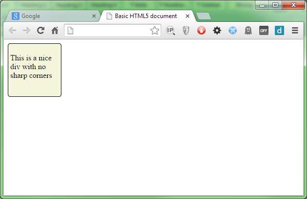
- Div with rounded corners
In the rule in Code Listing 61b, we've used the general default for border radius and just specified one value. When you define the rule this way, the same value is used for all four corners, so as you can see in Figure 58, each corner looks the same.
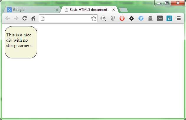
The value specified is how steep the angle of the curve will be; in our case, we've used 5 pixels. If you change it to 25 pixels, you should get something like Figure 59:
- Div with 25 pixel rounded corners
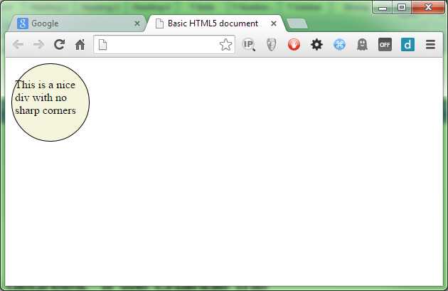
Because each corner is a quarter, and a quarter of a circle is 90 degrees, if we change the value to 90 pixels, we get a perfectly round circle.
- Div with 90-pixel, rounded corners
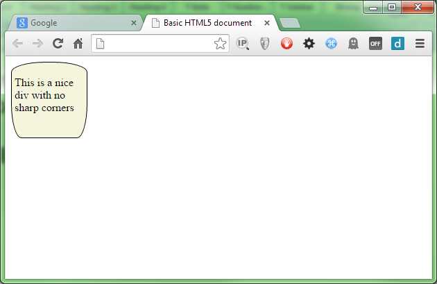
We've used the one value format in the demos above, but if you wish, you can also specify all four values (one for each corner), change the border-radius line in Code Listing 61b so that it looks like the following:
border-radius: 5px 10px 15px 20px; |
Code Listing 61c: Altered border radius line for Code Listing 61b
When rendered, you should get a div with four different-sized corners:

- Div with four different size corners
The first value is the top-left corner, followed by the top-right corner, then the bottom-right corner, and finally the bottom-left corner.
If you wish to, you can also use four different rules and write out the size specifications as follows:
border-top-left-radius: 5px; border-top-right-radius: 10px; border-bottom-right-radius: 15px; border-bottom-left-radius: 20px; |
Code Listing 61d: The changes from Code Listing 61c written out
How you choose to do it is entirely up to you; some people like the verbosity of doing things the long way, and to be honest, I find that during development it helps maintain the code. However, when you ship to production, you really want to make these things as small as possible.
A good CSS squisher is a must for optimizing your style files, especially if you do use the long form during development.
Note: Minifying CSS—Minifying is the process of making a file smaller than it is without losing any of its original intent. Unlike a compressed or zip file, a minified file still operates in the manner that it was originally intended—it's just become a lot smaller and more compact. Having a good minifier to squash your files down is a must for web development. One of the biggest speed-ups you can have when your site is being loaded, is for your styles, code, markup, and images to be as small as possible and as few as possible.
There a plethora of tools available to do help you do this. A good place to start is with the Grunt Task Runner. Grunt has a large number of modules for squashing CSS, JavaScript, images, and even HTML, allowing you to shave off precious bytes everywhere you can. Knowing how to use these tools is a very important skill for any web developer.
You don't just have to give one angle for each corner either. If you do, then the same angle will be applied on both sides, giving you a uniform and equal circle-based curve.
If you specify two values on each corner, you then get to use an ellipse to shape the border’s curve radius. Doing this gives you some interesting possibilities.
Change your border radius rules to read as follows:
border-top-left-radius: 50px 15px; border-top-right-radius: 50px 15px; border-bottom-right-radius: 15px 50px; border-bottom-left-radius: 15px 50px; |
Code Listing 61e: Border Radius rules extended to show ellipse-based curves
You should end up with something that looks like Figure 62:
- Our div with ellipse-based corners
Drop Shadows
Creating drop shadows is another easy bit of eye candy to master, and it can produce some interesting effects.
Drop shadows are created by using the box-shadow rule, which takes four integer measurements and a color value.
Of the four measurements that are provided, only the first two are required; the remaining two will default to browser defaults if left out.
The first two measurements are the offset x and offset y values, which as the names suggest, set the distance from the element that the shadow protrudes. If positive values are supplied, then the shadow protrudes from the bottom right; if negative values are used, the shadow protrudes from the top left. To get the shadow on other corners, you mix positive and negative offsets as required.
Create an HTML 5 document and add the following markup (or reuse the code from the previous section on border radius, but repeat it four times):
<div class="niceDiv"> <p>This is a nice div with drop shadows</p> </div> <div class="niceDiv"> <p>This is a nice div with drop shadows</p> </div> <div class="niceDiv"> <p>This is a nice div with drop shadows</p> </div> <div class="niceDiv"> <p>This is a nice div with drop shadows</p> </div> |
Code Listing 62a: HTML markup to demo drop shadow
Create the following style rule as a basis for the rest of this section:
.niceDiv { width: 100px; height: 100px; background-color: beige; padding: 4px; border: 1px solid black; display: inline-block; margin: 15px; } |
Code Listing 62b: CSS rule to style the HTML in 62a
This will give us the default beige div you saw in the last section, with no additional styling.
Note: You've seen many instances so far where rules cascade down from less-specific rules above them. This is one of CSS3’s (and previous versions) greatest features, which I've not gone into too much detail about. In the previous section we added the border radius directly too the 'niceDiv' rule; in this section I'm going to start using cascading more to keep the base styles (in this case our beige rectangle) separate from the rules we’re currently exploring. You can use the same selector as many times as you like, and the effect will always be cumulative. For example, if you specify '.niceDiv' and '.niceDiv .shadow', you then always have the option to use the base styling by specifying a class of 'niceDiv' to the element, and optionally applying the shadow by adding that to the class list as a secondary ID. There's nothing wrong with breaking things up into groups by repeating class and ID selectors if you wish, but if you do this, make sure you remember the rules of specificity and order things correctly.
As with the previous examples, we'll render this first, so you can see what it looks like before we start.
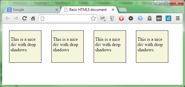
- Drop shadow divs before styling
Once we have that working, we'll create some sample rules to apply different drop shadows to our elements.
.niceDiv.topLeftShadow { box-shadow: -10px -10px; } .niceDiv.bottomLeftShadow { box-shadow: -10px 10px; } .niceDiv.bottomRightShadow { box-shadow: 10px 10px; } .niceDiv.topRightShadow { box-shadow: 10px -10px; } |
Code Listing 62b: CSS rule to apply different shadows to the HTML in 62a
Now we need to make a small alteration to the HTML, and add each of the new class names topLeftShadow, bottomLeftShadow and so on one to each div in the HTML in Code Listing 62a, as follows:
<div class="niceDiv topLeftShadow"> <p>This is a nice div with drop shadows</p> </div> <div class="niceDiv bottomLeftShadow"> <p>This is a nice div with drop shadows</p> </div> <div class="niceDiv bottomRightShadow"> <p>This is a nice div with drop shadows</p> </div> <div class="niceDiv topRightShadow"> <p>This is a nice div with drop shadows</p> </div> |
Code Listing 62c: Adding the four drop-shadow classes to our divs
Just in case you're wondering what's going on here, we’re using the cascading nature of CSS to our advantage so that we don't have to type out the basic beige div style four times in each of the four rules; doing things this way means less typing and better re-use.
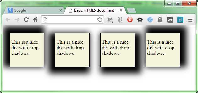
If we re-render that, you should now see that we have four default, blocky drop shadows for each of the directions on each of our div elements.
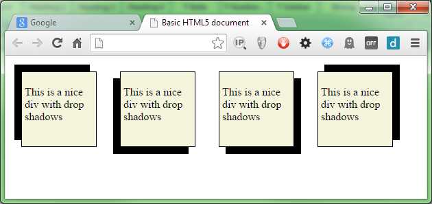
- Our div elements with default drop shadows
The default settings for drop shadows, however, are very bold and solid; changing this is where the remaining two optional measurements come into the equation.
The first value is the blur radius; you can't use negative values on this, but any positive values you supply blur the shadow out further and further, giving a much softer appearance with each increasing value.
Change the rules in Code Listing 62b as follows:
.niceDiv.topLeftShadow { box-shadow: -10px -10px 5px; } .niceDiv.bottomLeftShadow { box-shadow: -10px 10px 5px; } .niceDiv.bottomRightShadow { box-shadow: 10px 10px 5px; } .niceDiv.topRightShadow { box-shadow: 10px -10px 5px; } |
Code Listing 62d: CSS rules changed to blur the shadows
The re-render your test HTML document, you should now see the shadows become slightly softer.
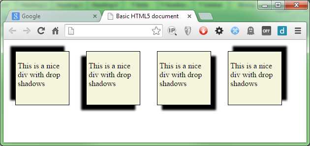
- Our div elements with a small blur added
The larger you make the blur, the softer the shadow’s edge will be.
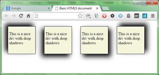
- Our div elements with a 30px blur radius
The fourth parameter controls how much the blur spreads away from the edge, and is called the spread radius.
If we add 10 pixels onto the blur radius, our shadow will grow to a total of 20 pixels (we already have a 10-pixel offset), but the final 10 pixels will be used for the blur and its associated fadeout. Change the shadow rules as follows:
.niceDiv.topLeftShadow { box-shadow: -10px -10px 30px 10px; } .niceDiv.bottomLeftShadow { box-shadow: -10px 10px 30px 10px; } .niceDiv.bottomRightShadow { box-shadow: 10px 10px 30px 10px; } .niceDiv.topRightShadow { box-shadow: 10px -10px 30px 10px; } |
Code Listing 62e: CSS rules changed to blur the shadows
Then re-render, and you should get some very large, very fuzzy shadows with very soft edges:
- Our div elements with an optional spread radius applied
Getting the right-looking value for the optional values can be very much a case of trial and error, but generally, the larger the spread radius, the more space the blur has to fade things out, and so can make a smoother transition.
Note: If you have some specific Z-ordering (that is, if you’re using div layers), then it is possible to cast a shadow onto sibling elements. For this reason it's usually better to try and keep drop shadows as low in the stack of elements as possible, or size the blurs and offsets so that things stay within any margins you have defined on the element.
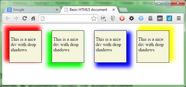
The final value is the color value, and like any other color property on an element, this can take any standard color value. For now we'll just use the standard 6-digit # symbol way of specifying color, as we'll be taking a closer look at defining colors in the next chapter.
Alter your rules so that they look as follows:
.niceDiv.topLeftShadow { box-shadow: -10px -10px 20px 5px #FF0000; } .niceDiv.bottomLeftShadow { box-shadow: -10px 10px 20px 5px #00FF00; } .niceDiv.bottomRightShadow { box-shadow: 10px 10px 20px 5px #0000FF; } .niceDiv.topRightShadow { box-shadow: 10px -10px 20px 5px #FFFF00; } |
Code Listing 62e: CSS rules changed to color the shadows
When the HTML is reloaded, you should see your shadows are now much brighter, more colorful, and nicer looking.
- Our shadows are now much more colorful
You can make the shadow appear inside the element (rather than outside as we have been doing) by specifying the optional inset keyword on the rule. If you use inset, however, you must supply it before any values. Alter our rules one last time:
.niceDiv.topLeftShadow { box-shadow: inset -10px -10px 20px 5px #FF0000; } .niceDiv.bottomLeftShadow { box-shadow: inset -10px 10px 20px 5px #00FF00; } .niceDiv.bottomRightShadow { box-shadow: inset 10px 10px 20px 5px #0000FF; } .niceDiv.topRightShadow { box-shadow: inset 10px -10px 20px 5px #FFFF00; } |
Code Listing 62e: CSS rules changed to inset the shadows
And re-render to see the effect.
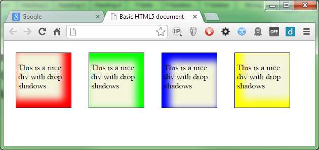
- Our div elements with inset shadows
Drop shadows on text
CSS3 also supports adding drop shadows to regular text elements. When you do this, the shape of the shadow will follow the shape of the text rather that it just being the outline of the element’s border.
The difference here is that while the parameters are the same (more or less), they are specified in a much different order to the parameters for box-shadow.
When specifying a text shadow, the rule is laid out as follows:
text-shadow: <color> <offsetx> <offsety> <blurRadius>
Text shadows don't support spread radius, and the color has to come first in the list rather than last.
By way of a quick example, add the following HTML to your document:
<h1>Drop Shadow Text</h1> |
Code Listing 63a: HTML to demo drop shadow text
Then add the following style rule:
h1 { text-shadow: red 10px 10px 10px; } |
Code Listing 63b: CSS rule to add a drop shadow to our text in code 63a
You should end up with something like Figure 70:
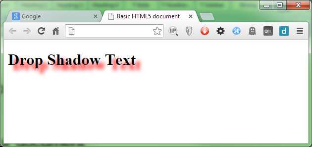
- Text with a red drop shadow
The parameters work the same way as for the box shadow, so we'll not go into any lengthy descriptions; instead, I'll leave it as an exercise to the reader to experiment.
The last thing you need to know about both shadow rules is that you can add multiple shadow declarations to an element, separated by a comma.
When you do this, the effect will be a cumulative one, and any shadows that overlay each other will be drawn front to back in the order they are specified in the CSS rule. This can be used to create some rather strange halo-like effects around elements. Remember, however, to use them sparingly: even though browsers these days might be getting faster, effects like this still take power and CPU energy to draw, and a mobile device user might not thank you for draining their device battery all in the name of looking pretty.
Graduated Fills
I'm sure that at some stage in your development of HTML documents you’ve come across the need for a graduated fill of some description in the design of a page.
It could be a subtle change in color, or a very bold change in a short amount of space. A correctly used graduation of color can make a lot of difference.
As with many graphical effects, in the past you would generally have resorted to an image-editing package such as Photoshop to create the color graduation. Then you would have applied the resulting graduation as a background image and repeated it as needed to cover the full size of the element you were targeting.
With CSS3 you can now use a gradient fill type to create color ranges on the fly without ever using an image editor ever again.
Notice in the previous paragraph I called the gradient fill a “type.” Unlike everything we've seen so far, graduated fills are not a rule all of their own, as shadows and curved borders are. They are in fact a type of image that the CSS engine creates for us, and are typically (but not always) used with any rule where you might normally specify an image.
This means that you don't have rules in your style sheet called gradient rules; instead, you create CSS rules for a given target using normal CSS properties such as color, background-color, background-image, and many others. Then you replace or override all or part of the rules already defined with the areas you wish to apply a gradient to.
This is important for backward compatibility, because it means that you'll always have a fall back, which means CSS color gradients are one of the many new things you can use without having to do anything too special to support older browsers.
In typical usage, you would create your rule (remembering specificity order) to style an element in a way that looks good for the older browsers. Then you'd either add class-specific selectable rules to extend the original rule, or you'd add the gradient generators towards the bottom of the rule in question after the basic properties had already been set.
Producing gradients in this manner allows the CSS engine in your browser to do all the hard work for you, meaning no polyfills or JavaScript hacks to provide backwards compatibility.
Now that you know the basics, let's see how we can apply it.
First we need some HTML markup to play with, so let's create a simple, single div and put it in an HTML document.
<div class="gradDiv"> <p>I'm a div with a gradient</p> </div> |
Code Listing 64a: HTML for our graduated fills
Let’s also define the following rule as a starting point to experiment with:
.gradDiv { width: 200px; height: 200px; background-color: salmon; padding: 4px; border: 1px solid black; display: inline-block; margin: 15px; } |
Code Listing 64b: Basic style for our graduated div
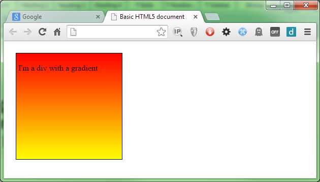
The initial render of this should look as follows:
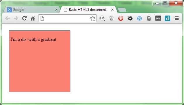
- Our un-graduated div element
Gradients come in three types: linear, radial, and repeating, each with its own syntax and format.
Note: Until quite recently, many of the major browsers used vendor prefixes to define things like gradients. Thankfully, all of them now support un-prefixed versions of gradient fills, and each browser has settled on using a standard syntax. If you’re tasked with supporting older browsers (and by older here I mean moderately old: IE9, FF20, etc.), then you might find that you need to specify gradient fills (and for that matter, other CSS3 features, too) more than once, and in several different forms. Throughout this book, I'm keeping to properties and functionality that can be used in an un-prefixed manner to keep things simple. Gradient fills have one extra bite that you need to watch for: the actual syntax to specify a fill is drastically different between the different prefixed versions, and only standardised non-prefixed versions.
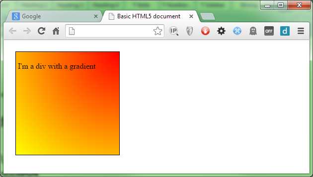
We'll start with the simplest of these, a linear gradient.
Add the following to your style file (but don't replace the rule we already defined):
.gradDiv { background-image: linear-gradient(red, yellow); } |
Code Listing 64b: Extension to the style for our graduated div
When you render that in your browser, you should see it change to:
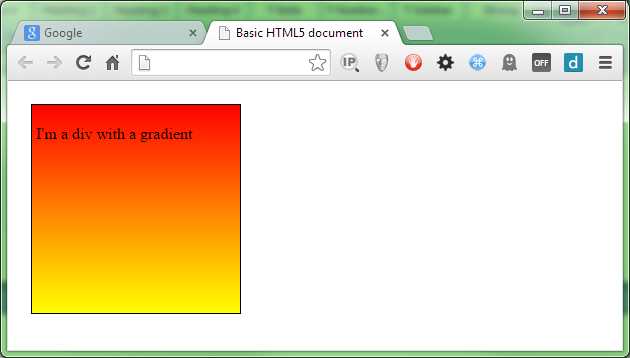
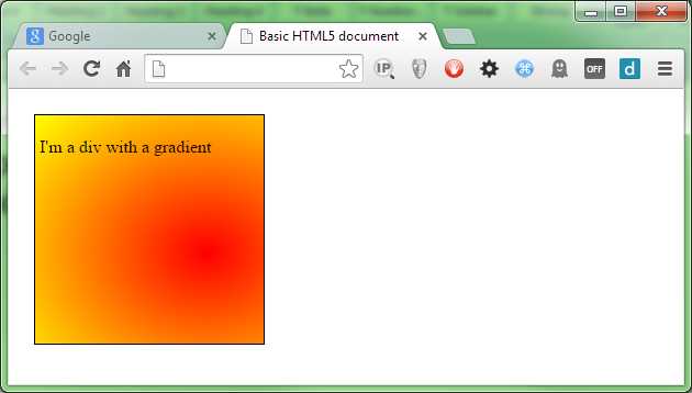
- Our first graduated div
As you can see, the linear gradient is very simple to use. We've told the CSS engine to start at red and end at yellow, and it does just that, creating an equal gradient across the entire size of the target element.
We can also change the direction by using the to keyword. Change the rule in 64b so that it reads as follows:
.gradDiv { background-image: linear-gradient(to left, red, yellow); } |
Code Listing 64c: CSS rule with a direction change
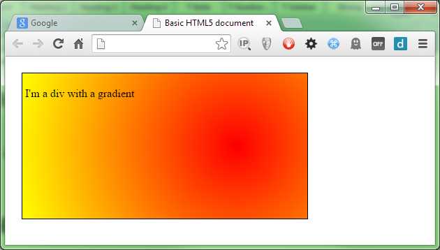
When we refresh the HTML, we should find that our gradient now starts at the right and goes toward the left.
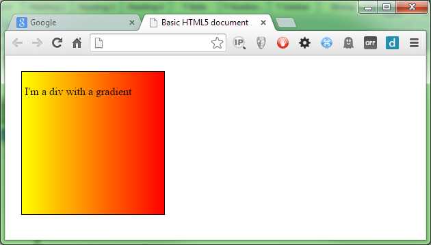
- Our gradient now runs right to left
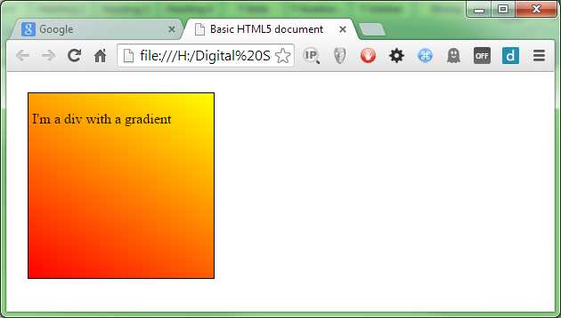
You can combine the directions such that you can have “to top left” or “to bottom right,” allowing you to graduate from corner to corner rather than just top to bottom or left to right.
You can also provide an angle. For example:
.gradDiv { background-image: linear-gradient(30deg, red, yellow); } |
Code Listing 64c: CSS rule with a direction change
This will give you a gradient traveling from red to yellow at an angle of 30 degrees of the 0 axis.
- Our gradient at 30 degrees
Note: Depending how far back you need to support, you might still need to use vendor prefixes. I’ve noted that the vendor-prefixed versions use different syntax to specify the gradients. What I haven't yet mentioned, however, are how the rotations are calculated. Standard syntax sees 0 degrees at the middle bottom of the target element, with positive increments from 0 to 360 degrees traveling clockwise. You can see this in the 30 degree rotation in the previous example as the red starts from the lower-left corner. In the browser-prefixed versions, two different schemes were used—the standard as it is now, and one where 0 degrees was middle right with positive rotations going counterclockwise from 0 to 360.
Linear gradients can also contain more than two colors; in fact, they can contain as many colors as you want. Remember those rainbow-colored backgrounds folks used to be so passionate about? Try the following extended CSS rule.
background-image: linear-gradient(red, orange, yellow, green, blue, indigo, violet); |
Code Listing 64d: CSS rule with distinct rainbow
Rendering that in your browser might just hurt your eyes!
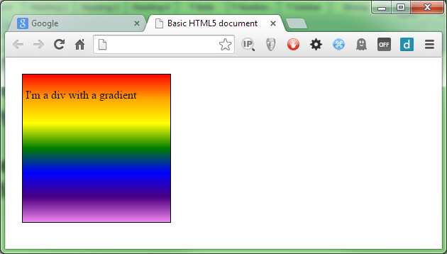
- Our div now looks like a rainbow
You'll notice that the color spread is still evenly distributed across the height of the element. We can change that easily using color stops.
If you've ever used an image editor like Photoshop or Gimp, then you'll most likely know what color stops are. They are set values that tell the graphics engine to change color at a given point in the scale.
To demonstrate what I mean, change your extension rule so it reads as follows:
.gradDiv { color: white; background-image: linear-gradient(black 0%, black 20%, green 30%, black 40%, black 100%); } |
Code Listing 64e: CSS rule now using color stops
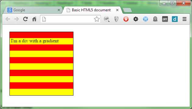
You should find that when you render your HTML now, you have a black background with a graduated green bar across it.
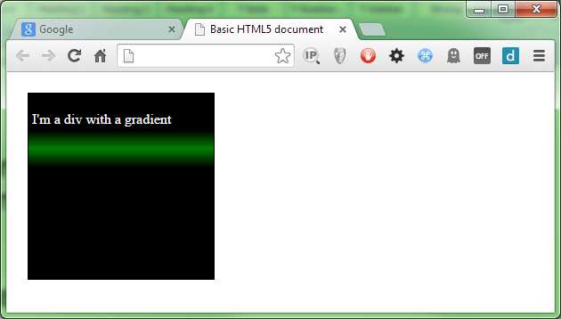
- Our div now looks rather dark
You can specify the stops using any value type you like, but for ease of reading I would recommend you stick to percentage values, especially if you need to finely control the values as I've done in Figure 76.
Radial Gradients
Like linear gradients, radials start at a defined point (usually the center of the element) and produce the color graduation in an outward motion. They also take the same set of color settings (and color stops) as linear gradients do.
Starting with a simple example (and re-using the HTML from the previous section), change your CSS rule as follows:
.gradDiv { background-image: radial-gradient(red, yellow); } |
Code Listing 65a: our CSS rule altered to be a radial gradient
This should produce the output shown in Figure 77:
- We've changed the gradient to a radial one
Just as with the linear gradient, we can change the start position. So, for instance, we could easily start the graduation from the upper-right corner by doing the following:
.gradDiv { background-image: radial-gradient(at top right, red, yellow); } |
Code Listing 65b: Radial gradient changed to the top right
This gives us the following:
- Radial gradient coming from the top right
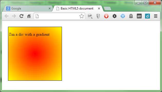
You can also supply an x and y offset using any valid CSS value. Using percentages here is interesting because you can make positional radials that are dependent on the size of the target element. In the following rule we’re starting 75 percent along the x-axis (0 is left) and 60 percent down the y-axis (0 is top).
.gradDiv { background-image: radial-gradient(at 75% 60%, red, yellow); } |
Code Listing 65c: Radial gradient changed to 75% X and 60% Y
Rendering this should give you something like the following:
- Our div with a gradient centered at 75% by 60%
If you've been looking closely at the rendered output, you may have noticed that the actual gradient is quite circular.
By default the CSS3 engine produces radial gradients with an elliptical shape rather than a balanced, circular shape.
If you need your radial gradient to be circular, then you can force the CSS3 engine to produce circular gradients by using the circle modifier as follows:
.gradDiv { background-image: radial-gradient(circle at 75% 50%, red, yellow); } |
Code Listing 65d: Applying the circle modifier to our rule
You might not be able to tell the difference here if you’re using the 200px by 200px element we've used so far, so you may want to try changing the width in the parent rule to something like 400px, and then try rendering with and without the circle modifier applied.
At 400 by 200 with the circle modifier applied, you should see something like this:
- Our gradient with the circle modifier applied
There are other modifiers that you can add too; these are mostly used to control things based on width. For example, if you have a short and wide element, and you’re specifying the circle modifier, then the largest color range will be along the longest edge. This means that from top to bottom you may only see your start color, but the full fade will be visible across the width. To combat this, one of the modifiers you can supply is closest-side, which will force the majority of your gradient into whichever side dimension is the smallest while letting the graduation run out early across the wider side. As with all of the different settings available, you can find these listed along with their explanations on the Mozilla developer network.
Repeating Gradients
The syntax for repeating gradients is identical to that of a linear gradient, the only difference is that you specify them using repeating-linear-gradient rather than just linear-gradient. However, there is a caveat that you need to watch out for, and that is you MUST supply your colors with color stop values.
If you try to specify a repeating gradient by just supplying non color stop values, you'll simply end up with something that just looks like a standard linear gradient for example
.gradDiv { background-image: repeating-linear-gradient(red, yellow); } |
Code Listing 66: A repeating linear gradient
This will produce the following image:
- Our repeating gradient doesn't work correctly
If we alter the gradient fill so that it looks like this:
.gradDiv { background-image: repeating-linear-gradient(red 0%, red 10%, yellow 10%, yellow 20%); } |
Code Listing 67: A repeating linear gradient that works correctly
You'll find that when you render it, you get the following:
- Our gradient now repeats
What's happening here is quite simple: we start at 0 percent and make sure we have red to 10 percent, and then we start yellow at that 10 percent mark and end it at 20 percent.
The CSS3 engine looks at the rule and sees that it runs out of color 20 percent into the element width, and so it repeats the first 20 percent to fill in the remaining 80 percent.
So does this mean we can never use 100 percent of our graduation to repeat? No, not at all; while the 100 percent width in our examples has been the width of the element, the calculations for the gradient are actually the width of the background.
In CSS3, you can now set the size of your background using the background-size rule.
The relevance to what we do here is that if we set our background size to 10px by 10px, then as far as our repeating gradient is concerned, that 10px would be 100 percent of the size. If that 10px by 10px background was then applied to a 200px by 200px element, the background would repeat 20 times in the X and Y directions unless otherwise instructed.
The only reason we see 100 percent as the width of the element in our examples is because we’re leaving the background width and height at the default, which happens to be 100 percent of the target element.
With that in mind, wherever you end a color stop, your repeating gradient will repeat within itself. This means that if you are resizing the background, you need to make sure that any color stops you make repeat also repeat across tiled image boundaries—unless misalignment is what you’re aiming for.
Summary
In this chapter, you've seen some of the eye candy that CSS3 introduces. Next, we'll look more closely at the different ways of specifying color in CSS3 and learn about some of the things we can now use, such as alpha channels.
- 1800+ high-performance UI components.
- Includes popular controls such as Grid, Chart, Scheduler, and more.
- 24x5 unlimited support by developers.