
BI Solutions Using SSAS Tabular Model Succinctly®

CHAPTER 5
Exploring the Data Model with Power View
In the previous chapters we learned how to design, develop, and deploy a data model using SSAS tabular model. In this chapter, we learn how to explore the data model using a reporting tool introduced in SQL 2012: Power View. Power View is a new, Silverlight-based ad hoc reporting tool with a rich set of visualizations useful for data exploration and analysis.
When Power View was introduced with SQL 2012, it was only available in the SharePoint Integrated Mode supported by SharePoint 2010 and SharePoint 2013. With the introduction of Excel 2013, Power View (and PowerPivot) is now natively integrated in Excel as a COM add-in, and is available for reporting. An Excel 2013 worksheet with a Power View report can be uploaded to a SharePoint 2013 document library, and can be rendered by Excel Services (Excel Web app) with SharePoint in the browser as well.
The interfaces for Power View in SharePoint and Excel 2013 are similar. In this chapter, we will be designing Power View reports using Excel 2013, but most of the steps discussed here also hold true for SharePoint.
Creating a connection to the data model in Excel 2013
The first step in designing reports is always creating a data connection to the model. In Excel 2013, we click on the Data tab in the toolbar and select Analysis Services from the Other Sources button as shown in the following figure.
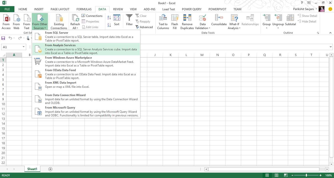
- Connecting Excel to Analysis Services
In the Data Connection Wizard, we provide the SSAS instance name under the Server Name and use Windows authentication. On the next screen, we select the database from the drop-down list and select the cube or perspective from the data model we intend to connect to, as shown in the following figure.
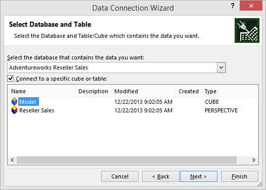
- Connecting to a cube
The final screen of the wizard is used to provide the file name, location for the .odc file, and a brief description about the data model. We can also choose the authentication settings to be used if the Excel file is uploaded in a SharePoint document library and is to be viewed in a browser using the Excel web app.
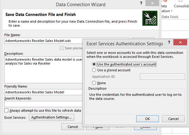
- Setting up authentication details
When we click Finish, we have the option to import the data model to an Excel workbook. Prior to Excel 2013, we only had the option to create a PivotTable or PivotChart report. With Excel 2013, we also see the Power View report option. Select Power View as shown in the following figure.
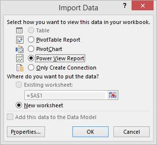
- Creating a Power View report in Excel
We can click the Properties button to modify the data refresh settings, which specify when to refresh the data in the Excel worksheet, and other OLAP settings in the Usage tab. In the Definition tab, we see the connection string, which we specified earlier.
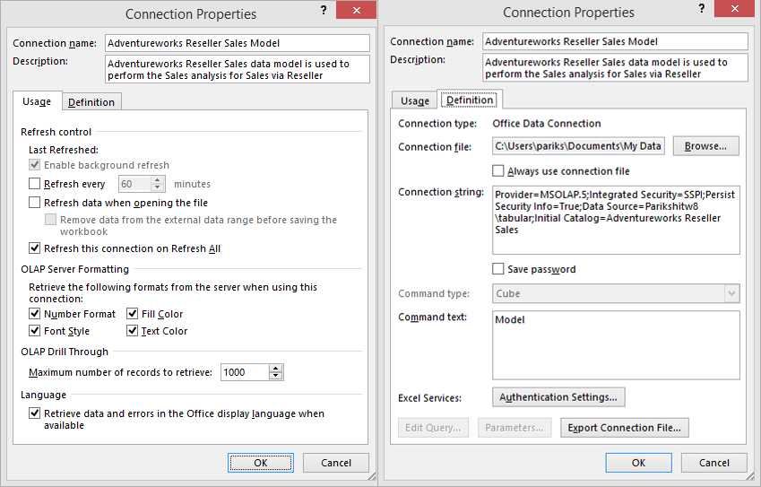
- Connection properties
Click OK to close the Properties window, and then click OK again with the Power View Report option selected to create a Power View report in a separate worksheet as shown in the following figure.
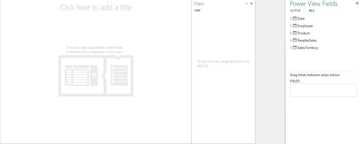
- New Power View report
For Power View in SharePoint, we need to create a BISM connection file, which again defines the connection string to the data model.
Power View visualization
Power View is designed to be highly intuitive with rich visualizations such that users should be able design a report with a few clicks, and the data format itself should identify the best visualization available to represent it. This is possible only if we set the right properties, including the default field set, table behavior, format, summarize, and data category, which we discussed in Chapter 4.
In the following sections we discuss all the visualization options available with Power View, and which data type best fits each visualization.
Visualizing data with tables in Power View
One of the simplest and most essential data visualization tools in reporting is table visualization, since most structured data can be best analyzed and interpreted in tabular format. By default, Power View represents most data types in tabular format, which we can later switch to other visualization methods if required.
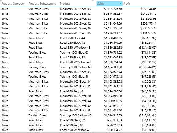
In order to visualize the data, we first need to select the data in an order from the field list on the right side of the Power View report. First, we select the Products hierarchy followed by the Sales and Profit measures as shown in the following figure.
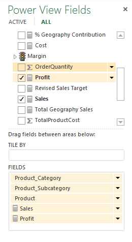
- Selecting data to visualize
The resulting table report in the Power View workspace window appears as shown in Figure 122.
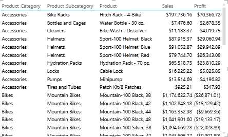
- Table visualization in Power View
By default, table visualization sums up the rows and displays the total at the bottom of the table as shown in the following figure.
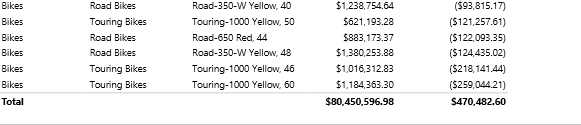
- Summary rows in table data visualization
If we don’t want the total in the report, we can open the Design tab on the ribbon, click Totals, and select None.

- Turning off totals
If we need to sort the table based on any column, we click on the column header, which sorts the table in ascending order. Clicking on the column header again sorts the table in descending order.
- Sorting a column
We can also represent KPI data, which is a common requirement for dashboard reporting.
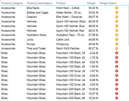
- KPIs in a Power View table report
Visualizing data using matrix in Power View
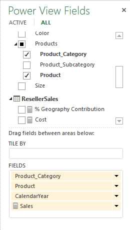
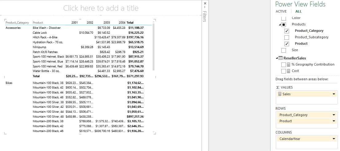
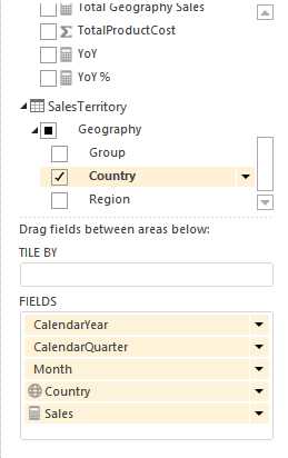
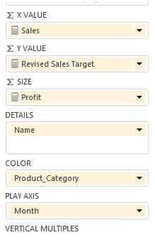
Matrix visualization is another popular visualization method for analyzing measures across multiple dimensions using row grouping and column grouping. To use it, we begin by selecting all the data fields we would like to visualize in the matrix from the field list.
- Selecting data to visualize
As we learned earlier, selecting data from the field list creates a tabular report by default. To switch to matrix visualization, select the table, open the Design tab in the ribbon, click Table, and select Matrix.
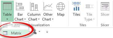
- Matrix visualization option
Switching to the matrix visualization puts the measures in the Values area of the field list, and all the dimension columns in the Rows area. We now move CalendarYear to the Columns area to form a matrix report, as shown in the following figure.
- Matrix report in Power View
By default, Power View summarizes measures across the rows and columns to calculate the row totals and column totals, which are represented in bold, as shown in the previous figure. We can turn off the row total, column totals, or both using the Design tab and Totals tab as described previously.
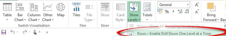
If we need to enable drill-down in the row hierarchy to initially hide the child levels, we can click the Show Levels button in the Design tab and select Rows – Enable Drill Down One Level at a Time as shown in the following figure.
- Hiding child levels initially
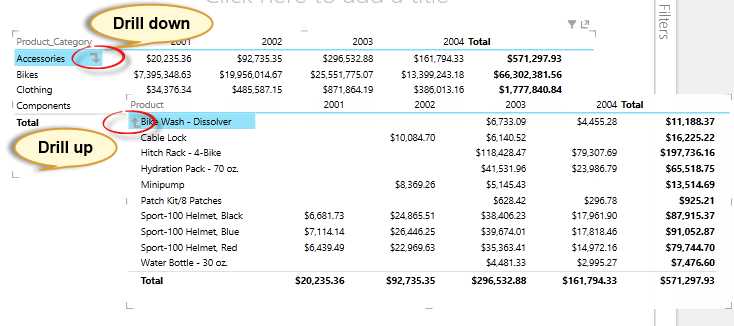
This will create a drill-down report which is initially collapsed, hiding all the child levels of the hierarchy. In our matrix report, initially we only see the Product Category at the row level. When we click on the Accessories value, we see a drill-down arrow, as shown in the following figure. When we click on the arrow, the data is drilled to the child level, the Product level in our case, with a drill-up arrow to allow us to drill back up to the parent level.
- Drill-down and drill-up options
Visualizing data with cards in Power View
Card visualization is a unique and innovative visualization useful for visualizing related data, attributes, or properties of an entity. For example, employee name, age, gender, and marital status fields can be represented together in a card. Similarly, product name, weight, size, color, and photo can be visualized in card format, which can appear as a catalog in the report.
To use the card visualization, we first select all the fields from the field list we would like to see in the card view.
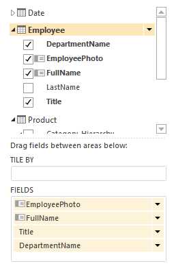
- Field list
Next, we open the Design tab on the ribbon, click the Table item, and select Card.
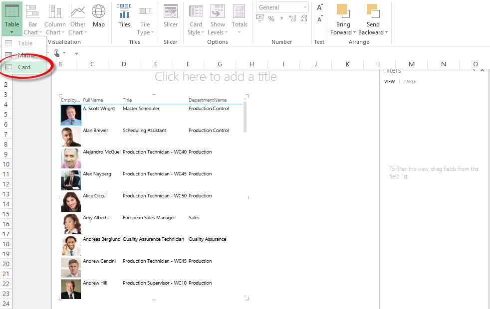
- Selecting the card visualization
In the card visualization, the data is represented as shown in the following figure:

- Card visualization
If we need to call out these fields in the report, we can switch the card style to callout mode by clicking on the Card Style button in the Design tab and selecting Callout as shown in the following figure.
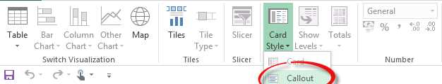
- Changing the card style to callout mode

- Card visualization with callout mode enabled
Visualizing data using charts in Power View
Power View provides a rich set of chart visualization tools ranging from column charts and bar charts to scatter charts. Different charts are useful for analysis and comparison of data across different dimensions. In this section we will explore the various chart visualization methods available.
To start, we select all the fields we need to visualize from the field list as shown in the following figure.
- Selecting fields to chart
We switch to a Stacked Column chart in the Design tab in as shown in the following figure.
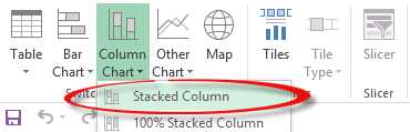
- Selecting a stacked column chart
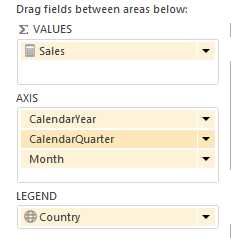
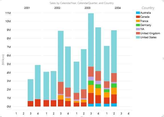
We drag the Year, Quarter, and Month fields into the AXIS box and set the LEGEND option to Country as shown in the following figure.
- Setting axis, legend, and values fields for the chart
The resulting graph is shown in Figure 140.
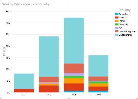
- Stacked column chart in Power View
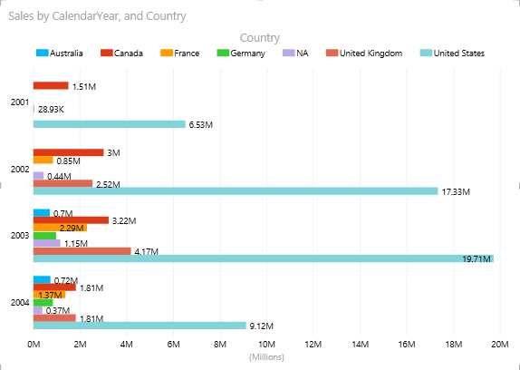
In the horizontal axis, we have a hierarchy of Year, Quarter, and Month; however, by default we can only visualize the parent level. In order to drill down to the quarter level, we need to double-click on a column bar. When we double-click on the 2003 column bar, we see the following graph.
![]()
- Drilling down in the 2003 column (drill-up arrow circled)
The data is now distributed across quarters for the year 2003. We can drill up by clicking the arrow circled in the previous figure. We can further drill down to the month level by double-clicking on a quarter’s column bar.
In this representation of data, we can compare sales across members in the same level of the hierarchy. For example, we can use column charts to make a comparison across years or quarter levels in a given year, but we cannot compare quarters from different years.
If we need to compare the sales across quarters of different years, we can move the Calendar Year to the Horizontal Multiples section as shown in the following figure.
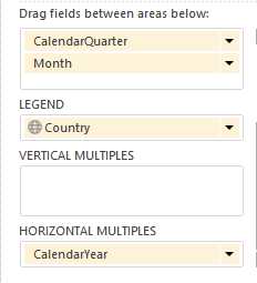
- Reorganizing the column chart
The resulting graph is displayed in the following figure.
- Comparing quarters between years in a column chart
If we need to turn the legends off, change the position of the legend, or turn on data labels, we can do it from the Layout tab at the top.
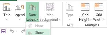
- Enabling data labels
If we are not concerned with the absolute sales but want to visualize the contribution of each country to the sales for each quarter, we can switch to a 100% stacked column chart to compare the relative contribution from each country. The resulting graph is:
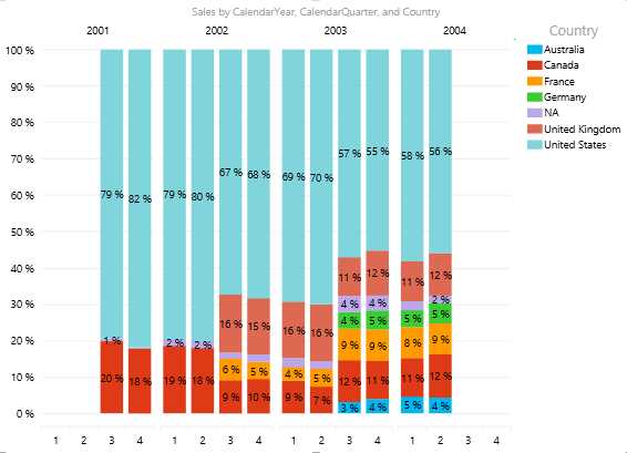
- 100% stacked column chart
This chart explains that the rise in sales in 2003 is due to added contribution from certain countries including Germany, Australia, and France to the overall sales.
We can switch to a clustered column chart, which is less compact since it moves the legends to the top to save some horizontal space, but can be useful for relative comparison of absolute sales across each country. To move the legend to the top, click the Layout tab, click Legend, and select Show Legend on Top.
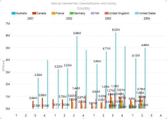
- Legend set at top of chart
From the graph in Figure 146, we understand that the sales are observed to be high in Q3 for the United States with the highest sales in Q3 of 2003.
Similar to the column chart, we have horizontal bar charts available, namely the stacked bar chart, 100% stacked bar chart, and clustered bar chart. The same information we charted with the column charts is shown in the following figure as a bar chart.
- Bar chart
If we observe the same information in bar format, we see that it appears less cluttered than the column format. The bar chart is easier to use for visual comparisons.
Similarly, if we need to study the trend of the sales, cost, and profit values over the months for the various product categories, we can use a line graph with the fields shown in Figure 148.
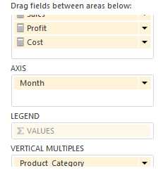
- Selecting fields for a line chart
- Line chart
This chart shows interesting statistics for bikes; even though the Bikes chart shows good sales from May to August, the cost for bikes is also higher during this period, which explains the loss for this product category. The line graph is popular for similar trend analysis and charting reports.
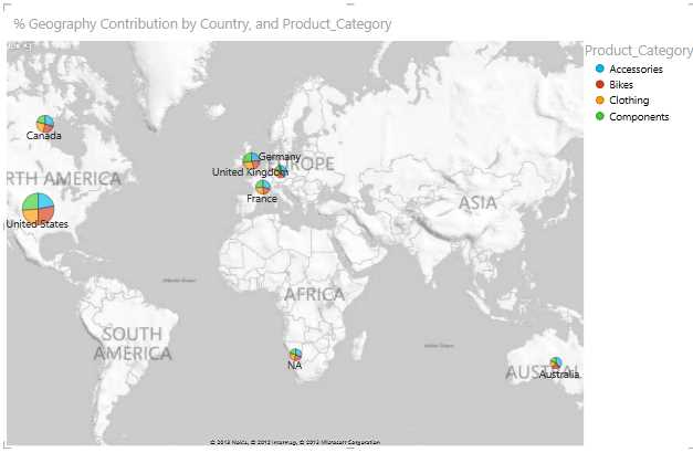
Pie charts are another graphic tool useful for analyzing the share or contribution of each sector to the total. While designing the data model, we created a calculated measure for % Geography Contribution to measure the contribution of each region to the total sales. This measure can be best represented in a pie chart.
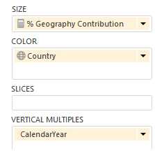
- Selecting the measure to chart in a pie chart
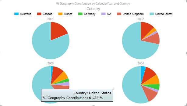
- Pie chart
Currently, one of the major limitations of pie charts is their lack of data labels.
One of the most impressive chart visualization tools, the bubble and scatter graph, allows us to measure data simultaneously across multiple dimensions or axes. Consider a scenario where we need to measure the sales, sales target, and profit trend month-on-month from each employee of AdventureWorks in various product categories. Here, we need to slice and dice the Sales, Sales Target, and Profit measures across the Employee, Date, and Product dimensions simultaneously. We can achieve this using the bubble and scatter graph as shown in the following figure.
- Selecting fields to chart in a bubble and scatter graph
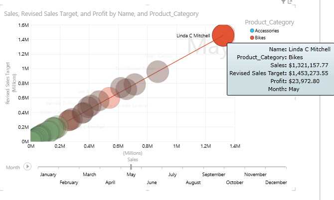
- Bubble and scatter graph
In a scatter chart, the x-axis displays one numeric field and the y-axis displays another, making it easy to see the relationship between the two values for all the items in the chart.
In a bubble chart, a third numeric field controls the size of the data points. To view changes in data over time, we add a time field, Month, to scatter and bubble charts with a “play axis.”
When we click the play button in the chart, the bubbles travel across the Month axis, growing and shrinking to show how the Profit changes based on the play axis. We can pause at any point to study the data in more detail. When we click a bubble on the chart, we see its history in the trail the bubble has followed over time, as shown in the previous figure.
We added the Product Category field to the Color box for a scatter or bubble chart, which colors the bubbles or scatter points differently according to the different values of the category, overriding the bubble colors.
Visualizing data using maps in Power View reports
Geographical or spatial data can be best visualized using maps in Power View reports. Power View can interpret the Data Category property for each field defined in the tabular model cube, which we discussed in the previous chapter. Fields with data categories like Country, City, and Region are good candidates to be viewed in map form.
Maps in Power View use Bing Maps tiles, so you can zoom and pan as you would with any other Bing map. To make maps work, Power View has to send the data to Bing through a secured web connection for geocoding, so it asks you to enable content. Hence we need to have an Internet connection to visualize maps in Power View.
Consider a scenario where we need to report the % Geography Contribution measure for AdventureWorks across various sales territories for various product categories. We select all the fields desired and switch to the map visualization using the Design tab on the ribbon. We can represent the data as follows:
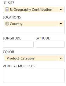
- Selecting fields to map
Adding locations and fields places dots on the map. The larger the value, the bigger the dot. When you add a multi-value series, you get pie charts on the map, with the size of the pie chart showing the size of the total as shown in the following figure:
- Map visualization
In a map visualization, besides the legend and data label options, we have the option to change the map background in the Layout tab:
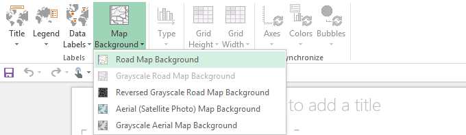
- Options to change map background
Filtering and slicing in Power View reports
Interactive filtering and highlighting with chart visualization
One of the unique features in Power View is interactive filtering and highlighting with chart visualization, which applies to all other visualizations in the report.
Charts can act as filters, thanks to those relationships in the underlying model. This is interactive filtering, meaning that we can select values directly on a chart and have it filter other data regions in the view. If we select one column in a column chart, this automatically:
- Filters the values in all the tables, tiles, and bubble charts in the report.
- Adds highlighting to bar and column charts. It highlights the parts of other bar and column charts that pertain to that value, showing the contribution of the filtered values to the original values.
We can press and hold Ctrl to select multiple values. To clear the filter, click inside the filter, but not on a value.
Interactive filtering also works with charts with multiple series. Clicking one section of a bar in a bar chart filters to that specific value. Clicking an item in the legend filters all the sections in that series.
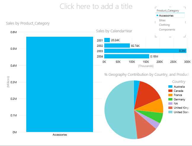
Consider the following report in Power View where we display sales by the product category in a column chart, sales by the calendar year in a bar chart, and the percent geography contribution to the sales in a pie chart.
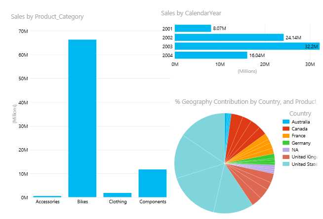
- Report with column, bar, and pie charts
Now if we are interested to know sales for the Components category for each year and each country’s contribution to sales in the Components category, we can click on the Components bar in the column chart and the report will dynamically slice and filter the other charts to highlight only the sales for the Components category. The result is shown in the following figure.

- Filtered chart data
This interactive filtering in each visualization, which applies to all the other visualizations in the report, is a very a useful feature for ad hoc analytics and reporting.
Filters
Besides interactive filtering, we can define filters in the Filters area of the Power View report. We can apply filters to individual visualizations in the report or apply them to the entire report. To add the filter, we need to drag and drop the field from the Field list to the Filters area.
Let us add Product Category as a filter in the Filters area as shown in the following figure.

- Adding a category to the Filters area
In the Filters area, we have distinct values of fields for each filter listed as shown in Figure 159. By default, all the values are selected in the filter. We can use the check boxes to select the individual Product Category fields that we want to view. If we need to reset the filter, we can click the Clear Filter option. To delete the filter, we can click the Delete Filter option as shown in the following figure.

- Filter options
We also have an Advanced Filter Mode option, which is very useful when we need to filter a field with a large number of unique values and it isn’t practical to filter the values by selecting the values individually.
If we click on Advanced Filter Mode, the following screen appears.

- Advanced filter options
In the Advanced Filter Mode, we can specify multiple filter conditions using the And and Or operators. If the field value satisfies the condition, the data is displayed in the report. The advanced filter options change depending on the data type of the field to be filtered.
If we apply the advanced filter to a field of the text data type, we see the following options.

- Text data type filter options
We can search for a value within a visualization-level or view-level filter on a text field, and then choose whether to apply a filter to it. The portion of a field's values that match the search text are highlighted in the search results list. The search is not case-sensitive, so searching for “Bikes” yields the same results as “bikes”.
We can also use wildcard characters like the question mark (?) and asterisk (*). A question mark matches any single character; an asterisk matches any sequence of characters. If we want to find an actual question mark or asterisk, we need to type a tilde (~) before the character.
If we search for fields with a date data type, we see the following options.

- Date data type filter options
For fields with a numeric data type, we see the following options.

- Numeric data type filter options
Slicers
Slicers are another kind of filter. They filter everything on the page. Power View slicers look very much like slicers in PowerPivot for Excel. We can create a single-column table from any field that is an attribute, and then convert the table into a slicer. Each value is a button, and a button in the top corner clears (resets) the filter. To select a value, just click that button. The data is filtered in the report immediately.
You can select multiple values by holding the Ctrl key when you click.
We can also select everything except a certain set of values by resetting the filter with the button in the top corner, and then using Ctrl + click to clear specific values. This shows overall values excluding the values not selected.
You can add more than one slicer to your report. Slicers filter each other; for example, if we have two slicers, one for Product Category and one for Products, when we click a category in the former, it filters the latter to show only products in that category. The filtering effects of all slicers are combined.
Unlike chart filters, slicers:
- Filter charts. They do not highlight charts.
- Are saved with the report. When you save, close, and reopen a report, the same values will be selected in the slicer.
- Can use image fields. Behind the scenes, Power View uses the Row Identifier field for that image as the filter in the slicer.
In order to create slicers in the report, we need to select the field from the field list that we want to use as slicer, and click the Slicer option in the Design tab on the ribbon.
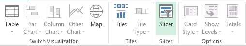
- Slicer option on ribbon
Slicers for the Product Category field are displayed in the Power View report as shown in the following figure. When we click on the individual values in the slicers, Accessories in this case, the entire report is filtered for that value.
- Applying a slicer to a report
Slicers can be useful as filters when we need to filter the entire report using a field that has less distinct values. When the number of unique values in a field are many, we can choose the advanced filter mode in the Filters area.
Of the different ways that we can filter and highlight data in our report, each way behaves differently when you save a report:
- If we set a filter or slicer in design view, the state of the slicer or filter is saved with the report.
- If we highlight a chart in design view, its state is not saved with the report.
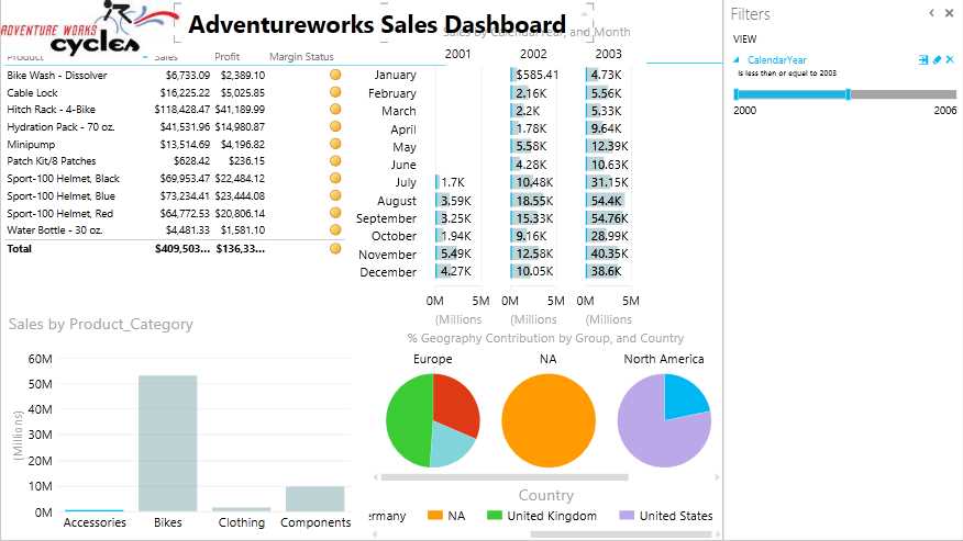
Designing a dashboard in Power View
In the previous sections, we learned all the visualizations and filtering options available with Power View and what data can be best represented by each visualization. Bringing them all together, we can create interactive dashboards for end users and analysts that will allow them to make informed decisions better and faster.
In this section, we will design the AdventureWorks sales dashboard to provide an executive-level summary of sales, profit, year-over-year comparisons, and the contribution of each region.
We create the following dashboard using the visualizations we discussed previously.
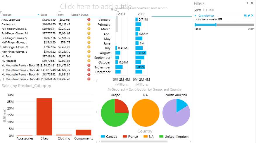
- Power View dashboard
In dashboards, it is preferred to represent detail-level data and KPIs in tabular format. Hence we represent product-level details along with the sales, profit, and margin KPI using table visualization.
In order to showcase year-over-year comparisons for product sales, we choose to represent the monthly sales figure with a bar chart with Calendar Year as the horizontal multiple. We could have represented the same chart using a column chart visualization, but due to horizontal space constraints, we choose to represent it with a bar chart (which is also visually better for yearly comparisons).
To represent the regional contribution, we use pie charts as horizontal multiples to represent the percent geography contributions. Pie charts best represent such data.
We choose to represent the sales by Product Category using a column chart, which is useful for interactive filtering and highlighting, specifically for filtering the Product Details table.

- : Applying filters to the dashboard
We add a Calendar Year filter in the Filters area, which can help limit the data in the bar chart for yearly comparisons.
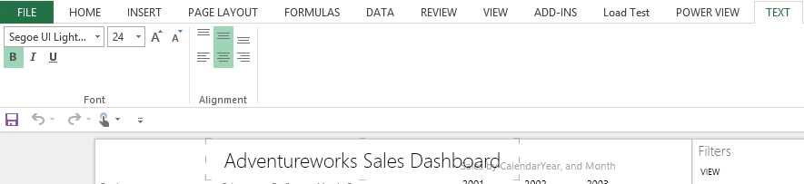
Once we have all the visualization and filters in place for the dashboard, we add a title to the report and adjust its position and font using the Text tab. The Text tab appears only when the mouse pointer is in the text box.
- Text options
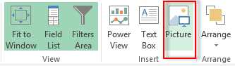
Next, we add the AdventureWorks logo image by clicking the Picture button in the Power View tab on the ribbon:
- Picture option
We position the logo as shown in the following figure.
- Adding an image and title to the dashboard
Next, we can set an image in the background of the report by clicking the Set Image option in the Power View tab on the ribbon.
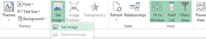
- Set Image option
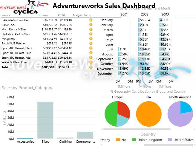
- Adding a background image to the dashboard
We can also set the transparency of the image and its position to Fit, Stretch, Tile, or Center in the Background Image area in the Power View tab.
- Background Image options
Finally, to make the Power View report visually appealing, we can change the theme and background of the Power View report using the Themes options as shown in the following figure.
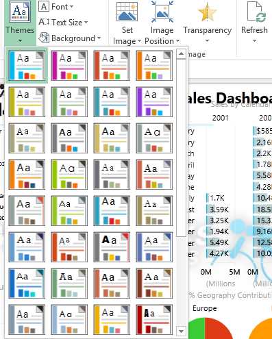
- Themes options in Power View dashboard
The dashboard is now ready for use in reporting and analytics.
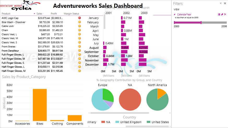
- Completed Power View dashboard
Using your creativity and UI expertise, you can create visually appealing and colorful reports for analytics and reporting.
Summary
In summary, Power View is a great reporting and analytics tool with a rich set of visualization options for data exploration and business intelligence.
The new SSAS tabular model provides BI developers the flexibility of easily creating data models with minimum complexity that can be consumed by the Power View report.
Hopefully you will now be excited and curious to explore these and other new products introduced in the Microsoft BI stack.
- 1800+ high-performance UI components.
- Includes popular controls such as Grid, Chart, Scheduler, and more.
- 24x5 unlimited support by developers.