
Beyond Public Speaking for Geeks Succinctly®

CHAPTER 4
Accessibility and Inclusion in Presentations
Fonts, colors, screen resolutions, contrast, language, jargon, image captions, live captions, accessible PPTX and PDF, etc. There are a lot of things to know to make our presentations accessible to everybody when you’re on stage, during virtual sessions, and when you publish your slides.
Accessibility terms
People with disabilities shouldn’t be defined by their condition. The first step to make your presentation more accessible and inclusive is to use a language that conveys respect to all people, in the slides and while presenting.
Don’t refer to people as normal, mute, disabled, crippled, etc. Always use terms like without disabilities, unable to speak, people with disabilities, with limited mobility, and so on.
Here you can find a list of accessibility terms that you can use in your slides and while presenting: https://docs.microsoft.com/en-us/style-guide/a-z-word-list-term-collections/term-collections/accessibility-terms.
Why do we need to think about accessibility?
Accessibility is useful for everybody, not only for people with different abilities.
Adding subtitles to a presentation can help people in noisy environments, even if they don’t have hearing loss. Adding subtitles to a virtual session can help people working with children and people with limited bandwidth, because they can read the subtitles instead of relying on audio. A presentation could be subtitled in another language when different people talk in different languages in the same country or online, or when people are learning a new language.
Having the right colors, contrast, and fonts can make the presentation clearer to people who have temporary visual impairments, like they’ve lost their glasses, have a cataract, or have allergies, just as some examples.
Accessibility is useful for everybody!
Promoting the session to the right audience
Is your session accessible? You should promote it!
Not all sessions are accessible at the moment, and the feelings of various speakers on the topic are different. Most speakers don’t even know that presentations can be easily made more accessible.
Are you using special effects?
Every time you go to an amusement park, before entering special attractions, you can find warning signs if the attraction is dangerous for some kinds of people.
If you’re using special effects in your presentations, like videos, noises, or special props, you should warn attendees in advance, like they do in theaters and in big conferences.
Preparing the presentation
Creating a new, accessible presentation is fairly easy. Adjusting a long presentation to make it accessible is another story. It’s easy, but it takes time.
Accessibility Checker
Guidelines are useful, but an automated tool that checks a presentation is even better.
PowerPoint includes an Accessibility Checker that can be found in the bottom-left corner of the screen.
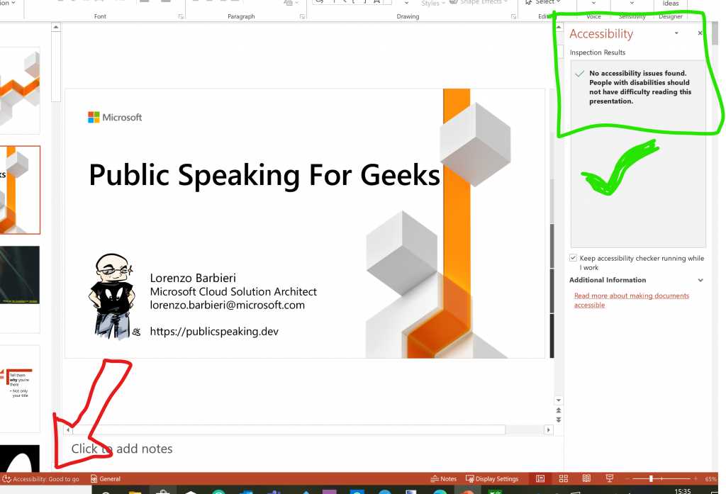
Figure 17: Accessibility Checker is always checking for accessibility in the background.
The Accessibility Checker can also be found under File > Info.
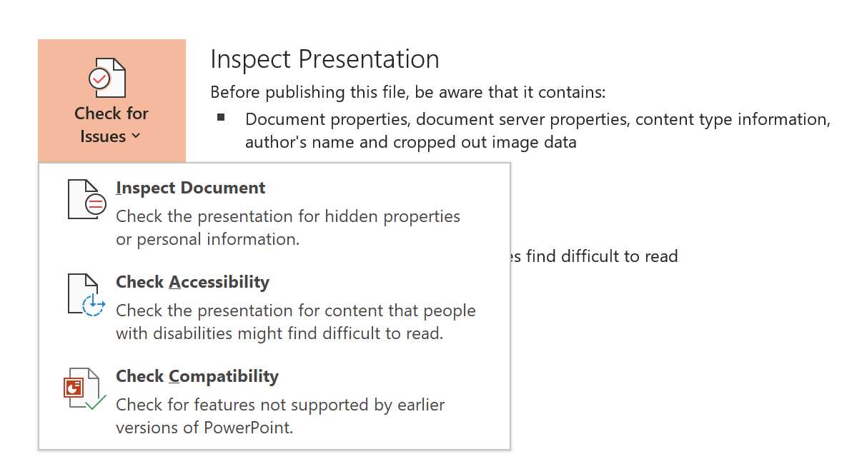
Figure 18: Another way to run Accessibility Checker.
The Accessibility Checker shows errors and warnings based on the recommendations we’ll see in the next section. It also explains why something should be fixed, the steps to fix it, and even provides direct actions to fix it.
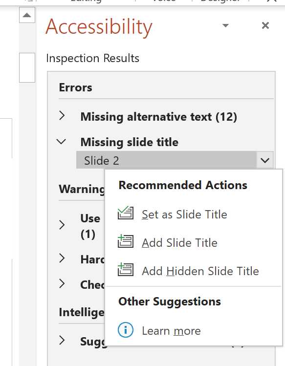
Figure 19: Recommended actions to fix accessibility.
Some recommendations are easy to fix, while some require rethinking the slides, animations, or videos. In the end, you decide if something should be fixed or not, depending on its importance for the presentation.
But, before working on the slides, the first step is to check the template we are using for accessibility, because if we fix the template, most of the work is already done.
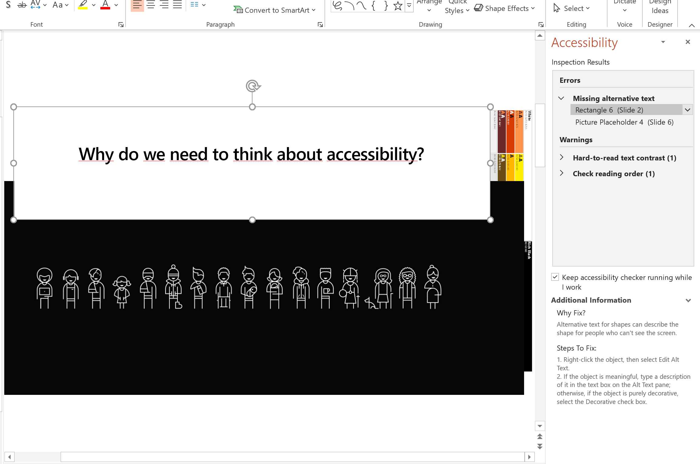
Figure 20: Accessibility Checker with errors and warnings.
Is the template accessible?
Most conference templates are bad, and a lot of them are also not accessible. This is unacceptable.
Tip: When I receive a conference template that’s not accessible, I open the Accessibility Checker and send the report to the organizers, asking them to fix it. If they won’t do it, it’s a bad sign.
If you don’t know where to start, PowerPoint already includes a guide to create accessible templates.
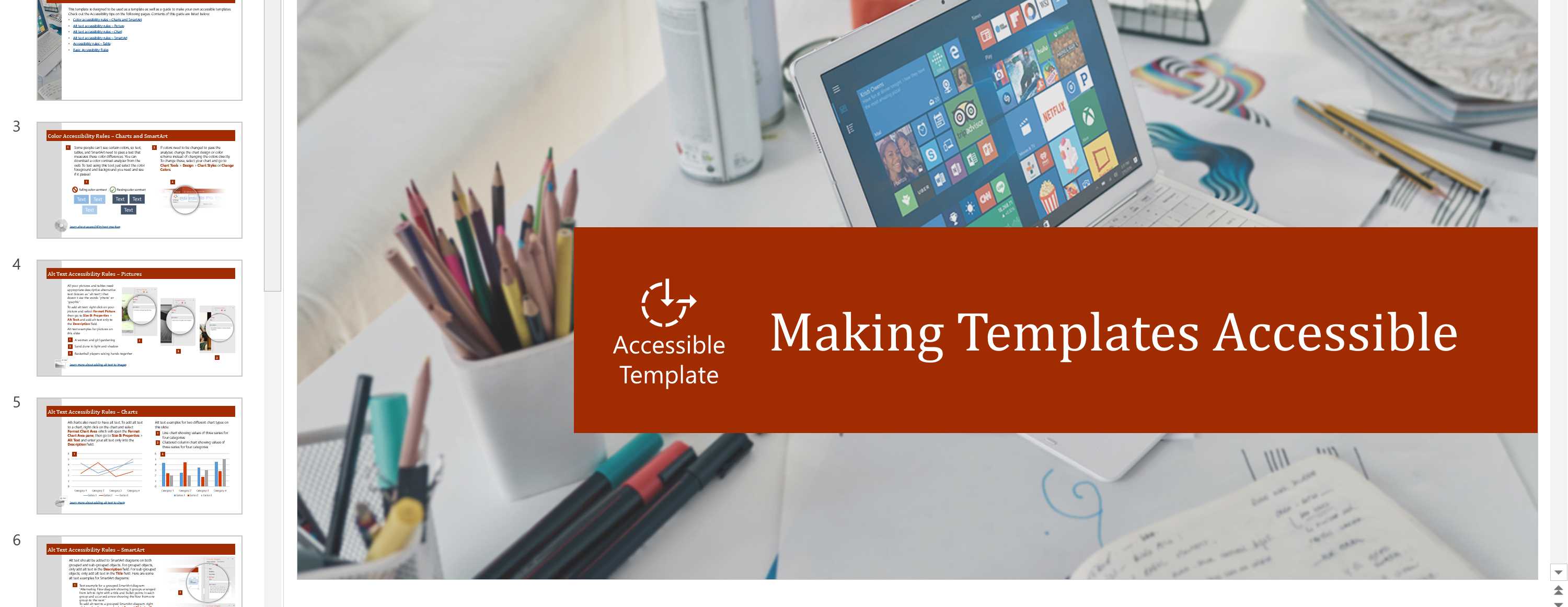
Figure 21: Making Templates Accessible guide in PowerPoint.
If you want to search for that guide, or if you want to look at some sample accessible templates, just search for them.
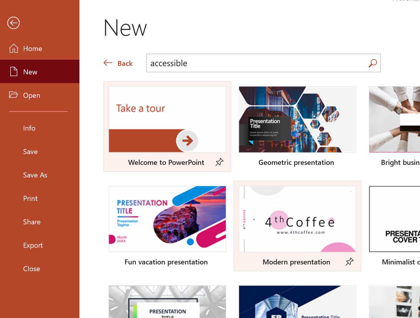
Figure 22: Finding accessible templates in PowerPoint.
Now we’ll see what the principal recommendations are to make your slides accessible.
Slide layout
If you use a built-in slide layout, it ensures a hierarchical reading order of text blocks. Look at the available layouts and customize them if needed, but don’t start adding text blocks to a blank layout if you don’t want to spend ages fixing the reading order (discussed later in this chapter).
Each slide should have a unique slide title
People who are blind, have low vision, or have a reading disability rely on slide titles to navigate the slides. If the titles are not unique, or are missing, it’s more difficult to navigate among the slides.
If multiple slides need to have the same title, consider adding numbers, like “Introduction 1 of 3,” or something like that.
If a slide doesn’t have a title, you can select a meaningful item and mark it as the slide title. You can add a slide title, or you can add a hidden slide title.
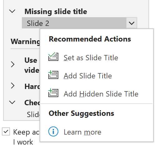
Figure 23: Fixing missing slide titles.
Reading order
Screen readers describe content on the screen, and they normally read elements in the order they were created. To ensure your content is read back in the order you intended, you should set the reading order.
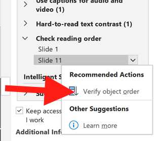
Figure 24: You can set the reading order directly from the Accessibility Checker.
In the Reading Order pane, you can arrange the reading order of all the objects. You can mark pictures and other objects as decorative by clearing the check box so they will be skipped by the screen reader, and you can even set the alternative text of pictures and other objects.
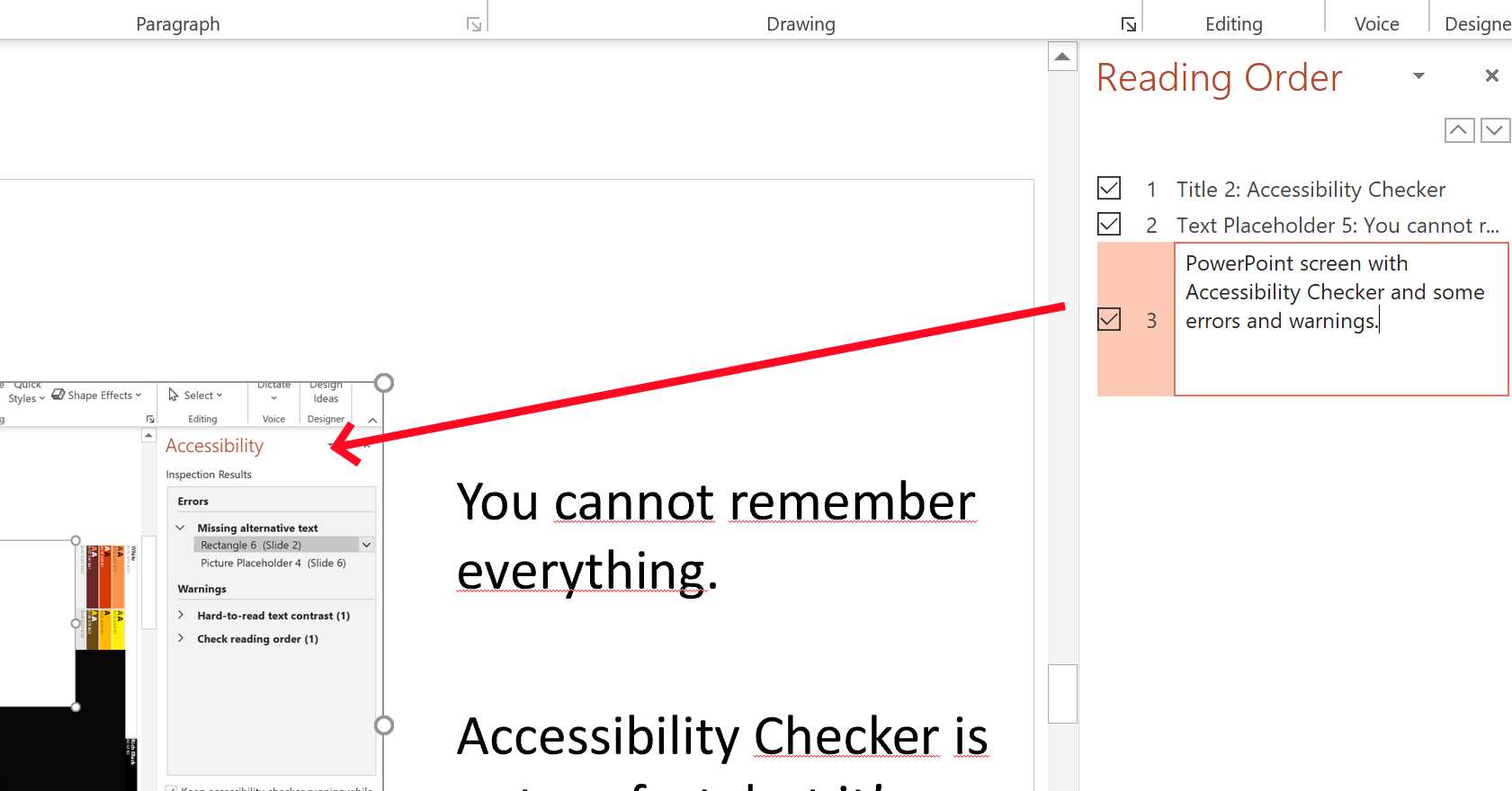
Figure 25: Setting the alternative text directly in the Reading Order pane.
Alternative text
Alternative (alt) text helps people with screen readers understand the content of slides by describing shapes, pictures, charts, tables, SmartArt graphics, and other objects.
You can set the alt text from the Reading Order pane, in the object context menu, or in the Accessibility Checker directly.
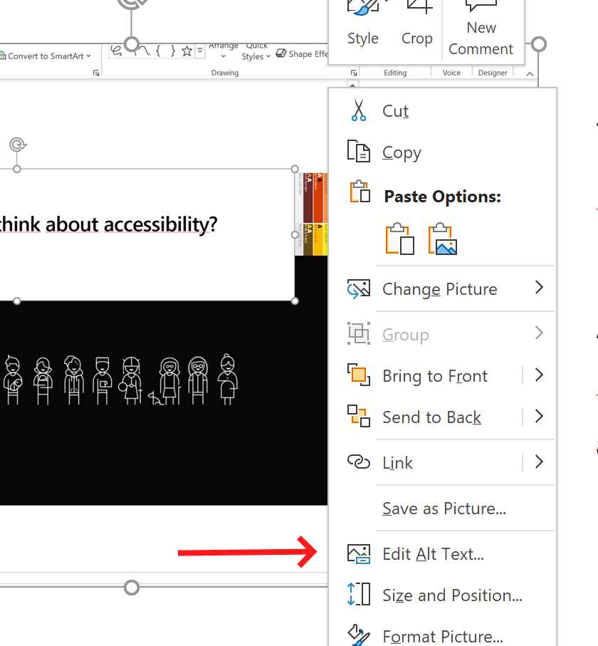
Figure 26: Setting the alt text directly from an object context menu.
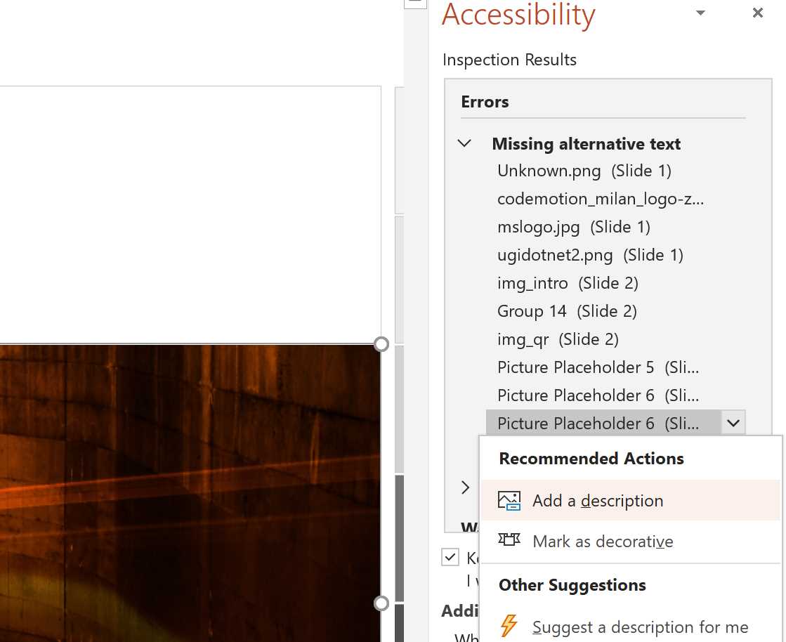
Figure 27: Setting the alt text from the Accessibility Checker.
If an object is meant to add only visual styling and it doesn’t have any meaning, you should select Mark as decorative.
Using the power of image recognition, PowerPoint can also automatically generate a description.
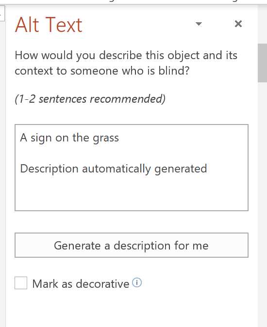
Figure 28: Autogenerated descriptions for alt text.
When you have hyperlinks on the slide, they can be difficult to read, especially if the underlying text is something like “click here.” Try to add the hyperlink to meaningful text, and if that’s not possible, you can use a ScreenTip that appears when you hover over the text, and that can be read by a screen reader. Always add an underline to color-coded hyperlink text, even if the result looks less polished, so that people who are colorblind can tell the text is a hyperlink even if they can’t see the different color.
Font families and sizes
Always use a larger font size (18 pt. or larger). Don’t trust the way slides appear on your screen, because small fonts are difficult to read when projected, or when using a remote presentation tool that also includes the participants, chat, etc. Use sans serif fonts and sufficient white space between sentences.
For headings, use the predefined styles. When you can’t use those, consider adding bold, using a font that’s natively black or bold, or simply using a larger font. Don’t rely only on color to identify headings or other key areas.
To help people who have dyslexia or low vision, you should use familiar sans serif font families, such as Arial or Calibri, to reduce reading load. Even Comic Sans is a good font for people with dyslexia. Fluent fonts (Fluent Calibri and Sitka) were also found to ease reading by reducing visual crowding.
All-capital letters and excessive italics or underlines are difficult to read, so use them only if needed. Add plenty of white space between sentences and paragraphs, especially when projecting or using a remote presentation tool.
Contrast
To help people with low vision, use sharp contrast between text and its background. Always use dark text on a white or off-white background. If you have a dark background, use white text (or yellow in some cases) on it.
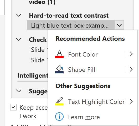
Figure 29: Accessibility Checker can spot hard-to-read text contrast.
Shapes and colors
You shouldn’t rely only on colors to deliver information. For example, never use a single red or green light to show success or failure; there are people who cannot see the difference between those colors. Use different shapes and always supply a legend if the meaning is not universal.
Tip: Switch to the View tab and select Grayscale or Black and White. You should scan each slide in your presentation for instances of color-coding. This action is easy if you do it regularly when creating new slides.
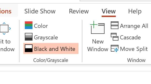
Figure 29: Look at your presentation without relying on colors, with Grayscale or Black and White views.
Use a simple table structure
Screen readers track their location in a table by counting table cells and use header information to identify rows and columns.
If a table is nested inside another table or if cells are merged or split, screen readers can’t provide meaningful information about the table.
Videos
Consider adding subtitles, closed captions, or video descriptions to your videos.
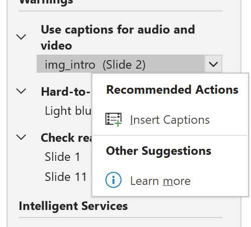
Figure 30: Use captions and subtitles if available.
PowerPoint supports the playback of video files with multiple audio tracks, closed captions, and subtitles.
Note: Currently, only PowerPoint for Windows supports insertion and playback of closed captions or subtitles stored in files separate from the video. For all other editions, you should encode them into the video using an external program.
Delivering the presentation
Accessible slides are important, but the way you deliver the presentation is even more important.
Body language
You shouldn’t rely only on your body language and gestures to deliver your message.
Shouting at a slide, saying, “Can you see it?” multiple times without explaining what your audience is supposed to see is not respectful. You should explain what’s wrong or good in the slide after some seconds of waiting.
Relying only on your facial expressions can be bad, even for people in the front rows.
There are countless examples, but in general, don’t rely only on your body language, expressions, and gestures.
Jargon and accessible language
Have you ever heard presenters use a lot of jargon, most of the time industry- or company-specific, without explaining the meaning? It’s a common error for people used to talking to internal audiences.
Always reduce the use of jargon and acronyms; if you need to use them, the first time you introduce a concept or an acronym, explain it.
Acronyms don’t work well with automatic subtitles (see next sections). If you need to use them, it’s always better to check how they’re displayed, and perhaps spell them out.
Are you speaking too fast?
Some people prefer to read your lips, instead of reading subtitles. Therefore, you should always look at the camera, or look at the attendees, and never talk looking at the screen.
Some presenters speak too fast, especially when doing a presentation in another language.
To help people who are reading your lips, and to ease the comprehension of cognitive algorithms that generate subtitles, you should speak loudly and clearly, and not too fast.
Present with subtitles
Live subtitles are essential for people who are hard of hearing, even temporarily (due to background noise, bad network connection, speech in another language, etc.).
The latest version of PowerPoint can show live subtitles, even in a different language. Subtitles can be shown below, above, or overlaid on the slides.
Note: Subtitling requires an active network connection.
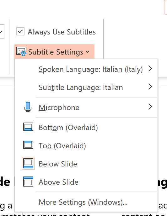
Figure 31: You can use subtitles in the latest versions of PowerPoint.
Other ways to add subtitles to your meetings
Zoom, Google Slides, Teams, Skype, and many other programs are adding options to enable subtitles for virtual and in-person meetings. The list is continuously increasing, so check the documentation of your favorite software to see how to enable it.
Publishing the presentation online
There are many ways to publish your slides online. One of the most-used services is SlideShare, part of LinkedIn.
SlideShare supports many formats, including PPTX and PDF. When sharing your accessible slides on SlideShare, always check them full screen, because sometimes the importer screws up some fonts and other details. In that case, the best solution is to export your slides in PDF format directly and import the PDF from SlideShare.
Tip: In this post, I cover many techniques that could be used to improve how presentations will look inside SlideShare.
Adding subtitles and closed captions to a video
If you haven’t enabled subtitles in your presentations, or if you can’t use subtitles, you can always add them to your recordings using video-producing software or directly in the platform you’re using to share videos. For example, YouTube supports both custom subtitles and automated captioning (for select languages only).
Distributing other materials
Have you created collateral materials while preparing your presentation? Demo scripts? Why don’t you share those materials together with the slides and all the other files? They can be used, for example, with a screen reader to improve the comprehension of a demo.
Is your website accessible?
So, you created an accessible presentation, curated your language, videos, and special effects. and then you published everything on your website, and it’s not accessible?
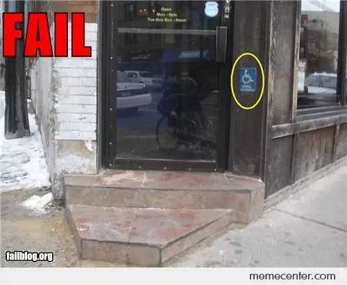
Figure 32: Accessibility fail (source: https://www.memecenter.com/fun/64537/Wheelchair-AccessibilityFAIL).
Accessibility is an end-to-end journey: don’t stop it at the last step.
Everybody should enjoy your presentations!
If you’ve a delightful story to tell, don’t limit its audience because of accessibility problems in your slides and talk.
Tip: Every time I prepare a new presentation, I use the Accessibility Checker from the beginning. If I need to use an old slide deck, I plan some time to improve its accessibility, so I can also enjoy the new accessible slides in the future. As I already said, accessibility is a journey, let’s begin it!
- 1800+ high-performance UI components.
- Includes popular controls such as Grid, Chart, Scheduler, and more.
- 24x5 unlimited support by developers.