
Avalonia UI Succinctly®

CHAPTER 8
Working with Windows, Pages, and Dialogs
Applications normally work on multiple pages. In the case of desktop applications, you usually implement multiple windows. In the case of web and mobile applications, you typically implement pages. There are different ways to implement navigation between windows or pages in Avalonia UI, depending on the application type. This chapter will first provide an overview of multi-window applications for the desktop and then explain one possible solution to implement navigation for cross-platform projects.
Multiple windows on desktop applications
You can have multiple Window objects in your application and access them programmatically. For example, suppose you have a new Avalonia UI desktop solution and want to open a secondary window from the main one. If you right-click the project name in Solution Explorer and then select Add New Item, you can add a new window by selecting the Window (Avalonia) item template (see Figure 44).
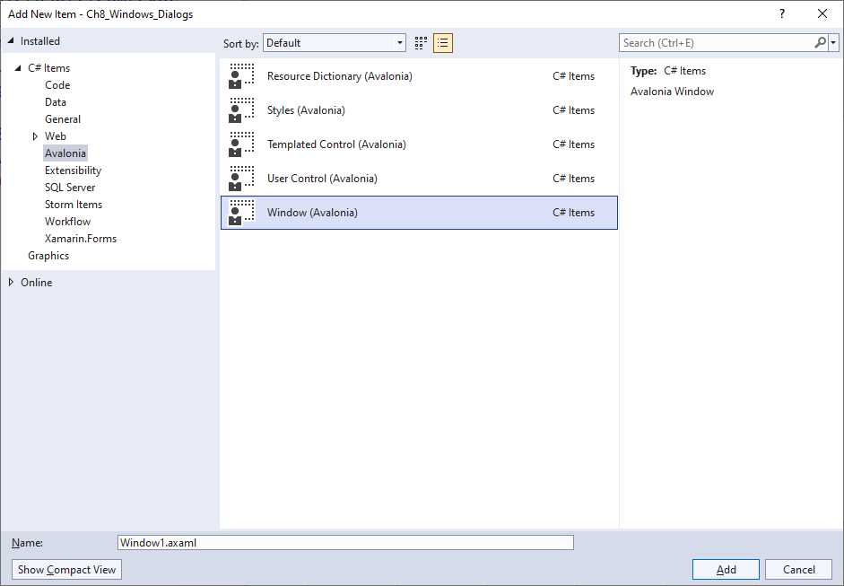
Figure 44: Adding a new window
Call the file SecondaryWindow.axaml and then click Add. In the XAML code for the MainWindow.axaml file, add the following simple code that will allow for opening a new window with a button click:
<StackPanel>
<Button Name="OpenWindowButton"
Content="Open new window"
Margin="10" Click="OpenWindowButton_Click"/>
</StackPanel>
The Click event handler contains the code that opens a new window, as follows:
private void OpenWindowButton_Click(object sender, RoutedEventArgs e)
{
var newWindow = new SecondaryWindow();
newWindow.Show();
}
This code creates an instance of the specified window and opens it. When you invoke Show, both the main and secondary windows are enabled, so you can use both (or all the windows that you have opened). In some cases, you might want the secondary window to be opened as a modal dialog, for example, to force the user to complete an action without being able of interacting with other pieces of the user interface.
In this case, you can invoke the following method:
newWindow.ShowDialog(this);
The argument for ShowDialog is an instance of the owner Window. In both cases, you can control the position and state of the window. You can assign the WindowStartupLocation property with one of the following self-explanatory values: CenterOwner, CenterScreen, or Manual. The state of the window can be assigned via the WindowState property with self-explanatory values like: FullScreen, Maximized, Minimized, and Normal.
You can also subscribe for a window’s events as you would normally do in C# code; for example, you could subscribe to the Window.Closed event if you need to understand when the secondary window has been closed:
private void OpenWindowButton_Click(object sender, RoutedEventArgs e)
{
var newWindow = new SecondaryWindow();
newWindow.Closed += NewWindow_Closed;
newWindow.Show();
}
private void NewWindow_Closed(object? sender, System.EventArgs e)
{
// Secondary window has been closed
}
You have a lot of flexibility when working with windows, but you have alternatives such as tabs.
Implementing tabs
As an alternative to multiple windows, you can organize the user interface with tabs. This approach is very common, and it is certainly more suitable for cross-platform projects that target different devices and systems. In Avalonia UI, you can use the TabControl visual element to organize the UI with tabs. The following XAML demonstrates how to implement a TabControl:
<TabControl>
<TabItem Header="First tab">
<TextBlock Text="Your content here.."/>
</TabItem>
<TabItem Header="Second tab">
</TabItem>
<TabItem Header="Third tab">
</TabItem>
</TabControl>
A TabControl is basically a container for TabItem elements, each representing a tab. Every TabItem has a Header and content. Because they are content controls, their content can be any visual element. In addition, they can be customized by assigning the properties listed in Table 6. If you add the code above to the XAML of the secondary window created before, you will get the result shown in Figure 45.
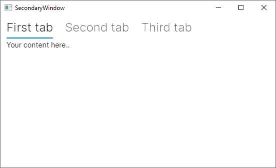
Figure 45: Organizing the UI with tabs
Tip: You can also customize the header and support data binding by assigning the HeaderTemplate property with a DataTemplate object populated with a visual element (for example, a panel with multiple child views) instead of assigning the Header property with a string.
There is also another control, called TabStrip, whose goal is to display a list of tabs as a menu. It is declared like the TabControl and still contains TabItem objects, but unlike the TabControl, the content inside TabItem objects is ignored. However, since tab items should act like menu items, you can handle the Tapped event, which is raised when the tab is touched (on devices that support touch gestures) or clicked. You would declare it as follows:
<TabStrip>
<TabItem Header="First tab" Tapped="TabItem_Tapped" />
</TabStrip>
The layout of a TabStrip is the same as a TabControl, but without any content for TabItem objects. This is immediately visible in the Visual Studio designer. The Tapped event can be handled as follows:
private void TabItem_Tapped(object sender, TappedEventArgs e)
{
}
Therefore, you need to handle this event to support interaction over tabs.
Implementing navigation between pages
When you create an Avalonia UI cross-platform solution that targets desktop systems, the web browser, and mobile devices, you cannot use windows only. In other development platforms, you would have a navigation framework that allows you to implement and browse pages. Though Avalonia UI does not implement a navigation framework per se, it provides the Avalonia ReactiveUI library. This library is available as a NuGet package and provides an additional layer to the Avalonia UI codebase, providing everything you need to implement navigation. It is based on the MVVM pattern and on logic that probably requires some time to learn if you are not familiar with more advanced MVVM concepts, but it exposes objects that can be used beyond the need to navigate between pages.
The cross-platform solution template you saw in Chapter 2, in the section called “Creating cross-platform solutions,” is based on the ReactiveUI library. It already includes most of the things that you can use for a quicker navigation startup. However, a better idea is to work with the official ToDo app sample because the documentation has a dedicated explanation page about this sample app. This includes some views and navigation objects that are more useful for learning purposes.
Now, let’s download the source code or clone the repository, and open the solution in Visual Studio. When you’re ready, run the project. You will see a main page that shows a list of items and a button that allows you to add a new item to the list. When you click this button, you will be able to add a new item via a new page that gives you the option to confirm or cancel the operation. Figure 46 shows the two pages in the application.
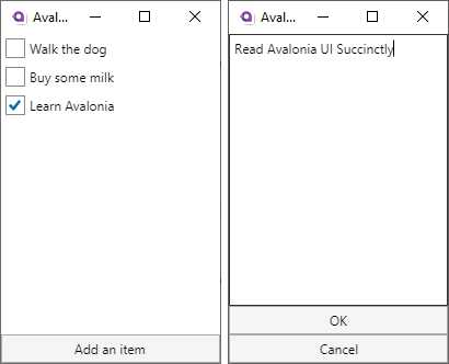
Figure 46: The ToDo app in action
Pages are actually represented by UserControl items, and each defines the entire visual tree of a page. The way the application navigates between user controls and the way these exchange data between one another is based on data binding, commands, and the MVVM pattern via objects that are exposed by the ReactiveUI library. Having said this, it is a good idea to dissect how the flow works from a different point of view, starting from the main window and the way it consumes user controls.
The main window and the main ViewModel
The definition of the main window is extremely simple:
<Window xmlns="https://github.com/avaloniaui"
xmlns:x="http://schemas.microsoft.com/winfx/2006/xaml"
x:Class="Todo.Views.MainWindow"
Icon="/Assets/avalonia-logo.ico"
Width="200" Height="300" Title="Avalonia Todo"
Content="{Binding Content}">
</Window>
The purpose of the main window is to act as a container of pages, rather than an individual page itself. As you will discover shortly, pages are built as user controls that are rendered as the window’s child visual element. The content of the window is represented by the Content property, which is bound to the same-named property of a ViewModel class called MainWindowViewModel. Code Listing 30 shows the content of the ViewModel.
Code Listing 30
class MainWindowViewModel : ViewModelBase { ViewModelBase content; public MainWindowViewModel(Database db) { Content = List = new TodoListViewModel(db.GetItems()); } public ViewModelBase Content { get => content; private set => this.RaiseAndSetIfChanged(ref content, value); } public TodoListViewModel List { get; } public void AddItem() { var vm = new AddItemViewModel(); Observable.Merge( vm.Ok, vm.Cancel.Select(_ => (TodoItem)null)) .Take(1) .Subscribe(model => { if (model != null) { List.Items.Add(model); } Content = List; }); Content = vm; } } |
Before discussing the details of the ViewModel class, the first thing to say is that it derives from another class called ViewModelBase, whose definition is the following:
public class ViewModelBase : ReactiveObject
{
}
The goal of this class is to offer a base with common objects to specialized ViewModels. In this particular example, there is no additional member, but you would ideally add any method or property that derived ViewModels could benefit from here. The key point is that this class inherits from ReactiveObject, a class exposed by the ReactiveUI library that already implements change notification, so you do not need to implement the INotifyPropertyChanged interface manually.
The following is a list of key points in the MainWIndowViewModel class:
· When the Content property is assigned, the setter invokes a method called RaiseAndSetIfChanged, which assigns the property value and raises a change notification. This is inherited from ReactiveObject and avoids the need to implement the INotifyPropertyChanged interface.
· The constructor assigns an instance of the ToDoListViewModel class, via a property called List, to the Content property. This ViewModel is discussed in the next section, but the important thing to notice here is that it represents a page called ToDoListView, that ReactiveUI implements navigation between ViewModels, and that the ViewLocator class (discussed shortly) renders the related view.
· Still on the constructor, it works with a class called Database. The purpose of this class is just to create sample data, specifically a list of TodoItem objects. These are made of two simple properties: Description of type string, and IsChecked of type bool. It is not a real database implementation, only in-memory data, but it is enough to understand how and where you could handle data, like a SQLite database. Code Listing 31 contains the definition for both classes.
· The AddItem method represents a command that will be bound to a button in the ToDoListView page. It creates an instance of the AddNewItemViewModel class (discussed later), and merges (Observable.Merge) a newly added TodoItem object into the current List. This is done by combining a method called Ok, which confirms the addition from the secondary page, and subscribing for the != null condition over the item. If the condition is instead == null, the addition is canceled (Cancel method).
Code Listing 31
namespace Todo.Services { public class Database { public IEnumerable<TodoItem> GetItems() => new[] { new TodoItem { Description = "Walk the dog" }, new TodoItem { Description = "Buy some milk" }, new TodoItem { Description = "Learn Avalonia", IsChecked = true }, }; } } namespace Todo.Models { public class TodoItem { public string Description { get; set; } public bool IsChecked { get; set; } } } |
The MainWindowViewModel represents a connection between the other ViewModels. In the next section, you will see how the ToDoListViewModel class is implemented and how a page is built on top of it.
Working with pages and ViewModels
With ReactiveUI, pages are represented by user controls, and each page has a backing ViewModel. Unlike other platforms, where you navigate by invoking another page, with ReactiveUI you invoke the ViewModel for the page you intend to display. The library then knows how to connect the ViewModel to the appropriate page and what to render. In the next paragraphs, this concept will be clarified.
If you look back at Code Listing 30, you can see how the content for the main Window is an instance of the TodoListViewModel class, created by the MainWindowViewModel. This means that the TodoListViewModel must be coupled to a user control that becomes the first page for the application. The code for this ViewModel is very simple:
public class TodoListViewModel : ViewModelBase
{
public TodoListViewModel(IEnumerable<TodoItem> items)
{
Items = new ObservableCollection<TodoItem>(items);
}
public ObservableCollection<TodoItem> Items { get; }
}
The relevant point of this class is the Items property, of type ObservableCollection<TodoItem>, which contains the list of items that will be displayed in the main list (see the left side of Figure 46). The user control that consumes this ViewModel is defined via the XAML code shown in Code Listing 32.
Code Listing 32
<UserControl xmlns="https://github.com/avaloniaui" xmlns:x="http://schemas.microsoft.com/winfx/2006/xaml" xmlns:d="http://schemas.microsoft.com/expression/blend/2008" xmlns:mc="http://schemas.openxmlformats.org/markup-compatibility/2006" mc:Ignorable="d" d:DesignWidth="200" d:DesignHeight="300" x:Class="Todo.Views.TodoListView"> <DockPanel> <Button DockPanel.Dock="Bottom" Command="{Binding $parent[Window].DataContext.AddItem}"> Add an item </Button> <ItemsControl Items="{Binding Items}"> <ItemsControl.ItemTemplate> <DataTemplate> <CheckBox Margin="4" IsChecked="{Binding IsChecked}" Content="{Binding Description}"/> </DataTemplate> </ItemsControl.ItemTemplate> </ItemsControl> </DockPanel> </UserControl> |
There are two relevant points in Code Listing 32:
· The button that allows adding a new item is bound to a command method defined in the MainWindowViewModel. The binding expression has a particular syntax: $parent[Window] points to the parent container for the user control, which is in fact a Window; DataContext is the property to which the MainWindowViewModel instance is bound; and AddItem is the actual invocation to the command method that adds a new TodoItem object to the list.
· The ItemsControl shows the list of items by binding the Items property of the ViewModel to the Items property of the control. A simple DataTemplate is defined to display the status and description of each object.
The code-behind file for the user control is very simple and is shown in Code Listing 33.
Code Listing 33
using Avalonia.Controls; using Avalonia.Markup.Xaml; namespace Todo.Views { public class TodoListView : UserControl { public TodoListView() { this.InitializeComponent(); } private void InitializeComponent() { AvaloniaXamlLoader.Load(this); } } } |
The only relevant point here is the invocation of the Load method from the AvaloniaXamlLoader class. This helper object provides members whose goal is to simplify how the runtime works with XAML. The Load method simply loads some XAML into an Avalonia UI component.
Tip: The invocation to AvaloniaXamlLoader.Load is also visible in the MainWindow.axaml.cs file with exactly the same purpose.
When the user clicks the button to add a new item, the AddItem method from the MainWindowViewModel class is invoked. If you look back at its definition in Code Listing 30, you can see how an instance of the AddItemViewModel class is created. As you can imagine, this is coupled with a user control called AddItemView. For a better understanding, the best approach is to start from the definition of the user control, shown in Code Listing 34.
Code Listing 34
<UserControl xmlns="https://github.com/avaloniaui" xmlns:x="http://schemas.microsoft.com/winfx/2006/xaml" xmlns:d="http://schemas.microsoft.com/expression/blend/2008" xmlns:mc="http://schemas.openxmlformats.org/markup-compatibility/2006" mc:Ignorable="d" d:DesignWidth="200" d:DesignHeight="300" x:Class="Todo.Views.AddItemView"> <DockPanel> <Button DockPanel.Dock="Bottom" Command="{Binding Cancel}">Cancel </Button> <Button DockPanel.Dock="Bottom" Command="{Binding Ok}">OK</Button> <TextBox AcceptsReturn="False" Text="{Binding Description}" Watermark="Enter your TODO"/> </DockPanel> </UserControl> |
The code is quite simple to understand due to the knowledge that you have gained so far. The relevant point is that the two buttons are bound to two commands, Cancel and Ok, whereas the TextBox is bound to the Description property of a new TodoItem object assigned in C# code. Both commands are defined in the AddItemViewModel class, whose code is shown in Code Listing 35.
Code Listing 35
using System.Reactive; using ReactiveUI; using Todo.Models; namespace Todo.ViewModels { class AddItemViewModel : ViewModelBase { string description; public AddItemViewModel() { var okEnabled = this.WhenAnyValue( x => x.Description, x => !string.IsNullOrWhiteSpace(x)); Ok = ReactiveCommand.Create( () => new TodoItem { Description = Description }, okEnabled); Cancel = ReactiveCommand.Create(() => { }); } public string Description { get => description; set => this.RaiseAndSetIfChanged(ref description, value); } public ReactiveCommand<Unit, TodoItem> Ok { get; } public ReactiveCommand<Unit, Unit> Cancel { get; } } } |
This class introduces new concepts of the ReactiveUI library, and it provides a good opportunity to understand more about its power. Starting from the bottom, you can see the definition of two objects of type ReactiveCommand. This type encapsulates an interaction between the user and a ReactiveUI interface, and when using this library, it can be used instead of command methods.
Both the Ok and Cancel commands are exposed as read-only properties of type ReactiveCommand, and they share the first type parameter, which is of type System.Reactive.Unit. This is used to specify that a method or property can return only one value. Then, in the case of Ok, the second type parameter is an object of type TodoItem, which represents the item that is committed to the data source when the OK button is pressed. In the case of Cancel, the second type parameter is another Unit, which simply returns no value. Both commands are objects that need to be instantiated before they can be used.
In Code Listing 35, you can see how the Create method of the ReactiveCommand class generates the command instances. In the case of Ok, a new TodoItem is created, and its Description property is assigned with the content that the user enters through the user interface.
It is also possible to specify some validation rules before the new item is added to the data source. In this case, the validation is performed via the WhenAnyValue method (included in the ReactiveUI library). Each method argument is a delegate provided and described in the following order:
- The property whose value needs to be evaluated (x.Description in this case)
- The condition that needs to be satisfied (!string.IsNullOrWhiteSpace(x) in this case)
When the conditions are satisfied (Description is not null or white space), an object of type IObservable<bool> is returned, and the ReactiveCommand.Create method uses this to determine whether the command can be executed or not, and, consequently, whether the bound control should be enabled. The Cancel command can always be executed, so it does not need validation rules and is simply instantiated via ReactiveCommand.Create.
So far, you have defined some user controls for pages and their operational ViewModels, but there is still the most important missing piece, something that connects ViewModels between one another and that allows for navigation between pages. This is discussed in the next section.
Resolving pages from ViewModels: The ViewLocator class
The ReactiveUI library implements a class called ViewLocator, which is responsible for displaying views based on their backing ViewModels. Code Listing 36 shows its definition. Notice that comments have been added for you, so they are not available in the solution you download from GitHub.
Code Listing 36
public class ViewLocator : IDataTemplate { public bool SupportsRecycling => false; //Create an instance of a user control public IControl Build(object data) { //Retrieve a user control name starting from its backing ViewModel var name = data.GetType().FullName.Replace("ViewModel", "View"); //Retrieve the actual type for the control var type = Type.GetType(name); if (type != null) { //Return an instance of a user control at runtime return (Control)Activator.CreateInstance(type); } else { //No backing ViewModel found return new TextBlock { Text = "Not Found: " + name }; } } //Return true if the data object derives from ViewModelBase public bool Match(object data) { return data is ViewModelBase; } } |
When a project is based on the ReactiveUI library, the runtime knows that the ViewLocator class must be instantiated, and it delegates to this class the responsibility of matching user controls with their ViewModels. The Build method retrieves the name of the view based on the name of the ViewModel, so you now better understand the reason for the naming convention introduced at the beginning of this topic. If a user control can be resolved based on the name, an instance of such a control is created and returned to the consumer (the main window).
In summary, differently from other cross-platform development environments where you have a navigation framework, with Avalonia UI you:
· Leverage the power of the ReactiveUI library to implement a view locator, commands, and objects that implement change notification.
· Create a user control for each page you want to display.
· Create a ViewModel for each user control and implement all the operational code.
You are certainly free to explore different options to implement your own navigation system, but if you plan to work cross-platform, you will still need to work with user controls within a container window.
Chapter summary
Applications are normally built on top of multiple windows for desktop apps, and on multiple pages for mobile apps. When you work on the desktop version, you can simply create Window objects and show them as floating or modal dialogs. If you prefer to just have one window (or page), you can organize the user interface with tabs via the TabControl visual element. When you work with mobile apps, or more generally with cross-platform projects, you might want to work with pages.
Avalonia UI does not have a built-in navigation framework, but it provides the ReactiveUI library, which simplifies the way you create pages by connecting view models to user controls. So far, you have seen most of what Avalonia UI offers in terms of user interface, but there is actually more. With graphics and animations, you will be able to enrich the look and feel of your user interface. These are discussed in the next chapter.
- 1800+ high-performance UI components.
- Includes popular controls such as Grid, Chart, Scheduler, and more.
- 24x5 unlimited support by developers.