
Avalonia UI Succinctly®

CHAPTER 6
Resources and Data Binding
XAML is a very powerful declarative language, and it shows all of its power with two particular scenarios: working with resources and working with data binding. If you have existing experience with platforms like WPF, .NET MAUI, and UWP, you will be familiar with the concepts described in this chapter, though with some differences that are highlighted where appropriate. If this is your first time, you will immediately appreciate how XAML simplifies difficult things in both scenarios.
Working with resources
Generally speaking, in XAML-based platforms such as WPF, UWP, .NET MAUI, and Avalonia UI, resources are reusable pieces of information that you can apply to visual elements in the user interface. Typical XAML resources are styles, control templates, object references, and data templates. Avalonia UI supports styles, control templates, and data templates, which we’ll cover in this chapter.
Tip: Resources in XAML are very different from resources in platforms such as Windows Forms, where you typically use .resx files to embed strings, images, icons, or files. My suggestion is that you should not make any comparison between XAML resources and other .NET resources.
Declaring resources
Every Window object and layout exposes a property called Resources, a collection of XAML resources that you can populate with one or more supported resources, such as reusable references and data templates:
<Window.Resources>
<SolidColorBrush Color="Red" x:Key="RedResx"/>
</Window.Resources>
In this case, a solid color is declared as a resource and can be referenced across the whole window. An identifier for the resource must be provided via the x:Key literal. A resource can then be consumed as follows:
<TextBlock Foreground="{StaticResource RedResx}"
Text="Hi from Avalonia UI!"/>
You point to a resource with one of these two options:
· StaticResource: This assigns the resource as a one-time approach. If the value of the resource changes at runtime, the target is not updated.
· DynamicResource: If the value of the resource is updated at runtime, the target is automatically updated.
Resources have scope. This implies that resources you add to the page level are available to the whole page, whereas resources you add to the layout level are only available to the current layout, like in the following snippet:
<StackPanel.Resources>
<!-- Resources are available only to this panel, not outside -->
</StackPanel.Resources>
Sometimes you might want to make resources available to the entire application. In this case, you can take advantage of the App.axaml file as follows:
<Application.Resources>
<!-- Resources are available across the app -->
</Application.Resources>
Resources you put inside this resource dictionary will be visible to any window, layout, or view in the application. It is also possible to organize resources within resource dictionaries. These are .axaml files that only contain resources. To create one, right-click the project name in Solution Explorer, select Add > New Item. In the Add New Item dialog, select the Resource Dictionary (Avalonia) item, as shown in Figure 31.
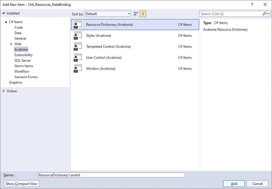
Figure 31: Creating a resource dictionary
Provide a name and click Add. The XAML for the new resource dictionary looks like the following:
<ResourceDictionary xmlns="https://github.com/avaloniaui"
xmlns:x="http://schemas.microsoft.com/winfx/2006/xaml">
<!-- Add Resources Here -->
</ResourceDictionary>
You will add resources inside the dictionary, replacing the comment; however, resource dictionaries cannot be consumed directly so they must be referenced first. To accomplish this, you use a merged dictionary as follows:
<Window.Resources>
<ResourceDictionary>
<ResourceDictionary.MergedDictionaries>
<ResourceInclude Source="/ResourceDictionary1.axaml"/>
</ResourceDictionary.MergedDictionaries>
</ResourceDictionary>
</Window.Resources>
You point to a resource dictionary specifying one or more ResourceInclude objects as a child of the ResourceDictionary.MergedDictionaries property. You assign the relative path of the dictionary to the Source property. In this way, resources stored in the dictionary can be consumed from within the visual element where they are referred from (or at the application level, if you add the merged dictionary to the App.axaml file).
Now that you know where resources are declared and their scope, it is time to see how resources work, starting with styles. Other resources, such as data templates, will be discussed later in this chapter.
Introducing styles
When designing your user interface, in some situations, you might have multiple controls of the same type and, for each of them, you might need to assign the same properties with the same values. For example, you might have two buttons with the same width and height, or two or more labels with the same width, height, and font settings. In such situations, instead of assigning the same properties many times, you can take advantage of styles. A style allows you to assign a set of properties to views of the same type.
Note: Styles in Avalonia UI work differently from WPF, where styles are resources that target a specific control as a whole. In Avalonia UI, styles are a separate feature with more flexibility, with an approach that recalls the Cascading Style Sheet (CSS) implementation. As you will see shortly, in Avalonia UI it is possible to reference specific parts of a control with a syntax that recalls HTML.
Implementing styles
In Avalonia UI, styles are added to the Styles element of a visual element and have the same scope as regular resources. They work like in the following example:
<Window.Styles>
<Style Selector="TextBlock.textblockwelcome">
<Setter Property="Foreground" Value="Green" />
<Setter Property="FontSize" Value="24" />
</Style>
</Window.Styles>
<TextBlock Classes="textblockwelcome" Text="Hi from Avalonia UI!" />
The first thing you notice is the Classes property of the target control, in this case, a TextBlock. Like for HTML, this identifies the target of a style with a custom identifier. The Style element targets the specified element via its Selector property, whose value is the name of the control followed by a dot and the value of the Classes property. Property values are assigned with Setter elements, whose Property property represents the target property name, and whose Value represents the property value.
Another difference with WPF is that you do not need to explicitly reference the style, since this is applied by the selector. Selectors also allow you to target specific behaviors of a control, also referred to as pseudo-classes. The following declaration applies the style only when the mouse pointer hovers over the TextBlock:
<Style Selector="TextBlock.textblockwelcome:pointerover">
<Setter Property="Foreground" Value="Green" />
<Setter Property="FontSize" Value="24" />
</Style>
Another common target is focus, which applies the style only when the target gets focus. The full list of selectors and pseudo-classes is available in the documentation.
Organizing styles
Like it is for regular resources, styles can be organized inside dedicated files. Avalonia UI provides the Styles (Avalonia) item template that you can see in Figure 31. With a separate file, you could rewrite the previous style as follows:
<Styles xmlns="https://github.com/avaloniaui"
xmlns:x="http://schemas.microsoft.com/winfx/2006/xaml">
<Style Selector="TextBlock.textblockwelcome:pointerover">
<Setter Property="Foreground" Value="Green" />
<Setter Property="FontSize" Value="24" />
</Style>
</Styles>
You could then reference the styles files in a window (or other container) with the following syntax:
<Window.Styles>
<StyleInclude Source="/Styles1.axaml" />
</Window.Styles>
The Source is represented by the relative path of the .axaml file on disk.
Using built-in themes
Themes are a special type of style that refer to the visual appearance of controls based on a specific style set. If you look at the App.axaml file, you will find the following definition:
<Application xmlns="https://github.com/avaloniaui"
xmlns:x="http://schemas.microsoft.com/winfx/2006/xaml"
x:Class="Ch6_Resources_DataBinding.App">
<Application.Styles>
<FluentTheme Mode="Light"/>
</Application.Styles>
</Application>
The FluentTheme built-in style applies a light theme at the application level. You can change it to Dark and see a result similar to Figure 32, depending on what controls you add to the UI.
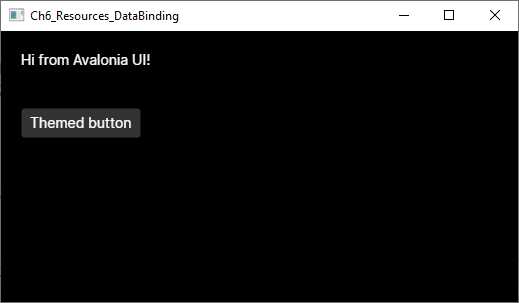
Figure 32: Applying a dark theme
It is also possible to define custom themes, but this is not covered here. You can refer to the official documentation page for more information on custom themes.
Working with data binding
Data binding is a built-in mechanism that allows visual elements to communicate with data so that the user interface is automatically updated when data changes, and vice versa. Data binding is available in all the most important development platforms, and Avalonia UI is no exception. In fact, its data-binding engine relies on the power of XAML, and the way it works is similar in all the XAML-based platforms.
Avalonia UI supports binding objects, collections, and visual elements to other visual elements. This chapter describes the first two scenarios. Because data binding is a very complex topic, the best way to start is with an example. Suppose you want to bind an instance of the following Person class to the user interface, so that a communication flow is established between the object and views:
public class Person
{
public string FullName { get; set; }
public DateTime DateOfBirth { get; set; }
public string Address { get; set; }
}
In the user interface, you will want to allow the user to enter their full name, date of birth, and address via a TextBox, a DatePicker, and another TextBox, respectively. In XAML, this can be accomplished with the code shown in Code Listing 10.
Code Listing 10
<Window xmlns="https://github.com/avaloniaui" xmlns:x="http://schemas.microsoft.com/winfx/2006/xaml" xmlns:d="http://schemas.microsoft.com/expression/blend/2008" xmlns:mc="http://schemas.openxmlformats.org/markup-compatibility/2006" mc:Ignorable="d" d:DesignWidth="800" d:DesignHeight="450" x:Class="Ch6_Resources_DataBinding.SimpleBindingWindow" Title="SimpleBindingWindow"> <StackPanel> <TextBlock Text="Name:" /> <TextBox Text="{Binding FullName}"/> <TextBlock Text="Date of birth:"/> <DatePicker SelectedDate="{Binding DateOfBirth, Mode=TwoWay}"/> <TextBlock Text="Address:"/> <TextBox Text="{Binding Address}"/>
</StackPanel> </Window> |
As you can see, the Text property for TextBox controls and the SelectedDate property of the DatePicker have a markup expression as their value. Such an expression is made up of the Binding literal followed by the property you want to bind from the data object. Actually, the expanded form of this syntax could be {Binding Path=PropertyName}, but Path can be omitted. Data binding can be of five types:
· TwoWay: Views can read and write data.
· OneWay: Views can only read data.
· OneWayToSource: Views can only write data.
· OneTime: Views can read data only once.
· Default: Avalonia UI resolves the appropriate mode automatically, based on the view.
TwoWay and OneWay are the most-used modes, and in most cases, you do not need to specify the mode explicitly because Avalonia UI automatically resolves the appropriate mode based on the control. For example, binding in the TextBox control is TwoWay because this kind of view can be used to read and write data, whereas binding in the TextBlock control is OneWay because this view can only read data.
Controls properties that are bound to an object’s properties are known as styled properties (or dependency properties, if you come from the WPF or UWP world). More details about styled properties will come shortly; for now, what you need to know is that styled properties will automatically update the value of the bound object’s property and automatically refresh their value in the user interface if the object is updated. However, this automatic refresh is possible only if the data-bound object implements the INotifyPropertyChanged interface, which allows an object to send change notifications. As a consequence, you must extend the Person class definition, as shown in Code Listing 11.
Code Listing 11
public class Person : INotifyPropertyChanged { private string fullName; public string FullName { get { return fullName; } set { fullName = value; OnPropertyChanged(); } }
private DateTime dateOfBirth;
public DateTime DateOfBirth { get { return dateOfBirth; } set { dateOfBirth = value; OnPropertyChanged(); } } private string address; public string Address { get { return address; } set { address = value; OnPropertyChanged(); } }
public event PropertyChangedEventHandler PropertyChanged;
private void OnPropertyChanged([CallerMemberName] string propertyName = null) { PropertyChanged?.Invoke(this, new PropertyChangedEventArgs(propertyName)); } } |
By implementing INotifyPropertyChanged, property setters can raise a change notification via the PropertyChanged event. Bound views will be notified of any changes and will refresh their contents.
Tip: With the CallerMemberName attribute, the compiler automatically resolves the name of the caller member. This avoids the need to pass the property name in each setter and helps keep code much cleaner.
The next step is binding an instance of the Person class to the user interface. This can be accomplished with the following lines of code, normally placed inside the window’s code-behind file:
Person person = new Person();
this.DataContext = person;
Windows and panels expose the DataContext property, of type object, which represents the data source for the window or panel. Child controls that are data bound to an object’s properties will search for an instance of the object in the DataContext property value and bind to properties from this instance. In this case, the TextBox and the DatePicker will search for an object instance inside DataContext and bind to properties from that instance. Remember that XAML is case-sensitive, so binding to FullName is different from binding to Fullname. The runtime will throw an exception if you try to bind to a property that does not exist or has a different name.
If you now try to run the application, not only will data binding work, but the user interface will also be automatically updated if the data source changes. You may think of binding views to a single object instance, like in the previous example, as binding to a row in a database table.
Introducing styled properties
Styled properties are the equivalent of WPF’s dependency properties and, put succinctly, they represent the target of a data-binding expression. Styled properties are only exposed by visual elements, and their value is automatically updated as the source value changes. As a consequence, the user interface is automatically updated as the styled property value changes.
In Avalonia UI, you will implement custom styled properties only when defining your own control (as demonstrated in Chapter 7, “Creating Custom Controls”). For now, it is important to understand their behavior. If you look at Code Listing 10, the Text property of the TextBox and the SelectedDate property of the DatePicker are both styled properties. They are the target of the data-binding expression, and the corresponding visual element is updated as their value changes.
For a better understanding, consider the following code that shows the implementation for the Button.IsPressed styled property:
public static readonly StyledProperty<bool> IsPressedProperty =
AvaloniaProperty.Register<Button, bool>(nameof(IsPressed));
public bool IsPressed
{
get => GetValue(IsPressedProperty);
private set => SetValue(IsPressedProperty, value);
}
The first step is declaring a static read-only field of type StyledProperty<T>, where T is the data type for the property. The name of the field ends, by convention, with the Property literal. Its value is an instance of the StyledProperty object created by the AvaloniaProperty.Register method (AvaloniaProperty is the base class for styled properties). Register requires two type parameters: the target control and the property type. The method argument is instead a string representing the name of a regular CLR property defined in the following example. The IsPressed property is a normal property that returns the value of the styled property via the GetValue method and stores the value via the SetValue method. Some styled properties, like the TextBox.Text, also define the default binding direction.
Note: Compared to WPF, Avalonia UI provides a richer property system made of the styled properties and the so-called direct properties. For the purposes of this book, knowing the styled properties is enough. For more information about the direct properties, you can refer to the documentation.
Working with collections
Though working with a single object instance is a common scenario, another very common situation is working with collections that you display as lists in the user interface. Avalonia UI supports data-binding over collections via the ObservableCollection<T> object. This collection works exactly like the List<T> but also raises a change notification when items are added to or removed from the collection. Collections are very useful, for example, when you want to represent rows in a database table.
For example, suppose you have the following collection of Person objects:
Person person1 = new Person { FullName = "Alessandro",
DateOfBirth = new DateTime(1977,5,10) };
Person person2 = new Person { FullName = "James",
DateOfBirth = new DateTime(1980, 1, 1) };
Person person3 = new Person { FullName = "Graham",
DateOfBirth = new DateTime(1982, 12, 31) };
var people = new ObservableCollection<Person>() { person1, person2,
person3 };
this.DataContext = people;
The code assigns the collection to the DataContext property of the root container (and later you will work with data and logic separation when talking about MVVM). At this point, you need a visual element capable of displaying the content of this collection. This is where the ListBox control comes in. The ListBox can receive the data source from either the DataContext of its container or by assigning its Items property, and any object that implements the IEnumerable interface can be used with the ListBox. You will typically assign Items directly if the data source for the ListBox is not the same data source as for the other views in the page.
Tip: All the controls that allow for displaying data and that expose the Items property are also referred to as Item Controls.
The problem to solve with the ListBox is that it does not know how to present objects in a list. For example, think of the People collection that contains instances of the Person class. Each instance exposes the FullName, DateOfBirth, and Address properties, but the ListBox does not know how to present these properties, so it is your job to explain to it how. This is accomplished with the data templates. A data template is a static set of views that are bound to properties in the object. It instructs the ListBox on how to present items.
For example, if you only had to display and edit the FullName property, you could write the following data template:
<Grid>
<ListBox x:Name="PeopleList" Items="{Binding}">
<ListBox.ItemTemplate>
<DataTemplate>
<StackPanel Orientation="Horizontal">
<TextBlock Text="Full name: "/>
<TextBlock Text="{Binding FullName}"/>
</StackPanel>
</DataTemplate>
</ListBox.ItemTemplate>
</ListBox>
</Grid>
Tip: The DataTemplate definition is always defined inside the ListBox.ItemTemplate element.
As a general rule, if the data source is assigned to the DataContext property, the Items must be set with the {Binding} value. This means your data source is the same as that of your parent. With this code, the ListBox will display all the items in the bound collection, showing two TextBlock controls for each item. However, each Person also exposes a property of type DateTime, so you need to extend the DataTemplate, as shown in Code Listing12.
Code Listing 12
<Window xmlns="https://github.com/avaloniaui" xmlns:x="http://schemas.microsoft.com/winfx/2006/xaml" xmlns:d="http://schemas.microsoft.com/expression/blend/2008" xmlns:mc="http://schemas.openxmlformats.org/markup-compatibility/2006" mc:Ignorable="d" d:DesignWidth="800" d:DesignHeight="450" x:Class="Ch6_Resources_DataBinding.ListBoxWindow" Title="ListBoxWindow"> <Grid> <ListBox x:Name="PeopleList" Items="{Binding}"> <ListBox.ItemTemplate> <DataTemplate> <StackPanel> <StackPanel Orientation="Horizontal"> <TextBlock Text="Full name: "/> <TextBlock Text="{Binding FullName}"/> </StackPanel> <StackPanel Orientation="Horizontal" Margin="0,5,0,0"> <TextBlock Text="Date of birth: "/> <CalendarDatePicker SelectedDate="{Binding DateOfBirth}"/> </StackPanel> </StackPanel> </DataTemplate> </ListBox.ItemTemplate> </ListBox> </Grid> </Window> |
As you can see, data templates allow you to implement complex visual elements and display whatever kind of information you need.
Figure 33 shows the result for the code described in this section. Notice that the ListBox includes built-in scrolling capability and must never be enclosed within a ScrollViewer.
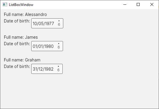
Figure 33: A data-bound ListBox
A data template can be placed inside the window or app resources so that it becomes reusable. Then, you assign the ItemTemplate property in the ListBox definition with the StaticResource expression, as shown in Code Listing 20.
Code Listing 20
<Window xmlns="https://github.com/avaloniaui" xmlns:x="http://schemas.microsoft.com/winfx/2006/xaml" xmlns:d="http://schemas.microsoft.com/expression/blend/2008" xmlns:mc="http://schemas.openxmlformats.org/markup-compatibility/2006" mc:Ignorable="d" d:DesignWidth="800" d:DesignHeight="450" x:Class="Ch6_Resources_DataBinding.ListBoxWindow" Title="ListBoxWindow"> <Window.Resources> <DataTemplate x:Key="PersonDataTemplate"> <StackPanel> <StackPanel Orientation="Horizontal"> <TextBlock Text="Full name: "/> <TextBlock Text="{Binding FullName}"/> </StackPanel> <StackPanel Orientation="Horizontal" Margin="0,5,0,0"> <TextBlock Text="Date of birth: "/> <CalendarDatePicker SelectedDate="{Binding DateOfBirth, Mode=TwoWay}"/> </StackPanel> </StackPanel> </DataTemplate> </Window.Resources> <Grid> <ListBox x:Name="PeopleList" Items="{Binding}" ItemTemplate="{StaticResource PersonDataTemplate}"/> </Grid> </Window> |
Separating data templates from the data controls is very common; it allows for reusability and helps keep the code cleaner. The ListBox also provides the following important properties:
· SelectedItem: Represents the currently selected item in the control.
· SelectionMode: Specifies how items can be selected according to the following values: Single, Multiple, Toggle, AlwaysSelected.
In order to handle selection, the ListBox must subscribe to the SelectionChanged event that can be handled as follows:
private void PeopleList_SelectionChanged(object sender, SelectionChangedEventArgs e)
{
// Get the current item
var currentItem = PeopleList.SelectedItem as Person;
// Get the first selected person from the collection
var selectedPerson = e.AddedItems[0] as Person;
}
SelectedItem is of type object and must be converted into an instance of the bound type. The AddedItems property of the SelectionChangedEventArgs object returns a collection of currently selected items (when SelectionMode is Multiple), whereas RemovedItems returns a collection of items that were selected before the current selection.
Binding lists to a ComboBox
In the previous chapter, you saw how to implement a ComboBox to display lists of options supplied in code, but actually, the ComboBox is an items control and exposes the Items property. For example, you could bind the collection of Person objects shown previously as follows:
<ComboBox Items="{Binding}">
<ComboBox.ItemTemplate>
<DataTemplate>
<StackPanel>
<TextBlock Text="{Binding FullName}"/>
</StackPanel>
</DataTemplate>
</ComboBox.ItemTemplate>
</ComboBox>
Figure 34 shows how the data-bound ComboBox appears.
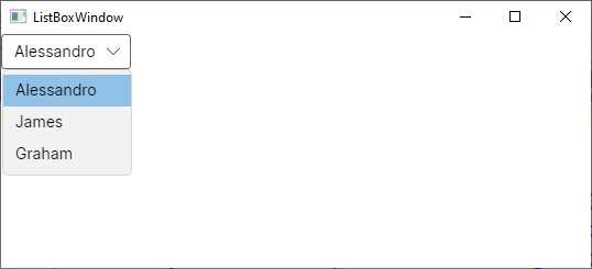
Figure 34: A data-bound ComboBox
Like the ListBox, the ComboBox also exposes the SelectedItem property and the SelectionChanged event that you handle in the same ways you previously saw.
Introducing value converters
In Chapter 3, you learned about type converters, which automatically convert a type into another one that is supported by a property binding. For example, if you bind an integer value to the Text property of a TextBox control, such an integer is converted into a string by a XAML type converter. However, there are situations in which you might want to bind objects that XAML type converters cannot automatically convert into the type a control expects.
For example, you might want to bind a Color value to a Label’s Text property, which is not possible out of the box. In these cases, you can create value converters. A value converter is a class that implements the IValueConverter interface and must expose the Convert and ConvertBack methods. Convert translates the original type into a type that the view can receive, while ConvertBack does the opposite.
For a better understanding, suppose you want to show or hide a TextBlock depending on the Yes or No choice made via the following ComboBox:
<ComboBox Name="ComboBox1">
<ComboBoxItem>Yes</ComboBoxItem>
<ComboBoxItem>No</ComboBoxItem>
</ComboBox>
The choice made here is stored by the Content property of each ComboBoxItem. This needs to be converted into a bool that can be assigned to the IsVisible property of a TextBlock. To accomplish this, you could implement the converter shown in Code Listing 21.
Code Listing 21
public class YesNoToBoolConverter : IValueConverter { public object? Convert(object? value, Type targetType, object? parameter, CultureInfo culture) { if (value == null) return false; var item = value as ComboBoxItem; string actualValue = item.Content.ToString(); switch(actualValue) { case "Yes": return true; default: return false; } } public object? ConvertBack(object? value, Type targetType, object? parameter, CultureInfo culture) { throw new NotImplementedException(); } } |
Both methods always receive the data to convert as object instances, and then you need to cast the object into a specialized type for manipulation. In this case, Convert receives a ComboBoxItem and converts the value of its Content property into a string. Then, depending on the content (Yes or No), it returns the appropriate bool value. The value converter must then be declared in the resources of the XAML file where you wish to use it (or in App.axaml). To do so, you first declare an XML namespace that points to the assembly that defines the converter:
xmlns:local="using:Ch6_Resources_DataBinding"
Then, you add the converter to the resources:
<Window.Resources>
<local:YesNoToBoolConverter x:Key="BoolConverter"/>
</Window.Resources>
As with any other resource, you assign an identifier via the x:Key attribute. Finally, you consume the converter in the following data-binding expression:
<TextBlock Text="Visibility test"
IsVisible="{Binding ElementName=ComboBox1, Path=SelectedItem,
Converter={StaticResource BoolConverter}}"/>
As a general rule, you assign a converter via the Converter expression pointing to the converter identifier via StaticResource. In this particular case, the TextBlock needs to read the value of the currently selected item in the ComboBox, so it is bound to the ComboBox via ElementName and the Path expression points to the SelectedItem property. If you ran this code, you would see that the TextBlock visibility is determined by what you choose in the ComboBox.
Displaying lists with the DataGrid
Previously, you have seen how to display lists of data with the ListBox, which provides great flexibility when it comes to creating complex data templates. However, sometimes you might need to display data in a tabular form. In this case, you can use a convenient control called DataGrid. This comes with a separate NuGet package called Avalonia.Controls.DataGrid. Figure 35 shows how it appears in the NuGet Package Manager.
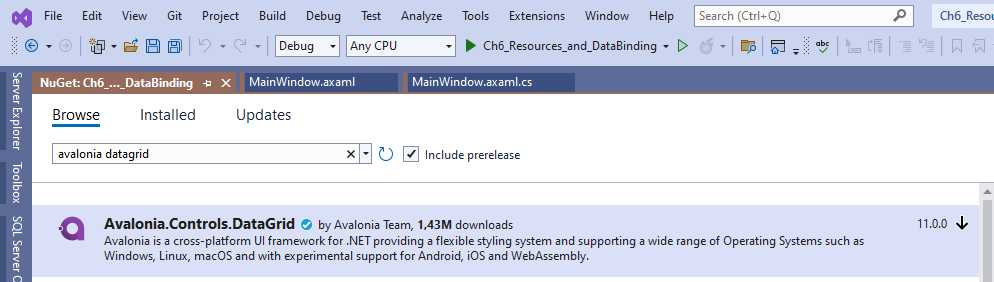
Figure 35: Installing the DataGrid package
Make sure that the package version matches the Avalonia UI version you selected during the project creation. Once installed, you need to add the following line to the Styles node of the App.axaml file:
<StyleInclude Source="avares://Avalonia.Controls.DataGrid/Themes/Fluent.xaml"/>
Now, suppose you want to display the previously discussed ObservableCollection<Person> as tabular data. The easiest way to accomplish this, after assigning the collection to the window’s DataContext (as you have already done several times), is by declaring a DataGrid as follows:
<DataGrid Name="DataGrid1" ClipboardCopyMode="IncludeHeader"
Items="{Binding}" AutoGenerateColumns="True"
GridLinesVisibility="All"/>
If you assign True to the AutoGenerateColumns property, the control will generate the columns for you. With the ClipboardCopyMode, you can specify if copying to the clipboard will include the header (IncludeHeader) or not (ExcludeHeader). You can also control the grid line visibility, such as all visible, only vertical, or only horizontal.
If you run the code, you will notice that the DataGrid generates editable text columns for all your properties by basically invoking a .ToString() on each. However, if you have specific data types like the DateTime of the sample code, a better approach is to implement specialized columns. What you need to do is assign AutoGenerateColumns with False and leverage the following objects:
· DataGridTextColumn: This allows for displaying and editing text values.
· DataGridCheckBoxColumn: This allows for displaying and editing bool values via a CheckBox control.
· DataGridTemplateColumn: This allows for the implementation of custom visualization for any other data type.
For example, if you look at Code Listing 22, you can see how to show text, but also how to provide a date selection for the sample data model you created previously.
Code Listing 22
<Window xmlns="https://github.com/avaloniaui" xmlns:x="http://schemas.microsoft.com/winfx/2006/xaml" xmlns:d="http://schemas.microsoft.com/expression/blend/2008" xmlns:mc="http://schemas.openxmlformats.org/markup-compatibility/2006" mc:Ignorable="d" d:DesignWidth="800" d:DesignHeight="450" x:Class="Ch6_Resources_and_DataBinding.DataGridWindow" Title="DataGridWindow"> <Grid> <DataGrid Name="DataGrid1" ClipboardCopyMode="IncludeHeader" Items="{Binding}" AutoGenerateColumns="False" AlternatingRowBackground="LightGreen" CanUserResizeColumns="True" CanUserReorderColumns="True" GridLinesVisibility="All"> <DataGrid.Columns> <DataGridTextColumn Header="First Name" Binding="{Binding FullName}"/> <DataGridTemplateColumn Header="Date of birth"> <DataGridTemplateColumn.CellTemplate> <DataTemplate> <CalendarDatePicker SelectedDate="{Binding DateOfBirth}" /> </DataTemplate>
</DataGridTemplateColumn.CellTemplate> </DataGridTemplateColumn> </DataGrid.Columns> </DataGrid> </Grid> </Window> |
All the columns share the Header property, which contains the text for the column header.
Tip: The HeaderTemplate property can be used instead of Header if you want to use a custom visual element as the column header. The definition is added inside a DataTemplate element.
The DataGridTextColumn and DataGridCheckBoxColumn objects also expose the Binding property, which is used to bind the backing data. For custom columns, in the DataGridTemplateColumn object, you need to populate the CellTemplate property with a DataTemplate that contains the visual elements you want to implement. In the current example, a CalendarDatePicker is used, and its SelectedDate property is bound to the DateOfBirth property of the Person class. The result of Code Listing 22 is shown in Figure 36.
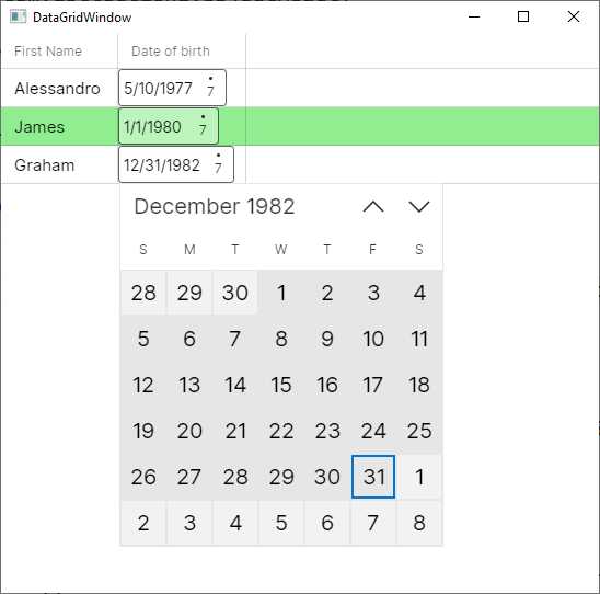
Figure 36: Generating custom columns with the DataGrid
Notice how the CanUserResizeColumns and CanUserReorderColumns properties can be used to improve the user interaction. You could also use the IsReadOnly property to implement read-only columns. Like for the ListBox, you can set the SelectionMode property to determine how item selection should work, and you can handle the SelectionChanged event in the same way.
In addition, you can control what happens inside cells by subscribing some events exposed by the DataGrid. For example, you can handle the CellEditEnding and CellEditEnded events, whose names are self-explanatory, as follows:
private void DataGrid1_CellEditEnding(object sender,
DataGridCellEditEndingEventArgs e)
{
if (e.EditAction == DataGridEditAction.Commit)
{
// Further data validation here...
}
}
private void DataGrid1_CellEditEnded(object sender,
DataGridCellEditEndedEventArgs e)
{
if(e.EditAction == DataGridEditAction.Commit)
{
// Some post-save actions here...
}
}
Both the DataGridCellEditEndingEventArgs and the DataGridCellEditEndedEventArgs objects expose the EditAction property, whose value can be Commit or Cancel, so you can understand what action was requested by the user. In the case of CellEditEnding, which happens before finalizing the edit action, you can also programmatically cancel the operation by setting e.Cancel = true;. The full list of events can be found in the official documentation. For now, you have everything you need to start working with the DataGrid.
Scrolling lists with the Carousel
The Carousel is a control that allows for scrolling lists. Typically, a Carousel is used to scroll lists horizontally, but it also supports vertical orientation. This control can also be populated manually, like the ComboBox, so it is not limited to data-binding scenarios, but the dynamic assignment of items is certainly more common.
Unlike what you would expect from similar controls offered by other platforms, the scrolling actions are not automatic, so you need to implement your own click handling. The code shown in Code Listing 23 provides an example of implementing a Carousel to scroll the previously defined list of people horizontally.
Code Listing 23
<Window xmlns="https://github.com/avaloniaui" xmlns:x="http://schemas.microsoft.com/winfx/2006/xaml" xmlns:d="http://schemas.microsoft.com/expression/blend/2008" xmlns:mc="http://schemas.openxmlformats.org/markup-compatibility/2006" mc:Ignorable="d" d:DesignWidth="800" d:DesignHeight="450" x:Class="Ch6_Resources_and_DataBinding.CarouselWindow" Title="CarouselWindow"> <Grid> <Grid.ColumnDefinitions> <ColumnDefinition Width="Auto"/> <ColumnDefinition /> <ColumnDefinition Width="Auto"/> </Grid.ColumnDefinitions> <Carousel Name="Carousel1" Items="{Binding}" Grid.Column="1" HorizontalAlignment="Center" VerticalAlignment="Center"> <Carousel.PageTransition> <CompositePageTransition> <PageSlide Duration="0:00:01.000" Orientation="Horizontal" /> </CompositePageTransition> </Carousel.PageTransition> <Carousel.ItemTemplate> <DataTemplate> <StackPanel> <TextBlock Text="{Binding FullName}" FontSize="18" FontWeight="Bold" /> <TextBlock Text="{Binding DateOfBirth}" Foreground="Gray" /> <TextBlock Text="{Binding Address}" FontSize="14" /> </StackPanel> </DataTemplate> </Carousel.ItemTemplate> </Carousel> <Button Margin="10" Name="PreviousButton" Click="PreviousButton_Click"><</Button> <Button Margin="10" Name="NextButton" Click="NextButton_Click" Grid.Column="2">></Button> </Grid> </Window> |
First, you specify the page transition via the CompositePageTransition object, assigned with a PageSlide object that represents the duration and direction of the transition. Then, you specify an ItemTemplate, as you have done previously with the ListBox and DataGrid. Notice how the two Button controls are implemented to provide sliding actions. Their event handlers look like the following:
private void PreviousButton_Click(object sender, RoutedEventArgs e)
{
Carousel1.Previous();
}
private void NextButton_Click(object sender, RoutedEventArgs e)
{
Carousel1.Next();
}
The Previous and Next methods allow for sliding the Carousel content. Figure 37 shows the result.
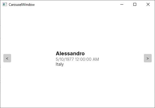
Figure 37: Sliding items with a Carousel
The current example is totally based on strings, but you can obviously add images and complex visual elements that are more suitable to be displayed with a Carousel.
Items repeater controls
The Avalonia UI codebase provides two controls called ItemsControl and ItemsRepeater. Their purpose is to display lists of items in a stack. The ItemsControl has no template and no interaction, whereas the ItemsRepeater does. For this reason, an example will be provided for the ItemsRepeater. For more on the ItemsControl, you can refer to the official documentation.
Suppose you want to display a list of Person objects as defined previously. You could implement an ItemsRepeater, as shown in Code Listing 24.
Code Listing 24
<Window xmlns="https://github.com/avaloniaui" xmlns:x="http://schemas.microsoft.com/winfx/2006/xaml" xmlns:d="http://schemas.microsoft.com/expression/blend/2008" xmlns:mc="http://schemas.openxmlformats.org/markup-compatibility/2006" mc:Ignorable="d" d:DesignWidth="800" d:DesignHeight="450" x:Class="Ch6_Resources_and_DataBinding.ItemsRepeaterWindow" Title="ItemsRepeaterWindow"> <Grid> <ItemsRepeater Items="{Binding}"> <ItemsRepeater.ItemTemplate> <DataTemplate> <Border BorderBrush="Blue" Margin="5" CornerRadius="10" BorderThickness="2"> <StackPanel Margin="5"> <TextBlock Text="{Binding FullName}"/> <CalendarDatePicker SelectedDate="{Binding DateOfBirth, Mode=TwoWay}"/> </StackPanel> </Border> </DataTemplate> </ItemsRepeater.ItemTemplate> </ItemsRepeater> </Grid> </Window> |
In the code-behind file, assign the data source as you have done for the previous controls. As the name implies, the Border draws a border around its child element by specifying the brush (BorderBrush), the thickness (BorderThickness), and the (optional) rounding for corners (CornerRadius). As you can see in Figure 38, the ItemsRepeater renders items in a vertical stack.
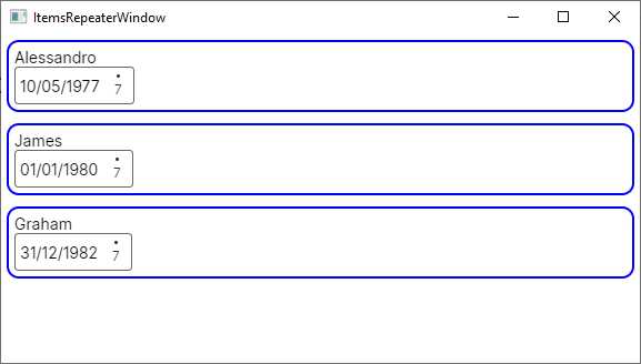
Figure 38: Displaying items with the ItemsRepeater
If you want to implement horizontal rendering, you need to assign the Layout property as follows:
<ItemsRepeater.Layout>
<StackLayout Spacing="40"
Orientation="Horizontal" />
</ItemsRepeater.Layout>
Here you also meet the StackLayout for the first time. This visual element renders items horizontally, but only as the child element of the Layout property from item controls.
Note: The ItemsRepeater control is a porting from the UWP counterpart and has been discussed here for the sake of consistency. However, you might prefer a ListBox, which certainly provides more flexibility.
Introducing the Model-View-ViewModel pattern
Model-View-ViewModel (MVVM) is an architectural pattern used in XAML-based platforms that allows for clean separation between the data (model), the logic (ViewModel), and the user interface (view). With MVVM, windows and user controls only contain code related to the user interface. They strongly rely on data binding, and most of the work is done in the ViewModel. MVVM can be quite complex if you have never seen it before, so I will try to simplify the explanations as much as possible, but you should use Avalonia’s MVVM documentation as a reference.
Let’s start with a simple example and a fresh Avalonia UI solution. Imagine you want to work with a list of Person objects. This is your model, and you can reuse the Person class from Code Listing 11. Add a new folder called Model to your project and add a new Person.cs class file to this folder, pasting in the code of the Person class. Next, add a new folder called ViewModel to the project and a new class file called PersonViewModel.cs.
Before writing the code for it, let’s summarize some important considerations:
· The ViewModel contains the business logic, acts like a bridge between the model and the view, and exposes properties to which the view can bind.
· Among such properties, one will certainly be a collection of Person objects.
· In the ViewModel, you can load data, filter data, execute save operations, and query data.
Loading, filtering, saving, and querying data are examples of actions a ViewModel can execute against data. In a classic development approach, you would handle Click events on Button controls and write the code that executes an action. However, in MVVM, windows and controls should only work with code related to the user interface, not code that executes actions against data. In MVVM, ViewModels expose public methods that will be bound to the Command property of a control, such as Button or MenuItem, and that will execute the action. In the UI, you bind a view to a command in the ViewModel. This way, the action is executed in the ViewModel instead of in the view’s code behind. Code Listing 25 shows the PersonViewModel class definition.
public class PersonViewModel : INotifyPropertyChanged { public ObservableCollection<Person> People { get; set; } private Person _selectedPerson; public Person SelectedPerson { get { return _selectedPerson; } set { _selectedPerson = value; OnPropertyChanged(); } } public void AddPerson() { People.Add(new Person()); } public bool CanAddPerson() { return true; } public event PropertyChangedEventHandler PropertyChanged; private void OnPropertyChanged([CallerMemberName] string propertyName = null) { PropertyChanged?.Invoke(this, new PropertyChangedEventArgs(propertyName)); } private void LoadSampleData() { People = new ObservableCollection<Person>(); // sample data Person person1 = new Person { FullName = "Alessandro", Address = "Italy", DateOfBirth = new DateTime(1977, 5, 10) }; Person person2 = new Person { FullName = "Robert", Address = "United States", DateOfBirth = new DateTime(1960, 2, 1) }; Person person3 = new Person { FullName = "Niklas", Address = "Germany", DateOfBirth = new DateTime(1980, 4, 2) }; People.Add(person1); People.Add(person2); People.Add(person3); } public PersonViewModel() { LoadSampleData(); } } |
The People and SelectedPerson properties expose a collection of Person objects and a single Person, respectively, and the latter will be bound to the SelectedItem property of a DataGrid, as you will see shortly. Notice how:
· The AddPerson method represents the action that makes it possible to add a new object to the collection and that will be bound to the Command property of a Button.
· The CanAddPerson method returns a bool value that the data-binding engine checks for, in order to understand if it is possible to execute an action.
The LoadSampleData method generates some sample data that will be the source for a DataGrid. Now it is time to write the XAML code for the user interface. Code Listing 26 shows how to use a DataGrid and bind a Button to commands.
<Window xmlns="https://github.com/avaloniaui" xmlns:x="http://schemas.microsoft.com/winfx/2006/xaml" xmlns:d="http://schemas.microsoft.com/expression/blend/2008" xmlns:mc="http://schemas.openxmlformats.org/markup-compatibility/2006" mc:Ignorable="d" d:DesignWidth="800" d:DesignHeight="450" x:Class="Ch6_MVVM.MainWindow" Title="Ch6_MVVM"> <Grid> <Grid.RowDefinitions> <RowDefinition Height="Auto"/> <RowDefinition /> </Grid.RowDefinitions> <StackPanel Orientation="Horizontal"> <Button Name="AddButton" Command="{Binding AddPerson}" Content="Add person"/> </StackPanel> <DataGrid Grid.Row="1" Name="DataGrid1" ClipboardCopyMode="IncludeHeader" Items="{Binding People}" AutoGenerateColumns="False" SelectedItem="{Binding SelectedPerson, Mode=TwoWay}" AlternatingRowBackground="LightGreen" CanUserResizeColumns="True" CanUserReorderColumns="True" GridLinesVisibility="All"> <DataGrid.Columns> <DataGridTextColumn Header="First Name" Binding="{Binding FullName}"/> <DataGridTemplateColumn Header="Date of birth"> <DataGridTemplateColumn.CellTemplate> <DataTemplate> <CalendarDatePicker SelectedDate="{Binding DateOfBirth}" /> </DataTemplate> </DataGridTemplateColumn.CellTemplate> </DataGridTemplateColumn> <DataGridTextColumn Header="Address" Binding="{Binding Address}"/> </DataGrid.Columns> </DataGrid> </Grid> </Window> |
Notice how:
· The DataGrid.Items property is bound to the People collection in the ViewModel.
· The DataGrid.SelectedItem property is bound to the SelectedPerson property in the ViewModel.
· The Button is bound to the AddPerson method in the ViewModel via its Command property.
The final step is to create an instance of the ViewModel and assign it to the DataContext of the page, which you can do in the page code-behind, as demonstrated in Code Listing 27.
Code Listing 27
namespace Ch6_MVVM { public partial class MainWindow : Window { // Not using a field here because properties // are optimized for data-binding. private PersonViewModel ViewModel { get; set; }
public MainWindow() { InitializeComponent();
this.ViewModel = new PersonViewModel(); this.DataContext = this.ViewModel; } } } |
If you run the application now (see Figure 39), you will see the list of Person objects and be able to use the button. However, the real benefit is that the whole logic is in the ViewModel. With this approach, if you change the logic in the properties or in the commands, you will not need to change the page code.
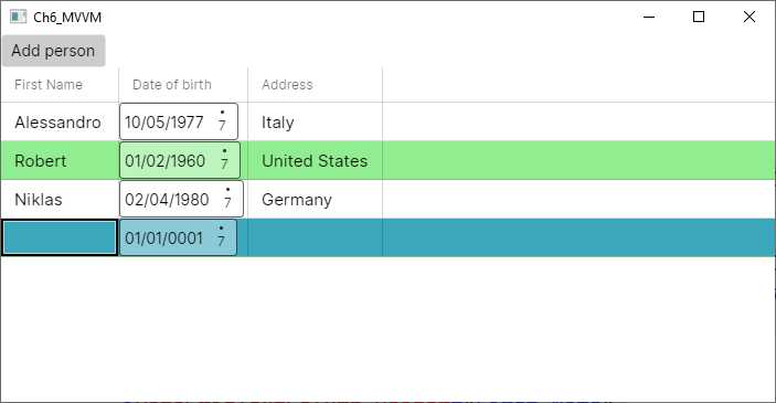
Figure 39: Showing a list of people and adding a new person with MVVM
MVVM is very powerful, but real-world implementations can be very complex. For example, if you want to navigate to another page and you have commands, the ViewModel should contain code related to the user interface (launching a window) that does not adhere to the principles of MVVM. You will get some more information about this in Chapter 8, “Working with Pages and Dialogs.”
Chapter summary
XAML plays a fundamental role in Avalonia UI and allows for defining reusable resources and for data-binding scenarios. Resources are reusable styles, data templates, and references to objects you declare in XAML. In particular, styles allow you to set the visual appearance of controls with a CSS-based approach. XAML also includes a powerful data-binding engine that allows you to quickly bind objects to visual elements in a two-way communication flow.
In this chapter, you have seen how to bind a single object to individual visual elements and collections of objects to the ListBox, DataGrid, Carousel, and ItemsRepeater. You have seen how to define data templates so that item controls can have knowledge of how items must be presented, and you have learned about value converters, special objects that come in to help when you want to bind objects of a type that is different from the type a view supports.
In the second part of the chapter, you walked through an introduction to the Model-View-ViewModel pattern, focusing on separating the logic from the UI and understanding new objects and concepts such as command binding.
In the next chapter, you will learn how to build your own controls and how to redefine the user interface for existing controls.
- 1800+ high-performance UI components.
- Includes popular controls such as Grid, Chart, Scheduler, and more.
- 24x5 unlimited support by developers.