
Avalonia UI Succinctly®

CHAPTER 4
Organizing the UI with Panels
One of the goals of XAML is simplifying the generation of dynamic user interfaces that automatically rearrange visual elements depending on page size and screen factors. Cross-platform development is even more important because phones, tablets, and laptops have different screen sizes and form factors. They also support both landscape and portrait orientations. Therefore, the user interface must dynamically adapt to the system, screen, and device so that visual elements can be automatically resized or rearranged based on the form factor and device orientation. In Avalonia UI, this is accomplished with panels, which is the topic of this chapter.
Understanding the concept of panels
Tip: If you have previous experience with WPF, UWP, or .NET MAUI, the concept of panels is something you already know.
One of the goals of Avalonia UI is providing the ability to create dynamic interfaces that can be rearranged according to the user’s preferences, or to the device and screen size. Because of this, controls in applications you build with Avalonia UI should not have a fixed size or position on the UI, except in a very limited number of scenarios. To make this possible, Avalonia UI controls are arranged within special containers, known as panels. Panels are classes that allow for arranging visual elements in the UI, and Avalonia UI provides many of them.
In this chapter, you’ll learn about available panels and how to use them to arrange controls. The most important thing to keep in mind is that controls in Avalonia UI have a hierarchical logic; therefore, you can nest multiple panels to create complex user experiences. Table 2 summarizes the available panels. You’ll learn about them in more detail in the sections that follow.
Table 2: Layouts in Avalonia UI
Layout | Description |
|---|---|
StackPanel | Allows you to place visual elements near each other horizontally or vertically on a single line. |
WrapPanel | Allows you to place visual elements near each other horizontally or vertically. Wraps visual elements to the next row or column if not enough space is available. |
Grid | Allows you to organize visual elements within rows and columns. |
Canvas | A panel placed at a specified, fixed position. |
RelativePanel | A panel whose position depends on relative constraints. |
ScrollViewer | Allows you to scroll the visual elements it contains. |
DockPanel | Allows you to arrange visual elements relative to each other, either horizontally or vertically |
Panel | Lays out all the children to fill the bounds of the panel itself. It works like a Grid with no rows and columns. |
Remember that only one root panel is assigned to the Content property of a Window, and that panels can then contain nested visual elements and panels.
Tip: The Panel container will not be discussed, since its usage is less common and can be covered by talking about the Grid.
Alignment and spacing options
Panels can be aligned by assigning the HorizontalAlignment and VerticalAlignment properties with one of the property values from the HorizontalAlignment and VerticalAlignment enumerations, respectively. These are summarized in Table 3. Though not mandatory, providing an alignment option is very common.
Table 3: Alignment options in Avalonia UI
Alignment | Enumeration | Description |
|---|---|---|
Center | VerticalAlignment | Aligns the visual element at the center, vertically |
Top | VerticalAlignment | Aligns the visual element at the top |
Bottom | VerticalAlignment | Aligns the visual element at the bottom |
Stretch | VerticalAlignment | Expands the visual element’s bounds to fill the available space vertically |
Center | HorizontalAlignment | Aligns the visual element at the center, horizontally |
Right | HorizontalAlignment | Aligns the visual element at the right |
Left | HorizontalAlignment | Aligns the visual element at the left |
Stretch | HorizontalAlignment | Expands the visual element’s bounds to fill the available space horizontally |
You can also control the space between visual elements with two properties: Spacing and Margin, summarized in Table 4.
Table 4: Spacing options in Avalonia UI
Spacing | Description |
|---|---|
Margin | Represents the distance between the current visual element and its adjacent elements with either a fixed value for all four sides, or with comma-separated values for the left, top, right, and bottom. It is of type Thickness and XAML has a built-in type converter for it. |
Spacing | Available only in the StackPanel container, it allows you to set the amount of space between each child element. |
I recommend you spend some time experimenting with how alignment and spacing options work in order to understand how to get the appropriate result in your user interfaces.
The StackPanel
The StackPanel container allows the placing of controls near each other, as in a stack that can be arranged both horizontally and vertically. As with other containers, the StackPanel can contain nested panels. The following code shows how you can arrange controls horizontally and vertically. Code Listing 4 shows an example with a root StackPanel and two nested layouts.
Code Listing 4
<Window xmlns="https://github.com/avaloniaui" xmlns:x="http://schemas.microsoft.com/winfx/2006/xaml" xmlns:d="http://schemas.microsoft.com/expression/blend/2008" xmlns:mc="http://schemas.openxmlformats.org/markup-compatibility/2006" mc:Ignorable="d" d:DesignWidth="800" d:DesignHeight="450" x:Class="Ch4_Panels.StackPanelWindow" Title="StackPanelWindow"> <StackPanel Orientation="Vertical"> <StackPanel Orientation="Horizontal" Margin="5"> <TextBlock Text="Sample controls" Margin="5"/> <Button Content="Test button" Margin="5"/> </StackPanel> <StackPanel Orientation="Vertical" Margin="5"> <TextBlock Text="Sample controls" Margin="5"/> <Button Content="Test button" Margin="5"/> </StackPanel> </StackPanel> </Window> |
The result of the XAML in Code Listing 4 is shown in Figure 12.
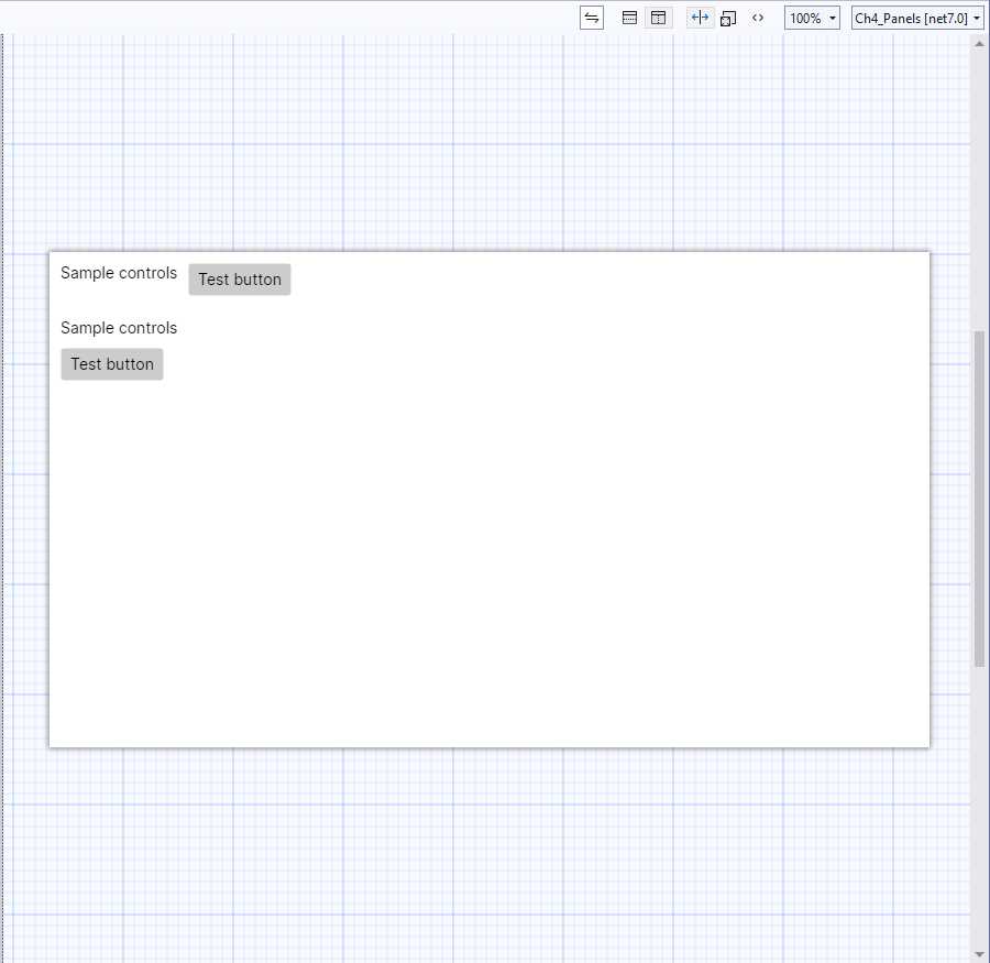
Figure 12: Arranging visual elements with the StackPanel
The Orientation property can be set as Horizontal or Vertical, and this influences the final layout. If not specified, Vertical is the default. One of the main benefits of XAML code is that element names and properties are self-explanatory, and this is the case in StackPanel’s properties, too.
Remember that controls within a StackPanel are automatically resized according to the orientation. If you do not like this behavior, you need to specify Width and Height properties on each control, which represent the width and height, respectively.
Spacing is a property that you can use to adjust the amount of space between child elements; this is preferred to adjusting the space on the individual controls with the Margin property.
The WrapPanel
The WrapPanel works like a StackPanel, since it arranges child visual elements vertically or horizontally, but the difference is that it is also able to wrap the child visual elements if there is not enough space in a single row or column. Code Listing 5 provides an example and shows how easy it is to work with this layout.
Code Listing 5
<Window xmlns="https://github.com/avaloniaui" xmlns:x="http://schemas.microsoft.com/winfx/2006/xaml" xmlns:d="http://schemas.microsoft.com/expression/blend/2008" xmlns:mc="http://schemas.openxmlformats.org/markup-compatibility/2006" mc:Ignorable="d" d:DesignWidth="800" d:DesignHeight="450" x:Class="Ch4_Panels.WrapPanelWindow" Title="WrapPanelWindow"> <WrapPanel> <WrapPanel Orientation="Horizontal" Margin="5"> <TextBlock Text="Sample controls" Margin="5"/> <Button Content="Test button" Margin="5"/> </WrapPanel> <WrapPanel Orientation="Vertical" Margin="5"> <TextBlock Text="Sample controls" Margin="5"/> <Button Content="Test button" Margin="5"/> </WrapPanel> </WrapPanel> </Window> |
Figure 13 shows a sample result for Code Listing 5 obtained by assigning the d:DesignWidth property of the Window with 200. By reducing the window’s width, the WrapPanel brings visual elements to the next row when necessary, making them still visible.
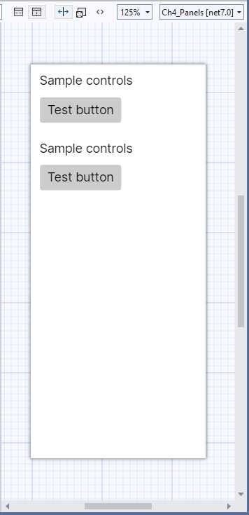
Figure 13: Arranging visual elements with the FlexLayout
Remember that, like for the StackPanel, visual elements in a WrapPanel are aligned from left to right.
The Grid
The Grid is one of the easiest layouts to understand, and probably the most versatile. It allows you to create tables with rows and columns. In this way, you can define cells, and each cell can contain a control or another layout storing nested controls. The Grid is versatile in that you can just divide it into rows or columns, or both.
The following code defines a Grid that is divided into two rows and two columns:
<Grid>
<Grid.RowDefinitions>
<RowDefinition />
<RowDefinition />
</Grid.RowDefinitions>
<Grid.ColumnDefinitions>
<ColumnDefinition />
<ColumnDefinition />
</Grid.ColumnDefinitions>
</Grid>
RowDefinitions is a collection of RowDefinition objects, and the same is true for ColumnDefinitions and ColumnDefinition. Each item represents a row or a column within the Grid, respectively. You can also specify a Width or a Height property to delimit row and column dimensions; if you do not specify anything, both rows and columns are dimensioned at the maximum size available. When resizing the parent container, rows and columns are automatically rearranged.
The preceding code creates a table with four cells. To place controls in the Grid, specify the row and column position via the Grid.Row and Grid.Column properties, known as attached properties, on the control.
Note: The Avalonia UI documentation explains how to create and consume new attached properties, but if you want to discover more about this topic, I recommend that you have a look at the WPF documentation.
Attached properties allow for assigning properties of the parent container from the current visual element. The index of both is zero-based, meaning that 0 represents the first column from the left and the first row from the top. You can place nested layouts within a cell or a single row or column. The code in Code Listing 6 shows how to nest a grid into a root grid with child controls.
Tip: Grid.Row="0" and Grid.Column="0" can be omitted.
Code Listing 6
<Window xmlns="https://github.com/avaloniaui" xmlns:x="http://schemas.microsoft.com/winfx/2006/xaml" xmlns:d="http://schemas.microsoft.com/expression/blend/2008" xmlns:mc="http://schemas.openxmlformats.org/markup-compatibility/2006" mc:Ignorable="d" d:DesignWidth="800" d:DesignHeight="450" x:Class="Ch4_Panels.GridPanelWindow" Title="GridPanelWindow"> <Grid> <Grid.RowDefinitions> <RowDefinition /> <RowDefinition /> </Grid.RowDefinitions> <Grid.ColumnDefinitions> <ColumnDefinition /> <ColumnDefinition /> </Grid.ColumnDefinitions> <Button Content="First Button" /> <Button Grid.Column="1" Content="Second Button"/>
<Grid Grid.Row="1"> <Grid.RowDefinitions> <RowDefinition /> <RowDefinition /> </Grid.RowDefinitions> <Grid.ColumnDefinitions> <ColumnDefinition /> <ColumnDefinition /> </Grid.ColumnDefinitions> <Button Content="Button 3" /> <Button Content="Button 4" Grid.Column="1" /> </Grid> </Grid> </Window> |
Figure 14 shows the result of this code.
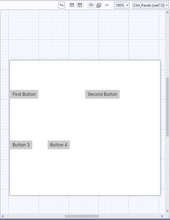
Figure 14: Arranging visual elements with the Grid
The Grid layout is very versatile and is also a good choice (when possible) in terms of performance.
Spacing and proportions for rows and columns
You have fine-grained control over the size, space, and proportions of rows and columns. The Height and Width properties of the RowDefinition and ColumnDefinition objects can be set with values from the GridUnitType enumeration as follows:
· Auto: Automatically sizes to fit content in the row or column.
· Star: Sizes columns and rows as a proportion of the remaining space.
· Absolute: Sizes columns and rows with specific, fixed height and width values.
XAML has type converters for the GridUnitType values, so you simply pass no value for Auto, a * for Star, and the fixed numeric value for Absolute, such as:
<Grid.ColumnDefinitions>
<ColumnDefinition />
<ColumnDefinition Width="*"/>
<ColumnDefinition Width="20"/>
</Grid.ColumnDefinitions>
If you wish, you can also explicitly pass Width="Auto" instead of passing no value.
Introducing spans
In some situations, you might have elements that should occupy more than one row or column. In these cases, you can assign the Grid.RowSpan and Grid.ColumnSpan attached properties with the number of rows and columns a visual element should occupy.
The Canvas
Sometimes you might need to place controls on the UI in a fixed position, regardless of the dynamic rearrangement. In these cases, you can use the Canvas panel, which allows for the so-called absolute positioning of its child elements, which are placed via the Canvas.Top, Canvas.Left, Canvas.Bottom, and Canvas.Right attached properties. These represent the distance from the upper margin, the distance from the left margin, the distance from the lower margin, and the distance from the right margin. They must be used in couples: Canvas.Top with Canvas.Left, and Canvas.Bottom with Canvas.Right. Other combinations are not valid. Consider the following code snippet:
<Canvas>
<TextBlock Text="This text will never change position"
Canvas.Left="50" Canvas.Top="30"/>
</Canvas>
The TextBlock control is positioned 50 pixels from the left edge, and 30 pixels from the top edge of the canvas. If you run the code, you will notice that the position of the control will never be rearranged as the interface changes.
Tip: The Canvas child elements are spaced from the canvas itself, and not from the window. This means that if the Canvas.Margin property is assigned or if the Canvas is contained in a StackPanel or WrapPanel, the location will be evaluated based on the organization of those panels. For this reason, the Canvas should be the root panel within a Window or UserControl.
The RelativePanel
The RelativePanel allows you to arrange elements by specifying their relative positioning with respect to other elements and the panel itself. By default, elements are positioned at the upper-left corner of the panel. You use some attached properties to govern the layout of these elements. Table 5 summarizes these properties.
Table 5: Attached properties to control the RelativePanel
Panel alignment | Relative alignment | Relative Position |
|---|---|---|
AlignTopWithPanel | AlignTopWith | Above |
AlignBottomWithPanel | AlignBottomWith | Below |
AlignLeftWithPanel | AlignLeftWith | LeftOf |
AlignRightWithPanel | AlignRightWith | RightOf |
AlignHorizontalCenterWithPanel | AlignHorizontalCenterWith | |
AlignVerticalCenterWithPanel | AlignVerticalCenterWith | |
The attached properties listed in the Panel Alignment column of Table 5 are of type bool and determine the way the child element is aligned with respect to the panel. The attached properties listed in the Relative Alignment column of Table 5 take the name of a relative control as value, and specify the alignment. Attached properties listed in the Relative Position column specify the position of the child element and take the name of the relative control as the value. Code Listing 7 provides an example of RelativePanel.
Code Listing 7
<Window xmlns="https://github.com/avaloniaui" xmlns:x="http://schemas.microsoft.com/winfx/2006/xaml" xmlns:d="http://schemas.microsoft.com/expression/blend/2008" xmlns:mc="http://schemas.openxmlformats.org/markup-compatibility/2006" mc:Ignorable="d" d:DesignWidth="800" d:DesignHeight="450" x:Class="Ch4_Panels.RelativePanelWindow" Title="RelativePanelWindow"> <RelativePanel Background="Gray"> <Rectangle x:Name="OrangeRectangle" Fill="Orange" Height="44" Width="44"/> <Rectangle x:Name="RedRectangleangle" Fill="Green" Height="44" Width="88" RelativePanel.RightOf="OrangeRectangle" />
<Rectangle x:Name="RedRectangle" Fill="Red" Height="44" RelativePanel.Below="OrangeRectangle" RelativePanel.AlignLeftWith="OrangeRectangle" RelativePanel.AlignRightWith="RedRectangleangle"/> <Rectangle Fill="Blue" RelativePanel.Below="RedRectangle" RelativePanel.AlignLeftWith="RedRectangleangle" RelativePanel.AlignRightWithPanel="True" RelativePanel.AlignBottomWithPanel="True"/> </RelativePanel> </Window> |
The example is based on some Rectangle elements, which are an appropriate choice due to the fact they can fill colored areas on screen, and make it easier to understand their relative positioning. As you can see, the attached properties listed in Table 5 allow for specifying the position of each rectangle, with respect to the panel and the other rectangles. Figure 15 shows the result of Code Listing 7.
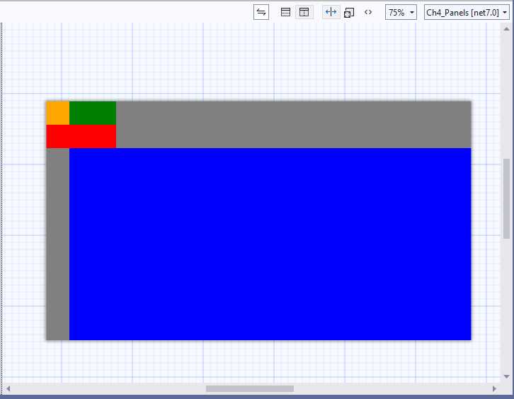
Figure 15: Arranging visual elements within a RelativePanel
The ScrollViewer
The ScrollViewer allows you to present content that cannot fit on one screen, and therefore should be scrolled. Technically speaking, this is considered a control, but actually you use it as a panel. Its usage is very simple and is demonstrated in Code Listing 8.
Code Listing 8
<Window xmlns="https://github.com/avaloniaui" xmlns:x="http://schemas.microsoft.com/winfx/2006/xaml" xmlns:d="http://schemas.microsoft.com/expression/blend/2008" xmlns:mc="http://schemas.openxmlformats.org/markup-compatibility/2006" mc:Ignorable="d" d:DesignWidth="800" d:DesignHeight="450" Height="500" x:Class="Ch4_Panels.ScrollViewerWindow" Title="ScrollViewerWindow"> <ScrollViewer Name="Scroll1"> <StackPanel> <TextBlock Text="My favorite color:" Name="TextBlock1"/> <Rectangle Height="600" Fill="BlueViolet"/> </StackPanel> </ScrollViewer> </Window> |
You basically add a panel or visual element inside the ScrollViewer and, at runtime, the content will be scrollable if its area is bigger than the screen size. You can also decide whether to display the scroll bars through the HorizontalScrollbarVisibility and VerticalScrollbarVisibility properties that can be assigned with self-explanatory values such as Visible, Disable, and Hidden.
Notice how, in order to simulate content that is longer than the actual screen size, a Height of 500 has been assigned to the Window, whereas a Height of 600 has been assigned to the rectangle. Remember to avoid nesting ScrollViewer views and to include controls like DataGrid and ListBox inside a ScrollViewer, since these include their own scrolling mechanism.
The DockPanel
The DockPanel container also has many similarities to the StackPanel, because it allows you to tile the controls it contains. The main difference is that child controls are docked to the sides of the DockPanel in the specified direction, they are also docked to each other, and their size and position can be specified. The typical use of the DockPanel is therefore related to the creation of interfaces in which menus and toolbars are connected to one another. The XAML in Code Listing 9 shows how to create a DockPanel and how to add a menu bar and a status bar, docked to each other:
Code Listing 9
<Window xmlns="https://github.com/avaloniaui" xmlns:x="http://schemas.microsoft.com/winfx/2006/xaml" xmlns:d="http://schemas.microsoft.com/expression/blend/2008" xmlns:mc="http://schemas.openxmlformats.org/markup-compatibility/2006" mc:Ignorable="d" d:DesignWidth="500" d:DesignHeight="450" x:Class="Ch4_Panels.DockPanelWindow" Title="DockPanelWindow"> <DockPanel LastChildFill="True" VerticalAlignment="Top"> <Menu DockPanel.Dock="Top" Background="LightGray" Name="MainMenu" > <MenuItem Header="File"/> <MenuItem Header="Edit"/> </Menu>
<StackPanel DockPanel.Dock="Top"> <TextBlock Text="Command bar" /> </StackPanel> </DockPanel> </Window> |
The result of the code is shown in Figure 16.
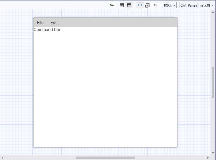
Figure 16: Arranging visual elements within a DockPanel
The orientation of the controls contained in the DockPanel is set through the VerticalAlignment property, whose values can be Top, Bottom, Center, or Stretch (to fill the available space). Through the LastChildFill property, the container is told whether the controls it contains should fill all the available space. The example assigns True, but you can set to False to tell the difference.
Finally, by assigning the DockPanel.Dock attached property, it is possible to establish the position in which the controls must be docked within the DockPanel.
Chapter summary
Modern apps require dynamic user interfaces that can automatically adapt to the screen size of different device form factors. In Avalonia UI, creating dynamic user interfaces is possible through a number of panels.
The StackPanel allows you to arrange controls near one another both horizontally and vertically. The WrapPanel does the same, but it is also capable of wrapping visual elements. The Grid allows you to arrange controls within rows and columns; the Canvas allows you to give controls an absolute position; the RelativePanel allows you to arrange controls based on the size and position of other controls or containers; the ScrollViewer allows you to scroll the content of visual elements that do not fit in a single page; and the DockPanel allows you to dock child elements to the specified edge.
Now that you have a basic knowledge of panels, it’s time to discuss common controls in Avalonia UI that allow you to build the functionalities of the user interface, arranged within the panels you learned in this chapter.
- 1800+ high-performance UI components.
- Includes popular controls such as Grid, Chart, Scheduler, and more.
- 24x5 unlimited support by developers.