
Avalonia UI Succinctly®

CHAPTER 7
Creating Custom Controls
Like any development platform, Avalonia UI also allows you to create reusable controls. Similarly to WPF, you can build user controls, which represent the aggregation of several visual elements into one control, and custom controls via templates. The latter allows for completely redefining the look and feel of an existing control, while keeping the existing behavior. Both types are discussed in this chapter.
Creating user controls
A user control is a reusable component that aggregates primitive or complex elements. The following example shows how to create a user control that will allow users to choose a file and display the file name in a text box. When you have an Avalonia UI solution ready, you can select Project > Add New Item, and in the Add New Item window, select the template called User Control (Avalonia) (see Figure 40). Assign FileBrowserUserControl.axaml as the file name, then click Add.
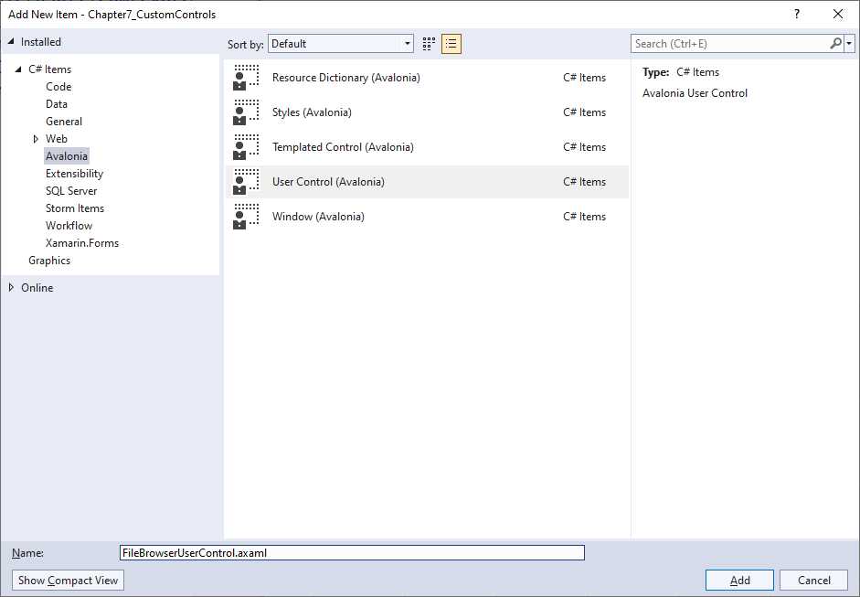
Figure 40: Adding a new user control
When the XAML code editor appears, you will notice that the root element in this case is UserControl, whose behavior is quite similar to Window, so all the techniques you learn in this e-book are still relevant. Now, suppose you want to create a control that allows the user to select a file and store the filename in a property. Designing the control can be done quite simply, as demonstrated in Code Listing 28.
Code Listing 28
<UserControl xmlns="https://github.com/avaloniaui" xmlns:x="http://schemas.microsoft.com/winfx/2006/xaml" xmlns:d="http://schemas.microsoft.com/expression/blend/2008" xmlns:mc="http://schemas.openxmlformats.org/markup-compatibility/2006" mc:Ignorable="d" d:DesignWidth="800" d:DesignHeight="450" x:Class="Chapter7_CustomControls.FileBrowserUserControl"> <StackPanel Orientation="Horizontal"> <TextBlock Margin="3" Text="File name:" Height="30"/> <TextBox Text="{Binding RelativeSource={RelativeSource FindAncestor, AncestorType={x:Type UserControl}}, Path=FileName}" Width="200" Name="FileNameTextBox" Margin="3" Height="30"/>
<Button Margin="3" Name="BrowseButton" Click="BrowseButton_Click" Content="Browse" Height="30"/> </StackPanel> </UserControl> |
The implementation is quite simple: a TextBlock, a TextBox, and a Button are used. The important note is about the TextBox, whose Text property is bound to a property called FileName, which is exposed by the control itself (RelativeSource FindAncestor), and which must now be defined as a styled property. Code Listing 29 demonstrates this.
Code Listing 29
public partial class FileBrowserUserControl : UserControl { public FileBrowserUserControl() { InitializeComponent(); } private static StyledProperty<string> FileNameProperty = AvaloniaProperty.Register<FileBrowserUserControl, string>(nameof(FileName)); public string FileName { get { return Convert.ToString(GetValue(FileNameProperty)); } set { SetValue(FileNameProperty, value); RaiseEvent(new RoutedEventArgs(fileNameChangedEvent)); } } private static readonly RoutedEvent fileNameChangedEvent = RoutedEvent.Register<FileBrowserUserControl, RoutedEventArgs>(nameof(FileNameChanged), RoutingStrategies.Bubble); public event EventHandler<RoutedEventArgs> FileNameChanged { add { AddHandler(fileNameChangedEvent, value); } remove { RemoveHandler(fileNameChangedEvent, value); } } private async void BrowseButton_Click(object sender, RoutedEventArgs e) { OpenFileDialog openDialog = new OpenFileDialog(); openDialog.Filters.Add(new FileDialogFilter { Extensions = new System.Collections.Generic.List<string> { "*.*" }, Name="All files" }); Window parentWindow = (Window)((StackPanel)Parent).Parent; var result = await openDialog.ShowAsync(parentWindow); if(result != null) FileName = result.FirstOrDefault(); } } |
The following is a list of relevant points for Code Listing 29:
· The FileName property is implemented as a styled property with the syntax you learned in the previous chapter. The addition is that the set method also raises a new, custom event.
· The FileNameChanged event is a custom routed event, defined with the Bubble strategy. The RoutedEvent.Register method creates an instance of the RoutedEvent class that is registered at runtime, and the FileNameChanged event, of type EventHandler<RoutedEventArgs>, registers the handlers to subscribe to and unsubscribe from the event.
· With an approach very close to WPF, the control opens a file dialog via the OpenFileDialog object. File filters are represented by the FileDialogFilter. This exposes the Extensions property, a List<string> that represents the file extensions, and a Name property that represents a friendly name for the filter.
· The ShowAsync method of the OpenFileDialog requires specifying a parent window as the argument, so this is retrieved by casting to Window the parent of the parent StackPanel.
At this point, you can consume the control from a regular window. To accomplish this, you first add an XML namespace that points to the assembly where the control is defined, like in the following line, where the assembly name is taken from the companion source code:
xmlns:local="using:Chapter7_CustomControls"
Then you can add the control to the UI, for example, by adding the following code as the child for the main Window:
<StackPanel Spacing="20">
<local:FileBrowserUserControl Name="FileBrowserControl1"/>
<TextBlock Text="{Binding ElementName=FileBrowserControl1,
Path=FileName}"/>
</StackPanel>
If you run the sample code, you will see the user control in the window, and you will be able to select a file from disk. The selected filename will be visible in the TextBlock via data binding. Figure 41 shows the result.
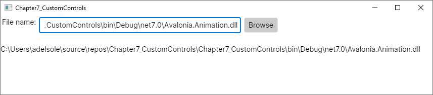
Figure 41: The new user control in action
Like for WPF, Avalonia UI is not limited to aggregating existing elements into one control. It also allows for redefining the look and feel of existing controls, as explained in the next section.
Creating templated controls
Exactly like in WPF, in Avalonia UI primitive controls are lookless. This means that their appearance is separate from their behavior. In other words, controls have a set of properties that make them operational, while what the user sees on the screen is represented by a control template, which is a special graphic style.
All Avalonia UI controls have a default control template, which is what you see when you declare them in XAML code. The control template can be completely redefined inside styles, giving the control a totally different look while keeping the behavior unchanged. For example, the appearance of a button can be redefined using the geometric shape of the ellipse, but while you will see an ellipse on the screen, it is a full-fledged button with the possibility of clicking or reacting to hovering at runtime. The example you will see in this chapter is exactly about redefining the control template of a Button by using an Ellipse.
Technically speaking, when you redefine the control template of an existing control or create a new customizable control from scratch, you work with templated controls. Creating a templated control is simplified by a specific Avalonia template for Visual Studio. If you right-click the project name in Solution Explorer and then select Add New Item, you will see an item template called Templated Control (Avalonia), as shown in Figure 42.
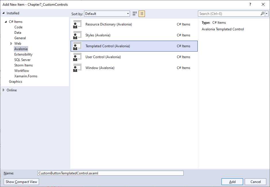
Figure 42: Creating a templated control
Name the new file CustomButtonTemplatedControl.axaml and then click Add. The auto-generated XAML code is related to a brand new control, but understanding how restyling an existing control works makes it easier to develop a new one. Having said that, remove all the XAML code inside the Styles node. Now that you are ready to redefine the control template of the Button control via an Ellipse, start adding the following lines:
<Design.PreviewWith>
<Button Classes="custombutton" />
</Design.PreviewWith>
With these lines, you are instructing the Visual Studio designer to show a preview of the templated control as if it were referenced by a Window or user control. The necessity of assigning the Classes property will be discussed shortly. As mentioned previously, redefining the control template is nothing but assigning the Template property of a control with an object called ControlTemplate, whose content is the different visual element you want to use. This is demonstrated by the following code:
<Style Selector="Button.custombutton">
<Setter Property="Template">
<ControlTemplate>
<Grid>
<Ellipse Fill="Red" Width="{TemplateBinding Width}" Height="{TemplateBinding Height}"/>
<ContentPresenter Content="{TemplateBinding Content}"
VerticalAlignment="Center" HorizontalAlignment="Center"/>
</Grid>
</ControlTemplate>
</Setter>
</Style>
You already saw the Style.Selector property in the previous chapter, and here it is targeting a class called custombutton. This implies that the control template will be applied only to those Button controls that assign the Classes property with the customcontrol value, whereas all the others will be ignored.
You assign the Template property of the Style with a ControlTemplate child element. This is where you actually provide a different look to the control, and you can add a complex visual element. In the current example, a Grid is the root layout containing an Ellipse and a ContentPresenter. The Ellipse exposes the Fill property, which represents the shape’s color.
Both the Width and Height properties invoke the TemplateBinding expression. This allows for the same property value to be applied to the declaring control. In other words, the control template should never have hard-coded values; instead, it should take property values from the control that is being redefined and declared in XAML.
The ContentPresenter represents the Content property of the Button and other content controls. It is fundamental to add a ContentPresenter when you restyle a content control; otherwise, you would not be able to display any content.
Before extending the template with additional states, it is a good idea to show how you consume the templated control. Assuming you want to use it inside a Window, you first need to reference the .axaml file that defines the control as follows (adjust the path for the .axaml file according to your folder structure):
<Window.Styles>
<StyleInclude Source="avares://CustomButtonTemplatedControl.axaml"/>
</Window.Styles>
Now, exactly how you have done with styles back in Chapter 6, you can declare a Button as follows:
<Button Classes="custombutton" Width="150"
Height="150" Content="A custom button"/>
As you assign the Classes property with the value targeted by the templated control’s Selector, the new control template will be applied, and it will look as it does in Figure 43.
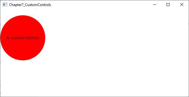
Figure 43: Templated control in action
As you can see, your Button looks like an Ellipse, but it still works like a Button with its properties and events. Restyling a Button is also a good learning opportunity, because it has different states, like normal, pressed, and hovered. You can provide a different control template depending on the pseudo-classes, like in the following code:
<Style Selector="Button.custombutton:pointerover">
<Setter Property="Template">
<ControlTemplate>
<Grid>
<Ellipse Fill="LightGreen" Width="{TemplateBinding Width}"
Height="{TemplateBinding Height}"/>
<ContentPresenter Content="{TemplateBinding Content}"
VerticalAlignment="Center" HorizontalAlignment="Center"/>
</Grid>
</ControlTemplate>
</Setter>
</Style>
<Style Selector="Button.custombutton:pressed">
<Setter Property="Template">
<ControlTemplate>
<Grid>
<Ellipse Fill="Yellow" Width="{TemplateBinding Width}"
Height="{TemplateBinding Height}"/>
<ContentPresenter Content="{TemplateBinding Content}"
VerticalAlignment="Center" HorizontalAlignment="Center"/>
</Grid>
</ControlTemplate>
</Setter>
</Style>
With this code, the Ellipse will be filled with the LightGreen color when you hover over the button, whereas it will be filled with Yellow when you keep the Button pressed. In terms of behavior, you can extend a templated control with the following:
· Styled properties: You have seen how to implement styled properties in the previous section, and they are still the way you implement bindable properties with templated controls.
· Custom routed events: These have also been discussed in the previous section, and they are the way you implement events that need to be raised across the visual tree.
As you can see, this example has provided a very basic control template, but you can actually implement complex visual elements to completely redefine the look and feel of controls. The documentation does not include a complete tutorial about creating new templated controls from scratch, but there are community resources available, so you can watch this YouTube video about this topic.
Note: Templated controls are very powerful but should be used carefully. The end user expects simplicity and an easy connection between the control and the action it is intended for.
Chapter summary
Creating reusable controls is crucial in every development platform, and Avalonia UI is no exception. There are many similarities with the WPF approach, due to the fact that you can create user controls, which are the result of the aggregation of multiple controls into one, and templated controls, which are primitive, lookless controls where you completely redefine the look and feel while keeping the behavior unchanged.
For both types, you can implement styled properties that represent the target of a data-binding expression and new routed events. It was important to discuss controls at this particular point, especially user controls, because they are at the core of the topic discussed in the next chapter: navigation between pages.
- 1800+ high-performance UI components.
- Includes popular controls such as Grid, Chart, Scheduler, and more.
- 24x5 unlimited support by developers.