
Avalonia UI Succinctly®

CHAPTER 9
Brushes, Graphics, and Animations
At its core, Avalonia UI is a development platform that enhances the user interface of your applications. To do so, it is not limited to its control library. There are additional elements of the user interface that you can leverage to create powerful visual experiences for your users. This chapter describes three more elements: brushes, 2D graphics, and animations, completing the knowledge you need to have to be productive with Avalonia UI.
Working with brushes
In your developer life, you likely had to set the background color of a window, a control, or an interface element hundreds of times, or simply had to change the foreground color of portions of text, using solid colors or pictures, for example, to create interesting texture-like effects. Avalonia UI is also a special platform from this point of view, because with very few simple lines of code, it allows you to apply fill effects using solid colors and gradients, pictures, and even other interface elements. This is possible thanks to objects called brushes that inherit from the Brush class. The available brushes are summarized in Table 12.
Table 12: Available brushes
Value | Description |
|---|---|
SolidColorBrush | Allows for filling an object with a solid color |
LinearGradientBrush | Allows for filling an object with a gradient of colors with a linear direction |
RadialGradientBrush | Allows for filling an object with a circular gradient of colors |
ImageBrush | Allows for filling an object with an image |
VisualBrush | Allows for filling an object with the content of another visual element |
You typically use brush objects to assign the Foreground and Background properties of controls and panels, but also to fill in geometric shapes. For a better understanding, first consider Figure 47, where:
· The root panel’s background has been filled with a SolidColorBrush.
· The Grid at the upper-left corner has been filled with a LinearGradientBrush.
· The Grid at the upper-right corner has been filled with a RadialGradientBrush.
· The Grid at the bottom-left corner has been filled with an ImageBrush.
· The bottom-right corner contains a StackPanel with a Button whose background has been filled with a VisualBrush, which points to another StackPanel that contains a TextBlock and a TextBox.
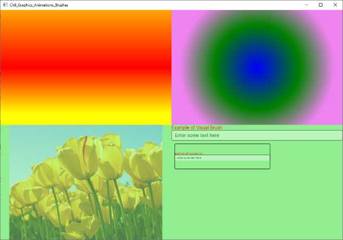
Figure 47: Applying brushes
The following paragraphs discuss the various brushes in more detail.
Working with solid colors
You paint visual elements with a solid color via the SolidColorBrush object. The following code shows an example:
<Grid>
<Grid.Background>
<SolidColorBrush Color="LightGreen"/>
</Grid.Background>
</Grid>
You assign the Color property a color. You can implicitly specify a solid color by assigning the color to the property of interest, like this:
<Grid Background="LightGreen"/>
Put succinctly, when you assign control properties like Foreground or Background with a color, you are actually assigning a SolidColorBrush.
Tip: All the brushes discussed in this section can also be reusable resources. You can define them in the scope you need, and then you assign the x:Key identifier so they can be consumed multiple times.
Applying gradients
In Avalonia UI, you have the option to use two different gradient brushes: LinearGradientBrush and RadialGradientBrush. The first object applies a linear gradient, whereas the second object applies a circular gradient. Based on Figure 47, the following code applies the linear gradient:
<Grid>
<Grid.Background>
<LinearGradientBrush StartPoint="0%,0%" EndPoint="0%,100%">
<GradientStop Offset="0" Color="Orange"/>
<GradientStop Offset="0.5" Color="Red"/>
<GradientStop Offset="0.9" Color="Yellow"/>
</LinearGradientBrush>
</Grid.Background>
</Grid>
Each color in the gradient is represented by a GradientStop object, and its Color property is assigned with the color of interest, while the Offset property represents the position of the color within the gradient, with a value between 0 and 1. The StartPoint and EndPoint properties of the LinearGradientBrush determine the direction of the gradient through coordinates of the type x, y where both x and y are percentage values between 0 and 100.
If you have worked with linear gradients in WPF, you might remember that the value for StartPoint and EndPoint is a double between 0.0 and 1.0. In Avalonia, these values must be specified in percentage, and you must enter the % symbol. The RadialGradientBrush shares most of the properties, but it does not allow for specifying a start point and endpoint due to its circular nature:
<Grid Grid.Column="1">
<Grid.Background>
<RadialGradientBrush>
<GradientStop Offset="0" Color="Blue"/>
<GradientStop Offset="0.5" Color="Green"/>
<GradientStop Offset="0.9" Color="Violet"/>
</RadialGradientBrush>
</Grid.Background>
</Grid>
Gradients are certainly powerful, but there is more, as discussed in the next paragraphs.
Filling objects with images
You can use an image to fill an object by using the ImageBrush class as follows:
<Grid Grid.Row="1">
<Grid.Background>
<ImageBrush Opacity="0.5" Source="/tulips.jpg" />
</Grid.Background>
</Grid>
You specify the image file via the Source property, and the transparency via the Opacity property, of type double, whose value is between 0 and 1. This can be particularly interesting if you want to create a texture effect, for example, over the Foreground property of a TextBlock control.
Dynamic painting with visual elements
An interesting option in Avalonia UI (like in WPF) is the possibility of filling an object with another visual element. Consider the following code:
<StackPanel Grid.Row="1" Grid.Column="1">
<StackPanel Name="Stack1">
<TextBlock Text="Example of Visual Brush" Foreground="Red" />
<TextBox Text="Enter some text here" Foreground="Green" />
</StackPanel>
<StackPanel VerticalAlignment="Center">
<Button BorderBrush="Black"
Margin="10,10,10,10" Height="80" Width="300">
<Button.Background>
<VisualBrush Visual="{Binding ElementName=Stack1}"/>
</Button.Background>
</Button>
</StackPanel>
</StackPanel>
The Background property of the Button is assigned by a VisualBrush object. This allows for filling the background (or other property of type Brush) with another visual element. In this case, the background of the button is a StackPanel with all its content. The content is specified via the Visual property, assigned with a binding expression that requires specifying the source's name (Binding ElementName).
Introducing shapes
Avalonia UI provides several geometric shapes that you can use to create the following 2D drawings:
· Rectangle, which allows for drawing rectangles and squares.
· Ellipse, which allows for drawing ellipses and circles.
· Line, which allows for drawing an individual line.
· Polyline, which allows for drawing lines connected to one another.
· Polygon, which allows for drawing a variety of polygons.
· Path, which allows for creating complex drawings via XAML points.
All these shapes inherit from the Shape base class. They also share the properties described in Table 13.
Table 13: Shape properties
Property | Type | Description |
|---|---|---|
Fill | Brush | The brush used to fill the shape’s interior |
Stroke | Brush | The brush used for the shape’s outline |
StrokeThickness | double | The width of the shape’s outline with a default of 0 |
StrokeDashArray | AvaloniaList<double> | A collection of values that indicate the pattern of dashes and gaps used to outline a shape |
StrokeDashOffset | double | The distance between dashes |
In the following paragraphs, you will see how to draw geometric shapes with hints about their usage in applications.
Tip: You are not limited to using shapes only to create drawings. Being visual elements, they can also be assigned to the Content property of content controls.
Drawing rectangles
The first shape we will discuss is the Rectangle. The following example helps understanding how you declare the shape, and how you can use brushes:
<Rectangle Stroke="Green" StrokeThickness="4" StrokeDashArray="1,1"
StrokeDashOffset="6" Width="250" Height="100"
Margin="0,50,0,0">
<Rectangle.Fill>
<LinearGradientBrush>
<GradientStop Color="LightBlue" Offset="0"/>
<GradientStop Color="Blue" Offset="0.5"/>
<GradientStop Color="Violet" Offset="1"/>
</LinearGradientBrush>
</Rectangle.Fill>
</Rectangle>
The resulting shape is the first one from the top of Figure 48.
Drawing ellipses and circles
The second shape is the Ellipse, which you use to draw ellipses and circles. The following code provides an example where the ellipse is filled in violet and the outline is green, with a thickness of 3:
<Ellipse Fill="Violet" Stroke="Green" StrokeThickness="3"
Width="250" Height="100" Margin="0,50,0,0"/>
The resulting shape is the second one from the top in Figure 48.
Drawing lines
The next shape is the Line. Let’s start with some code:
<Line StartPoint="10,0" EndPoint="230,0" StrokeLineCap="Round"
Stroke="Violet" StrokeThickness="12" Margin="0,50,0,0" />
StartPoint and EndPoint represent the starting and ending points of the line. The value on the left of the comma represents the position on the X axis, whereas the value on the right of the comma represents the position on the Y axis.
The StrokeLineCap property, of type PenCap, describes a shape at the end of a line and can be assigned with Flat (default), Square, or Round. Flat basically draws no shape, Square draws a rectangle with the same height and thickness of the line, and Round draws a semicircle with the diameter equal to the line’s thickness. The resulting shape is the third from the top shown in Figure 48.
Drawing polygons
Polygons are complex shapes, and Avalonia UI provides the Polygon class to draw these geometries. The following example draws a triangle filled in violet and with a green, dashed outline:
<Polygon Points="50,20 80,60 20,60" Fill="Violet" Stroke="Green"
StrokeThickness="4" StrokeDashArray="1,1" StrokeDashOffset="6"/>
The resulting shape is the fourth from the top in Figure 48. The key property in the Polygon shape is Points, a collection of Point objects that each represent the coordinates of a specific delimiter in the polygon. Because there’s basically no limit to the collection of points, you can create very complex polygons.
Drawing complex shapes with the Polyline
The Polyline is a particular shape that allows for drawing a series of straight lines connected to one another, but where the last line does not connect with the first point of the shape. Consider the following example:
<Polyline Margin="0,50,0,0" Points="0 48, 0 144, 96 150, 100 0, 192 0, 192
96, 50 96, 48 192, 150 200 144 48"
Fill="Violet" Stroke="DarkGreen" StrokeThickness="3"/>
Similarly to the Polygon, the Polyline exposes a property called Points, a collection of Point objects that each represent the coordinates of a point. The resulting shape is the fifth from the top in Figure 48.
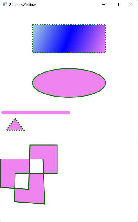
Figure 48: Drawing shapes
Hints about geometries and paths
The new drawing possibilities are not limited to the basic shapes described in the previous sections. Avalonia UI also offers powerful 2D drawings with geometries and provides the Path and PathIcon classes that allow drawing curves and complex shapes using geometries. Both are very complex and long topics that cannot fit inside a book of the Succinctly series. For this reason, I recommend taking a look at the official documentation page.
Adding animations
In Avalonia UI, there are two types of animations: keyframe animations and easing animations. Despite similar names, they work differently from WPF. This section explains keyframe animations in detail and provides hints about the easing functions.
Keyframe animations
Keyframe animations work with styles and selectors, and their goal is to animate property values of an object. Consider Code Listing 37, where a keyframe animation is applied to an Ellipse.
Code Listing 37
<Window xmlns="https://github.com/avaloniaui" xmlns:x="http://schemas.microsoft.com/winfx/2006/xaml" xmlns:d="http://schemas.microsoft.com/expression/blend/2008" xmlns:mc="http://schemas.openxmlformats.org/markup-compatibility/2006" mc:Ignorable="d" d:DesignWidth="800" d:DesignHeight="450" x:Class="Ch9_Graphics_Animations_Brushes.AnimationsWindow" Title="AnimationsWindow"> <Window.Styles> <Style Selector="Ellipse.blue"> <Setter Property="Height" Value="100"/> <Setter Property="Width" Value="100"/> <Setter Property="Fill" Value="Blue"/> <Style.Animations> <Animation Duration="0:0:15"> <KeyFrame Cue="0%"> <Setter Property="Opacity" Value="0.0"/> <Setter Property="Height" Value="0"/> </KeyFrame> <KeyFrame Cue="100%"> <Setter Property="Opacity" Value="1.0"/> <Setter Property="Height" Value="100"/> </KeyFrame> </Animation> </Style.Animations> </Style> </Window.Styles> <Ellipse Classes="blue"/> </Window> |
The style is applied to the Ellipse via selectors and the syntax you learned in Chapter 6, but it adds the Animations node where you add an Animation object. The Duration property specifies the animation duration with the hh:mm:ss format. KeyFrame objects represent individual moments in the animation, and their Cue property determines, in percentage, what needs to happen in a specific moment of the animation progress.
In the current example, the first KeyFrame.Cue assigns the Opacity property of the Ellipse a value of 0.0, which means full transparency, and the Height property a value of 0 at the beginning of the animation. In contrast, the second assignment assigns the Opacity a value of 1.0, which means no transparency, and the Height property a value of 100 when the animation is 100% completed.
It is not possible to render an animation on a printed figure, so you can try running Code Listing 37 and see the resulting animation on your machine. You can further control the animation via the properties listed in Table 14.
Table 14: Animation properties
Property | Description |
|---|---|
Delay | Adds a delay in the animation rendering. |
IterationCount | The number of iterations for the animation. Supported values are 0, an integer representing the number, or INFINITE. |
PlaybackDirection | Determines how the animation should be played. Possible values are Normal, Reverse (in reverse direction, from 100% to 0%), Alternate (played forward first and then backward), and AlternateReverse (played backward first and then forward). |
These properties also apply to easing functions, as discussed in the next section.
Hints about easing functions
Easing functions apply mathematical formulas to animations. The following code provides an example based on the QuarticEaseIn function, and it is applied to a TextBlock control that you can declare in your XAML code, assigning the Classes property with red:
<Style Selector="TextBlock.red">
<Setter Property="Foreground" Value="Red"/>
<Style.Animations>
<Animation Duration="0:0:15"
Easing="QuarticEaseIn">
<KeyFrame Cue="0%">
<Setter Property="Margin" Value="0"/>
</KeyFrame>
<KeyFrame Cue="100%">
<Setter Property="Margin" Value="200,0,0,0"/>
</KeyFrame>
</Animation>
</Style.Animations>
</Style>
The list of easing functions is very long, and it is not possible to include them all here, so in this case, it is recommended to have a look at the documentation.
Introducing transformations
In Avalonia UI, objects called render transforms, commonly referred to as transformations, allow you to apply changes to the graphic layout of the visual elements, keeping their behavior unchanged. These transformations allow you to tilt, rotate, resize, and translate the elements of the graphic interface, so that you can obtain extremely interesting graphic effects. Transformations make sense with animations, and the following ones are available:
· SkewTransform, which creates a three-dimensional effect by tilting an object according to the X and Y coordinates and the specified AngleX and AngleY properties.
· RotateTransform, which allows you to rotate a control by n degrees, assigning the Angle property.
· ScaleTransform, which allows you to resize a control to the values provided via the ScaleX and ScaleY properties.
· TranslateTransform, which allows you to move a control to the specified X and Y coordinates.
· MatrixTransform, which allows you to define custom transformations.
For example, the following transformation will rotate, via an animation, the target TextBlock object, changing the angle’s value from 0 to 270:
<Style Selector="TextBlock.red">
<Setter Property="Foreground" Value="Red"/>
<Style.Animations>
<Animation Duration="0:0:15">
<KeyFrame Cue="0%">
<Setter Property="RotateTransform.Angle" Value="0"/>
</KeyFrame>
<KeyFrame Cue="100%">
<Setter Property="RotateTransform.Angle"
Value="270"/>
</KeyFrame>
</Animation>
</Style.Animations>
</Style>
In terms of syntax, you specify the transformation name followed by the property name (in the previous code, RotateTransform.Angle). Trying all the other transformations is left to you as an exercise. It is worth mentioning that you can combine multiple transformations into one animation, so you can really create complex and interesting effects.
Introducing transitions
While animations change property values based on the specified conditions, transitions listen to changes over the specified properties, and when their value changes, a transition effect is applied to that property. Transitions work at the Setter level, as you can see in the following code:
<Style Selector="TextBlock.red">
<Setter Property="Foreground" Value="Red"/>
<Setter Property="Transitions">
<Transitions>
<ThicknessTransition Property="Margin" Duration="0:0:2"/>
</Transitions>
</Setter>
</Style>
When the Margin property of the target control changes, a transition of two seconds is applied. In this case, you use the ThicknessTransition object, which targets properties of type Thickness. Table 15 summarizes the available transitions.
Table 15: Available transitions
BoxShadowsTransition | For BoxShadows properties |
BrushTransition | For properties of type IBrush |
ColorTransition | For properties of type Color |
CornerRadiusTransition | For CornerRadius properties |
DoubleTransitions | For properties of type double |
FloatTransitions | For properties of type float |
IntegerTransitions | For properties of type int |
PointTransition | For properties of type Point |
SizeTransition | For properties of type Size |
ThicknessTransition | For properties of type Thickness |
TransformOperationsTransition | For properties of type ITransform |
VectorTransition | For properties of type Vector |
You can combine multiple transitions into one style, so you have great control over the effects that you can get.
Chapter summary
In this chapter, you have seen another important part of the Avalonia UI framework, related to 2D graphics. You have seen how to fill objects with brushes, how to create drawings using shapes, and how they can also be assigned to the Content property of content controls for a richer user interface.
Finally, you have seen how to implement animations and transformations, leveraging the power of the Avalonia UI graphic engine based on Skia. You have now gained all the necessary knowledge to build applications with Avalonia UI, leveraging all the framework and tooling productivity.
- 1800+ high-performance UI components.
- Includes popular controls such as Grid, Chart, Scheduler, and more.
- 24x5 unlimited support by developers.