
Avalonia UI Succinctly®

CHAPTER 5
Avalonia Common Controls
Avalonia UI ships with a rich set of common controls that you can use to build cross-platform user interfaces easily and without the need for the complexity of platform-specific features. As you can imagine, the benefit of these common controls is that they run on Android, iOS, Windows, and the web browser from the same codebase. In this chapter, you’ll learn about common controls, their properties, and their events. Controls whose purpose is displaying data and lists will be covered in the next chapter.
Working with the companion code
In order to follow the examples in this chapter, you can create a blank Avalonia UI solution or open the solution in the Ch5_Controls folder of the companion code repository. If you go for the first option, make sure you follow these steps:
- Create an Avalonia UI .NET Core App. You can also create a cross-platform solution, but remember that the companion code is based on this template. The name for the new solution is up to you.
- Make sure you select the latest Avalonia UI version possible, even if it is a pre-release version. For example, controls like the SplitButton and the ToggleSplitButton are only available with the latest pre-release version.
- For each control or group of controls of the same family, add a new item of type Window (Avalonia) to the project, rather than working on the main window.
Any additional steps will be explained where required.
Understanding controls
In Avalonia UI, a control is the building block of any user interface. Put succinctly, a control represents what you would call a widget in Android, a view in iOS, and a control in Windows. Controls derive from the TemplatedControl class, which inherits from Control. The TemplatedControl class provides the possibility to define (and redefine) the appearance of a control, whereas Control implements any basic property and behavior that controls share. In Chapter 6, “Resources and Data-binding,” you will learn more about styles and control templates.
Controls’ common properties
Controls share a number of properties that are important for you to know in advance. They are many, and they are inherited from both TemplatedControl and Control, but the most relevant and used are summarized in Table 6.
Table 6: Controls’ common properties
Property | Type | Description |
|---|---|---|
Width | double | Gets or sets the width of the control |
Height | double | Gets or sets the height of the control |
Margin | Thickness | Gets or sets the distance of the control from other controls or from its parent |
Background | IBrush | Fills the control’s background with a brush, like a solid color or gradient |
BorderThickness | Thickness | Gets or sets the thickness for the control’s border |
BorderBrush | IBrush | Assigns the control’s border with a brush, like a solid color or gradient |
FontFamily | FontFamily | Gets or sets the font type for the text in the control |
FontSize | double | Gets or sets the font size |
FontWeight | FontWeight | Gets or sets the strength of the font (for example, from Thin to Ultrablack) |
FontStyle | FontStyle | Gets or sets the style of the font (Normal, Italic, Oblique) |
Foreground | IBrush | Gets or sets the foreground color |
CornerRadius | CornerRadius | The radius of the edges around the control |
HorizontalAlignment | HorizontalAlignment | Specifies the horizontal alignment for the control. Supported values are Center, Left, Right, Stretch |
VerticalAlignment | VerticalAlignment | Specifies the vertical alignment for the control. Supported values are Center, Bottom, Top, Stretch |
Follow these steps to discover values in the FontFamily, FontWeight, and FontStyle enumerations:
- In C# code, declare the following line:
Control ctrl;
- Right-click Control and select Go to Definition.
- When the source code for the Control class appears, locate the aforementioned properties, right-click the desired enumeration, and select Go to Definition.
In this way, you will be able to investigate the type definitions. This actually works with any other .NET type. When you’re done, remove the line you wrote previously.
Introducing common controls
This section provides a high-level overview of common controls offered by Avalonia UI and their most utilized properties. Remember to add the official documentation about the user interface to your bookmarks for a more detailed reference.
User input with buttons
Most of the time, users interact with the user interface by clicking visual elements. The Button control is certainly one of the most-used controls in every user interface, but in Avalonia UI you have several types of buttons available.
Note: Figure 17 groups all the examples related to button controls, so keep this as a reference for the whole paragraph.
You already saw a couple examples of the Button, but here is a quick summary. This control exposes the properties already summarized in Table 6, and you declare it like this:
<Button Name="Button1" Content="Click here" Foreground="Orange"
BorderBrush="Red" BorderThickness="2" CornerRadius="10"
Click="Button1_Click"/>
As you might remember, you can write the click event handler as follows:
private void Button1_Click(object sender, RoutedEventArgs e)
{
}
Notice how the content for the button is represented by the Content property. This is of type object and can contain any visual element, not just text. For example, you could display an image and some text as the content of a button as follows:
<Button>
<Button.Content>
<StackPanel Orientation="Horizontal">
<Image Source="image.png"/>
<TextBlock Text="Custom button"/>
</StackPanel>
</Button.Content>
</Button>
This is a very powerful feature, because you can create very attractive buttons that can also include videos, complex elements, and so on. Just keep in mind that, most of the time, the simpler the user interface, the better the user experience.
Tip: As you will discover shortly, there are many controls that give you the ability to display complex visual elements through the Content property. These are usually referred to as content controls.
Continuous clicks with the RepeatButton
The RepeatButton is similar to the button, but it continues to raise click events when you keep it pressed. The following is a simple example of RepeatButton:
<RepeatButton Name="Button1" Content="Click here" Click="Button1_Click"/>
The only difference with the Button is that the RepeatButton keeps raising click events if you keep it pressed, whereas the Button raises one click event only. They share all the other properties and events, including the way you handle click events.
Handling states with the ToggleButton
The ToggleButton implements a checked or unchecked state that can be changed on click by the user. You declare it like this:
<ToggleButton Name="Button3" Content="Click to change state"
IsChecked="true"/>
You can programmatically control the checked state via the IsChecked property, of type bool. When the state changes, the control raises a Click event that you can use to detect the state as follows:
private void Button3_Click(object sender, RoutedEventArgs e)
{
switch(Button3.IsChecked)
{
case true:
// Take an action
break;
default:
// Take an action
break;
}
}
Implementing user choice with the RadioButton
The RadioButton control is available in most development platforms, so you might already be familiar with it. It allows for providing the user the option to pick up one among multiple choices. The following code shows an example:
<RadioButton IsChecked="true" Name="Option1" GroupName="First Group"
Content="First choice"/>
<RadioButton IsChecked="false" Name="Option2" GroupName="First Group"
Content="Second choice"/>
<RadioButton IsChecked="false" Name="Option3" GroupName="First Group"
Content="Third choice"/>
The IsChecked property determines whether the control is selected. The GroupName property allows for logically grouping controls. You can assign a name to each RadioButton so that you can interact with it in C# code, as well as binding the IsChecked property to a bool value (data-binding is discussed later in the book).
In the previous code snippet, all the RadioButton controls display some text via the Content property, but this property is of type object and can contain any visual element to provide a fully customized visual appearance, like regular buttons.
Remember that RadioButton controls are mutually exclusive, which means that selecting one will automatically deselect the other controls. Additionally, all the properties discussed in Table 6 also apply to the RadioButton.
Spinning values with the ButtonSpinner
The ButtonSpinner is a control that includes a box where you can show some content or values and two buttons, up and down, that allow for increasing or decreasing the value. The following example shows how to implement a ButtonSpinner that allows for increasing or decreasing a numerical value:
<ButtonSpinner Margin="10" Name="ButtonSpinner1" AllowSpin="True"
ButtonSpinnerLocation="Right" Content="1" Spin="ButtonSpinner1_Spin" />
AllowSpin with True enables the buttons, whereas ButtonSpinnerLocation can be set with Right (default) or Left and specifies the position of the up and down buttons.
The Content property specifies the value you display. Remember that this is a property of type object, so you will need to provide the appropriate conversion in code-behind. For example, supposing you want to allow for increasing or decreasing an integer value based on the previous XAML, you will handle the Spin event as follows:
private void ButtonSpinner1_Spin(object sender, SpinEventArgs e)
{
int content = Convert.ToInt32(ButtonSpinner1.Content);
switch (e.Direction)
{
case SpinDirection.Increase:
content++;
ButtonSpinner1.Content = content;
break;
case SpinDirection.Decrease:
content--;
ButtonSpinner1.Content = content;
break;
}
}
The SpinEventArgs class provides the SpinDirection property, which you can use to detect the spin direction. Values can be Increase or Decrease. The previous code snippet converts the original value into an integer, increases or decreases the number, and then reassigns the result to the Content property. Figure 17 shows how the ButtonSpinner appears.
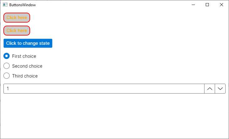
Figure 17: Different types of buttons in Avalonia UI
Working with text
Displaying text and requesting input from the user in the form of text is extremely common in every application. Avalonia UI provides the following controls for displaying and editing text:
· TextBlock, which allows for displaying read-only text.
· TextBox, which allows for entering and editing text.
· MaskedTextBox, which can be used to display or edit text using a mask to distinguish between proper and improper user input formats.
· AutoCompleteBox, which provides a text box for user input and a dropdown list that contains possible matches based on the input in the text box.
The TextBlock control displays read-only text, and it exposes some useful properties, as shown in the following XAML:
<TextBlock Text="Displaying some text" HorizontalAlignment="Center"
VerticalAlignment="Center" TextWrapping="Wrap" Foreground="Blue" />
TextWrapping allows you to wrap a long string and can be assigned a value from the TextWrapping enumeration. For example, Wrap splits a long string into multiple lines proportionate to the available space. WrapWithOverflow splits a long string into multiple lines if the line overflows the available block width. If not specified, NoWrap is the default.
HorizontalAlignment and VerticalAlignment specify the horizontal and vertical alignment for the text. The result of the previous snippet is shown in Figure 18 (which also includes other text-related controls).
The TextBox control allows you to enter unformatted text. Its relevant properties are summarized in Table 7.
Table 7: TextBox properties
Property | Type | Description |
|---|---|---|
Text | string | Gets or sets the input text |
PasswordChar | char | Hides any character in the text box, replacing them with the specified character; useful to implement a password box |
Watermark | string | Specifies a placeholder text |
AcceptsReturn | bool | Gets or sets whether pressing Enter should add a new line |
AcceptsTab | bool | Gets or sets whether pressing Tab has an effect inside the control |
Foreground | IBrush | Gets or sets the foreground brush |
TextWrapping | TextWrapping | Determines how long text is sent to a new line; possible values are Wrap (splits a long string into multiple lines), WrapWithOverflow (splits a long string into multiple lines if the line overflows the available block width), NoWrap |
Following is an example:
<TextBox Name="TextBox1" Watermark="Enter some text..."
Foreground="Green" TextInput="TextBox1_TextInput"/>
This control also exposes the TextInput event which is fired after the control loses focus. You handle it the usual way, as follows:
private void TextBox1_TextInput(object sender, TextInputEventArgs e)
{
string inputText = e.Text;
}
The event handler takes an object of type TextInputEventArgs as the second parameter, which exposes the Text property that stores the content of the text box after it loses focus. The following example demonstrates how to implement a password box:
<TextBox RevealPassword="False" PasswordChar="*" Name="TextBox1"/>
With PasswordChar assigned, every character is replaced with the specified symbol. RevealPassword can be assigned with true to show the real content of the TextBox, whereas when false, it keeps it hidden. Figure 18 includes an example of TextBox (the second from top).
Tip: By default, the TextBox is displayed with a black border and rounded corners. You can change this by assigning the BorderBrush, BorderThickness, and CornerRadius properties, according to your needs. For example, you could hide the border by simply assigning 0 to BorderThickness.
The MaskedTextBox is similar to the TextBox, but the input is constrained by a mask that specifies the input format. For example, the following code declares two MaskedTextBox controls, where the first one requires a phone number in the international format, and the second one requires the input of an Italian VAT code (made of 11 numbers):
<StackPanel>
<TextBlock Margin="5">International phone number:</TextBlock>
<MaskedTextBox Margin="5" Mask="(+09) 000 000 0000" />
<TextBlock Margin="5">Italian VAT number:</TextBlock>
<MaskedTextBox Margin="5" Mask="IT 000 000 000 00" />
</StackPanel>
The constraint format is specified via the Mask property. The result of the code is visible in Figure 18, where you can see how the possibility of typing characters is restricted based on the specified constraint. You can retrieve the content of the MaskedTextBox by accessing its Text property or by handling the TextInput event. Table 8 contains the list of supported characters for the mask.
Table 8: Possible masks
Property | Description |
|---|---|
0 | Required digit; accepts any single digit between 0 and 9 |
9 | Optional digit |
# | Optional digit or space; if blank in the mask, a space will be placed in the Text property |
L | Required letter, with input restricted to the ASCII letters a-z and A-Z |
? | Optional letter, with input restricted to the ASCII letters a-z and A-Z |
& | Required character |
C | Optional character |
A | Required alphanumeric value |
a | Optional alphanumeric value |
. | Decimal placeholder shown based on the decimal symbol appropriate to the control’s format provider |
, | Thousands placeholder shown based on the decimal symbol appropriate to the control’s format provider |
: | Time separator shown based on the decimal symbol appropriate to the control’s format provider |
/ | Date separator shown based on the decimal symbol appropriate to the control’s format provider |
$ | Currency symbol shown based on the decimal symbol appropriate to the control’s format provider |
< | Shifts all following characters to lowercase |
> | Shifts all following characters to uppercase |
| | Disables a previous shift |
\ | Escapes a mask character, turning it into a literal |
The last control that allows for working with text is the AutoCompleteBox. The purpose of this control is to simplify user input by showing suggestions from a list as the user types. The list is prepopulated, so you should use it when you use the AutoCompleteBox for a specific topic, and not for generic input. The following XAML shows how to declare an AutoCompleteBox:
<StackPanel Margin="5">
<TextBlock>Select your favorite food:</TextBlock>
<AutoCompleteBox Name="FoodBox" FilterMode="StartsWith" />
</StackPanel>
In C# code, for example in the constructor of the window, you can populate the Items property as follows:
FoodBox.Items = new string[] { "Pizza", "Caesar salad", "Hot dog",
"Seafood" };
The Items property could also be dynamically populated via data-binding rather than being populated in C# code with fixed values, but data-binding has not been discussed yet, and will be a topic of Chapter 7, “Resources and Data-Binding.”
Figure 18 shows the result of this code, and as you can see, matching suggestions are coming as the user types.
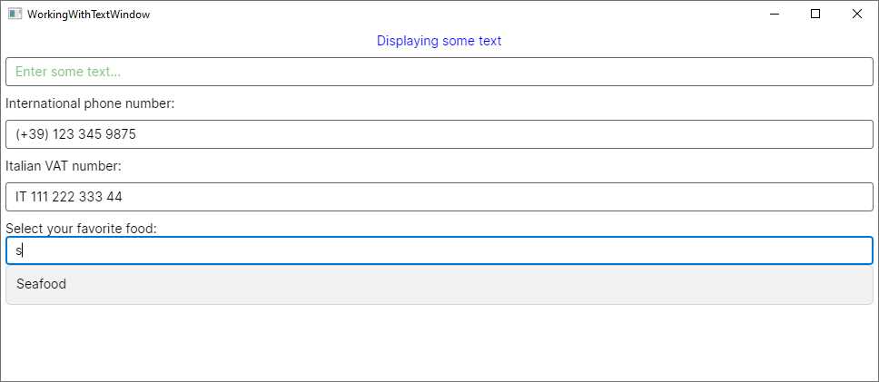
Figure 18: Controls for working with text
The way suggestions are provided is determined by the FilterMode property. Luckily enough, possible value names are self-explanatory and do not require any further explanation. They are StartsWith, StartsWithCaseSensitive, StartsWithOrdinal, StartsWithOrdinalCaseSensitive, Contains, ContainsCaseSensitive, ContainsOrdinal, ContainsOrdinalCaseSensitive, Equals, EqualsCaseSensitive, EqualsOrdinal, and EqualsOrdinalCaseSensitive.
Working with dates and time
Another common requirement in most applications is working with dates and time: Avalonia UI provides the DatePicker, Calendar, CalendarDatePicker, and TimePicker controls for that. Both the DatePicker and the Calendar allow for date selection, but with a different visual style. The DatePicker exposes the SelectedDate, MinYear, and MaxYear properties that represent the selected/current date, the minimum date, and the maximum date, respectively, all of type DateTime. It exposes an event called SelectedDateChanged, which is raised when the user selects a date. You can handle this to retrieve the value of the SelectedDate property.
The view can be declared as follows:
<DatePicker Name="DatePicker1" MaxYear="12/31/2023" MinYear="01/01/1990"
SelectedDateChanged="DatePicker1_SelectedDateChanged"/>
And then in the code-behind, you can retrieve the selected date like this:
private void DatePicker1_SelectedDateChanged(object sender,
DatePickerSelectedValueChangedEventArgs e)
{
DateTimeOffset? newDate = e.NewDate;
DateTimeOffset? oldDate = e.OldDate;
}
The DatePickerSelectedValueChangedEventArgs object stores the selected date in the NewDate property, and the previous date in the OldDate property. Both properties are of type DateTimeOffset?. Figure 19 shows the DatePicker in action.
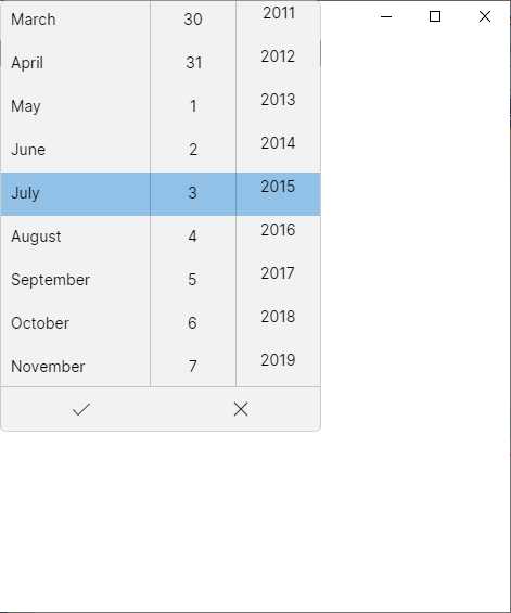
Figure 19: The DatePicker in action
The Calendar is declared as follows:
<Calendar Name="Calendar1" DisplayDate="07/03/2023"
DisplayDateStart="01/01/2023" DisplayDateEnd="12/31/2023"
DisplayMode="Month" FirstDayOfWeek="Monday"
DisplayDateChanged="Calendar1_DisplayDateChanged"/>
The DisplayDate property sets the default date, whereas DisplayDateStart and DisplayDateEnd delimit the date range for the calendar. DisplayMode allows you to set the view by Month, Year, and Decade.
You can also specify the first day of the week via the FirstDayOfWeek property. This can also be assigned in code-behind if you want to determine the user’s settings with the following line:
Calendar1.FirstDayOfWeek = System.Threading.Thread.
CurrentThread.CurrentCulture.DateTimeFormat.FirstDayOfWeek;
When the user selects a date, the DisplayDateChanged event is fired, and can be handled like in the following example:
private void Calendar1_DisplayDateChanged(object sender,
CalendarDateChangedEventArgs e)
{
DateTime? newDate = e.AddedDate;
DateTime? oldDate = e.RemovedDate;
}
The AddedDate and RemovedDate property from the CalendarDateChangedEventArgs object return the newly selected date and the previously selected date, respectively, as DateTime? objects. Figure 20 shows the Calendar in action.
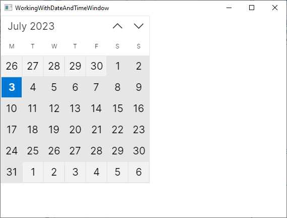
Figure 20: The Calendar in action
The third and last control for working with dates is the CalendarDatePicker, which has the same properties and events of the DatePicker, but it shows a calendar instead of a selector. Figure 21 shows how the CalendarDatePicker appears, based on the same property assignments of the previous DatePicker.
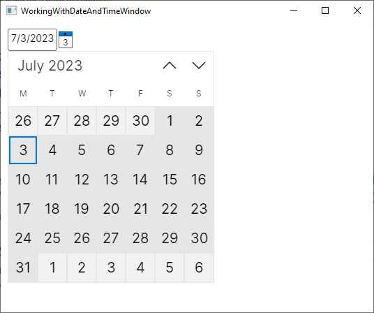
Figure 21: The CalendarDatePicker in action
By default, the view is collapsed, and it only shows the date box and the calendar icon. When you click this icon, the calendar view is expanded.
The TimePicker allows for selecting a time in the day. The following snippet shows an example:
<TimePicker Name="TimePicker1" MinuteIncrement="15" SelectedTime="02:30:00"
SelectedTimeChanged="TimePicker1_SelectedTimeChanged"/>
You can set and read the time for the control via the SelectedTime property. The MinuteIncrement property allows you to specify the minute increment in the selector. By default, the TimePicker shows a 12-hour, AM/PM clock, but you can change this behavior by assigning the following property value:
ClockIdentifier="24HourClock"
When the user selects a time, the SelectedTimeChanged event is fired, and you can handle it like in the following example:
private void TimePicker1_SelectedTimeChanged(object sender,
TimePickerSelectedValueChangedEventArgs e)
{
TimeSpan? newTime = e.NewTime;
TimeSpan? oldTime = e.OldTime;
}
The TimePickerSelectedValueChangedEventArgs exposes the NewTime and OldTime properties, both of type TimeSpan?, which return the newly selected time and the previously selected time, respectively. Figure 21 shows how the TimePicker appears.
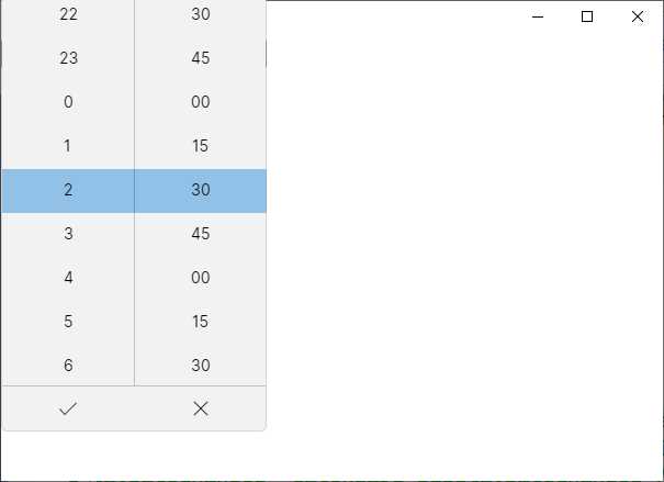
Figure 22: The TimePicker in action
Tip: All four controls described so far also expose a property called Header, of type string, which you can assign with text that is displayed above the control.
Implementing value selection: CheckBox, Slider, ComboBox
Avalonia UI offers a number of controls for user input based on selecting values. The first of them is the CheckBox, which exposes the IsChecked property, whose value is true or false. However, if you assign the IsThreeState property as true, IsChecked also supports a null value. The following snippet provides an example:
<CheckBox Name="CheckBox1" Content="Do you agree?" IsChecked="true"
IsThreeState="true"/>
Notice that you are not limited to showing a label for the CheckBox, because this exposes the Content property, making it possible to implement a composite view as the control description. You also access the control’s value via its IsChecked property. Figure 23 shows what it looks like.
The Slider allows the input of a linear value. It exposes the Value, Minimum, and Maximum properties, all of type double, which represent the current value, minimum value, and maximum value. It does not have a built-in label, so you can use it together with a TextBlock as follows:
<StackPanel Margin="10">
<TextBlock Text="Select your age:" />
<Slider x:Name="Slider1" Maximum="85" Minimum="13" Value="30"
PropertyChanged="Slider1_PropertyChanged" TickFrequency="1"
TickPlacement="TopLeft" Ticks="1"/>
</StackPanel>
Surprisingly, no event is fired when the value changes, so the only alternative to handle this is working with the PropertyChanged event as follows:
private void Slider1_PropertyChanged(object sender,
AvaloniaPropertyChangedEventArgs e)
{
if(e.Property.Name == nameof(Slider1.Value))
{
// Handle Value here...
}
}
TickFrequency is a double that defines the interval between ticks on the bar, whereas TickPlacement specifies where the tick bar should be placed (TopLeft, BottomRight, Outside, None). An example of the slider can be seen in Figure 23.
The next control for value selection is the ComboBox. The following is an example of how you can declare it:
<ComboBox SelectedIndex="0" IsDropDownOpen="True">
<ComboBoxItem>Item 1</ComboBoxItem>
<ComboBoxItem>Item 2</ComboBoxItem>
<ComboBoxItem>Item 3</ComboBoxItem>
<ComboBoxItem>Item 4</ComboBoxItem>
</ComboBox>
The following is a list of relevant points:
· The ComboBox can be populated with items programmatically or via data-binding. In the first case, you add as many ComboBoxItem objects as many items you want to display. In the second case, as you will learn in the next chapter, you assign the ItemsSource property with a collection.
· The SelectedIndex property allows you to get and set the current item if the control is populated programmatically; otherwise, you use the SelectedItem property.
· The IsDropDownOpen property allows you to automatically expand the view when assigned with true.
· The ComboBoxItem object is not limited to displaying strings; it can display complex visual elements through the usual XAML hierarchical structure.
When the selection changes, the SelectionChanged event is fired. The following code snippet shows a sample handler:
private void ComboBox1_SelectionChanged(object sender,
SelectionChangedEventArgs e)
{
var selectedItems = e.AddedItems;
}
AddedItems is of type IList, so you will need to cast the result to the expected type. Figure 23 shows how the ComboBox appears, along with the controls described previously.
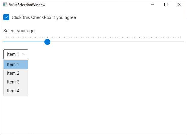
Figure 23: A summary view of the CheckBox, Slider, and ComboBox controls
Working with images
Using images is very common in most applications since they both enrich the look and feel of the user interface and enable apps to support multimedia content. Avalonia UI provides an Image control you can use to display images from local files and embedded resources. Displaying images is really simple, while understanding how you load and size images is more complex, especially if you have no previous experience with XAML and dynamic user interfaces.
You declare an Image as follows, obviously replacing the image file name with a name of your choice:
<Image Source="avares://Ch5_CommonControls/Assets/yourImage.png" Stretch="UniformToFill" Width="300"/>
The way you specify the image path depends on how and where the image is stored. If it is a resource in the application, you will need to assign the Build Action property with AvaloniaResource in the Properties window. The syntax you use is the following:
Source="avares://rootNamespace/folder/filename"
avares:// is a prefix followed by the project’s root namespace, a slash with the name of the folder where the image file is, a slash, and the file name. If the file is not a resource and is stored locally on disk, the syntax you use is the following:
Source="folder/filename"
If you need to display images that are loaded at runtime, you can instantiate a Bitmap object and assign the result to the Source property as follows:
var image = new Image();
var bmp = new Bitmap("folder/imageFileName.jpg");
image.Source = bmp;
// Stack1 is a StackPanel declared in XAML
Stack1.Children.Add(image);
The Stretch property determines how to size and stretch an image within the bounds it is being displayed in. It requires a value from the Avalonia.Media.Stretch enumeration:
· Fill: Stretches the image to fill the display area completely and exactly. This may result in the image being distorted.
· Uniform: The content is resized to fit the destination dimensions while preserving its native aspect ratio.
· UniformToFill: The content is resized to completely fill the destination rectangle while preserving its native aspect ratio.
· None: The image is not resized.
You can control the stretch direction by assigning the StretchDirection property with DownOnly (scales the image downwards), UpOnly (scales the image upwards), or Both (uses both directions). You can also set the Width and Height properties to adjust the size of the Image control. Figure 24 shows an example.
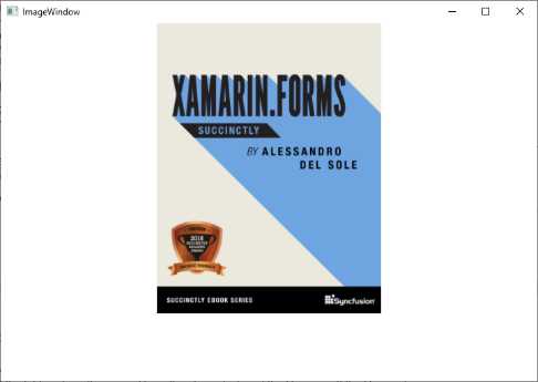
Figure 24: Displaying images with the Image view
Supported image formats are .jpg, .png, .gif, .bmp, and .tif.
Working with menus
You can create top-level menus with the Menu control. This is a common feature for desktop applications. The following XAML code demonstrates how to define a menu with two items and nested commands:
<DockPanel VerticalAlignment="Top">
<Menu DockPanel.Dock="Top" Background="LightGray">
<MenuItem Header="_File">
<MenuItem Header="_Open..." Name="OpenButton"
Click="OpenButton_Click">
<MenuItem.Icon>
<Image
Source="avares://Ch5_Controls/Assets/OpenFile.png"/>
</MenuItem.Icon>
</MenuItem>
<Separator/>
<MenuItem Header="_Exit"/>
</MenuItem>
<MenuItem Header="_Edit">
<MenuItem Header="Copy"/>
<MenuItem Header="Paste"/>
</MenuItem>
</Menu>
</DockPanel>
These are the most relevant points about menus:
· A Menu is normally included in a DockPanel because it arranges child elements most appropriately.
· A Menu contains MenuItem objects, each representing a real menu.
· The Header property of the MenuItem shows the name on the bar.
· Each MenuItem contains child MenuItem objects that point to specific actions.
· A MenuItem exposes the Click event you can handle to take the appropriate action at button click. It is also possible to bind the Command property to an action in a ViewModel, but this will be explained in the next chapter. Look back at the description for the Button control to understand how the Click event can be handled.
· You can separate menu items using the Separator control.
· You can provide an icon by assigning an Image control to the MenuItem.Icon property. Look back at the Image control description about the syntax.
Notice how you can add an underscore (_) before the letter you want to use as a shortcut. For example, pressing Alt + F will open the File menu item. In addition, you could assign the InputGesture property with a keyboard shortcut as in the following line:
<MenuItem Header="Paste" InputGesture="Ctrl+V"/>
Also, remember that you have complete control over colors and fonts using the properties discussed in Table 6. Figure 25 shows how the menu appears.
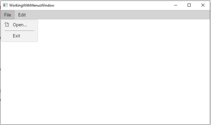
Figure 25: A menu in Avalonia UI
Tip: If you declare a CheckBox as the content for the MenuItem.Icon property, you will be able to enable or disable that menu item, depending on the CheckBox value.
Working with flyouts
Flyouts are containers similar to pop-up windows that can be used to display and dismiss arbitrary UI contents. They have become very popular with mobile applications, but they can still be useful in desktop apps as well. They are not used as individual controls; rather, they represent the content of two controls in particular: the Button and the SplitButton.
You assign a Flyout element to the same-named property of the Button like in the following example:
<Button Margin="20" Name="FlyoutButton" Content="Click for privacy policy">
<Button.Flyout>
<Flyout Placement="Bottom">
<TextBlock
Text="The application will not collect any personal data"/>
</Flyout>
</Button.Flyout>
</Button>
With the Flyout you can show additional UI content. In this case, when the user clicks the button, a pop-up window appears and shows the provided text, as shown in Figure 26.
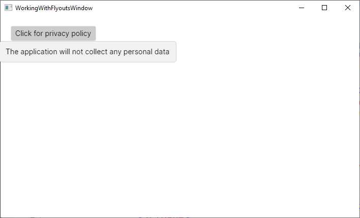
Figure 26: A Flyout opened with a Button
As you would expect, the Flyout is not limited to displaying text, so you can provide complex visual elements as their content. The flyout position is determined via the Placement property, of type FlyoutPlacementMode. Table 9 describes possible values.
Table 9: Flyout placement modes
Value | Description |
|---|---|
Auto | Preferred location is determined automatically. |
Bottom | Preferred location is below the target element. |
BottomEdgeAlignedLeft | Preferred location is below the target element, with the left edge of the flyout aligned with the left edge of the target element. |
BottomEdgeAlignedRight | Preferred location is below the target element, with the right edge of the flyout aligned with the right edge of the target element. |
Left | Preferred location is to the left of the target element. |
LeftEdgeAlignedBottom | Preferred location is to the left of the target element, with the bottom edge of the flyout aligned with the bottom edge of the target element. |
LeftEdgeAlignedTop | Preferred location is to the left of the target element, with the top edge of the flyout aligned with the top edge of the target element. |
Right | Preferred location is to the right of the target element. |
RightEdgeAlignedBottom | Preferred location is to the right of the target element, with the bottom edge of the flyout aligned with the bottom edge of the target element. |
RightEdgeAlignedTop | Preferred location is to the right of the target element, with the top edge of the flyout aligned with the top edge of the target element. |
Top | Preferred location is above the target element. |
TopEdgeAlignedLeft | Preferred location is above the target element, with the left edge of the flyout aligned with the left edge of the target element. |
TopEdgeAlignedRight | Preferred location is above the target element, with the right edge of the flyout aligned with the right edge of the target element. |
You can then control the Flyout behavior via the ShowMode property, of type FlyoutShowMode, whose values are listed in Table 10.
Table 10: Flyout show modes
Value | Description |
|---|---|
Standard | The flyout is shown and dismissed on click. |
Transient | The flyout is shown and dismissed when the parent gets focus. |
TransientWithDismissOnPointerMoveAway | The flyout is shown on click but dismissed when the mouse pointer moves away. |
Finally, the IsOpen property can be used to determine if the pop-up window is open, and to close it programmatically. A more interesting usage of the Flyout is done with the SplitButton, as you will learn next.
The SplitButton
The SplitButton is a special control made of two parts: the content and a flyout. Figure 27 shows an example that you can take as a reference before writing code.
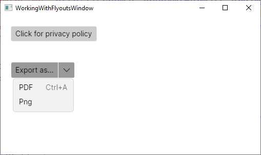
Figure 27: A SplitButton in action
As you can see, the Export as… button shows a pop-up window to provide further options. Figure 27 shows the result of the following code:
<SplitButton Margin="20" Content="Export as..." >
<SplitButton.Flyout>
<MenuFlyout Placement="Bottom">
<MenuItem Header="PDF"
InputGesture="Ctrl+A" />
<MenuItem Header="Png" />
</MenuFlyout>
</SplitButton.Flyout>
</SplitButton>
The SplitButton supports a flyout called MenuFlyout, which makes it possible to provide options. The Placement values are the same as described in Table 9. Options are provided via MenuItem objects that you saw when working with menus, which means you can handle actions via the Click event (or by binding the Command property if you work with data-binding). This is a very interesting control that you can use in a variety of scenarios that simplifies the way you can provide interaction over options.
The SplitView
The SplitView allows for the implementation of a master-detail view with a side pane and some content. Figure 28 shows an example, with considerations following shortly.
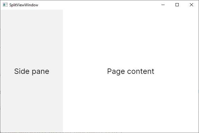
Figure 28: Organizing a window with the SplitView
The result in Figure 28 is obtained via the following XAML code:
<SplitView IsPaneOpen="True" DisplayMode="Inline" OpenPaneLength="200">
<SplitView.Pane>
<TextBlock Text="Side pane" FontSize="24"
VerticalAlignment="Center"
HorizontalAlignment="Center"/>
</SplitView.Pane>
<Grid>
<TextBlock Text="Page content" FontSize="24"
VerticalAlignment="Center"
HorizontalAlignment="Center"/>
</Grid>
</SplitView>
The side pane is defined by implementing visual elements as the content of the SplitView.Pane property. The OpenPaneLength property specifies the width of the pane, and it will keep it fixed, while the rest of the window is rearranged dynamically. The DisplayMode property, of type SplitViewDisplayMode, supports values described in Table 11.
Table 11: Pane display modes
Value | Description |
|---|---|
CompactInline | The pane is displayed next to the content. When collapsed, the pane is still visible according to CompactPaneLength. The pane does not automatically collapse when tapped outside. |
CompactOverlay | The pane is displayed above the content. When collapsed, the pane is still visible according to CompactPaneLength and collapses when the user taps outside of it. |
Inline | The pane is displayed next to the content and does not collapse automatically when the user taps outside of it. |
Overlay | The pane is displayed above the content and collapses when a user taps outside of it. |
All the visual elements you add to the SplitView pane or content behave exactly as they would outside this container. This can be a convenient UI implementation for cross-platform projects or mobile apps.
Organizing views with the Expander
The Expander is a control that can be collapsed or expanded. When expanded, it shows additional visual elements. The following code provides an example:
<Expander Header="Expand for full view">
<StackPanel>
<TextBlock Text="You have expanded the view to see this image:"/>
<Image Width="200"
Source="avares://Ch5_Controls/Assets/xamarin-forms-succinctly.png"
Stretch="Fill"/>
</StackPanel>
</Expander>
The Header property can be a string or another visual element. In this case, you use the extended Expander.Header form. It also exposes the IsExpanded property, of type bool, that gets or sets whether the control is expanded. Figure 29 shows an example.
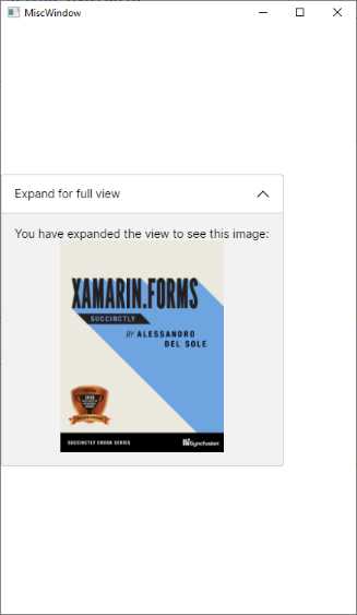
Figure 29: Organizing the UI with the Expander
The Expander is a convenient choice when you have several pieces of user interface that do not need to be displayed all at the same time.
Showing progress with the ProgressBar
The ProgressBar is another popular control that allows you to display the progress of a long-running operation. You declare it as follows:
<ProgressBar Minimum="0" Maximum="100" Foreground="LightGray"
Value="70" ShowProgressText="True"/>
You specify the Minimum and Maximum values, and the Value property will likely be updated at runtime by your C# logic. If you do not specify a Foreground color, a shade of blue will be used by default.
If you set the ShowProgressText property as True, the ProgressBar will show the value with a percentage sign (%). This behavior cannot be changed, but at least it is not mandatory, and you could implement a different visualization option via a TextBlock. Figure 30 shows what the ProgressBar looks like.
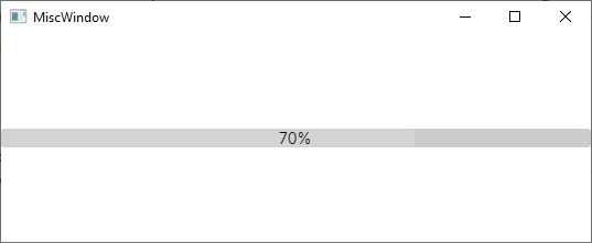
Figure 30: Implementing a ProgressBar
The LightGray color has been used here to better render this page.
Chapter summary
This chapter introduced the concept of the control in Avalonia UI, the building blocks for any user interface. You have seen the different types of buttons, the different controls you use to display and edit text, how you can manipulate dates and time, how you can implement value selection, and how to work with images and menus.
Now you have all you need to build high-quality user interfaces with panels and controls, but there is more that you need to know to really enrich your applications. In the next chapter, you will make an important step forward, understanding how to consume styles and resources, and how to display data sets via data binding.
- 1800+ high-performance UI components.
- Includes popular controls such as Grid, Chart, Scheduler, and more.
- 24x5 unlimited support by developers.