
Aurelia Succinctly®

CHAPTER 5
Databinding
Overview
One of the most important features to a framework is the ability to provide some form of databinding, and Aurelia has a wonderful and mature implementation. We will first look at the core components of databinding, and then dive into real world scenarios. Let’s get started.
Bind
In Aurelia, it is possible to bind to practically any attribute, with a few exceptions. You achieve this by using the following markup:
Code Listing 67
<input value.bind="firstname" /> |
This simple example demonstrates how to “bind” to a given attribute of an element. Here, we are binding to the value property of the input control.
Note: Binding is typically one-way, but if your element is inside a form tag, then the binding will actually be two-way by default.
If we go back to the nav-bar.html file, we can see another example of a usage of bind:
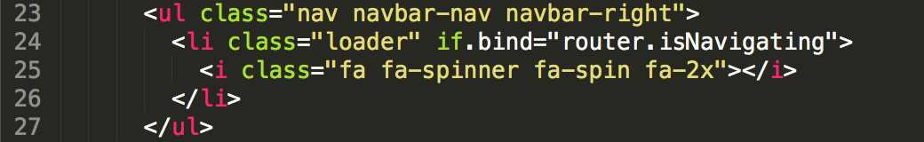
Figure 22: if.bind example
Here, we see an example of binding to an attribute that does not exist on the li element. The if attribute is provided by the Aurelia framework to allow us to programmatically add and remove DOM elements. The if.bind will inject the li element and its corresponding children when the expression router.isNavigating is true.
Perhaps you want the element to always be a part of the DOM, but to be hidden at times. You can do this by simply changing the binding to the following:
Code Listing 68
<li class="loader" show.bind="router.isNavigating">…</li> |
By using show.bind, we are basically setting the style attribute to display="none".
One-way
There are times when we just want our pages to reflect what is stored in our view-model and update whenever a value changes. That is exactly what one-way does for us. A simple example of this would be the following:
Code Listing 69
<li content.one-way="name"></li> |
In this example, we are setting the content attribute of the li to be bound to the name property on our view-model. Whenever our name property changes, the li will be updated correspondingly.
Two-way
Likewise, if we want to be able to provide the ability for a binding to receive updates from the view-model as well as send updates from the view, we would need to create a binding like the following:
Code Listing 70
<input value.two-way="search" /> |
In this example, we are specifying that we want our value property of the input element to have two-way databinding so that changes in the view and view-model are reflected properly. Remember that if you are binding input and select elements inside a form tag, you will get two-way databinding automatically.
One-time
There may be times when you want to bind a value to a screen and you know that the value will never change in the view-model. You can notify Aurelia that it does not need to observe changes to this underlying property on the view-model and simply request it to render the initial value when the screen is loaded. If you change the value on the view-model at a later time, the view will not receive this update automatically. See the following for an example:
Code Listing 71
<span content.one-time="message"></span> |
String interpolation
We just saw how to do a one-way binding, but you will find a lot of scenarios when you want to provide both content and a binding. This is where string interpolation comes in. The nice thing about this feature is that it is exactly the same as the ES6 specification, so you are not learning anything new from an API perspective. Consider the following example from the nav-bar.html custom element:
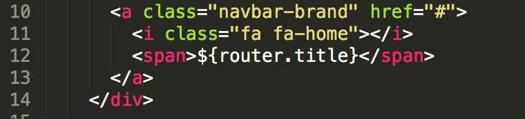
Figure 23: String interpolation snippet
In this snippet, we see that this portion of the markup corresponds to what will be displayed in the left-most entry of the menu. If we refer to Figure 11, we see that there is a title property. It is this property that we are going to interpolate when we load the screen; we can add content around it and customize our output like the following:
Code Listing 72
<span>Hello ${name}, how are you doing?</span> |
Here you can see that we have a dynamic message we are displaying in our span element. Let’s look at another example, this time using an expression:
Code Listing 73
<li class="${row.isActive ? 'active' : ''}">…</li> |
In this example, we are adding the isActive class to the li element when the row.isActive property is true.
Loops
Binding to properties is great, but it really doesn’t help when you need to loop over a collection of data. Aurelia has a great solution for this using the repeat.for syntax. Consider the following example taken again from the nav-bar custom element:
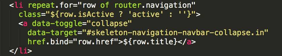
Figure 24: repeat.for example
Here, we are looping over the navigation array property off of the router object. We can interpret the syntax as such:
For each row in the navigation array, inject the li element with its corresponding children.
Also notice that we can reference the row property within the child elements and access other properties. You can see that we access the isActive, href, and title properties this way.
Note: If you need to reference something that is not in the context of the row object, you need to use the $parent keyword to go to the parent of the row object.
Ref binding
Sometimes you just want to bind to a property on another element. Aurelia makes this extremely easy to accomplish with the ref keyword. Consider the following example:
Code Listing 74
<template> <h1>${title}</h1> <input ref="customerName"> <h2>Hello ${customerName.value}, how can I help you?</h2> </template> |
Here, we are referencing the input element and accessing the value property so that we can display its value in the span element. Not only do we have the ability to reference any element that has a ref attribute, but we can also reference it from the view-model.
Here is what we get for the output:
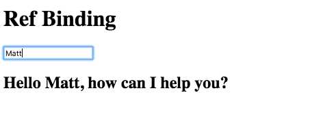
Figure 25: Ref Binding
You can see this example in action here.
Referencing functions
There will be times when you are authoring your screens and custom elements and attributes will have a bound property on your view-model that is looking for a reference to a function. If you were to use bind as the keyword against your function, you would not be guaranteed that the context of the this keyword would be correct. Most of the time, you will want this to be in the context of the view-model, and that is exactly what the call keyword does for you. Consider the following saveButton custom element template:
Code Listing 75
<template> <button click.delegate="saveFunc()">Save</button> <template> |
If we look at the markup above, we see a bindable property exposed from our view-model, named saveFunc. This property will now hold a reference to any save implementation using the call keyword, as we will see shortly. This is powerful in that it lets us create some generic solutions for common use cases, and yet pass in custom functionality like the save function to our custom elements.
Let’s see what the view-model would look like for this custom element:
Code Listing 76
import {customElement, bindable} from 'aurelia-framework'; @customElement('save-button') export class SaveButton { @bindable saveFunc; constructor() { } } |
Next, let’s look at how we would use this:
Code Listing 77
<template> <require from='save-button'></require> <h1>${title}</h1> <save-button save-func.call="performSave()"></save-button> </template> |
By using the call keyword, we are passing a reference to the performSave function, and this ensures that the function is not executed immediately.
Let’s look at the view-model and see what we have there:
Code Listing 78
export class App { title = 'Custom Element referencing a function';
constuctor() {
}
performSave() { alert('You clicked save!'); } } |
Our performSave function doesn’t do much except throw up an alert when called. Finally, here is how it looks when we click Save:
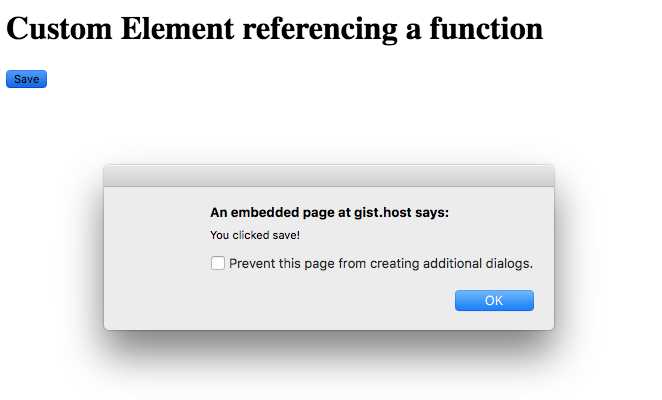
Figure 26: Custom Element referencing a function
You can see this example in action here.
We will be going into more detail on custom elements and attributes in a later chapter.
Event binding
Binding to properties and arrays and other elements is great, but sometimes you need to have some form of interaction with the user. A common scenario is performing some form of action when a user clicks on button or anchor tag. Aurelia supports binding to DOM events using the following formats:
- click.delegate="sayHello()"
- click.trigger="sayHello()"
The delegate keyword attaches a single event handler to the document that handles all events of that given type and dispatches them to the correct target when the corresponding event is raised.
The trigger keyword creates an event handler directly to the underlying element. When the event is fired, only the function reference will be invoked.
Note: You can bind to any event in the DOM by removing the on prefix and providing the rest of the event name in lowercase.
Consider the following view snippet:
Code Listing 79
<template> <h1>${title}</h1> <input value.bind="name"> <button click.delegate="sayHello()">Greeting</button> </template> |
In this simple example, we are binding the click event that will execute the sayHello function whenever a user clicks the button.
Here is what the sayHello function might look like in the view-model:
Code Listing 80
export class App { title = 'Event Binding'; name = '';
constuctor() {
}
sayHello() { alert(`Hello ${this.name}`); } } |
You can see this example in action here.
All event bindings come with an $event property that you can pass on to the view-model or use in your expression as follows:
Code Listing 81
<input ref="customerName" /> <button click.delegate="save($event.target, customerName.value)"> Save </button> <button click.trigger="cancel($event)">Cancel</button> |
This provides a lot of flexibility, and in a simple, elegant semantic. In general, you should use delegate rather than trigger. Event delegation improves application performance; it can reduce the number of event subscriptions by leveraging the “bubbling” characteristic of many events. With event delegation, handlers are not attached to individual elements.
Form controls
As I’ve already indicated, elements inside a form tag have their default binding as two-way. This section will cover both input bindings and select control bindings.
Input binding
The following is an example of input bindings:
Code Listing 82
<template> <form> <label>Customer Email</label> <input type="email" value.bind="customerEmail"> <label>User Name</label> <input type="text" value.bind="username"> </form> </template> |
Check-box binding
The most common scenario is binding a check box to a Boolean value. The following is an example of binding a checkbox to the property billingAddressSameAsCustomerAddress on the view-model:
Code Listing 83
<template> <form> <h4>Favorite Color</h4> <input type="checkbox" checked.bind="billingAddressSameAsCustomerAddress"> </form> </template> |
It is also possible to bind to numbers, objects, and strings. You can find examples of each of these here.
Radio-button binding
Radio buttons are another common pattern that allow an end user to make a single selection from a list of options. The following is an example of binding radio buttons:
Code Listing 84
<template> <form> <h4>Favorite Color</h4> <label><input type="radio" name="color" value="red" checked.bind="selectedColor">Red</label> <label><input type="radio" name="color" value="blue" checked.bind="selectedColor">Blue</label> <label><input type="radio" name="color" value="green" checked.bind="selectedColor">Green</label> <br /> Selected color: ${selectedColor} </form> </template> |
Again, it is also possible to bind to numbers, objects, and Booleans, aside from the string example shown above. You can find examples of each of these here.
Select binding
The select control allows users to perform a single or multiple selection. You indicate multiple selection by including the multiple attribute. Let’s take a look at the following example:
Code Listing 85
<template> <form> <label>T-Shirt Size:<br /> <select value.bind="shirtSize"> <option repeat.for="size of sizes" model.bind="size.value">${size.name} </option> </select> </label> Shirt Size: ${shirtSize} </form> </template> |
Just like check boxes and radio buttons, it is possible to bind to numbers, objects, and strings. You can find examples of each of these here.
Let’s see how this would look with the multiple attribute on the select control:
Code Listing 86
<template> <form> <label>College Courses:<br /> <select value.bind="selectedCourses" multiple> <option repeat.for="course of courses" model.bind="course.id">${course.name} </option> </select> </label> Selected courses: ${selectedCourses} </form> </template> |
Computed properties
Let’s say you just finished writing your security component to allow users to sign into your application, and you want to display their first and last names as a greeting in the header area of your screen. You can do this by creating a computed property even though the underlying data object does not expose this property. Computed properties allow you to combine multiple properties from a given object and expose them for binding on your view-model. Let’s take a look at a simplified version of the welcome.js file:
Code Listing 87
export class Welcome { heading = 'Welcome to the Aurelia Navigation App!'; firstName = 'John'; lastName = 'Doe'; previousValue = this.fullName; get fullName() { return `${this.firstName} ${this.lastName}`; } } |
Here we see the use of the fullName computed property. It simply returns the firstName and lastName properties from the Welcome class as a template string.
Note: It is not possible to observe getters, and they must be “dirty-checked,” which is very expensive. However, it is possible to let Aurelia know the properties this computed property is dependent upon. You can do this by using the @computedFrom decorator.
Here is a more efficient, optimized version using the @computedFrom decorator on our computed property:
Code Listing 88
import {computedFrom} from 'aurelia-framework'; export class Welcome { heading = 'Welcome to the Aurelia Navigation App!'; firstName = 'John'; lastName = 'Doe'; previousValue = this.fullName; @computedFrom('firstName', 'lastName') get fullName() { return `${this.firstName} ${this.lastName}`; } } |
This provides a lot of flexibility when you want to bind to a single property, but still receive updates when the underlying dependent properties change.
Value converters
Value converters allow the developer to define data transformation during the binding process bubbling up from the view-model or modified by the user from the view. We can look again to the welcome.js file to see usage of a value converter:
Code Listing 89
import {computedFrom} from 'aurelia-framework'; export class Welcome { heading = 'Welcome to the Aurelia Navigation App!'; firstName = 'John'; lastName = 'Doe'; previousValue = this.fullName; @computedFrom('firstName', 'lastName') get fullName() { return `${this.firstName} ${this.lastName}`; } } export class UpperValueConverter { toView(value) { return value && value.toUpperCase(); } } |
In this simplified file, we see the class UpperValueConverter, and the toView function, which lets us know that we are converting the value from our view-model to the view. The other function available is the fromView, which, as the name suggests, takes the value from the view and updates the view-model.
Let’s take a look at how we use this newly created value converter in our simplified welcome.html file:
Code Listing 90
<template> <section class="au-animate"> <form role="form"> <div class="form-group"> <label>Full Name</label> <p class="help-block">${fullName | upper}</p> </div> </form> </section> </template> |
As you can see, we are using the value converter when we are interpolating the fullName property inside the paragraph element. The syntax is: ${<property> | <value-converter>}.
Note: We are able to reference the UpperValueConverter as “upper” since Aurelia has a default convention of looking for a class that has the name Upper with a suffix, ValueConverter, attached to it.
There is so much more you can do with value converters; look here for more examples.
Binding behaviors
If you need something more powerful than a value converter, then binding behaviors are exactly what you are looking for. Binding behaviors give you full access to a binding throughout its lifecycle. This differs from value converters in that they only have access to the value bubbling up from the view-model or modified by the user on the view. This added power gives binding behaviors the opportunity to change the behavior of the binding.
There are a couple of rules that you need to be aware of when dealing with binding behaviors:
- A binding behavior can accept arguments using the colon (:) as the delimiter.
- A binding expression can be comprised of multiple binding behaviors.
- A binding expression can be comprised of multiple value converters and binding behaviors. The value converters must always come first.
Let’s define a use case and see if we might be able to use a binding behavior to satisfy the requirement. You are tasked with creating a screen where users will type into an input element to search, and after the user has finished typing, the screen will perform a lookup via a Web API call to a back end for querying the results. Let’s take a look at the following example to see how this might be accomplished:
Code Listing 91
<template> <form role="form"> <div class="form-group"> <label>Search:</label> <input type="text" value.bind="criteria & debounce" change.delegate="performSearch()"> </div> </form> </template> |
You will notice in our value.bind expression that we are introducing the ampersand (&) character. It is this character that identifies that we are going to be passing in a binding behavior. In our case, it will be debounce. The debounce binding behavior allows users to type into an input, but it will not update the underlying property that it is bound to until 200 milliseconds have passed. This is very similar to the value converter pipe (|) notation that we looked at earlier. The difference here is that we are not changing the underlying value in the binding, but adding a specific behavior. In this case, we do not want the change event to fire with every keystroke the user makes, but after a brief period. This is where binding behaviors become powerful.
We can override the default time as follows:
Code Listing 92
<template> <form role="form"> <div class="form-group"> <label>Search:</label> <input type="text" value.bind="criteria & debounce:500" change.delegate="performSearch()"> </div> </form> </template> |
Here, we are stating that we don’t want an update to fire until 500 milliseconds have passed from the last change the user entered. This is exactly what we want, and prevents our function performSearch from being called too many times.
The following is a short list of the binding behaviors Aurelia has out of the box:
- throttle–Limits the rate at which the view-model is updated in two-way binding scenarios, or limits the rate at which the view is updated in one-way binding scenarios.
- debounce–Prevents the binding from being updated until a specified time has passed without any changes.
- updateTrigger–Gives the ability to override the input events that cause the element’s value to be updated on the view-model. The default events are change and input.
- signal–This allows for signaling a change to other parts of your screen that are not aware of the change. A common example would be to allow a user to switch the language in which they are viewing your screen.
- oneTime–This comes in handy for string interpolation expressions. We already have this capability in our binding expression. Simply put, it will allow for the expression to be evaluated once and then remain the same regardless of any subsequent changes on the view-model.
Please refer here for further discussion on each of these powerful binding behaviors.
You have seen what Aurelia brings to the table, but what if you have a scenario that requires something unique? No worries—you can create your own custom binding behavior. The syntax for creating a custom binding behavior is very similar to a value converter. You are provided with two methods: bind(binding, scope, […args]) and unbind(binding, scope). In the bind method, you apply your behavior to the binding; in the unbind method, you clean up anything you did to the binding and restore it back to its original state.
Please refer here for further discussion on creating your own binding behavior. We will go over creating our own custom binding behavior in Chapter 10.
- 1800+ high-performance UI components.
- Includes popular controls such as Grid, Chart, Scheduler, and more.
- 24x5 unlimited support by developers.