
Aurelia Succinctly®

CHAPTER 8
Custom Elements
Overview
Custom elements are by far some of the most exciting pieces within Aurelia. You have the ability to create reusable components that can be as simple or as complicated as necessary. Suppose you would like to create a component that encapsulates the logic for an input element along with a label. Let’s look at what it takes to create our first custom element. We will call it my-input. Let’s look at the my-input.html file first:
Code Listing 97
<template> <label>${label}</label> <input type.bind="type" placeholder.bind="placeholder" value.bind="value"> </template> |
In this example, we can see that we need four properties on our view-model: label, type, placeholder, and value. Let’s now take a look at our my-input.js file:
Code Listing 98
import {customElement, bindable} from 'aurelia-framework'; @customElement('my-input') export class MyInput { @bindable type = 'text'; @bindable label; @bindable placeholder = ''; @bindable value; constructor() { } } |
We create our file and it then defines a custom element. We are exposing four attributes for this custom element that we are allowing the developer to bind to when using.
Let’s see what it takes to use our new custom element in a screen:
Code Listing 99
<template> <require from='my-input'></require> <h1>${title}</h1> <form> <my-input label="Customer Name" placeholder="Enter your name..." value.two-way="customerName"></my-input> <p>${customerName}</p> </form> </template> |
As you can see, that is pretty slick. We have reduced a ton of markup, yet still have a very simple API. Also notice that we did not provide a type. We don’t have to if we want the type to remain text. We only have to provide a type if we wish to override the default value. Here is a screenshot of this example:
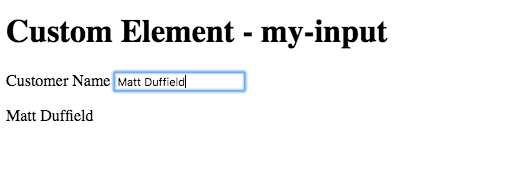
Figure 27: Custom Element–my-input
You can see this example in action here.
Content projection
There will be times when you are authoring a custom element for which you want to allow a developer who uses your element to inject content. Say we want to create a panel element where we will have a header and body section to the element. In the header, we will just bind to a heading, but we want to allow the developer to provide any content into the body. Let’s look at the following bs-panel.html file:
Code Listing 100
<template> <div class="panel"> <div class="panel-heading"> ${header} </div> <div class="panel-body"> <slot></slot> </div> </div> </template> |
Let’s take a look at the bs-panel.js file:
Code Listing 101
import {customElement, bindable} from 'aurelia-framework'; @customElement('bs-panel') export class BsPanel { @bindable header = '';
constructor() {
} } |
Now let’s take a look at how we use our new custom element:
Code Listing 102
<template> <require from='bs-panel'></require> <h1>${title}</h1> <bs-panel header="My Discourse"> <p>Four score and seven years ago...</p> </bs-panel> </template> |
As you can see, you are able to put in any content you like. You don’t even have to change your programming paradigm, as the content just works. Let’s see what this looks like:
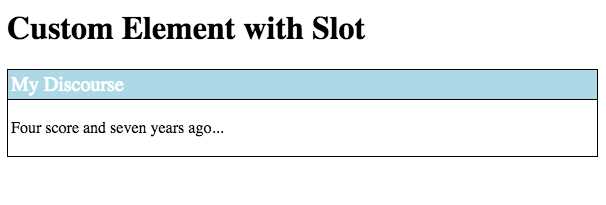
Figure 28: Custom element with slot
You can see this example in action here.
- 1800+ high-performance UI components.
- Includes popular controls such as Grid, Chart, Scheduler, and more.
- 24x5 unlimited support by developers.