
ASP.NET MVC 4 Mobile Websites Succinctly®

CHAPTER 8
Tips and Tricks
“Do not try and bend the spoon. That’s impossible. Instead...only try to realize the truth. There is no spoon. Then you’ll see that it is not the spoon that bends, it is only yourself.”
Young boy in The Matrix
Using Partial Views to Minimize Duplication
One of the major problems with the type of website that we have been creating so far is that we are replicating pages in our site, and with that comes the curse of duplicate content. One way you can avoid replicating your content is by creating partial views that you share between the different device pages. The following three screenshots are the exact same URL with the exact same content, but each is organized and optimized for the platform it is targeting, and each shares the same content file.
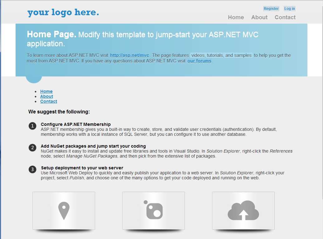
Desktop View
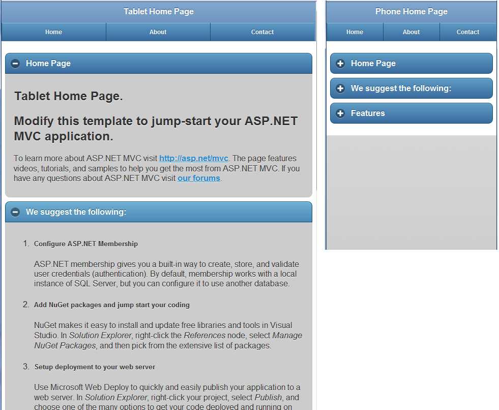
Tablet and Phone Views
Let’s look at the source code for each of these pages, starting with the desktop view:
@{ ViewBag.Title = "Home Page"; }
@section featured {
@Html.Partial("_Index_SubPage1")
}
<ul >
@Html.Partial("_Index_SubPage2")
</ul>
<h3>We suggest the following:</h3>
@Html.Partial("_Index_SubPage3")
<section class="features">
@Html.Partial("_Index_SubPage4")
</section>
That’s it—that’s the entire page. For each of the main areas on the page, you can see that the content has been moved to a partial view file, so there is very little left on the actual page.
Let’s start by creating the mobile views with a very similar layout. Here is the phone page:
@{ Layout = "../Shared/_Layout.Phone.cshtml"; }
@{ ViewBag.Title = "Phone Home Page"; }
<h2>Home Page</h2>
@Html.Partial("_Index_SubPage1")
@* -- Moved to the Shared/_Layout.Phone.cshtml *@
@* @Html.Partial("_Index_SubPage2")*@
<h2>We suggest the following:</h2>
@Html.Partial("_Index_SubPage3")
<h2>Features</h2>
@Html.Partial("_Index_SubPage4")
And here is the tablet page:
@{ Layout = "../Shared/_Layout.Tablet.cshtml"; }
@{ ViewBag.Title = "Tablet Home Page"; }
<h2>Home Page</h2>
@Html.Partial("_Index_SubPage1")
@* -- Moved to the Shared/_Layout.Tablet.cshtml *@
@* @Html.Partial("_Index_SubPage2")*@
<h2>We suggest the following:</h2>
@Html.Partial("_Index_SubPage3")
<h2>Features</h2>
@Html.Partial("_Index_SubPage4")
Note that we removed the _Index_SubPage2 because that is the menu that we already have in the base layout page. This code won’t produce the sleek page shown in the previous screenshot quite yet, but it will have all of the content on the page. We’ll look at adding the collapsible containers in just a minute.
Using this type of coding pattern raises your chances of success tremendously because you can optimize the design of your pages to match the device, but at the same time save yourself from having to maintain content in three different places at once. With this model, when you change the content in one place, it’s changed on all three platforms at the same time!
Collapsible Containers and Reusable Content
Let’s go back to the collapsible containers we referenced briefly in Chapter 3. jQuery.Mobile makes it very easy to create these. Let’s look at an example of this in action.
Let’s modify the mobile views we just created to put the partial view content inside of a div with a role of collapsible. If you use that type of div container and you have to add a header tag at the top of your content, you’ll end up with a nice-looking bar with a plus or minus sign at the top of the container. You can see that we’ve set the phone containers to be collapsed and the tablet containers to be expanded by default since we have different device specifications.
Here is the finished code for the phone page:
@{ Layout = "../Shared/_Layout.Phone.cshtml"; }
@{ ViewBag.Title = "Phone Home Page"; }
<div data-role="collapsible" data-theme="b" data-content-theme="b"
data-collapsed="true">
<h2>Home Page</h2>
@Html.Partial("_Index_SubPage1")
</div>
@* -- Moved to the Shared/_Layout.Phone.cshtml *@
@* @Html.Partial("_Index_SubPage2")*@
<div data-role="collapsible" data-theme="b"
data-content-theme="b" data-collapsed="true">
<h2>We suggest the following:</h2>
@Html.Partial("_Index_SubPage3")
</div>
<div data-role="collapsible" data-theme="b"
data-content-theme="b" data-collapsed="true">
<h2>Features</h2>
@Html.Partial("_Index_SubPage4")
</div>
And here is the code for the finished tablet page:
@{ Layout = "../Shared/_Layout.Tablet.cshtml"; }
@{ ViewBag.Title = "Tablet Home Page"; }
<div data-role="collapsible" data-theme="b"
data-content-theme="b" data-collapsed="false">
<h2>Home Page</h2>
@Html.Partial("_Index_SubPage1")
</div>
@* -- Moved to the Shared/_Layout.Tablet.cshtml *@
@* @Html.Partial("_Index_SubPage2")*@
<div data-role="collapsible" data-theme="b"
data-content-theme="b" data-collapsed="false">
<h2>We suggest the following:</h2>
@Html.Partial("_Index_SubPage3")
</div>
<div data-role="collapsible" data-theme="b"
data-content-theme="b" data-collapsed="false">
<h2>Features</h2>
@Html.Partial("_Index_SubPage4")
</div>
This source code will now produce pages that look like the screenshots at the beginning of the chapter. With this code, you now have three pages that look distinctly different and behave differently, but they all share the exact same URL and content. The only difference is in the device that requests the page.
Desktop/Mobile ViewSwitcher
MVC 4 has a new feature available called browser overriding, which lets users override their normal user agent string and view your page as if they were using a different browser. Using this, you can allow users to come to your site on their phone and get your mobile optimized view, and then they can request to see what it would look like on a desktop or a tablet.
There are several options available to you for this feature. There is actually a NuGet package that you can download to enable this, but the following code has been customized to work with the mobile framework concepts that we have been developing in this book.
There are two components that you need to enable this feature: a view and the corresponding controller. Let’s look at the view first:
<span style="font-size: 0.7em;">
Switch To:
@Html.ActionLink("Desktop View", "SwitchView", "ViewSwitcher",
new { mobile = false, mobileType = "Desktop",
returnUrl = Request.Url.PathAndQuery },
new { rel = "external" })
@Html.ActionLink("Tablet View", "SwitchView", "ViewSwitcher",
new { mobile = true, mobileType = "Tablet",
returnUrl = Request.Url.PathAndQuery },
new { rel = "external" })
@Html.ActionLink("Phone View", "SwitchView", "ViewSwitcher",
new { mobile = true, mobileType = "Phone",
returnUrl = Request.Url.PathAndQuery },
new { rel = "external" })
@Html.ActionLink("Default View", "SwitchView", "ViewSwitcher",
new { mobile = false, mobileType = "Default",
returnUrl = Request.Url.PathAndQuery },
new { rel = "external" })
</span>
View Options
So far, we have been working to develop three distinct views for our site: a desktop, tablet, and phone version. The links shown in the previous screenshot let users choose any of the three display options, or reset to the default view that their device would normally request.
The controller that catches this link and processes it looks like this:
using System.Web.Mvc;
using System.Web.WebPages;
namespace Demo.Controllers
{
public class ViewSwitcherController : Controller
{
public RedirectResult SwitchView(bool mobile, string mobileType,
string returnUrl)
{
mobileType = (mobileType == null) ?
string.Empty : mobileType.Trim().ToLower();
if (mobileType == "default")
{
HttpContext.ClearOverriddenBrowser();
}
else
{
if (mobileType == string.Empty) mobileType = "mobile";
switch (mobileType)
{
case "desktop":
HttpContext.SetOverriddenBrowser("Mozilla/5.0 (Macintosh; U; Intel Mac OS X 10_6_8; en-us) AppleWebKit/534.55.3 (KHTML, like Gecko) Version/5.1.5 Safari/534.55.3");
break;
case "tablet":
case "ipad":
HttpContext.SetOverriddenBrowser("Mozilla/5.0 (iPad; U; CPU OS 4_3_3 like Mac OS X; en-us) AppleWebKit/533.17.9 (KHTML, like Gecko) Version/5.0.2 Mobile/8J2 Safari/6533.18.5");
break;
case "phone":
case "iphone":
HttpContext.SetOverriddenBrowser("Mozilla/5.0 (iPhone; U; CPU iPhone OS 4_3_3 like Mac OS X; en-us) AppleWebKit/533.17.9 (KHTML, like Gecko) Version/5.0.2 Mobile/8J2 Safari/6533.18.5");
break;
default:
HttpContext.SetOverriddenBrowser(BrowserOverride.Mobile);
break;
}
}
return Redirect(returnUrl);
}
}
}
The new functions provided by MVC 4 that this controller uses are SetOverriddenBrowser and ClearOverriddenBrowser. In this case, if a user requests a desktop view, the user agent is set to simulate a Macintosh desktop, but you can easily set it to whatever user agent you want. In our framework, it really doesn’t make much difference what desktop user agent you specify as any of them will return the default desktop view.
With this code in place, all you have to do is to add the following line into your layout pages to include the ViewSwitcher code:
@Html.Partial("_ViewSwitcher")
Some designers believe this should be at the top of the page above your mobile view, and others like to put it at the bottom, but it’s really a matter of personal preference where you display these links.
Having this link gives your users a degree of control that they didn’t have before by letting them use the desktop site if the mobile pages are not functioning properly for some reason.
HTML 5 Tags
There are a variety of new HTML 5 tags that can be very useful on a mobile device. You can specify HTML 5 tags in your app by setting the <input type= parameter. These tags include (but are not limited to): email, tel, url, number, search, time, date, month, datetime, and datetime-local. Many of these have very limited support on mobile browsers (especially on Android browsers), and there are some, such as week and color, that don’t work at all on certain mobile platforms like iOS, and others that work on current versions of iOS (5.x) but not earlier versions (4.x). We’ll discuss a few of them here and see how you can easily use these in your MVC project.
Editor Templates
Here is an example of the HTML that would create a Phone field:
<input class="text-box single-line" name="Phone" type="tel" value="" />
This code will generate a screen on an iOS phone that looks like this:
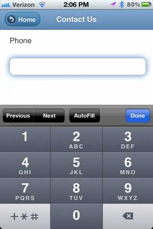
Phone Screen
Notice that the standard keyboard has been replaced with one that consists of only numbers which gives the user much larger buttons and a greater chance of entering the proper information. In a similar fashion, the email and url attributes will display a keyboard that has letters and common web address characters like the @ sign, which doesn’t appear on the default keyboard for normal text fields.
You can manually create the HTML to put in that special input type attribute, but in MVC there is a much better way to do this: data annotations. Let’s start by modifying a model definition:
public class SampleModel
{
// -- Other fields omitted here for brevity.
[DataType(DataType.PhoneNumber)]
[Display(Name = "Phone", Prompt = "Phone:")]
public string Phone { get; set; }
}
When we add the DataType annotation, this will tell MVC that this is a special type of string, and it will be treated differently when composing a view. However, if all you do is add this data annotation, you won’t see anything different; you need one more piece to this puzzle: editor templates.
These templates are not supplied with the standard MVC project template, so you must go get them yourself and add them to your project. These templates must reside in a folder named EditorTemplates under the Shared folder. The templates can be found by fetching a NuGet package (Install-Package MvcHtml5Templates).
In our model definition, we’ve specified that our Phone field has a DataType of PhoneNumber, so MVC will look for and use the PhoneNumber template when creating the HTML for editing this field. The PhoneNumber.cshtml file is very simple, and contains only the following code:
@Html.TextBox("", ViewData.TemplateInfo.FormattedModelValue,
new { @class = "text-box single-line", type = "tel" })
In your view file, all you need to do is use the EditorFor helper on your field and it will automatically generate the updated HTML now. (Note that if you use the TextBoxFor helper without any special parameters, it won’t work automatically.)
@Html.EditorFor(m => m.Phone)
This combination of model data annotation, editor templates, and the EditorFor helper will generate the code that we started with earlier. MVC does all the hard stuff for us—pretty sweet, huh?
<input class="text-box single-line" name="Phone" type="tel" value="" />
Let’s look at another example: the DateTime helper. Let’s edit our model again and add a DateTime field:
public class SampleModel
{
// -- Other fields omitted here.
[DataType(DataType.DateTime)]
public DateTime ContactDateTime { get; set; }
}
Next we’ll add a DateTime.cshtml editor template in the Shared folder:
@Html.TextBox("", ViewData.TemplateInfo.FormattedModelValue,
new { @class = "text-box single-line", type = "datetime" })
While we’re at it, let’s create a Month.cshtml editor template too:
@Html.TextBox("", ViewData.TemplateInfo.FormattedModelValue,
new { @class = "text-box single-line", type = "month" })
After adding this field to our view, we can use any of the following EditorFor statements:
@Html.EditorFor(m => m.ContactDateTime)
@Html.EditorFor(m => m.ContactDateTime, "DateTime")
@Html.EditorFor(m => m.ContactDateTime, "Month")
When you run this code on an iOS phone, you will get one of these editors:
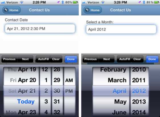
Date Pickers in iOS
It looks like a native app and behaves like a native app, but it’s all HTML!
On your desktop, you won’t notice any difference yet. If you want a nice date picker on your desktop, you will need to install the jQuery.UI components if they are not already in your project. If you have already added the DateType.Date data annotation in your model, and you have included the Date.cshtml editor template, then there are only a few small changes that you need to make. In your _Layout.cshtml page (or in your desktop bundles in the Global.asax if you are using minification), you will need to include the jquery-ui.min.js and the jquery-ui.min.css files, and you will need to add the following script in the header of the _Layout file to enable the fields:
<script type="text/javascript">
$(document).ready(function () {
$('.date').datepicker({ dateFormat: "mm/dd/yy" });
});
</script>
That’s it—now you will have a nice fancy date picker pop-up in your application that looks like this (with almost no work on your part!):
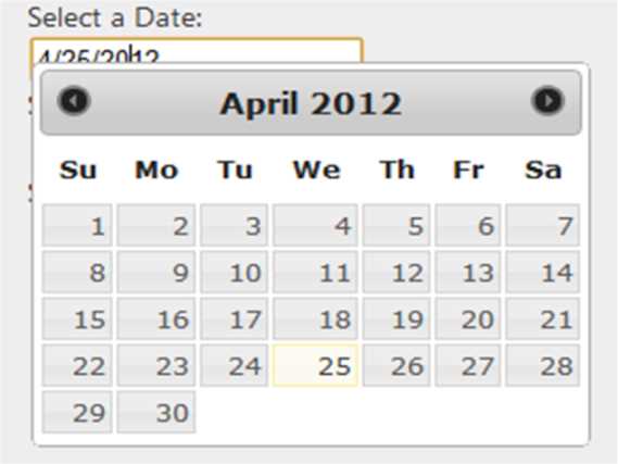
Date Picker
Before you commit to using these features, you should make sure they are supported on the devices that you want to target. A couple of good resources to check are:
- http://mobilehtml5.org/: This site lists many HTML 5 features and which browsers and operating systems support them.
- http://www.quirksmode.org/html5/inputs_mobile.html: This site lists some of the specific HTML tags and attributes (like the ones shown in this chapter), and details which mobile operating systems support those tags.
Search Fields
Another useful field type is the search type. If you want a field that looks like a search field, just add the Search template type on a string field. In the following code sample we don’t have a Search data annotation that we can add to our model, so we’ll tell the EditorFor helper to use a specific template:
@Html.EditorFor(m => m.SearchTxt, "Search")
The code in the Search Editor Template looks like this:
@Html.TextBox("", ViewData.TemplateInfo.FormattedModelValue,
new { @class = "text-box single-line", type = "search" })
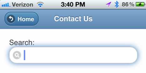
Search Field
Notice how the field corners are much more rounded than a normal text box, and how it has a magnifying glass inside the text field? These are just subtle hints to the user that this is a special field.
We won’t go into all of the editor templates here because there are several with many options each. Some work with the EditorFor and data annotations, and some will need a little more manual tweaking.
Special HTML 5 Attributes
There are a few other special attributes that you will appreciate. The Required attribute is a nice HTML 5 attribute, but that should be handled by the Required data annotation in your model, so we won’t address it here.
One attribute that is very useful is the placeholder attribute. This will place light gray text in the text box field to give users a hint of what to type, and then the text disappears when they click in the box. Let’s go back and enhance our Search box by using the TextBoxFor helper so we can easily add an extra attribute. Remember that I mentioned the default TextBoxFor helper wouldn’t use a template from the data annotation? You can specify one by editing the HtmlAttributes. Since that is how we need to specify the placeholder tag, we’ll specify both the editor template and the placeholder attribute using the TextBoxFor command.
@Html.TextBoxFor(m => m.SearchTxt,
new { type= "search", placeholder = "enter search terms" })
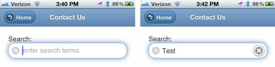
Placeholder in a Search Field
Now you’ve got the enter search terms placeholder text in your search field. When you click inside the field and start typing, the placeholder goes away. In addition, the user gets a nice little clear button on the right of the text box. Not bad for one simple little attribute!
Other attributes you may want to investigate adding to your text boxes are autocorrect="off", autocomplete="off", and autocapitalize="off".
The MVC 4 Tilde Tidbit
Here is one awesome feature of MVC 4 that we have been using through all of the examples so far, but you may not have noticed. Take a look at this code:
<img src="~/Content/images/icon.png"/>
If you were coding in MVC 3, you would expect to see a tag like this:
<img src="@Url.Content("~/Content/images/icon.png")"/>
This is one of the small, overlooked features of MVC 4 that is really useful. If you look at the HTML that is generated, these two statements will both generate exactly the same HTML, but the first is much cleaner. It doesn’t seem like much, but anything that makes your code more readable is a nice feature in my book.
- 80+ high-performance ASP.NET MVC controls, including DataGrid, Charts, and Scheduler.
- Feature demos teach you how to make the most of the controls.
- Lightweight and user-friendly.
- Stunning built-in themes.