
Application Insights Succinctly®

CHAPTER 10
Application Insights Analytics
Application Insights Analytics is a powerful tool that enables users to search across large amounts of data that can then be collected within an Application Insights resource. It uses a specific language to query terabytes of data in seconds.
In the following sections, we will be exploring this tool in more detail and obtain greater understanding of this querying language.
This tool is available from the Azure portal by selecting the Overview page of the Application Insights resource and searching for the Application Insights Analytics icon.
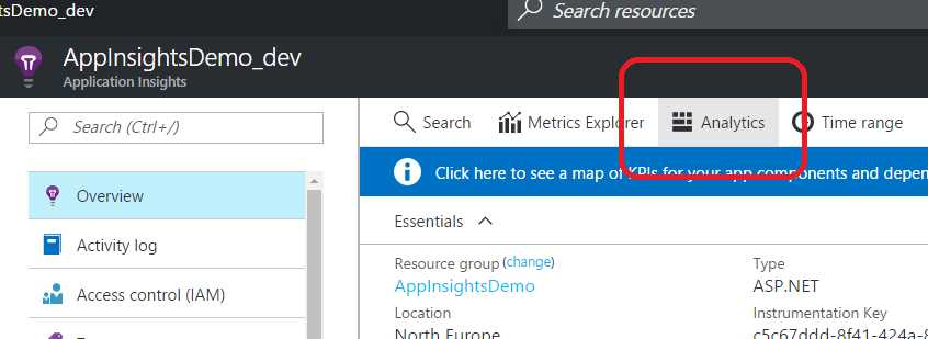
Figure 35: The Application Insights Analytics Button
Using this button, you will land on a separate portal, focused solely on Application Insights Analytics, as shown in Figure 36.
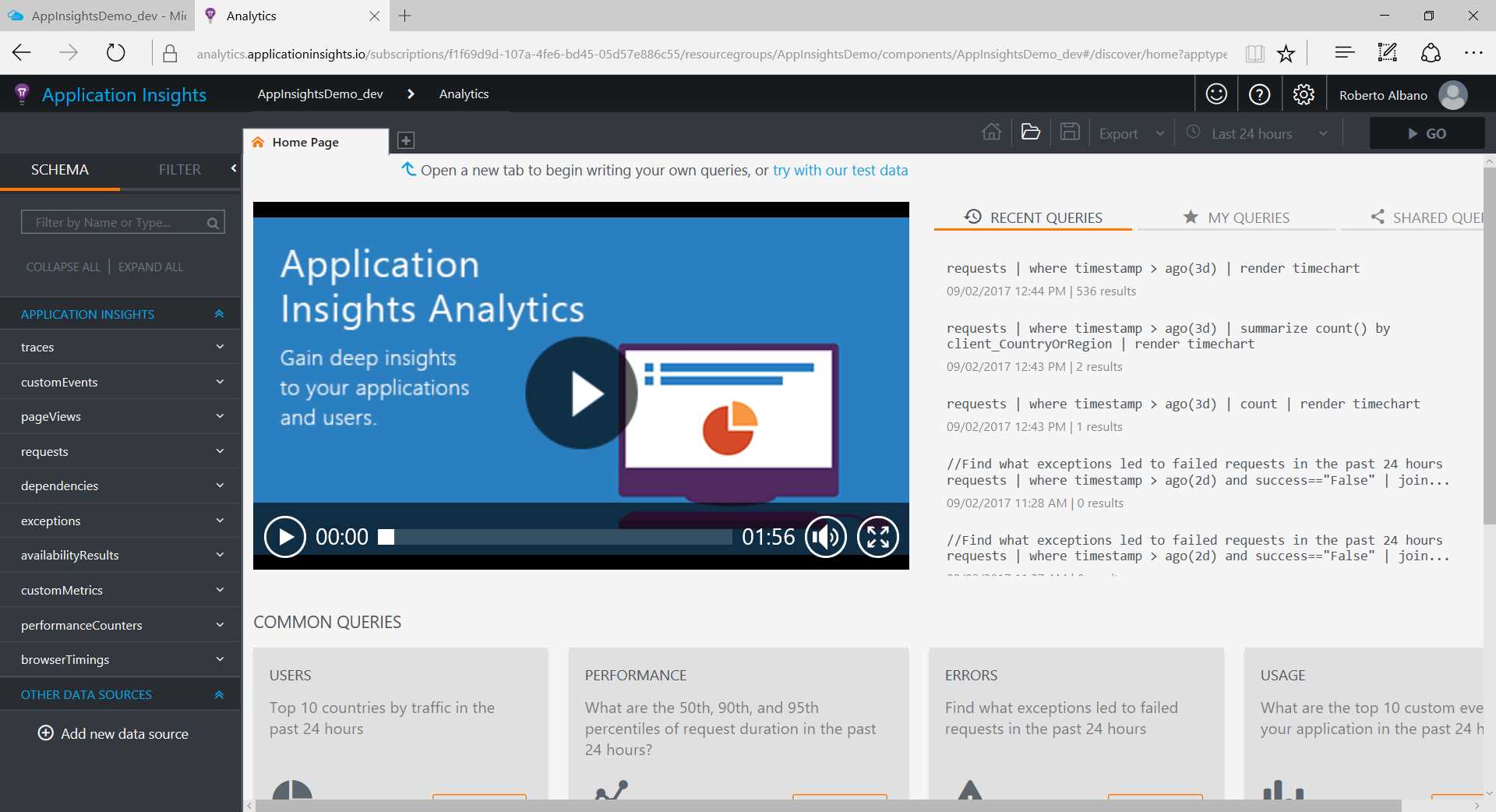
Figure 36: The Application Insights Analytics Portal
Here you will be able to query data from your telemetry and export results.
On this page, we can find a section with common queries for users, performance, errors, and usage topics. These are useful samples to start exploring the query language.
By understanding the basics of the query language, you will be able to retrieve more data than by using the available dashboard features. Before we dig deeper into the query language, we will preview some of the main sections that you will find on the query page.
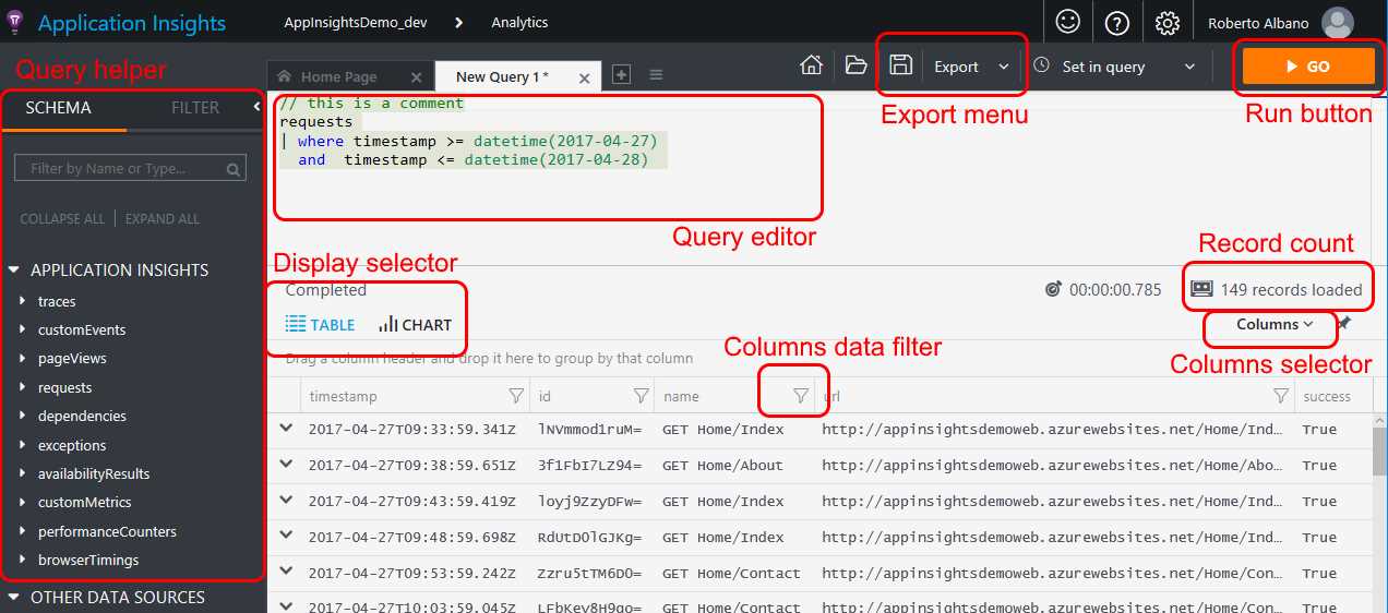
Figure 37: A Preview of the Query Page
Querying the data
Let’s start with a simple example of a query. Suppose you would like to get information on the last five requests received from your web application.
You need to query your Application Insights resource to get back the last five HTTP requests registered in your telemetry.
The syntax is as follows:
Code Listing 14: A Simple Query to Return the Last Five Requests
In simple terms, all the telemetry data is stored in a big database. The first line of this command indicates the table from which we want to retrieve the data (in this case, the request table). Then, separated by the pipe character (|), are the filter clauses we want to apply on that table to get the proper data from the query. You can use one or more filters, but every query needs to start with the pipe character.
Note: It is not mandatory to write a filter clause per row to execute the query, but writing one per row improves readability and performance.
To run the query, click the orange GO button in the top-right corner of the page. Figure 38 displays the results.
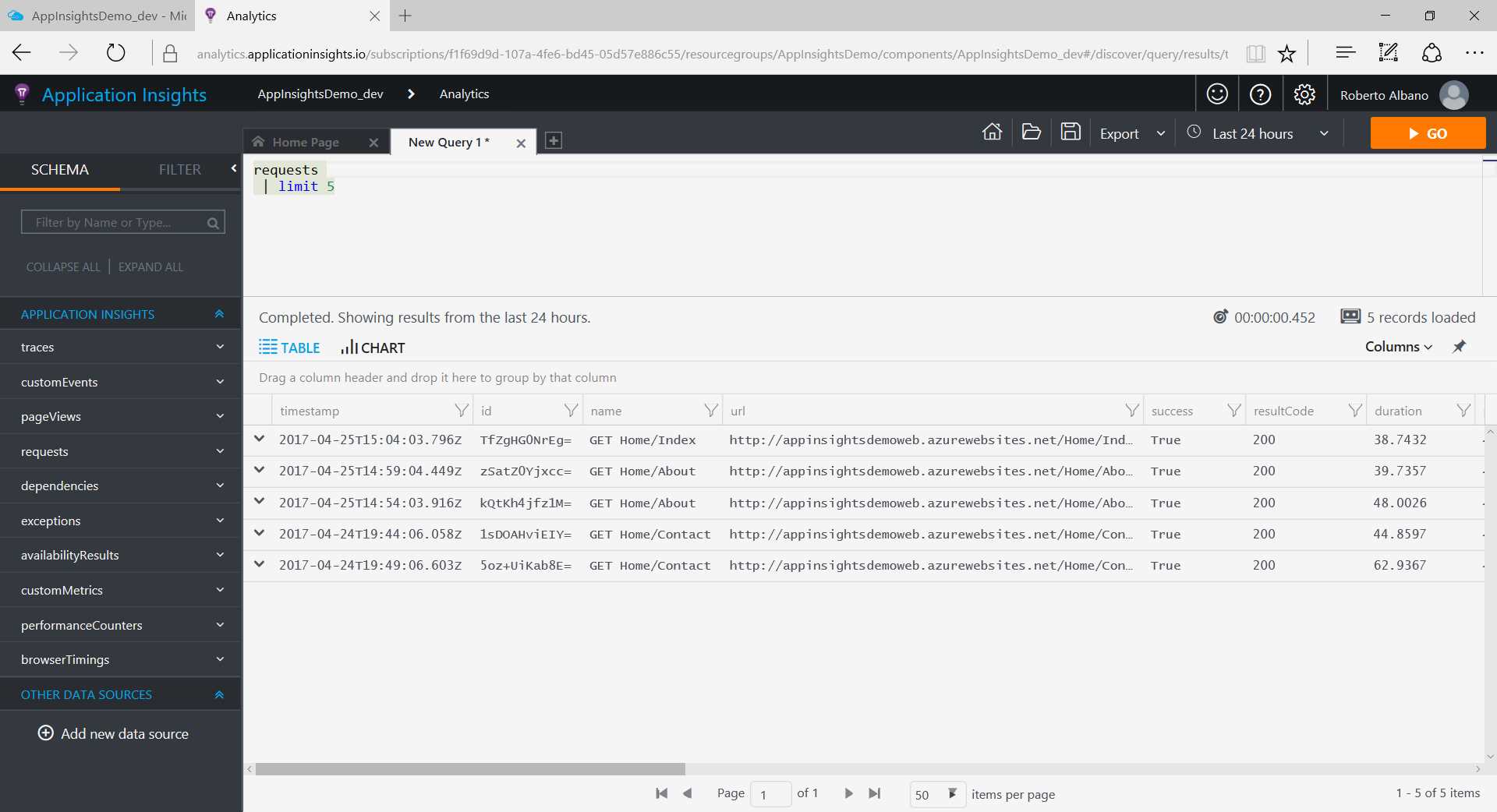
Figure 38: An Elementary Example of a Query
As you can see, the page shows the results for the query (if it is correct and there is data to display). The grid displays the records found. The first column of every line contains a chevron icon; when you click this icon, the row will expand to show all the details for that record.
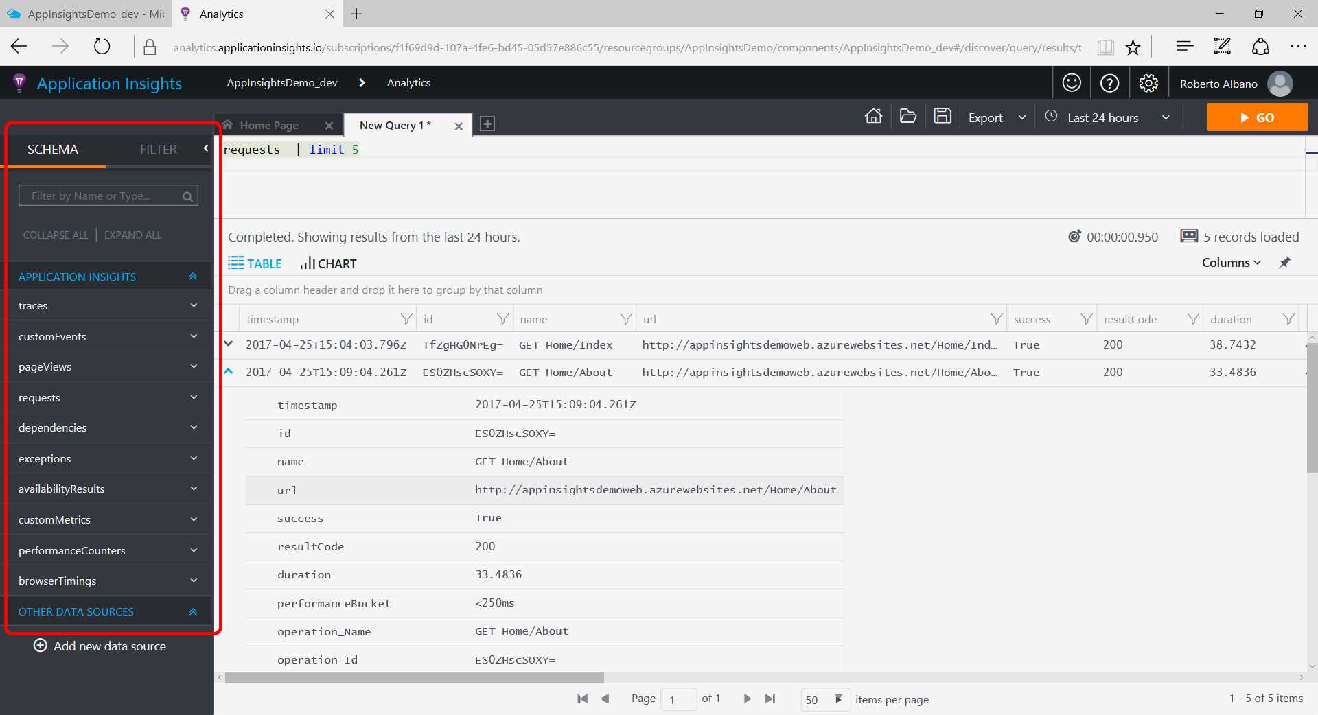
It is possible to retrieve a lot of data within seconds, no matter the date range you choose. Remember that the retaining period for data is 90 days.
As you can see in Figure 39, on the left of the query editor, there is a toolbox with all the entities you can query that are available in the schema. You can expand each one to see the list of data points (or fields, if you think of your data as a database) that you can find within the entity.
You can put any item from this toolbox directly into the query editor by double-clicking on it instead of typing it into the editor. This toolbox is useful for formulating standardized commands and provides a good starting point for understanding data points per entity.
If you want to add more filters or, more generally, need to build your statement, the autocompletion feature can help you. You can see this feature in action when writing code in the query editor.
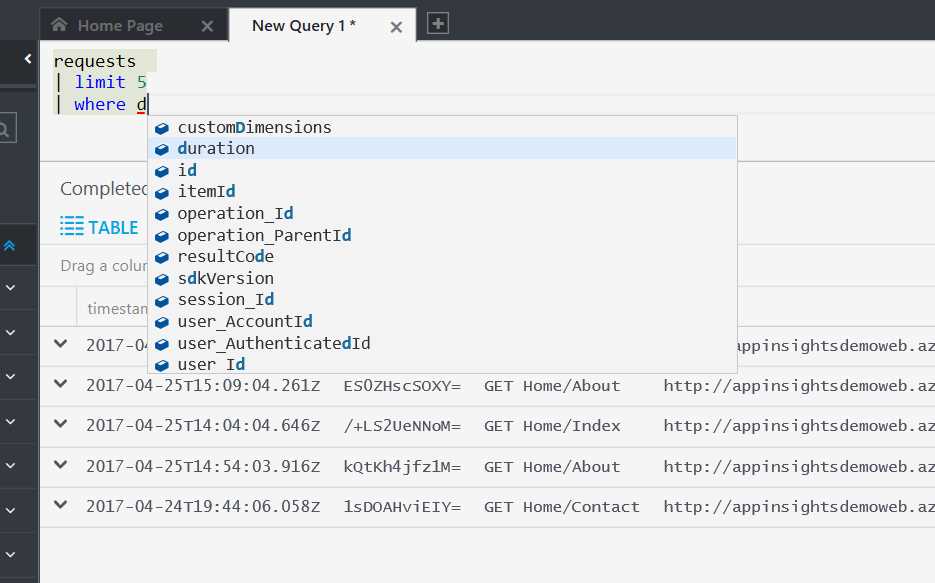
Figure 40: Query Autocompletion
Columns selected and columns displayed
When you execute a query, you will retrieve all the information available on the table you are querying. But if you want to specify the fields that you want to receive in your result, you should use the project keyword. For instance, if you want to receive from the query only two fields, such as timestamp and url, you can write the following query.
Code Listing 15: A Query Returning Only Two Fields
The keyword project allows you to fetch only the fields you specify in the query. These will be displayed as columns, and you will see that in your grid.
In addition, if you want to display only a subset of the columns returned from the query, you can use the selector available on the top, right-hand side of the grid.
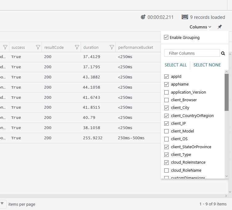
Figure 41: The Columns Selector
You can use both the project keyword and the Columns selector; however, the selector will only display the columns returned from the query. Columns that have been unselected are still in the result even if not displayed, and will be there if you export the whole query result.
You can filter the data in the grid as well, using the filter symbol in the header of every column. Every filter will open a little pop-up window for entering the filter value, as shown in the following figure.
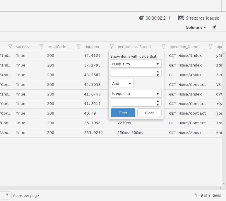
Figure 42: The Column Data Filter
This image is familiar for users who frequently manage data through a spreadsheet application such as Excel, and using such an application enables users to apply detailed filters to the columns to drill down into the results.
Date and time expressions
In almost every kind of metric, there is a timestamp related to the moment in which the event happened. And, of course, it is also possible to apply a filter on this timestamp.
For the time filter statement, there are some rules to know in order to be more productive when building your query. For instance, if you want to get the requests for the last 24 hours, you can write a query as follows.
Code Listing 16: A Query that Returns the Last Day's Requests
If you want to get the requests starting from a specific date, you can write the following query.
Code Listing 17: A Query that Returns Requests from a Specific Date
You can be more precise in your filter by using a specific time range.
Code Listing 18: A Query that Returns Requests from a Specific Time Range
requests | where timestamp >= datetime(2017-01-01T00:00:00.000) and timestamp <= datetime(2017-01-31T23:59:59.999) |
There are quite a few time filters that can be used in your query; they are listed here alphabetically:
- ago
- datepart
- dayofmonth
- dayofweek
- dayofyear
- endofday
- endofmonth
- endofweek
- endofyear
- getyear
- now
- startofday
- startofmonth
- startofweek
- startofyear
- todatetime
- totimespan
- weekofyear
Managing the results
When you run a query, the results will be returned in a grid, as seen in Figure 38. It is a flat visualization that is useful for reading your data in a simple way.
But you might need to save your data, understand it with a different visualization, or perform more analysis on the results. In that case, you need to export that data or show it in a form other than a grid.
Exporting the grid
If you want to save your data, you can export it using the integrated Export menu in the top, right-hand side of the page.
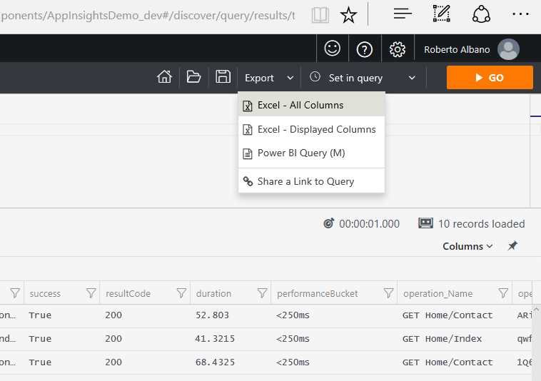
Figure 43: The Export Menu
You can choose to export it to an Excel file, using all the columns returned by the query, or only the displayed columns by choosing Excel - All Columns or Excel - Displayed Columns. The exported file will be saved with a .csv extension, so you can open it in Excel or a text editor, in case you don’t have Excel installed.
From the same menu, you can also export using the Power BI Query (M) option (meaning a query in the M language, or the Power Query M formula language), so it can be used in Excel or with the Power BI Desktop application.
The exported file is saved with the .txt extension. It includes instructions on how to use Power Query within the Power BI Desktop app and get the results from the Analytics query directly into the application.
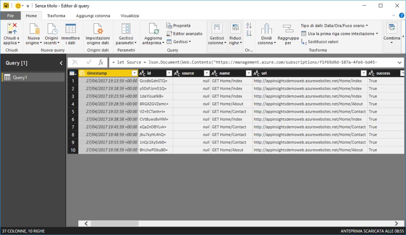
Figure 44: Power Query Running from the Power BI Desktop App
To execute the query from the Power BI app, the user must sign in with valid credentials on the Application Insights resource. To understand how to assign valid credentials to other users, refer to Chapter 5, Access Control.
In the same menu, you can find a Share a Link to Query item as well. It is not an export feature; instead, it copies a link to your clipboard that you can share with someone with valid credentials to run the query. Pasting this URL in a browser will bring the user to Application Insights Analytics, running the shared query and returning the same results. This feature can be advantageous if you need to share by email a set of data that updates every time the query is executed.
Shape your data
Sometimes it is difficult to analyze the data with only a grid. Perhaps you need to evaluate a particular KPI, and the best way to do it is with a graphical representation instead of a flat visualization as a grid. To achieve this, Application Insights Analytics offers an alternative chart representation to the grid.
Let’s start with an example. Suppose you have a query like this:
Code Listing 19: A Query that Returns a Limited Number of Requests in a Specific Time Range
This query will return a grid like the one in Figure 38. Above the grid, you can find two labels: TABLE, which stands for the grid visualization; and CHART, which represents a graphical display like the one in the following figure.
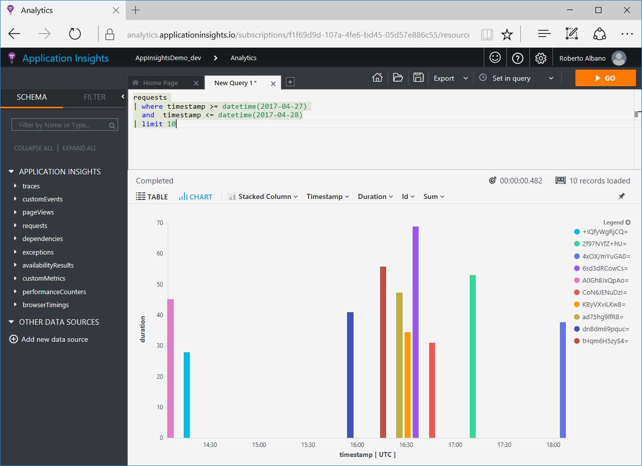
Figure 45: A Chart Visualization
Charts can be more useful than grids when you want to see the data instead of read it. The data can be arranged into different shapes using the bar options above the chart.
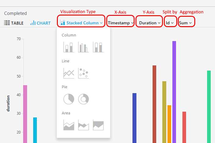
The available options are:
- Visualization Type
- Here you can choose the kind of chart to display (as seen in Figure 46) with the following:
- Column charts
- Stacked column
- Unstacked column
- 100% stacked column
- Line charts
- Line
- Scatter
- Pie charts
- Pie
- Doughnut
- Area charts
- Stacked area
- Unstacked area
- 100% stacked area
- X-Axis
- Here you can choose the field to use for the horizontal axis of the chart. The list shows the fields available in the query.
- Y-Axis
- Here you can choose the field to use for the vertical axis of the chart. The list shows the fields available in the query.
- Split by
- Here you can choose one or more fields to represent within the chart. The list shows the fields available in the query, excluding the ones on the x-axis and y-axis.
- Aggregation
- Here you can choose the aggregation mode you want to apply to the chart, with the following options:
- Sum
- Average
- Minimum
- Maximum
Figures 45 and 46 display charts using the Stacked column option. This is useful if you want to see at a glance which are the best and the worst results in a metric. The downside is that if you have many items, it could be confusing.
If you want to take a quick look at a summarization or a percentage of the complete data set, you can use the Pie option. For example, you can use it when you want to see the country of origin of your visitors, as shown in the following figure.
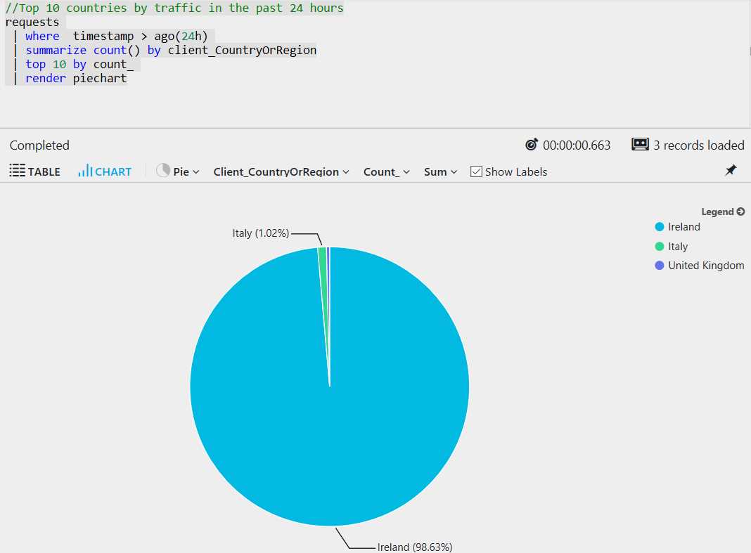
Figure 47: A Pie Chart
- 1800+ high-performance UI components.
- Includes popular controls such as Grid, Chart, Scheduler, and more.
- 24x5 unlimited support by developers.