
AngularDart Succinctly®

CHAPTER 4
Form UI Component
Overview
At this stage, we have the app’s main screen, which displays the list of documents, ready to go—which is awesome! Now we need to focus our attention on the de-form component, which will be used by the application for editing and deleting existing documents or adding new ones. This is what we will build throughout this chapter.
Component structure
Just like we did with de-base, we’ll explore the structure of the de-form component, so we can understand the relationship between the markup and finished UI. Let’s have a look at the following diagrams.
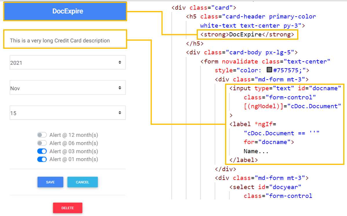
Figure 4-a: Header and Name—Form Component
We can see how the form’s header is contained within a strong tag—so this relationship between the markup and UI is quite straightforward.
As for the document’s description, the relationship between the markup and UI is slightly more complex.
We can see that the description relates to an input tag, which has a two-way binding with the cDoc.Document property. This is achieved using the ngModel directive.
If the document’s description is empty, then the label with the value Name… will be shown on the input tag, which is achieved by using the *ngIf directive, when the value of cDoc.Document is empty.
Next, we have the year and month fields. Let’s have a look at the following diagram to see how the markup of both relates to the UI.
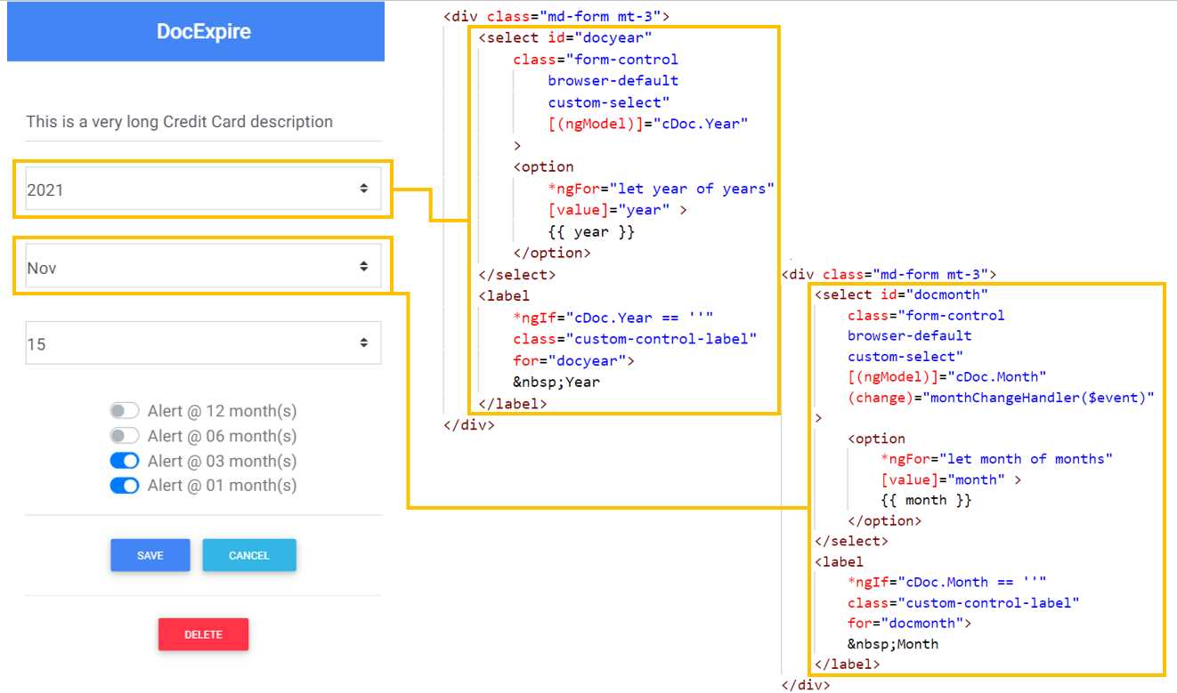
Figure 4-b: Year and Month—Form Component
We can see that the year is a select tag that has a two-way binding with cDoc.Year, which is achieved using the ngModel directive.
The available years range from 2030 to 2020, each of which is added as an option to the select tag. This is achieved by using the *ngFor directive, by looping through the years array (which has values 2030 to 2020). The value of the chosen year is shown by using the double curly braces syntax {{ year }}.
With regards to the month, we can see that the select tag for it has also a two-way binding with cDoc.Month, which is achieved using the ngModel directive.
The available months range from Jan to Dec, each of which is added as an option to the select tag. This is achieved by using the *ngFor directive, by looping through the months array.
The value of the chosen month is shown by using the double curly braces syntax {{ month }}.
Following that, we have the day and alertyear fields. Let’s have a look at the following diagram to see how the markup of both relates to the UI.
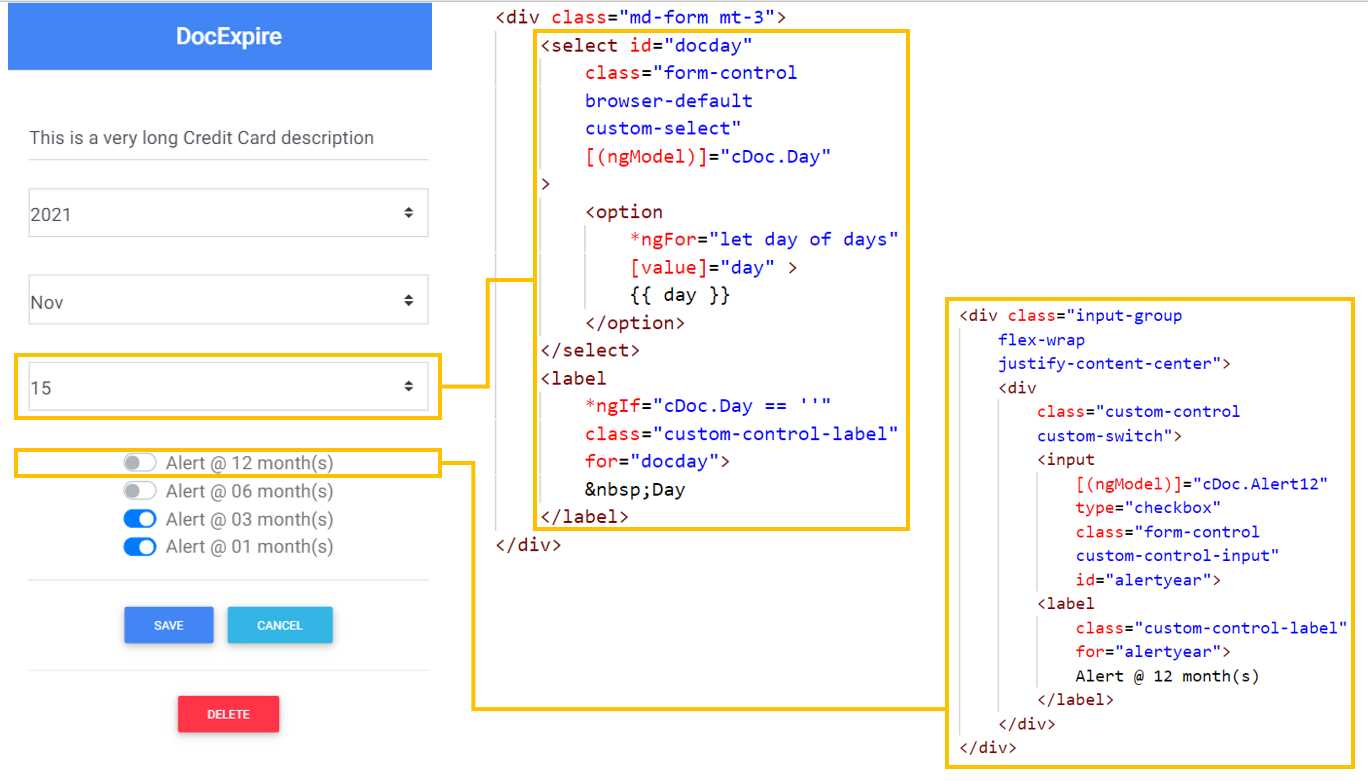
Figure 4-c: Day and 12 Months Alert—Form Component
We can see that the day is also a select tag that has a two-way binding with cDoc.Day, which is achieved using the ngModel directive.
The available days range mostly from 01 to 31, but depending on the value of the chosen month, the range could be until 28 or 30, each of which is added as an option to the select tag. This is achieved by using the *ngFor directive, by looping through the days array.
The value of the chosen day is shown with the double curly braces syntax {{ day }}.
With regards to the alertyear field, we can see it relates to an input tag of type checkbox (with its corresponding label), with a two-way binding with the cDoc.Alert12 property, which is achieved using the ngModel directive.
Next, let’s have a look at the alert6months and alert3months fields, and how their markup relates to the UI. You’ll find this almost identical to the alertyear field.
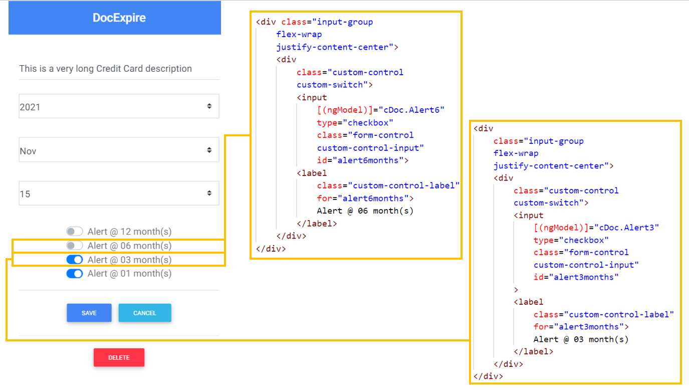
Figure 4-d: 6 and 3 Months Alerts—Form Component
Regarding the alert6months field, we can see it relates to an input tag of type checkbox (with its corresponding label) with a two-way binding with the cDoc.Alert6 property, which is achieved using the ngModel directive.
As you can see, the alert3months field is the same as alert6months, with the difference that alert3months binds to cDoc.Alert3.
Next, let’s have a look at the alert1month field and Save button.
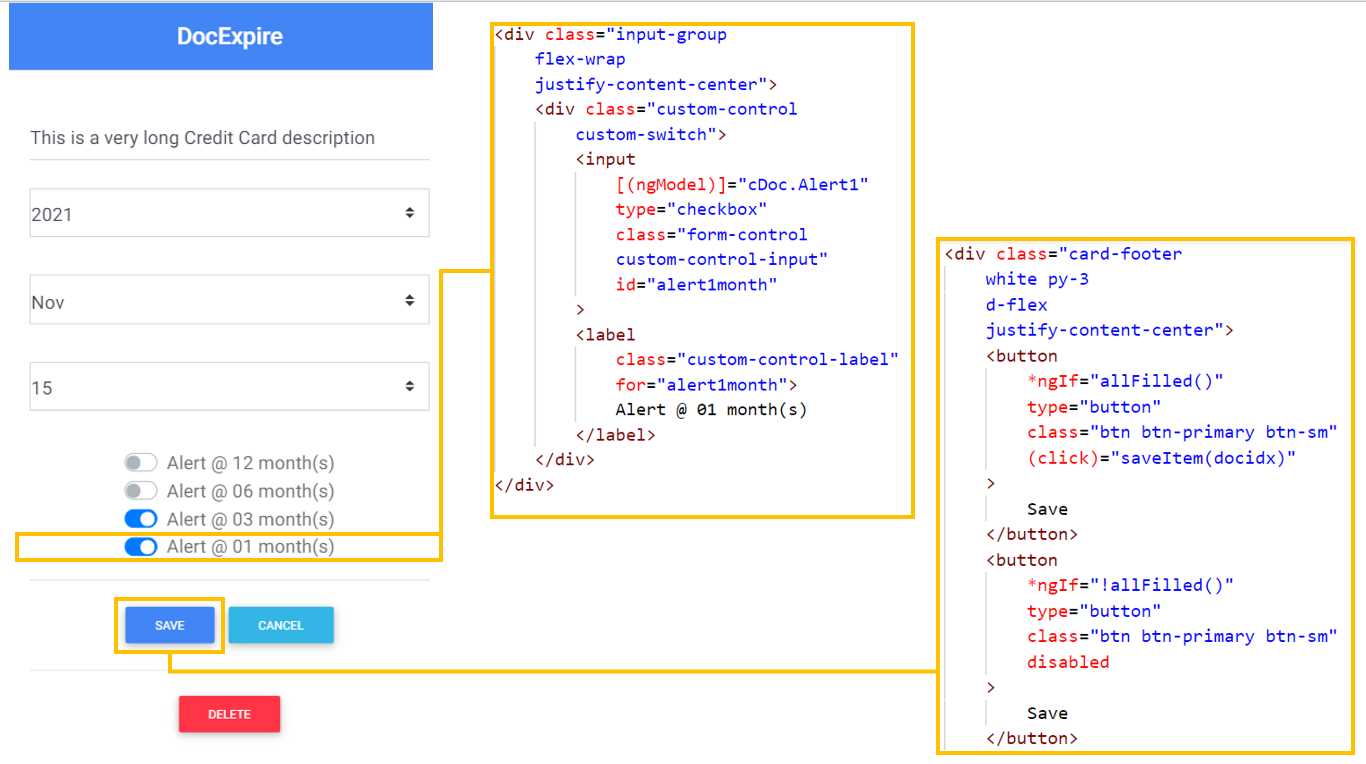
Figure 4-e: 1 Month Alert and Save Button—Form Component
Similar to other alert fields, the alert1month field relates to an input tag of type checkbox (with its corresponding label) with a two-way binding with the cDoc.Alert1 property, which is achieved using the ngModel directive.
With regards to the Save button, we have two versions of the same button. The first one is displayed when all the fields in the form have been filled in (all fields have a value)—this shows a Save button that is enabled and clickable. This is visible when *ngIf="allFilled()" evaluates to true.
Notice that the Save button has a saveItem method that gets triggered when the click event executes.
The saveItem method will raise an event on the parent component, de-base, which will insert (by executing insertDoc) or update (by executing updateDoc) the document on Firebase and in the list of documents.
The second version is shown when not all the fields in the form have been filled in, displaying a Save button that is disabled and not clickable. This is visible when *ngIf="!allFilled()" evaluates to true. This button has no event attached to it.
Now, let’s have a look at the Cancel and Delete buttons.
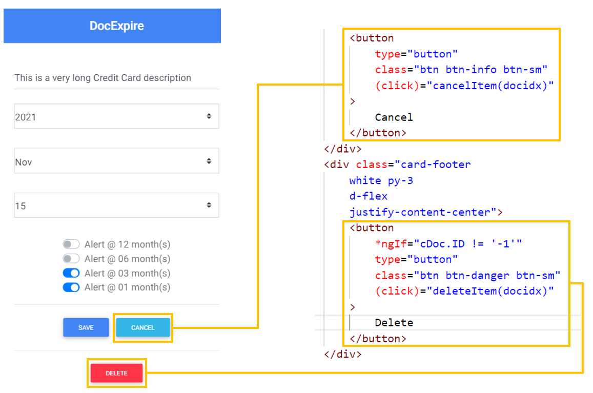
Figure 4-f: The Cancel and Delete Buttons—Form Component
The Cancel and Delete buttons are very similar to the Save button in terms of functionality, but with some slight differences.
The Cancel button is always displayed, and it has a cancelItem method that gets triggered when the click event executes.
The cancelItem method will raise an event on the parent component, de-base, which will cancel the insertion or update of the document (by executing cancelNew) on the document list.
The Delete button, on the other hand, is not always displayed. It is only displayed when *ngIf="cDoc.ID != '-1'" evaluates to true—when the value of the current document’s ID (cDoc.ID) is different than the string value of -1. In other words, the Delete button is shown when the document is not new (when an existing document is being edited).
The Delete button has a deleteItem method that gets triggered when the click event executes. The deleteItem method will raise an event on the parent component, de-base, which will remove the document (by executing removeDoc) from Firebase and the document list.
Awesome! We now have a good understanding of how the markup of the de-form component relates to the UI.
Component markup
Now that we have explored how the de-form component is structured and how the UI elements relate to the markup, let’s have a look at the full HTML markup of the component.
Within VS Code, open the de_form_component.html file and add the code from the following listing. This markup uses regular Bootstrap classes that have a Material Design look and feel, just like with the de-base component.
Code Listing 4-a: de_form_component.html (Full Code)
<div class="card"> <h5 class="card-header primary-color white-text text-center py-3"> <strong>DocExpire</strong> </h5> <div class="card-body px-lg-5"> <form novalidate class="text-center" style="color: #757575;"> <div class="md-form mt-3"> <input type="text" id="docname" class="form-control" [(ngModel)]="cDoc.Document" > <label *ngIf= "cDoc.Document == ''" for="docname"> Name... </label> </div> <div class="md-form mt-3"> <select id="docyear" class="form-control browser-default custom-select" [(ngModel)]="cDoc.Year" > <option *ngFor="let year of years" [value]="year" > {{ year }} </option> </select> <label *ngIf="cDoc.Year == ''" class="custom-control-label" for="docyear"> Year </label> </div> <div class="md-form mt-3"> <select id="docmonth" class="form-control browser-default custom-select" [(ngModel)]="cDoc.Month" (change)="monthChangeHandler($event)" > <option *ngFor="let month of months" [value]="month" > {{ month }} </option> </select> <label *ngIf="cDoc.Month == ''" class="custom-control-label" for="docmonth"> Month </label> </div> <div class="md-form mt-3"> <select id="docday" class="form-control browser-default custom-select" [(ngModel)]="cDoc.Day" > <option *ngFor="let day of days" [value]="day" > {{ day }} </option> </select> <label *ngIf="cDoc.Day == ''" class="custom-control-label" for="docday"> Day </label> </div> <div class="input-group flex-wrap justify-content-center"> <div class="custom-control custom-switch"> <input [(ngModel)]="cDoc.Alert12" type="checkbox" class="form-control custom-control-input" id="alertyear"> <label class="custom-control-label" for="alertyear"> Alert @ 12 month(s) </label> </div> </div> <div class="input-group flex-wrap justify-content-center"> <div class="custom-control custom-switch"> <input [(ngModel)]="cDoc.Alert6" type="checkbox" class="form-control custom-control-input" id="alert6months"> <label class="custom-control-label" for="alert6months"> Alert @ 06 month(s) </label> </div> </div> <div class="input-group flex-wrap justify-content-center"> <div class="custom-control custom-switch"> <input [(ngModel)]="cDoc.Alert3" type="checkbox" class="form-control custom-control-input" id="alert3months" > <label class="custom-control-label" for="alert3months"> Alert @ 03 month(s) </label> </div> </div> <div class="input-group flex-wrap justify-content-center"> <div class="custom-control custom-switch"> <input [(ngModel)]="cDoc.Alert1" type="checkbox" class="form-control custom-control-input" id="alert1month" > <label class="custom-control-label" for="alert1month"> Alert @ 01 month(s) </label> </div> </div> <div class="row"><p> </p></div> <div class="card-footer white py-3 d-flex justify-content-center"> <button *ngIf="allFilled()" type="button" class="btn btn-primary btn-sm" (click)="saveItem(docidx)" > Save </button> <button *ngIf="!allFilled()" type="button" class="btn btn-primary btn-sm" disabled > Save </button> <button type="button" class="btn btn-info btn-sm" (click)="cancelItem(docidx)" > Cancel </button> </div> <div class="card-footer white py-3 d-flex justify-content-center"> <button *ngIf="cDoc.ID != '-1'" type="button" class="btn btn-danger btn-sm" (click)="deleteItem(docidx)" > Delete </button> </div> </form> </div> </div> |
By reviewing the de-form component’s structure in the previous section, we covered most of the functionality behind this markup. As you might have noticed, the markup is annotated with some AngularDart directives and specific syntax, which we covered when we reviewed the de-base markup. Nevertheless, let’s go over each of the parts of the de-form markup to make sure we have everything covered.
The de-form component is contained within a Bootstrap for Material Design card class, which is described as follows.
<div class="card">
</div>
After the component’s header, we find the form itself, which is described as follows.
<form novalidate class="text-center" style="color: #757575;">
Notice that the form is marked with the novalidate attribute, which means that the input should not be validated when submitted.
The document description field contains an input tag and a label, as follows.
<input type="text" id="docname" class="form-control"
[(ngModel)]="cDoc.Document">
<label *ngIf="cDoc.Document == ''" for="docname">Name...</label>
By using the [(ngModel)] directive, it is possible to perform two-way binding between the input tag’s value and the value of the cDoc.Document property. When the value of the input tag is empty—when *ngIf="cDoc.Document == ''" evaluates to true—then the Name… value is displayed on the input tag.
Figure 4-g shows how the input tag’s value looks when the document’s description (cDoc.Document) is empty. As you can see, the Name… value is displayed.
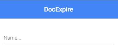
Figure 4-g: Empty Document Description—Form Component
Now, let’s explore the how the year drop-down (docyear) works.
<select id="docyear" class="form-control browser-default
custom-select" [(ngModel)]="cDoc.Year">
<option
*ngFor="let year of years" [value]="year" >
{{ year }}
</option>
</select>
<label
*ngIf="cDoc.Year == ''" class="custom-control-label" for="docyear">
Yea
</label>
Just like with the document’s description (cDoc.Document), the year drop-down (docyear) has a label associated. This label will display a default value when the year value has not been chosen—when *ngIf="cDoc.Year == ''" evaluates to true. Here’s what it looks like.
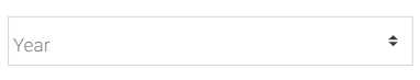
Figure 4-h: Year Not Selected—Form Component
The year drop-down (docyear) has a two-way binding relationship with cDoc.Year, which is achieved by using the [(ngModel)] directive. The available options for the year drop-down (docyear) are added as [value]="year" by using the *ngFor directive. This is done by iterating through the years array, which is what *ngFor="let year of years" does. The values of the years array range from 2030 to 2020.
Now, let’s have a look at the Month drop-down (docmonth).
<select id="docmonth" class="form-control browser-default custom-select"
[(ngModel)]="cDoc.Month"(change)="monthChangeHandler($event)"
>
<option
*ngFor="let month of months" [value]="month" >
{{ month }}
</option>
</select>
<label
*ngIf="cDoc.Month == ''" class="custom-control-label" for="docmonth">
Month
</label>
Just like with the year drop-down (docyear), the month drop-down (docmonth) has a label associated, which displays a default value when the month value has not been chosen. We can see this as follows.
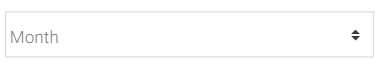
Figure 4-i: Month Not Selected—Form Component
The month drop-down (docmonth) works in almost the same way as the year drop-down (docyear). The main difference is that docmonth has a two-way binding relationship with the cDoc.Month property, and the values of the months array range from Jan to Dec.
Another notable difference is that the month drop-down (docmonth) has a change event listener attached, which triggers the monthChangeHandler method.
The monthChangeHandler method is used for dynamically adding the values available for the day drop-down (docday). This means that, depending on the month selected, the number of days on the day drop-down will vary. For example, if Jun is chosen as a month, then the maximum number of days for that month will be 30. If Dec is chosen as a month, then the maximum number of days for that month will be 31.
Now, let’s have a look at the day drop-down (docday).
<select id="docday" class="form-control browser-default custom-select"
[(ngModel)]="cDoc.Day">
<option *ngFor="let day of days" [value]="day" >
{{ day }}
</option>
</select>
<label
*ngIf="cDoc.Day == ''" class="custom-control-label" for="docday">
Day
</label>
As you can see, the markup for the day drop-down (docday) is almost identical for the year dropdown. The main differences are that docday has a two-way binding relationship with the cDoc.Day property, and the values of the days array varies dynamically, depending on the month selected.
Concerning the four alerts, they are pretty much identical. Let’s have a look at the following one.
<input [(ngModel)]="cDoc.Alert12" type="checkbox" class="form-control
custom-control-input" id="alertyear">
<label class="custom-control-label" for="alertyear">
Alert @ 12 month(s)
</label>
We can see that the alertyear input tag is of type checkbox and has a two-way data binding relationship with the cDoc.Alert12 property. The other alert tags are almost identical to this one. The only difference is that each will bind to a different property. This means that the alert6months input tag will bind to cDoc.Alert6, alert3months to cDoc.Alert3, and alert1month to cDoc.Alert1.
Regarding the Save, Cancel, and Delete buttons, the most important characteristic is that all of them have an event attached that triggers a specific method. The Save button’s event triggers the saveItem method, the Cancel button’s event triggers the cancelItem event, and the Delete button’s event triggers the deleteItem event.
These methods cascade specific actions that get executed within the parent component, de-base, which ultimately updates the document list and interacts with Firebase.
Component logic
Now that we’ve explored how the markup of the de-form component is organized, let’s see how the logic behind it works. Within VS Code, open the de_form_component.dart file and copy and paste the code from the following listing.
Code Listing 4-b: de_form_component.dart (Full Code)
import 'dart:async'; import 'package:angular/angular.dart'; import 'package:angular_forms/angular_forms.dart'; import '../model/docs.dart'; @Component( selector: 'de-form', templateUrl: 'de_form_component.html', directives: [coreDirectives, formDirectives] ) class DocForm implements OnInit { @Input() int docidx; @Input() List docs; Doc cDoc; List<String> years = [ '2030', '2029', '2028', '2027', '2026', '2025', '2024', '2023', '2022', '2021', '2020' ]; List<String> months = [ 'Jan', 'Feb', 'Mar', 'Apr', 'May', 'Jun', 'Jul', 'Aug', 'Sep', 'Oct', 'Nov', 'Dec' ]; List<int> daysMonth = [ 31, 28, 31, 30, 31, 30, 31, 31, 30, 31, 30, 31 ]; List<String> days = []; final _removeCtrl = StreamController(); @Output('onDelete') Stream get removeItem => _removeCtrl.stream; final _cancelNewCtrl = StreamController(); @Output('onCancelNew') Stream get cancelNewItem => _cancelNewCtrl.stream; final _insertCtrl = StreamController(); @Output('onInsert') Stream get insertItem => _insertCtrl.stream; final _updateCtrl = StreamController(); @Output('onUpdate') Stream get updateItem => _updateCtrl.stream; @override Future<Null> ngOnInit() async { cDoc = docs[docidx]; updateDays(months.indexOf(cDoc.Month)); } void monthChangeHandler(event) { var midx = months.indexOf(event.target.value); updateDays(midx); } void updateDays(int m) { if (m > -1) { days = List<String>. generate(daysMonth[m], (i) => (i + 1).toString()); } } void saveItem(int index) { // insert item if (cDoc.ID == '-1') { _insertCtrl.add(null); } // update item else { _updateCtrl.add(null); } docs[index].Edit = false; docs[index]..update(cDoc); } bool allFilled() { var r = false; if (cDoc.Document != '' && cDoc.Year != '' && cDoc.Month != '' && cDoc.Day != '') { r = true; } return r; } void cancelItem(int index) { docs[index].Edit = false; _cancelNewCtrl.add(null); } void deleteItem(int index) { cancelItem(index); _removeCtrl.add(null); } } |
To get a full understanding of this logic, let’s break it down into smaller parts to see what each one does.
Component initialization
Just like we did with the de-base component, we start by importing the required modules that the de-form component will need.
import 'dart:async';
import 'package:angular/angular.dart';
import 'package:angular_forms/angular_forms.dart';
import '../model/docs.dart';
We reference Dart’s asynchronous library, the AngularDart and AngularDart forms, and finally, the application’s data model (docs.dart)—which we will explore later.
Next, we find the @Component annotation, which makes DocForm an AngularDart component, rather than a standard Dart class.
The selector property of the @Component annotation specifies how the component will be referenced within the markup—which, in this case, is de-form.
The templateUrl property of the @Component annotation indicates the name of the file that contains the source code for the markup—which, in this case, is de_form_component.html.
The directives property of the @Component annotation indicates the name of the directives that will be used by the component—coreDirectives and formDirectives.
Just like the de-base component, the de-form component implements the ngOnInit method, which is used for calling the initialization code. This is described by the implements OnInit instruction.
Component inputs
As we have seen, the de-form component is embedded within the de-base component’s markup—as you can see in the following code. The variables docidx and docs are passed to de-form.
<de-form *ngIf="ifEditing()"[docidx]="idx" [docs]="docs"
(onDelete)="removeDoc(idx)" (onCancelNew)="cancelNew()"
(onInsert)="insertDoc(idx)" (onUpdate)="updateDoc(idx)">
</de-form>
For the de-form component to be able to receive these variables from the parent component (de-base), we need to declare them within the DocForm class and annotate each with the @Input() attribute. We can see this as follows.
@Input() int docidx;
@Input() List docs;
By annotating these variables with the @Input() annotation, we are indicating to the DocForm class that these are variables that are passed from de-base to de-form. This is the way to pass data from a parent component to a child component in AngularDart.
Other component variables
The cDoc variable is an instance of type Doc, and it contains the data of the document being edited or created through the de-form UI.
Moving on, we find the years, months, daysMonth, and days lists, which will be used to fill in the values of the drop-`downs.
Component events
The de-form component can raise events by using Dart’s StreamController class, which is designed to send data by creating a stream that other components can listen on. This is how data is passed from the child component to the parent component—in our case, from de-form to de-base.
The de-form component will raise an event for every action that may occur when a document is being edited or created. Two events might occur when a document is being edited: onDelete or onUpdate. Let’s have a look at the following code to see how this works.
final _removeCtrl = StreamController();
@Output('onDelete')
Stream get removeItem => _removeCtrl.stream;
The onDelete event gets triggered when the Delete button is clicked. For the onDelete event, we create an immutable (final) instance of a StreamController class. The stream property of that StreamController instance is assigned to the Stream that will be invoked by the onDelete event, which in this case is removeItem.
For this event to be intercepted by the parent component (de-base) so that its corresponding parent method (removeDoc) is invoked, the onDelete event is marked with the @Output annotation attribute.
The way the onUpdate event works is almost identical to the way the onDelete event works. Let’s have a look.
final _updateCtrl = StreamController();
@Output('onUpdate')
Stream get updateItem => _updateCtrl.stream;
The onUpdate event gets triggered when the Save button is clicked (for an existing document). So, for the onUpdate event, we create an immutable (final) instance of a StreamController class.
The stream property of that StreamController instance is assigned to the Stream that will be invoked by the onUpdate event, which in this case is updateItem.
For this event to be intercepted by the parent component (de-base) so that its corresponding parent method (updateDoc) is invoked, the onUpdate event is marked with the @Output annotation attribute.
The triggering of the onCancelNew event follows the same logic and process.
final _cancelNewCtrl = StreamController();
@Output('onCancelNew')
Stream get cancelNewItem => _cancelNewCtrl.stream;
The onCancelNew event gets triggered when the Cancel button is clicked. So, for the onCancelNew event, we create an immutable (final) instance of a StreamController class.
The stream property of that StreamController instance is assigned to the Stream that will be invoked by the onCancelNew event, which in this case is cancelNewItem.
For this event to be intercepted by the parent component de-base—so it’s corresponding parent method (cancelNew) is invoked—the onCancelNew event is marked with the @Output annotation attribute.
On the other hand, only one event occurs when a new document is created and saved: onInsert. The way this event gets triggered follows the same logical process.
final _insertCtrl = StreamController();
@Output('onInsert')
Stream get insertItem => _insertCtrl.stream;
The onInsert event gets triggered when the Save button is clicked (for a new document). So, for the onInsert event, we create an immutable (final) instance of a StreamController class. The stream property of that StreamController instance is assigned to the Stream that will be invoked by the onInsert event, which in this case is insertItem.
For this event to be intercepted by the parent component (de-base) so its corresponding parent method (insertDoc) is invoked, the onInsert event is marked with the @Output annotation attribute.
Now that we know how the events within the de-form component get triggered, and how those events are intercepted by the parent component (de-base) to carry out the corresponding operations with Firebase and the list of documents, let’s focus on the de-form component methods.
Component methods
With the component’s initialization and events covered, it’s now time to dive into the component’s methods and what they do. We’ll start with the ngOnInit method, which the DocForm class implements, as you can see in the following listing.
Code Listing 4-c: de_form_component.dart (ngOnInit Method)
@override Future<Null> ngOnInit() async { cDoc = docs[docidx]; updateDays(months.indexOf(cDoc.Month)); } |
This method—which is asynchronous (async) and returns a Future (a promise)—gets executed when the de-form component loads (thus the OnInit suffix). This method is used for assigning to the cDoc instance the reference of the document being edited or inserted (docs[docidx]).
Once that has been done, the day drop-down is updated with the corresponding number of days available for that chosen month (cDoc.Month). This is only applicable when an existing document is being edited, which is what the updateDays method does.
Let’s explore in detail how the days are updated, depending on the month selected.
Updating days
The number of days available, which depends on the month selected, gets updated on two occasions: when the component loads (as we just saw), and when the month selected changes. Let’s have a look.
Code Listing 4-d: de_form_component.dart (Updating Days Methods)
void monthChangeHandler(event) { var midx = months.indexOf(event.target.value); updateDays(midx); } void updateDays(int m) { if (m > -1) { days = List<String>. generate(daysMonth[m], (i) => (i + 1).toString()); } } |
The monthChangeHandler method gets executed when the month changes, for which the change event is responsible. This method obtains the selected month by inspecting the event.target.value property. Once the selected month is known, then the updateDays method is invoked.
The updateDays method dynamically generates the days list values, based on the value of daysMonth for the selected month (m).
Checking filled fields
As you might recall, the enabled Save button is displayed (and becomes clickable) when all the fields have been filled in; this is achieved with the allFilled method. Let’s have a look.
Code Listing 4-e: de_form_component.dart (allFilled Method)
bool allFilled() { var r = false; if (cDoc.Document != '' && cDoc.Year != '' && cDoc.Month != '' && cDoc.Day != '') { r = true; } return r; } |
This method checks the values of the Document, Year, Month, and Day properties, and if all are not empty, then true is returned—which indicates that all fields have been filled in.
If this method returns false, it means at least one field has not been filled in. In that case, the disabled Save button (which is not clickable) is displayed instead.
Saving a document
One of the key aspects of the de-form component is its ability to save a new or existing document, which triggers either an insert or update operation on the parent component, de-base. Let’s explore how saving a document works.
Code Listing 4-f: de_form_component.dart (saveItem Method)
void saveItem(int index) { // insert item if (cDoc.ID == '-1') { _insertCtrl.add(null); } // update item else { _updateCtrl.add(null); } docs[index].Edit = false; docs[index]..update(cDoc); } |
As we can see, the saveItem method has two distinct parts, which are visible by the comments in the code.
When an insert operation is taking place—when a new document is being added—we can see that _insertCtrl (the StreamController instance) is invoked. This results in the insertDoc method being invoked on the parent component, de-base.
On the other hand, when an update operation is taking place—when an existing document is being edited—we can see that _updateCtrl (the StreamController instance) is invoked. This results in the updateDoc method being invoked on the parent component, de-base.
The saveItem method sets the Edit property of the current document being worked on (docs[index]) to false, indicating that the document doesn’t need to be further changed.
Then, the saveItem method invokes the update method from the model—passing the current document instance (cDoc) as a parameter to the update method.
Notice that the update method is called with what is known in Dart as the cascade notation (..), which means that we can execute operations in sequence on the same object.
Canceling a document
Another key aspect of the de-form component is its ability to cancel a document from being inserted or updated. Let’s have a look at how this is done.
Code Listing 4-g: de_form_component.dart (cancelItem Method)
void cancelItem(int index) { docs[index].Edit = false; _cancelNewCtrl.add(null); } |
All that happens is the Edit property of the current document being worked on (docs[index]) is set to false, and the _cancelNewCtrl (the StreamController instance) is invoked—which results in the cancelNew method being invoked on the parent component.
Deleting a document
Another important aspect of the de-form component is its ability to delete a document. Let’s see how that works.
Code Listing 4-h: de_form_component.dart (deleteItem Method)
void deleteItem(int index) { cancelItem(index); _removeCtrl.add(null); } |
As you can see, deleting a document calls the cancelItem method, and then the _removeCtrl (the StreamController instance) is invoked—which results in the removeDoc method being invoked on the parent component.
Cool—that’s all the code required for the de-form component to work.
Summary
At this stage, we’ve written the markup and logic of the two components our application uses, de-base and de-form, which, as you have seen, wasn’t that difficult. In the chapters that follow, we will finish the application’s logic by creating the app’s model and service provider, which will be responsible for interacting with Firebase. Once we’ve finished creating the application’s model, we will set up a Firebase real-time database, and then create the service provider to finalize the app.
- 80+ high-performance Angular components, including DataGrid, Diagram, and Scheduler.
- Support for AOT compilation and tree shaking.
- Lightweight and user-friendly.