
Android Programming Succinctly®

CHAPTER 5
User Interface Widgets
In this chapter, we’ll survey Android’s basic user interface widgets: buttons, text fields, checkboxes, sliders, spinners, and pickers. Understanding how to configure and query these components enables you to collect or display virtually any kind of information to a user, and that’s the basis of any quality Android application. We’ll also briefly talk about how to change the appearance of these UI elements and Android’s built-in themes.
This chapter is meant to be a introduction to the many UI components offered by Android. You should walk away with a basic understanding of what components are available and how to get started using them in real-world applications. Links to official documentation providing more information are included throughout the chapter.
All of the examples in this chapter are available in the UserInterfaceWidgets project included with the example code of this book. The main activity of this project provides links to several other activities, each of which contain concrete examples of a particular type of widget.
Images
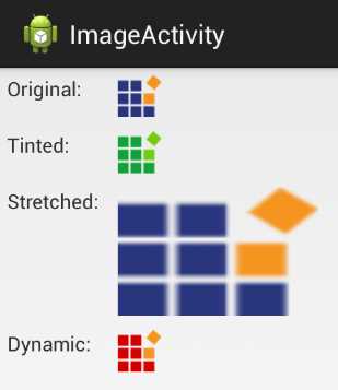
Images can be displayed using an ImageView object. An ImageView can display any kind of bitmap, and it takes care of basic alignment and scaling functionality. You can find several examples of various ImageView configurations in the activity_image.xml layout file:
- The ImageActivity defined in the example application for this chapter
To include an ImageView in an XML layout file, you can develop the following code:
<ImageView
android:layout_width="wrap_content"
android:layout_height="wrap_content"
android:padding="5dp"
android:src="@drawable/syncfusion_icon" />
The most important attribute of an ImageView is android:src. This defines the image that it will display. In the above case, @drawable/syncfusion_icon refers to an image file that was included with the application source code. Note that this has a similar format to string resources (e.g., @string/button_title). However, the @drawable prefix refers to a drawable resource, which is any kind of graphical asset.
Adding Drawable Resources
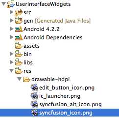
Of course, for the above code snippet to work, we need to add an image file called syncfusion_icon to the Eclipse project. The UserInterfaceWidgets example project already contains this file, but adding your own graphical assets is as simple as copying them from your hard drive and pasting them into one or more of the res/drawable directories in the Eclipse Package Explorer. Remember that the hdpi, ldpi, and other suffixes correspond to different screen resolutions, so it’s a good practice to include alternative images for each of the resolutions that you plan to support.
- Adding a graphical asset to an Eclipse project
Note that drawable resources can be PNG, GIF, or JPG files—the file extension will be inferred automatically.
Scaling Images
You can scale images by defining layout_width and layout_height attributes on the ImageView element. ImageView provides several types of scaling behaviors. The value of an ImageView’s android:scaleType attribute determines whether it stretches the image to the specified dimensions (fitXY), scales proportionally to display the whole image (centerInside), centers the unscaled image within the specified dimensions (center), or maps the image dimensions to the layout_width and layout_height values in several other pre-defined ways.
<ImageView
android:layout_width="150dp"
android:layout_height="100dp"
android:scaleType="fitXY"
android:src="@drawable/syncfusion_icon" />
For example, the above code will stretch the syncfusion_icon image to 150x100 device-independent pixels.
Programmatically Defining the Image Source
If you want to set the source image of an ImageView instance dynamically, you can pass a drawable resource to its setImageDrawable() method. The following snippet, which can be found in ImageActivity.java, demonstrates how to load an image called syncfusion_alt_icon.png into an ImageView defined in an XML layout file.
// Dynamically load an image into an ImageView
ImageView imageView = (ImageView) findViewById(R.id.dynamicImage);
Resources resources = getResources();
Drawable image = resources.getDrawable(R.drawable.syncfusion_alt_icon);
imageView.setImageDrawable(image);
In the Android framework, the resource bundle contains all of the XML layout files, string resources, and drawable resources. An application’s resource bundle is represented by the Resources class, and the active bundle can be fetched through the global getResources() function. The Resources class defines several useful methods that turn a resource ID into a useful object. In this case, the getDrawable() method lets us convert an image file in one of the res/drawable folders into a Drawable object, which can be displayed by an ImageView object. Note that the ID of the image file is accessed via R.drawable, much like an XML layout file is access via R.layout.
The setImageDrawable() method is a very flexible way to display images, as it’s possible to load bitmaps from the resource bundle (as shown above) from a remote URL, or from a user-defined location.
Buttons
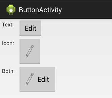
We’ve been working with Button views throughout this book, but there a few common modifications that are worth surveying. The buttons that we’ve used thus far have been purely text-based, but it’s possible to create icon-based buttons, as well as ones that combine icons and text. The activity_button.xml layout file contained in the included example project contains text-based, icon-based, and combined buttons.
- The ButtonActivity defined in the example application for this chapter
We’ve already seen several examples of text-based buttons, so we’ll jump right into icon buttons. Icon buttons are created with a dedicated class called ImageButton. These kinds of buttons don’t display a text title, and they use the same android:src attribute as the ImageView from the previous section. For example, the following snippet uses an image file called edit_button_icon.png as its icon:
<ImageButton
android:layout_width="wrap_content"
android:layout_height="wrap_content"
android:padding="20dp"
android:src="@drawable/edit_button_icon" />
As with ImageView, the android:src attribute must point to a drawable resource that you’ve added to your project.
Combining icons and text in a single button is a little bit more complicated. We have to go back to the familiar Button class and tell it where it should display the icon in relation to its text title using one of the following attributes:
- android:drawableBottom – Add the icon under the text
- android:drawableEnd – Add the icon after the text (varies based on text direction)
- android:drawableLeft – Add the icon to the left of the text
- android:drawableRight – Add the icon to the right of the text
- android:drawableStart – Add the icon before the text (varies based on text direction)
- android:drawableTop – Add the icon above the text
Each of these takes a drawable resource as a value, just like ImageView’s android:src attribute. For example, if you wanted to display the image file edit_button_icon.png to the left of the text title, you could use the following:
<Button
android:layout_width="wrap_content"
android:layout_height="wrap_content"
android:padding="20dp"
android:text="Edit"
android:drawableLeft="@drawable/edit_button_icon"
android:drawablePadding="10dp" />
Also notice the android:drawablePadding attribute, which lets you define the amount of space between the icon and the text.
All of these button types can use the android:onClick attribute to define a method to be called when they are tapped, but if you’re creating them programmatically, this XML attribute is not available. Instead, you need to set the button’s onClickListener property, just like we did to detect clicks of ListView and GridView items in the previous chapter. For instance, if you wanted to programmatically define the behavior of the textImageButton in the ButtonActivity of this chapter’s example app, you would use the following:
Button button = (Button) findViewById(R.id.textImageButton);
button.setOnClickListener(new View.OnClickListener() {
public void onClick(View sender) {
Button senderAsButton = (Button) sender;
String title = senderAsButton.getText().toString();
Log.d(TAG, String.format("You clicked the '%s' button", title));
}
});
This method of defining button behavior opens up many more possibilities than the static android:onClick XML attribute. It’s necessary when dynamically generating buttons, and it makes it possible to change a button’s behavior depending on its context.
Text Fields
Static text fields (i.e., labels) were introduced earlier in this book. In this section, we’ll learn how to change their color, size, and other properties. We’ll also learn how to accept user input via editable text fields, which are one of the most basic ways to collect input from a user. Concrete examples of all the code in this section can be found in the activity_text_field.xml layout in the UserInterfaceWidgets project. A more detailed overview of text fields can be found in the Input Controls section of the developer guide, as well as in the TextView class documentation.
Styling Text Fields
Remember that text fields can be added to a layout using the <TextView> element and their text can be defined with the android:text attribute. The appearance of a particular text field can be altered by defining other attributes on it, the most common of which are listed below:
- android:textColor – The color of the text field, specified as a hex number in the form of #AARRGGBB.
- android:textSize – The size of the text. The scaled pixel (sp) is the preferred unit to use.
- android:textStyle – The style of the type. Must be either normal, bold, or italic.
- android:typeface – The typeface to use. Value must be either normal, sans, serif, or monospace.
- android:textIsSelectable – Whether or not the user can select the text. Must be either true or false.
The following <TextView> demonstrates all of these properties. Note that the scaled pixel unit (sp) is based on the user’s preferred font size, which means that it will scale appropriately with the surrounding text. When explicitly defining the text size using pixel (px), device-independent pixels (dp), or inches (in), this will not be the case.
<TextView
android:layout_width="wrap_content"
android:layout_height="wrap_content"
android:text="Look, a big red serif font"
android:textColor="#ffff0000"
android:textSize="20sp"
android:textStyle="italic"
android:typeface="serif"
android:textIsSelectable="true" />
This will create a label that looks like this:
- A TextView with customized appearance
And, since android:textIsSelectable is set to true, the user can tap and hold the text to select and copy it.

- Selecting part of a selectable TextView
Editable Text Fields
Editable text fields have a distinct appearance and behavior from static ones. They use an underline and a hint to show the user that it is meant for collecting input, and when the user taps an editable text field, an on-screen keyboard—also called a soft keyboard (opposed to a hardware keyboard)—appears.

- Editing a text field with a soft keyboard
Instead of the <TextView> element, editable text views are created with the <EditText> element. For example, the text view in the above screenshot was created from the following XML:
<EditText
android:layout_width="fill_parent"
android:layout_height="wrap_content"
android:hint="Tap here to edit this text"
android:inputType="text" />
Editable text field hints are one of the most important attributes to set. They function as labels, telling the user what kind of input is expected.
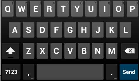
The android:inputType attribute lets you specify what kind of input you’re expecting. This can have a drastic impact on usability, since it determines what type of soft keyboard is displayed. For example, if you only wanted to collect a phone number, you would use phone for this value. Instead of a full keyboard, this will make Android display a dial pad, making it much easier to enter the desired input.
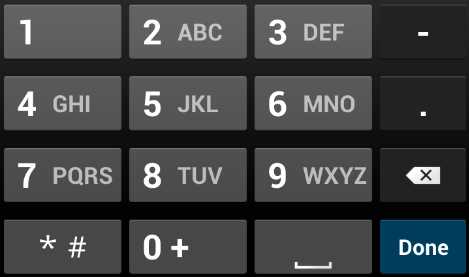
- Using android:inputType to display a number pad instead of a full keyboard
There is a plethora of built-in input types, and many of them can be combined to give app developers refined control over the user experience. Some of the most common values for android:inputType values are listed below (see the android:inputType documentation for all of the available options):
- text – Use a normal text keyboard.
- textEmailAddress – Use a text keyboard with the @ character readily available.
- textUri – Use a text keyboard with the / character readily available.
- number – Use a number keypad without traditional dial pad letters.
- phone – Use a number keypad with traditional dial pad letters (e.g., the 2 key also displays ABC).
- textCapWords – Capitalize each word that the user types.
- textCapSentences – Capitalize the first letter of each sentence.
- TextAutoCorrect – Auto correct misspelled words using Android’s built-in dictionary.
- textPassword – Hide characters after they have been typed.
- datetime – Use a number keypad with a / character readily available.
Some of these values can be combined using a bitwise operator (|). For example, if you wanted an <EditText> element to use a text input, capitalize sentences, and auto correct misspelled words, you would use the following:
android:inputType="text|textCapSentences|textAutoCorrect"
Another way to customize the soft keyboard is with the android:imeOptions attribute. This defines what is used as the Done button. For example, if you wanted to display Send as the final action after the user is finished entering input, you would add the following line to the the <EditText> element:
android:imeOptions="actionSend"
The resulting keyboard is shown in the following screenshot. Notice how the Done button from the previous examples turned into a Send button.
- Changing the android:imeOptions attribute to show a Send button
The most common values for android:imeOptions are: actionDone, actionSend, actionSearch, and actionNext, all of which are self-explanatory. Please visit the android:imeOptions documentation for the complete list.
Collecting Text Input
Of course, if you’re using an <EditText> element, you’re probably going to want to do something with the input after the user is done entering it. This process is similar to listening for button clicks with an OnClickListener. In TextFieldActivity.java, you’ll find a minimal example that shows you how to collect the input.
Let’s start by looking at the classes that need to be imported for our example to work:
import android.view.KeyEvent;
import android.view.inputmethod.EditorInfo;
import android.widget.TextView;
import android.widget.TextView.OnEditorActionListener;
import android.widget.EditText;
import android.util.Log;
The KeyEvent class contains information about which key was pressed. We won’t be using this for our example, but it can be very useful when working with hardware keyboards. The EditorInfo class defines several constants that let us check which kind of text the <EditText> element is collecting. Of course, we’ll need the TextView and EditText classes, along with the OnEditorActionLister class, which is what lets us listen for the “done” action.
To figure out when the user has pressed the Done button, you first need to find the text view in question, then set its onEditorActionListener property, like so:
EditText text = (EditText) findViewById(R.id.textField);
text.setOnEditorActionListener(new OnEditorActionListener() {
public boolean onEditorAction(TextView textView,
int actionId,
KeyEvent event) {
if (actionId == EditorInfo.IME_ACTION_SEND) {
String input = textView.getText().toString();
Log.d(TAG, String.format("Processing input: %s", input));
}
return false;
}
});
The onEditorAction() function is called whenever the user has finished editing the specified <EditText> (in this case, the one with an ID of textField). This is where you should process the input however you see fit. If you want to check which kind of action was sent, you can check its actionId parameter against one of the constants in EditorInfo. Here, we made sure that it was a Send action, then we simply logged the input to LogCat.
The return value of onEditorAction() is very important. If it returns true, it means that your code has taken care of everything related to collecting the input, including hiding the on-screen keyboard, if necessary. However, if it returns false, it means that the default handling behavior should be executed, which will typically hide the on-screen keyboard.
The above snippet returns false so that the keyboard is hidden when the user is done, regardless of what the user entered. If you want to manually dismiss the keyboard based on the input (e.g., you want to keep the keyboard displayed if the user entered an invalid value), you can do so with the InputMethodManager, like so:
InputMethodManager imm = (InputMethodManager)getSystemService(Context.INPUT_METHOD_SERVICE);
imm.hideSoftInputFromWindow(textView.getWindowToken(), 0);
You’ll also need two more imports for this to work:
import android.content.Context;
import android.view.inputmethod.InputMethodManager;
You should now understand how to include editable text fields in XML layouts, configure their keyboards, and collect that data after the user is done entering it. This is everything you need to know to start collecting text input in your own Android applications.
Checkboxes
Checkboxes are designed to let users select multiple boolean items at the same time. They can be contrasted with radio buttons, which only let the user select one item from the group. Since checkboxes can be checked individually, working with them is very similar to working with buttons.
They are represented by the CheckBox class, which implements the actual check and box, as well as a corresponding text label. Checkboxes use the same android:onClick attribute as buttons, which makes it easy to determine when they are toggled by the user.
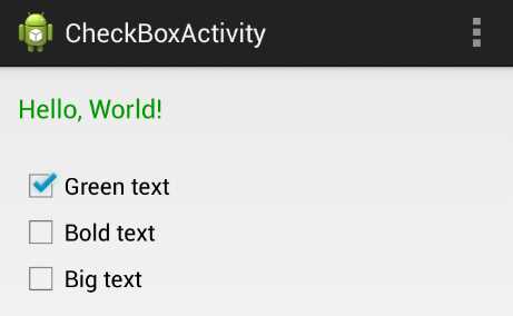
- Using several checkboxes to change the appearance of a TextView
The activity_check_box.xml layout file and the CheckBoxActivity.java class in the example project demonstrate the most common characteristics of checkboxes (along with some programmatic TextView manipulation). It uses three checkboxes to alter the color, style, and size of a text field. The complete example can be seen in the above screenshot. Let’s start by taking a look at the XML for one of the checkboxes:
<CheckBox
android:id="@+id/checkBoxGreen"
android:layout_width="wrap_content"
android:layout_height="wrap_content"
android:text="Green text"
android:onClick="checkBoxClicked" />
This creates a checkbox with Green text as its label, and it calls the checkBoxClicked() method on CheckBoxActivity whenever it’s clicked. The example project contains another one for toggling whether the text field is normal or bold (Bold text), and a third to switch between 18sp and 30sp text size (Big text).
The activity to handle this click will be a little bit more involved than previous examples. In CheckBoxActivity.java, you’ll find three private instance variables used to store the state of the text field:
private boolean isGreen;
private boolean isBold;
private boolean isBig;
The onCreate() method initializes these variables, then calls two methods that we’ll define shortly:
@Override
protected void onCreate(Bundle savedInstanceState) {
super.onCreate(savedInstanceState);
setContentView(R.layout.activity_check_box);
this.isGreen = true;
this.isBold = false;
this.isBig = false;
synchronizeCheckBoxes();
synchronizeTextView();
}
These synchronization methods separate the logic for making the checkboxes and the TextView match the internal state of the activity, respectively. For activities that have many interconnected UI widgets, organizing their interaction in this way can make for a much more maintainable project. The synchronizeCheckBoxes() method fetches each of the checkboxes by their ID and makes them match their corresponding property using CheckBox’s setChecked() method:
private void synchronizeCheckBoxes() {
CheckBox green = (CheckBox) findViewById(R.id.checkBoxGreen);
CheckBox bold = (CheckBox) findViewById(R.id.checkBoxBold);
CheckBox big = (CheckBox) findViewById(R.id.checkBoxBig);
green.setChecked(this.isGreen);
bold.setChecked(this.isBold);
big.setChecked(this.isBig);
}
The synchronizeTextView() method uses the private instance variables to toggle the appearance of the TextView:
private void synchronizeTextView() {
TextView text = (TextView) findViewById(R.id.checkBoxText);
if (this.isGreen) {
text.setTextColor(Color.parseColor("#FF009900"));
} else {
text.setTextColor(Color.parseColor("#FF000000"));
}
if (this.isBold) {
text.setTypeface(Typeface.create("default", Typeface.BOLD));
} else {
text.setTypeface(Typeface.create("default", Typeface.NORMAL));
}
if (this.isBig) {
text.setTextSize(TypedValue.COMPLEX_UNIT_SP, 30);
} else {
text.setTextSize(TypedValue.COMPLEX_UNIT_SP, 18);
}
}
Finally, we have the checkboxes’ on-click method, which uses the ID and value of the clicked checkbox to update the internal state:
public void checkBoxClicked(View view) {
CheckBox checkbox = (CheckBox) view;
boolean isChecked = checkbox.isChecked();
switch (view.getId()) {
case R.id.checkBoxGreen:
this.isGreen = isChecked;
break;
case R.id.checkBoxBold:
this.isBold = isChecked;
break;
case R.id.checkBoxBig:
this.isBig = isChecked;
break;
}
synchronizeTextView();
}
These three methods provide a clear data flow that is very easy to maintain, even for larger activities: the synchronization methods make the views match the internal state of the activity, and checkBoxClicked() collects user input to alter that state.
Radio Buttons
From a UI perspective, a group of radio buttons is like a group of checkboxes; however, only one item is allowed to be selected at a time. From a developer perspective, this behavior makes their API distinct from checkboxes. Instead of managing each item individually, you have to encapsulate the radio buttons in a group so the system knows that it should only select one of them at a time.
The buttons are represented by the RadioButton class, and you group them using the RadioGroup class. Like buttons and checkboxes, you can use the android:onClick attribute on the buttons to call a method when the user makes a selection.
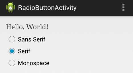
- Using radio buttons to set the typeface of a TextView
The activity_radio_button.xml layout and the RadioButtonActivity.java class in this chapter’s example project provide a simple demonstration of radio buttons and radio groups. It uses three radio buttons to let the user choose the typeface of a TextView. Whereas the previous section’s example let the user toggle several independent properties, the sans serif, serif, and monospace typeface values are mutually exclusive, so radio buttons are an appropriate choice for presenting these options.
The XML for a radio is a list of <RadioButton> elements surrounded by a <RadioGroup> element. Aside from ensuring that only one item is selection, the job of the RadioGroup is to arrange the radio buttons in a horizontal or vertical format. It’s actually a subclass of LinearLayout, so you can use the same android:orientation attribute to set the direction of the radio buttons. Each of the contained <RadioButton> elements are essentially the same as the buttons and checkboxes that we’ve been working with:
<RadioGroup
android:id="@+id/radioGroup"
android:layout_width="fill_parent"
android:layout_height="wrap_content"
android:orientation="vertical">
<RadioButton
android:id="@+id/radioButtonSans"
android:layout_width="wrap_content"
android:layout_height="wrap_content"
android:text="Sans Serif"
android:onClick="radioButtonClicked"/>
<RadioButton
android:id="@+id/radioButtonSerif"
android:layout_width="wrap_content"
android:layout_height="wrap_content"
android:text="Serif"
android:onClick="radioButtonClicked"/>
<RadioButton
android:id="@+id/radioButtonMonospace"
android:layout_width="wrap_content"
android:layout_height="wrap_content"
android:text="Monospace"
android:onClick="radioButtonClicked"/>
</RadioGroup>
In RadioButtonActivity.java, you’ll find some code in the onCreate() method to set the initial selection, along with a radioButtonClicked() method to update the TextView whenever the user changes the selection. We didn’t bother abstracting as much of the functionality as we did in the previous section, since there is only one property being altered:
@Override
protected void onCreate(Bundle savedInstanceState) {
super.onCreate(savedInstanceState);
setContentView(R.layout.activity_radio_button);
// Set the initial selection
RadioButton serif = (RadioButton) findViewById(R.id.radioButtonSerif);
serif.setChecked(true);
radioButtonClicked(null);
}
public void radioButtonClicked(View view) {
// Use the radio group to find the selected button
RadioGroup group = (RadioGroup) findViewById(R.id.radioGroup);
String typeface;
switch (group.getCheckedRadioButtonId()) {
case R.id.radioButtonSans:
typeface = "sans";
break;
case R.id.radioButtonSerif:
typeface = "serif";
break;
case R.id.radioButtonMonospace:
typeface = "monospace";
break;
default:
typeface = "default";
}
// Update the TextView accordingly
TextView text = (TextView) findViewById(R.id.radioButtonText);
text.setTypeface(Typeface.create(typeface, Typeface.NORMAL));
}
The only new method here is the RadioGroup’s getCheckedRadioButtonId(), which returns the ID of the selected radio button. This lets you figure out which item is selected without querying each button (notice how radioButtonClicked() doesn’t need to use the view parameter at all). Radio buttons can be selected programmatically using the same setChecked() method as checkboxes, which we use to set the initial selection. If you do need to individually inspect each radio button, you can use the corresponding getChecked() method.
It’s also worth noting that you can clear the radio button selection with RadioGroup’s clearCheck() method.
Spinners
Spinners are drop-down menus that allow the user to pick one item from a group of choices. They provide similar functionality to radio buttons, but they take up less space on the screen and make it easier to see the selected item. For these reasons, it is advised to use a spinner instead of radio buttons if you’re offering more than four or five options for a single field.
While they may offer similar functionality as radio buttons, spinners require an entirely different API. Their items are populated using an Adapter, which makes working with them more like working with list views and grid views rather than radio buttons or checkboxes.
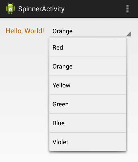
- Using a Spinner to change the color of a TextView
In this section, we’ll learn how to create a Spinner, populate it with an ArrayAdapter, and handle user input with an OnItemSelectedListener. This is almost the exact pattern we used to configure list views and grid views earlier in this book. The activity_spinner.xml layout file and the SpinnerActivity.java class demonstrate how to set a TextView’s color with a Spinner.
Since spinners need to be populated programmatically, the XML for adding one to a layout is very simple:
<LinearLayout xmlns:android="http://schemas.android.com/apk/res/android"
xmlns:tools="http://schemas.android.com/tools"
android:layout_width="match_parent"
android:layout_height="match_parent"
android:orientation="horizontal"
tools:context=".SpinnerActivity" >
<TextView
android:id="@+id/spinnerText"
android:layout_width="wrap_content"
android:layout_height="wrap_content"
android:layout_marginRight="10dp"
android:text="Hello, World!"
android:textSize="18sp" />
<Spinner
android:id="@+id/colorSpinner"
android:layout_width="fill_parent"
android:layout_height="wrap_content" />
</LinearLayout>
SpinnerActivity.java shows you how to populate this spinner. First, we create an ArrayList to represent the options:
ArrayList<String> colors = new ArrayList<String>();
colors.add("Red");
colors.add("Orange");
colors.add("Yellow");
colors.add("Green");
colors.add("Blue");
colors.add("Violet");
Then, we use this ArrayList to create an ArrayAdapter. Remember from our work with list views that an ArrayAdapter is what converts the data items into View objects for display by the spinner. Android provides a built-in spinner item resource, accessible via android.R.simple_spinner_item. But, since spinners are dropdown widgets, we also need to set the adapter’s dropDownViewResource property. The built-in android.R.simple_spinner_dropdown_item is the preferred resource to use for this:
ArrayAdapter<String> adapter = new ArrayAdapter<String>(this,
android.R.layout.simple_spinner_item,
colors);
adapter.setDropDownViewResource(
android.R.layout.simple_spinner_dropdown_item);
Then, we can give the adapter to the Spinner that we defined in the layout file:
Spinner spinner = (Spinner) findViewById(R.id.colorSpinner);
spinner.setAdapter(adapter);
If you compile the project at this point, you should be able to see the selected item in the spinner and be able to tap it to see the dropdown menu. But, to make it actually do something, we need to implement a selection handler. It’s important not to confuse the OnItemSelectedListener class that we need for the spinner with the OnItemClickListener that we used with the ListView and GridView in the previous chapter. The former has an additional method that we need to implement (though it doesn’t necessarily need to do anything):
spinner.setOnItemSelectedListener(new OnItemSelectedListener() {
public void onItemSelected(AdapterView<?> parent,
View v,
int position,
long id) {
String selectedColor = (String) parent.getItemAtPosition(position);
setTextColor(selectedColor);
}
public void onNothingSelected(AdapterView<?> parent) {
// Called when the selection disappears
}
});
The onItemSelected() method is where the click is handled. The above code fetches the selected String using the adapter’s getItemAtPosition() method. We then pass it off to a method called setTextColor(), which looks like this:
private void setTextColor(String color) {
String hexColor = "#FF000000";
if (color.equals("Red")) {
hexColor = "#FFAA0000";
} else if (color.equals("Orange")) {
hexColor = "#FFCC6600";
} else if (color.equals("Yellow")) {
hexColor = "#FFCCAA00";
} else if (color.equals("Green")) {
hexColor = "#FF00AA00";
} else if (color.equals("Blue")) {
hexColor = "#FF0000AA";
} else if (color.equals("Violet")) {
hexColor = "#FF6600AA";
}
TextView text = (TextView) findViewById(R.id.spinnerText);
text.setTextColor(Color.parseColor(hexColor));
}
This takes the String values displayed in the spinner, turns them into hex values, and updates the TextView’s color accordingly. This is all that’s required to get our spinner working.
If you don’t like defining the list items programmatically, it’s possible to put them in an XML resource file and load it into an adapter dynamically. This is a better practice than hardcoding values in activity classes, as it keeps all of your text values in XML files. Since it’s easy to load different resource files based on the device and the user’s locale, this makes it a breeze to translate your app into other languages
First we need to define a string array in strings.xml:
<string-array name="spinnerColors">
<item>Red</item>
<item>Orange</item>
<item>Yellow</item>
<item>Green</item>
<item>Blue</item>
<item>Violet</item>
</string-array>
To load these items into the spinner, all you have to do is replace the current ArrayAdapter with one created from the resource file:
ArrayAdapter<CharSequence> adapter = ArrayAdapter.createFromResource(this,
R.array.spinnerColors,
android.R.layout.simple_spinner_item);
R.array.spinnerColors is the ID of the string array we just created, and the static ArrayAdapter.createFromResource() method takes care of everything else for us. This will have the exact same effect as hardcoding the ArrayList.
Date/Time Pickers
Android provides built-in UI components for selecting dates and times. Typically, this is done via a dialog instead of directly in an activity. The DatePickerDialog and TimePickerDialog classes provide reusable interfaces that ensure a valid date/time is selected by the user. They also ensure a consistent user interface across applications.
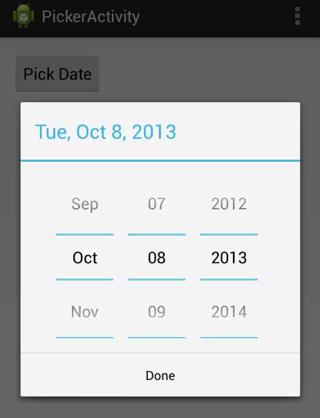
- Selecting the date with a date picker dialog
This section explains the bare minimum required to collect date or time input from a user. Creating a date picker requires three things:
- A DatePickerDialog object defines the appearance of the dialog.
- A DialogFragment object hosts the DatePickerDialog and manages the dialog lifecycle.
- An OnDateSetListener implementation processes the user input.
The first component is provided by the Android platform, so all we need to do is instantiate it.
The DialogFragment is a lightweight wrapper for the actual dialog, and it makes sure that the dialog is opened/closed properly, and that any interruptions are handled correctly. All we need to do is subclass DialogFragment to return a DatePickerDialog object as its hosted dialog. Fragments are introduced in the next chapter, but for now, suffice it to say that they are modular UI components. You can think of them as reusable views that can be embedded in different activities or dialogs.
To collect the input, we need to implement the OnDateSetListener interface, which defines a single method called onDateSet() that gets called whenever the user closes the dialog. Since you’ll probably want to process the input in the host Activity, this is where we’ll define onDateSet().
First, let’s start with the XML for the example, which is just a button that lets the user pick a date:
<Button
android:layout_width="wrap_content"
android:layout_height="wrap_content"
android:padding="10dp"
android:text="Pick Date"
android:onClick="showDatePickerDialog" />
The showDatePickerDialog() method is what will open the dialog, but before we get to that, let’s configure the dialog itself. This is conventionally done by subclassing DialogFragment and overriding its onCreateDialog() method to return whatever dialog you want to display. So, we need to create a new class called DatePickerFragment, and it will look like this:
import android.os.Bundle;
import android.support.v4.app.DialogFragment;
import android.app.Dialog;
import android.app.DatePickerDialog;
import java.util.Calendar;
public class DatePickerFragment extends DialogFragment {
@Override
public Dialog onCreateDialog(Bundle savedInstanceState) {
// Create and return the date picker dialog
final Calendar c = Calendar.getInstance();
int year = c.get(Calendar.YEAR);
int month = c.get(Calendar.MONTH);
int day = c.get(Calendar.DAY_OF_MONTH);
PickerActivity context = (PickerActivity) getActivity();
return new DatePickerDialog(context, context, year, month, day);
}
}
First, we use the Calendar class to fetch the current date, then we extract the year, month, and day components to give to the date picker. Then, all we need to do is instantiate DatePickerDialog. The first parameter should be the host Activity, and the second one is the listener object, which should implement the OnDateSetListener interface. Since we want the host activity to be the listener, too, we use this as the second parameter (note that this will require a change to the PickerActivity class declaration).
Now, we can define the showDatePickerDialog() method in PickerActivity.java to display this dialog. Opening the picker entails creating the DialogFragment object that hosts the date picker (DatePickerFragment), then calling its show() method, like so:
public void showDatePickerDialog(View view) {
DialogFragment picker = new DatePickerFragment();
picker.show(getSupportFragmentManager(), "datePicker");
}
The getSupportFragmentManager() method is a backwards-compatible way of displaying fragments (fragments were added in Android 3.0, but can support back to Android 1.6 using getSupportFragmentManager()). This method is defined in FragmentActivity, which means PickerActivity must subclass that instead of the usual Activity. Remember that PickerActivity is also being used as the listener object, so its class declaration should look like this:
public class PickerActivity extends FragmentActivity
implements DatePickerDialog.OnDateSetListener
Finally, to process the selected date, we need to define onDateSet() in PickerActivity.java. In this case, we’ll just display it in a text field:
@Override
public void onDateSet(DatePicker view, int year, int month, int day) {
// Process the selected date (month is zero-indexed)
TextView text = (TextView) findViewById(R.id.pickerText);
String message = String.format("Selected date: %d/%d/%d",
month+1, day, year);
text.setText(message);
}
Note that the month parameter is always zero-indexed to be compatible with the Calendar class.
Summary
This chapter briefly introduced some of the most important widgets for creating an Android user interface. We learned how to use image views, buttons, text fields, checkboxes, radio buttons, spinners, and date pickers to display and collect information from the user. There are a few other useful UI components that we didn’t discuss, including toggle buttons and action bars, but we’ll leave these for you to explore on your own.
By now, you should have the skills to create your own multi-screen Android apps and construct several different types of layouts. In the next section, we’ll look at a more advanced aspect of user interface development called fragments. Fragments are part of a modular framework for reusing behaviors and views in several different activities. This will open up several new navigation possibilities for your Android apps.
- 1800+ high-performance UI components.
- Includes popular controls such as Grid, Chart, Scheduler, and more.
- 24x5 unlimited support by developers.