
Android Programming Succinctly®

CHAPTER 4
User Interface Layouts
Laying out the UI elements in each Activity is one of the most important aspects of Android app development. It defines the appearance of an app, how you collect and display information to your users, and how they navigate between the various activities that compose your application.
The first chapter in Android Programming Succinctly provided a brief introduction to XML layouts, but this chapter will take a much deeper look at Android’s built-in layout options. In this chapter, we’ll learn how to arrange UI elements in linear, relative, and grid layouts, the common navigation patterns recommended by Android maintainers, and we’ll even take a brief look at how to develop device-independent layouts that can seamlessly stretch and shrink to different dimensions.
This chapter goes hand-in-hand with the upcoming chapter, in which we’ll learn about all of the individual UI elements. The running example for this chapter uses buttons and text fields to demonstrate different layout functionality, but remember that you can substitute any of the UI elements discussed in the next chapter to the same effect.
Loading an Android Project
You can follow along with the examples for this chapter from a fresh Android project, but if you want to see the end result, you can load the UserInterfaceLayouts project contained in the sample code for this book. To open an existing project, launch Eclipse (with the ADT plugin), and select Import in the File menu. This will open a dialog that looks like the following figure:
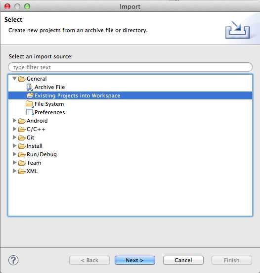
- Opening a project in Eclipse
Open the General folder and select Existing Projects into Workspace, then click Next. In the next dialog, click Browse..., find the resource folder that came with this book, and open the UserInterfaceLayouts folder. After clicking Finish, you should see the project in the Package Explorer.
Loading Layouts
In the first chapter, we let the template load the XML layout file for us, but it’s important to understand how this works under the hood. Fortunately, it’s also a relatively simple process.
When you compile a project, Android automatically generates a View instance from each of your XML layout files. Like String resources, these are accessed via the special R class under the static layout variable. For example, if you wanted to access the View instance created from a file called activity_main.xml, you would use the following:
R.layout.activity_main
To display this View object in an Activity, all you have to do is call the setContentView() method. The onCreate() method of the blank Activity template always contains a call to setContentView() to load the associated view into the Activity:
@Override
protected void onCreate(Bundle savedInstanceState) {
super.onCreate(savedInstanceState);
setContentView(R.layout.activity_main);
}
Note that you can pass any View instance to setContentView(); using the generated R.layout.activity_main object is just a useful convention for working with XML-based layouts. If you need to replace an Activity’s content dynamically, it’s perfectly legal to call setContentView() outside of onCreate().
Basic View Attributes
Before we start talking about Android’s built-in layout schemes, it’s important to understand how to set the size and position of UI elements within a particular layout. The next three sections show you how to define the dimensions, padding, and margin of a UI element using various XML properties.
Size
To set the width of a particular UI element, all you need to do is add an android:layout_width attribute to that element in the XML layout file. Likewise, the android:layout_height attribute defines the height of the element. The value for either of these parameters must be one of the following:
- wrap_content – This constant makes the element as big as it needs to be to contain its content.
- match_parent – This constant makes the element match the width and height of the parent element.
- An explicit dimension – Explicit dimensions can be measured in pixels (px), density-independent pixels (dp), scaled pixels based on preferred font size (sp), inches (in), or millimeters (mm). For example, android:layout_width="120dp" will make the element 120 device-independent pixels wide.
- A reference to a resource – Dimension resources let you abstract reusable values into a resource file, just like we saw with strings.xml in the first chapter of this book. Dimension resources can be accessed using the @dimen/resource_id syntax, where resource_id is the unique ID of the resource defined in dimens.xml.
Let’s start by exploring wrap_content. Change activity_main.xml to the following and compile the project (we’ll discuss the LinearLayout element later in this chapter):
<LinearLayout xmlns:android="http://schemas.android.com/apk/res/android"
xmlns:tools="http://schemas.android.com/tools"
android:layout_width="match_parent"
android:layout_height="match_parent"
android:orientation="vertical"
tools:context=".MainActivity"
>
<Button
android:layout_width="wrap_content"
android:layout_height="wrap_content"
android:text="Click me!" />
</LinearLayout>
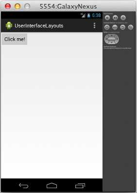
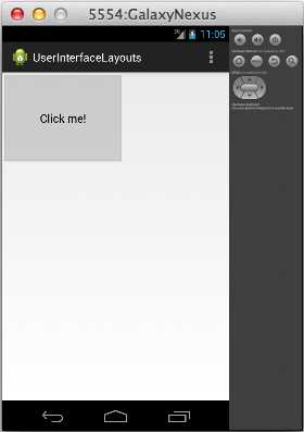
You should see a single button at the top of the screen, and since we used wrap_content for both of the dimensions, it should be just big enough to fit the “Click me!” text (with some default padding). If you change the text, the button will expand or shrink to match. The following figure shows you the button you have created in the activity_main.xml.

- A Button element using the wrap_content constant for both dimensions
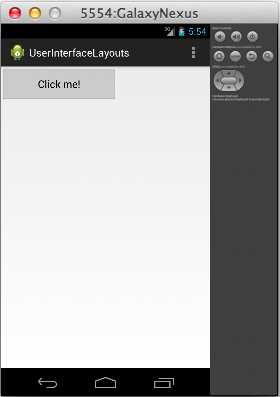
If you change android:layout_width and android:layout_height to match_parent, the button will fill the entire screen, since that’s how big the parent LinearLayout is:
<Button
android:layout_width="match_parent"
android:layout_height="match_parent"
android:text="Click me!" />
When you run this, it should look something like the following:
- A Button element using the match_parent constant for both dimensions
If you need more control over the size of your UI elements, you can always manually define their width and height using explicit values, like so:
<Button
android:layout_width="200dp"
android:layout_height="60dp"
android:text="Click me!" />
This makes the button 200 device-independent pixels wide by 60 device-independent pixels high, as you can see in the following figure:
- A Button element with an explicit width and height
The last option is to add an explicit dimension to dimens.xml and reference that from activity_main.xml. This is very useful if you have many elements that need to share the same dimension. Dimension resource references look just like string resource references, except you use @dimen instead of @string:
<Button
android:layout_width="@dimen/button_width"
android:layout_height="@dimen/button_height"
android:text="Click me!" />
Of course, you’ll also have to add these resources to dimens.xml before you compile the project:
<resources>
<!-- Default screen margins, per the Android Design guidelines. -->
<dimen name="activity_horizontal_margin">16dp</dimen>
<dimen name="activity_vertical_margin">16dp</dimen>
<dimen name="button_width">200dp</dimen>
<dimen name="button_height">60dp</dimen>
</resources>
This will have the exact same effect as the previous snippet, but now it’s possible to reuse the button_width and button_height values in other layouts (or for other elements in the same layout).
It’s also worth noting that you can mix-and-match different methods for the width and height values. For example, it’s perfectly legal to use 200dp for the width and wrap_content for the height.
Padding
Padding is the space between an element’s content and its border. It can be defined via any of the following attributes, all of which take an explicit dimension (e.g., 120dp) or a reference to a resource (e.g., @dimen/button_padding):
- android:padding – Sets a uniform value for all sides of the element.
- android:paddingTop – Sets the padding for the top edge of the element.
- android:paddingBottom – Sets the padding for the bottom edge of the element.
- android:paddingLeft – Sets the padding for the left edge of the element.
- android:paddingRight – Sets the padding for the right edge of the element.
- android:paddingStart – Sets the padding for the start edge of the element.
- android:paddingEnd – Sets the padding for the end edge of the element.
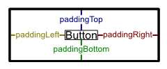
- Padding attributes
Padding can be added to View or ViewGroup elements. For the former, it defines the space between the element’s contents (e.g., a button’s title text) and its border, and for the latter it defines the space between the edge of the group and all of its child elements. For example, the following button will have 60 device-independent pixels surrounding its title text:
<Button
android:layout_width="wrap_content"
android:layout_height="wrap_content"
android:padding="60dp"
android:text="Click me!" />
This should result in the following:
- A Button with 60dp padding
Next, let’s try adding some padding to the top and bottom of the containing ViewGroup (i.e., the LinearLayout element) and making the button match the size of its parent, like so:
<LinearLayout xmlns:android="http://schemas.android.com/apk/res/android"
xmlns:tools="http://schemas.android.com/tools"
android:layout_width="match_parent"
android:layout_height="match_parent"
android:orientation="vertical"
android:paddingTop="24dp"
android:paddingBottom="24dp"
tools:context=".MainActivity"
>
<Button
android:layout_width="match_parent"
android:layout_height="match_parent"
android:text="Click me!" />
</LinearLayout>
This demonstrates that using match_parent on a child element takes the padding of the parent into account. Notice the 24dp padding on the top and bottom of the following screenshot:

- A Button with match_parent for its width and height and 24dp top and bottom padding in its parent ViewGroup
Margin
An element’s margin is the space between its border and either the surrounding elements or the edges of the parent element. It can be specified for any View or ViewGroup using the android:layout_margin element. And, like android:padding, the top, bottom, left, right, start, and end margins can be defined individually using android:layout_marginTop, android:layout_marginBottom, etc.
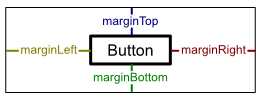
- Margin attributes
For instance, the following code creates the same result as the example from the previous section by defining a top and bottom margin on the Button instead of top and bottom padding on the parent LinearLayout:
<LinearLayout xmlns:android="http://schemas.android.com/apk/res/android"
xmlns:tools="http://schemas.android.com/tools"
android:layout_width="match_parent"
android:layout_height="match_parent"
android:orientation="vertical"
tools:context=".MainActivity"
>
<Button
android:layout_width="match_parent"
android:layout_height="match_parent"
android:layout_marginTop="24dp"
android:layout_marginBottom="24dp"
android:text="Click me!" />
</LinearLayout>
Common Layouts
Android provides three main ways to arrange UI elements: linear layouts, relative layouts, and grid layouts. The first two methods use classes called LinearLayout and RelativeLayout, respectively. These are subclasses of ViewGroup that have built-in functionality for setting the position and size of their child View objects. Grid layouts make it easy to display one- and two-dimensional data structures to the user, and they are slightly more complex than linear or relative layouts. The following figure shows you the available layout elements:
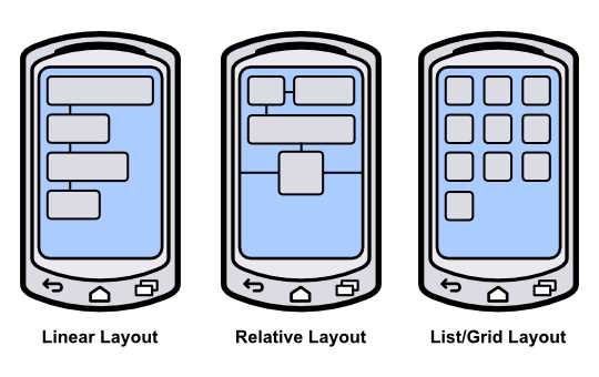
- The three standard Android layouts
Linear Layouts
The LinearLayout class arranges all of the contained UI elements either horizontally or vertically. It displays each element in the same order it appears in the XML file, making it a very simple way to create complex layouts made up of many elements.
Orientation
A LinearLayout element needs to know in which direction it should lay out its children. This is specified via the android:orientation attribute, which can have a value of either horizontal or vertical. A horizontal layout will have each child element stacked left-to-right (in the same order as they appear in the source XML). For example, try changing activity_main.xml to the following:
<LinearLayout xmlns:android="http://schemas.android.com/apk/res/android"
xmlns:tools="http://schemas.android.com/tools"
android:layout_width="match_parent"
android:layout_height="match_parent"
android:orientation="horizontal"
tools:context=".MainActivity"
>
<Button
android:layout_width="wrap_content"
android:layout_height="wrap_content"
android:text="Click me!" />
<Button
android:layout_width="wrap_content"
android:layout_height="wrap_content"
android:text="Click me!" />
<Button
android:layout_width="wrap_content"
android:layout_height="wrap_content"
android:text="Click me!" />
</LinearLayout>
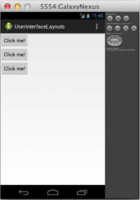
If you compile the project and run it in the emulator, you should see a single row of three buttons, like the following:
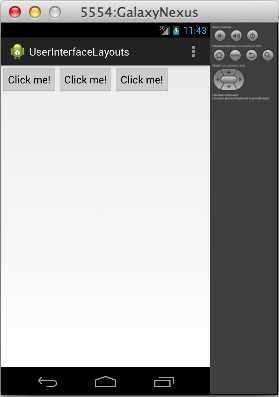
- A LinearLayout with horizontal orientation
But if you change the orientation to vertical, like so:
<LinearLayout xmlns:android="http://schemas.android.com/apk/res/android"
xmlns:tools="http://schemas.android.com/tools"
android:layout_width="match_parent"
android:layout_height="match_parent"
android:orientation="vertical"
tools:context=".MainActivity"
>
...
</LinearLayout>
The three buttons will appear in a single column:
- A LinearLayout with vertical orientation
Weight
You can use the same android:layout_width and android:layout_height attributes discussed earlier this chapter to define the size of each child element, but LinearLayout also enables another sizing option called android:layout_weight. An element’s weight determines how much space it takes up relative to its siblings. For example, if you want three buttons to be evenly distributed over the height of the parent LinearLayout, you could use the following:
<LinearLayout xmlns:android="http://schemas.android.com/apk/res/android"
xmlns:tools="http://schemas.android.com/tools"
android:layout_width="match_parent"
android:layout_height="match_parent"
android:orientation="vertical"
tools:context=".MainActivity"
>
<Button
android:layout_width="match_parent"
android:layout_height="0dp"
android:layout_weight="1"
android:text="Click me!" />
<Button
android:layout_width="match_parent"
android:layout_height="0dp"
android:layout_weight="1"
android:text="Click me!" />
<Button
android:layout_width="match_parent"
android:layout_height="0dp"
android:layout_weight="1"
android:text="Click me!" />
</LinearLayout>
Note that for vertical orientations, you need to set each element’s android:layout_height attribute to 0 so that it can be calculated automatically using the specified weight. For horizontal orientations, you would need to set their android:layout_width to 0. Running the above code should give you the following:
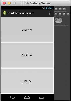
- Evenly weighted UI elements in a vertical linear layout
You can change the weight ratios to make the buttons take up different proportions of the screen. For example, changing the button weights to 2, 1, 1 will make the first button take up half the screen and the other two a fourth of the screen:
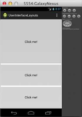
- Unevenly weighted UI elements in a vertical linear layout
Specifying weights instead of explicit dimensions for UI elements is a flexible way to configure layouts, as it lets them automatically scale to match the size of the parent ViewGroup.
Relative Layouts
RelativeLayout is an alternative to LinearLayout that lets you specify where each element should be placed with respect to the other elements in the interface. Unlike LinearLayout, the order of the elements in the rendered interface of a RelativeLayout does not necessarily have to match the underlying XML file. Instead, their positions are defined by specifying a relationship to another element (e.g., “place the button to the left of the text field” or “place the button at the bottom of its parent”). The fact that positions are defined relative to other elements makes this a very powerful way to create pleasing UIs that expand and contract based on the screen size.
Relative To Parent
In a RelativeLayout, a UI element can be positioned with respect to its parent or with respect to its siblings. In either case, you define the position using one of the layout attributes defined by RelativeLayouts.LayoutParams. The attributes that position elements relative to their parent are listed below, and all of them take a Boolean value:
- android:layout_alignParentLeft – If true, aligns the left side of the element with the left side of its parent.
- android:layout_centerHorizontal – If true, centers the element horizontally in its parent.
- android:layout_alignParentRight – If true, aligns the right side of the element with the right side of its parent.
- android:layout_alignParentTop – If true, aligns the top of the element to the top of its parent.
- android:layout_centerVertical – If true, centers the element vertically in its parent.
- android:layout_alignParentBottom – If true, aligns the bottom of the element to the bottom of its parent.
- android:layout_alignParentStart – If true, aligns the start edge of the element with the start edge of its parent.
- android:layout_alignParentEnd – If true, aligns the end edge of the element with the end edge of its parent.
- android:layout_centerInParent – If true, centers the element horizontally and vertically in its parent.
For example, try changing activity_main.xml to the following:
<RelativeLayout xmlns:android="http://schemas.android.com/apk/res/android"
xmlns:tools="http://schemas.android.com/tools"
android:layout_width="match_parent"
android:layout_height="match_parent"
tools:context=".MainActivity"
>
<Button
android:layout_width="wrap_content"
android:layout_height="wrap_content"
android:layout_alignParentRight="true"
android:layout_alignParentBottom="true"
android:text="Top Button" />
<Button
android:layout_width="wrap_content"
android:layout_height="wrap_content"
android:layout_centerHorizontal="true"
android:layout_centerVertical="true"
android:text="Middle Button" />
<Button
android:layout_width="wrap_content"
android:layout_height="wrap_content"
android:layout_alignParentLeft="true"
android:layout_alignParentTop="true"
android:text="Bottom Button" />
</RelativeLayout>
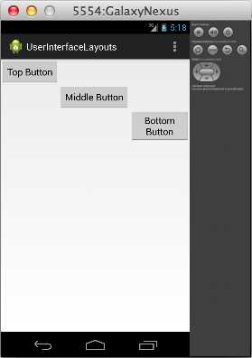
This will result in a diagonal row of three buttons, as shown below:
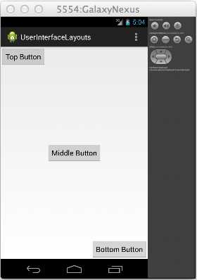
- A RelativeLayout that positions elements with respect to their parent
Note that if you change the order of the XML elements in activity_main.xml, the buttons will still appear in the same locations. This is different than the behavior of LinearLayout, which places each element relative to the previous one. Also notice that if you change the button dimensions or rotate the emulator (Ctrl+F12), they will still appear in their respective locations relative to the screen.
Relative To Siblings
Elements can also be positioned relative to each other. The attributes listed below all specify a graphical relationship with surrounding elements, but instead of a Boolean value, they require an ID of another element in the layout:
- android:layout_above – Positions the bottom edge of the element above the element with the specified ID.
- android:layout_below – Positions the top edge of the element below the element with the specified ID.
- android:layout_toLeftOf – Positions the right edge of the element to the left of the element with the specified ID.
- android:layout_toRightOf – Positions the left edge of the element to the right of the element with the specified ID.
- android:layout_alignBaseline – Aligns the baseline of the element with the baseline of the element with the specified ID.
- android:layout_alignTop– Aligns the top edge of the element with the top of the element with the specified ID.
- android:layout_alignBottom – Aligns the bottom edge of the element with the bottom edge of the element with the specified ID.
- android:layout_alignLeft – Aligns the left edge of the element with the left edge of the element with the specified ID.
- android:layout_alignRight – Aligns the right edge of the element with the right edge of the element with the specified ID.
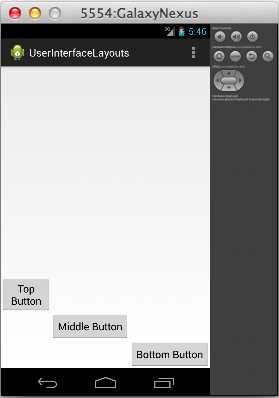
For example, consider the following RelativeLayout that uses relative-to-sibling attributes instead of relative-to-parent attributes. The second and third buttons are positioned relative to the first one, which will be located in the default top-left corner.
<Button
android:id="@+id/topButton"
android:layout_width="wrap_content"
android:layout_height="wrap_content"
android:text="Top Button" />
<Button
android:id="@+id/middleButton"
android:layout_width="wrap_content"
android:layout_height="wrap_content"
android:layout_below="@id/topButton"
android:layout_toRightOf="@id/topButton"
android:text="Middle Button" />
<Button
android:layout_width="wrap_content"
android:layout_height="wrap_content"
android:layout_below="@id/middleButton"
android:layout_toRightOf="@id/middleButton"
android:text="Bottom Button" />
Instead of a diagonal line of buttons that spans the entire screen, this code will give you a diagonal with all of the button corners touching:
- A RelativeLayout that positions elements with respect to their siblings
Since we’re referencing them by ID, we needed to include an android:id attribute for the top and middle buttons. Remember from the first chapter that the first time an XML element ID is used, it needs to be declared as "@+id/foo". This plus sign usually occurs in the android:id attribute, but it doesn’t have to—it should always be found in the first attribute that uses the ID. In the following snippet, the android:layout_toLeftOf attributes are the first place the middleButton and bottomButton IDs are referenced, so they need to be prefixed by a plus sign:
<Button
android:layout_width="wrap_content"
android:layout_height="wrap_content"
android:layout_toLeftOf="@+id/middleButton"
android:layout_above="@id/middleButton"
android:text="Top Button" />
<Button
android:id="@id/middleButton"
android:layout_width="wrap_content"
android:layout_height="wrap_content"
android:layout_toLeftOf="@+id/bottomButton"
android:layout_above="@id/bottomButton"
android:text="Middle Button" />
<Button
android:id="@id/bottomButton"
android:layout_width="wrap_content"
android:layout_height="wrap_content"
android:layout_alignParentRight="true"
android:layout_alignParentBottom="true"
android:text="Bottom Button" />
This use of plus signs helps reduce the number of mistyped IDs by ensuring that new IDs are explicitly labeled as such. For example, if you were to accidentally try to reference an element with @id/bottumButton, the compiler would let you know that there is no such element.
The above XML positions the top and middle buttons relative to the bottom one, then puts the bottom one in the bottom-right corner of the screen. This gives you the following layout:
- A RelativeLayout that positions buttons relative to elements that have not been declared yet
Also notice that you can combine the relative-to-sibling with the relative-to-parent positioning methods. The bottom button is positioned relative to its parent (e.g., android:layout_alignParentRight), and the others are positioned relative to a sibling (e.g., android:layout_toLeftOf).
List and Grid Layouts
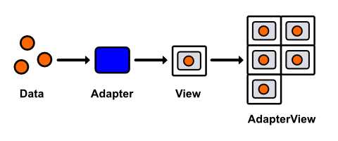
So far, we’ve learned how to quickly create user interfaces with LinearLayout and RelativeLayout; however, the content of these interfaces have been entirely static—their UI elements are hardcoded into the underlying XML file. When you want to create a user interface using dynamic data, things get a little bit more complicated. Data-driven layouts require three components:
- A data set
- A subclass of Adapter for converting the data items into View objects.
- A subclass of AdapterView for laying out the View objects created by the Adapter
Before you can start configuring a data-driven layout, you need some data to work with. For this section, our data set will be a simple array of String objects, but Android also provides many built-in classes for fetching data from text files, databases, or web services.
Next, you need an Adapter to convert the data into View objects. For example, the built-in ArrayAdapter takes an array of objects, creates a TextView for each one, and sets its text property to the toString() value of each object in the array. These TextView instances are then sent to an AdapterView.
AdapterView is a ViewGroup subclass that replaces the LinearLayout and RelativeLayout classes from the previous sections. Its job is to arrange the View objects provided by the Adapter. This section explores the two most common AdapterView subclasses, ListView and GridView, which position these views into a list or a grid, respectively.
- Displaying a data set in a GridView using an Adapter
List Layouts
Let’s start by getting a simple ListView up and running. Since we’re no longer hardcoding UI elements, our XML layout file is going to be very simple—all it needs is an empty ListView element. Change activity_main.xml to the following:
<ListView xmlns:android="http://schemas.android.com/apk/res/android"
android:id="@+id/listView"
android:layout_width="wrap_content"
android:layout_height="wrap_content" />
This ListView defines our entire XML layout—all of its UI elements will be populated dynamically. We do, however, need to include an android:id attribute so that we can access the ListView instance from our activity.
Next, we need to update our MainActivity class to define a data set, pass that data set to an Adapter, and then pass that adapter to the ListView that we defined in activity_main.xml. So, change MainActivity.java to the following:
package com.example.userinterfacelayouts;
import android.os.Bundle;
import android.app.Activity;
import android.widget.ListView;
import android.widget.ArrayAdapter;
public class MainActivity extends Activity {
@Override
protected void onCreate(Bundle savedInstanceState) {
super.onCreate(savedInstanceState);
setContentView(R.layout.activity_main);
String[] data = new String[] { "Item 1", "Item 2", "Item 3",
"Item 4" };
ArrayAdapter<String> adapter = new ArrayAdapter<String>(this, android.R.layout.simple_list_item_1, data);
ListView listView = (ListView) findViewById(R.id.listView);
listView.setAdapter(adapter);
}
}
First, we create an array of Strings to serve as our data set and assign it to the local data variable. Then, we create an ArrayAdapter, which generates a TextView from each String in the array. Its constructor takes an Activity context, the ID of the prototypical TextView, and the array of data. The android.R.layout.simple_list_item_1 snippet is a reference to one of Android’s convenient built-in layouts. You can find the complete list in the R.layout documentation. Next, we have to find the ListView that we added to activity_main.xml via findViewById(), and then we need to set its adapter property to the ArrayAdapter instance that we just configured.
You should now be able to compile the project and see the four strings in the data array displayed as a list of TextView elements:
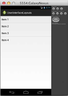
- A dynamic layout generated by ListView
List layouts make it incredibly easy to work with large data sets, and the fact that you can represent each item with any view lets you display objects that have several properties (e.g., a list of contacts that all display an image, name, and preferred phone number).
Grid Layouts
Grid layouts use the same data/Adapter/AdapterView pattern as list layouts, but instead of ListView, you use the GridView class. GridView also defines some extra configuration options for defining the number of columns and the spacing between each grid item, most of which are included in the following snippet. Try changing activity_main.xml to:
<GridView xmlns:android="http://schemas.android.com/apk/res/android"
android:id="@+id/gridView"
android:layout_width="fill_parent"
android:layout_height="fill_parent"
android:columnWidth="100dp"
android:numColumns="auto_fit"
android:verticalSpacing="5dp"
android:horizontalSpacing="5dp"
android:stretchMode="columnWidth" />
The only change we need to make in MainActivity.java is to update the ListView references to GridView:
package com.example.userinterfacelayouts;
import android.os.Bundle;
import android.app.Activity;
import android.widget.GridView;
import android.widget.ArrayAdapter;
public class MainActivity extends Activity {
@Override
protected void onCreate(Bundle savedInstanceState) {
super.onCreate(savedInstanceState);
setContentView(R.layout.activity_main);
String[] data = new String[] { "Item 1", "Item 2", "Item 3",
"Item 4", "Item 5", "Item 6",
"Item 7", "Item 8", "Item 9"};
ArrayAdapter<String> adapter = new ArrayAdapter<String>(this, android.R.layout.simple_list_item_1, data);
GridView gridView = (GridView) findViewById(R.id.gridView);
gridView.setAdapter(adapter);
}
}
This will give you a nice grid of text fields that are 100 device-independent pixels wide with 5 device-independent pixels between each one:
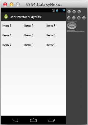
- A dynamic layout generated by GridView
Handling Click Events
Of course, you’re probably going to want to allow the user to interact with the items in a ListView or a GridView. However, because the interface generated by either of these classes is dynamic, we can’t use the android:onClick XML attribute to call a method when the user clicks one of the list items. Instead, we have to define a general callback function in MainActivity.java. This can be accomplished by implementing the AdapterView.OnItemClickListener interface, like so:
package com.example.userinterfacelayouts;
import android.os.Bundle;
import android.app.Activity;
import android.widget.GridView;
import android.widget.ArrayAdapter;
import android.util.Log;
import android.view.View;
import android.widget.TextView;
import android.widget.AdapterView;
import android.widget.AdapterView.OnItemClickListener;
public class MainActivity extends Activity {
private static final String TAG = "MainActivity";
@Override
protected void onCreate(Bundle savedInstanceState) {
super.onCreate(savedInstanceState);
setContentView(R.layout.activity_main);
String[] data = new String[] { "Item 1", "Item 2", "Item 3",
"Item 4", "Item 5", "Item 6",
"Item 7", "Item 8", "Item 9"};
ArrayAdapter<String> adapter = new ArrayAdapter<String>(this, android.R.layout.simple_list_item_1, data);
GridView gridView = (GridView) findViewById(R.id.gridView);
gridView.setAdapter(adapter);
gridView.setOnItemClickListener(new OnItemClickListener() {
public void onItemClick(AdapterView<?> parent, View v,
int position, long id) {
TextView selectedView = (TextView) v;
Log.d(TAG, String.format("You clicked: %s",
selectedView.getText()));
}
});
}
}
Now, the onItemClick() method will be called every time one of the GridView’s items are clicked. All of the relevant parameters are passed to this function as parameters: the parent AdapterView, the View item that was clicked, its position in the data set, and its row id. The above callback simply casts the clicked View to a TextView and displays whatever text it contains in LogCat.
Clicks can be handled in the exact same way for ListView layouts.
Editing The Data Set
When you want to change the data that is displayed to the user at runtime, all you have to do is edit the underlying data set and the built-in BaseAdapter class takes care of updating the user interface accordingly. In this section, we’ll add a button to the layout so the user can add new items to the grid, and then we’ll re-implement the onItemClick() function to remove the selected item from the list.
First, let’s change activity_main.xml to include a button. We’ll do this by making LinearLayout the root XML element and giving it a Button and a GridView for children:
<LinearLayout xmlns:android="http://schemas.android.com/apk/res/android"
xmlns:tools="http://schemas.android.com/tools"
android:layout_width="fill_parent"
android:layout_height="fill_parent"
android:orientation="vertical"
tools:context=".MainActivity" >
<Button
android:layout_width="match_parent"
android:layout_height="80dp"
android:text="Add Item"
android:onClick="addItem"/>
<GridView android:id="@+id/gridView"
android:layout_width="fill_parent"
android:layout_height="fill_parent"
android:columnWidth="100dp"
android:numColumns="auto_fit"
android:verticalSpacing="5dp"
android:horizontalSpacing="5dp"
android:stretchMode="columnWidth" />
</LinearLayout>
Notice that it’s perfectly legal to nest different layout schemes inside of each other (i.e., putting a GridView inside of a LinearLayout). This makes it possible to create complex, dynamic user interfaces with very little effort.
Next, we need to alter the corresponding activity to handle Add Item button clicks and remove items when they are selected in the GridView. This will require a number of changes to MainActivity.java:
package com.example.userinterfacelayouts;
import android.os.Bundle;
import android.app.Activity;
import android.widget.GridView;
import android.widget.ArrayAdapter;
import android.view.View;
import android.widget.AdapterView;
import android.widget.AdapterView.OnItemClickListener;
import java.util.ArrayList;
public class MainActivity extends Activity {
private ArrayList<String> data;
private ArrayAdapter<String> adapter;
private int count;
@Override
protected void onCreate(Bundle savedInstanceState) {
super.onCreate(savedInstanceState);
setContentView(R.layout.activity_main);
this.data = new ArrayList<String>();
this.data.add("Item 1");
this.data.add("Item 2");
this.data.add("Item 3");
this.count = 3;
adapter = new ArrayAdapter<String>(this, android.R.layout.simple_list_item_1, data);
GridView gridView = (GridView) findViewById(R.id.gridView);
gridView.setAdapter(adapter);
gridView.setOnItemClickListener(new OnItemClickListener() {
public void onItemClick(AdapterView<?> parent, View v,
int position, long id) {
data.remove(position);
adapter.notifyDataSetChanged();
}
});
}
public void addItem(View view) {
count++;
String newItem = String.format("Item %d", count);
this.data.add(newItem);
this.adapter.notifyDataSetChanged();
}
}
First, we have to change the static String[] array that represents our data set to a mutable ArrayList. This will allow us to add and remove items. We also have to change the data and adapter local variables to instance variables so that we can access them outside of onCreate(). We also added a count variable to keep track of how many items have been created.
To remove an item from the the GridView, all we have to do is remove it from the data set with ArrayList’s remove() method, then call adapter.notifyDataSetChanged(). This latter method is defined by BaseAdapter, and it tells the Adapter that it needs to synchronize its associated AdapterView items. It should be called whenever the underlying data set has changed.
The new addItem() method is called whenever the Add Item button is clicked. First it increments the count variable, then uses it to generate a title for the new item, adds the title to the data set, and finally calls notifyDataSetChanged() to refresh the GridView.
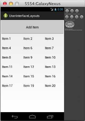
- Adding and removing items from the data set
You should now be able to compile the project and alter the underlying data set. While this example only demonstrates adding and removing items from the GridView, editing existing items works the exact same way. All you have to do is change the value in the ArrayList and call notifyDataSetChanged() on the adapter.
Custom ListView (and GridView) Items
The R.layout.simple_list_item_1 TextView that we’ve been using up to this point is convenient when working with string data, but more complex data items typically call for correspondingly complex views. Fortunately, it’s relatively easy to implement your own ListView or GridView items. In this section, we’ll create a custom view that displays a name and a phone number.
Custom ListView items require three components: a class to represent the data, an XML layout file to define the View for each item, and a custom Adapter to display the data in the view. These components will be replacing the String data, the android.R.layout.simple_list_item_1 view, and the ArrayAdapter from the previous example. The result we’re aiming for looks like this:
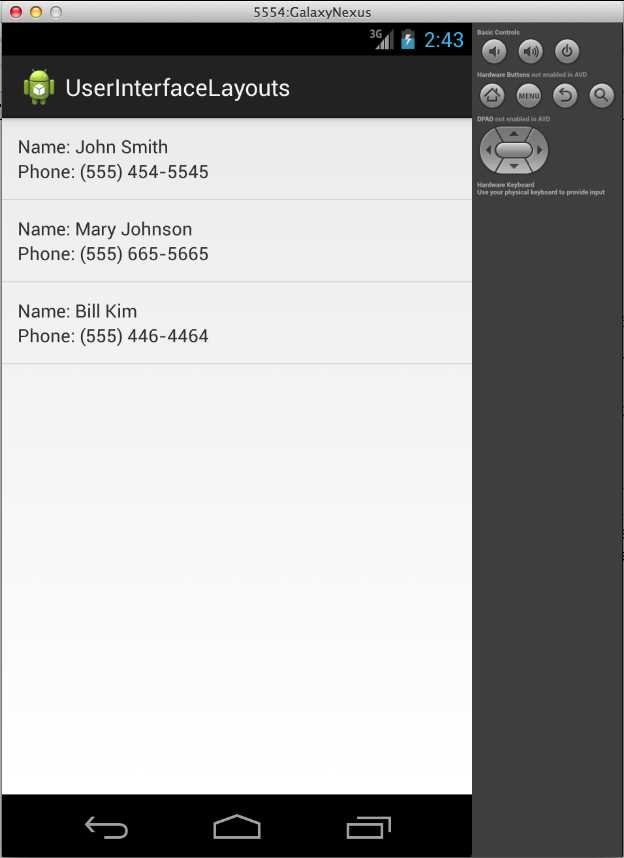
- ListView with custom View objects for each item
First, we need to create a new class to represent a custom data item. We’ll call it DataItem, and all it needs to store is two properties called name and phoneNumber. You can create a new class in Eclipse by pressing Cmd+N (or Ctrl+N if you are on a PC), and then selecting Java, and then Class. Enter DataItem for the Name field, and leave everything else at default values. The form should look like the following:
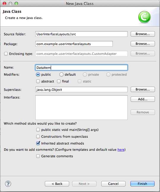
- Creating the DataItem class
After clicking Finish, you should find a new file called DataItem.java under src/com.example.userinterfacelayouts in the Package Explorer. Double-click the file to open it, and change it to the following:
package com.example.userinterfacelayouts;
public class DataItem {
String name;
String phoneNumber;
public DataItem(String name, String phoneNumber) {
this.name = name;
this.phoneNumber = phoneNumber;
}
}
This defines two properties for each data item, along with a convenient constructor. That’s all we need to represent the data, so we can move on to the XML layout file that defines the View object associated with each data item.
To create the layout XML file, press Cmd+N (or Ctrl+N if you are on a PC) and select Android, and then Android XML Layout File. Use list_item.xml for the File field, and leave Root Element as the default value (we’ll change it by editing the XML). Clicking Finish will give you a new file called list_item.xml in the res/layout folder. We want each item to look like the following:

- The view created by list_item.xml
We’ll use a RelativeLayout and four TextView elements to create this layout. Change list_item.xml to the following:
<?xml version="1.0" encoding="utf-8"?>
<RelativeLayout xmlns:android="http://schemas.android.com/apk/res/android"
android:layout_width="match_parent"
android:layout_height="match_parent"
android:padding="12dp">
<TextView
android:id="@+id/nameLabel"
android:layout_width="wrap_content"
android:layout_height="wrap_content"
android:text="@string/nameLabel"/>
<TextView
android:id="@+id/nameValue"
android:layout_toRightOf="@id/nameLabel"
android:layout_width="wrap_content"
android:layout_height="wrap_content"/>
<TextView
android:id="@+id/phoneLabel"
android:layout_below="@id/nameLabel"
android:layout_width="wrap_content"
android:layout_height="wrap_content"
android:text="@string/phoneLabel"/>
<TextView
android:id="@+id/phoneValue"
android:layout_below="@id/nameLabel"
android:layout_toRightOf="@id/phoneLabel"
android:layout_width="wrap_content"
android:layout_height="wrap_content"/>
</RelativeLayout>
The id/nameValue and id/phoneValue elements are going to be set dynamically by our custom Adapter, so they don’t need an android:text attribute, but the id/nameLabel and id/phoneLabel elements are static labels, so they can be populated from strings.xml. Add the following two lines to strings.xml:
<string name="nameLabel">Name: </string>
<string name="phoneLabel">Phone: </string>
The only new part here is the   entity, which is a non-breaking space. This is necessary to get our label to display correctly. That takes care of the XML layout file, so all we have left is the custom Adapter to connect it with the DataItem class.
Create another new class called CustomAdapter and use BaseAdapter as the subclass. BaseAdapter is a minimal implementation of the Adapter class. It provides some basic definitions for the inner-workings of Adapter, which lets us focus on higher-level functionality in our CustomAdapter. This is going to be a longer class definition, so let’s tackle it in steps.
Let’s start by changing CustomAdapter.java to the following:
package com.example.userinterfacelayouts;
import java.util.ArrayList;
import android.view.View;
import android.view.ViewGroup;
import android.view.LayoutInflater;
import android.content.Context;
import android.widget.BaseAdapter;
import android.widget.TextView;
public class CustomAdapter extends BaseAdapter {
ArrayList<DataItem> data;
Context context;
private static LayoutInflater inflater = null;
public CustomAdapter(Context context, ArrayList<DataItem> data) {
this.context = context;
this.data = data;
inflater = (LayoutInflater) context
.getSystemService(Context.LAYOUT_INFLATER_SERVICE);
}
}
This starts by importing the classes that we’ll need later on. Then, it defines a few properties. The data variable stores the data backing the adapter, which is just an ArrayList of DataItem objects. The Context class contains information about the global application environment, and we need to store a reference to it in the context variable. Finally, we need a LayoutInflater to turn the XML from list_item.xml into a View hierarchy. Without this LayoutInflater, it would be impossible to get to the text fields that we defined in list_item.xml.
Next, we define a constructor that takes a Context instance and the data set as parameters. Then, it uses the context to fetch a LayoutInflater. The getSystemService() method of a Context instance is the canonical way to do this.
Now we’re ready to define the custom behavior of our adapter. Add the following methods to CustomAdapter.java:
@Override
public int getCount() {
return data.size();
}
@Override
public Object getItem(int position) {
return data.get(position);
}
@Override
public long getItemId(int position) {
return position;
}
@Override
public View getView(int position, View convertView, ViewGroup parent) {
// See if the view needs to be inflated
View view = convertView;
if (view == null) {
view = inflater.inflate(R.layout.list_item, null);
}
// Extract the desired views
TextView nameText = (TextView) view.findViewById(R.id.nameValue);
TextView phoneText = (TextView) view.findViewById(R.id.phoneValue);
// Get the data item
DataItem item = data.get(position);
// Display the data item's properties
nameText.setText(item.name);
phoneText.setText(item.phoneNumber);
return view;
}
The first three methods provide information that is required by all Adapter subclasses. The getCount() and getItem() methods must return the number of items represented by the adapter and the item at the specified position, respectively. These both just need to forward the information from the underlying ArrayAdapter. The getItemId() method should return the row ID of the item at the specified position. In this case, we can just return the position of the item in the array.
The heart of our CustomAdapter class is the getView() method, which must return a View object that represents the data item at the specified position. This is where the list_view.xml file is converted into a View and its TextViews are populated with data from the associated DataItem.
First, we need to see if the adapter is working with an existing view, which would be passed in via the convertView parameter. If it’s not, we need to create a new View instance by inflating the XML layout file with the LayoutInflater instance that we recorded in the constructor. This parses the XML, turning each element into its corresponding view object and adding it to a view hierarchy. Finally, we need to find the TextView elements that we defined in the XML file and use them to display the requested DataItem’s name and phoneNumber properties. The following figure shows you how to inflate an XML layout file to access the contained views.
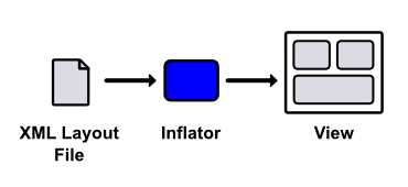
- Inflating an XML layout file to access the contained views
This process should provide a better understanding of the purpose of an Adapter: its getView() method is where the data set is adapted to be displayed in a View hierarchy. The returned View instance is what gets displayed by the parent ListView/GridView.
We have our three components of a customized ListView set up, but we still need to put all of it together in the main activity. All that’s required for activity_main.xml is a ListView that we can reference in MainActivity.java:
<LinearLayout xmlns:android="http://schemas.android.com/apk/res/android"
xmlns:tools="http://schemas.android.com/tools"
android:layout_width="fill_parent"
android:layout_height="fill_parent"
android:orientation="horizontal"
tools:context=".MainActivity" >
<ListView
android:id="@+id/listView"
android:layout_width="fill_parent"
android:layout_height="fill_parent" />
</LinearLayout>
Then, in MainActivity.java, we need to create the data set of DataItem instances and attach our CustomAdapter to the above ListView:
package com.example.userinterfacelayouts;
import android.os.Bundle;
import android.app.Activity;
import android.widget.ListView;
import java.util.ArrayList;
public class MainActivity extends Activity {
private ArrayList<DataItem> data;
private CustomAdapter adapter;
@Override
protected void onCreate(Bundle savedInstanceState) {
super.onCreate(savedInstanceState);
setContentView(R.layout.activity_main);
this.data = new ArrayList<DataItem>();
this.data.add(new DataItem("John Smith", "(555) 454-5545"));
this.data.add(new DataItem("Mary Johnson", "(555) 665-5665"));
this.data.add(new DataItem("Bill Kim", "(555) 446-4464"));
adapter = new CustomAdapter(this, data);
ListView listView = (ListView) findViewById(R.id.listView);
listView.setAdapter(adapter);
}
}
You should now be able to compile the app and see our custom list_item.xml displayed as each item in the ListView. While this was a simple example using only TextView widgets, it’s easy to extend this pattern to create arbitrarily complex ListView or GridView items with images, buttons, and other UI widgets.
The concept to take away is the interaction between lists/grids, custom views, data objects, and adapters. Together, they provide a reusable model-view-controller framework that makes it possible to display complex data sets to the user with minimal effort on the part of the developer.
Nesting Layouts
While layout optimization is an advanced topic out of the scope of this book, it’s worth noting that excessively deep view hierarchies can be a potential performance bottleneck. For this reason, you should try to keep your view groups flat and wide, as opposed to narrow and deep. Consider the following layout:
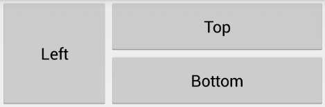
- A simple layout consisting of three buttons
This can be created in one of two ways. First, let's see how to do it using two LinearLayouts: a horizontal one to separate the left button from the others, and another nested LinearLayout to render the top and bottom buttons.
<!-- Don't do this (it's not efficient) -->
<LinearLayout xmlns:android="http://schemas.android.com/apk/res/android"
xmlns:tools="http://schemas.android.com/tools"
android:layout_width="match_parent"
android:layout_height="match_parent"
android:orientation="horizontal"
tools:context=".MainActivity" >
<Button
android:layout_width="0dp"
android:layout_height="120dp"
android:layout_weight="1"
android:text="Left" />
<LinearLayout
android:layout_width="0dp"
android:layout_height="120dp"
android:layout_weight="2"
android:orientation="vertical">
<Button
android:layout_width="match_parent"
android:layout_height="0dp"
android:layout_weight="1"
android:text="Top" />
<Button
android:layout_width="match_parent"
android:layout_height="0dp"
android:layout_weight="1"
android:text="Bottom" />
</LinearLayout>
</LinearLayout>
However, the fact that both LinearLayout elements contain widgets with a layout_weight property means that their dimensions need to be calculated twice. Needless to say, this is not an optimal layout.
The other (and preferred) method of creating this layout is with a single RelativeLayout. This has the advantage of flattening the view hierarchy into a single layer, avoiding the inefficiencies of the nested LinearLayouts shown above.
<!-- Do this instead (it's more efficient) -->
<RelativeLayout xmlns:android="http://schemas.android.com/apk/res/android"
xmlns:tools="http://schemas.android.com/tools"
android:layout_width="match_parent"
android:layout_height="match_parent"
tools:context=".MainActivity" >
<Button
android:id="@+id/leftButton"
android:layout_width="120dp"
android:layout_height="120dp"
android:text="Left" />
<Button
android:id="@+id/topButton"
android:layout_width="match_parent"
android:layout_height="60dp"
android:layout_toRightOf="@id/leftButton"
android:text="Top" />
<Button
android:layout_width="match_parent"
android:layout_height="60dp"
android:layout_toRightOf="@id/leftButton"
android:layout_below="@id/topButton"
android:text="Bottom" />
</RelativeLayout>
So, the general rule of thumb is to avoid nesting LinearLayouts whenever possible. This is particularly true for custom ListView/GridView items because the view gets inflated multiple times, thus any inefficiencies are multiplied as well. However, that’s not to say you should never use LinearLayouts. They are very easy to configure, and they are plenty efficient when not nested. This makes them appropriate for simpler layouts (e.g., a form made up of consecutive text fields).
For more information about creating efficient layouts, please visit Optimizing Your UI.
Summary
In this chapter, we explored the standard mechanisms of laying out an Android user interface. First, we discussed the basic attributes for defining the padding and margin of View elements. Then, we learned how to position elements using the built-in ViewGroup subclasses: LinearLayout, RelativeLayout, ListView, and GridView. These classes make it incredibly easy to organize UI widgets into complex layouts with minimal coding.
While it’s important to know how to position elements on the screen, that knowledge is useless if you don’t know what elements are available. The next chapter will flesh out your understanding of Android’s user interface framework by surveying the most common UI widgets.
- 1800+ high-performance UI components.
- Includes popular controls such as Grid, Chart, Scheduler, and more.
- 24x5 unlimited support by developers.