Default Color for all series is yellow for dark birghtness?
The charts i use either lineseries or columnseries, etc.... default to a yellow color when i have brightness set to dark. in exmaples online it shows a blue color. i can set the color for each one but i have a LOT of charts and i dont want to do that. is the default truely yellow?
ColumnSeries<dynamic, String>(
    enableTooltip: true,
    name: ' Qty        ',
    dataSource: dashboardChartData['FailurePareto']['Bar'],
    xValueMapper: (data, _) => data['Failure'],
    yValueMapper: (data, _) => data['Qty']),
Attachment: Capture_8e6ae2ea.zip
Hi Jesse,
To achieve all the series in yellow color when the brightness is dark, you can use the palette property in SfCartesianChart. Here you can provide a series color and it apply all the series in the chart. We have shared the UG documentation.
UG link : https://help.syncfusion.com/flutter/cartesian-charts/series-customization#color-palette
Also, we consider your requirement as a feature and we will log the feature request in our feedback portal. We will prioritize the features of every release based on demand and priority. So, this feature will be available in any of our upcoming releases. We will update this tomorrow along with FR.
Regards,
S. Thilip Chandru.
Sorry there must be a miscommunication. I don't want my chart to be yellow but it shows that way without me setting the color. If I leave it default without setting a color it shows up yellow not blue. I thought the default was blue which is much more readable.
Here is an example from your info page of a default chart showing blue.
Empty points
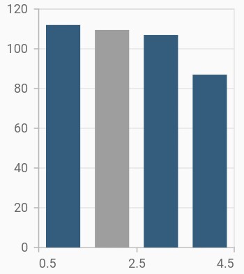
The data points that has null value are considered as empty points. Empty data points are ignored and not plotted in the chart. By using emptyPointSettings property in series, you can decide the action taken for empty points. Available modes are EmptyPointMode.gap, EmptyPointMode.zero, EmptyPointMode.drop and EmptyPointMode.average. Default mode of the empty point is EmptyPointMode.gap.
@override
    Widget build(BuildContext context) {

        final List<ChartData> chartData = [
            ChartData(1, 112),
            ChartData(2, null),
            ChartData(3, 107),
            ChartData(4, 87)
        ];

        return Scaffold(
            body: Center(
                child: Container(
                    child: SfCartesianChart(
                        series: <CartesianSeries>[
                            ColumnSeries<ChartData, double>(
                                dataSource: chartData,
                                xValueMapper: (ChartData data, _) => data.x,
                                yValueMapper: (ChartData data, _) => data.y,
                                emptyPointSettings: EmptyPointSettings(
                                    // Mode of empty point
                                    mode: EmptyPointMode.average
                                )
                            )
                        ]
                    )
                )
            )
        );
    }

    class ChartData {
        ChartData(this.x, this.y);
        final double x;
        final double? y;
      }
Hi Jesse,
We have validated the provided sample code, and your app theme is light theme, so chart series rendered with blue for light theme and yellow for dark theme from palette colors. However, you can customize the series colors based on themes using the palette property in chart. Refer the following code snippet.
|
final List<Color> darkThemePalette = [Colors.blue, Colors.cyan]; final List<Color> lightThemePalette = [Colors.yellow, Colors.orange]; @override Widget build(BuildContext context) { final bool isDarkTheme = Theme.of(context).brightness == Brightness.dark; final List<Color> palette = isDarkTheme ? darkThemePalette : lightThemePalette;
return Scaffold( body: Center( child: SizedBox( child: SfCartesianChart( palette: palette, series: <CartesianSeries>[ ColumnSeries<ChartData, double>( dataSource: chartData, xValueMapper: (ChartData data, _) => data.x, yValueMapper: (ChartData data, _) => data.y, emptyPointSettings: const EmptyPointSettings(mode: EmptyPointMode.average), ), ], ), ), ), ); |
Regards,
S Thilip Chandru.
The palette feature in the Chart is the solution to this color issue.
Hi Waston,
Thank you for your suggestion. Please get back to us if you have any queries.
Regards,
Maryline A.
- 5 Replies
- 4 Participants
-
JE Jesse
- Aug 30, 2024 03:33 PM UTC
- Jul 28, 2025 07:51 AM UTC
