- Home
- Forum
- React - EJ 2
- DataGrid, Inline editing with autocomplete that shows grid with results (interaction only with keyboard)
DataGrid, Inline editing with autocomplete that shows grid with results (interaction only with keyboard)
Hi there,
I'm prototyping an online invoice system and I'd like to build it using your React components.
The main part will be the grid, which will allow adding new products to orders.
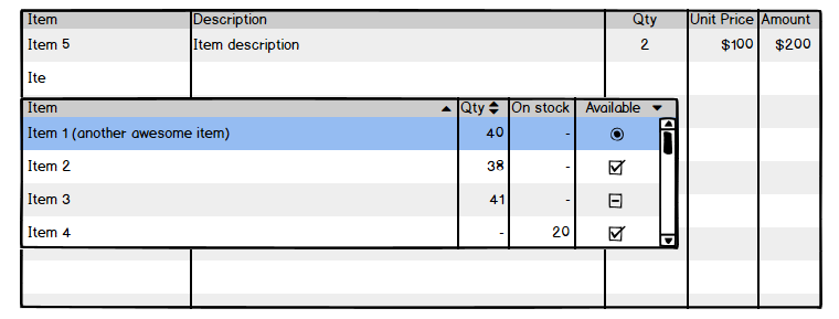
My idea is to display an empty grid with the cursor in the first column, after typing minimum 3 letters an autocomplete should show and display items that match specific criteria. Something like shown below:
When the user continues to type the search results should update, he can press up and down to navigate the results and when he press Enter that item should be added and the cursor should move to third column (Qty).
The idea is to allow filling the grid using only the keyboard.
My questions are:
Can we use the grid as an autocomplete template? If yes, then I'll be grateful for an example
Can we add items to the grid using only the keyboard? Currently, we must press on the "Add" button.
SIGN IN To post a reply.
3 Replies
1 reply marked as answer
RR
Rajapandi Ravi
Syncfusion Team
July 14, 2020 12:54 PM UTC
Hi Tomasz,
Thanks for contacting Syncfusion support.
Based on your query we found that you like to display the empty Grid at initial and like to add the records by using AutoComplete. You can bind the autoComplete component to the Grid forms by using cell editTemplate feature. The cell edit template is used to add a custom component for a particular column by invoking the following functions read, create, write and destroy.
In your query you have mentioned when you press the enter key while selecting the item the cursor(focus) should move to the third column. You can achieve this requirement by using the select event of the AutoComplete. Please refer the below code example for more information.
In this below sample, we have bind the AutoComplete component for the OrderID column only. You can add autoComplete component for other columns based on your requirement by using the below code. Please refer the below code example and sample, documentation for more information.
|
class App extends Component<AppProps, AppState> {
public elem : HTMLElement;
public flag: any = true;
public autodata: any;
public editOptions: EditSettingsModel = { allowAdding: true, allowDeleting: true, allowEditing: true };
public toolbarOptions: ToolbarItems[] = ['Add', 'Edit', 'Delete', 'Update', 'Cancel'];
public grid: Grid | null;
public datePickerObj: AutoComplete;
public datepickerTemp : IEditCell = {
create:()=>{
this.elem = document.createElement('input');
return this.elem;
},
destroy:()=>{
this.datePickerObj.destroy();
},
read:()=>{
return this.datePickerObj.value;
},
write:(args)=>{
this.flag = false;
var grid = (document.getElementsByClassName('e-grid')[0] as any).ej2_instances[0];
var autoDataSource = cascadeData;
var col = grid.getColumns();
var arr = [];
for(var sam of col) {
arr = arr.concat(DataUtil.distinct(autoDataSource, sam.field));
}
this.autodata = arr;
this.datePickerObj = new AutoComplete({
dataSource: this.autodata,
select: this.selectitem.bind(this)
});
this.datePickerObj.appendTo(this.elem);
}
};
selectitem(args) {
if(args.item.parentElement.id == "gridOrderID_options") {
(document.getElementsByClassName('e-field')[2] as any).focus(); //focus the third column
}
}
dataBound() {
var grid = (document.getElementsByClassName('e-grid')[0] as any).ej2_instances[0];
if (this.flag){
grid.addRecord();//render Grid with edit mode initially
}
}
actionComplete(args){
if (args.requestType == "save") {
var grid = (document.getElementsByClassName('e-grid')[0] as any).ej2_instances[0];
grid.addRecord(); //after saving a record here you can call again a addRecord method to make Grid is in edit mode
}
}
render() {
return (
<div className='control-pane'>
<div className='control-section'>
<GridComponent id='grid' dataSource={[]} actionComplete={this.actionComplete.bind(this)} dataBound={this.dataBound.bind(this)} editSettings={this.editOptions}
toolbar={this.toolbarOptions} height={273} ref={g => this.grid = g}>
<ColumnsDirective>
<ColumnDirective field='OrderID' edit={this.datepickerTemp} headerText='Order ID' width='120'
isPrimaryKey={true}textAlign='Right'></ColumnDirective>
<ColumnDirective field='CustomerID' headerText='Customer Name'
width='150'></ColumnDirective>
<ColumnDirective field='ShipCountry' headerText='Ship Country' width='150'></ColumnDirective>
</ColumnsDirective>
<Inject services={[Edit, Toolbar]} />
</GridComponent>
</div>
</div>
);
}
}
|
API: AutoComplete Select event: https://ej2.syncfusion.com/react/documentation/api/auto-complete/#select
Grid ActionComplete event: https://ej2.syncfusion.com/react/documentation/api/grid/#actioncomplete
DataBound event : https://ej2.syncfusion.com/react/documentation/api/grid/#databound
Regards,
Rajapandi R
Marked as answer
TJ
Tomasz Jagusz
July 14, 2020 01:35 PM UTC
Hi Rajapandi,

thank you for your reply and for the sample.
It is a good start! :)
but the main requirement was to display grid as autocomplete template, similar to WPF Multi Column dropdown - https://help.syncfusion.com/wpf/multi-column-dropdown/editing-and-autocomplete
take a look at recorded demo:
this works almost perfectly. When I click enter while selecting an item from auto-complete I get moved to the third column when I click enter on the keyboard, the new item should get added and the focus should be in first column (to allow adding new item). Also clicking outside creates unwanted rows.
But the main requirement is to display grid as autocomplete template.
RR
Rajapandi Ravi
Syncfusion Team
July 15, 2020 01:29 PM UTC
Hi Tomasz,
Based on your query we found that you like to focus the first column after added a record in a Grid and you have mentioned when clicking outside it creates unwanted rows. By default when the Grid is in Edit state when you click outside of the row in Grid it saves as empty records or if you have a any value in the forms its saves with that value.
We can prevent that saving action when clicking outside of the row using mousedown event. In this we also found that you like to save the records only pressing the Enter key. We have handled this query by using keydown event. Based on the mousedown and keydown event we have handled the saving action in the Grid. Please refer the below code example and sample for more information.
|
class App extends Component<AppProps, AppState> {
public elem : HTMLElement;
public flag: any = true;
public autodata: any;
public editOptions: EditSettingsModel = { allowAdding: true, allowDeleting: true, allowEditing: true };
public toolbarOptions: ToolbarItems[] = ['Add', 'Edit', 'Delete', 'Update', 'Cancel'];
public grid: Grid | null;
public mousedown: any = false;
public datePickerObj: AutoComplete;
public datepickerTemp : IEditCell = {
create:()=>{
this.elem = document.createElement('input');
return this.elem;
},
destroy:()=>{
this.datePickerObj.destroy();
},
read:()=>{
return this.datePickerObj.value;
},
write:(args)=>{
this.flag = false;
var grid = (document.getElementsByClassName('e-grid')[0] as any).ej2_instances[0];
var autoDataSource = cascadeData;
var col = grid.getColumns();
var arr = [];
for(var sam of col) {
arr = arr.concat(DataUtil.distinct(autoDataSource, sam.field));
}
this.autodata = arr;
this.datePickerObj = new AutoComplete({
dataSource: this.autodata,
select: this.selectitem.bind(this)
});
this.datePickerObj.appendTo(this.elem);
}
};
selectitem(args) {
if(args.item.parentElement.id == "gridOrderID_options") {
(document.getElementsByClassName('e-field')[2] as any).focus();
}
}
dataBound() {
var grid = (document.getElementsByClassName('e-grid')[0] as any).ej2_instances[0];
if (this.flag){
grid.addRecord();
}
}
actionComplete(args){
if (args.requestType == "add") {
setTimeout(function(){
(document.getElementsByClassName('e-field')[0] as any).focus(); //focus the first column
});
}
if (args.requestType == "save") {
var grid = (document.getElementsByClassName('e-grid')[0] as any).ej2_instances[0];
grid.addRecord();
}
}
load(){
var grid = (document.getElementsByClassName('e-grid')[0] as any).ej2_instances[0];
grid.element.addEventListener('mousedown', function (e) {
this.mousedown = false;
}.bind(this))
grid.element.addEventListener('keydown', function (e) {
if(e.key == "Enter"){
this.mousedown = true;
}
}.bind(this))
}
begin(args) {
if (args.requestType == "save" && !this.mousedown) {
args.cancel = true; //it helps to prevent the saving when you click outside of the row in the Grid
}
}
render() {
return (
<div className='control-pane'>
<div className='control-section'>
<GridComponent id='grid' dataSource={[]} actionBegin={this.begin.bind(this)} load={this.load.bind(this)} actionComplete={this.actionComplete.bind(this)} dataBound={this.dataBound.bind(this)} editSettings={this.editOptions}
toolbar={this.toolbarOptions} height={273} ref={g => this.grid = g}>
<ColumnsDirective>
<ColumnDirective field='OrderID' edit={this.datepickerTemp} headerText='Order ID' width='120'
isPrimaryKey={true}textAlign='Right'></ColumnDirective>
<ColumnDirective field='CustomerID' headerText='Customer Name'
width='150'></ColumnDirective>
<ColumnDirective field='ShipCountry' headerText='Ship Country' width='150'></ColumnDirective>
</ColumnsDirective>
<Inject services={[Edit, Toolbar]} />
</GridComponent>
</div>
</div>
);
}
}
|
Regards,
Rajapandi R
SIGN IN To post a reply.
- 3 Replies
- 2 Participants
- Marked answer
-
TJ Tomasz Jagusz
- Jul 13, 2020 01:57 PM UTC
- Jul 15, 2020 01:29 PM UTC
