- Home
- Forum
- Xamarin.Forms
- Height and colors of SfSegmentedControl
Height and colors of SfSegmentedControl
For the SfSegmentedControl on Xamarin.Forms, what is the property for the background of the currently selected segment? The Customization page does not mention it.
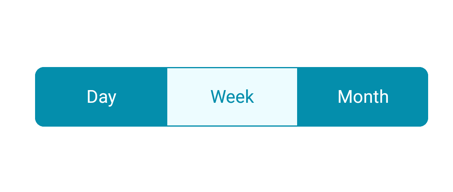


Also, in the documentation sometimes the control is shown very tall, like this:
And sometimes it's shown very short, like this:
Mine is being shown very tall and I can't figure out how to change that. I'm trying to port an application from native iOS to Xamarin forms and I'm not able to recreate this:
SIGN IN To post a reply.
7 Replies
SJ
Suyamburaja Jayakumar
Syncfusion Team
April 5, 2020 10:49 AM UTC
Hi Brad Dean,
Greetings from Syncfusion.
We have analyzed your query we would like to let you know that your requirement has been achieved by using SfSegmentedControl HeightRequest property and the background color of the selection strip can be customized using the Color property of SelectionIndicatorSettings. Please refer the below code snippet,
XAML:
|
<buttons:SelectionIndicatorSettings
Color="Red">
</buttons:SelectionIndicatorSettings>
</buttons:SfSegmentedControl.SelectionIndicatorSettings> |
More information please refer the below UG link.
Please let us know if you need any further assistance.
Regards,
Suyamburaja J.
BD
Brad Dean
April 5, 2020 03:43 PM UTC
For the color, that worked perfectly, thank you. For the height, I'm still struggling.


With a HeightRequest of 40 I get this:
With a HeightRequest of 10 I get this:
It doesn't change size, it just seems to mess up the margins.
My XAML is this:
<code>
<buttons:SfSegmentedControl
HeightRequest="40" CornerRadius="20"
HorizontalOptions="StartAndExpand"
VisibleSegmentsCount="2"
BorderColor="{DynamicResource TextColor}"
SelectionTextColor="{DynamicResource TextColor}"
Color="{DynamicResource BackgroundColor}" FontColor="{DynamicResource TextColor}"
ItemsSource="{Binding FilterSegmentNames}"
SelectedIndex="{Binding FilterSegmentSelectedIndex}">
<buttons:SfSegmentedControl.SelectionIndicatorSettings>
<buttons:SelectionIndicatorSettings Color="{DynamicResource GridBackgroundColor}" />
</buttons:SfSegmentedControl.SelectionIndicatorSettings>
</buttons:SfSegmentedControl>
</code>
BD
Brad Dean
April 5, 2020 03:48 PM UTC
Oh, duh. I don't know how I missed this. There is a SegmentHeight property.
Okay, all good now!
SJ
Suyamburaja Jayakumar
Syncfusion Team
April 6, 2020 05:21 AM UTC
Hi Brad Dean,
We are glad to hear that your requirement has been achieved.
Please let us know if you need any further assistance on this.
Regards,
Suyamburaja J.
EA
Enrique Alejandro Pinelo Novelo
May 11, 2021 06:42 PM UTC
Thankas Man I missed it too.
It should be great that you expand your documentation in Customization section to show how to change height in this control.
Its easy to miss that property.
SP
Sakthivel Palaniyappan
Syncfusion Team
May 12, 2021 11:03 AM UTC
Hi Enrique,
Greetings from Syncfusion.
We have analyzed your query and we can achieve your requirement by using SegmentHeight
property of SfSegmentedControl as like below code snippet.
XAML:
|
<buttons:SfSegmentedControl ItemsSource="{Binding
Segments}" SegmentHeight="200" SelectedIndex="{Binding SelectedSegmentIndex}"> </buttons:SfSegmentedControl> |
We will add documentation about SegmentHeight and publish the document on
or before end of this month.
Please let us know if you have any other queries.
Regards,
Sakthivel P.
JK
Jeya Kasipandi
Syncfusion Team
June 1, 2021 02:32 PM UTC
Hi Enrique,
We have included the SegmentHeight in the help documentation and it has not yet been published in live and we will let you know once it has been published in live. We appreciate your patience until then.
We have included the SegmentHeight in the help documentation and it has not yet been published in live and we will let you know once it has been published in live. We appreciate your patience until then.
Regards,
Jeya K
SIGN IN To post a reply.
- 7 Replies
- 5 Participants
-
BD Brad Dean
- Apr 2, 2020 08:54 PM UTC
- Jun 1, 2021 02:32 PM UTC
