- Home
- Forum
- ASP.NET MVC - EJ 2
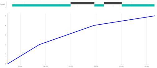
- Chart showing status in time
Chart showing status in time
Hello,
It is possible to
make combination of charts as shown in attached image? The X axis is „ValueType.DateTime“
Chart area is splited to two rows:
Top chart is transposed „ChartSeriesType.RangeColumn“
Bottom is classic line chart.
Example of my
data classes:
Public Class LineChartData
Public xValue As DateTime
Public yValue As Double
Public yValue1 As Double
End Class
Public Class InversedRangeColumnData
Public x As String
Public low As DateTime
Public high As DateTime
End Class

Attachment: chart_sample_image_5130ab7.zip
SIGN IN To post a reply.
5 Replies
KC
Kalaimathi Chellaiah
Syncfusion Team
September 26, 2019 11:11 AM UTC
Hi Libor,
Greetings from Syncfusion.
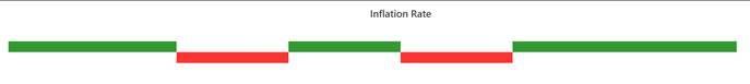
We have analyzed your query. From that we would like to let you know that your requirement is not possible in single chart. Because, when we use isTransposed it will apply for whole chart and it is not applicable for specific rows in the chart. So we suggest to use two charts to achieve your requirement. This is only possible way to achieve your requirement. We have prepared a sample based on attached image using two charts for your reference. Please find below sample and screenshots,
Screenshot:
Also, here we have attached MVC demo links for your reference,
Kindly revert us, if you have any concerns.
Regards,
Kalai.
LI
Libor
October 3, 2019 08:42 AM UTC
Thank you,
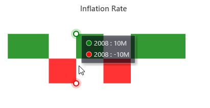
I have an idea that the required charts in one object could be possible if the top part is made as area chart with empty points. Specificaly two series, one series with value 10, the second series value -10. Well the data must be modified to get empty points in the right place.
I would like to ask you if this is the good way. You do not need to make a demo.
Regards,
Libor
KC
Kalaimathi Chellaiah
Syncfusion Team
October 4, 2019 11:26 AM UTC
Hi Libor,
Thanks for the update. Yes, using area series instead of rangeColumn is a good way to achieve your requirement. We have tested this case with a simple sample. In that, the status time bar is working properly as you expect. Please check the below sample,
Screenshot:
Let me know, if you need further assistance.
Regards,
Kalai.
SS
Sarasilmiya Shahul Hameed
Syncfusion Team
October 16, 2019 08:57 AM UTC
From: Libor Dopita
Subject: RE: Syncfusion support community forum 147805, Chart showing status in time, has been updated.
Hello,
The chart itself is good but the problem is that tooltip is shown only for points of the area, so in very top left corner. It means tooltip is not showing for 99% of surface of the object.
Best regards,
Libor Dopita
SM
Srihari Muthukaruppan
Syncfusion Team
October 18, 2019 12:23 PM UTC
Hi Libor,
We have analyzed your query. From that, we suggest you to set “shared” property in tooltip to be true to achieve your requirement. By default, tooltip only showed when hovering the point but on the area. Based on that we have a sample for reference. Please find the sample and code snippet below.
Code Snippet:
|
tooltip: {enable: true, shared: true}
|
Screenshot:
If this doesn’t meet your requirement, please revert us on further information about your requirement.
Regards,
Srihari M
SIGN IN To post a reply.
- 5 Replies
- 4 Participants
-
LI Libor
- Sep 24, 2019 04:19 PM UTC
- Oct 18, 2019 12:23 PM UTC
