|
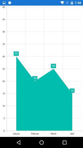
<chart:SfChart.PrimaryAxis>
<chart:CategoryAxis PlotOffset="10">
</chart:CategoryAxis>
</chart:SfChart.PrimaryAxis> |
|
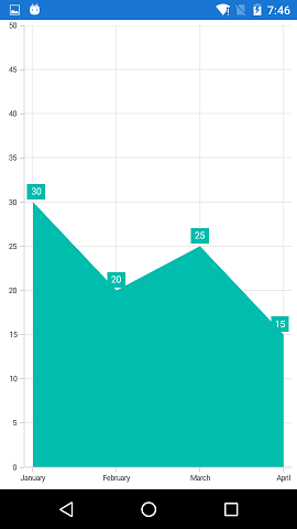
<chart:SfChart.PrimaryAxis>
<chart:CategoryAxis LabelPlacement="BetweenTicks" >
</chart:CategoryAxis>
</chart:SfChart.PrimaryAxis> |