- Home
- Forum
- ASP.NET Core - EJ 2
- How to change line chart style for last segment
How to change line chart style for last segment
I'm plotting some data in a line chart. The last bit of data is an estimate so I want that part of the line graph to be a dotted line instead of the solid line and a different color. The data is something like this:
day: Monday
temperature: 10,
isEstimate: false
day: Tuesday
temperature: 20,
isEstimate: false
day: Wednesday
temperature: 30,
isEstimate: true
SIGN IN To post a reply.
3 Replies
BV
Bhuvanesh Valarman
Syncfusion Team
September 19, 2019 12:09 PM UTC
Hi Scott,
Greetings from Syncfusion.
We have analyzed your query. From that we have prepared sample to customize the point segments with different color and dotted line.
In that sample we have customized the last segment by using series type as ‘MultiColoredLine’ and ‘pointColorMapping’, which is used to customize the line series with multiple color from dataSource field.
Also we have used CSS selector to apply dotted line style for the last segment.
For more details please refer the UG documentation and demo sample.
Please find the code snippet and sample below.
Code Snippet:
[Index.cshtml]
|
<ejs-chart id="container">
<e-chart-primaryxaxis valueType="Category"></e-chart-primaryxaxis>
<e-series-collection>
<e-series dataSource="ViewBag.DataSource" xName="Day" yName="Temperature" type="MultiColoredLine" pointColorMapping="Color" width="2"></e-series>
</e-series-collection>
</ejs-chart>
<style>
#container_Series_0_Point_3 {
stroke-dasharray: 5;
}
</style> |
[HomeController.cs]
|
...
public IActionResult Index()
{
List<ChartData> ChartLineData = new List<ChartData>();
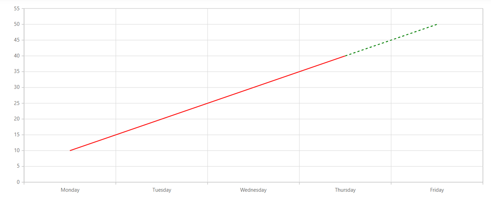
ChartLineData.Add(new ChartData("Monday", 10, false));
ChartLineData.Add(new ChartData("Tuesday", 20, false));
ChartLineData.Add(new ChartData("Wednesday", 30, false));
ChartLineData.Add(new ChartData("Thursday", 40, true));
ChartLineData.Add(new ChartData("Friday", 50, false));
ViewBag.DataSource = ChartLineData;
return View();
}
...
public class ChartData
{
public string Day { get; set; }
public string Color { get; set; }
public int Temperature { get; set; }
public bool IsEstimate { get; set; }
public ChartData(string Day, int Temperature, bool IsEstimate)
{
this.Day = Day;
this.Temperature = Temperature;
this.IsEstimate = IsEstimate;
this.Color = IsEstimate ? "Green" : "Red";
}
} |
Screenshot:
 |
Sample: https://www.syncfusion.com/downloads/support/directtrac/general/ze/LineChartMultiColor-191673018.zip
Kindly revert us, if you have any concern about this.
Regards,
Bhuvanesh V.
SH
Scott Hancock
September 19, 2019 05:44 PM UTC
I've tried this but the line is still just one color. Looking at the html produced by my code, it looks like the line is just one path tag. Why am I not getting multiple paths for each bit of data? Here is my view code:
@using Syncfusion.EJ2;
@{
ViewData["Title"] = "Contact";
}
<h2>@ViewData["Title"]</h2>
<h3>@ViewData["Message"]</h3>
@{var x = "hello";}
<ejs-chart id="container" chartMouseClick="onchartclick" selectionMode="Cluster">
<e-chart-primaryxaxis valueType="Category"></e-chart-primaryxaxis>
<e-chart-primaryyaxis name="powerAxis" title="@x KiloWatt Hours" minimum="500" maximum="4000" interval="500"></e-chart-primaryyaxis>
<e-chart-axes>
<e-chart-axis rowIndex="0" name="tempAxis" opposedPosition="true" title="Temperature °F"></e-chart-axis>
</e-chart-axes>
<e-series-collection>
<e-series dataSource="ViewBag.dataSource" name="Power Usage" selectionStyle="series" xName="month" width="2" opacity="1" yName="powerUsage" yAxisName="powerAxis" type="@Syncfusion.EJ2.Charts.ChartSeriesType.StackingColumn">
<e-series-animation enable="false"></e-series-animation>
</e-series>
<e-series dataSource="ViewBag.dataSource" name="Power Usage 2" xName="month" width="2" opacity="1" yName="powerUsage2" yAxisName="powerAxis" type="@Syncfusion.EJ2.Charts.ChartSeriesType.StackingColumn">
<e-series-animation enable="false"></e-series-animation>
</e-series>
<e-series dataSource="ViewBag.dataSource" name="High Temp" xName="month" pointColorMapping="color" width="2" opacity="1" yName="highTemp" yAxisName="tempAxis" type="@Syncfusion.EJ2.Charts.ChartSeriesType.Line">
<e-series-animation enable="false"></e-series-animation>
<e-series-marker visible="true" shape="Circle" width="10" height="10">
<e-series-datalabel visible="true" template="#template"></e-series-datalabel>
</e-series-marker>
<e-series-animation enable="false"></e-series-animation>
</e-series>
<e-series id="lowTemp" dataSource="ViewBag.dataSource" name="Low Temp" xName="month" width="2" opacity="1" yName="lowTemp" yAxisName="tempAxis" type="@Syncfusion.EJ2.Charts.ChartSeriesType.MultiColoredLine" pointColorMapping="color">
<e-series-marker visible="true" shape="Circle" width="10" height="10">
<e-series-datalabel visible="true" position="Top" template="#template"></e-series-datalabel>
</e-series-marker>
<e-series-animation enable="false"></e-series-animation>
</e-series>
</e-series-collection>
</ejs-chart>
<script id="template" type="text/html">
<div>${point.y} °F</div>
</script>
<button id="btnHigh">High</button>
<button id="btnLow">Low</button>
<script type="text/javascript">
function onchartclick(sender) {
// Get the chart instance
var chart = document.getElementById('container').ej2_instances[0];
// Check if they clicked on the stacked chart
if (event.target.id.indexOf('Point_') > -1) {
var id = event.target.id;
// Find point and series index. Point is the column. Series is the parts of the stacked chart (counting from 0 at the bottom).
var indexes = (id.replace("container", '')).replace('_Series_', '').replace('_Point', '').split("_");
// Gets the X value of the chart.
alert(chart.series[0].points[parseInt(indexes[1])].x);
}
}
</script>
<script>
document.getElementById("btnHigh").onclick = function () {
var chart = document.getElementById("container").ej2_instances[0];
chart.series[2].visible = !chart.series[2].visible;
chart.refresh();
};
document.getElementById("btnLow").onclick = function () {
var chart = document.getElementById("container").ej2_instances[0];
chart.series[3].visible = !chart.series[3].visible;
chart.refresh();
}
</script>
<style>
#container_Series_3_Point_2 {
stroke-dasharray: 5;
}
</style>
BV
Bhuvanesh Valarman
Syncfusion Team
September 20, 2019 01:11 PM UTC
Hi Scott,
Thanks for the update.
We have analyzed your provided sample code snippet. From that we suspect below scenario not satisfied in your case.
In order to customize the last segment need provide color for last point’s previous point.
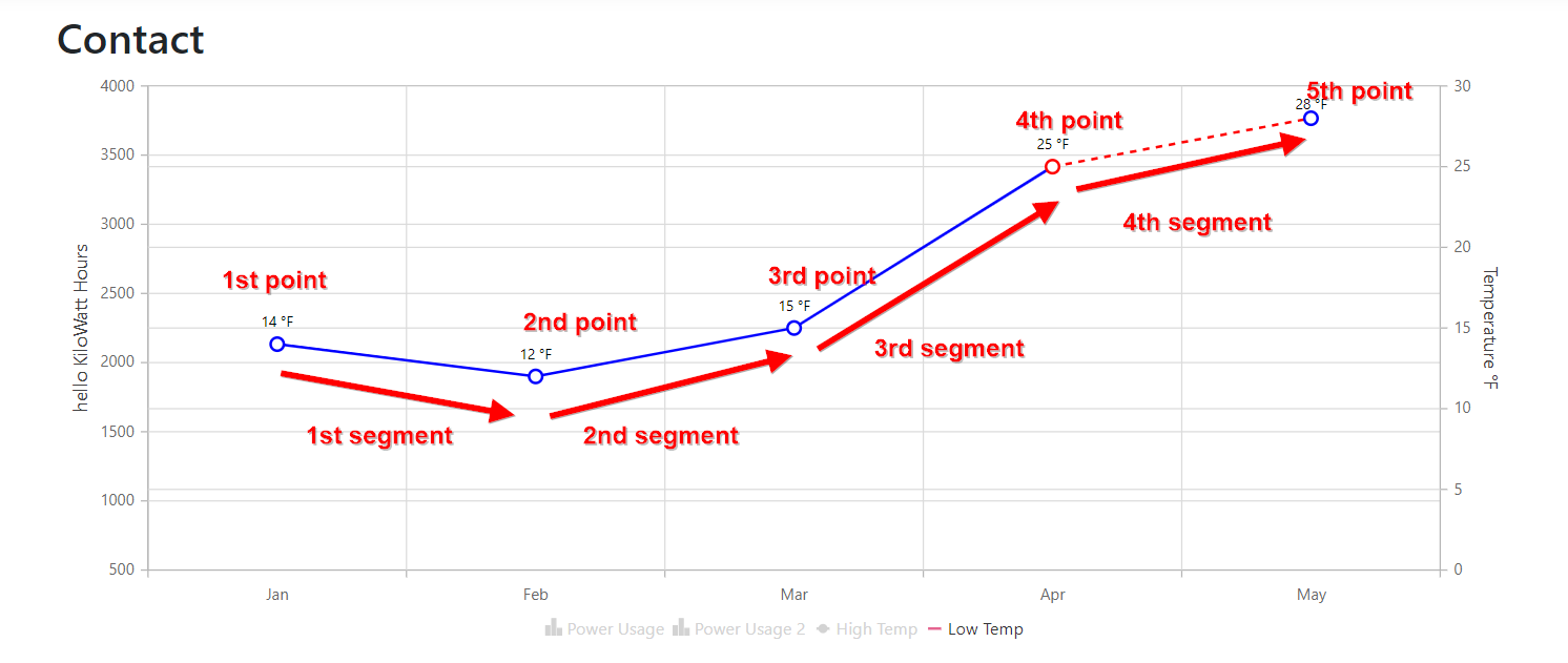
If you have n number of points there will be only n-1 number of segments will render for line charts. Please refer below screenshot, in that we have 5 points but we get only 4 segments.
So if we provide color for 4th point we will get colored last segment. We have attached the sample below, which used for testing.
Screenshot:
 |
Code Snippet:
[HomeController.cs]
|
.......
public IActionResult Index()
{
List<ChartData> ChartLineData = new List<ChartData>();
ChartLineData.Add(new ChartData("Jan", 1000, 2000, 6, 14, false));
ChartLineData.Add(new ChartData("Feb", 2000, 1500, 22, 12, false));
ChartLineData.Add(new ChartData("Mar", 2200, 1000, 36, 15, false));
ChartLineData.Add(new ChartData("Apr", 1500, 500, 46, 25, true));
ChartLineData.Add(new ChartData("May", 2500, 1000, 56, 28, false));
ViewBag.dataSource = ChartLineData;
return View();
}
......
public class ChartData
{
public string month { get; set; }
public string color { get; set; }
public int powerUsage { get; set; }
public int powerUsage2 { get; set; }
public int highTemp { get; set; }
public int lowTemp { get; set; }
public bool IsEstimate { get; set; }
public ChartData(string month, int powerUsage, int powerUsage2, int highTemp, int lowTemp, bool IsEstimate)
{
this.month = month;
this.powerUsage = powerUsage;
this.powerUsage2 = powerUsage2;
this.highTemp = highTemp;
this.lowTemp = lowTemp;
this.IsEstimate = IsEstimate;
this.color = IsEstimate ? "Red" : "Blue";
}
}
........ |
Sample: https://www.syncfusion.com/downloads/support/directtrac/general/ze/LineChartMultiColor1541232487.zip
Kindly revert us with your sample data, if this is not your requirement.
Regards,
Bhuvanesh V.
SIGN IN To post a reply.
- 3 Replies
- 2 Participants
-
SH Scott Hancock
- Sep 18, 2019 07:25 PM UTC
- Sep 20, 2019 01:11 PM UTC
