How to change style of PushButton to metro style,set backcolor of PushButton ( or custom PushButton )
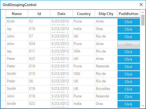
Hi everyone , I have a gridgroupingcontrol like this. How can i set style of PushButton to metro, set backcolor of PushButton
Thank you for helping me.
Thank you for helping me.
Best Regard.

SIGN IN To post a reply.
11 Replies
MG
Mohanraj Gunasekaran
Syncfusion Team
July 20, 2018 11:26 AM UTC
Hi Truong,
Thanks for using Syncfusion product.
|
Query |
Solution |
|
How can i set style of PushButton to metro, set backcolor of PushButton |
In order to change the background color of PushButton, you can use the GridMetroColors in SetMetroStyle method. Please refer to the below code example,
Code example
GridMetroColors colors = new GridMetroColors();
colors.PushButtonColor.NormalBackColor = Color.FromArgb(22,165,220);
colors.PushButtonColor.HoverBackColor = Color.FromArgb(26, 198, 255);
colors.PushButtonColor.PushedBackColor = Color.FromArgb(120, 191, 217);
this.gridGroupingControl1.SetMetroStyle(colors);
|
|
Change style of pushbutton(TextColor, FontStyle,etc) |
Suggestion1
In order to change the style of push button, you can use the GridTableCellAppearance.AnyRecordFieldCell property. Please refer to the below code example,
Code example
this.gridGroupingControl1.TableDescriptor.Columns["ColumnName"].Appearance.AnyRecordFieldCell.TextColor = Color.White;
this.gridGroupingControl1.TableDescriptor.Columns["ColumnName"].Appearance.AnyRecordFieldCell.HorizontalAlignment = GridHorizontalAlignment.Center;
this.gridGroupingControl1.TableDescriptor.Columns["ColumnName"].Appearance.AnyRecordFieldCell.VerticalAlignment = GridVerticalAlignment.Middle;
Suggestion2
You can also use the QueryCellStyleInfo event to change the style of PushButton column. Please refer to the below code example,
Code example
this.gridGroupingControl1.QueryCellStyleInfo += GridGroupingControl1_QueryCellStyleInfo;
private void GridGroupingControl1_QueryCellStyleInfo(object sender, GridTableCellStyleInfoEventArgs e)
{
if (e.TableCellIdentity == null || e.TableCellIdentity.Column == null)
return;
if(e.TableCellIdentity.Column.Name == " ColumnName")
{
e.Style.Description = "Click";
e.Style.TextColor = Color.White;
e.Style.HorizontalAlignment = GridHorizontalAlignment.Center;
e.Style.VerticalAlignment = GridVerticalAlignment.Middle;
}
} |
Screenshot

Sample link: GridGroupingControl
Regards,
Mohanraj G
TR
Truong
July 23, 2018 01:15 AM UTC
Hi Mohanraj Gunasekaran.
It is so great ! Thank you for your helping.
Best Regard.
Best Regard.
AR
Arulpriya Ramalingam
Syncfusion Team
July 23, 2018 09:08 AM UTC
Hi Truong,
Thanks for the update.
We are glad that the provided solution resolved your scenario at your end. Please, let us know if you have any other queries.
Regards,
Arulpriya
TR
Truong
July 26, 2018 09:53 AM UTC
Hi everyone
In this case how can i disable pushButton of a row.
Thank you for helping me.
Best Regard.
Truong
MG
Mohanraj Gunasekaran
Syncfusion Team
July 27, 2018 07:32 AM UTC
Hi Truong,
Thanks for your update.
To disable the push button cell in specific cases, you could use the Style.Enabled property in QueryCellStyleInfo event. Please refer to the below code example:
Code example
|
this.gridGroupingControl1.QueryCellStyleInfo += GridGroupingControl1_QueryCellStyleInfo;
private void GridGroupingControl1_QueryCellStyleInfo(object sender, GridTableCellStyleInfoEventArgs e)
{
if (e.TableCellIdentity == null || e.TableCellIdentity.Column == null)
return;
if(e.TableCellIdentity.Column.Name == "PushButton")
{
if (e.TableCellIdentity.RowIndex == 5)
e.Style.Enabled = false;
e.Style.Description = "Click";
}
} |
Screenshot

Sample link: GridGroupingControl
Regards,
Mohanraj G
TR
Truong
October 9, 2018 02:48 AM UTC
Hi Mohanraj Gunasekaran.
Best Regard.
It is so great ! Thank you for your helping.In this screenshot blow, the style of disable button which does not have metro style anymore ? How to set metro style to disable button.
Screenshot
Best Regard.
AA
Arulraj A
Syncfusion Team
October 9, 2018 06:58 AM UTC
Hi Truong,
Thanks for your update.
To make the pushbutton disabled appearance like a Metro disabled appearance, you could manually draw the button by handling the DrawCellButton event. Please refer the following code example and the sample,
Code example
|
this.gridGroupingControl1.TableControl.DrawCellButton += TableControl_DrawCellButton;
private void TableControl_DrawCellButton(object sender, GridDrawCellButtonEventArgs e)
{
if (this.gridGroupingControl1.GridVisualStyles == GridVisualStyles.Metro && !e.Style.Enabled && e.Style.CellType.Equals(GridCellTypeName.PushButton))
{
Rectangle rect = e.Button.Bounds;
Rectangle faceRect = Rectangle.FromLTRB(rect.Left + 1, rect.Top + 1, rect.Right - 2, rect.Bottom - 2);
StringFormat format = new StringFormat();
format.Alignment = GridUtil.ConvertToStringAlignment(e.Style.HorizontalAlignment);
format.LineAlignment = GridUtil.ConvertToStringAlignment(e.Style.VerticalAlignment);
format.HotkeyPrefix = e.Style.HotkeyPrefix;
format.Trimming = e.Style.Trimming;
if (!e.Style.WrapText)
{
format.FormatFlags = StringFormatFlags.NoWrap;
}
//To draw the disabled back color
e.Graphics.FillRectangle(new SolidBrush(ColorTranslator.FromHtml("#d5d5d5")), rect);
//To draw the text with disabled forecolor
e.Graphics.DrawString(e.Style.Description, e.Style.GdipFont, new SolidBrush(ColorTranslator.FromHtml("#9e9e9e")), faceRect, format);
e.Cancel = true;
}
} |
Arulraj A
QU
QLT User
October 26, 2018 09:09 PM UTC
i have 2 push buttons in my gridgroupingcontrol which is not metro color. how do i change the color of one push button based on the column name and the state of the cell value ?
how do i get the column name and the cell value so i can color based on those values ?
AA
Arulraj A
Syncfusion Team
October 29, 2018 04:50 AM UTC
Hi QLT User,
Thanks for your update.
To get the column named and cell value in DrawCellButton event, you could use the TableCellIdentity.Column and CellValue property. Please refer the following code example,
Code example C#
|
private void TableControl_DrawCellButton(object sender, GridDrawCellButtonEventArgs e)
{
if (this.gridGroupingControl1.GridVisualStyles == GridVisualStyles.Metro && e.Style.CellType.Equals(GridCellTypeName.PushButton))
{
GridTableCellStyleInfo style = e.Style as GridTableCellStyleInfo;
if (style != null && style.TableCellIdentity.Column != null && style.TableCellIdentity.Column.Name == "PushButton")
{
var value = style.CellValue;
}
//Your customization
e.Cancel = true;
}
} |
Arulraj A
QU
QLT User
January 29, 2019 05:27 PM UTC
i seem to get an error when i use this
String mappingName = ((Syncfusion.Windows.Forms.Grid.Grouping.GridTableCellStyleInfoIdentity)e.Style.Identity).Column.FieldDescriptor.MappingName;
should i be using Name instead of mappingname ?
i had to hack it with this code
if (e.Style.Description == "+" || e.Style.Description == "-") return;
var style = e.Style as GridTableCellStyleInfo;
String mappingName = string.Empty;
if (style != null && style.TableCellIdentity != null && style.TableCellIdentity.Column != null)
{
mappingName = style.TableCellIdentity.Column.MappingName;
}
var style = e.Style as GridTableCellStyleInfo;
String mappingName = string.Empty;
if (style != null && style.TableCellIdentity != null && style.TableCellIdentity.Column != null)
{
mappingName = style.TableCellIdentity.Column.MappingName;
}
JP
Jagadeesan Pichaimuthu
Syncfusion Team
January 30, 2019 10:06 AM UTC
Hi QLT User,
Thanks for your update.
If you use this code part in CellDrawn or QueryCellStyleInfo, (etc), the event will be triggered for every cells so TableCellIdentiy/Column getting null for caption element. So, you could implement the null check in that event as you shared.
We are glad to know that your reported problem has resolved at your end.
Please get back us if you need any further assistance on this.
Regards,
Jagadeesan
SIGN IN To post a reply.
- 11 Replies
- 6 Participants
-
TR Truong
- Jul 20, 2018 03:33 AM UTC
- Jan 30, 2019 10:06 AM UTC
