- Home
- Forum
- Xamarin.Forms
- ChartType selection help
ChartType selection help
Hi,

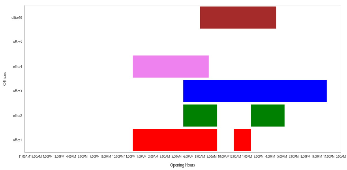
I'd like to visualize opening hours of some offices, but I'm not sure which chart is the best one. Look at the picture bellow. Do you have any suitable chart for this?
SIGN IN To post a reply.
5 Replies
DD
Dharanidharan Dharmasivam
Syncfusion Team
July 13, 2016 10:36 AM UTC
Hi Lukas,
Thanks for contacting Syncfusion support. We have analyzed your query, Currently we don’t have support for gantt chart in ejChart, so we have created a feature request for your requirement. And also a support incident to track the status of this defect has been created under your account.
We have created work around sample in which we have used range column series type and transposed the series. Here for opening and closing time of office, we have given data in date time format, currently we don’t have datetime support for yaxis, so we have converted date time values to double in the load event. By using the axisLabelRendering event, we have rendered labels in date time format. Please find the code snippet below.
Code snippet:
| JS: function load(sender) { for (i = 0; i < sender.model.series[0].points.length; i++) { sender.model.series[0].points[i].high = Date.parse(sender.model.series[0].points[i].high); sender.model.series[0].points[i].low = Date.parse(sender.model.series[0].points[i].low); } } function label(sender) { if (sender.data.axis.orientation == "horizontal") { var date = new Date(sender.data.label.Text); date = date.getHours(); if (date <= 12) sender.data.label.Text = date + ":00AM"; else { date = ((date + 11) % 12 + 1); sender.data.label.Text = date + ":00PM" } } } |
Screenshot:
For your reference, kindly find the sample in below link,
Thanks,
Dharani.
LK
Lukas Kubis
July 14, 2016 10:19 AM UTC
Hi Dharani,
thank you for your work around sample, it helped me a lot.
Best Regards
Lukas
DD
Dharanidharan Dharmasivam
Syncfusion Team
July 18, 2016 09:04 AM UTC
Hi Lukas,
Thanks for your update, please let us know if you require any further assistance on this.
Thanks & Regards,
D.Dharani.
MD
Márcio de Souza Júnior
January 8, 2021 12:33 PM UTC
Hi! How can I achieve this using Xamarin Forms? I've tried following your example but the data is ploting in another month.

YP
Yuvaraj Palanisamy
Syncfusion Team
January 11, 2021 12:14 PM UTC
Hi Márcio de Souza Júnior,
We have analyzed your query and we have achieved your requirement “The segment should be stacked when we have same datetime of XAxis” by using DateTimeAxis instead of using CategoryAxis. Please find the Code snippet below.
CodeSnippet:[Xaml]
|
<chart:SfChart.PrimaryAxis>
<chart:DateTimeAxis Interval="1"
IntervalType="Months">
<chart:DateTimeAxis.LabelStyle>
<chart:ChartAxisLabelStyle LabelFormat="MMM"/>
</chart:DateTimeAxis.LabelStyle>
</chart:DateTimeAxis>
</chart:SfChart.PrimaryAxis>
|
Also, we have attached the sample for your reference, please find the sample from the below link.’’
Output:

Regards,
Yuvaraj.
SIGN IN To post a reply.
- 5 Replies
- 4 Participants
-
LK Lukas Kubis
- Jul 12, 2016 04:42 PM UTC
- Jan 11, 2021 12:14 PM UTC
