Chart Alignment
Thanks
Attachment: chart_9fb9f727.zip
Hi Josh,
Thanks for using Syncfusion product.
We have analyzed this. Placement of the axis labels on the ticks or between the ticks is possible only when the labels are of type category (string labels). This is not supported for date time/ numeric labels.
And in addition, If your data contains points at regular intervals, we suggest you to use “Category” as the “ValueType” for x axis.
Date time axis will be rendered such that axis range will be calculated based on minimum and maximum values of data points. The number of intervals in axis will be calculated based on range and axis size. Labels will be created for the intervals in specified format rather than data points. Refer Datetime Axis for more information about date time axis in Chart.
Category axis will display labels only for the points plotted in chart. Points will be plotted in the order they were added in series irrespective of their x value and also axis labels represents the x value of the point. The following screenshots show the difference between date time axis and category axis for same data in Chart.
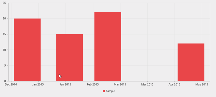
Screenshot displaying chart with date time axis with following data in x values “1/1/2015”, “1/2/2015”, “1/3/2015” and “1/5/2015”. Labels in date time axis will represent calculated intervals instead of x value of the points.
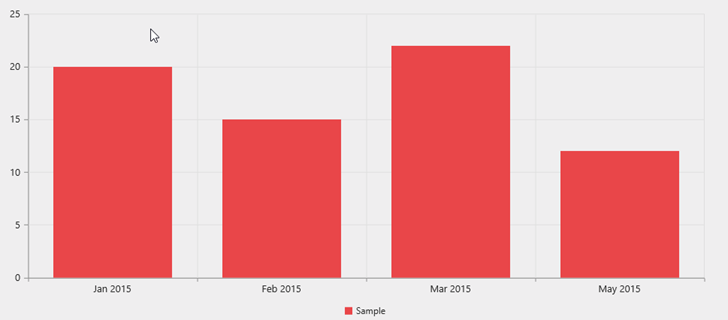
Screenshot for chart with above data in category axis. Points are rendered in order irrespective of their x values. Labels will display the x value of points. All columns will have equal width and points will be rendered in equal intervals.
So as suggested early, if data contains points at regular intervals, you can use “Category” as the “ValueType” for x axis. Because category axis is more suitable in this case rather than date time axis to avoid multiple labels appearing for a column segment. Refer Category Axis link for more information about category axis.
As stated before, if you are using category axis then you can able to place the labels on or between the ticks. This can be achieved by setting the below property
| [JS] $("#container").ejChart( { primaryXAxis: { labelPlacement: "onTicks" //changes the position of labels and ticks } }); |
This labelPlacement property takes two values “onTicks” and “betweenTicks”. By default “betweenTicks” value is set to labelPlacement.
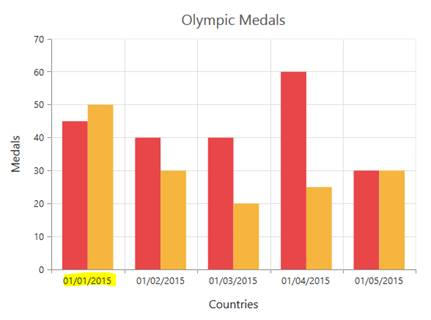
The below screen shot shows a column chart in which labels are placed in between the ticks. This is default behavior
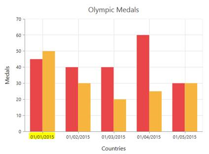
The below shows a chart in which the x axis labels are placed on the ticks.
We have also made a sample to illustrate this. Find it from the below location.
Sample.zip
Please let us know if you have any concern.
Thanks,
Jayavigneshwaran
- 1 Reply
- 2 Participants
-
JB Josh Bowen
- Feb 11, 2015 09:05 PM UTC
- Feb 12, 2015 11:53 AM UTC
