We use cookies to give you the best experience on our website. If you continue to browse, then you agree to our privacy policy and cookie policy. Image for the cookie policy date

Need padding to right/left on line chart

Refer to the attached .zip file, which has a screen grab.

The chart has a line, and point annotations are added to the line. Works fine, looks as I want--mostly.

The problem is that the line marks cannot be read for the first and last point.

The only solution I can find is to add RangePadding="Additional" to the date axis (X-axis). But this is a bad solution because it adss *too much* extra space on the left and right, making the chart look very strange.  What's needed is a way to add some padding on the x-axis so the ends of the lines can be seen (and so the annotated marks can be fully read).  For comparison, try this in Tableau--that product automatically adds enough space to make the chart perfectly readable.

Can this *small* amount of extra space be padded without the excessive space added by RangePadding=Additional?

Thanks,
Rob


Attachment: ChartPercentages_f80599b6.zip

7 Replies

SJ Sumathi Jayaraj Syncfusion Team November 24, 2014 03:59 PM UTC

Hi Rob,

We are having another property called PlotOffset, which will be suitable for your requirement. This property will give an offset inside the plot area and its value based on pixels, so we can give the space as per your convenience.

Code snippet:

<chart:SfChart.PrimaryAxis>

    <chart:DateTimeAxis LabelFormat="yyyy" PlotOffset="10" Header="Product"/>

</chart:SfChart.PrimaryAxis>

Note : The RangePadding property will be useful, when required the spacing(padding) based on our axis values.

Please let us know if you require further assistance on this.

Regards,

Sumathi J


RK Rob Kerr November 25, 2014 04:41 PM UTC

Thank you, Sumathi.  This is exactly what I needed!


MK Magesh Kumar Krishnan Syncfusion Team November 26, 2014 05:20 AM UTC

Hi Rob,
Thanks for the update. Please let us know if you require further assistance on this.
Thanks,
Magesh Kumar K


SM Steve Matyszka May 5, 2015 09:32 PM UTC

The plotoffset works well for the right side of the axis.  But it does not affect the left side of the axis!
I have a data range (24 + months) for the x axis with 2 columns per month.  With plotoffset(20) i can now see the 2 columns on the farthest right-hand side.  But I still have the issue on the furthest left side point of the axis.  I attached a picture for your reference.

Thanks,
Steve

Attachment: Missing_Column_on_Left_Side_6ac589e0.zip


SA Santhiya Arulsamy Syncfusion Team May 6, 2015 11:14 AM UTC

Hi Steve,

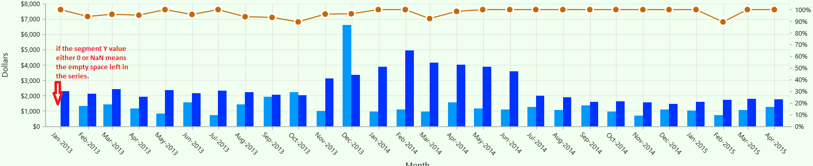
We have analyzed the reported query. If the segment’s y-value is either 0 or NaN means the empty space will be left for that segment, so that the space differs in left and right side.


Please let us know, if you need any further assistance on this.

Thanks,
Santhiya A


JP Jia Pin replied to Sumathi Jayaraj May 2, 2020 10:33 AM UTC

Hi Rob,

We are having another property called PlotOffset, which will be suitable for your requirement. This property will give an offset inside the plot area and its value based on pixels, so we can give the space as per your convenience.

Code snippet:

<chart:SfChart.PrimaryAxis>

    <chart:DateTimeAxis LabelFormat="yyyy" PlotOffset="10" Header="Product"/>

</chart:SfChart.PrimaryAxis>

Note : The RangePadding property will be useful, when required the spacing(padding) based on our axis values.

Please let us know if you require further assistance on this.

Regards,

Sumathi J


Actually what is needed. Thanks!


DD Devakumar Dhanapoosanam Syncfusion Team May 4, 2020 12:35 PM UTC

Hi Jia Pin, 
 
Please let us know if you need any further assistance on this. 
 
Regards, 
Devakumar D 


Loader.
Live Chat Icon For mobile
Up arrow icon