Looking for a Kendo React Pivot Grid Alternative?
Syncfusion React Pivot Table:
Enterprise-Ready BI and Data Analysis Tool
Syncfusion React Pivot Table simplifies multi-dimensional data analysis with powerful built-in features like grouping, filtering, sorting, aggregation, and Excel-style pivoting—perfect for dashboards, BI tools, and data-centric applications.
-
Up to 8x Faster Interactions
-
Consistent Performance with Virtualization
-
24/5 Premium Support
-
Up to 8x Faster Interactions
-
Consistent Performance with Virtualization
-
24/5 Premium Support
Trusted by the world's leading companies


Explore Syncfusion React Pivot Table Demo
Syncfusion React Pivot Table enables powerful, interactive data analysis with features like pivoting, filtering, and grouping. Its Excel-like functionality and responsive design make it ideal for dashboards and business intelligence applications. Try the live demo.
Performance Benchmark
Syncfusion surpasses Telerik with lightning-fast rendering and superior drill-down and sorting speeds, making it the top choice for high-performance pivot tables.
Performance results with 10K Rows × 20 Columns
Key operations
Syncfusion React Pivot Table
Kendo React Pivot Grid
Initial Rendering
Drill-Down (Column)
Drill-Down (Row)
Sorting (Column)
Sorting (Row)
Scrolling
Aggregation
Filtering
Calculated Field
High-Performance Data Handling
Efficient Data Handling – Handles millions of records seamlessly using Virtualization and Paging, ensuring smooth performance even with large datasets — ideal for enterprise-level analytics and reporting.
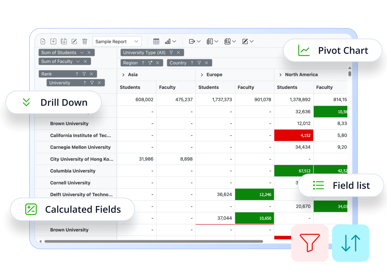
Drill Up & Down Interactive Data Exploration
Drill-down & Drill-up – Enables users to navigate data hierarchically and switch between detailed and summarized views for deeper insights.

Visual Analytics with Pivot Charts
Visualize pivot data using 20+ interactive chart types—including bar, line, area, pie, and more. These charts are fully customizable, enabling powerful visual analytics that help users uncover trends and gain actionable insights in real time.

Custom Calculated Fields
Create custom fields with formulas to perform dynamic data calculations within the pivot table. This feature allows users to derive new metrics, apply custom expressions, and tailor reports without modifying the original data source.

Interactive Field List
The Field List offers an intuitive panel for adding, removing, and rearranging fields in your pivot table. With a drag-and-drop interface, users can easily configure rows, columns, values, and filters to build reports dynamically. It also includes search and sorting capabilities, making it simple to manage large datasets.
Built for Users Who Demand More
Built for power users who demand advanced sorting, flexible filtering, instant export options, and embedded analytics.
Why Syncfusion is the Right Pick for You?
24+ Years Proven
Mature, stable, and trusted by enterprises in mission-critical applications for nearly two decades.
Secure and Private
No external calls or data sharing—everything processes on your server for maximum security and compliance.
Continuous Development
Actively maintained with regular updates and feature enhancements based on real customer feedback.
Backed by Global Trust
Trusted by 1M+ developers, 36K+ companies, and 400+ Fortune 500 enterprises over 24+ years of innovation and excellence.
Microsoft Collaboration
We actively collaborate with Microsoft to advance the .NET developer ecosystem. Our free and open-source .NET MAUI Toolkit is a key contribution, empowering developers to build modern cross-platform apps with ease.
Enterprise-Proven Solutions
Our UI components power high-scale SaaS platforms, trusted to handle millions of user interactions daily. Syncfusion’s reliability is proven in our own enterprise products, including BoldDesk and BoldSign, solutions that are widely adopted and loved by customers across industries.
Developer Support That Never Lets You Down
Documentation
Easy-to-follow guides, detailed API references, and real-world code examples via GitHub, NuGet, and our official docs.
Dedicated support
Unlimited tickets and fast 24-hour guaranteed responses via live chat, forums, and our support portal.
Community Engagement
A thriving developer community, frequently updated samples, and constantly evolving documentation.
Feature-by-Feature Comparison
Choosing the right Pivot Table component can impact your data analysis and reporting. Here’s how Syncfusion and Kendo compare on key features:
Key operations
Syncfusion React Pivot Table
Kendo React Pivot Grid
Data Binding
Supports JSON, CSV, OLAP, Remote (Web API, REST, Server-side)
Supports JSON, OLAP (XMLA), Remote (OData, REST)
Database Connectivity
Supports 7+ databases (SQL, Oracle, MongoDB, Snowflake, etc.)
Supports SQL via ADO.NET/OData
Server-Side Engine
Supports processing large datasets on the server
Not available
OLAP Support
Yes, supports analyzing multidimensional data
Yes
Table View
Supports tabular, compact
Supports tabular only
Chart View
Supports 25+ built-in chart types
Supports custom integration via Kendo UI
Drill Up/Down
Yes, allows expand/collapse of hierarchical data
Yes
Aggregation
Supports 20+ built-in types and custom aggregation
Supports 10+ built-in types and custom aggregation
Calculated Field
Supports all data types
Supports OLAP only
Grouping
Supports number, date, custom
Supports number, partial date
Filtering
Supports member, conditional
Supports member, conditional
Sorting
Supports rows, columns, custom sorting
Supports rows, columns, custom sorting
Value Sorting
Yes
Yes
Selection
Supports single and multiple selection
Supports single selection only
Drill Through
Yes, allows to view raw data by cell click
Custom implementation possible
Editing & Validation
Supports full editing and custom validation
Limited support via handlers
Number Formatting
Yes
Yes
Conditional Formatting
Yes
Custom supported
Grouping Bar
Yes
Yes
Field List
Yes
Yes
Defer Layout Update
Yes
No
Virtual Scrolling
Yes
Limited options
Paging
Yes
No
Data Compression
Optimizes memory in description
No
State Persistence
Yes
Yes
Show/Hide Totals
Yes
Yes
Hyperlink
Yes
Custom supported
Toolbar
Supports 15+ built-in options
Limited options
Report Manipulation
Yes
Yes
Tooltip
Yes
Yes
Exporting
Supports exporting to PDF, Excel, CSV
Supports only PDF, Excel export
Supports printing table, chart
Not supported
Template Support
Supports applying templates for multiple elements such as cells, headers etc
Supports cells only
Real-Time Updates
Customizable via react hooks
Supports data refresh
BI Tool Integration
Yes
Yes
Responsive Design
Supports resizing and responsive
Supports resizing only
Mobile Support
Yes
Partial support
Touch Interactions
Yes
Yes
Cross-Browser
Supports all major browsers
Supports all major browsers
Localization
Yes
Yes
RTL Support
Yes
Yes
Keyboard Navigation
Yes
Yes
Accessibility
Yes
Yes
Themes & Styling
Built-in themes
Built-in themes
What Our Customers Say
Real feedback from developers who rely on Syncfusion every day.
Syncfusion Recognition Highlights
G2
Capterra
Total User Reviews
600+
800+
Rating
⭐ 4.5 / 5
⭐ 4.5 / 5
Need more information?
Get detailed documentation, explore live demos, or speak with our experts to find the perfect solution for your needs.
Ready to Transform Your Data Analysis in React?
Unlock the full potential of your data with the Syncfusion React Pivot Table. Deliver lightning-fast, interactive data summaries and visualizations—effortlessly. Start your free trial and experience seamless, enterprise-grade analytics with zero risk.