
W3.CSS Succinctly®

CHAPTER 1
Introduction
W3.CSS is a free, no-license CSS framework from w3schools.com that you can use to produce responsive websites that work across all common browsers (Chrome, Edge, Firefox, Internet Explorer) and devices (desktops, tablets, mobile). It is much smaller than other frameworks and relies only on standard CSS. For example, many common frameworks (such as Bootstrap and Foundation) offer both a CSS and JavaScript component. For a comparison of uncompressed memory sizes, see Table 1.
Table 1: Approximate framework sizes
JavaScript (min) | CSS(min) | |
Bootstrap | 37 kb | 119 kb |
Foundation | 86 kb | 60 kb |
W3.CSS | N/A | 21 kb |
While each framework has its own set of features and components, the W3.CSS is small and simple to learn, and is a worthwhile contender to consider when deciding on a CSS framework.
CSS only
Since W3.CSS is a CSS-only framework, there are no components, which some of the other frameworks include. This means that while you can use the framework to handle the appearance and responsive design elements of your site, there is no JavaScript. Bootstrap, Foundation, and other such frameworks are built with both CSS styling and JavaScript components. If you need scripting functionality in your site, you should either build it yourself using libraries like jQuery, or consider a larger framework.
Layers
A website consists of three layers, but only the data (or HTML) layer is required. A user could possibly disable all scripting and CSS styling, and the data should still be readable. CSS styling improves the look of the site by providing the browser with a set of rules indicating how to display HTML elements. Scripting (mostly JavaScript) adds interactive features, such as table searching and sorting, and client size form validation.
Table 2: Website layers
Layer | Content | Format |
|---|---|---|
Data Layer | Text/images to display | HTML |
Presentation layer | Style rules to overwrite browser defaults | CSS |
Activity layer | Scripting to provide interactivity to the site | JavaScript, Typescript, etc. |
Browsers have default rules indicating how to display HTML tags; your custom CSS or CSS frameworks (such as W3.CSS) provide overrides for these defaults. Everything in W3.CSS uses standard CSS styles, just organized in a way to provide consistent layout and responsive design (by wrapping some styles with a media/device query filter).
W3.CSS classes
All the classes in the W3.CSS framework begin with w3-, which reduces the likelihood of conflicting style names. You can combine multiple class names in a single class statement, allowing you to provide the basic CSS class and add additional features to it. For example, the following code will create a w3 container, and set its background color to blue-gray.
Code Listing 1
<div class="w3-container w3-blue-gray"> </div> |
You could add the class w3-round-large to add rounded corners to the <div> element.
Simple example
The following example shows a simple webpage displaying an image and some text in a container. You can resize your browser and the entire page will adjust to the new size.
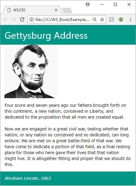
Figure 1: Sample webpage
Source page
Code Listing 1 is the source page for the above webpage. Note the link-reference to local file w3.css in the <head> section of the page. An alternative is to link to an external copy of the framework, as I'll explain shortly.
Code Listing 2: Sample W3.CSS page
<DOCTYPE html> <html> <head> <title>W3.CSS</title> <meta name="viewport" content="width=device-width, initial-scale=1"> <link rel="stylesheet" href="w3.css"> </head> <body> <div class="w3-container w3-teal"> <h1>Gettysburg Address</h1> </div> <div class="w3-container"> <p><img src="abraham-lincoln.jpg" style="width:50%"></p> </div> <div class="w3-container w3-round-large"> <p>Four score and seven years ago our fathers brought forth on this continent, a new nation, conceived in liberty, and dedicated to the proposition that all men are created equal. <br/><br/> Now we are engaged in a great civil war, testing whether that nation, or any nation so conceived and so dedicated, can long endure. We are met on a great battle-field of that war. We have come to dedicate a portion of that field as a final resting place for those who here gave their lives so that that nation might live. It is altogether fitting and proper that we should do this. </p> </div> <div class="w3-container w3-teal"> <p>Abraham Lincoln 1863</p> </div> </body> </html> |
Obtaining W3.CSS
You can download W3.CSS by following this link. It is totally free and does not require any license to use.
You can also link to the W3.CSS library via an external link, using the following snippet in your <head> section.
<link rel="stylesheet" href="https://www.w3schools.com/w3css/4/w3.css">
The code in this book is based on W3.CSS version 4. Version 4 was released in March of 2017, and is significantly faster than version 3.
- 1800+ high-performance UI components.
- Includes popular controls such as Grid, Chart, Scheduler, and more.
- 24x5 unlimited support by developers.