
Twitter Bootstrap 4 Succinctly®

CHAPTER 1
The Grids, the Grids, the Beautiful Grids
For as long as I can remember, developers using HTML technologies have struggled immensely with laying out even the most basic of grid patterns. If you’re old enough to remember HTML4 and (shudder) even versions 2 and 3, then you’ll be all too familiar with the abuse HTML tables received as many folks (me included) tried to use them to control and constrain their layouts.
With Bootstrap, all of this is a thing of the past.
In recent years, the CSS specification has brought forward two new layout modes, called Flexbox and CSS Grid, the latter of which is the newest kid on the block. BS4 takes full advantage of everything that Flexbox has to offer, and this has not only given us the original world-class pre-Flexbox grid that BS3 already had, but has seriously supercharged what BS4 has available.
BS4 is fully Flexbox to the core, and uses it for just about everything. All block-level containers and elements are now controlled using Flexbox, enabling some very interesting layouts to be created.
Before we talk more about that, let’s start with some simple examples.
Containers
Before you can do anything with any of the Bootstrap grid tools, you need a container. Containers are the daddy, the alpha, the numero uno, and they contain everything else that your layout will use.
Containers come in two flavors: a fluid container whose width is always 100 percent of the width of its parent (usually the page), and a standard container that will always use a center column fixed width, whose size is dependent on the overall parent width.
Using the template from Code Listing 1 or 2, add the following just after <!--Page content goes here-->.
Code Listing 3: Our first container
<div class="container" style="background-color: yellow">Hello Bootstrap</div> |
If you save your file and load it into your browser, you should see something like the following figure.
Figure 1: Our first container, as seen in Chrome
What you’ve just created is a fixed-width container, and if you change the width of your browser window, you should see that it remains centered, and where possible, keeps an equally spaced margin at each side.
Everything you just added is regular HTML; the magic part is the class that was added to it.
Most of Bootstrap’s magic is applied simply by choosing the correct class to add to your code. In this case, we added container, and we also added some extra style so that you could see the background of the <div> tag it created.
Load your HTML file back into your editor and change the class so that it reads container-fluid rather than container, and then press F5 to refresh your browser. The result should look like Figure 2.
Figure 2: Our first container with container-fluid applied
You’ll notice that the container now occupies 100 percent of the width of the page. If you were creating a layout that required you to use the full page width, then you’ve just created the base container to add the rest of your content into.
You might be wondering what the purpose of the fixed width container is—surely most of the layouts you’re going to want to do will be full width, right?
Well, yes and no. If you’re building a blog or magazine-style site, then you’ll definitely want to use a fixed width, and in fact, anything that has a high density of words to read should use a fixed-width container. This is because if the width is too great, then people have to move their heads side to side as they read.
With a balanced central column, usually all that has to move is a person’s eyes.
If you’re creating an application on the other hand, then there is an expectation that the interface will use the full browser window. Not only that, but there is an expectation that the user interface will actually adapt itself to varying sizes of page width depending on the device being used.
When you create your base container, you’re creating more than just a placeholder—you’re creating a flexible box that will resize itself, and even in some cases lay itself out differently depending on the screen size being used. This technique is called responsive design, and BS4 (like its predecessor) fully supports it with a mobile-first strategy.
Note: Mobile-first strategy means that you concentrate on making your design work on many different mobile platforms first, and then you concentrate on what it will look like on the desktop.
In short, BS4 sets all of this up for you, and adds a staggering amount of support to get you up and running quickly by just adding a simple class to your HTML tag.
Rows
Containers are all well and good, but most layouts also consist of rows and columns to divide the space used into different zones, depending on the designer’s needs.
Applications, for example, generally have a header, body, and footer. Usually only the content within the central body scrolls; the rest normally stays in a fixed position.
Reading layouts usually have a header and a content area, and then a footer, but the entire page usually scrolls, with the header scrolling up and off the screen, and the footer scrolling in as the bottom of the page is reached. Reading layouts usually also have boxouts in the margins or advertising space in the header.
The first step to making all this happen is to divide your layout into rows.
Using rows is rather like defining rows in a table; you need to work out how you want to use the vertical space, and how many slots you want, before you can start to divide those slots horizontally.
Open your HTML file (or create a new one using the template) and make sure your body code looks like the following listing.
Code Listing 4: Our first container with a row
<div class="container" style="background-color: yellow"> <div class="row" style="background-color: green">Hello Bootstrap Row</div> </div> |
All being well, you should see something similar to Figure 3.
Figure 3: Our container with a row in it
You might be forgiven for thinking, “That looks just the same as the first container example, except now it’s green. What’s the point of adding it?” I can understand why you would come to that conclusion.
A row is designed to consume 100 percent of its parent space, but unlike a container, it doesn’t set anything up to support responsive design. It simply makes sure that it follows whatever the parent container width is, and this includes nesting rows.
Add two more <div>s of different colors to the listing in Code Listing 4, so that it now looks like this:
Code Listing 5: Fixed container with three rows defined
<div class="container" style="background-color: yellow"> <div class="row" style="background-color: green">Hello Bootstrap Row</div> <div class="row" style="background-color: red">Hello Bootstrap Row</div> <div class="row" style="background-color: blue">Hello Bootstrap Row</div> </div> |
Save and reload that into your browser, and you should have something that looks the same as Figure 4.
Figure 4: Three rows
You should see that each row sits neatly on top of another, and that each obeys the 100 percent space available within the parent container.
If you change your container to a fluid one just as you did before, then you’ll see that all three rows will also follow the container and its width.
What you have now, however, are three fully self-contained rows, and just like rows in a spreadsheet or rows in a table, each of them is capable of being divided vertically.
What’s important is that you’re partitioning off sections of your document, and as you’ll see later in the book, you could fix the height on each of these rows so that you always have a fixed height header and footer, and a different height content area.
Note: In a later chapter, I’ll show you how to create some common layouts using the tools BS4 provides for you, one of which will be the “golden layout,” or the fixed header, footer, and scrolling content region.
And that’s all there is for rows. You can nest them if you want to, but there’s very little need for that. What’s more likely to happen is that you’ll produce a static template of some description (similar to the template we defined earlier), and you’ll use a front-end framework, such as Aurelia, React, Redux, or Vue, to host that template. The template will in turn have its own container and row layouts on a smaller scale, and if everything is nested correctly when your app is compiled to production, the components and the template should just re-size as needed for the display.
Columns
Of course, having rows in a layout is not much use unless you can further divide those rows into columns, and BS4 definitely has you covered here with some rather surprising abilities.
First things first: to make things simpler, let’s change our body code so that we are back to having just one row.
Code Listing 6: Reset back to one column
<!-- Page content goes here --> <div class="container" style="background-color: yellow"> <div class="row" style="background-color: green">Hello Bootstrap Row</div> </div> |
This should take your document back to looking as it did in Figure 3. If you want to keep what you’ve done previously, then by all means save this under a new name and start a new document.
In BS3, you always had to specify the specific number of units that a column used, and the maximum number of units allowed per row was 12 (unless you created a custom BS3 build).
In BS4 this is still true, and you can specify the row sizes just as you used to, but BS4 also has a new way of specifying columns (thanks to Flexbox) that allows you to just set a number of columns and have the columns work out how much space they should consume.
I’ll start with the newer way of doing things, and then quickly cover the old way so that you can see the advantages and disadvantages of both.
The new method
As with everything Bootstrap, it’s all about the CSS class names you add to your markup. With columns, you use the col-XXXXX classes.
Take the code from Code Listing 6 and change it so that it looks as follows.
Code Listing 7: Three equal-sized columns
<!-- Page content goes here --> <div class="container" style="background-color: yellow"> <div class="row" style="background-color: green"> <div class="col-sm" style="background-color: pink">Col 1</div> <div class="col-sm" style="background-color: hotpink">Col 2</div> <div class="col-sm" style="background-color: deeppink">Col 3</div> </div> </div> |
Once you save and load this into your browser, you should see something like the following figure.
Figure 5: Three equal-spaced columns
The first thing you should notice is that all three columns each have the same amount of space.
You’ve gotten this far by just adding three extra <div>s to your row and telling your browser that these are small equal columns (that’s what the sm suffix means). However, the best part is yet to come.
If you resize your browser so that it’s more of a mobile width rather than a desktop width, you should see the following output.
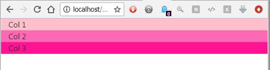
Figure 6: The same layout in Figure 5 with the width reduced
Your three columns have magically repositioned themselves so that they stack neatly on top of each other as the display gets narrower. It’s the sm suffix that decides at what point this switch happens, and there are a few different suffixes defined in the base BS4 grid system.
Here are the suffix and sizing options, as provided in the BS4 documentation.
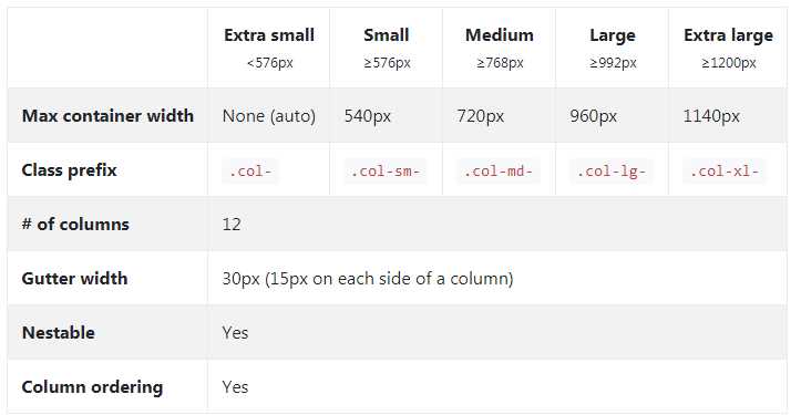
Figure 7: Bootstrap column sizing options
Each of these measurements is based on the standard size of 12 units in a row. So in our example from Code Listing 7, each column will be 4 units in size.
Because we didn’t specify any actual column unit sizes, however, BS4 automatically worked that out for us. If we wanted to, we could have quite easily done the following:
Code Listing 8: Three equally sized columns with the sizes specified by the class
<!-- Page content goes here --> <div class="container" style="background-color: yellow"> <div class="row" style="background-color: green"> <div class="col-sm-4" style="background-color: pink">Col 1</div> <div class="col-sm-4" style="background-color: hotpink">Col 2</div> <div class="col-sm-4" style="background-color: deeppink">Col 3</div> </div> </div> |
The old method
All that’s changed is the class name; we’ve simply added a -4 after the sm suffix to tell BS4 that it should always use 4 units (out of the 12 available) for that column.
Again, if you resize your browser, you should see exactly the same effect as seen in Figures 5 and 6.
In previous versions of Bootstrap, you had to work this way all the time, so you always had to remember what you set your sizes to, and often had to mentally picture your layouts and the space they used. If you exceed the number of units you have available in a row, then your columns will spill onto the next line. In some cases, this may be what you want; for example, if you were creating an image gallery. In most cases, however, it’s not the desired output, so you always need to ensure that you don’t exceed 12 units in one row.
The best of both
The crux of the two methods is that in BS4 you can easily mix things and use both side by side.
For example, let’s suppose you want your center column to always take up 6 units of space no matter what, but your two side columns should always just divide the remaining space between themselves. In BS3, you’d have to make sure that you had a set number of units for all three columns specified at all the different unit sets you wanted to support, leading to class names such as col-xs-2, col-sm-2, col-md-1, col-lg-1, and so on.
In BS4, it’s as simple as doing this:
Code Listing 9: Three columns with a fixed center
<!-- Page content goes here --> <div class="container" style="background-color: yellow"> <div class="row" style="background-color: green"> <div class="col-sm" style="background-color: pink">Col 1</div> <div class="col-sm-6" style="background-color: hotpink">Col 2</div> <div class="col-sm" style="background-color: deeppink">Col 3</div> </div> </div> |
Which when rendered, will give you:
Figure 8: The column layout produced by Code Listing 9
As you can see, the center column is now the widest of the three, and the left and right columns share what’s left between them.
Depending on your needs, you may still need to specify multiple suffix breakpoints on your classes using sm, lg, and others where needed, but you won’t have to make every single size specific.
It gets better than this though—I’ve left the best for last.
If you remove the suffix altogether, then your columns will work at all breakpoints. This means if you rewrite Code Listing 9 so that it reads as shown in Code Listing 10, you’ll get exactly the same output as in Figure 8, but this time you don’t have to specify multiple suffixes because it now works with all sizes.
Code Listing 10: Listing 9 revised to remove the breakpoint suffixes
<!-- Page content goes here --> <div class="container" style="background-color: yellow"> <div class="row" style="background-color: green"> <div class="col" style="background-color: pink">Col 1</div> <div class="col-6" style="background-color: hotpink">Col 2</div> <div class="col" style="background-color: deeppink">Col 3</div> </div> </div> |
You do, however, have a price to pay: you lose some of the automatic stacking of columns. Using the non-suffix method, BS will attempt to make your row stay consistent across small displays. With an appropriate arrangement of columns and rows, it’s still possible to take advantage of the clever things BS can do; you just need to get creative.
There’s much more you can do with columns and rows, such as vertical and horizontal alignment, nesting, offsets, and floating containers. You can find the rest of this in the official documentation.
- 1800+ high-performance UI components.
- Includes popular controls such as Grid, Chart, Scheduler, and more.
- 24x5 unlimited support by developers.