
TL;DR: Build an interactive energy analytics dashboard in WPF using Surface Charts. Learn how to structure energy data, bind it to a 3D surface chart, customize axes and color palettes, and add interactivity like rotation, zoom, and surface type switching. Perfect for developers looking to transform complex energy datasets into actionable insights with high-performance WPF visualization.
Welcome to the Chart of the Week blog series!
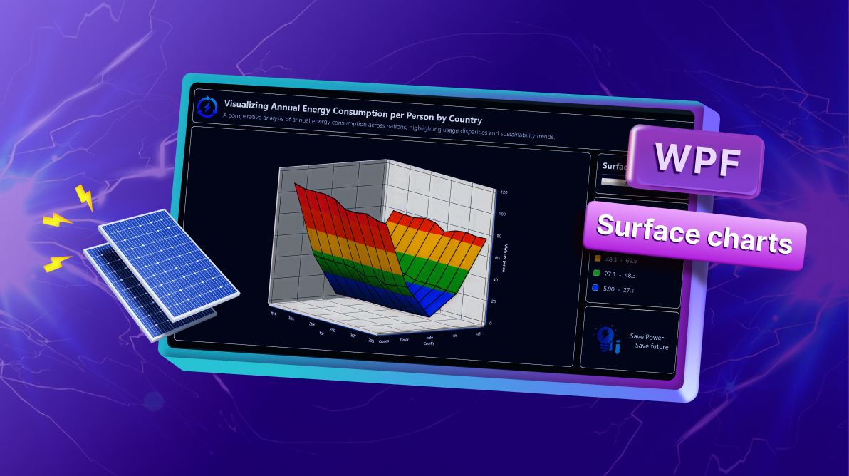
If you’ve ever tried to analyze energy consumption data across multiple countries and years, you know how overwhelming raw tables can be. In this edition, we’ll tackle that challenge by building an interactive energy analytics interface using Syncfusion® WPF Surface Chart.
Our goal? To transform complex electricity consumption data into a 3D visualization that makes patterns, trends, and disparities instantly clear. Instead of scrolling through endless rows of numbers, you’ll see a dynamic surface chart that tells the story at a glance.
What makes Surface Charts ideal for this?
Surface charts are a specialized 3D chart type designed to represent data across three dimensions. They connect individual data points into a continuous surface, where X, Y, and Z values define the position of each point, and color gradients highlight variations, making it easy to identify trends, clusters, and anomalies.
This makes Surface Charts perfect for scenarios where understanding relationships between multiple variables is critical.
Use cases
Surface charts are versatile and can be applied across multiple domains:
- Energy analytics: Compare consumption trends across regions and years.
- Financial modeling: Visualize risk vs. return vs. time.
- Scientific data visualization: Map temperature, pressure, and other variables.
Key benefits
Surface charts offer several advantages that make them ideal for multidimensional analysis:
- Visualize relationships between three variables.
- Highlight consumption zones with color gradients.
- Enable interactive exploration through rotation and zoom.
- Support decision-making with clear, actionable insights.
Why surface charts for energy analytics
Visualizing annual per-person energy consumption requires considering three key dimensions:
- Year (X-axis) – Tracks changes over time.
- Energy Consumption in MWh (Y-axis) – Measures usage intensity.
- Country (Z-axis) – Compares across regions.
A surface chart brings these dimensions together, allowing analysts to spot trends, regional disparities, and anomalies at a glance.
Why Syncfusion WPF Surface Chart?
Syncfusion’s WPF Surface Chart offers a robust solution for building high-performance, interactive visualizations:
- High-performance rendering for large datasets without lag.
- Rich customization options for axes, colors, and styles.
- MVVM-friendly architecture for clean, maintainable code.
- Built-in interactivity, including rotation, tilt, and surface type switching.
- Seamless integration with WPF UI components for a polished user experience.
What you’ll build
By the end of this guide, you’ll have a fully functional energy analytics interface that includes:
- A 3D surface chart with dynamic color gradients.
- Interactive controls for surface type selection.
- A color legend for understanding energy usage.

Building the energy analytics dashboard
Ready to bring this dashboard to life? Let’s walk through the steps to build this powerful solution from scratch.
Step 1: Configure Syncfusion WPF Charts
To build the interactive energy analytics interface, the first step is setting up the charting environment. Begin by installing the Syncfusion WPF Charts and Syncfusion.Shared.WPF NuGet packages. Follow the official documentation for detailed installation and setup instructions.
Step 2: Define the data model
Next, we need a well-structured dataset to feed into the chart. Our data source is Our World in Data, which offers reliable statistics on primary energy consumption per capita (measured in kWh) across multiple countries.
To organize this data effectively, we’ll define two classes:
- EnergyDataPoint: Represents a single data point for the surface chart.
- AnnualEnergyStats: Stores yearly consumption data for multiple countries.
Refer to the code example below.
// Represents a single data point for the surface chart
public class EnergyDataPoint
{
    public double Year { get; set; }
    public double Consumption { get; set; }
    public double Country { get; set; }
}
// Represents yearly stats for multiple countries
public class AnnualEnergyStats
{
public double Year { get; set; }
public double Canada { get; set; }
public double France { get; set; }
public double India { get; set; }
public double UK { get; set; }
public double US { get; set; }
}Step 3: Initializing energy data in the ViewModel
Now, we’ll prepare and organize the data for the WPF Surface Chart. To accomplish this, we’ll use a ChartViewModel class, which acts as the bridge between the data and the chart.
The ChartViewModel is responsible for:
- Storing annual energy consumption data for multiple countries.
- Converting raw stats into a collection of EnergyDataPoint objects for chart binding.
- Maintaining RowSize and ColumnSize properties to define the surface chart grid.
Refer to the code example.
public class ChartViewModel : INotifyPropertyChanged
{
    private int rowSize;
    private int columnSize;
    private ObservableCollection<EnergyDataPoint> dataValues = new();

    public ObservableCollection<EnergyDataPoint> DataValues
    {
        get => dataValues;
        set { dataValues = value; OnPropertyChanged(); }
    }

    public int RowSize
    {
        get => rowSize;
        set { rowSize = value; OnPropertyChanged(); }
    }

    public int ColumnSize
    {
        get => columnSize;
        set { columnSize = value; OnPropertyChanged(); }
    }


    public ChartViewModel()
    {
        var stats = new List<AnnualEnergyStats>
        {
            new() { Year = 2015, Canada = 111824, France = 43493, India = 5943, UK = 34864, US = 78949 },
            new() { Year = 2016, Canada = 109289, France = 42506, India = 6148, UK = 34099, US = 78155 },
            new() { Year = 2017, Canada = 109394, France = 42219, India = 6304, UK = 33925, US = 77730 },
            ….
        };

        BuildSurfaceData(stats);
    }

    private void BuildSurfaceData(IList<AnnualEnergyStats> years)
    {
        DataValues.Clear();
        foreach (var y in years)
        {
            DataValues.Add(new EnergyDataPoint { Year = y.Year, Consumption = y.Canada / 1000d, Country = 1 });
            DataValues.Add(new EnergyDataPoint { Year = y.Year, Consumption = y.France / 1000d, Country = 2 });
            DataValues.Add(new EnergyDataPoint { Year = y.Year, Consumption = y.India / 1000d, Country = 3 });
….
        }

        RowSize = years.Count;  // number of years provided
        ColumnSize = 5;         // countries plotted per year
    }

    public event PropertyChangedEventHandler? PropertyChanged;
    private void OnPropertyChanged([CallerMemberName] string? name = null)
        => PropertyChanged?.Invoke(this, new PropertyChangedEventArgs(name));
}
Step 4: Create a responsive Energy Analytics layout
A clean dashboard layout improves usability. We’ll use a Grid to organize:
- Title section: Displays the chart title and a brief description.
- Main chart area: Shows the 3D surface chart for annual energy consumption.
- Side panel: Contains interactive controls, color legend, and sustainability logo.
Refer to the code example.
<Grid Margin="10" >
    <Grid.ColumnDefinitions>
        <ColumnDefinition Width="8*"/>
        <ColumnDefinition Width="2*"/>
    </Grid.ColumnDefinitions>

    <Grid.RowDefinitions>
        <RowDefinition Height="1.5*"/>
        <RowDefinition Height="8.5*"/>
    </Grid.RowDefinitions>

    <!-- Blog Title -->
    <Border Grid.Row="0" Grid.ColumnSpan="2">
    </Border>

    <!-- Surface Chart -->
    <Border Grid.Row="0" Grid.ColumnSpan="2">
    </Border>

    <!-- Side Panel -->
    <Grid Grid.Row="1" Grid.Column="1">
    </Grid>

</Grid>
Step 5: Configure the Syncfusion WPF Charts
We will now set up the Syncfusion WPF Surface Charts to effectively visualize annual energy consumption. This chart type is ideal for representing three-dimensional data, such as Year, Energy Consumption, and Country.
Refer to the code example.
<Border Grid.Row="1"
Grid.Column="0"
Margin="10,0,10,10"
Padding="5"
CornerRadius="10"
BorderBrush="#e3e2df"
BorderThickness="2"
Background="#0a1f53" >
<syncfusion:SfSurfaceChart ItemsSource="{Binding DataValues}"
XBindingPath="Year"
YBindingPath="Consumption"
ZBindingPath="Country"
RowSize="{Binding RowSize}"
ColumnSize="{Binding ColumnSize}">
<syncfusion:SfSurfaceChart.XAxis>
<syncfusion:SurfaceAxis />
</syncfusion:SfSurfaceChart.XAxis>
<syncfusion:SfSurfaceChart.YAxis>
<syncfusion:SurfaceAxis />
</syncfusion:SfSurfaceChart.YAxis>
<syncfusion:SfSurfaceChart.ZAxis>
<syncfusion:SurfaceAxis />
</syncfusion:SfSurfaceChart.ZAxis>
</syncfusion:SfSurfaceChart>
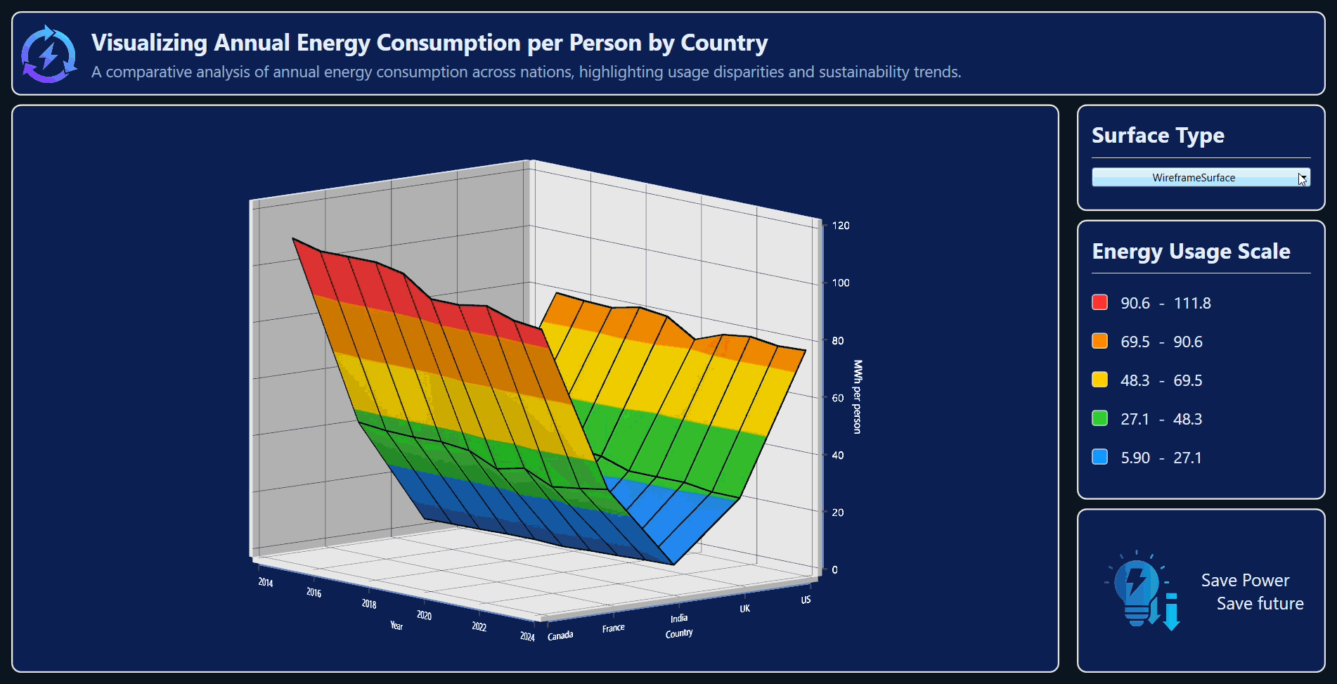
</Border>Preview the chart in the image below:

Step 6: Adding the title for the interface
In the header section, include a descriptive title and subtitle that clearly communicate the purpose of the interface. Style them to match the dashboard theme.
Refer to the code example.
<Border Grid.Row="0"
        Grid.ColumnSpan="2"
        Margin="10"
        Padding="5"
        CornerRadius="10"
        BorderBrush="#e3e2df"
        BorderThickness="2"
        Background="#0a1f53" >

    <Grid>
        <Grid.ColumnDefinitions>
            <ColumnDefinition Width="0.5*"/>
            <ColumnDefinition Width="9.5*"/>
        </Grid.ColumnDefinitions>

        <Image Source="/Images/renewableEnergy.png"
               Height="70"
               Width="70"
               Grid.Column="0"/>

        <StackPanel Margin="10"
                    Grid.Column="1">

            <TextBlock Text="Visualizing Annual Energy Consumption per Person by Country"
                       FontSize="26"
                       FontWeight="Bold"
                       Foreground="#E6F0FF"/>
            <TextBlock Text="A comparative analysis of annual energy consumption across nations, highlighting usage disparities and sustainability trends."
                       Margin="0,4"
                       Foreground="#9AB0CC"
                       FontSize="18"/>
        </StackPanel>
    </Grid>
</Border>
Take a look at the example below:
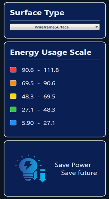
Step 7: Build the side panel
Next, we’ll add a side panel to make the visualization more interactive and informative. This panel will include:
- Surface type selector: Allows users to switch between different surface chart types
- Energy usage scale (Color legend): Displays the color gradient used in the chart to represent consumption levels.
- Energy-saving logo and message: Reinforces the sustainability theme with a small icon and tagline.
Refer to the code example.
<!-- Side Panel -->
<Grid Grid.Row="1" Grid.Column="1">
    <Grid.RowDefinitions>
        <RowDefinition Height="2*"/>
        <RowDefinition Height="5*"/>
        <RowDefinition Height="3*"/>
    </Grid.RowDefinitions>

    <!-- Surface Type selector -->
    <Border  Grid.Row="0" />
    <!-- Energy Usage Scale -->
    <Border  Grid.Row="1" />
    <!-- Energy Save Logo -->
    <Border  Grid.Row="2" />

</Grid>
Step 8: Add a surface type selector to the side panel
The surface type selector gives users the flexibility to switch between different visualization styles, such as WireframeSurface and Surface. This interactivity makes data exploration more dynamic and insightful.
For a modern look and smooth interaction, we’ll use the Syncfusion ComboBoxAdv control.
Refer to the code example.
<Border  Grid.Row="0"
         Margin="10,0,10,10"
         Padding="5"
         CornerRadius="10"
         BorderBrush="#e3e2df"
         BorderThickness="2"
         Background="#0a1f53">

    <!-- Surface Type selector -->
    <StackPanel Orientation="Vertical"
                Margin="10">

        <TextBlock Text="Surface Type"
                   FontSize="25"
                   FontWeight="Bold"
                   Foreground="#E6F0FF" />
        <Separator Background="#e3e2df"
                   Height="1.5"
                   Margin="0,10"/>

        <syncfusion:ComboBoxAdv x:Name="TypeCombo"
                                Width="250"
                                SelectedValuePath="Content"
                                SelectionChanged="TypeCombo_SelectionChanged"
                                HorizontalContentAlignment="Center"
                                HorizontalAlignment="Center"
                                VerticalAlignment="Center" >
            <syncfusion:ComboBoxItemAdv Content="WireframeSurface" />
            <syncfusion:ComboBoxItemAdv Content="Surface" />
        </syncfusion:ComboBoxAdv>
    </StackPanel>
</Border>
Step 9: Add an energy usage scale
The energy usage scale visually represents the color gradient applied to the surface chart. Each color corresponds to a range of energy consumption values (in MWh per person). This helps users quickly interpret high and low consumption zones.
In Syncfusion WPF Surface Chart, the ColorBar is used to display these ranges. For detailed configuration, refer to the official documentation.
We’ll also add an energy-saving logo and message at the bottom of the side panel.
<Border Grid.Row="1"
        Margin="10,0,10,10"
        Padding="5"
        CornerRadius="10"
        BorderBrush="#e3e2df"
        BorderThickness="2"
        Background="#0a1f53">

    <StackPanel  Orientation="Vertical"
                 Margin="10">
        <TextBlock Text="Energy Usage Scale"
                   FontSize="25"
                   FontWeight="Bold"
                   Foreground="#E6F0FF" />
        <Separator Background="#e3e2df"
                   Height="1.5"
                   Margin="0,10"/>
        <StackPanel Orientation="Horizontal"
                    Margin="0,10">
            <Rectangle Width="18"
                       Height="18"
                       Fill="#FF3B3B"
                       RadiusX="3"
                       RadiusY="3"
                       Stroke="#e3e2df"
                       StrokeThickness="1"/>
            <TextBlock Text="90.6  -  111.8"
                       Margin="15,0,0,0"
                       FontSize="18"
                       Foreground="#E6F0FF"
                       VerticalAlignment="Center"/>
        </StackPanel>
            …………………..
            …………………...

    </StackPanel>
</Border>

<Border Grid.Row="2"
        Margin="10,0,10,10"
        Padding="5"
        CornerRadius="10"
        BorderBrush="#e3e2df"
        BorderThickness="2"
        Background="#0a1f53">

    <Grid>
        <Grid.ColumnDefinitions>
            <ColumnDefinition Width="5*"/>
            <ColumnDefinition Width="5*"/>
        </Grid.ColumnDefinitions>

        <Image Source="/Images/energyConsumption.png"
               Height="100"
               Width="100" />
        <StackPanel Grid.Column="1"
                    VerticalAlignment="Center" >
            <TextBlock Text="Save Power"
                       Grid.Row="0"
                       FontSize="20"
                       Foreground="#E6F0FF"
                       VerticalAlignment="Center"
                       HorizontalAlignment="Left"/>
            <TextBlock Text="Save future"
                       Grid.Row="1"
                       FontSize="20"
                       Foreground="#E6F0FF"
                       VerticalAlignment="Center"
                       HorizontalAlignment="Center"/>

        </StackPanel>
    </Grid>
</Border>
Preview the energy usage scale in the image below.
Step 10: Customizing the chart appearance
Now, let’s make the chart more intuitive and visually appealing by customizing its axes, colors, and interaction settings.
Customize the chart axis
Modify axis properties, such as intervals, labels, and grid lines, for improved readability. For more details, you can refer to the Axis customization documentation.
<!--X axis-->
<syncfusion:SfSurfaceChart.XAxis>
    <syncfusion:SurfaceAxis HeaderTemplate="{StaticResource headerTemplate1}"
                            Interval="2 "
                            EdgeLabelsDrawingMode="Shift"
                            GridLineStroke="#344566"
                            LabelTemplate="{StaticResource labelTemplate}"
                            AxisLineStyle="{StaticResource lineStyle }">
    </syncfusion:SurfaceAxis>

</syncfusion:SfSurfaceChart.XAxis>

<!--Y axis-->
<syncfusion:SfSurfaceChart.YAxis>
    <syncfusion:SurfaceAxis HeaderTemplate="{StaticResource headerTemplate2}"
                            GridLineStroke="#344566"
                            Minimum="0"
                            Maximum="120"
                            Interval="20"
                            LabelTemplate="{StaticResource labelTemplate}"
                            AxisLineStyle="{StaticResource lineStyle }">
    </syncfusion:SurfaceAxis>
</syncfusion:SfSurfaceChart.YAxis>

<!--Z axis-->
<syncfusion:SfSurfaceChart.ZAxis>
    <syncfusion:SurfaceAxis HeaderTemplate="{StaticResource headerTemplate3}"
                            Minimum="1"
                            Maximum="5"
                            Interval="1"
                            GridLineStroke="#344566"
                            EdgeLabelsDrawingMode="Shift"
                            LabelTemplate="{StaticResource zLabelTemplate}"
                            AxisLineStyle="{StaticResource lineStyle }">
    </syncfusion:SurfaceAxis>
</syncfusion:SfSurfaceChart.ZAxis>
Customize chart color
Enhance the visual appeal by defining custom color palettes and adjusting chart properties, such as tilt, rotation, and stroke thickness. For more details, refer to the surface area customization documentation.
<syncfusion:SfSurfaceChart x:Name="Surface"
                           Palette="Custom"
                           Type="WireframeSurface"
                           EnableRotation="True"
                           ItemsSource="{Binding DataValues}"
                           WireframeStroke="Black"
                           XBindingPath="Year"
                           YBindingPath="Consumption"
                           Tilt="10"
                           Rotate="50"
                           ZBindingPath="Country"
                           WireframeStrokeThickness="3"
                           RowSize="{Binding RowSize}"
                           ColumnSize="{Binding ColumnSize}"
                           HorizontalAlignment="Center">

    <syncfusion:SfSurfaceChart.ColorModel>
        <syncfusion:ChartColorModel>
            <syncfusion:ChartColorModel.CustomBrushes>
                <SolidColorBrush Color="#1E90FF"/>
                <SolidColorBrush Color="#32CD32"/>
                <SolidColorBrush Color="#FFD700"/>
                <SolidColorBrush Color="#FF8C00"/>
                <SolidColorBrush Color="#FF3B3B"/>
            </syncfusion:ChartColorModel.CustomBrushes>
        </syncfusion:ChartColorModel>
    </syncfusion:SfSurfaceChart.ColorModel>

</syncfusion:SfSurfaceChart>
The following GIF demonstrates the interactive capabilities of the Energy Analytics Interface.
FAQ
Q1: How many countries can I visualize?
You can scale the chart to include more countries by adjusting the ColumnSize, RowSize, and data model.
Q2: What palettes are available in WPF Surface Chart?
WPF Surface Chart provides several predefined palettes, including Metro, AutumnBrights, FloraHues, Pineapple, TomotoSpectrum, RedChrome, PurpleChrome, BlueChrome, GreenChrome, and Elite. These palettes help enhance the visual appeal of the chart.
Q3: Does the chart support rotation and zooming?
Yes, rotation is supported, and zooming of the surface chart is controlled using the EnableZooming property.
GitHub reference
For more details, refer to the GitHub demo.
Conclusion
Thank you for following along! In this blog, we explored how to visualize power consumption trends using the Syncfusion WPF Surface Chart. By defining a structured data model and integrating real-world energy statistics, we built an interactive dashboard that uncovers global energy usage patterns and supports sustainability insights.
We hope this guide helps you create powerful, data-driven interfaces and inspires you to explore more possibilities in energy analytics and WPF data visualization. With the right tools and techniques, turning complex datasets into actionable insights has never been easier.
If you’re a Syncfusion user, you can download the setup from the license and downloads page. Otherwise, you can download a free 30-day trial.
You can also contact us through our support forum, support portal, or feedback portal for queries. We are always happy to assist you!


 No spam, just valuable updates.