TL;DR: Boost project scheduling visualization, accuracy, and debugging efficiency with the new features added in Syncfusion’s React Gantt Chart for the 2024 Volume 2 release. Explore the latest updates now!
The Essential Studio® 2024 volume 2 release brings a host of new features and enhancements to Syncfusion’s React Gantt Chart component. These features are designed to elevate the project management capabilities and the user experience.
Let’s explore the major updates in the React Gantt Chart component for this 2024 volume 2 release!
Timeline template
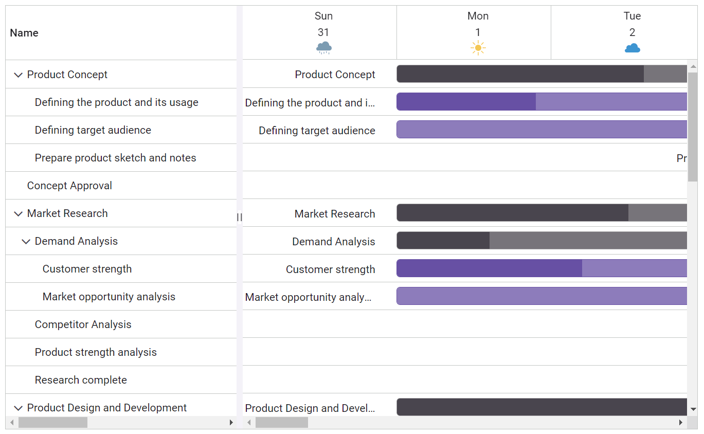
One of the standout features in this release is the timeline template. This feature allows users to customize the timeline headers according to their requirements, enabling more personalized and relevant views for project schedules.
Key benefits:
- Customization: Users can define their own templates for the timeline headers, allowing for better alignment with project specifications.
- Enhanced readability: Custom templates can include additional information or styling, making the timeline easier to read and understand.
Refer to the following code example.
import * as ReactDOM from 'react-dom';
import * as React from 'react';
import { useEffect } from 'react';
import { GanttComponent, Inject, Selection, DayMarkers, ColumnsDirective, ColumnDirective } from '@syncfusion/ej2-react-gantt';
import { timelineTemplateData } from './data';
import './timelinetemplate.css'
const TimelineTemplate = () => {
…
 const timelineTemplate =(props): any =>{
    if (props.tier == 'topTier') {
      return (<div className="e-header-cell-label e-gantt-top-cell-text" style={{ width: '100%', fontWeight: 'bold', height: '100%', display: 'flex', justifyContent: 'center', alignItems: 'center' }} title={props.date}>
        <div style={{ width: '100%', height: '100%', display: 'flex', justifyContent: center', alignItems: 'center', flexDirection: 'column'}}>
          <div style={{ lineHeight: 'initial', fontWeight: 'normal' }}>{weekDate(props.date)}</div>
          <div style={{ lineHeight: 'normal', paddingTop: '5px', paddingBottom: '2px', fontWeight: 'normal' }}>{formatDate(props.date)}</div>
          <div style={{ width: '20px', height: '20px', lineHeight: 'normal'}}>
            <img style={{  width: '100%', height: '100%’}} src={imageString(props.value)} />
          </div>
        </div>
      </div>)
    }
  }
  …
  return (
    <div className='control-pane'>
      <div className='control-section'>
      <GanttComponent id='Timeline' dataSource={timelineTemplateData}
            splitterSettings={splitterSettings}
            taskFields={taskFields} height='550px'
            projectStartDate={projectStartDate} projectEndDate={projectEndDate} timelineSettings={timelineSettings}
            timelineTemplate={timelineTemplate} labelSettings={labelSettings} treeColumnIndex={1}>
            <ColumnsDirective>
              <ColumnDirective field='TaskID' visible={false}></ColumnDirective>
              <ColumnDirective field='TaskName' width={300} ></ColumnDirective>
              <ColumnDirective field='StartDate'></ColumnDirective>
              <ColumnDirective field='EndDate' ></ColumnDirective>
              <ColumnDirective field='Duration' ></ColumnDirective>
              <ColumnDirective field='Progress' ></ColumnDirective>
            </ColumnsDirective>
            <Inject services={[Selection, DayMarkers]} />
          </GanttComponent>
      </div>
      </div>
  )
}
export default TimelineTemplate;
Refer to the following image.

Note: For more details, refer to the timeline template in React Gantt Chart demos and documentation.
Different working time ranges for each day
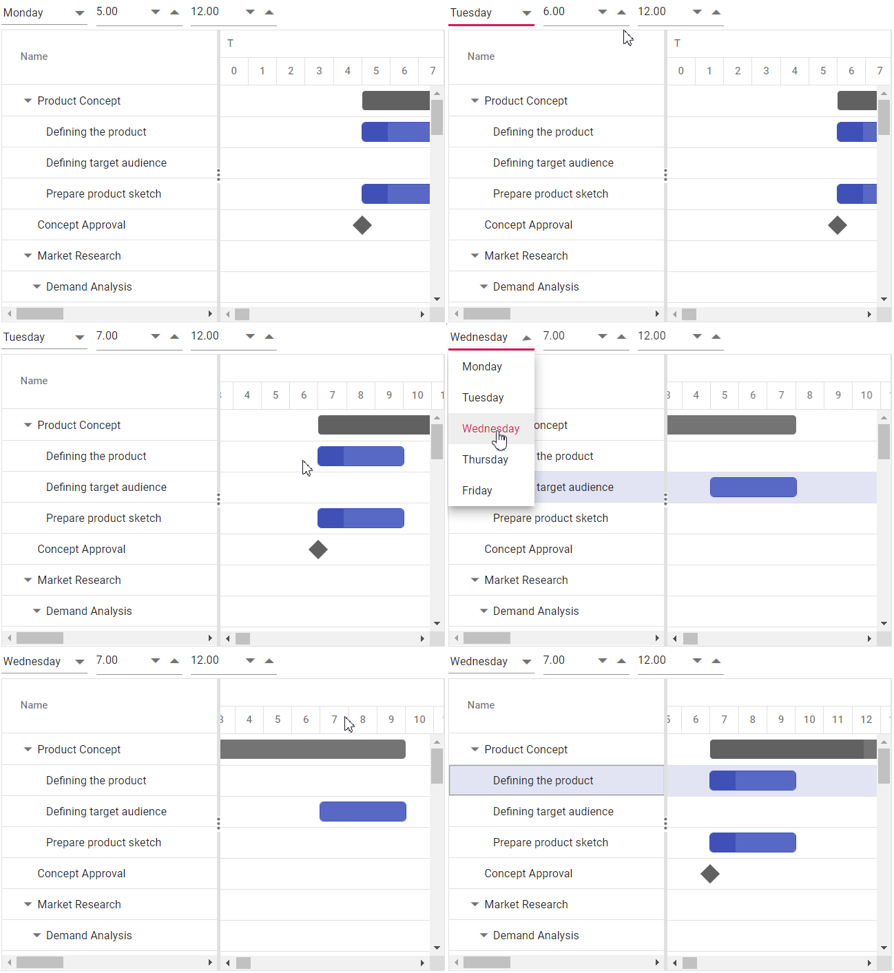
Another significant enhancement is the ability to set different working time ranges for each day of the week. This feature provides more granular control over scheduling, ensuring that project plans accurately reflect the actual working hours of the week.
Key benefits:
- Flexibility: Define specific working hours for each day, accommodating variations in daily schedules.
- Accuracy: Better representation of work schedules, reducing discrepancies between planned and actual work times.
Refer to the following code example.
import * as React from 'react';
import * as ReactDOM from 'react-dom';
import { GanttComponent } from '@syncfusion/ej2-react-gantt';
import { data } from './datasource';
function App() {
        …
        const timelineSettings = {
            timelineViewMode: 'Day'
        };
        const weekWorkingTime = [{ dayOfWeek: 'Monday', timeRange: [{ from: 10, to: 18 }] },
                                { dayOfWeek: 'Tuesday', timeRange: [{ from: 10, to: 18 }] }];
        return <GanttComponent dataSource={data} taskFields={taskFields} weekWorkingTime={weekWorkingTime} timelineSettings={timelineSettings} height='450px'>
      </GanttComponent>;
};
ReactDOM.render(<App />, document.getElementById('root'));
Refer to the following image.

Note: For more details, refer to customizing the working time range for each day in the React Gantt Chart demos and documentation.
Improvements in error handling
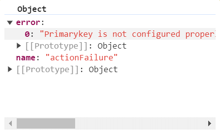
The 2024 volume 2 release also brings significant improvements in error handling. These enhancements ensure that any issues encountered during the configuration of the React Gantt Chart are promptly identified, and error information is provided through the actionFailure event.
Key benefits:
- Enhanced reliability: Improved error detection and reporting mechanisms ensure a smoother user experience.
- Better debugging: Detailed error messages and logs make identifying and fixing issues easier.
Refer to the following code example.
import * as React from 'react';
import * as ReactDOM from 'react-dom';
import { GanttComponent } from '@syncfusion/ej2-react-gantt';
import { data } from './datasource';
function App() {
    …
    const handleError = (args) => {
       console.error("An error occurred: ", args.error);
    };

    return <GanttComponent dataSource={data} actionFailure={handleError} taskFields={taskFields} height='450px'>
    </GanttComponent>;
};
ReactDOM.render(<App />, document.getElementById('root'));
Refer to the following image.


Explore the endless possibilities with Syncfusion’s outstanding React UI components.
Conclusion
Thanks for reading! In this blog, we’ve explored the latest features added to the Syncfusion React Gantt Chart component for the 2024 Volume 2 release. These powerful features and enhancements provide developers with the tools to create sophisticated and reliable project management apps. Check out our Release Notes and What’s New pages to see the other updates in this release, and leave your feedback in the comments section below.
Syncfusion’s commitment to providing high-quality, feature-rich components ensures that developers can easily continue building cutting-edge apps. To learn more about these features and start using them in your projects, visit the official Syncfusion documentation.
Stay tuned for more updates and enhancements in future releases!
The newest version of Essential Studio® is available on the license and downloads page for existing Syncfusion customers. If you are not a customer, try our 30-day free trial to test these new features.
You can also contact us through our support forums, feedback portal, or support portal. We are always happy to assist you!
