
 Maithiliy K
TL;DR: Discover how Syncfusion React Data Grid enhances React applications with powerful features like virtual scrolling for large datasets, intuitive editing, hierarchical grouping, customizable templates, and flexible exporting to Excel, PDF, or CSV, enabling efficient and tailored data management.
Introduction
The Syncfusion React Data Grid (data table) is a feature-rich control for displaying data in a tabular format. The wide range of functionalities includes data binding, editing, Excel-like filtering, custom sorting, support to export data grids to Excel, CSV, and PDF formats, aggregating rows, selection, etc. It provides extensive appearance customization options and is very useful for generating complex grid-based reports with rich formatting. In this blog, I am going to walk you through five major features of the Data Grid control:
Virtual scrolling
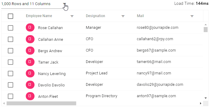
To achieve high performance in React Data Grid when loading a huge number of records, we have provided virtualization support. This loads data that you require instantly as you scroll (load data based on page size) without loading the entire database.
The control loads a high volume of data, nearly 1 million records, in one second, without any performance degradation, with the help of row and column virtualization support.
Row virtualization
Row virtualization allows you to load and render only the rows that fit the content viewport. It is an alternative way of paging, in which the data will be loaded on demand as you scroll vertically.
Column virtualization
Column virtualization allows you to virtualize columns. Data Grid will render only the columns that are in the current viewport, and the rest of the columns will be rendered instantly as you scroll horizontally.
Editing
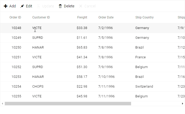
React Data Grid provides full-fledged support to manipulate (create, read, update, and delete) records easily by using the following built-in options for both local and remote data.
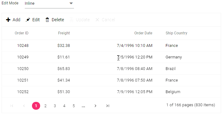
Edit modes
Through an interactive UI edit mode, you can easily add or edit records. The available edit modes are:
- Inline: Allows editing entire row values.
- Dialog: The row details are shown in a dialog for editing.
- Batch: The cell itself allows you to edit its value.
Edit types
You can also use built-in editors to edit a column value in a row easily. The available edit types are:
- Numeric TextBox: component for integer, double, and decimal data types.
- TextBox: component for a string data type.
- DropDown List: component to show all unique values related to that field.
- Checkbox: component for a boolean data type.
- DatePicker: component for a date data type.
- DateTime Picker: component for a date-time data type.
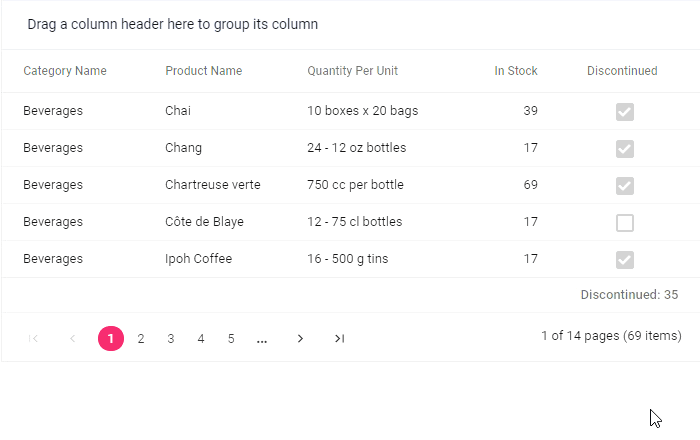
Grouping with aggregates
React Data Grid supports row grouping. The records are organized into a hierarchical structure to facilitate easier expanding and collapsing of records. Rows can be grouped by dragging the desired columns into the interactive drop area or programmatically.
You have an option to show the aggregate value of the grouped records either in individual group-summary rows or in group-caption rows. The control also lets you show the total summary of the corresponding column in the individual summary rows (footer summary).
Built-in aggregate types
Aggregates for column values can be easily processed by using the following built-in aggregate types:
- Sum
- Average
- Min
- Max
- Count
- Truecount
- Falsecount
Custom aggregate
Using this feature, you can use your own custom logic aggregate function to calculate the aggregate value of the corresponding column and display the resultant value in individual summary rows, individual group-summary rows, or group-caption rows.
Templates
React Data Grid offers template support, through which you can create custom user experiences. There are template options for the following features:
- Header template: You can customize the header element.
- Column template: You can customize the cell content by displaying a custom element instead of a field value in the column.
- Row template: You can customize the look and behavior of the grid rows as your application needs.
- Details template: You can customize the look and behavior of the details row by expanding or collapsing detail content.
- Toolbar template: You can customize the entire toolbar by adding custom toolbar items.
- Cell edit template: You can add a custom component for a column to edit the value of the corresponding cell.
- Inline/dialog template: You can customize the form elements and also edit the column values not specified in the React Data Grid columns.
Exporting
Easily export the React Data Grid component in various file formats such as Excel, PDF, or CSV. You can customize the exported document programmatically.
Some of the important supports available in the exporting feature are:
- Export multiple grids.
- Export hierarchy grids.
- Conditional cell formatting.
- Export with a theme.
- Export the current page.
- Export hidden columns, etc.
Conclusion
In this blog post, we have seen the top five features of the React Data Grid. I hope you now have a better understanding of the major supported features. What else do you expect from a React Data Grid? Please share your feedback in the comments section. Try all these features with the help of our available online samples.
If you’re already a Syncfusion user, you can download the product setup from your account. Otherwise, you can download a free, 30-day trial.
If you have any questions about this control, please let us know in the comments section below. You can also contact us through our support forum, Direct-Trac, or Feedback Portal. We are happy to assist you!
 No spam, just valuable updates.