

In the last release, we rolled out the Charts widget for the Flutter platform and got a lot of valuable feedback from our customers. We were overwhelmed by your positive response.
Every release, we work on including new widgets and new features for existing widgets by considering the requests from our customers, the complexity of the implementation, and its usability. We hope these coming additions will help make your development easier.
In this blog, we will talk about some of the new widgets and features you can expect for the Flutter platform in the 2019 Volume 3 Beta release. The beta release of 2019 Volume 3 should be available in the third week of September, 2019.
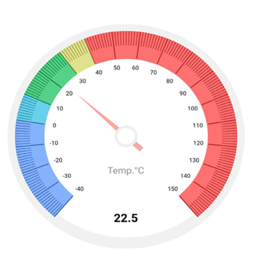
New Radial Gauge widget
A new radial gauge can be expected in this release that can be used for visualizing numeric values on a circular scale. It has rich set of features and is completely customizable and extendable to simulate a speedometer, meter gauge, analog clock, and so on. The following is the list of planned features for this widget:
- Axis—A circular scale that holds elements like ticks, labels, and axis lines.
- Pointers—Points to a definite value on an axis. The control supports needle pointers, range bar pointers, and marker pointers.
- Ranges—Categorize certain intervals in the radial gauge.
- Annotation—Place any desired widget inside the plot area.
- Animation—Experience fluid animation for the pointers.
Addition to the Charts widget
The Syncfusion Flutter charts widget already has 12 popular chart types. In this release, you can expect an addition of seven more chart types that are widely used.
Stacked charts
Stacked charts will be helpful in finding the sum of data points of various series. The following stacked charts will be available:
- Stacked line
- Stacked area
- Stacked column
- Stacked bar
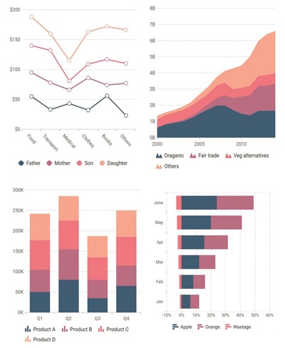
Range column chart
A range column chart is quite similar to the column chart but renders the data points from the user-specified low value instead of 0.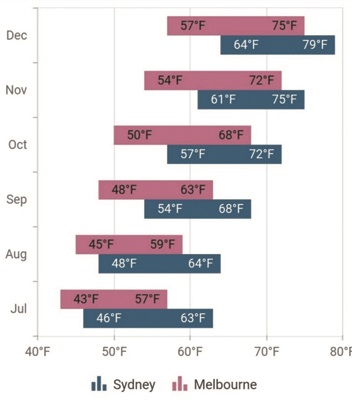
Pyramid chart
A pyramid chart resembles a triangle and the size of each segment is calculated based on the user’s input values.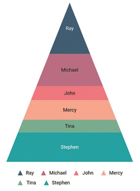
Funnel chart
The funnel chart is similar to the pyramid chart, which also stacks data points, and it resembles the appearance of a funnel.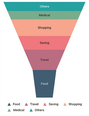
Other chart features
Our features list will keep on increasing with every release. In this release, we’re adding the following new features to the Charts widget:
- Logarithmic axis
- Axis crossing
- Plot band
- Recursive plot band
- Dynamic update animation
Logarithmic axis
A logarithmic axis in the chart plots data points on a logarithmic scale.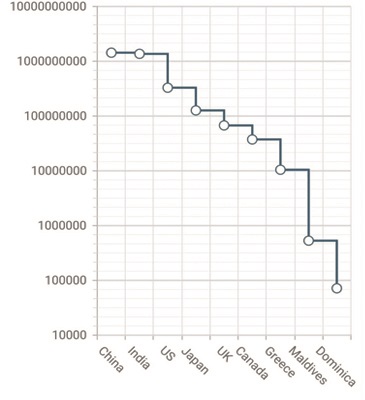
Axis crossing
The axis crossing feature allows users to position the chart axis anywhere in the plot area.
Plot band
Use plot bands to differentiate ranges in the plot area with different colors to improve the readability of a chart.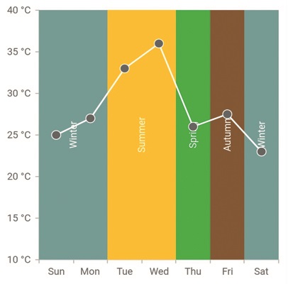
Recursive plot band
Recursively render the plot bands to differentiate the ranges for both the vertical and horizontal axes.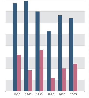
Dynamic update animation
The chart series and its elements will be animated on updating the data points’ values dynamically. 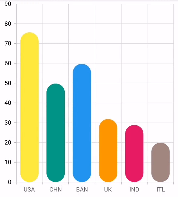
Conclusion
I hope you are excited to use these new features in your applications. You can check out all these features once the release is rolled out.
Stay tuned to the official Twitter, Facebook, and LinkedIn pages for the announcement of the release. We will also post a detailed blog right after the release to guide you through working with the new features in our Flutter widgets.


 No spam, just valuable updates.