
 Gowrimathi S
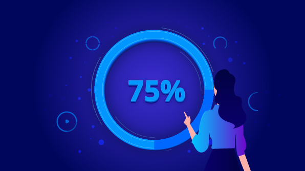
To add colorful animation effects to your progress indicator, you need a groundbreaking progress bar! In this aspect, our new Progress Bar control for the Essential JS 2 suite fulfills your need. This control is available with the 2020 Volume 1 release. It comes with the following functionalities:
- Determinate and indeterminate states
- Buffering
- Segmented progress
- Animation
- Custom content
- Right-to-left rendering
- Built-in themes
- Adaptability
The Progress Bar control can be used to visualize the changing status of an extended operation such as a download, file transfer, or installation. All progress bar elements are rendered using scalable vector graphics (SVG) to ensure the quality of the visual experience.

This blog will provide a walk-through on the Progress Bar control and its features.
Types
Progress Bar supports different shapes (rectangle, circle, and semi-circle) to give a unique design to the work progress visualization.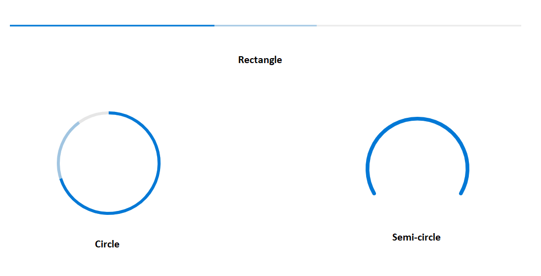
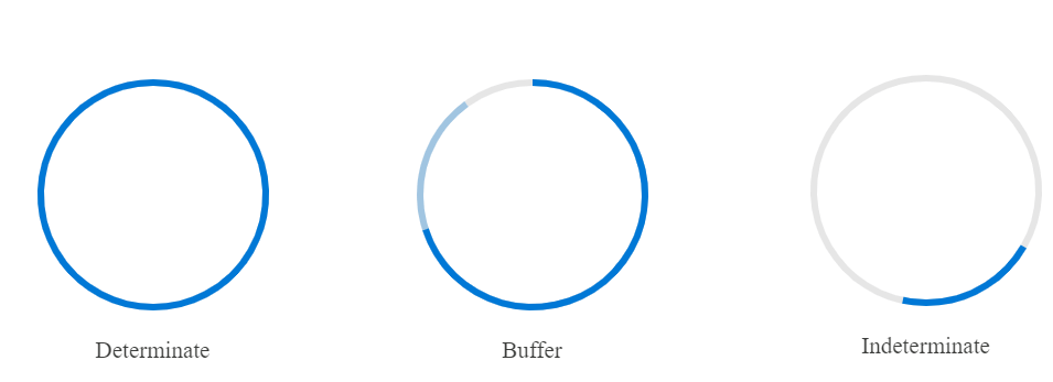
States
This feature allows you to visualize the changing status of an operation in different modes.
Determinate: Use this when the time of completion of a progression can be estimated.
Indeterminate: Use this when the time of completion of a progression can’t be estimated or calculated.
Buffer: Use this for co-related tasks. It supports secondary progress, where the primary task depends on the secondary task.
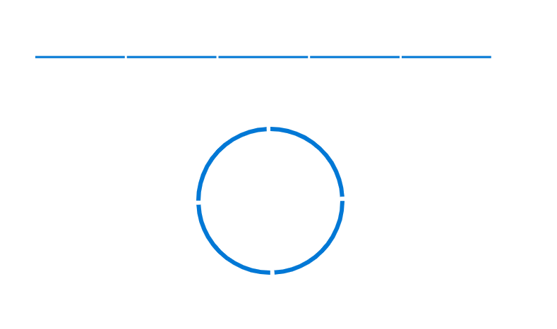
Segments
This feature allows you to divide a progress bar into multiple segments to visualize the progress of multi-sequence tasks.
Angle
This feature allows you to customize the start and sweep angles of a circular progress bar to give a unique style to it.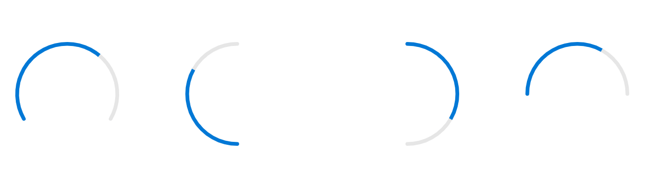
Custom content
This feature allows you to add any custom content at the center of the circular progress bar to indicate the completion of progress or to add any custom text that conveys the current status of the progress.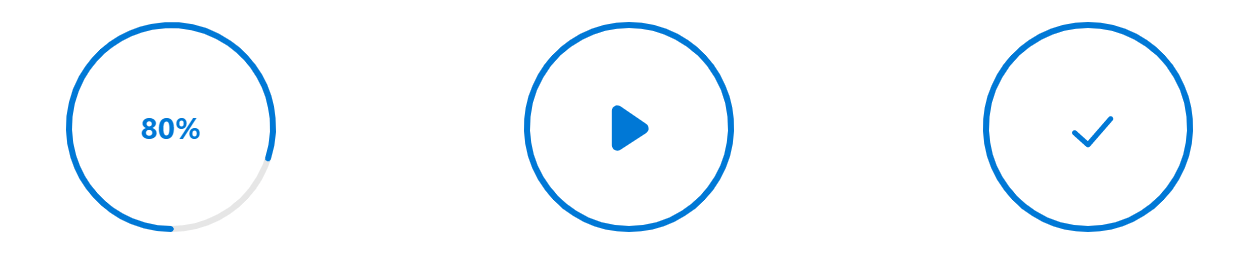
Multiple ranges
This feature allows you to visualize the progress of a task with multiple color ranges.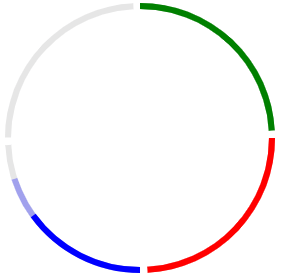
Themes
Configure the look and feel of a progress bar using several built-in options to match with the application. The control supports the following themes:
- Fabric
- Material
- High contrast
- Bootstrap
Getting started with the Progress Bar in TypeScript
Let’s create a progress bar to give an attractive look to visualize measures. Follow these steps to configure the Progress Bar in TypeScript.
- Clone the Essential JS 2 quick-start seed repository and configure the necessary packages in the config.js file.
"@syncfusion/ej2-base": "syncfusion:ej2-base/dist/ej2-base.umd.min.js",

"@syncfusion/ej2-data": "syncfusion:ej2-data/dist/ej2-data.umd.min.js",

"@syncfusion/ej2- progressbar": "syncfusion:ej2-progressbar/dist/ej2-progressbar.umd.min.js",

"@syncfusion/ej2-svg-base": "syncfusion:ej2-svg-base/dist/ej2-svg-base.umd.min.js"
- Install the NPM packages using the following command.
npm install
- Add the HTML input element that needs to be initialized as a component in the index.html file.
- Initialize the component in the ts file as shown in the following code.
import { ProgressBar } from '@syncfusion/ej2-progressbar;

// initialize progress bar component
let linear: ProgressBar = new ProgressBar (
{

     type: 'linear',
     value: 50,
}
);

// render initialized progress bar.
linear.appendTo('#container');
- You can change the value of the progress bar dynamically as shown in the following code.
linear.value = 70;
linear.dataBind();

Conclusion
I hope you now have a clear idea of the new, user-friendly Progress Bar control for the Essential JS 2 suites. This control is available with the 2020 Volume 1 release. We look forward to you trying it out. You can install and download the Essential JS 2 components from our website. Also, you can check out the source code for the Progress Bar in this GitHub location. Please take a look at our live demos in our sample browser.
The JavaScript Progress bar component is also available in the React, Angular, Vue, Blazor, and MVC frameworks, built from their own TypeScript libraries.
If you wish to send us feedback or would like to ask any questions, please feel free to post in the comments section below, or contact us through our support forum, Direct-Trac, or feedback portal.
If you liked this blog post, we think you’ll also like the following free ebooks:
 No spam, just valuable updates.