
The right image can provide more information than 1000 words. The pictorial representation of a pivot table is a pivot chart. In this blog, I will walk you through the pivot chart view, present within the Pivot Table control, and its key features.
The pivot chart is used to organize and summarize business data and display results in graphical format for analysis purposes. In Syncfusion Essential JS 2 Pivot Table, the pivot chart is added to serve as a secondary visualization control with all basic charting functionalities.
The pivot chart supports both:
Relational data source
For relational data sources, you can feed the control either with local raw data or by fetching raw data from the remote server using web services.
[pivotData.ts]
//Sample raw data to feed pivot control.
let pivotData: IDataSet[] = [
  { Amount: 100, Country: "Canada", Year: "FY 2005", Product: "Bike", Quantity: 2, State: "Alberta" },
  { Amount: 200, Country: "Canada", Year: "FY 2006", Product: "Car", Quantity: 4, State: "Ontario" },
  { Amount: 100, Country: "Canada", Year: "FY 2007", Product: "Van", Quantity: 1, State: "Quebec" },
  { Amount: 200, Country: "France", Year: "FY 2005", Product: "Bike", Quantity: 2, State: "Charente-Maritime" },
  { Amount: 150, Country: "Germany", Year: "FY 2008", Product: "Car", Quantity: 4, State: "Hamburg" },
  { Amount: 200, Country: "Germany", Year: "FY 2008", Product: "Bike", Quantity: 4, State: "Hessen" },
  { Amount: 150, Country: "Germany", Year: "FY 2007", Product: "Van", Quantity: 3, State: "Nordrhein-Westfalen" },
  { Amount: 100, Country: "Germany", Year: "FY 2005", Product: "Bike", Quantity: 2, State: "Saarland" },
  { Amount: 150, Country: "United States", Year: "FY 2008", Product: "Car", Quantity: 3, State: "New Mexico" },
  { Amount: 200, Country: "United States", Year: "FY 2005", Product: "Bike", Quantity: 4, State: "New York" },
    ];
[Sample.html]
<html>
// ...

    <body>
        // DOM element to add to the pivot control.
        <div id="pivotView1"></div>
    </body>

</html>
[Sample.ts]
//Importing necessary files.
import { pivotData } from 'dataSource/pivotData.ts;
import { PivotView, PivotChart } from '@syncfusion/ej2-pivotview';

//Injecting the "PivotChart" module.
PivotView.Inject(PivotChart)

//Initializing the pivot control.
let pivotObj: PivotView = new PivotView({
    dataSourceSettings: {

        //Assign raw data to "dataSource" from "pivotData.ts" file.
        dataSource: pivotData,

        //Assign desired fields available in raw data to appropriate axes.
        columns: [{ name: 'Year' }, { name: 'Product' }],
        rows: [{ name: 'Country' }, { name: 'State' }],
        formatSettings: [{ name: 'Amount', format: 'C' }],
        values: [{ name: 'Amount' }, { name: 'Quantity' }],
    },

    //To display only the pivot chart and hide the pivot table.
    displayOption: { view: 'Chart' },

    //Configure settings of the pivot chart.
    chartSettings: {
        chartSeries: { type: 'Column' },  //Setting the chart type.
        title: 'Sales Analysis'           //Setting the title.
    },
});

//Adding the control to the div tag whose ID is "pivotView1".
pivotObj.appendTo('#pivotView1');
OLAP data source
For OLAP data source, the control accepts online SSAS cube (XML/A) to connect and fetch data from it.
[Sample.html]
<html>
// ...

    <body>
        // DOM element to add the pivot control.
        <div id="pivotView1"></div>
    </body>

</html>
[Sample.ts]
import { PivotView, PivotChart } from '@syncfusion/ej2-pivotview';
PivotView.Inject(PivotChart)

let pivotObj: PivotView = new PivotView({
    dataSourceSettings: {

        //Assign the connection string of the SSAS server that is to be connected.
        url: 'https://bi.syncfusion.com/olap/msmdpump.dll',

        //Assign the name of the desired database available in the connected server.
        catalog: 'Adventure Works DW 2008 SE',

        //Assign the name of the desired cube available in the connected database.
        cube: 'Adventure Works',

        //Assign the provider type to connect.
        providerType: 'SSAS',

        //Assign the locale ID value. Here 1033 refers to default English language.
        localeIdentifier: 1033,

        //Assign the desired hierarchies available in the attached cube to appropriate axes.
        rows: [
            { name: '[Customer].[Customer Geography]', caption: 'Customer Geography' },
        ],
        columns: [
            { name: '[Product].[Product Categories]', caption: 'Product Categories' },
            { name: '[Measures]', caption: 'Measures'},
        ],
        values: [
            { name: '[Measures].[Customer Count]', caption: 'Customer Count' },
            { name: '[Measures].[Internet Sales Amount]', caption: 'Internet Sales Amount'}
        ],
        filters: [
            { name: '[Date].[Fiscal]', caption: 'Date Fiscal' },
        ],
    },
    displayOption: { view: 'Chart' },
    chartSettings: {
        chartSeries: { type: 'Column' },
        title: 'Sales Analysis'
    },
});

pivotObj.appendTo('#pivotView1');
Following are some exclusive properties to be set for the OLAP data source alone:
- “providerType” of “SSAS”: the kind of data source that you have connected.
- “URL”: the connection string of the server that needs to connect.
- “cube”: the desired cube name available in the connected data source.
- “catalog”: the desired database available in the connected server.
- “localeIdentifier”: to define the localization. It isn’t mandatory and will take the default language if it is not set.
Common properties of both relational and OLAP data sources
Apart from the previous properties exclusive for OLAP data sources, there are some common properties for both relational and OLAP. You can find these properties under dataSourceSettings. They are rows, columns, values and filters. These help the users create a pivot report in appropriate axes.
Switching between table and chart
Built-in display options help define the visibility of the table and chart in the Pivot Table control. These are the possible display options:
- Chart only
- Table only
- Both table and chart
In the case of both table and chart, you can determine which view should be shown primarily during initial loading.
The views can be dynamically swapped using the toolbar options. If any UI operation is done to modify the report, both these views will be refreshed based on the changes made.
let pivotGridObj: PivotView = new PivotView({
    dataSourceSettings: {
        dataSource: pivotData,
        columns: [{ name: 'Date' }, { name: 'Product' }],
        rows: [{ name: 'Country' }, { name: 'State' }],
        formatSettings: [{ name: 'Amount', format: 'C' }],
        values: [{ name: 'Amount' }, { name: 'Quantity' }],
    },
    displayOption: {
        // To display both table and chart views.
        view: 'Both',
        // To set chart as the primary control in the view port.
        primary: 'Chart'
    },
    chartSettings: {
        chartSeries: { type: 'Column' }, title: 'Sales Analysis'
    },
});
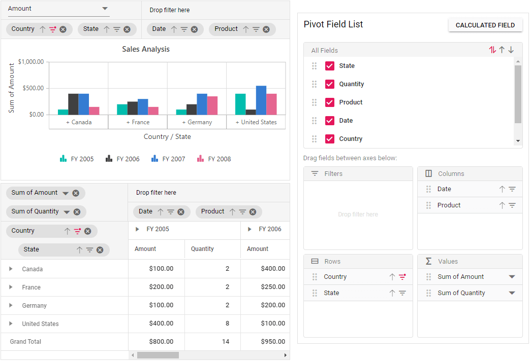
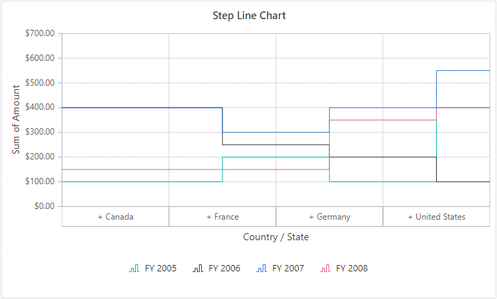
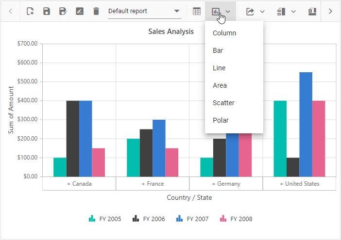
Chart types supported by pivot chart
The pivot chart can display data in 19 different types:
- Line
- Column
- Area
- Bar
- StepArea
- StackingColumn
- StackingArea
- StackingBar
- StepLine
- Pareto
- Bubble
- Scatter
- Spline
- SplineArea
- StackingColumn100
- StackingBar100
- StackingArea100
- Polar
- Radar
The line chart is the default chart type. The chart type can be set in the code-behind and can be dynamically modified with the help of the option available in the toolbar.
let pivotGridObj: PivotView = new PivotView({
    dataSourceSettings: {
        dataSource: pivotData,
        columns: [{ name: 'Date' }, { name: 'Product' }],
        rows: [{ name: 'Country' }, { name: 'State' }],
        formatSettings: [{ name: 'Amount', format: 'C' }],
        values: [{ name: 'Amount' }, { name: 'Quantity' }],
    },
    displayOption: {
        view: 'Chart',
    },
    chartSettings: {
        chartSeries: {
             type: 'Column'   // To set the desired chart type here.
        },
        title: 'Column Chart'
    },
});
Drill operations in pivot chart
The pivot chart displays multilevel labels in its x-axis to perform drill operations over fields bound to the row axis. With the display of + and – symbols placed as prefixes to the label text, the drill state can be identified.
If the label text is prefixed with the + symbol, this indicates that the header is in a collapsed state. The label text prefixed with – symbol indicates an expanded state. If the label does not have either of these icons, it means that it is a child member and it does not have a child member, and a drill operation cannot be performed.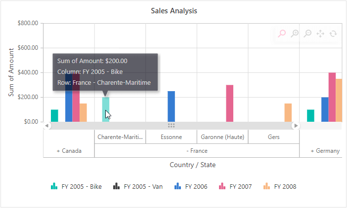
Interaction with group bar and field list
End users can dynamically configure the bound report in the pivot chart with the help of group bar and field list options. The applicable operations are:
- Drag and drop fields.
- Filter
- Sort
- Include new fields in the report (applicable in field list alone).
- Remove fields.
- Change aggregation type.
- Create new fields (calculated field).
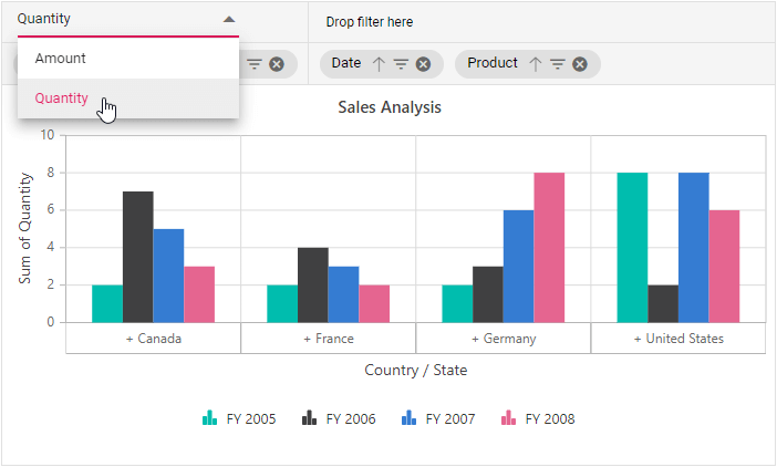
For the pivot chart alone, a drop-down list is placed in the value axis of the group bar filled with measures. If we change the measure in the drop-down list, the pivot chart will be refreshed based on it. This occurs only in the case of a single axis. With multiple axes, the pivot buttons will be positioned in place of the drop-down list similar to in the pivot table.
PivotView.Inject(GroupingBar);
PivotFieldList.Inject(CalculatedField);
let pivotGridObj: PivotView = new PivotView({
    enginePopulated: () => {
        if (fieldlist) {
            fieldlist.update(pivotGridObj);
        }
    },
    displayOption: {
        view: 'Chart'
    },
    chartSettings: {
        chartSeries: { type: 'Column' }, title: 'Sales Analysis'
    },
    showGroupingBar: true,
});
pivotGridObj.appendTo('#PivotView');
let fieldlist: PivotFieldList = new PivotFieldList({
    dataSourceSettings: {
        dataSource: pivotData,
        columns: [{ name: 'Date' }, { name: 'Product' }],
        rows: [{ name: 'Country' }, { name: 'State' }],
        formatSettings: [{ name: 'Amount', format: 'C' }],
        values: [{ name: 'Amount' }, { name: 'Quantity' }]
    },
    enginePopulated: (): void => {
        fieldlist.updateView(pivotGridObj);
    },
    allowCalculatedField: true,
    renderMode: 'Fixed'
});
fieldlist.appendTo('#FieldList');

Axis support in pivot chart
Single axis
The single axis is the default value of Axis in a pivot chart. In this case, the pivot chart will consider only one measure (value field) at a time to plot the series in the chart. If the pivot report has “n” number of measures, only the measure bound to the first position of the value axis will be considered to plot the series. On the other hand, the default measure name can also be defined specifically by an API.
The measure can also be dynamically modified with the help of the drop-down option available in the group bar layout described in the previous topic. Using the field list, the appropriate measure can be moved to the top of the value axis.
let pivotGridObj: PivotView = new PivotView({
    dataSourceSettings: {
        dataSource: pivotData as IDataSet[],
        columns: [{ name: 'Date' }, { name: 'Product' }],
        rows: [{ name: 'Country' }, { name: 'State' }],
        formatSettings: [{ name: 'Amount', format: 'C' }],
        values: [
            { name: 'Amount' },
            { name: 'Quantity' }   // Two measures are bound here.
        ],
    },
    displayOption: {
        primary: 'Chart'
    },
    chartSettings: {
        value: 'Quantity',       // To set the desired measure based on the requirement.
        chartSeries: { type: 'Column' },
        title: 'Sales Analysis',
    },
});
Multiple axes
The multiple axes option lets you draw multiple series within the specified area based on the measures (value fields) bound by the pivot report.
Here, each series visualizes the result of each measure bound by the pivot report. The y-axis label is framed based on each measure while the x-axis label remains the same.
The drill operation performed through multilevel labels in the x-axis will refresh all the series accordingly.
The legend information will also be displayed separately for each measure and will be aligned within the chart area.
The measure can also be dynamically modified with the help of buttons placed in the group bar and the field list UI similar to in the pivot table.
let pivotGridObj: PivotView = new PivotView({
    dataSourceSettings: {
        dataSource: pivotData as IDataSet[],
        columns: [{ name: 'Date' }, { name: 'Product' }],
        rows: [{ name: 'Country' }, { name: 'State' }],
        formatSettings: [{ name: 'Amount', format: 'C' }],
        values: [
            { name: 'Amount' },
            { name: 'Quantity' }     // Two measures are bound here.
        ],
    },
    displayOption: {
        primary: 'Chart'
    },
    chartSettings: {
        chartSeries: { type: 'Column' },
        title: 'Sales Analysis',
        enableMultiAxis: true    // To display multiple axes.
    },
});

Toolbar
The end user can switch the view (table and chart) and also dynamically change the chart type using the built-in toolbar option. The selected chart type will be maintained even during refresh scenarios until the chart type is modified back in the same way.
PivotView.Inject(Toolbar, FieldList, ExcelExport, ConditionalFormatting);
let pivotGridObj: PivotView = new PivotView({
    dataSourceSettings: {
        dataSource: pivotData,
        columns: [{ name: 'Date' }, { name: 'Product' }],
        rows: [{ name: 'Country' }, { name: 'State' }],
        formatSettings: [{ name: 'Amount', format: 'C' }],
        values: [{ name: 'Amount' }, { name: 'Quantity' }],
    },
    displayOption: { view: 'Both' },
    chartSettings: {
        title: 'Sales Analysis',
    },
    // User may define the required toolbar options here.
    toolbar: ['New', 'Save', 'SaveAs', 'Rename', 'Remove', 'Load',
            'Grid', 'Chart', 'Export', 'SubTotal', 'GrandTotal',
            'ConditionalFormatting', 'FieldList'],

    // To enable the toolbar panel.
    showToolbar: true,

    // Additional code here…
});
Other common features
The other common features of the pivot chart include:
- Series customization: Allows customizing the pivot chart series type, color, border, animation, visibility, width, tooltip, trendlines, etc. They can be customized for all series or for a specific series.
- Axis customization: Allows customizing for both the x-axis and y-axis the title, label format, label position, label rotation, label intersect action, visibility, interval, border, etc.
- Legend customization: Allows customizing the legend items’ position, alignment, text style, border, margin, color, visibility, height, width, etc.
- Zooming and panning: The pivot chart supports four types of zooming options: pinch zooming, select zooming, deferred zooming, and mouse wheel zooming. You can specify the direction of zooming, which can be horizontal, vertical, and both. Also, the built-in toolbar option is provided with the pivot chart UI to zoom in, zoom out, pan, and reset operations at runtime.
- Tooltip: The tooltip will appear when you hover over any series point and display the corresponding data information, such as row headers, column headers, and aggregation values. The tooltip is enabled by default, but it can be disabled.
- Export: You can export the pivot chart in the following types: PDF, PNG, JPEG, and SVG. You can perform the exporting operation either through code (by calling predefined public methods) or dynamically using the export options available in the toolbar.
Conclusion
I hope you now have a clear idea about the pivot chart view in the Pivot Table control. This feature is available in all the platforms of Essential JS 2: ASP.NET Core, ASP.NET MVC, JavaScript, Angular, React, and Vue.
For existing customers, the latest version is available for download from the license and downloads page. If you are not yet a customer, you can try our 30-day free trial to check out these new features. You can also explore samples in our GitHub repository.
If you have any questions, please let us know in the comments section. You can also contact us through our support forum, Direct-Trac, or feedback portal. As always, we are happy to assist you!
 No spam, just valuable updates.