

TL;DR: Learn how to build high-performance, native React charts for modern data visualization. This guide explores Pure React Chart components that simplify integration and enhance UX.
Struggling to find a charting solution that feels truly native to React? In modern data visualization tools, performance and native integration with React’s architecture matter more than ever.
Syncfusion’s Pure React Chart is built entirely with functional components, React Hooks, and a modular architecture, delivering unmatched speed, scalability, and developer experience. Unlike traditional wrapper-based libraries, this solution stays true to React’s core principles, offering clean, maintainable code without legacy dependencies.
Whether you’re building dashboards, analytics platforms, or real-time monitoring tools, this charting library is optimized to handle massive datasets, render visuals with blazing speed, and provide deep customization.
In this post, we’ll explore how to build Pure React Charts using native functional components, React Hooks, and modular architecture, with no wrappers, no legacy dependencies, just clean, scalable React code designed for modern front-end applications.
Why build a Pure React Chart?
Pure React Chart components are built entirely using native React architecture. This native-first approach results in clean, maintainable code that integrates seamlessly into modern React applications, boosting performance and simplifying development.
- Unrivaled performance: Optimized for speed, our chart handles large datasets with minimal latency, consistently outperforming other libraries in real-world benchmarks.
- True React architecture: No wrappers. Built natively using React hooks and functional components, without relying on external libraries like jQuery or other non-React JavaScript tools.
- Rich interactivity: Supports zooming, panning, tooltips, clickable legends, and smooth animations, making your charts dynamic and engaging.
- Accessibility first: Fully compliant with WAI-ARIA standards, including keyboard navigation and high-contrast support.
- Global readiness: RTL support and localization features make it ideal for international applications.
- Developer-centric design: Offers clean APIs, a modular architecture, and comprehensive documentation to ensure a frictionless development experience.
Advantages of the Pure React Chart
The Pure React Chart is packed with features that make it a top choice for developers building data-driven interfaces:
- High performance: Designed to handle large datasets efficiently, these components deliver smooth interactions and quick updates with minimal delay.
- Wide range of Chart types: Supports 10 popular chart types, including line, bar, area, spline, and scatter, giving you plenty of options for visualizing your data.
- Versatile axis options: It offers various axis types, such as numeric, datetime, logarithmic, and categorical, allowing you to easily plot different kinds of data.
- Smooth animations: Includes eye-catching transitions and effects that enhance storytelling and improve the overall user experience.
- Accessibility and navigation: Built with keyboard navigation and screen reader support to ensure everyone can interact with your charts comfortably.
- Flexible customization: Allows developers to customize data points, series styles, and UI behaviors to perfectly suit their application’s needs.
Let’s build it: Step-by-step guide
Step 1: Create a Vite + TypeScript project
Let’s start by setting up a new Vite project configured for React and TypeScript:
npm create vite@latest
cd my-project
npm install
Note: For detailed instructions on creating a React Vite application, refer to the official Vite documentation.
Step 2: Install the Syncfusion React Chart component
Run the command below to install the Syncfusion React Charts package in your project.
npm install @syncfusion/react-chartsStep 3: Import the required component
To integrate the React Chart, import the Chart component into your application.
JSX
import React from 'react';
import { Chart } from '@syncfusion/react-charts;
Step 4: Configure the Data Source
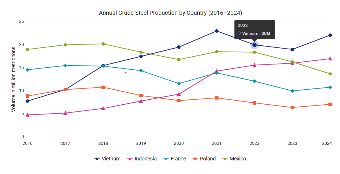
We create a TypeScript file and define a JSON dataset for steel records. Then, import and bind the data to the Chart using the dataSource property.
steel-data.ts
export const vietnamData = [
    { x: 2016, y: 7.8 },
    { x: 2017, y: 10.3 },
    { x: 2018, y: 15.5 },
    { x: 2019, y: 17.5 },
    { x: 2020, y: 19.5 },
    { x: 2021, y: 23.0 },
    { x: 2022, y: 20.0 },
    { x: 2023, y: 19.0 },
    { x: 2024, y: 22.1 }
];
export const indonesiaData = [
    { x: 2016, y: 4.8 },
    { x: 2017, y: 5.2 },
    { x: 2018, y: 6.2 },
    { x: 2019, y: 7.8 },
    { x: 2020, y: 9.3 },
    { x: 2021, y: 14.3 },
    { x: 2022, y: 15.6 },
    { x: 2023, y: 16.0 },
    { x: 2024, y: 17.0 }
];
export const franceData = [
    { x: 2016, y: 14.6 },
    { x: 2017, y: 15.5 },
    { x: 2018, y: 15.4 },
    { x: 2019, y: 14.4 },
    { x: 2020, y: 11.6 },
    { x: 2021, y: 13.9 },
    { x: 2022, y: 12.1 },
    { x: 2023, y: 10.0 },
    { x: 2024, y: 10.8 }
];
export const polandData = [
    { x: 2016, y: 8.9 },
    { x: 2017, y: 10.3 },
    { x: 2018, y: 10.8 },
    { x: 2019, y: 9.0 },
    { x: 2020, y: 7.9 },
    { x: 2021, y: 8.5 },
    { x: 2022, y: 7.4 },
    { x: 2023, y: 6.4 },
    { x: 2024, y: 7.1 }
];
export const mexicoData = [
    { x: 2016, y: 19.0 },
    { x: 2017, y: 20.0 },
    { x: 2018, y: 20.2 },
    { x: 2019, y: 18.4 },
    { x: 2020, y: 16.8 },
    { x: 2021, y: 18.5 },
    { x: 2022, y: 18.4 },
    { x: 2023, y: 16.3 },
    { x: 2024, y: 13.7 }
];
import { vietnamData, indonesiaData, franceData, polandData, mexicoData } from './steel-data';
import { Chart, ChartSeries, ChartSeriesCollection } from '@syncfusion/react-charts'
export default function App() {
return (
<Chart>
<ChartSeriesCollection>
<ChartSeries dataSource={vietnamData} xField="x" yField="y" type="Line"/>
<ChartSeries dataSource={indonesiaData} xField="x" yField="y" type="Line"/>
<ChartSeries dataSource={franceData} xField="x" yField="y" type="Line"/>
<ChartSeries dataSource={polandData} xField="x" yField="y" type="Line"/>
<ChartSeries dataSource={mexicoData} xField="x" yField="y" type="Line"/>
</ChartSeriesCollection>
</Chart>
)
}Step 5: Enable the marker
Enable the marker to emphasize each data point, making the chart easier to interpret.
import { vietnamData, indonesiaData, franceData, polandData, mexicoData } from './steel-data';
import { Chart, ChartSeries, ChartSeriesCollection, ChartMarker } from '@syncfusion/react-charts'
export default function App() {
    return (
        <Chart theme={chartTheme}>
            <ChartSeriesCollection>
                <ChartSeries dataSource={vietnamData} xField="x" yField="y" type="Line">
                    <ChartMarker visible={true} />
                </ChartSeries>
                <ChartSeries dataSource={indonesiaData} xField="x" yField="y" type="Line">
                    <ChartMarker visible={true} />
                </ChartSeries>
                <ChartSeries dataSource={franceData} xField="x" yField="y" type="Line">
                    <ChartMarker visible={true} />
                </ChartSeries>
                <ChartSeries dataSource={polandData} xField="x" yField="y" type="Line">
                    <ChartMarker visible={true} />
                </ChartSeries>
                <ChartSeries dataSource={mexicoData} xField="x" yField="y" type="Line">
                    <ChartMarker visible={true}  />
                </ChartSeries>
            </ChartSeriesCollection>
        </Chart>
    )
}
Step 6: Enable the tooltip
You can add tooltips to provide contextual information when hovering over data points in the chart.
import { vietnamData, indonesiaData, franceData, polandData, mexicoData } from './steel-data';
import { Chart, ChartSeries, ChartSeriesCollection, ChartTooltip } from '@syncfusion/react-charts'
export default function App() {
    return (
        <Chart>
            <ChartSeriesCollection>
                <ChartSeries dataSource={vietnamData} xField="x" yField="y" type="Line"/>
                <ChartSeries dataSource={indonesiaData} xField="x" yField="y" type="Line"/>
                <ChartSeries dataSource={franceData} xField="x" yField="y" type="Line"/>
                <ChartSeries dataSource={polandData} xField="x" yField="y" type="Line"/>
                <ChartSeries dataSource={mexicoData} xField="x" yField="y" type="Line"/>
            </ChartSeriesCollection>
	<ChartTooltip enable={true} />
        </Chart>
    )
}
Step 7: Enable the legend
You can enable the legend to display information about the data series represented in the chart.
import { vietnamData, indonesiaData, franceData, polandData, mexicoData } from './steel-data';
import { Chart, ChartSeries, ChartSeriesCollection, ChartLegend } from '@syncfusion/react-charts'
export default function App() {
    return (
        <Chart>
            <ChartSeriesCollection>
                <ChartSeries dataSource={vietnamData} xField="x" yField="y" type="Line" name="Vietnam"/>
                <ChartSeries dataSource={indonesiaData} xField="x" yField="y" type="Line" name="Indonesia"/>
                <ChartSeries dataSource={franceData} xField="x" yField="y" type="Line" name="France"/>
                <ChartSeries dataSource={polandData} xField="x" yField="y" type="Line" name="Poland"/>
                <ChartSeries dataSource={mexicoData} xField="x" yField="y" type="Line" name="Mexico"/>
            </ChartSeriesCollection>
          <ChartLegend visible={true} />
        </Chart>
    )
}
Step 8: Run the application
To visualize the Chart, launch your application by running the command below:
npm run devThe image below illustrates the basic Chart layout with a tooltip, markers, and a legend.
Built for large data: Syncfusion React Chart’s scalable performance
Modern applications often need to visualize large datasets, whether financial data, IoT sensor streams, or enterprise analytics.
How Pure React Chart handles large datasets
- Optimized rendering engine: The chart uses a highly efficient rendering pipeline that minimizes DOM updates.
- Real-time data support: Whether you’re streaming live data or updating charts dynamically, the component maintains fluid animations and fast refresh rates.
- Minimal React re-renders: Built with hooks and memoization strategies to avoid unnecessary re-renders, keeping the UI responsive.
Example: Rendering 100,000+ data points
Here’s a real-world example of how Syncfusion React Chart performs with a large dataset:
export default function App() {
    function getData(n: any) {
        const points = [];
        let i, x, a = 0, b = 0, c = 0, spike;
        for (i = 0, x = Date.UTC(new Date().getUTCFullYear(), 0, 1) - n * 36e5; i < n; i = i + 1, x = x + 36e5) {
            points.push({ x: x, y: 2 * Math.sin(i / 100) + a + b + c + spike + Math.random() });
        }
        return points;
    }
    const data = getData(100000);

    return (
        <Chart>
            <ChartTitle text="Syncfusion line charts drawing 100000 points" />
            <ChartPrimaryXAxis valueType="DateTime" />
            <ChartSeriesCollection>
                <ChartSeries dataSource={data} xField="x" yField="y" type="Line" />
            </ChartSeriesCollection>
        </Chart>
    );
}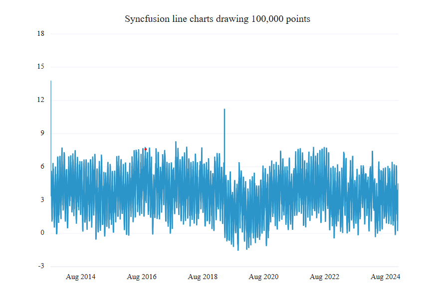
Benchmark example
| Loading 100,000+ data points across line series | Results |
| Initial render time | < 1 second |
| Zooming and panning latency | < 50ms |
Real-time data updates with Syncfusion React Chart
In many modern applications, real-time data visualization is essential. Syncfusion React Chart makes streaming and displaying live data easy with smooth transitions, minimal latency, and zero performance bottlenecks.
Key benefits of live updates
- Seamless animation: You can add new data points with fluid motion, enhancing the user experience.
- Efficient rendering: Only the updated portions of the chart are re-rendered, keeping performance high.
- Custom update intervals: Developers can control how frequently data is refreshed, from milliseconds to minutes.
- Dynamic data binding: You can easily bind live data from APIs, WebSockets, or local timers.
Example: Live Spline Chart
Here’s a simplified example of how to implement a live updating chart:
const initialData = [
    { x: new Date(2020, 0, 1, 10, 0), y: 21.5 },
    { x: new Date(2020, 0, 1, 10, 1), y: 24.0 },
    { x: new Date(2020, 0, 1, 10, 2), y: 41.3 },
    { x: new Date(2020, 0, 1, 10, 3), y: 49.5 },
    { x: new Date(2020, 0, 1, 10, 4), y: 61.0 },
    { x: new Date(2020, 0, 1, 10, 5), y: 48.6 },
    { x: new Date(2020, 0, 1, 10, 6), y: 39.5 },
    { x: new Date(2020, 0, 1, 10, 7), y: 42.1 }
];
export default function App() {

    const chartRef = useRef<ChartComponentProps>(null);
    const [dataSource, setDataSource] = useState(initialData);
    const intervalRef = useRef<ReturnType<typeof setTimeout> | null>(null);

    const addPoint = () => {
        });
    };
    const removeFirstPoint = () => {

        });
    };
    const updateData = () => {
        addPoint();
        setTimeout(() => {
            removeFirstPoint();
        }, 1000);
    };
    useEffect(() => {
        intervalRef.current = setInterval(updateData, 2000);
        return () => {
            if (intervalRef.current) {
                clearInterval(intervalRef.current);
                intervalRef.current = null;
            }
        };
    }, []);
    return (
        <Chart ref={chartRef}>
            <ChartTitle text={'Live Spline Chart'} />
            <ChartSeriesCollection>
                <ChartSeries dataSource={dataSource} xField="x" yField="y" type="Spline" >
                    <ChartMarker visible={true} />
                </ChartSeries>
            </ChartSeriesCollection>
        </Chart>
    );
};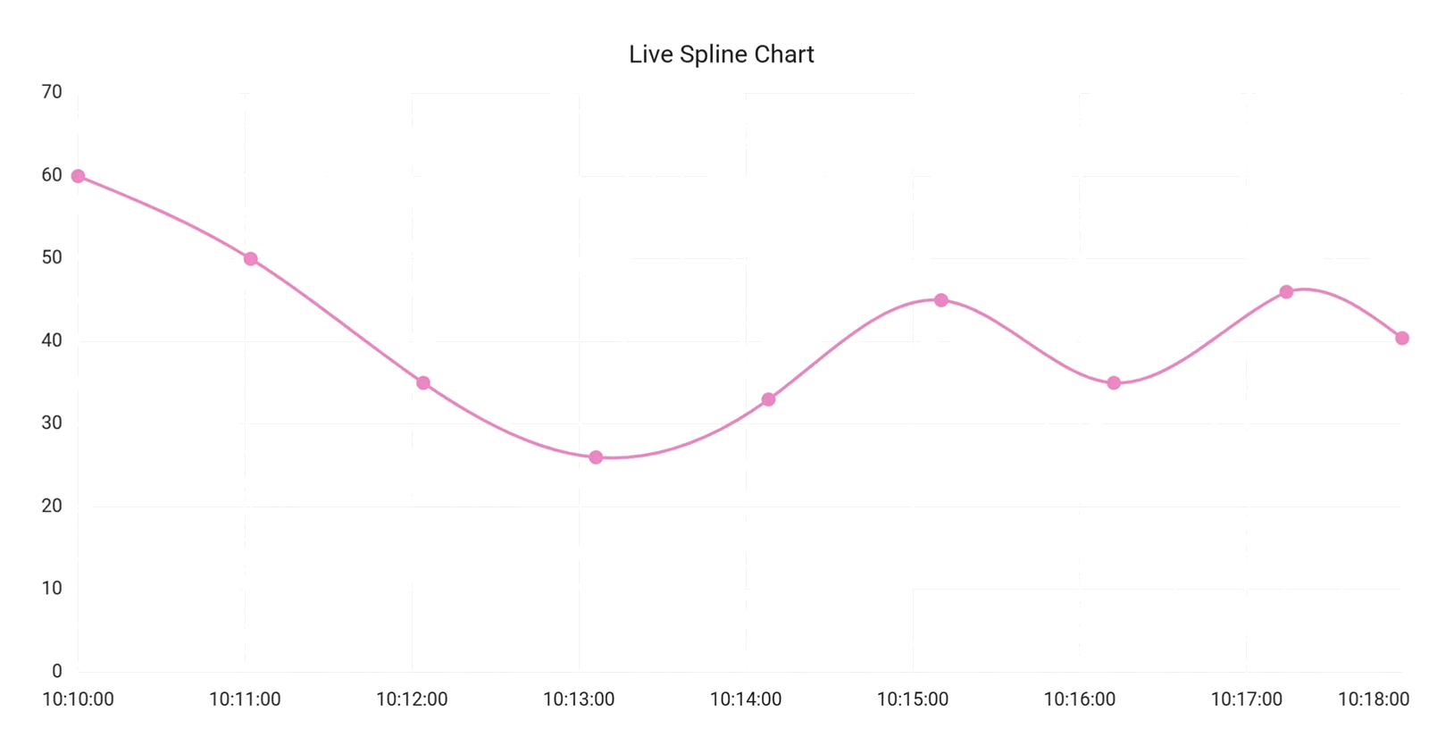
Note: For more details, check out the demo here.
Key features of Pure React Chart
Pure React Chart comes packed with features that make it ideal for building modern, data-rich interfaces:
- Data binding: Easily bind to local or remote data sources like JSON, OData, or RESTful web services, perfect for handling large datasets efficiently.
- Multiple panes: Split charts into rows and columns using multiple panes. You can assign axes to specific sections for better organization and clearer data representation.
- Stripline: Add horizontal or vertical bands to highlight key intervals, target ranges, or thresholds, great for drawing attention to important data.
- DataLabel: Display values directly on data points. Customize label styles and positions to improve readability and user understanding.
- Markers: Visually distinguish individual data points with customizable shapes, sizes, and colors, making charts more engaging and easier to interpret.
- Tooltips: Provide contextual information on hover, allowing users to explore data without cluttering the chart interface.
- Legends: Act as a visual key for chart series, helping users identify colors and symbols used across datasets.
- Zooming and panning: Let users zoom into specific chart areas and navigate large datasets interactively for a dynamic experience.
- RTL support: Render chart elements from right to left to support languages like Arabic and Hebrew, essential for global applications.
- Animations: Add smooth transitions and effects to enhance the visual appeal and professionalism of your charts.
Roadmap for future releases
Syncfusion is committed to continuously enhancing Pure React Chart with powerful new features that improve flexibility, interactivity, and visualization depth:
- Expanded Chart types: Upcoming support for financial chart types like Candle, Hilo, OHLC, and 100% Stacking series, ideal for advanced analytics and trading platforms.
- Circular Chart enhancements: Pie and Donut chart types are on the way, expanding the Pure React components lineup.
- Data point interaction: Users will be able to highlight and select individual data points, making it easier to analyze specific segments within a dataset.
- Crosshair support: Add precision inspection with horizontal and vertical crosshair lines that follow mouse movement and display detailed tooltips.
- Exporting improvements: Charts will soon support exporting to SVG, PNG, and JPEG formats, making it easier to share, download, or embed visualizations.
Conclusion
Syncfusion’s Pure React Chart offers developers a robust, performant, and native solution for building modern web applications. With seamless integration, modular design, and enterprise-grade features, these components empower developers to create data-intensive interfaces easily.
The planned roadmap ensures continued innovation, with features such as advanced chart types, crosshairs, highlights, and selection. Try them out today and elevate your React development experience!
Start building smarter UIs today with Syncfusion Pure React components. Explore the documentation, experiment with interactive demos, and take your frontend development to the next level. New users can enjoy a 30-day free trial to explore all features and capabilities.
If you’re an existing Syncfusion® user, you can download the latest version of Essential Studio® from the license and downloads page.
If you need further assistance, contact us via our support forums, support portal, or feedback portal. We’re always here to help you!


 No spam, just valuable updates.