This is the continuation of my previous blog “Overview of Chart in Xamarin.Forms Part 1“. Hope you enjoyed it and have gained some basic knowledge about to configure the chart in a cross platform Xamarin application. In this blog, we are going to explain about some advanced features that are used for any application requirement. It includes configuring multiple series, annotation, zooming and scrolling, tracking data point, selection, auto scrolling and strip lines.
Adding multiple chart types
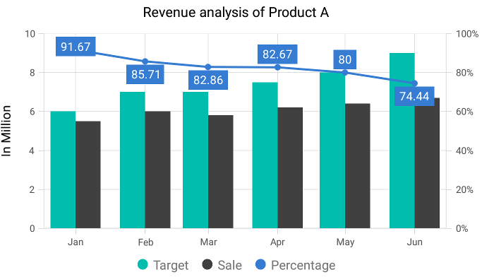
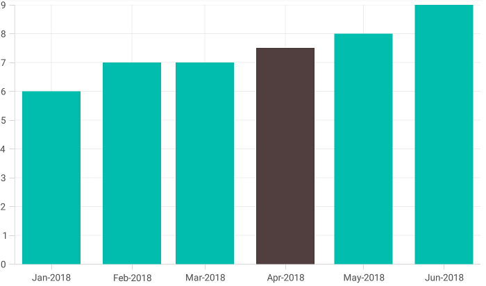
Adding multiple types of charts is a typical requirement when you need to plot different units of data to compare trends across a timeline. Let’s move forward with an example. I’m going to plot the Target vs Sale of each month using a column chart and show the percentage of achievement using a line chart so that I can display clear information about the trend across six months.
 <chart:SfChart.Series>
      <chart:ColumnSeries ItemsSource="{Binding Data}" XBindingPath="Date" YBindingPath="Target" Label="Target"> </chart:ColumnSeries>
      <chart:ColumnSeries ItemsSource="{Binding Data}" XBindingPath="Date" YBindingPath="Sale" Label="Sale"> </chart:ColumnSeries>
      <chart:LineSeries ItemsSource="{Binding Data}" XBindingPath="Date" YBindingPath="Percentage" Label="Percentage"> </chart:LineSeries>
</chart:SfChart.Series>
Note: The transposed series (such as bar, stacked bar, and stacked bar 100) cannot be combined with other normal cartesian series and any cartesian series type cannot be combined with accumulation series (pie, doughnut, funnel, and pyramid).
Configuring annotations
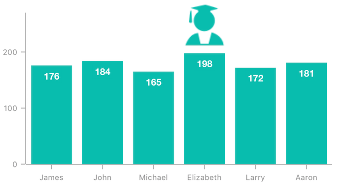
Annotations are commonly used to display metadata about a chart or series at a specific point of interest in the plotting area. The control allows you to position them on a chart based on the screen point (pixel coordinate) or chart data. This feature includes functionality like built-in shapes, custom view support, text support to describe an annotation, axis-based plotting, and UI customization. Multiple annotations can be added to a single chart using the Annotations property of chart. In the following example, the top among six students is annotated with view annotation above the column segment.
<chart:SfChart.ChartAnnotations>
      <chart:ViewAnnotation CoordinateUnit="Axis" X1="{Binding AnnotationX}" Y1="{Binding AnnotationY}">
           <chart:ViewAnnotation.View>
                 <Image Source="Topper.png" ZoomMode="X"/>
           </chart:ViewAnnotation.View>
       </chart:ViewAnnotation>
</chart:SfChart.ChartAnnotations>
Enable zooming and scrolling
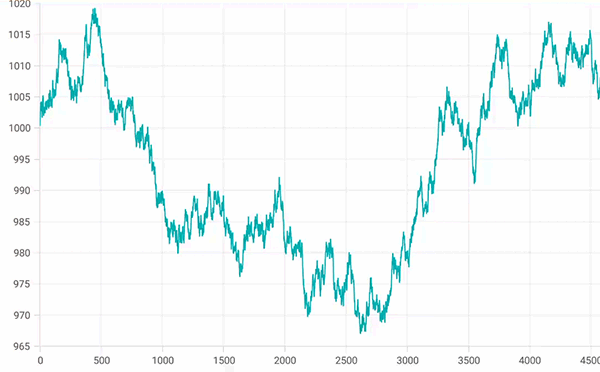
Zooming and scrolling are useful when you need to visualize large amounts of data. Zooming is performed by pinching, selecting the region, and double tapping at the required position. You can also restrict the zooming and scrolling actions to happen only in a vertical or horizontal direction.
<chart:SfChart.ChartBehaviors>
      <chart:ChartZoomPanBehavior ZoomMode="X"> </chart:ChartZoomPanBehavior>
</chart:SfChart.ChartBehaviors>
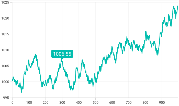
Tracking data point
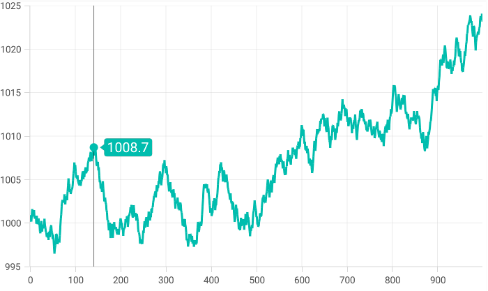
When there are so many data points plotted in a chart that you cannot enable data markers due to space constraints, you would generally seek an alternate way to view the data values. That is where trackball and tooltip come into play for tracking the data point values.
The trackball feature is used to track a data point close to the touch contact point. It enables on long press, is draggable across the chart, and will be deactivated with one touch of the finger.
On the other hand, we have the tooltip feature that displays a pop-up with additional information when the mouse pointer is touching a data point. It is your choice to configure the most suitable feature between trackball and tooltip, or both in the same chart.
Following is the example code of trackball and its output.
<chart:SfChart.ChartBehaviors>
     <chart:ChartTrackballBehavior> </chart:ChartTrackballBehavior>
</chart:SfChart.ChartBehaviors>
Following is the example code of tooltip and its output.
<chart:LineSeries EnableTooltip="true" ItemsSource="{Binding Data}" XBindingPath="X" YBindingPath="Y"> </chart:LineSeries>
Enable data point selection
Interactively select and highlight a data point. This is widely used to navigate to another page with the information of a selected data point or to update the other components in the same page based on the selected data point in a chart.
<chart:LineSeries EnableDataPointSelection="true" ItemsSource="{Binding Data}" XBindingPath="X" YBindingPath="Y"> </chart:LineSeries>
Configuring autoscrolling
You can configure the autoscrolling feature to focus on a minimal set of data points by visualizing only a few items in the UI and viewing the remaining data points by scrolling. This is typically used in real-time updates to view recently added data points. You need to specify the autoscrolling delta to display a fixed number of points and set the mode to define the position where it should show, the start or end.
<chart:SfChart.ChartBehaviors>
     <chart:ChartZoomPanBehavior ZoomMode="X"> </chart:chartZoomPanBehavior>
</chart:SfChart.ChartBehaviors>
<chart:SfChart.PrimaryAxis>
     <chart:DateTimeAxis AutoScrollingDelta="5" AutoScrollingDeltaType="Months"> </chart:DateTimeAxis>
</chart:SfChart.PrimaryAxis>
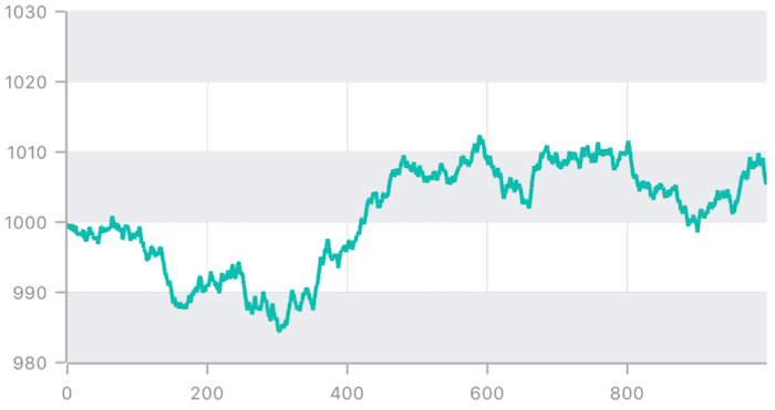
Configuring strip lines
Strip lines are used to shade different ranges in a plot area with different colors to improve the readability of a chart. You can annotate them with text to indicate what a particular region indicates. You can also enable the strip lines to be drawn repeatedly at regular intervals—this is useful when you want to mark an event that occurs recursively along the timeline of the chart.
<chart:SfChart.SecondaryAxis>
     <chart:NumericalAxis Minimum="980" Maximum="1030">
           <chart:NumericalAxis.StripLines>
                <chart:NumericalStripLine Start="980" Width="10" RepeatEvery="20" RepeatUntil="1030" FillColor="#EBECF0"> </chart:NumericalStripLine>
           </chart:NumericalAxis.StripLines>
     </chart:NumericalAxis>
</chart:SfChart.SecondaryAxis>
Download the complete sample from here. You can change the MainPage of this sample to the required page to switch between features.
Conclusion
In this blog post, you learned about advanced features available in the Syncfusion chart control for the Xamarin.Forms platform. But there are still a few more features that have not been discussed in this blog. Take look at our
documentation to learn about all the features with example codes, or download our sample browser app from
Google Play,
Windows Store or the iOS App Store to explore all the samples.
If you have any questions or require clarification on these features, please let us know in the comments below. You can also contact us through our
support forum or
Direct-Trac. We are happy to assist you!

 Prabakaran Ramasamy
 No spam, just valuable updates.