
 Sridhar Narasimhan
Syncfusion has recently added the Query Builder UI component to our React UI components library. It’s a great tool to help you construct and display complex filtering queries. This blog will provide an overview of the React Query Builder UI component, and shows you its basic usage and features, step by step.
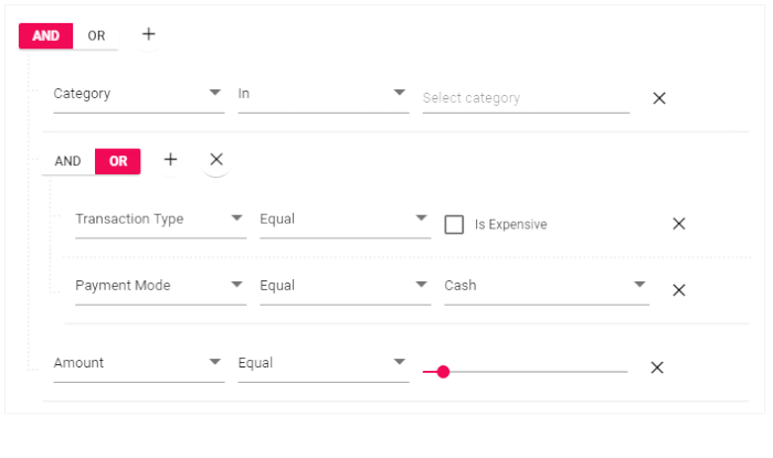
React Query builder UI component
The Query Builder UI combined with Grid performs advanced searching and displays the results in an organized manner. It is fully customizable to include many input components like slider, drop-down list, multi-select, and check boxes for value selection.
Get started with Query Builder UI
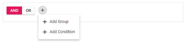
Here, we can see step by step procedure to get started with the Query Builder UI component in the React platform:
- First, we need to use the create-react-app CLI. If you don’t have the CLI, then, install it globally using following command.
npm install -g create-react-app - Create a React application and download its dependencies using the following command.
create-react-app querybuilder --scripts-version=react-scripts-ts - Now, install the packages for including Query Builder UI component into your application, using the following command.
cd querybuilder
npm install @syncfusion/ej2-react-querybuilder - With this we have completed the environment related configurations. Next, to include the Query Builder UI component in the application, import the same from ej2-react-querybuilder package in App.tsx.
import {QueryBuilderComponent} from '@syncfusion/ej2-react-querybuilder'; - Syncfusion React UI components support a set of built-in themes, and here we will use the Material theme for our query builder. To add the Material theme to your application, you need to import material.css into App.css.
@import "https://cdn.syncfusion.com/ej2/material.css";
- With this, we have successfully completed the configurations related to the Query Builder UI component. Now we should initialize our first query builder in TSX as shown in the following code example.
class App extends React.Component { public render() { return (<div > <QueryBuilderComponent /> </div>); } } - Finally, run the following command to see the output in a browser.
npm start |
 Query Builder UI
Data binding
The Query Builder UI component uses DataManager, which supports both RESTful JSON data service binding and local JavaScript object array binding. The dataSource property of the query builder can be assigned with a JavaScript object array collection.
All the columns defined in the dataSource will be auto-populated using the data source schema. If all the columns defined are not required, then, we can manually define the fields using the columns property.
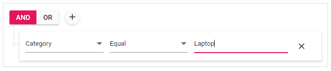
Now, define the employee table and map it to the dataSource of our query builder.
const hardwareData: object[] = [
{"TaskID": 1, "Name": "Lenovo Yoga", "Category": "Laptop",
"SerialNo": "CB27932009", "InvoiceNo": "INV-2878", "Status": "Assigned"  },
{"TaskID": 2, "Name": "Acer Aspire", "Category": "Others",
"SerialNo": "CB35728290", "InvoiceNo": "INV-3456", "Status": "In-repair" },
….
]

class App extends React.Component {
public render() {
return (<div ><QueryBuilderComponent dataSource={ hardwareData } /></div>);
}
}
After binding the data, the query builder will be rendered based on the data.
 Data binding in Query Builder UI
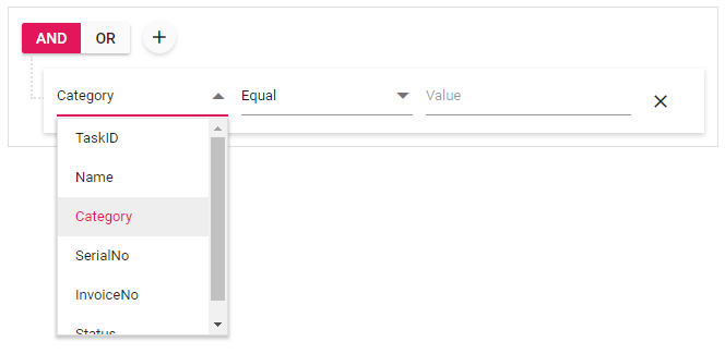
Defining columns
The Query Builder UI component has flexible APIs to define the column label, type, format, and operators:
label—Field values are considered labels by default, and we can further customize them using this property.
type—Defines the data type of the column.
format—Customizes the format of date and number column types.
operators—Customizes the default operators for the column.
The following code example imports the ColumnsModel from the ej2-react-querybuilder package in App.tsx and customizes the label and type.
import {ColumnsModel, QueryBuilderComponent} from '@syncfusion/ej2-react-querybuilder';
class App extends React.Component {
public columnData: ColumnsModel[] = [
{field: 'TaskID', label: 'TaskID', type: 'number',
operators: [{ key: 'equal', value: 'equal' },
{ key: 'greaterthan', value: 'greaterthan' }, { key: 'lessthan', value: 'lessthan' }]
},
{ field: 'Name', label: 'Name', type: 'string' },
{ field: 'Category', label: 'Category', type: 'string' },
{ field: 'SerialNo', label: 'SerialNo', type: 'string' },
{ field: 'InvoiceNo', label: 'InvoiceNo', type: 'string' },
{ field: 'Status', label: 'Status', type: 'string' }
];

public render() {
return (<div ><QueryBuilderComponent dataSource={employeeData} columns={this.columnData} /></div>);
}
}
 Defining columns in Query Builder UI
Binding the filter query to Grid
In this segment, we are going to add a grid component and populate it with the search result from the query builder. For this, we need to install the Syncfusion React Grid and Syncfusion React Button packages.
npm install @syncfusion/ej2-react-grids @syncfusion/ej2-react-buttons |
Now, bind the data and configure the columns of the grid. Initialize DataManager with hardwareData, which is defined as the dataSource of Query Builder UI component. Define the query to get the required data from the hardware data and assign it to the Grid component’s query property.
import { DataManager, Predicate, Query } from '@syncfusion/ej2-data';
import { ButtonComponent } from '@syncfusion/ej2-react-buttons';
import { ColumnDirective, ColumnsDirective, GridComponent, Inject, Page } from '@syncfusion/ej2-react-grids';

public datamanager: DataManager = new DataManager(hardwareData);
public query: Query = new Query().select(['TaskID', 'Name', 'Category', 'SerialNo', 'InvoiceNo', 'Status']);

<GridComponent allowPaging={true} dataSource={this.datamanager} width='100%'
ref={(scope) => { this.gridObj = scope; }} query={this.query} >
<ColumnsDirective>
<ColumnDirective field='TaskID' headerText='Task ID' width='120' textAlign='Right' />
<ColumnDirective field='Name' headerText='Name' width='140' />
<ColumnDirective field='Category' headerText='Category' width='140' textAlign='Right' />
<ColumnDirective field='SerialNo' headerText='Serial No' width='130' />
<ColumnDirective field='InvoiceNo' headerText='Invoice No' width='120' />
<ColumnDirective field='Status' headerText='Status' width='120' />
</ColumnsDirective>
<Inject services={[Page]} />
</GridComponent>
Finally, synchronize the filter changes in our query builder to populate the filtered data into our grid. For this, we need to detect the query changes and update the grid query to refresh the filtered data by handling the button click event.
<QueryBuilderComponent width='100%' dataSource={hardwareData} columns={this.columnData} ref={(scope) => { this.qryBldrObj = scope; }} />
<ButtonComponent onClick={this.updateRule()} >Filter Grid</ButtonComponent>

public updateRule = ()=>() => {
const predicate: Predicate = this.qryBldrObj.getPredicate({ condition: this.qryBldrObj.rule.condition, rules: this.qryBldrObj.rule.rules });
if (isNullOrUndefined(predicate))
{ this.gridObj.query = new Query().select(['TaskID', 'Name', 'Category', 'SerialNo', 'InvoiceNo', 'Status']); }
else
{ this.gridObj.query = new Query().select(['TaskID', 'Name', 'Category', 'SerialNo', 'InvoiceNo', 'Status']).where(predicate); }
this.gridObj.refresh();
}
Now our query builder will look like the below screenshot, with a grid component. You can now create your own complex filter queries and click the filter grid button to see the results.
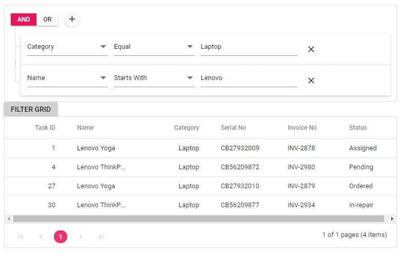 Binding query builder filter result to grid
Summary
The Query Builder UI component is designed to be highly customizable, to include various input components like slider, multi-select, checkbox, and drop-down lists. This way, input can be received in different formats, to create complex queries.
To try our Query Builder UI component, please download our free trial. You can also check its source from GitHub. For the better use of the component you can check our online sample browser and documentation.
If you have any questions or need any clarification, then, please let us know in the comments section below. You can also contact us through our support forum, Support Portal or Feedback portal. We are always happy to assist you!
If you like this blog post, then we think you’ll also like the following free ebooks,
 No spam, just valuable updates.