
 Mohamed Samsudeen
The Material design concept by Google has completely changed the way the Android applications are developed. By following the provided guidelines on how the UI has to be designed, applications became super interactive, with impressive and creative designs.
Xamarin.Forms has taken advantage of this guideline and provided Material design support for their most-used framework controls in 3.6 for iOS and Android platforms. This support not only provides a beautiful appearance for the application, but also provides a uniform look in iOS and Android platforms. When it is enabled in an application, all the supported views are rendered with a uniform look and feel.
Having said that, it is always not enough to have new features for the framework controls alone. We understand this and we make sure that Syncfusion controls are always compatible with these new features from Xamarin.Forms. Hence, we have provided a built-in support for this in our components in 2019 Volume 3. We have also made lots of improvements in Material design. I will walk you through how to enable this support in applications and show you the UI enhancements it makes in Xamarin.Forms and Syncfusion components.
How to set the Visual property
In this blog, we are not going to concentrate on the required configurations and how the Visual property works, since this was already discussed in detail in this blog post. So, let me just show you how to set Visual.
    <StackLayout Spacing="50" VerticalOptions="Center" HorizontalOptions="Center">
        <Button Text="Default" />
        <Button Text="Material" Visual="Material" />
    </StackLayout>
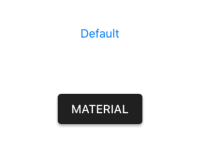
You can see the difference it makes to the button. Moreover, Visual is a property that can be set to the element or its parent or the page itself. Due to this, you can set Visual as Material for the root element and override it as Default for a specific element if needed.
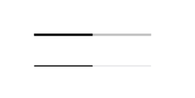
    <StackLayout Visual="Material" Spacing="50" VerticalOptions="Center" HorizontalOptions="Center">
        <ProgressBar Progress="0.5" ProgressColor="Black" WidthRequest="200" />
        <ProgressBar Progress="0.5" ProgressColor="Black" WidthRequest="200" Visual="Default" />
    </StackLayout>
Support for Syncfusion controls
One of the most important aspects of Material design is that all the UI elements should feel responsive. So, we have added ripple and highlight effects to applicable controls. If you want to achieve this effect in any kind of view, use our new Effects View control, which was introduced in 2019 Volume 3. Refer to this blog post to learn details about the Effects View.
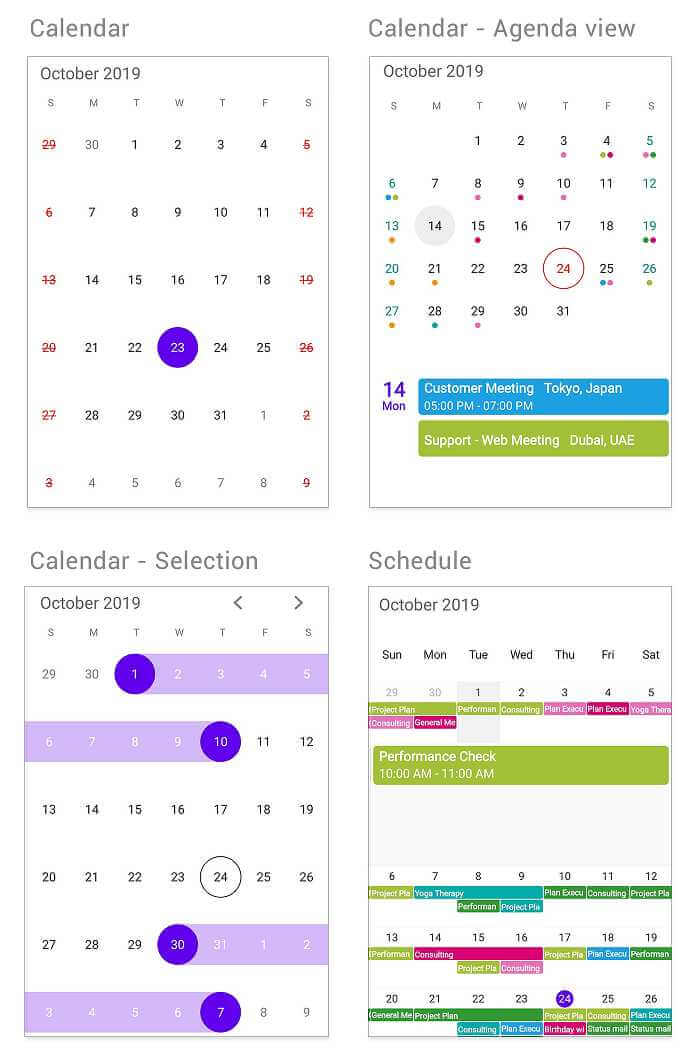
Note: For the Calendar control, we have changed the default appearance to this improved Material design to make the UI more attractive.
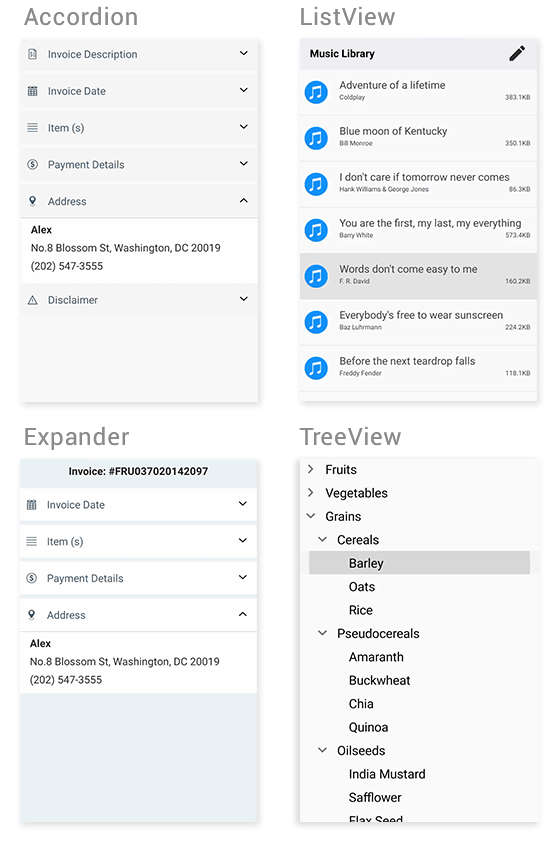
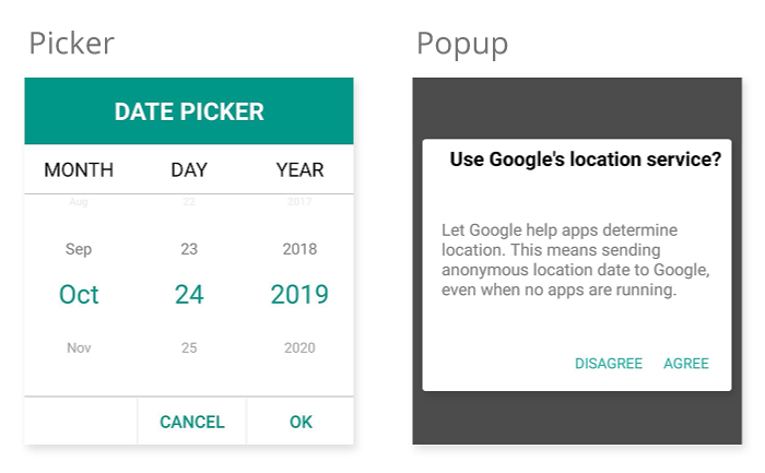
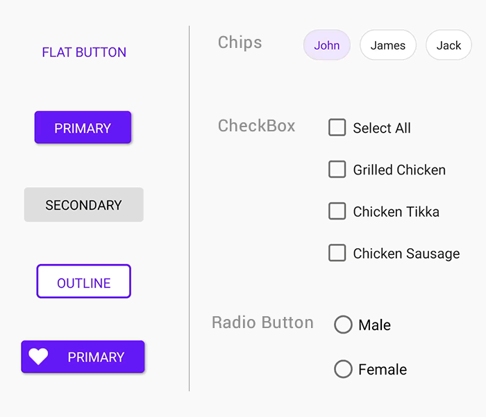
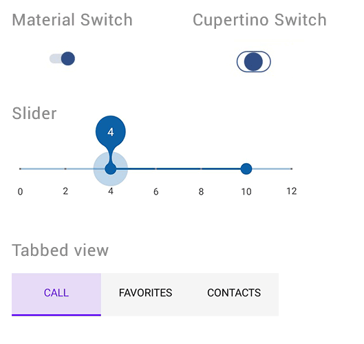
Let me show you the Material design improvements made for Syncfusion controls. The following images are taken in either the iOS or Android platform. However, both the iOS and Android platforms will have the uniform UI.
Calendar and Schedule
Accordion, ListView, Expander, and TreeView
Picker and Popup
Button, Radio Button, CheckBox, and Chips
Switch, Range Slider, and Tabbed View
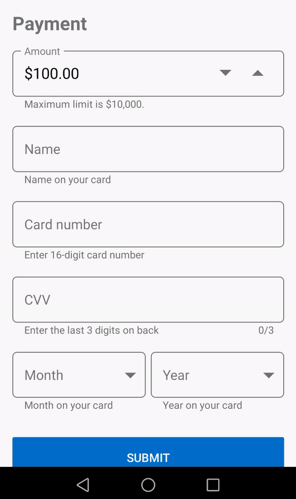
Input components
The previously listed controls will change to Material design automatically when you set the Visual property to Material. However, the following input components will be wrapped with our Text Input Layout control to render in the Material design. To learn more about this, refer to this blog post.
- DataForm
- Numeric Entry
- Masked Entry
- Autocomplete
- ComboBox
- NumericUpDown (from 2019 Volume 3)
In addition to the existing controls, we have also added support for NumericUpDown in our 2019 Volume 3 release.
Conclusion
In this blog post, we have walked through the Material design support introduced by Xamarin.Forms and how it can be achieved by setting the Visual property to Material. Also, we have seen the Material UI improvements made in Syncfusion Xamarin controls and the ability the design provides to achieve uniform appearance in iOS and Android platforms. We will keep improving the UI based on the requirements in our upcoming releases. If you have any questions, please let us know in the comments section below.
Also, you can contact us through our support forum, Direct-Trac, or feedback portal. We are waiting to hear your feedback about these UI improvements!
 No spam, just valuable updates.
Comments (4)
Do the renderers work for UWP?
Hi Mark,
No. Like framework controls, we support this only for iOS and Android.
Regards,
Samsudeen
LiveXAML allows for live UI reload in Xamarin Forms applications. This package is a runtime dependency, you also need to install Visual Studio extension. ResourceDictionary instances containing standard Google Material Design swatches, for inclusion in a XAML application.
Hi Maria,
Are you facing any issues in material design? Could you please provide more details about your requirements?
Regards,
Samsudeen