
 Dilli Babu N
We are happy to introduce the Xamarin.Forms StepProgressBar component in Essential Studio® for Xamarin.Forms 2019, Vol.2.
Most mobile applications have tasks or operations that involve multiple steps or stages that need to be conveyed through a user interface. That’s why Syncfusion created a StepProgressBar component for Xamarin with dashing visuals and hassle-free usability.
The Xamarin.Forms StepProgressBar is a control that indicates the progress of a multiple-step (state) process, such as new-user registration or package status tracking. You can customize its appearance by changing step shape, step content, progress bar color, and more. In this blog post, we will summarize the key features of the Xamarin.Forms StepProgressBar control.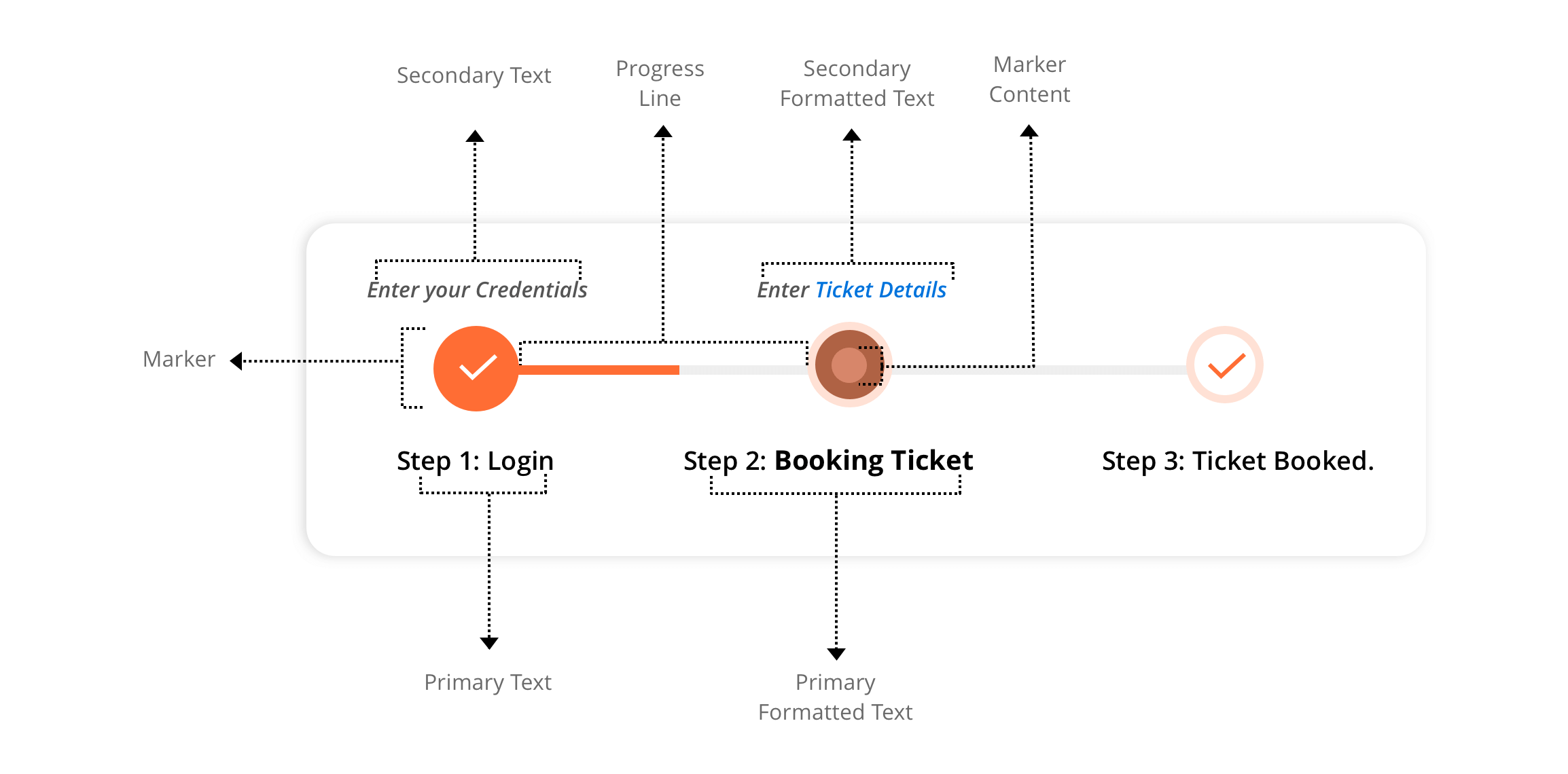
Step Progress Bar Control Overview
Orientation
Since a multi-step process can progress in a horizontal or vertical direction, we have provided orientation support for both.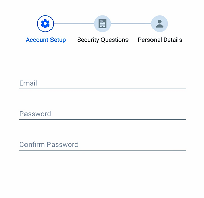
Horizontal Step Progress Bar Control
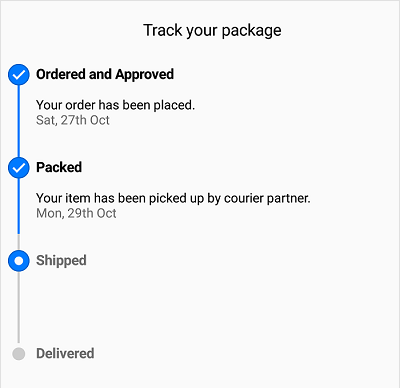
Vertical Step Progress Bar Control
Status
A step has three statuses: not started, in progress, and completed. Based on the status, you can format a step with different styles, which means whenever the status of a step changes, the style of the visual will change synchronously.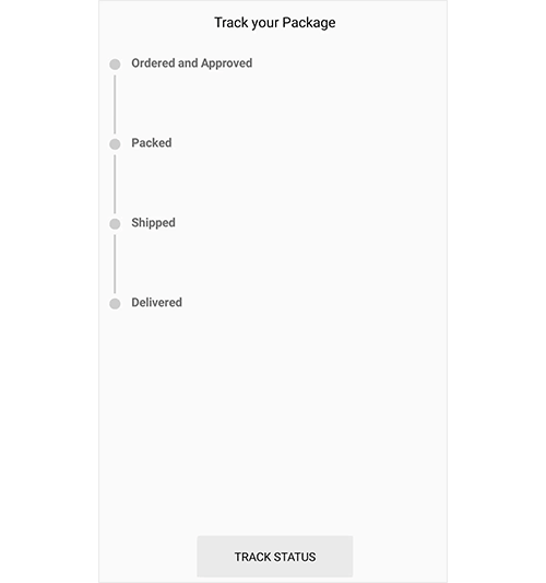
Steps in different status
Step description
Each step in a multistep process has a different operation. To provide self-explanatory information about a step, a step description can be shown on either side. A primary description will be on the right or bottom of the step, and a secondary description will be on the left or top of the step.
We extended this feature by providing additional support where the FormattedString class can be provided as an input for both descriptions. You can customize these descriptions with different formatting styles.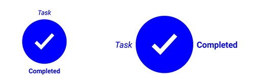
Step Descriptions
Marker shape
The shape of a step marker can be a circle or a square.
Step Markers
Content type
You can customize the step content with numbers, ticks, crosses, dots or images.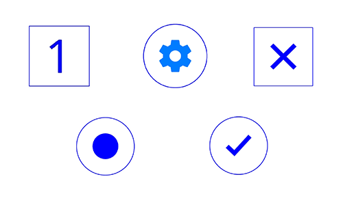
Step Content
Style
The Xamarin.Forms StepProgressBar control allows you to customize a step based on its status. Define an individual style for each status to achieve this. Marker color, marker shape type, marker content color, marker content type, marker stroke color, marker stroke width, marker size, marker content size, progress line color, and font can be defined for a style.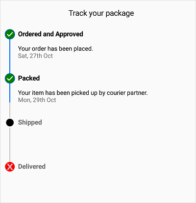
Style applied to Step Progress Bar
Getting started with StepProgressBar
This section shows you, step by step, how to implement a Xamarin mobile application with the StepProgressBar Control.
- Create a blank Xamarin.Forms application.
- In the application, refer to the Xamarin.SfProgressBar NuGet package from nuget.org. To learn more about SfStepProgressBar, refer to “Adding SfStepProgressBar reference” in Syncfusion’s documentation.
- When deploying the application in UWP and iOS, please follow the steps provided in “Launching the application on each platform with StepProgressBar,” which is also found in Syncfusion’s documentation.
- Import the progress bar namespace in your respective page as demonstrated in the following code sample.
xmlns:progressBar="clr-namespace:Syncfusion.XForms.ProgressBar;assembly=Syncfusion.SfProgressBar.XForms"
Then, initialize SfStepProgressBar as shown in the following code.
<progressBar:SfStepProgressBar HorizontalOptions="Center" VerticalOptions="Center">
    <progressBar:StepView PrimaryText="Step 1" />
    <progressBar:StepView PrimaryText="Step 2" />
    <progressBar:StepView PrimaryText="Step 3" />
    <progressBar:StepView PrimaryText="Step 4" Status="InProgress" />
    <progressBar:StepView PrimaryText="Step 5" />
</progressBar:SfStepProgressBar>
And, that’s how to add the StepProgressBar control to an application.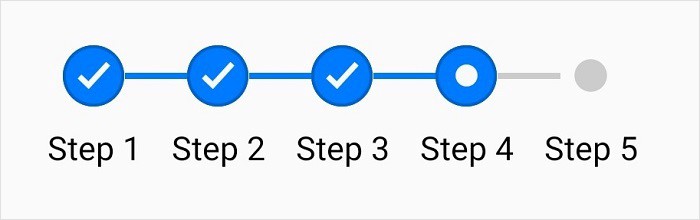
You can download the getting started sample from this GitHub location.
Conclusion
In this blog post, we had a quick overview of the Xamarin.Forms step progress indicator that is available in the 2019 Volume 2 release. We invite you to check out all our Xamarin.Forms controls. You can always download our free evaluation to see all our controls in action. Feel free to explore our samples on Google Play and the Microsoft Store. To learn more about the advanced features of our Xamarin.Forms controls, refer to our documentation.
If you have any questions or require clarification regarding this control, please let us know in the comments section. You can also contact us through our support forum, Direct-Trac, or feedback portal. We are always happy to assist.
 No spam, just valuable updates.