
 Vimal Prabhu
To all the Syncfusion Xamarin.Forms DataGrid users and fans out there, we have some exciting news for you. The most awaited and requested feature has finally made its way in the 2019 Volume 2 release: stacked headers. For those of you who don’t know what stacked headers are, you may feel lost. To catch up, continue reading through this blog post, where I explain what stacked headers are, their capabilities, and why should you be excited about this feature’s arrival.
What are stacked headers?
Stacked headers are multiple-level column headers that span across multiple columns of the DataGrid. These unbound header rows take data visualization and data classification to the next level by allowing the columns in DataGrid to be grouped under common column headers. This enables you to present the data in a more pleasant, classified, and clear manner. The end users can then understand the data better, as the stacked headers clearly classify the data by grouping together the related columns. Thus, you can easily convey to the end user what type of information these columns are going to hold and display. Now let’s add some stacked headers and begin simplifying data for the end user.
<sfgrid:SfDataGrid.StackedHeaderRows>
    <sfgrid:StackedHeaderRow>
        <sfgrid:StackedHeaderRow.StackedColumns>
            <sfgrid:StackedColumn
                ChildColumns="OrderID,OrderDate,CustomerID,ContactName"
                Text="Order Shipment Details"
                TextSize="{StaticResource textSize}"
                MappingName="SalesDetails"
                FontAttribute="Bold"
                TextAlignment="Center"
            />
        </sfgrid:StackedHeaderRow.StackedColumns>
    </sfgrid:StackedHeaderRow>

    <sfgrid:StackedHeaderRow>
        <sfgrid:StackedHeaderRow.StackedColumns>
            <sfgrid:StackedColumn
                ChildColumns="OrderID,OrderDate"
                Text="Order Details"
                TextSize="{StaticResource textSize}"
                MappingName="OrderDetails"
                FontAttribute="Bold"
                TextAlignment="Center"
            />
            <sfgrid:StackedColumn
                ChildColumns="CustomerID,ContactName"
                Text="Customer Details"
                TextSize="{StaticResource textSize}"
                MappingName="CustomerDetails"
                FontAttribute="Bold"
                TextAlignment="Center"
            />
        </sfgrid:StackedHeaderRow.StackedColumns>
    </sfgrid:StackedHeaderRow>
</sfgrid:SfDataGrid.StackedHeaderRows>
var stackedHeaderRow = new StackedHeaderRow();
stackedHeaderRow.StackedColumns.Add(new StackedColumn()
{
	ChildColumns = "OrderID" + "," + "OrderDate" + "," + "CustomerID" + "," + "ContactName",
	Text = "Order Shipment Details",
	MappingName = "SalesDetails",
	FontAttribute = FontAttributes.Bold,
	TextAlignment = TextAlignment.Center,
});
dataGrid.StackedHeaderRows.Add(stackedHeaderRow);

var stackedHeaderRow1 = new StackedHeaderRow();
stackedHeaderRow1.StackedColumns.Add(new StackedColumn()
{
	ChildColumns = "OrderID" + "," + "OrderDate",
	Text = "Order Details",
	MappingName = "OrderDetails",
	FontAttribute = FontAttributes.Bold,
	TextAlignment = TextAlignment.Center
});
stackedHeaderRow1.StackedColumns.Add(new StackedColumn()
{
	ChildColumns = "CustomerID" + "," + "ContactName",
	Text = "Customer Details",
	MappingName = "CustomerDetails",
	FontAttribute = FontAttributes.Bold,
	TextAlignment = TextAlignment.Center
});
this.dataGrid.StackedHeaderRows.Add(stackedHeaderRow1);
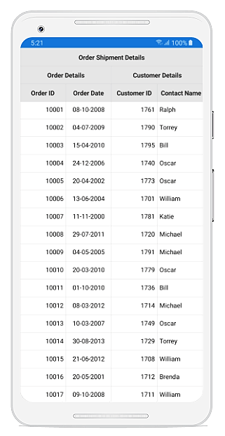
Ta-da! Stacked headers in an Android device
Why should you be excited?
Appearance customizations (foreground and background)
Apart from the awesomeness of simplifying data, this feature comes with loads of preloaded customization options to match the dashing, attractive UI of your application. You get to play with the font face, font color, font size, and background color of the rows; the border color of the cells; etc.
////---------------------StackedHeaderRowOne-----------------------------////
StackedHeaderRow _stackedHeaderRowOne = new StackedHeaderRow();

StackedColumn _stackedColumn = new StackedColumn();
_stackedColumn.ChildColumns = "OrderID" + "," + "ShippingDate" + "," + "EmployeeID" + "," + "FirstName" + "," + "ShipCity" + "," + "ShipCountry";
_stackedColumn.Text = "Order Shipment Details";
_stackedColumn.TextSize = 40;
_stackedColumn.MappingName = "SalesDetails";
_stackedColumn.Font = "Amontillados.ttf#Amontillados";
_stackedHeaderRowOne.StackedColumns.Add(_stackedColumn);

////---------------------StackedHeaderRowTwo-----------------------------////
StackedHeaderRow _stackedHeaderRowTwo = new StackedHeaderRow();

////----------------StackedColumnOne-------------------////
StackedColumn stackedColumnOne = new StackedColumn();
stackedColumnOne.ChildColumns = "OrderID" + "," + "ShippingDate";
stackedColumnOne.Text = "Order Details";
stackedColumnOne.TextSize = 12;
stackedColumnOne.MappingName = "OrderDetails";
stackedColumnOne.FontAttribute = FontAttributes.Bold;
stackedColumnOne.Font = "Arial";

////----------------StackedColumnTwo-------------------////
StackedColumn stackedColumnTwo = new StackedColumn();
stackedColumnTwo.ChildColumns = "EmployeeID" + "," + "FirstName";
stackedColumnTwo.Text = "Customer Detail";
stackedColumnTwo.TextSize = 12;
stackedColumnTwo.MappingName = "CustomerDetails";
stackedColumnTwo.FontAttribute = FontAttributes.Bold;
stackedColumnTwo.Font = "Italic";

_stackedHeaderRowTwo.StackedColumns.Add(stackedColumnOne);
_stackedHeaderRowTwo.StackedColumns.Add(stackedColumnTwo);

StackedHeaderRowCollection _stackedHeaderRowCollection = new StackedHeaderRowCollection();
_stackedHeaderRowCollection.Add(_stackedHeaderRowOne);
_stackedHeaderRowCollection.Add(_stackedHeaderRowTwo);

dataGrid.StackedHeaderRows = _stackedHeaderRowCollection;

dataGrid.GridStyle = new MyStyle();


public class MyStyle : DataGridStyle
{
    public MyStyle()
    {
    }

    public override Color GetStackedHeaderBackgroundColor(int rowIndex)
    {
            return Color. OrangeRed;
    }

    public override Color GetStackedHeaderForegroundColor(int rowIndex)
    {
            return Color.FromRgb(255, 255, 255);
    }

   public override Color GetHeaderBorderColor()
   {
         return Color.Black;
    }
}
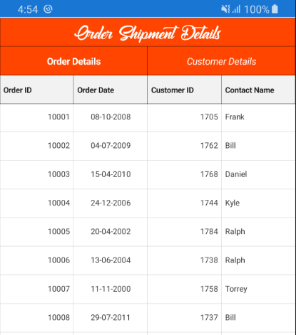
Customized stacked headers
As a step further, you can also apply a different background color to each row of the stacked headers conditionally, based on its row index.
dataGrid.GridStyle = new MyStyle();

public class MyStyle : DataGridStyle
{
    public MyStyle()
    {
    }

    public override Color GetStackedHeaderBackgroundColor(int rowIndex)
    {
        // Applying background color based on row index.
        if (rowIndex == 0)
        {
            return Color.Black;
        }
        else if (rowIndex == 1)
        {
            return Color.DarkOliveGreen;
        }
    }

    public override Color GetStackedHeaderForegroundColor(int rowIndex)
    {
        // Applying foreground color based on row index.
        if (rowIndex == 0 || rowIndex == 1)
        {
            return Color.FromRgb(255, 255, 255);
        }
        else
        {
            return Color.FromRgb(43, 43, 43);
        }
    }
}
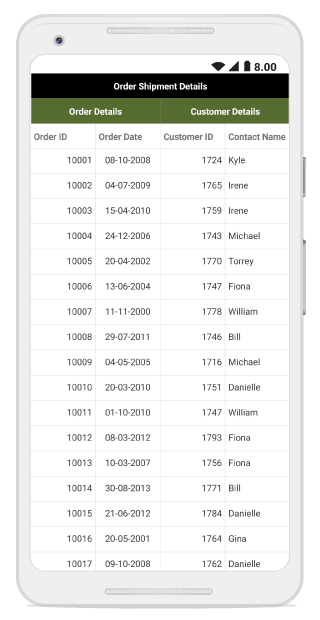
Conditional styling in stacked headers
View customizations
Even more exciting, the customization options are left entirely to you. It’s time to awaken the UI developer in you and get creative, because with built-in templates and template selector support for the stacked header rows, the customizations are completely within your control.
<syncfusion:SfDataGrid.StackedHeaderRows>
            <syncfusion:StackedHeaderRow>
                <syncfusion:StackedHeaderRow.StackedColumns>
                    <syncfusion:StackedColumn
                            ChildColumns="OrderID,OrderDate"
                            Text="Order Details"
                            MappingName="OrderDetails"
                            FontAttribute="Bold"
                            TextAlignment="Center"
                            />
                    <syncfusion:StackedColumn
                            ChildColumns="CustomerID,ContactName"
                            MappingName="CustomerDetails"
                            >
                            <syncfusion:StackedColumn.Template>
                            <DataTemplate>
                                <Grid BackgroundColor="MediumPurple">
                                    <Grid.ColumnDefinitions>
                                        <ColumnDefinition Width="*"/>
                                        <ColumnDefinition Width="50"/>
                                    </Grid.ColumnDefinitions>
                                    <Label Text="Customer Details" TextColor="White" HorizontalTextAlignment="Center" VerticalTextAlignment="Center" Grid.Column="0"/>
                                    <Image Source="customer_details.png"  VerticalOptions="Center" HorizontalOptions="Start" Aspect="AspectFit" Grid.Column="1"/>
                                </Grid>
                            </DataTemplate>
                        </syncfusion:StackedColumn.Template>
                     </syncfusion:StackedColumn>
                </syncfusion:StackedHeaderRow.StackedColumns>
            </syncfusion:StackedHeaderRow>
      </syncfusion:SfDataGrid.StackedHeaderRows>
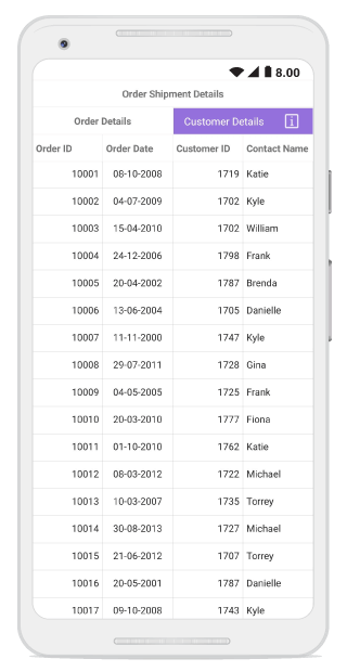
Template content in stacked headers
Height customizations
Let’s move on to the available height customization options for the stacked headers. You can choose to have the same height for all the header rows, have different heights for each header row, or even auto-size the header row height based on its content.
Zero limitations
Are you developing an application to display the prolific results of a complex scientific experiment? Stacked headers has you covered! You can add any number of rows and columns in any combination without any limitations or restrictions to display data in any way you wish.
// Use below code to apply same height to all header rows.
dataGrid.HeaderRowHeight = 50;
dataGrid.QueryRowHeight += dataGrid_QueryRowHeight;
void dataGrid_QueryRowHeight(object sender, QueryRowHeightEventArgs  e)
{
    // Use the below code to set a desired height based on the row index.
    if(e.RowIndex == 0)
    {
        e.Height = 50;
    }
    else if(e.RowIndex == 1)
    {
        // Use the below code to apply auto height based on the contents of the stacked header row.
        e.Height = dataGrid.GetRowHeight(e.RowIndex);
    }
    else
    {
        e.Height = 70;
    }
    e.Handled = true;
}
Conclusion
In addition to this, stacked headers support interactive column-width resizing and CRUD operations. Therefore, runtime changes to the UI are a piece of cake with no additional overhead required. Thus summing up why stacked headers was the most requested feature in DataGrid. We hope you play around with this feature yourself, available from this 2019 Volume 2 release. This documentation link might come in handy, just in case. If you want more info on the DataGrid, look no further.
I hope you found this blog interesting. If you still aren’t excited, I am sure you will be when you check out the awesome controls in our Xamarin suite. Do let me know your thoughts in the comments section below.
As always, you can also contact us through our support forum, Direct-Trac, or feedback portal and we will be happy to assist you.
 No spam, just valuable updates.
Comments (3)
Hi @Gary,
Thanks for your valuable feedback. As per your suggestion, posting the link of the sample below.
https://www.syncfusion.com/downloads/support/directtrac/general/ze/SfGridSample-2094173312
What about single fixed header row?
I can’t show them like a simple grid with fixed header.
Hi @Christian,
We noticed that you have created a support ticket for the same via this forum (https://www.syncfusion.com/forums/148554/fixed-header-row). Our support team will follow up with it and provide solutions in that thread. Thank you !